


|
 Here's some self-crit. - Yes it looks cool but does it do anything more than that? I think I'm drawn to it only because I know the building (The Barbican in London). - I took the shot on a beautiful sunny day and the contrast between the grey building and the blue sky was amazing. Did I ruin it with the B&W conversion? Possibly. - Would this photo be better if it had the context of the ground / bottom of the building? Maybe but I have no idea how to get that shot due to the scale of the building. - The angle that the building is leaning at feels wrong but I couldn't find a good way to correct it in post. I rotated the shot but I think I need to learn how to do perspective correction in PS.
|
 #
¿
Jun 3, 2017 11:16
#
¿
Jun 3, 2017 11:16
|
|

|

|
| # ¿ May 17, 2024 18:38 |
|
|
Cacator posted:Could you maybe recentre the building so that the base of the building fills the bottom of the photo? I feel like there's too much empty space on the left side. I'd get more of an impression that the edges of the buildings are converging at the top. Helen Highwater posted:I find the aspect ratio a bit odd, it looks narrower than the usual 4:3, is it a custom crop? If so, then I'd be tempted to make it a vertical panorama crop and have the building fill almost the whole base of the photo with no dead space at the bottom left. If it's a crop and you have some more of the top available I'd probably give it a bit more room up there as well. I recropped in 4:3 and I do like it more. Thanks for the suggestions!  rio posted:I like the third one. It frames the couple well and gives the best context of their surroundings while still drawing attention to them. Agreed. It seems the most interesting and the road draws the eye nicely.
|
|
#
¿
Jun 4, 2017 19:00
|
|
|
Just wanted to say that I really like this shot. The contrast between the struggling growth of the bare bush and the oppressive, giant vent looming above it really works for me.
|
|
#
¿
Jun 9, 2017 12:25
|
|

|
TsarAleksi posted:
One of the more tasteful processing jobs I've seen on that location. Nicely done. Also yeah, where are all the people? When I went the place was swarming. --- Not sure whether to go with the photoshopped out power lines or not on this one. Had to hold my camera up over a wall to get this shot! 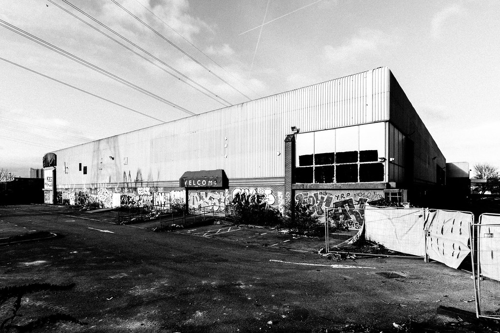 
|
|
#
¿
Jan 11, 2019 17:29
|
|

|
TsarAleksi posted:I'll be the dissenter and say that I think the one without power lines is better; to me they throw the balance of the image off. I think this is an interesting image (in either version) and there is a lot to look at that is well displayed. I'm a bit unsure about what appears to be added grain; I see the intent but it's a bit too artificial looking I think. Also, you're losing a lot of detail in the shadows, you might try playing with bringing that out to strengthen it. Thanks for the advice. I'm a big fan of Moriyama and his ilk so I like my blacks super crushed and my images nice and grainy. It has to serve the image though and I'll experiment with pulling it back and see how it looks. Also obs your shot is amazing. pointsofdata posted:
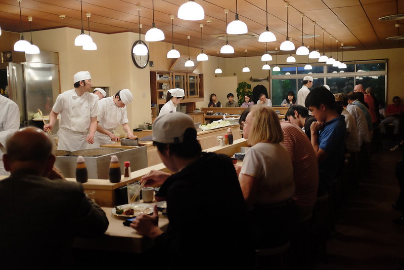
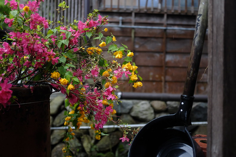
To me the restaurant shot is a snapshot. It's too cluttered and the subject is unclear. I can see you were on the X100 so no zoom available but it would have been better to move / zoom until the chefs were dominating the frame and then waited for that old 'decisive moment' when there was some kind of interaction. Flower shots aren't my think but I thought this picture on your Flickr could have had potential: 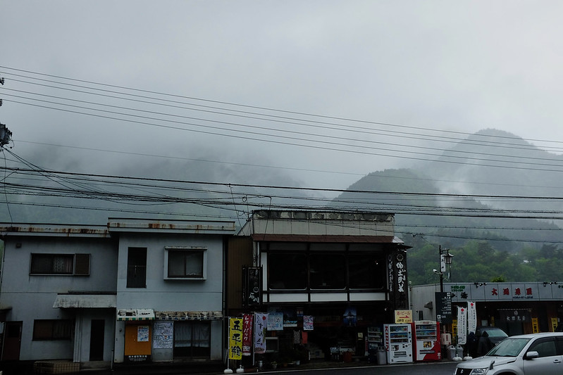 Very moody atmosphere but for me the car in the lower right ruins it and I would have wanted you to get straight on to the buildings with the mountain in the background (I accept this may not have been possible with your fixed focal length).
|
|
#
¿
Jan 29, 2019 21:05
|
|

|
pointsofdata posted:I tried cropping the restaurant one and I agree that being less busy helps, although it does make it more obvious that there isn't actually much of interest happening. Yeah something that comes with time is knowing which shots you were excited to take (and so ascribe meaning to) but actually are poor photographs in terms of composition, exposure etc. God knows I�ve taken, and will continue to take, hundreds of shots where I was excited because the location has hard to get to or I faced a fear and photographed a stranger etc; only to realise that my personal connection to the photo is stopping me from seeing that it isn�t actually a good image. Few famous photographers talk about their �hit rate� of bad to good photos but I�ve heard pros say that, when doing street for example, they�d be happy with one good shot for every 100 they took. Look at Cartier-Bresson�s contact sheets. He often took 5-10 photos of one scene to get the perfect single image. You rarely see all the misses that lead to the hit. Only thing you can do is practice! ")
|
|
#
¿
Jan 29, 2019 23:16
|
|
|
I don't usually go in for nature so would love some feedback on these. My main reflection on urban vs rural is how hard / important it is to control background elements. I think a shallower DOF would have definitely helped in all the photos. I have an extremely strong desire to photoshop a tree in to the last photo to fill the space on the right in the background. I also saw something interesting on youtube where a photographer had lit his subject with flash at dusk and then let the natural light falloff darken the background. I'd like to try that in the future. 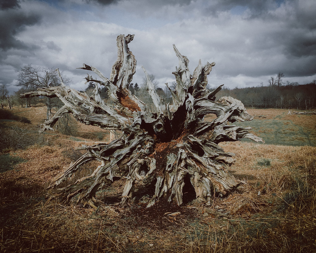  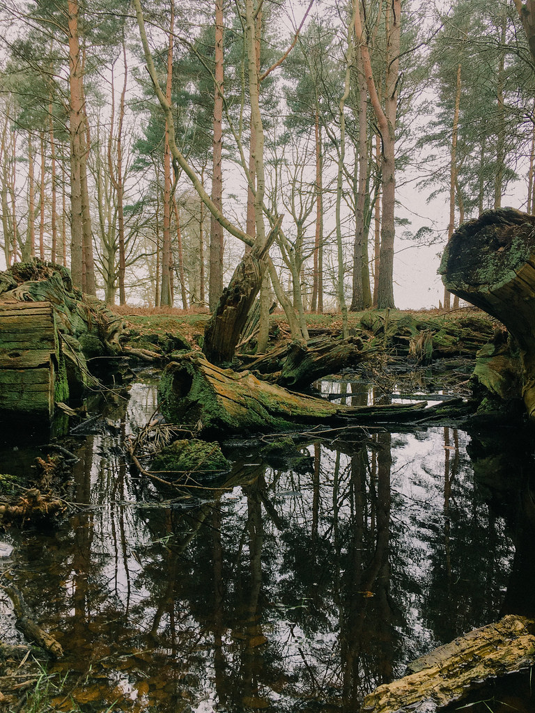 Thinking about entering that last one under this month's grunge theme.
|
|
#
¿
Mar 8, 2021 11:14
|
|
|
Really appreciate the detailed feedback. Lots to think about there. I definitely need to switch up my approach as compared to urban photography. Looking at the first image especially in the cold light of day I think I was excited because of the subject and tried to polish a turd in post-processing. Hence extreme vignette and other slightly odd colour processing. Also stupidly left my camera in the car and so was shooting with my phone.
|
|
#
¿
Mar 12, 2021 11:56
|
|
|
Don�t know what your autofocus settings are but you might want to try setting it to single point. You can then do the focus and recompose technique which is what I do rather than have the camera try to guess what I want to focus on in the frame.
|
|
#
¿
Jun 16, 2021 08:28
|
|
|

|
| # ¿ May 17, 2024 18:38 |
|
|
I think the colours are over saturated by dorkroom standards but I reckon 99% of the population would prefer those colours (or think they were 'better') than something more realistic. So I think it comes back to your artistic intention. Either way, glad you're out with your camera. I haven't shot much at all in the last year or so and recently started getting over the hump and it feels good.
|
|
#
¿
Mar 24, 2022 16:50
|
|