|
Cockwhore posted:
Second shot: Branches over face ruin it for me, unfortunately. krackmonkey posted:
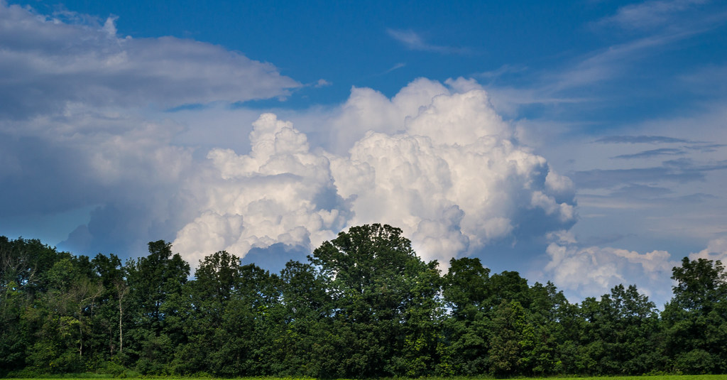
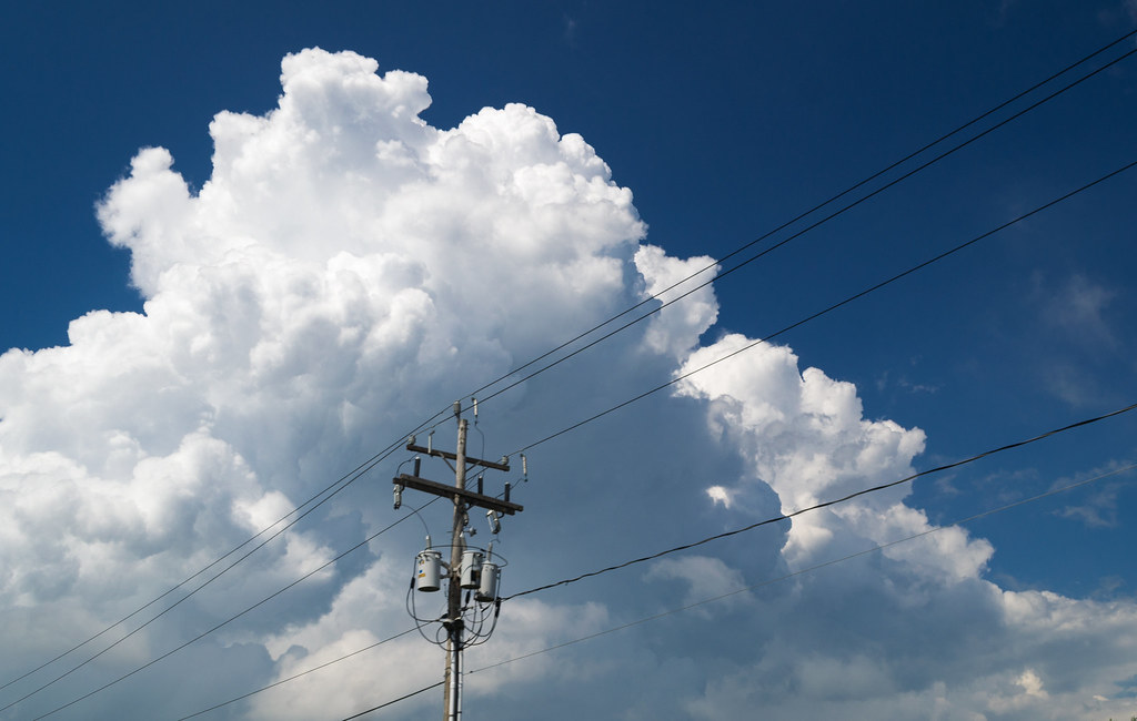
I've been ignoring photography for a few months - my flat got burgled and I temporarily got rid of all my gear out of paranoia (they took my laptop but left the 5D and lenses ") ). Time to post here and force myself to take more photos. ). Time to post here and force myself to take more photos.Here's a couple of old Kodachromes I just got round to scanning:  Duck by atmz, on Flickr 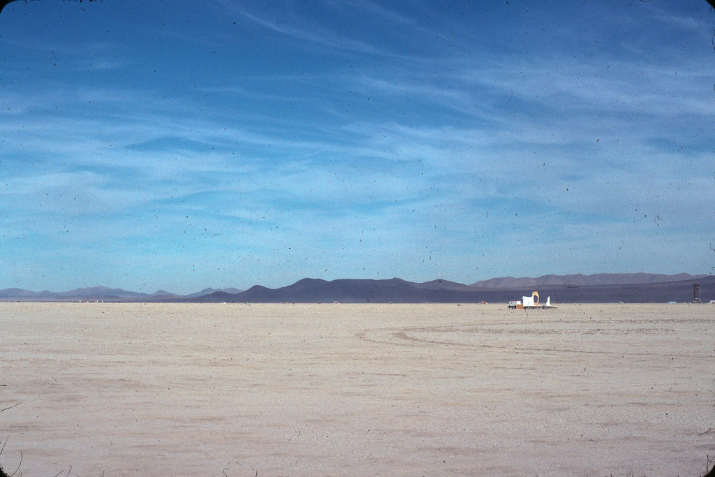 Dusty Kodachrome by atmz, on Flickr Does the dust hurt or help the feel? And here's a stalkery shot from my roof: 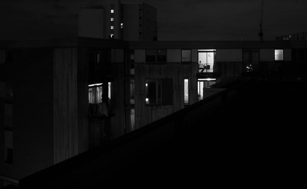 Alone, the city by atmz, on Flickr Not enough going on?
|
 #
¿
Jan 10, 2012 22:00
#
¿
Jan 10, 2012 22:00
|
|


|

|
| # ¿ May 3, 2024 11:26 |
|
|
Thanks for the feedback, sorry for the late replies.Santa is strapped posted:How did get access to the roof though? Is there some kind of unlocked hatch you go through? dreggory posted:These are awesome. I haven't seen many film shots from the playa. What year was this? pootiebigwang posted:Fake Edit: didn't realize it was film, nice; grain is unavoidable then but I really like the effect you got out of it. Dread Head posted:
|
|
#
¿
Jan 14, 2012 12:06
|
|

|
rio posted:
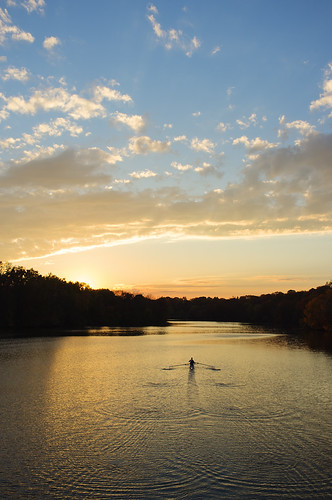
I like these - and I think the straggler in the bird one helps it, actually. I will say that the landscapes themselves are quite boring, but the interesting bits in each one make up for it. I am slightly torn on the rower, as it's really well done but also screams 'clich�' to me (this is not necessarily a bad thing). yoohoo posted:
I don't mind the noise/filters, but the edge looks terrible. The crop is interesting - it's different, which is good, but it feels like it's a bit tight on the right. Shampoo posted:I really like this one, it almost feels like a goodbye. The contrast between the sky and the ground works here really well. I'm curious about changing the crop somewhat though. I'm not usually a fan of the vertical crop, but I wonder if a horizontal crop would make the birds too small, and if a square crop would be too cramped. The vertical lends to a big sky, which I like a lot. Putrid Grin posted:
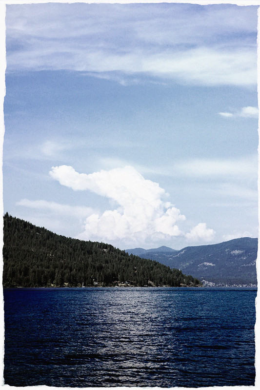
Sorry, no feedback, but I like these. Where'd you take the second one? It looks familiar. I've been playing around with swapping channels - I saw someone in the Dorkroom do it a while back (http://www.flickr.com/photos/mrdespair/8706195732/in/faves-atmz/ - MrDespair on Flickr, I'm not sure of his SA name) and I really liked the effect on landscapes. I'm not sure if it's a bit too over-the-top though. 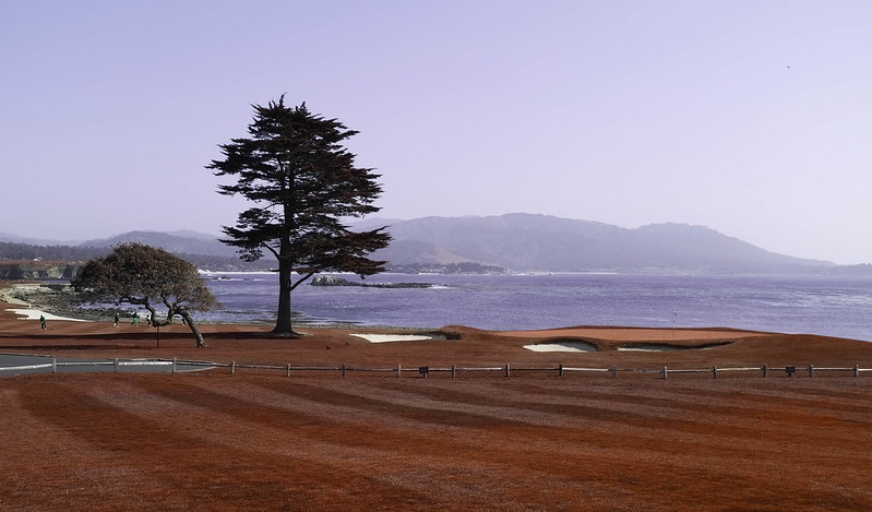 Pebble Beach by atmz, on Flickr  Stavro tis Psokas by atmz, on Flickr 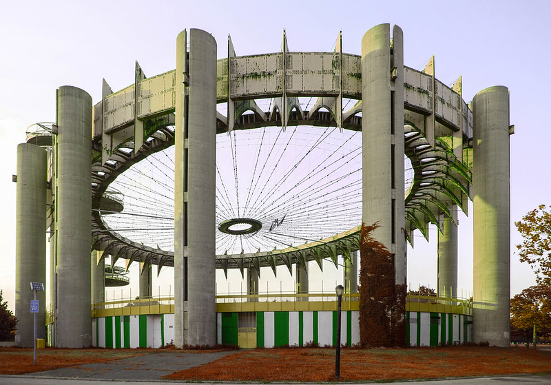 State Pavillion, 64 Wold Expo by atmz, on Flickr Full set here atmz fucked around with this message at 21:28 on Nov 10, 2013 |
|
#
¿
Nov 10, 2013 21:26
|
|


|
Thanks!Shampoo posted:It might just be my eyes, but it also looks a little distorted. Shampoo posted:
|
|
#
¿
Nov 11, 2013 22:29
|
|