|
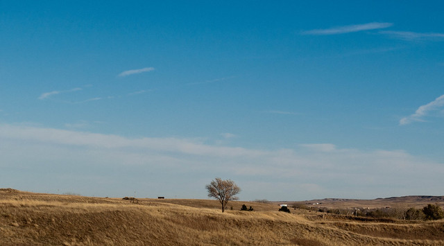
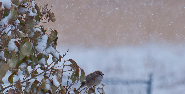
Bimtob posted:I took several shots of this dog on the porch, this one I ended up liking the best. I agree that this is underexposed. I would have tried exposing for the dog and seeing where that got me with the light through the window (because I'd like to see that more blown out) and the light cast from above the door (exposing for the dog might wash the top of the door out too much). Compositionally, the biggest problem that jumps out at me is the huge area of porch boards. I can see you were trying to divide the frame up in thirds, but making a full third of the frame porch is really hurting you here-- what is that much porch adding to the picture that a third as much wouldn't be able to? Show that the porch is there, but don't make it a major subject. The dog gets lost the way you've composed the shot, because he seems like an afterthought; he's not placed as deliberately as the other elements are. I wonder if you could have gotten more symmetry or just more balance and less busyness out of the door area. The pillars on the left don't make a lot of visual sense, and the plant probably should have been removed before you took the shot. Mr. Despair posted:I like this, but I wish the dog was exposed a bit more. Maybe use a mask or something to expose the bottom half of the picture more to even things out? What was your focus with the first shot? I see the whole "tree on the prairie under a vast sky" thing, but you have so many things cluttering up the shot that you can't pull that look off. Even the sky is too busy. Also, wherever you live looks suspiciously like Colorado in the winter! I like the second one a lot more, but the line of the fence frame in the background intersecting the bird is distracting, and I'd rather not see the bird positioned in the lower center like that with all the visual weight of the bush on the left side; it looks a bit awkward. I like how you've captured the falling snow, though. My most recent: 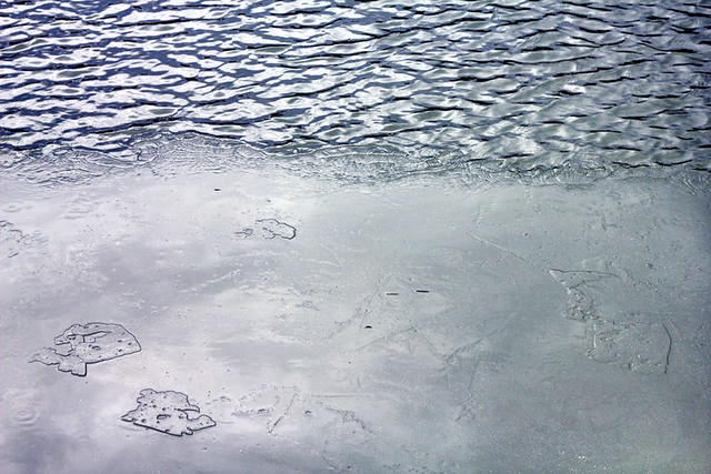 Thaw and Flow by E Banker, on Flickr
|
 #
¿
Nov 29, 2011 23:45
#
¿
Nov 29, 2011 23:45
|
|


|

|
| # ¿ May 5, 2024 17:52 |
|
|
rio posted:Thanks for the advice on the earlier shot. I think that I was shooting for something symmetrical in my mind and just didn't execute it. Pretty frustrating, but good to recognize the problem. I think any symmetry you were hoping for here is ruined by the diagonal line of the cloud edge. The crop is actually better because you've moved away from symmetry with it. I can tell you're working on getting a handle on symmetry, which is a great skill, but while you're doing that, think about how you can also convey a SENSE of symmetry without actually trying to force it on subjects that don't lend themselves to it. I think the shot also suffers from "look, it's a thing" syndrome-- I can see that you deliberately framed it with symmetry in mind, but you've also shot it from eye level in a very straightforward way, which gives me the feeling that I am just walking around looking at things, if you see what I mean. Try to engage with your subject in an unusual way-- play with angles, get up high, crouch down, get up in its face, do whatever you can to show us this everyday thing in a way we haven't seen before. There are leaves and various debris under the the water, there are clouds reflected on the water's surface, there's a contrast between the shadow cast by the fountain and the reflection of the sky, there's a slight breeze rippling the surface of the water... these are all things you can play with and put together in different ways. Also, dirt and dilapidation can be fantastic elements, but make sure they're intentional. The crap in the background isn't helping the picture out; it just looks like you either weren't paying a lot of attention to what was behind the fountain, or weren't paying attention to your aperture.
|
|
#
¿
Nov 30, 2011 18:35
|
|


|
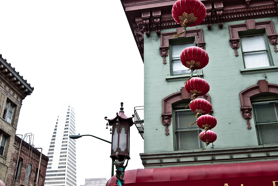
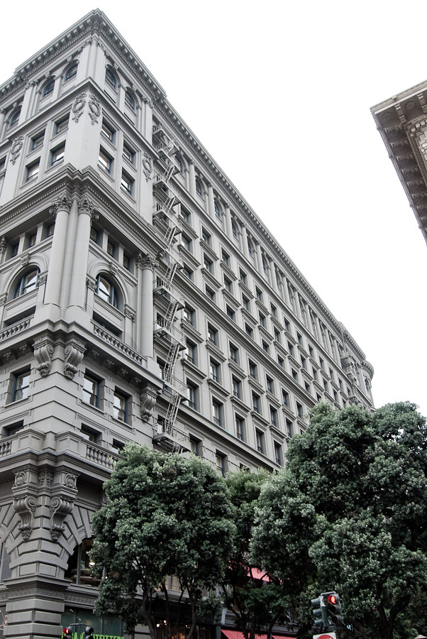
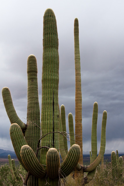
Tactical Mistake posted:OK, cool concept. I think you should have killed the glare, it would be interesting to see the photo broken into sections of blue with the little islands of ice in the bottom left raised up more. Thanks for the input. I love the idea of sticking something in the ice, although I can't go back and reshoot that particular area because the paper-thin sheet of ice was gone by that afternoon. I may tuck that idea away for the future. I haven't worked with gradients before, so that may be why I couldn't seem to get it to come out right; instead, I just focused on trying to tone the glare down and even out the color. I did bump the blacks up considerably even in the original image, and I'm not 100% sure how far I can take it without it looking silly. I don't know that this is a picture I'll ever be wild about, but here's my attempt at improving on it: 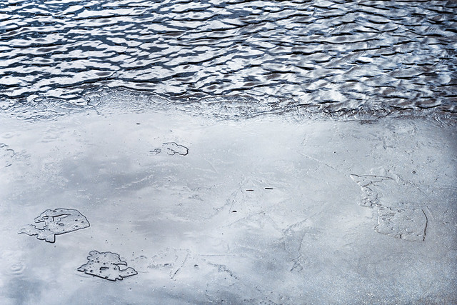 Thaw and Flow (remix) by E Banker, on Flickr Disreputable Dog posted:3 Photos I took recently on a trip to SF: I really love your processing on all these, but I'd like to see you compose a little more deliberately. You have clear subjects, but also random things cluttering up the frame without adding a lot. For example, the lanterns against the building are gorgeous and the balcony and ornate lamp are cool, but the buildings on the left are just kind of hanging out. Combined with the skewed angle, things look haphazardly mushed into the frame. Similar issue with the third shot-- cool architecture really standing out against the blown-out sky, trees make for a nice overall color palette, but then you've got a little corner of a random building sticking out, and traffic lights poking up from the bottom of the frame like they just snuck in there somehow. I think the second shot is the strongest, because those are some incredible lines you have going. I think it still suffers from the same problems as the others in that the top half of the picture becomes a little less coherent; however, if you cropped about the top half out right around where that little nub is peeking out from the edge of the wall on the left, I think it would be solid. My tendency for these shots would be tighten, isolate, simplify. I know that can be hard in a big city, but here you're teetering on the edge between isolating your subject and including background and context information. If you're going to put a lot of stuff in a shot, just make sure it needs to be there. Axel Serenity posted:Here you go! Wasn't sure the subject was solid enough to be in color vs. the stark detailing of B&W, but I'm glad you guys liked the sky. All I wanted on the trip was a little rain, and thankfully we got there during one of the few times a year it happens. I'm going to have to say I actually really prefer this shot in black and white. It makes the growth patterns on the saguaro pop out much more.
|
|
#
¿
Dec 8, 2011 21:13
|
|
|
Pope Mobile posted:
The first one is a cool concept and you've achieved the silhouette effect very well. The main thing that stands out to me is that the sky and water are a rather unattractive, flat smog color. I'd be inclined to play with the color balance a little and come up with something more toward the blue side. And what about brightening the midtones up a bit to give the picture more dimension? I don't agree that the reflection on the water is too strong; I think it looks great filtered through the leaves. Also, watch your horizon. It's a little tilted. The second picture is at a really awkward angle and her posture and expression make her look like she doesn't want her picture taken at all. She's also underexposed because the lighting situation kind of sucks with the sun coming in at a low angle behind her like that, which is probably why you feel like she's just blending in. Try to think about how you can work backlighting to your advantage, e.g. a closer shot exposed for her face with the background blown out. Enigma89 posted:Here are my three. I am looking for comments mostly on the third one, but I threw in two more just in case. #1 has no clear subject and I don't know what you're trying to show me with it. #2 has a much clearer subject, but again, what are you trying to show me? I've seen cell phones, cigarettes, and beer bottles sitting on a table like this before; I want you to show it to me in a fresh way. It's also a bit dark. With #3, what was your focal length? That will have an effect on background blurring as well (you're looking for a longer focal length to blur the background out more). Unfortunately, her hair is melting into the background; I'd be interested to see this in color because I'm not sure the black and white is doing this picture any favors. Also, I know it's a candid, but she's too pretty to be caught at a weird angle like that. There's often a way to set up candids so the composition is more deliberate, but the process is still minimally intrusive.
|
|
#
¿
Dec 13, 2011 20:40
|
|


|
Yes. You're on the right track with the wide aperture, now you just need to mess around with your lens and get a feel for how focal length will affect background blurring.
|
|
#
¿
Dec 13, 2011 21:14
|
|
|
I think brightening up the ferns is a step in the right direction, although now the greens are REALLY GREEN. I also feel like you've lost a little of the beautiful, hazy subtlety that the fog has in the first version. I think the lower contrast might be preferable for the trees, and then maybe work independently with the ferns? Both your fog pics are gorgeous, by the way, especially the one with the guy walking along the trail. I wouldn't worry too much about messing with the fog and agree with Pope Mobile that it looks good the way it is.
|
|
#
¿
Dec 14, 2011 01:30
|
|
|
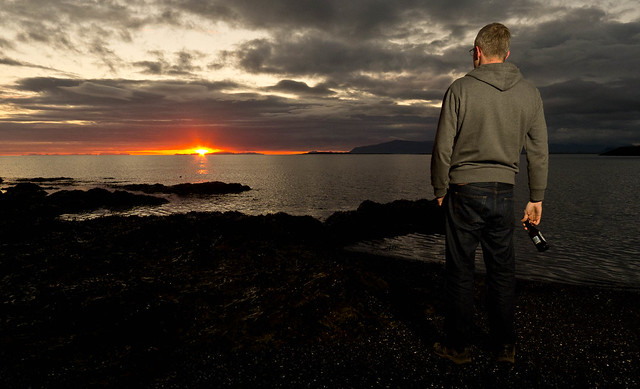
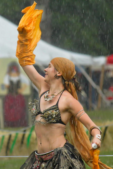
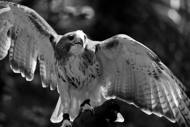
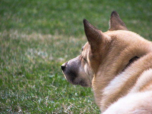
David Pratt posted:Happy summer solstice everyone I really have to disagree with Dread Head here about the person being distracting and not adding to the photo. I interpreted the subject of the picture as "hanging out with a beer on the beach, watching the summer solstice sunset". Take the guy out and you lose the personality and story in the shot. His legs are definitely too dark, though. Kiri koli posted:Took some pictures at a local medieval fair. I really want to like this one, but I feel like it's just not quite there. I'm curious what others think, if it could be improved with more/different processing or if the picture itself just isn't quite right. I DO like the first shot, but you're right, it's not quite there. The two problems that stand out to me are that the busy background is competing for attention, and that it feels framed a little high. Looking at the other shots of her on your Flickr, I understand there might not have been a lot you could do about the background at the time, but maybe you can tease her apart from it a little in post. As far as the framing goes, you've put a lot of emphasis on her face and raised arm, but my eye gets held there because there's a lot of stuff going on all squished into the bottom of the frame. That said, I think the way you've captured so much movement and feeling in the shot is excellent. I like the dynamic pose of the hawk, but he's cropped off in odd places. Valdara posted:I'm still very new and working on trying to figure out how to take pictures in various conditions. Most of my indoor photos end up being very dark or very noisy if I up the ISO. If I up the shutter speed, they get blown out. So, it's a very low picture to good picture ratio right now. Some day I will find that balance! What's the dog looking at? Think about what you're trying to say with your subject's pose (yes, even if it's a dog). Is there a squirrel or a ball? Put that in the frame. Is he just staring off dreamily into the distance, contemplating the nature of doggie existence? Show his eyes so we can get a sense of that. You're doing really well with the exposure and white balance on your indoor shots, so just keep focusing on that. I don't know the exact capabilities of your Powershot but it might be that you just have to deal with some noise indoors. Just spend your energy working on other fundamentals instead ")
|
|
#
¿
Jun 24, 2012 19:38
|
|
|

|
| # ¿ May 5, 2024 17:52 |
|
|
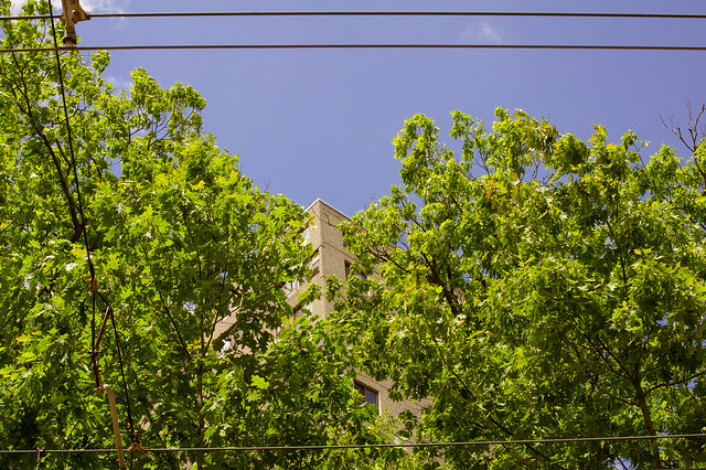
^^^E: Yeah, I didn't understand that either, clear skies are flat blue and trees have texture in their leaves. It is normal.LargeHadron posted:I shot this photo. The scene was appealing to me, probably because the trees seem to part and make way for the building, and the wires act as a frame. There are probably millions of other photos out there that do this same thing better, but I am very recently becoming interested in photographing hidden beauty in scenes that are typically ignored or considered ugly at first glance. Yay or nay? I love your idea to look for hidden beauty in overlooked places, and I really want to see you continue it because I think there's a lot of potential there. This particular shot isn't conveying that to me very effectively. When I look at it, I can see that you've thoughtfully composed it, as you mentioned about the placement of the building and the frame created by the wires, etc., but it still manages to retain an indeliberate quality that I'm not sure you wanted. As far as unlikely beauty, I'm struggling to see the elements coalesce into something greater. It's not unusual or aesthetically pleasing enough in an abstract way to accomplish it, and I don't find a clear subject. So, start to think about how exactly you want to go about illustrating your concept. Is the building, as the focal point, the secretly beautiful thing? They can be, but this is just a nondescript corner. Is it the composition of the elements themselves? Again, you may try presenting these ordinary things in a more unusual light. --- Haven't been shooting much at all lately, so I forced myself to do something today to get the gears working again. It's so hellishly hot that half my state is bursting into flame   Heat Wave by E Banker, on Flickr Kingdom of Sin fucked around with this message at 03:05 on Jun 26, 2012 |
|
#
¿
Jun 26, 2012 03:03
|
|