|
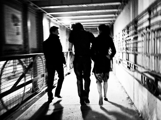
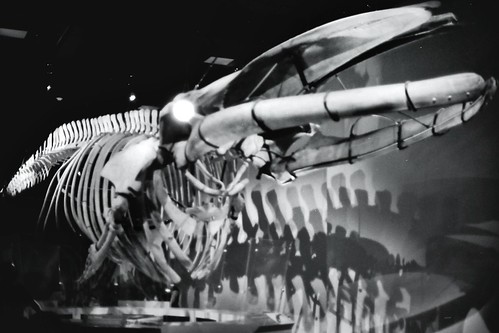
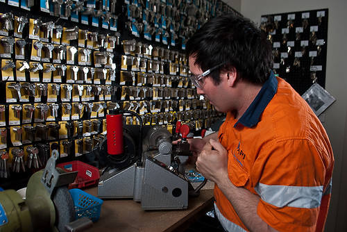
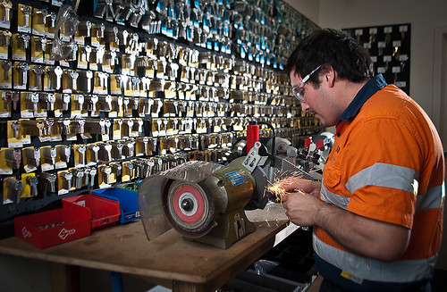
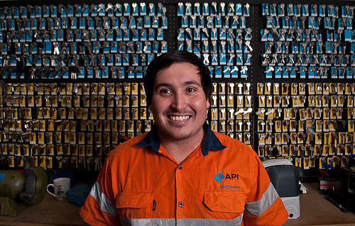
Tigertron posted:I am mostly a film shooter and I came accross a cheapo film scanner for making essentially contact prints and Flickr. I only own an iPad for editing, using snapseed, but it does provide me with a ballpark approach for dodging/burning as well as a moderate contrast level for printing. All in all it works to suit my needs unfortunately it makes awful looking digital grain and captures none of the film grain so bear with me. One of my main critiques with this photo doesn't have to deal with any of the editing/noise really, but instead the fact that the main subject in the foreground is out of focus. I like the way the bones have an interesting shadow in the background (lower right), but it's really hard to look at the whole photo when my attention is drawn to the mid-left area which is small and relatively boring. AlienApeBoy posted:Took this yesterday at my in-laws (pity the birds are long gone, but generally happy with the mixture of sharp and blurry elements): Also here, the out of focus details are really distracting from the main subject. At least here the outer branches are almost making a coil inward to the center of the image (which is kind of nice because the main subject is dead-pan in the center), but the fact that the upper right of the image does not have anything to redirect your attention back to the middle doesn't help. The brownish background color in the lower right is also a little distracting. Ambihelical Hexnut posted:It was foggy this morning, attached is my favorite of what I shot. I tried to bring out the super faint destination area they're walking to but it was looking like crap so I left it as is. I cropped this a few different ways and I think the overcontrast/tiny people/vertical format is working for me right now, but I'm trying to get back into photo-ing so critiques are appreciated. I think this photo could really use more contrast actually. Or at least, I think the darkness at the base of the photo is good but I'd like to see the top brightened up a bit more. It just seems a bit too muddled. I know a lot of people have mentioned noise reduction already, but honestly since that whole area is just a big blob of one color you could do a real quick blur in photoshop over the entire area and it'd get rid of all the noise very easily. Add a little sharpening to the 3 silhouettes to make them pop a bit more too. Cyberbob posted:Here's a couple of shots for a local locksmith. Love the 3rd shot. Only minor things are that the background clutter on the desk (coffee mug mostly) is a little distracting. Maybe bump the shadows on this face a tiny bit, on the left side mostly. Other than those small things though it's great framing and really cool. I wish the sparks flying in the 2nd shot made a bigger impact or filled more of the frame in the shot. Its a cool effect but it gets lost in the image. Darkening the rest of the image (especially the bright keys in the background) might draw more of the attention to the action in the shot, but its probably too much effort to pull it off seamlessly. -------- This is a set of photos I'm working on for my mom:  For Christmas/birthday my mom had asked me to take a photo of something sewing related (she works for a big regional sewing machine distributor... another ridiculously expensive hobby with machines that sell for 10k+). My end-goal is to print/mount them on a 9x9 grid with each photo being 5 inches, using this: http://bayphoto.com/mounting-finishing/collagewall-displays.htm I tried making the background solid white but it seemed way too bright, so I went with a slightly darker off-white/gray. I'm not super pleased with the way they look all stacked next to each other like this, they look fake, but oh well. At a higher resolution you can make out each individual thread which was my main goal here. The thing that is bothering me the most right now is the shadows (which are fake and just photoshop layer effects), as you can see some of them have odd shapes. I'm going to try and go back, making them more blurred, and probably less intense.
|
 #
¿
Nov 28, 2011 18:04
#
¿
Nov 28, 2011 18:04
|
|


|

|
| # ¿ Apr 28, 2024 19:30 |
|
|
TheLastManStanding posted:The problem with the shadows is that they are way to big; which in turn makes the picture as a whole look fake. The shadows as they are would imply you used a tiny led light that was about an inch away from the spool. With such a tiny object even an incandescent would produce a small shadow. Shoot for as small and as subtle a shadow as you can. I think your right, here in this version I've lightened the shadow up and moved it closer to spools (less spread). I still don't like it but its closer. Also including a closeup of an individual one in case anyone wanted to get a look at that. Next I'm going to work on getting the edges cleaned up in each, since it seems to be influencing the fake shadow now a lot.   They should be just a tiny bit smaller than this size when printed.
|
|
#
¿
Nov 29, 2011 06:59
|
|
|
AlienApeBoy posted:Tried cropping out more of the problem bits (green and brown voids on the right side), does this help things? (unfortunately I couldn't get rid of all the brown in the lower right without losing more of the bottom the nest than I'd like). Not really. Enigma89 posted:Here are three of mine. I used lightroom to make them look a bit better. I think I need to work on using aperature more. The first image is pretty bad. Why is everything hazy and out of focus? Why is the image in black and white? Why are the bases of the glasses and wine bottle cut off? Why are none of the labels or names clearly pointed towards the camera? Why is everything off level and not aligned? Why the blurry hand in the background? Sure I get this was some kind of dinner or party, but this just looks haphazard. Which brings me to your second shot. What do you think is cool about this shot? The third shot is not really flattering. That woman is going to spill wine all over her nose if that man tips his wine glass any closer to her face. Cutting things off in portraits is almost never a good idea. The tones here are really dull. I like that she is smiling at least, but her hair is in her eyes and you've shot her from slightly below her chin level which makes her look condescending among other things. Cacator posted:I took some pictures while walking (not standing still to take a picture) to a pub last night (after already having consumed a fair amount of alcohol), and although I probably shouldn't have done that, I like how this one turned out. Is the motion blurriness effective or does it just make it look like a mess? Please advise. Retemnav posted:So this is my attempt at composing a shot and doing some post-processing, rudimentary as it may be: The first shot is too crowded and the white balance looks off. The shadow from your glass is covering up the beer bottle. I generally like the wide angle / close up shots but this just feels too constricting. The nuts look out of focus. You've taken care to place an emphasis on the beer cap, but it takes up so little space visually that it is not really important in the photo. Second shot is a boring snapshot, sorry. We've all seen rusty farm equipment before. rio posted:I was taking a walk yesterday and wanted to start to try to shoot some outdoor shots. I was on break and only had fifteen minutes, so had to shoot hastily. I feel like I missed some really good opportunities. I agree that something feels off, but I can't put my finger on it either. It is balanced, exposed properly, mostly aligned, has a nice amount of sharpening. I don't know. One of the things I like about it is the blue cast on the tiles, normally with fall pictures everything is very warm and red-ish. I liked the change here but that might be what seems off.
|
|
#
¿
Nov 29, 2011 17:24
|
|