


|
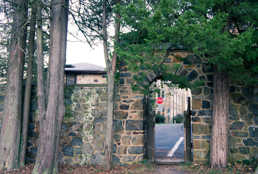
Edit: Woops, due to a terrible mixup I commented on photos from the first page, instead of the last one. I'll post other criticisms in a minute!Beaver Fever posted:I took several shots of this dog on the porch, this one I ended up liking the best. The theme here is definitely interesting (got the whole sad dog waiting thing going on), but the lines in the picture are a bit distracting for me. I think if you would have positioned yourself a bit more to the left, the lines of the door, the fence and the floor woud have aligned more with the borders of the photo. But I'm not sure though, maybe I only feel like that because the focus is on the line in the floor. Which brings me to my second criticism: I think you should have focussed more on the dog's face.. rio posted:This picture, there is something not right. The composition does not seem how I had imagined it and I feel like I missed something that could have made it a good shot. Or I may be too self critical and not trusting myself. I would love any advice as to what I missed or what could have been done to make something like this a good picture, either in shooting or in post. I disagree with Retemnav that the triangles look slightly off. I don't think you could have made them more symmetric. I think it is because the shape of the stones is so irregular, and their layout so random, it plays a trick on the eye and the whole picture seems off. I don't know what you could have done about it (the picture doesn't really do anything for me), but I do think that it could have been sharper. Especially the grass and the leaves on it. ========= My turn! I rarely take pictures nowadays, but I'm temporarily relocated to the French Riviera for a few months (for work) and there is plenty of interesting sights around! 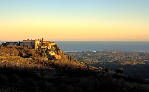 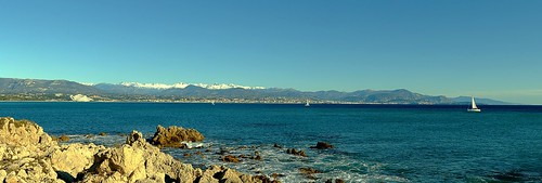 For this one I am especially interested in how I should crop it, because I think it is too big (it is a huge stitched panorama but it doesn't show with the flickr resolution). I want to bring out the snow on the mountains. 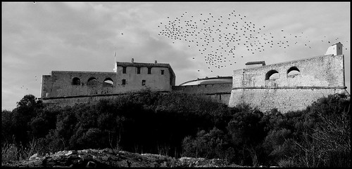 Is it obvious I clone stamped 90% of the crows? 
Touchdown Pope! fucked around with this message at 21:43 on Dec 17, 2011 |
 #
¿
Dec 17, 2011 21:39
#
¿
Dec 17, 2011 21:39
|
|


|

|
| # ¿ May 5, 2024 09:57 |
|
|
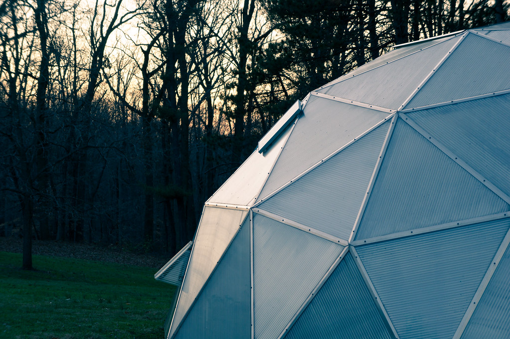
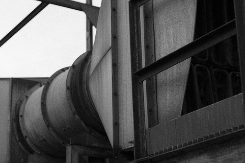
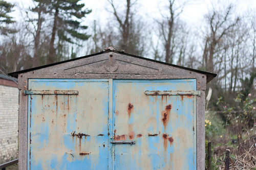
rio posted:Just to add to this, in layman's terms (I am a layman), the more you zoom in with that lens, the less background blur you will be able to get. The kicker is that the more you zoom in, you will reach a focal point more appropriate for a portrait, but lose the blur you are looking for. That's the inverse of what he was saying? I think if you have such a lens, call NASA because they will definitely be interested! ") rio posted:Here's a nutcracker! I don't know if I am really happy with either one of these, but I like that at least the nutcracker in the second one looks bored as hell (much like my posting). It is in my house, so I have more opportunities, but which one is off to a better start? I like the first one better: more interesting viewpoint, and the flashy red backdrop gives it an nice artificial toy appearance. You are shooting in a controlled environment (your house) so I do think you should get rid of the blow-outs in his face. As for the second one: it has the same potential, but the thing in the bottom right is distracting. I also think you should get rid of the shadow and replace it with a flashy backdrop like in the first photo. It's not a realistic subject, so you should go wild with the saturation IMO rio posted:Here's picture of a Death Star greenhouse thing that I found. I wanted to do something interesting with it, but feel like it might have come out too dark. Not sure about the composition, though. rio posted:This seemed more interesting when shooting it and now seems to have come off cliched. I'm wondering if the post processing works, and if I am being too hard on myself, because it took a couple days to find a crop that I could live with. Colours are good, but I think the stop sign is a bit tacky. I also don't really know what it means in this context.
|
|
#
¿
Dec 17, 2011 22:01
|
|


|
Waarg posted:First off, I think all of your pictures are awesome, really striking! Also great to see someone getting such good results from the 1000D! I will try to find something to criticise them for. I am a beginner so take my feedback with a grain of salt. Thanks for the feedback. The pictures mostly come out pretty crappy out of the 1000D, but post processing goes a long way to fix that. Waarg posted:
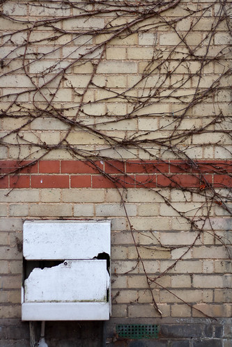
The first one would be my favorite, because it has a theme going on (abstract, industrial). I would advise a simple contrast increase to enhance those effects and make it more gritty. For the same reason I like this one on your stream: http://www.flickr.com/photos/t_ogden/6544525689/in/photostream That is also the weakness of your second picture: it lacks a theme. I don't really know what it 'means'. On the plus side, it is exposed very well. It would also benefit a lot from some quick and easy postprocessing (contrast, levels, ...) You should experiment more with that. To illustrate I did some of the basic enhancements that I do to my pictures to one of yours: http://i41.tinypic.com/1zz6lpd.jpg I also don't really know what to make of the third one. I think the subject is the rust against the blue door, but I think the other picture of the same door on your stream does a better job with that. Again, some postprocessing is definitely in order.
|
|
#
¿
Dec 20, 2011 22:33
|
|
|
Gazmachine posted:
I agree that your scenes aren't the most exciting, but I do love the feeling and colors. Any special post-processing techniques that you want to share?
|
|
#
¿
Jan 6, 2012 20:23
|
|

