


|
Touchdown Pope! posted:quote:
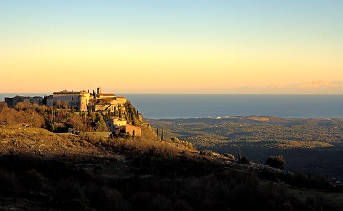
Here's two of mine (the first being a crosspost from SAD):  Bay by Victor's adorable world of pixels (Interesting note, the above picture is taken at around 1pm. God bless Danish winter sun, barely rising above the horizon.)  Unjoy by Victor's adorable world of pixels I really like this photo, though I've no idea what's happening with the top of his head there.
|
 #
¿
Dec 25, 2011 13:33
#
¿
Dec 25, 2011 13:33
|
|


|

|
| # ¿ May 1, 2024 00:58 |
|
|
Gazmachine posted:
#1. I don't think the processing is over the top, other the fact that you seemed to have pushed the recovery slider way too hard. If you look at the clouds, parts of them are blown out - which is fine in itself - but the parts that are blown out aren't white but are this murky shade of grey, which you should avoid. I also think the composition could have been a lot more interesting, if you had tried to align the lamp-posts to the pillars of the gate. Moving so that the the concrete path is right in the center in the image (and its lines converge in the middle of the image), would have also yielded a stronger image. Everything is almost symmetrical, but not quite, which is driving my brain crazy. Sometimes this can be desirable, but I don't feel this is one of those times. Overall, I think out of the three pictures you posted this is your strongest one (just push the recovery slider back a little bit, please). #2. Yeah, it's a huge cliche, but it's well executed. The road is nice and centered. The tree provides a good frame for the couple. The light is nice, and the colors are warm, which suits the image. I can almost see this being a poster for a romantic comedy. Like a picture of a waterfall at low shutter speed, or a suset over the ocean, you won't be breaking any artistic ground, but you'll still get something pretty. #3. This picture, along with a huge collection of pictures of door-frames, benches, etc, mentally goes into a file I call "pictures that do nothing for me, but seem to have some following, which I will leave alone". My turn. I took some photos on Christmas day, when I went for a walk with my father and my uncle, I'd like to get some critique on. The first was more of a snapshot, and I'm not terribly happy with the framing, but looking at it a little later, I noticed a single seagull in the sky, which really endeared the picture for me.  A Walk by Victor's adorable world of pixels This is my dad. Hi, dad.  Father by Victor's adorable world of pixels
|
|
#
¿
Jan 7, 2012 12:56
|
|


|
KidDynamite posted:
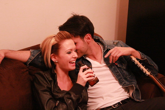
All in that said, though, good for you for not using the popup flash. Compositionally: it's just not a very interesting photo. The dude's hand is cut off awkwardly. The angle isn't very interesting. The interaction between the two isn't very interesting. Even if everything was technically perfect, it would be a mediocre snapshot at best. The girl is pretty, but that's pretty much it, and as a photographer, that's not something you can take credit for. As per the OP, why don't you tell us what you think makes this photo good?
|
|
#
¿
Jan 9, 2012 01:18
|
|
|
Trambopaline posted:
I don't like the fact that your face is obscured. If the focal point of the picture is somebody's body, that should be because their pose, clothing, body type, is interesting or unusual. Seeing the photo with no context, the first thing I think is, "self-portrait of somebody who feels insecure about how they look". I might be way off, here, it's just the first thing that pops into my mind. The pose is nothing to write home about, if anything it feels a little awkward, and everything else is just as bland. The blackness at the top of the photo doesn't really serve any purpose, I don't like the harsh shadows, nor the fact that you are standing in front of what appears to be a door. Even the lighting isn't that interesting; it's a snooted flash aimed directly at the subject. I hope this didn't come off as too harsh, I just don't like the photo very much  Bottom Liner posted:Yeah, how the hell are you lighting those or getting that lighting from the ambient? 16. I like the lighting, but it doesn't seem to blend well with the rest of the picture, so it almost looks like your subject has been pasted in the photo. I also don't like how cluttered the background is. My attention is continually drawn to that bright thing to the left of the door, then the fire extinguisher, and then all over the place. I get that you were trying to have him in his natural habitat, so to speak, but maybe have him sit on a chair with just a few instruments and tools around him? 17. I really like this. The window light is very pleasing, the facial expression of your grandma just radiates happiness and content, the styling of the room really compliments your subject - it's immediately obvious it's your grandma's room (try for something similar with the luthier). The only thing I would change about that photo, is that I would remove everything on that stand except for the lamp and maybe a book or two, and then I'd add a little bit of light to it. Here are three photos of mine, I've posted before but never got any critique on. 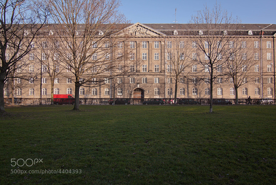 House by Victor's adorable world of pixels My self critique: I like the van and the person walking on the right, and how the photo is split into three. I'm unsure about the ratio of grass:building:sky. I don't have enough sky to make it 1:1:1, though I'm not sure that would be the most pleasing composition anyway. I feel like somebody will tell me the grass in the foreground shouldn't be filling up half the frame, but I just can't bear cropping it. 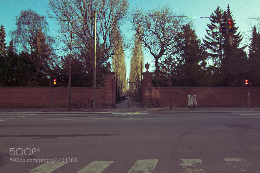 Cemetery by Victor's adorable world of pixels Tried to do low-contrast+split toning look. I'm not sure if it works or if I like it. I also can't tell if this is interesting at all. 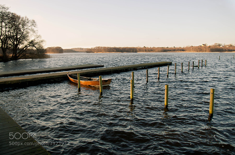 Bay by Victor's adorable world of pixels This is probably one of my favorite photos I've taken in a while. I should have really stepped down, to get that tree on the left be a little sharper. Cockwhore fucked around with this message at 21:04 on Feb 3, 2012 |
|
#
¿
Feb 3, 2012 20:30
|
|


|
Bottom Liner posted:
rio posted:
This is fantastic. If it wasn't for the cluttered background, I could have mistaken this for a woot fatigue photo. (is he still around?) e: to elaborate a little, it's not just the guy's expression, though it certainly contributes. I think that pretzel stand, with its cartoonish colors, and strangely regular lines, could be a strong subject in itself. If you're not averse to digital manipulation, I think it'd be interesting to knock out that distracting background, and place the stand on a mall hallway. Cockwhore fucked around with this message at 23:31 on Feb 16, 2012 |
|
#
¿
Feb 16, 2012 23:23
|
|


|
 Criminals by Victor's adorable world of pixels ...still getting the hang of the whole 'camera' and 'light' and 'post-processing' thing TsarAleksi posted:Editing a few pictures from my last trip. Not much to be said about the first one; it seems absolutely flawless. The light is great, the expression is great, the post-processing is great, and while I'm not sure you were responsible for the styling, it's also great. As to the second one, I wanted to say it's a bit too saturated, but the more I look at it, the less I'm convinced that's the case. It actually seems to kind of compliment the energy of the children. Maybe decrease it just a tad? Bottom Liner posted:I really like this one. It feels off, almost creepy, in a good way. I expect something to be hiding in that window, but maybe that's because I've been watching some horror films lately. Already commented on your self-portrait, but as a small follow-up, I partly agree with whoever said it's awkward as a diptych due to the different lighting, but I'll add that the different sizes of the two pictures upset my internal sense of balance. So there's that. I'll also reiterate that I think the one on the right is incredibly strong, and is being weighed down by the format you chose to present it in. Regarding day 32, I love the concept, but I find that the strings really compete for attention with the model. That's fine in itself (they're interesting, and an important part of the picture), but they're out of focus, and I want the things I'm supposed to be looking at to be in focus. The light is really fantastic, and this is one of the few pictures, where I don't mind not being able to see the subject's face. Day 35 I feel is the weakest of the bunch. I agree completely with you that brighter trees in the background would have helped the picture a lot - that was my first thought before I read your comment. I also didn't immediately notice the owl. Have you considered a much tighter crop? Something like this (but less crude and lovely):  would get rid of the bushes in the foreground, and make the fill a larger part of the frame, while also making sure it's not in the middle of it (like it is with the original image). Cockwhore fucked around with this message at 21:09 on Feb 20, 2012 |
|
#
¿
Feb 19, 2012 17:03
|
|


|

|
| # ¿ May 1, 2024 00:58 |
|
|
scotty posted:
The style - split toned, low contrast shots of pretty girls in various degrees of undress - reminds me a lot of shots I'd see in Vice magazine, or other similar hipster-ish mags I see lying around trendy cafes. In particular, I really like the first shot. The window light is flattering and the the blown out window doesn't at all detract from it. The background is just the right amount of messy and compliments the model's sexy-yet-casually-sloppy appearance (I have no problem believing that's her apartment. I like the last picture the least. I can't quite put my finger on it - I think it has something to do with the background competing for attention. All the sloping lines make me a little uneasy. Maybe if your camera was at 90� to the wall, I'd feel better about it, though if the framing was too perfect it might detract from the 'casual snapshot' vibe you have going on (which I like). I also wish I could see some more detail in her top; I don't like how it's not true black, and at the same time has almost no detail either. Great job, overall though. 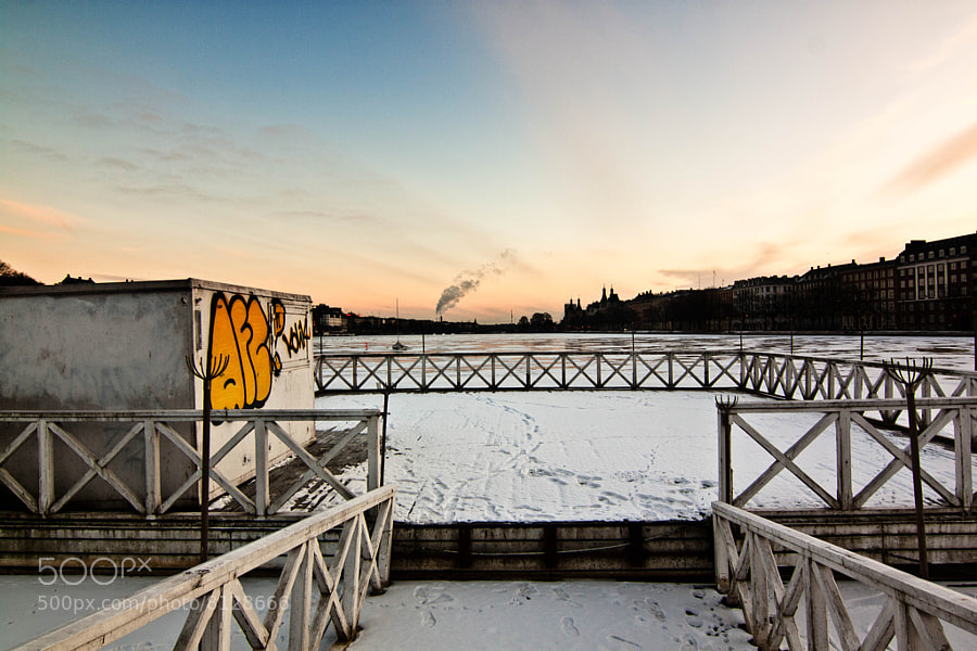 Snow by Victor's adorable world of pixels  Transcriptomics by Victor's adorable world of pixels  Like a hawk by Victor's adorable world of pixels
|
|
#
¿
Jul 24, 2012 13:15
|
|


