|
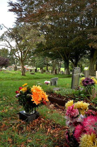
Pickman posted:Enough of my amateurish critique. I'm still trying to narrow down my selection of images for my course portfolio, and I need to decide between these two: I prefer the 1st photo, because my eyes take a more interesting path from the flowers, to the foreground gravestones, to the background gravestones. The 2nd one it's pretty much a straightforward line from left-to-right. However, I get the sense I might've preferred both with a landscape orientation. The 1st one, if you were to print it, I'd recommend a non-standard square crop of the bottom 2/3s of the photo to get rid of the bright white sky in the top-left. Here's a B&W edit I liked from a week ago:  I kinda like the color version too-- to retain the green patina on the bronze: http://i.imgur.com/NGyBDh.jpg
|
 #
¿
Nov 19, 2011 23:30
#
¿
Nov 19, 2011 23:30
|
|


|

|
| # ¿ Apr 28, 2024 18:08 |
|
|
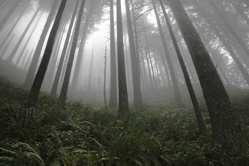
Ambihelical Hexnut posted:Reminds me of my favorite children's book illustrator, Stephen Gammel:  I'd agree at trying to apply some noise reduction on the fog. Took this yesterday at my in-laws (pity the birds are long gone, but generally happy with the mixture of sharp and blurry elements): 
|
|
#
¿
Nov 26, 2011 03:02
|
|
|
robertdx posted:Also here, the out of focus details are really distracting from the main subject. At least here the outer branches are almost making a coil inward to the center of the image (which is kind of nice because the main subject is dead-pan in the center), but the fact that the upper right of the image does not have anything to redirect your attention back to the middle doesn't help. The brownish background color in the lower right is also a little distracting. Retemnav posted:Just to use yours as an example, the timg really highlights how busy the picture is, and makes the brown background in the bottom right stand out much more. At least to my eye. Tried cropping out more of the problem bits (green and brown voids on the right side), does this help things? (unfortunately I couldn't get rid of all the brown in the lower right without losing more of the bottom the nest than I'd like). 
|
|
#
¿
Nov 29, 2011 12:54
|
|
|
Turd Nelson posted:Thank you!
|
|
#
¿
Dec 16, 2011 12:06
|
|