


|
I've been away from this thread for a while, but I will be happy to share my thoughts on others photos and any ideas I have for them. rio posted:I tried to post these last week, but my computer crashed and then the forums were down all night. So, here we go again. These were taken new year's day at Ikea. I would greatly appreciate any critiques, comments, advice, or opinions, as I am trying to learn through shooting and reading and I trust the Dorkroom and have learned a lot here. The first two are great. They really nail the simple, minimal, vibrant style that works really well, and you did a good job with the processing and colors. I think the third one doesn't hold up nearly as well though. The composition is off, especially compared to the first two, maybe singled out a single color instead of capturing them all. If you could have gotten a tight shot of the red area then these three shots would fit nicely as a whole in a cute way. The first could probably use a slight straightening though, it looks slightly crooked. TMZ posted:
I just started a 365 project myself, with the aim of staying active, previsualization, pushing my comfort zone, and refining my style. I'm keeping a notebook with sketches for any ideas I have, then I refine them and shoot them for each days photo. I tend to lean towards what I call a cinematic style, and a lot of shots in this project will be made towards developing that further. I want my shots to look like a singular frame from a movie basically. I don't know how better to explain that but I hope it comes through in the works (where appropriate). Day 1  Day 1 by David Childers, on Flickr Day 2 This was a drastically different style from my typical work, and I feel like it shows. I was going for an editorial look, like Wired or ESPN magazines. The arms are blown out because the lights were too close to me and the handlebars gave off a nasty shadow on my legs, but overall I learned a lot from trying out this kind of shot, but I'm eager to hear any tips or ideas to improve it.  Day 2 by David Childers, on Flickr Day 3  Day 3 by David Childers, on Flickr Bottom Liner fucked around with this message at 08:47 on Jan 13, 2012 |
 #
¿
Jan 13, 2012 08:41
#
¿
Jan 13, 2012 08:41
|
|


|

|
| # ¿ May 1, 2024 11:49 |
|
|
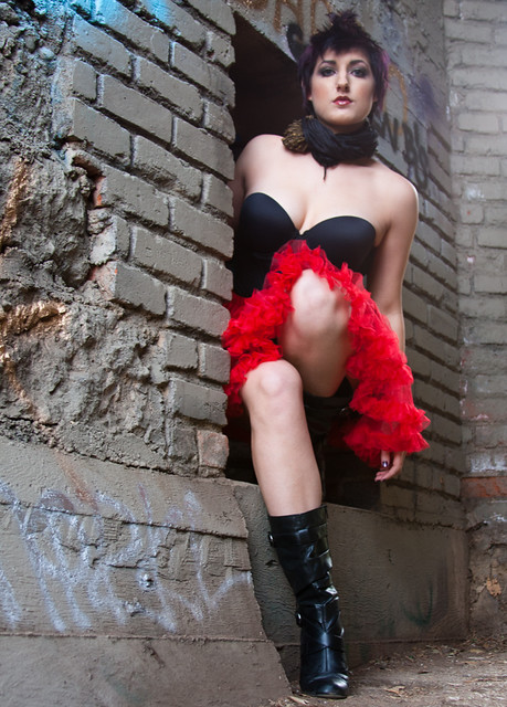
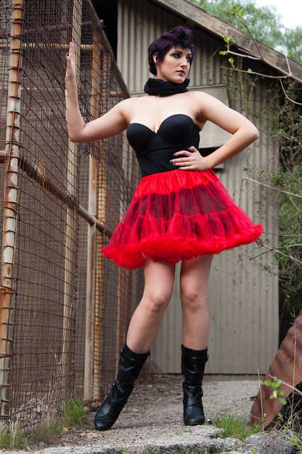
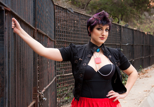
Thanks for all the comments guys, I appreciate you taking the time to look and discuss my photos. Axel Serenity posted:Overall I think her look is just too busy. Too many things fighting for your eyes. For instance, number 2 would be a much better look without the scarf. The top and skirt look great, and her hair and hair color already have plenty going on up top. This isn't under your control, but would definitely improve things. I don't mind telling models when to ditch an article or accessory, and they usually are happy to oblige, just tell them it's distracting. Also, for fashion these are a little plain. They are fine technically, but fashion tends to do a lot of exciting things with post, lighting, or concept. They work fine as portraits, but they don't really fit into the fashion photography realm (which is a crazy world in itself, I hate a lot of the styles that are big right now in fashion). Also, I try to never shoot from below a female, it is almost never flattering to their figures, especially with a curvy lady.  2012-28 by Tom Rintjema, on Flickr [/quote] I get what you're going for here and like the composition, but I think it would come across better as black and white. I like the lights in the center but the brake lights on the cars are distracting, and B&W would fix that. I think you could show a more dramatic range of tones that way too. Just a thought. David Pratt posted:
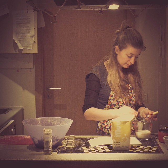
Was this cropped a lot? The resolution is suffering almost to the point of looking like an iphone photo. The cross processing is a little heavy, way too much brown/yellow and not enough color to keep it grounded. As for the photo itself, getting level with the counter would be a better angle and add a nice depth to the scene. Here are the next few from my 365 project: Day 4 I wanted a fun shot today, and Evan was the perfect subject for a silly shot like this. She's a great baker, and I wanted to highlight that somehow, and this fits her personality perfectly. The side lighting was really needed to seperate the flour from the wall. I wanted to keep this photo simple and be all about the action.  Day 4 by David Childers, on Flickr Day 5 We were sitting at Barnes and Noble today looking through girly magazines when I had the idea to do a beauty shot. I asked Ericka to be my guinea pig and she happily obliged. This was a great exercise to work on soft light and skin retouching. If you light it well you don't have to do much retouching.  Day 5 by David Childers, on Flickr Day 6 I've been watching a lot of Ken Burns documentaries lately and I wanted to create a photo that reminds me of his work. A big part of his films is the photos showing American lifestyle and culture. My favorites are the 70s era photos, especially in the Jazz series. I love the old paint and the mood the lighting, both in the house and the flash, create here. I wanted an old film look here and I think I got close.  Day 6 by David Childers, on Flickr Bottom Liner fucked around with this message at 09:32 on Jan 16, 2012 |
|
#
¿
Jan 16, 2012 09:27
|
|
")
|
AIIAZNSK8ER posted:I like this version better, but I still think there's too much headroom. I have to agree now that you say that. The black and white does work better though. quazi posted:
The first one is perfect. The second one feels like a cheap comp, and the third is too mirrored to work as well as the subtle first one. The color you used for all of them fits perfectly though. miketh posted:
It doesn't seem like much thought went into the first two. They just look like you wanted to take some artsy shots but didn't put in much thought to the photos. The spider photo is nice and the tones work well, it almost looks like film. gently caress getting that close to a black widow though. The next three of my 365. First week down so far, and I love how it's keeping my mind on photos all day. I am really happy with a few photos so far, and I've decided how to fix a lot of things I'm unhappy with in others. I highly recommend shooting every day if you're not already, it's quickly changing how I approach everything I shoot. Day 7 Today's photo is a simple and sweet portrait. No fancy lighting, just a good location, a good model, and my camera. This is from a headshot session with Katie, who is a great actress and performer that has some big plans for her career. I wanted to show her sweet personality with these photos, and this was my favorite from the set.  Day 7 by David Childers, on Flickr Day 8 I love wildlife and nature, and I've long been a fan of a photographer by the name of Igor Siwanowicz who specializes in insects, reptiles, and amphibians. This goal of this photo was to create a portrait of the animal, very different from most animal photos. I don't have a macro lens so I decided to use Lainey's hand to hold him and show their interaction as well. This snake (named Metallic) is a 1.5 year old corn snake. He's a cute little guy that is very friendly. We were lucky enough to see his weekly feeding after this shoot, he earned it!  Day 8 by David Childers, on Flickr Day 9 I knew going into this project that I was going to have to stretch myself out of my comfort zone of working with people as subjects and create photos I wouldn't normally take. This is the first attempt at that. A night landscape in B&W. I ride my bike a lot at night and I love these trees and the light on them every time I pass this spot. I love the depth of the scene, you can make out the sky and clouds towards the top of the frame, and the layered trees all the way down the street came out just right. Note, this one looks terrible online for some reason, out of focus and kind of blah. I don't know why, it's the first photo that's given me this issue and my workflow is 100% unchanged.  Day 9 by David Childers, on Flickr Bottom Liner fucked around with this message at 10:02 on Jan 19, 2012 |
|
#
¿
Jan 19, 2012 09:47
|
|

|
Yeh, as I hinted in the portrait thread, it was really hard to get her to open up for the camera. I couldn't get anything but smiles, but I feel like that was my fault as much as hers. I work with a lot of really photogenic people, so I need to force myself to direct people that aren't as loose a lot more heavily.
|
|
#
¿
Jan 19, 2012 22:06
|
|
|
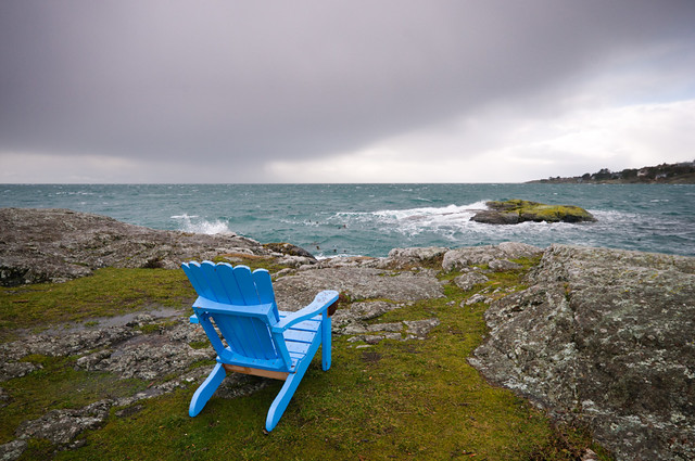
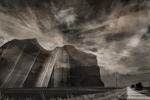
Dread Head posted:This is one of those shots that just have that "dslr" look. I can't explain it, it's just crisp, sharp, and a little too clean. It sounds counter-intuitive, but it makes it dull. The composition is fine enough, but I don't like the blob of a cloud taking up most of the sky, and the chair isn't interesting enough for my eye to fix on it. quazi posted:Anyway, the mountain is one of the walls of Antelope Canyon, but this is more an experiment of how many sky photos I can stack up. (Not sure, but I think there's five here.) You said it yourself, but this is way too busy. The first two have a subtler touch that works, especially the second. I like the first a lot because it took me a while to figure out the waves in the sky (are they cliff edges/mountain faces?) but it's a nice effect that draws you in. Here are the next three from me.  Day 10 by David Childers, on Flickr  Day 11 by David Childers, on Flickr  Day 12 by David Childers, on Flickr
|
|
#
¿
Jan 22, 2012 08:42
|
|
|
Gazmachine posted:Oh poo poo David, please tell me you shot a shot of this without you in the water, so you can clone it in underneath yourself and then make yourself semi transparent in the water, because that would be rad. drat, that's a good idea.
|
|
#
¿
Jan 26, 2012 19:25
|
|
|
Yeah, how the hell are you lighting those or getting that lighting from the ambient? EDIT; To expand on my thoughts of them, I agree with the sentiment that they look almost artificial, like museum models. They're just so clean, I don't know if it hurts or helps more. I feel like wild exotic animals shouldn't look so pretty, they lose some of that feral nature about them. quazi posted:I like the transparency of the feet in Day 11. It makes me think that the subject of Day 10 could be slightly transparent, to connect the two. To further the thematic connection, try rotating Day 10 as a vertical. (The waves are great. You could have easily shot this with flat water; glad you didn't!) Not sure where to go with Day 12. It seems a bit straightforward and grounded in comparison. There's no sense of weightlessness which the other two images have. If anything, the noise reduction in 12 is a bit too smooth. It could use a little more grain. Thanks for the ideas. I agree, 10 and 11 definitely connect, though I didn't think about that until a few days afterwards. I'm already starting to see some trends (just finished day 17) and I'm eager to see the end and how themes develop further. Day 15 A landscape. I'm terrible at this.  Day 15 by David Childers, on Flickr Day 16 A luthier.  Day 16 by David Childers, on Flickr Day 17 My grandmother.  Day 17 by David Childers, on Flickr Bottom Liner fucked around with this message at 06:44 on Jan 27, 2012 |
|
#
¿
Jan 27, 2012 05:51
|
|
|
I think one of the reasons it is not optional to give criticism here is because that is part of the process. Learning to disect, discuss, and think about what makes a photo good and bad is important for developing your own eye and skill. Don't feel bad about your level of knowledge or skill, that's not what is important, your opinion is still valid as an active viewer of the photos. You can point out the strong points, talk about things you would change, or say something just doesn't work for you, all are ok. As for your photo, the scene is nice but there are some exposure issues. The street lamps are way too bright and look like tiny suns throughout the frame. Bring the exposure/brightness down and try a darker look. There is enough light in the scene to still capture everything without having those crazy hot spots. Also, the tree trunks have some vibration blur, and it's bad enough to draw my attention to it repeatedly. I like the scene and the photo, but there is plenty to do to improve it. I'm going to cross post my three main shots from this weekend in hopes of hearing some dialog about them. This has been a really fun series to work on with my friends, and I'm planning more for this coming weekend.  day 31 by David Childers, on Flickr  day 33 by David Childers, on Flickr  day 29 by David Childers, on Flickr
|
|
#
¿
Feb 8, 2012 01:17
|
|
|
Thanks, I agree with the shoulder now that you point it out, I will fix it before printing. Your color processing is incredibly good, in that photo and the others in SaD. It fits the subject perfectly and the scene is a nice find overall. The B&W shot is fine, it looks like it was shot on some old film. I hate brick walls though, and I think they're especially bad in two cases, when shot straight on, and in B&W. This photo does both, which makes my eyes go crazy. That's probably just me though.
|
|
#
¿
Feb 8, 2012 02:43
|
|
|
CarrotFlowers posted:You've got a Brooke Shaden type feel going on with the poses and elements, but not the processing, which is interesting. That's an intriguing compliment. I'm generally torn on Brooke's photos one way or another, either the pose or the processing, but she's fantastic regardless of my opinion. I'm working in realm that's not quite as dark as her stuff, combining more natural portraits with conceptual fantasy-ish themes, but with a "happier" feel I guess. I completely agree with the lighting on the first. I shouldn't have added the fill from the right, but that ended up being the best pose so I'm torn there. I loved her expression in the second, but I'll work on getting more emotion in general. The color in the legs in the third is bothering me too, I'll have to fix that. I wasn't the one with the beach photos, I'd like to see them though.
|
|
#
¿
Feb 8, 2012 03:09
|
|
|
my vinyl heart posted:Ok, here is the deal. I've lurked this thread for a while, and never really felt confident to post any of my own stuff, but I finally got my computer working again and am trying to teach myself lightroom. I have only used it a couple times and really don't know what I'm doing, so I figured now is the time to man up and ask some opinions. Here are a few things I edited today. Feel free to tell me anything you want about them. The first has potential, but when shooting in a high contrast scene you need to subdue that in post, especially when you're shooting a person in the scene. I try to compress and get tight (either with zoom or my proximity to a model) to make the frame have a more consistent light so that I can control and use it better. For instance, having her in the shade so you can get a nice even exposure instead of fighting with the dark ground and bright sky. You did much better with this photo as far as that idea is concerned. http://www.flickr.com/photos/30814206@N08/6839369141/in/photostream/ The second, while a funny shot, looks like you just snapped a funny picture of a funny incident. It's a really cool bird though, he would make a good subject if you ever get the chance to try something more thought out with him. All of these were nice but this one is much much better than the rest. Where were these taken? It's a beautiful place and this photo makes me want to go there. truncated aardvar posted:
Yeah, we can all do our part to make this thread more active. I'm personally trying to comment more on photos and make sure I post here when I have images I feel are worth sharing. The 365 project has been a great motivator for me to actually follow through with plans I've been making. I started out shooting random stuff and now I'm working more on different themes and series like the ones I just posted, which I feel is a better use of the time and effort than just random ideas that don't have much forethought. The hardest part for me is scheduling things with people, so I end up shooting most of them for a week in 2 or 3 days. I don't feel like I'm cheating the idea though, I'm still producing 365 photos in 365 days, which is my goal, so I don't worry about shooting one image per day as much. I would highly recommend everyone do something like a 365, even forcing yourself to produce 1 image a week will give you something to always be thinking about and planning, as well as being able to constantly critique your own work and progress. It's also been a good move business wise for me, I've booked a few shoots and gotten wedding inquiries from people seeing my 365 photos, as well as selling prints and licensing for some of them. My Facebook page, which is the heart of my marketing efforts, has blown up, getting 2000% growth on interactions and 10x the reach of my normal posts, so that's a cool side effect.
|
|
#
¿
Feb 8, 2012 21:04
|
|


|
Leit Motif posted:
The exposures are nice, and the models and locations are great, but the lighting is so flat it really hurts them. I really like 1 and 3, but the 2nd model's poses are really off for the subject matter. I know that's not under your control because of the workshop. Robot Jelly posted:
Be really careful in B&W with dark colored skin, it looks like you made her skin significantly darker in the B&W shots than color. Of these three, the first pose is the strongest. The third's hair in the eyes is distracting, the second is ok but not great, but the first is very flattering and she looks great there, just lighten it up a little. Use color channel mixer in the B&W editing to get her skin tones right.
|
|
#
¿
Feb 9, 2012 08:05
|
|


|
Just to clarify, those are Leif's photos, not mine. Your wording makes me think your thought they were mine?
|
|
#
¿
Feb 12, 2012 23:09
|
|
|
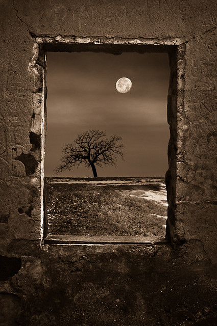
MrBlandAverage posted:------------------------------- I really like this one. It feels off, almost creepy, in a good way. I expect something to be hiding in that window, but maybe that's because I've been watching some horror films lately. Ambihelical Hexnut posted:I'm jealous. It's a good shot, but I'm not crazy about the perspective of the camera. I would like to see it higher off the ground looking you more in the eye instead of looking up. This might help give a bigger sense of scale by showing more of the background and less of the sky. Just a thought. The lighting is good, and has a straight forward adventure editorial feel. Here are a few I like from this week  day 32 by David Childers, on Flickr I tried layering lighting with a long exposure. I wish I had gotten the back trees more to really add that extra depth. Oh well, the owl is cool.  day 35 by David Childers, on Flickr Self portraits are hard, especially with no tripod or remote shutter release.  day 36 by David Childers, on Flickr
|
|
#
¿
Feb 16, 2012 20:47
|
|
|
The more I look at them I agree. It was really just a study in lighting, and I wish I could have shot the right one a little farther back in a landscape orientation.
|
|
#
¿
Feb 17, 2012 02:20
|
|
|
These two are begging to be shown together. Very funny. TsarAleksi posted:
That portrait is so so good. The second is a great capture too, very good journalistic quality to it. Where did you go? whaam posted:
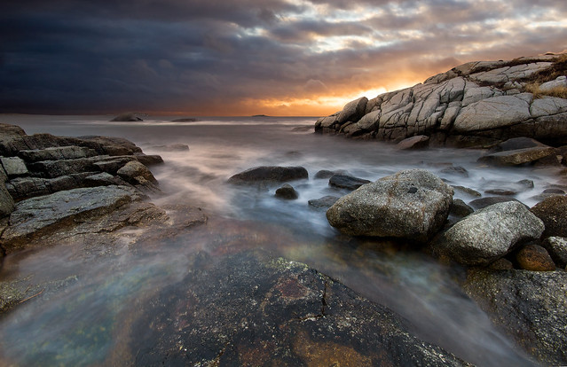
That's definitely a great spot. The only thing I think could be improved would be having the large rocks in the upper right on the left side so they capture some of that light and even out the left side. The top left corner is a good bit darker than the rest of the photo, and it traps my eyes. You could probably just bring it up in post a little and even it out. The next installment of this series I'm working on within my 365. I'm starting to hate the days when I don't have anything lined up to shoot, because I am terrible at just walking around and finding a photo. My strength is planning things out then shooting, ugh.  day 39 by David Childers, on Flickr  day 40 by David Childers, on Flickr
|
|
#
¿
Feb 19, 2012 15:40
|
|


|
Cockwhore posted:Day 35 I feel is the weakest of the bunch. I agree completely with you that brighter trees in the background would have helped the picture a lot - that was my first thought before I read your comment. I also didn't immediately notice the owl. Have you considered a much tighter crop? Something like this (but less crude and lovely): Thank you for the idea and the thoughts, I agree that crop is a good fix for it. Tamgerine posted:The first one is way too wide and they're lost in the frame, and it also draws too much attention to the lighting. I like the second the best, but as said the couples form isn't quite clear. I think the rim light is too harsh as well. I like the sky and ground balance though. The third has potential but that is a bad angle for her. Also his hand is really akward, I can't tell if he's trying to hold her hair back or turn her chin for a kiss, but it looks like he's going to grab her throat. CarrotFlowers posted:
The second one is really nice. The first one could benefit from having a dark background like the others, and her expression doesn't really fit the hood. Overall they're a little dark, and the back of her face is brighter than the front in all, something I try to avoid. I like for the brightest part of the face to be the closest cheek/nose for headshot style portraits. Also, be mindful of models' jaw lines, she could push out her chin more in all of these and really help her look. I always tell subjects to push it out until it feels awkward, then when they inevitably relax a little it usually ends up in the right place. I'm going to post 4 today because they are a set, sorry for breaking the rules.  day 41 by David Childers, on Flickr  day 42 by David Childers, on Flickr  day 43 by David Childers, on Flickr  day 44 by David Childers, on Flickr
|
|
#
¿
Feb 21, 2012 04:37
|
|


|
rio posted:One more thing about this - I don't know if you were looking for a natural looking thing where it actually looked like she was throwing the powder, but it was almost immediately apparent that the dust is photoshopped due to the symmetry. I would have liked to see a more natural looking dust pattern, even if you had done what you did but then went further to add some randomness to the dust patterns. I am always looking at symmetry, so this might not even be a noticeable issue for a general audience, but I thought it was worth mentioning. Actually it was real, at least most of it. I mirrored the right bottom to the left bottom for symmetry but the rest is real. Good point though, I may do some clone work to change it up some.
|
|
#
¿
Feb 28, 2012 20:57
|
|
|
Ringo R posted:This photo is really ruined by the reflection of yourself on the trunk. If you cleaned up that section it would be really nice. AIIAZNSK8ER posted:
There is some really nice light there but too much clutter that makes it just look like a normal room, nothing to draw you in or make your eyes care to explore the space and gorgeous light. There either needs to be more stuff or nothing, it's just kind of bland as is. A few recent shots of mine, I've been busy and haven't been able to post here    
Bottom Liner fucked around with this message at 09:06 on Apr 1, 2012 |
|
#
¿
Apr 1, 2012 09:00
|
|
|
I'm going to post this here to help both people that are shy about posting critiques and those that are shy about posting photos. quote:How do I give another photographer a critique? So with every photo that catches your eye you have plenty to think about there. You can also apply these same thoughts to your own images, and if you can't answer or justify why you took the photo or why you shot it the way you did, you're not putting enough thought into your images. If you know your photo is weak technically, say you missed the focus, you should probably withhold sharing it, unless there is a compelling reason otherwise. I am a firm believer in getting down the basic technical skills of any creative outlet first so that you can actually flex your creative muscles with it. If you don't understand exposure or focus, you need to spend some time working on that before you post. We're mostly here to improve our craft while sharing with one another, so let's put more effort into both sides of that relationship. EatinCake posted:Here are a few from myself. You need to resize these. They are too small as thumbnails and way too large at full size to really take the photo in. I will say they are all out of focus and the second shot is particularly effortless. The third shot has the most potential given the crazy scene, but the technical issues hurt it too much. Augmented Dickey posted:Like this one but the vignetting is a little distracting. Senior portraits with a super photogenic friend of mine. These were all taken outside, the first with one strobe/softbox, the seconds using a reflector and shade to create a studio feel (with the sun providing a nice hair light), and the third with no flash.   
Bottom Liner fucked around with this message at 11:42 on Apr 2, 2012 |
|
#
¿
Apr 2, 2012 11:22
|
|


|
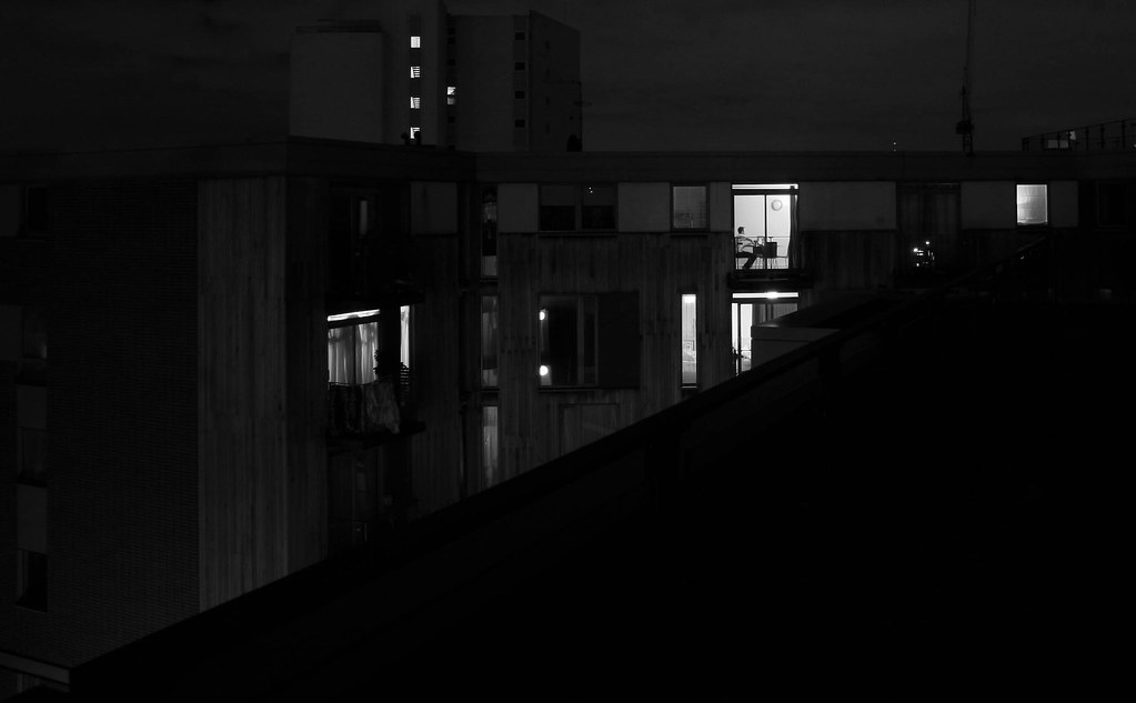
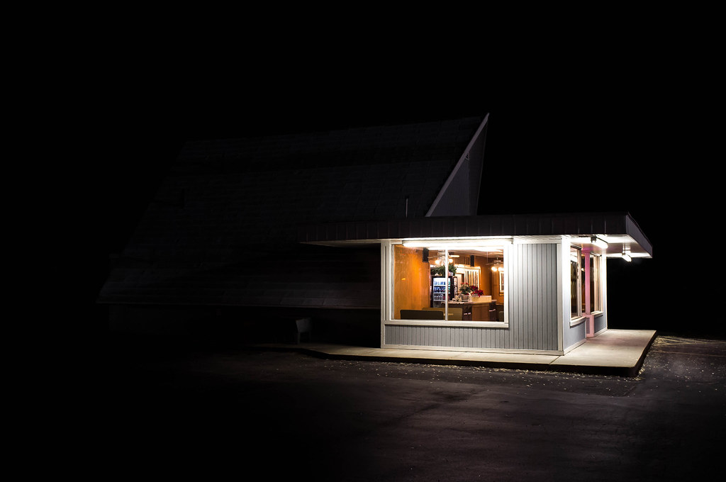
Thanks for all the posts guys, you guys help me notice the little things I miss when going over hundreds of photos a week. Lot's of great activity here too, glad to see this thread back. AIIAZNSK8ER posted:
You nailed that one. I would love to see a person sitting inside but I love the scene as is and I like the blackness surrounding the building.
|
|
#
¿
Apr 3, 2012 03:39
|
|
|
Sleeping baby shots can definitely work, but you do have to be careful of dead baby syndrome. I don't particularly get that vibe from your shot, but it's something to watch for.
|
|
#
¿
Apr 4, 2012 19:49
|
|
|
Here is another great read about critiques. http://theawesomephotographer.com/discussing-photo-critiques-forget-the-bokeh-focus-on-the-creativity/
|
|
#
¿
Apr 11, 2012 08:55
|
|
|
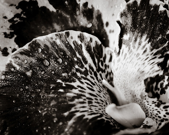
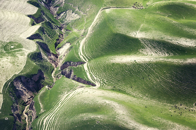
Mannequin posted:Yeah man, that sounds like a winning attitude. Why bother with fashion or food photography? I mean, drat, there are some (good) photographers who do that stuff. It's not special, right? Sorry, but that logic is idiotic. If anything your style makes the genre more interesting, because it's refined and different enough from most of the street work you see out there (good or bad). I hope you take a good break and continue doing them, as they're your best work in my opinion. As someone else said, the best thing about them was how much of the subjects personality came through, which says a lot about your skill in not only shooting, but finding interesting subjects and engaging them. That said, I'm eager to see what you cooked up with a model. I remember years ago telling you to start shooting some portraits because you had such a good technical knowledge, but I wanted you to apply it to something like people. alkanphel posted:
I think this is really nice. You took a normally cliche photo and made it something more. It almost doesn't look like a flower at all. Ambihelical Hexnut posted:Critiques a few posts up. Here are some more loving landscapes. Again. All of your aerials are outright stunning, but this one is my favorite so far. The sense of scale really plays with your head, and I think that's why it's better shot so tight than wide. The compression really enhances the effect, and getting that detail from that far away makes it just feel massive. This kind of landscape work make for really amazing prints, I hope you get to see some of them on a wall. I probably missed the back story, but where is this and what do you do? hepkitten posted:Here are some recent portraits of mine. The subject is an actress/writer that was insanely photogenic. Dark skin on such a bright day was a big challenge, but I was pretty happy with the results.  IMG_9352 by David Childers, on Flickr  IMG_9346 by David Childers, on Flickr  Panorama by David Childers, on Flickr
|
|
#
¿
Apr 12, 2012 03:17
|
|

|
carcinofuck posted:It is, I like the same thing about it. It looks tilted though, and it also looks like a shot that would actually benefit from centering the bulk of the object of interest. I like the haze. The only issue for me is the underexposed bottom, but the general feel of the photo is really nice.
|
|
#
¿
Apr 13, 2012 23:34
|
|


|
ButtMonkey posted:Hi Photo a Day! But it's fine to comment on photos without posting some ourselves that day right?
|
|
#
¿
Apr 14, 2012 07:41
|
|
|
Cacator posted:Gracias for the input, y'all. I cropped closer and pushed him towards the right, could have gone a little further but I wanted to keep just a bit more of those trees on the right in. I don't think the crop works, it draws attention to the fact that the image isn't quite sharp, which wasn't noticeable before. The wide street in view was what made the photo for me, filling the frame with him more isn't as strong because his pose and expression are a bit deer-in-the-headlights. It was ok in the original frame, but looks awkward here.
|
|
#
¿
Apr 16, 2012 16:13
|
|

|
Dude, you're being pretty hard on yourself unjustly. Your photos are fine, and you don't have any huge issues, at least not from what you've shared. Also, don't worry about your gear. I actually just posted my first blog post about that very topic, with the point being that any decent camera can take great photos. The three photos in the blog post were taken with a canon XTi, so you're a generation ahead there. http://www.davidchildersphotography.com/Blog/Which-camera-should-I-buy/22480976_tWLJ4p The fact that you constantly worry about fundementals is a good thing, it shows that you know what you need to look out for to not mess up basic principals. as for those three pictures, the third is the best, though his shirt is awkward and his skin tone is a little off. The first is a great composition and the light is really nice, but you missed the focus. The second was shot from a bit too low, and it doesn't flatter the subject. I'd personally say that your eye is better than mine was at a year. Keep shooting, keep sharing, you'll only get better. All said though, your smugmug isn't doing justice to your photos, you could do a lot of cleaning up on your site and maybe even an overhaul. If you're going to market your work, you want your site to be a lot more attractive and match the photos. Bottom Liner fucked around with this message at 22:17 on Apr 17, 2012 |
|
#
¿
Apr 17, 2012 22:11
|
|
|
I like the posture in the first. He looks kind of like a goofy guy, but his jawline is really great there and I think it works. The second is very awkward though. There is also a lot of issues with hot spots from the lighting and color temp of the skin.
|
|
#
¿
Apr 19, 2012 21:05
|
|
|
Ringo R posted:I agree with the other guy who said the first two blend in too much with the background. Do you have a longer/faster lens to create a bit of background blur? Have you tried longer shutter speeds to blur the background/get a sense of motion? The first shot has a great eerily empty feel, I really like this shot. The second and third together create an interesting effect that almost hurt my eyes trying to seperate the lines, but seperately I think the third achieves the same effect stronger than the second.
|
|
#
¿
Apr 27, 2012 09:33
|
|


|
Samolety posted:People talked about the babies a lot, but I really like the dog. Specifically, I think the perspective is working really well in this one. Being down there with the dog really seems to show "relaxed" and "lounging" better than other angles may have. Gonna critique this post because you have a big range of content and success in the execution in just three photos. The first is great. Lots of mood and very sharp with great tones. It looks like a great spot to hang. You could probably try boosting the shadows a bit to improve it, it's a little on the dark side. The second is just really flat in both composition and lighting. If you're going to do an environmental portrait, you need to show more. I think it would work a lot better with a wider angle. The lighting is also dull and the scene needs more contrast. The third is the worst, as the bottom of the statue is completely blown out, and the angle isn't showing it in an interesting way at all. Again, I think wider would have helped this shot, just to give it some context. These are the first two portraits from a new series I'm working on, a feature of local faces and micro interviews with them about who they are. I can't decide if I want to keep the composition really similar throughout (planning 100+ of these) or not. I like it but I would also like to branch out and add environmental portraits depending on the subject. I could post the stories with them, but I wanted feedback on the photos mostly.  Fraser by David Childers Photography, on Flickr  Madison by David Childers Photography, on Flickr
|
|
#
¿
Jun 12, 2013 04:25
|
|

|
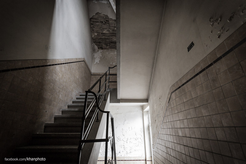
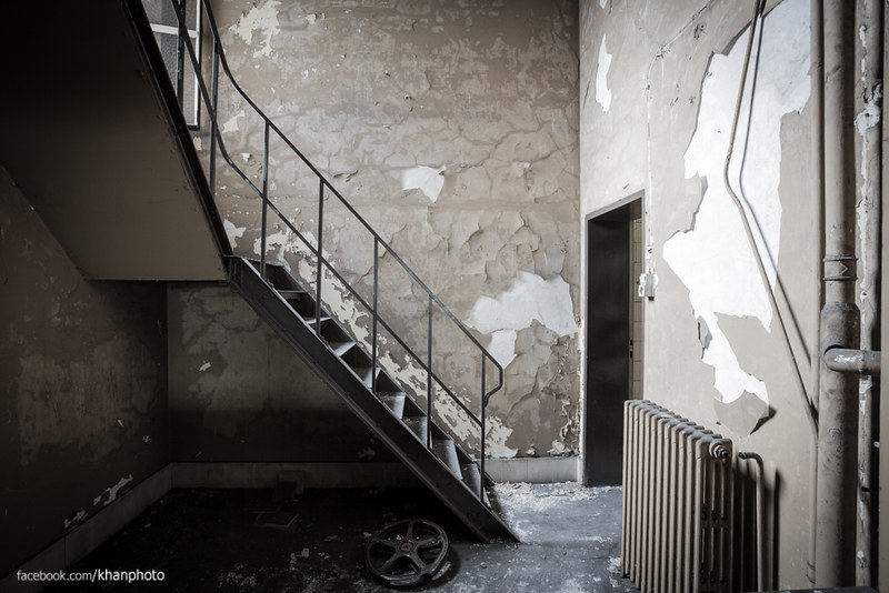
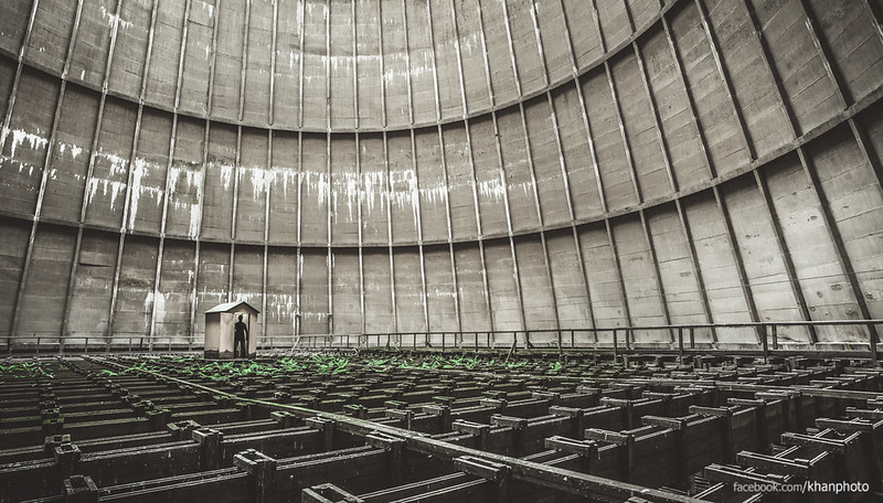
mrk posted:Here's some Urbex. All three of these are great. How are you doing your white balance, it's so clean and perfect. The first and third are better, the second is just a little too straight on. Actually, I think the second would be a lot better with a wider angle to accent the angles and lines. Two more portraits today, not crazy about the light in the first but it was the best available in his shop.  Patrick by David Childers Photography, on Flickr  August by David Childers Photography, on Flickr
|
|
#
¿
Jun 14, 2013 02:04
|
|
|

|
| # ¿ May 1, 2024 11:49 |
|
|
It's a Will Ferrell cutout with a mustache taped to him  Thanks for the idea of vertical cropping, I'll give it a try.
|
|
#
¿
Jun 14, 2013 02:56
|
|