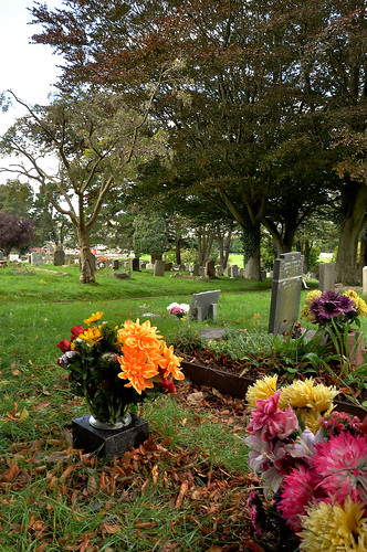
Register a SA Forums Account here!
JOINING THE SA FORUMS WILL REMOVE THIS BIG AD, THE ANNOYING UNDERLINED ADS, AND STUPID INTERSTITIAL ADS!!!

You can: log in, read the tech support FAQ, or request your lost password. This dumb message (and those ads) will appear on every screen until you register! Get rid of this crap by registering your own SA Forums Account and joining roughly 150,000 Goons, for the one-time price of $9.95! We charge money because it costs us money per month for bills, and since we don't believe in showing ads to our users, we try to make the money back through forum registrations.
 
  • Post
  • Reply
jodys
May 30, 2006

Pickman posted:

Enough of my amateurish critique. I'm still trying to narrow down my selection of images for my course portfolio, and I need to decide between these two:


cemeterypic2(sharp) by Tom.Plk, on Flickr


cemeterypic1(sharp) by Tom.Plk, on Flickr

I welcome criticism of either picture, but if anyone could let me know which of the two images they prefer that would be great.

I prefer the second one. However, in both the "line" my eye follows is pretty confused and doesn't ever really stop on anything like a focus. In the first one, my eye hops from the lower right flowers, to the left flower, then to the line of gravestones, then it gets lost in the trees. The line my eye follows is much stronger in second one, but, again, the line does lead me anywhere in particular. I think that the second could benefit from cropping.

Adbot
ADBOT LOVES YOU

  • 1
  • 2
  • 3
  • 4
  • 5
  • Post
  • Reply