|
Someone linked it over in the GameDev contest thread, but the Liberated Pixel Cup contest is in its pixel art stage right now. It seems pretty cool if you'd like to contribute to some free RPG-style graphics and possibly win something. Submissions are open until June ends! I wish I'd found out about it sooner.
|
 #
¿
Jun 20, 2012 05:56
#
¿
Jun 20, 2012 05:56
|
|


|

|
| # ¿ May 5, 2024 05:11 |
|
|
I'm playing around with some simple platformer tiles.  That walk animation will probably be faster in-game.
|
|
#
¿
Jul 17, 2012 15:55
|
|
|
Triangle posted:did a new one and tweaked the animation on the first a little Looks great, but it might make the "tearing" effect systran mentioned less obvious if you cleaned up some of the edges that look a bit off? Like the bit on her sleeves where there's a one-pixel outward pucker, or the top of her boot where part of it seems to bulge outward. It's a little ripply right now. I think it'd benefit from a little more movement as well, maybe in the feet, sleeves or skirt.
|
|
#
¿
Apr 3, 2013 01:29
|
|

|
Arbor posted:Oh man. I love me some pixel art. I don't do it nearly as often as I wish I did. I have a big soft spot for Pokemon and for little isometric scenes so I love this.  You could probably play up the contrast between shadows and midtones in this but I honestly kind of like it as it is, it's very soft-looking. You could probably play up the contrast between shadows and midtones in this but I honestly kind of like it as it is, it's very soft-looking.
|
|
#
¿
Apr 10, 2013 03:36
|
|


|
Supernorn posted:Here's a little compilation of a bunch of assets i'm creating for the Space Station 13 remake. I know it's not traditional pixel art, but would appreciate any crits. I've been trying hard to keep the 'perspective' consistent and think overall I'm doing okay (although the airlock might need tweaking). I feel like your player sprite needs a bit of an outline. Everything else has one, more or less, and he's kinda slipping into the background without one. Other than that, maybe a bit of gloss on the blood in the IV drip? And something feels off about the contrast in the sink but other than that this looks great. Please come back when you get to adding the butts and clown suits 
|
|
#
¿
May 21, 2013 19:49
|
|

|
Maybe something like this? I followed the full arc of the swing and tapered it a bit.
|
|
#
¿
Jun 19, 2013 05:15
|
|
|
Feel free!
|
|
#
¿
Jun 19, 2013 08:55
|
|
|
Shoehead posted:
Exaggerate this even further and make a fiddler crab man. e: I have an incomplete tree tutorial from approximately forever ago, intended for iso   
Clockwork Cupcake fucked around with this message at 19:36 on Aug 18, 2013 |
|
#
¿
Aug 18, 2013 19:27
|
|

|
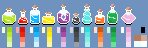
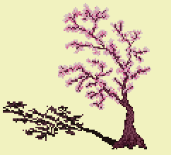
Digital Fingers posted:I think we should do more "Lets all make a _____". We're all learning so much about trees. I actually like the little bottles. Maybe they'd benefit from a little more contrast in their color ramps? It might help if you made the highlights persist throughout the bounce, too - right now some of the smaller bottles lose most of their highlighting. For the cherry blossom tree, what I'd recommend doing is sketching in the branches and then roughing in some puffy blossoms. Yours is pretty good, actually, you just need more volume to the blossoms, if that makes sense? Right now you've got what would be the thick main branches, but you want to extend the blossoms further out from there because there would be many smaller branchlets extending off them.
|
|
#
¿
Aug 19, 2013 06:42
|
|


|
Red Mike posted:Had a free hour to work on ...texture I suppose? Tried to make it clear that it's grass, and to do a proper perspective thing where the lower third actually looks like it's close to the camera. Not bad! You can push the depth a bit more by shifting distant areas more toward the color of the sky. Here's a lazy photoshop-filtered example of what I mean:  I shifted the foreground to be yellower as well just to play it up a bit more.
|
|
#
¿
Aug 22, 2013 11:23
|
|

|
Red Mike posted:Wonderful, thanks! That looks much better. Do I shift hue-wise, or do I also modify saturation/value? Intuitively I'd say I should also desaturate slightly the farther apart it is, and saturate slightly closer up, is that about right? Generally speaking, yes! If you want to really play with your palette all bets are off but that's a good rule of thumb. LoreOfSerpents posted:Amateur tree hour! This is great so far, love your palette!
|
|
#
¿
Aug 22, 2013 20:30
|
|
 I tried following the wonderful tree guides and ended up with this:
|
korusan posted:I come now seeking to improve this sprite of an orb and really make it shine. Again using limited colours, and will be resizing/modifying this sprite in three different sizes and colours once complete for the title screen: Well, right now you're getting across the translucence but it's not really round-looking - it looks more like a flat gem than an orb. You kind of want to combine those two properties like so:  I'm kind of bullshitting the highlights here but you get the idea. It might also benefit from having the darkest shade for the outline instead of black, but I left it since that might be a stylistic thing.
|
|
#
¿
Aug 22, 2013 21:24
|
|

|
the chaos engine posted:Photoshop. And it pretty much *is* tedious, i'm just very used to it. That said for scanline stuff I just draw one pixel a bunch of times at one pixel interval, then transform > stretch horizontal. If you're working in photoshop you should be able to make a 1x2 pattern that's just a single black pixel and a single transparent pixel. Define pattern -> pattern fill -> instant horizontal scan lines. Same thing works in 2x1 for vertical, or a 2x2 black-transparent checkerboard pattern will work for a quick dithering pattern.
|
|
#
¿
Sep 17, 2013 19:32
|
|

|
I missed that you'd posted that, Shoehead! Those are some pretty cool owl(s), are your monster dudes for a specific project or just for fun?
|
|
#
¿
Sep 17, 2013 22:49
|
|
|
PublicOpinion posted:I took a stab at 64px character sprites, but it turns out that despite being easy to insert into RPG Maker there's enough assumptions about having characters 32px wide that it was kind of a pain. I briefly looked at 32x64, but that changed things enough that I would have to redo everything and I'll save redoing everything for after I ride this project into the ground and discover more of the things I don't know. Being able to actually put a face on the character is an attractive prospect, I must admit. Anyway, attempted animating the mumbler: The hands on this guy are staying completely static while everything else moves. Make 'em bob around with the rest of the body and it should help.
|
|
#
¿
Jun 10, 2014 04:34
|
|


|

|
| # ¿ May 5, 2024 05:11 |
|
|
Chipp Zanuff posted:I didn't ignore your advice btw, sorry for the really late reply, been working on the horse lately but decided to give that a break for now: I think you want to put more force into the backswing on the zombie? Spend more time on pulling the arms back and then have it come down like WHAM, faster, on the downswing. You might want a couple more frames for the pull-back, exaggerate the movement more? I tried messing with the timing alone but it still sort of just reads as waving arms.
|
|
#
¿
Aug 2, 2014 20:58
|
|