


|
I do pixel art sometimes. I don't really practise enough to be much good at it, I kinda only do it around once or twice a month, mostly because I'm pretty bad at thinking of things to make with such a small amount of space. I probably should practise more often though. I like to do top-down shooter style sprites, I keep them on a single big image, and because of that whenever I want to do a new one I will tweak a lot of the others a little too, so the image is kind of a mishmash of different colour and shading techniques.    I also did a few portraits using some of the tabletop stuff I had lying around as reference.
|
 #
¿
Jun 22, 2012 01:48
#
¿
Jun 22, 2012 01:48
|
|


|

|
| # ¿ May 5, 2024 05:06 |
|
|
Kazerad posted:Would anyone here with experience choosing palettes for retro games be willing to throw me some ideas, or examples of existing, sunset-like palettes close to what I'm looking for? I'm a huge fan of the simple, almost iconic many old games use but have no idea where to start in choosing my own. I am by no means an expert, but I thought I'd give it a go and I came up with this:  It's 15 colours in total, mostly reds and purples since it's supposed to be sunset, with a little green to contrast. Here's an example of what it might look like in your scene:  Bear in mind I was a little bit overzealous with the fill bucket and for some reason photoshop says there are supposed to be 26 colours in the image (I've looked and I haven't found these extra 11 colours) so it's probably worth playing around with them a bit more, see what works.
|
|
#
¿
Apr 22, 2013 16:51
|
|
|
Kazerad posted:Disproportionation, if you're still looking at this thread: do you have a website or something? I'm about to finish up a project and want to credit you with a name/link for the palette help, but I can't find any website or contact info related to you. Not at the moment, though I'm looking to have one up by the end of the month. It's not much of a big deal though, I'm just happy to help. Content: I should really do pixel art more than once in a blue moon, I got a lot of free time though now (touch wood) so I'm gonna try and actually use some of this stuff in a project, since I need to learn unity anyway.      
|
|
#
¿
Jul 9, 2013 20:23
|
|
|
Chipp Zanuff posted:Tried making bigger, more detailed versions of the body types i did earlier (Currently missing thin-tallish pink one). It kinda looks like their torsos are pointing straight ahead while their heads and legs are off to the side. That might be the problem.
|
|
#
¿
Apr 19, 2014 21:21
|
|

|
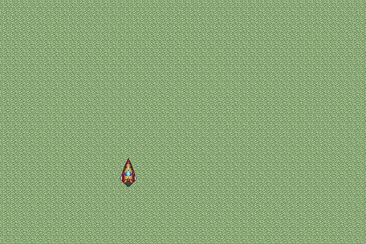 I haven't really grappled with tilesets much, so I thought I'd try doing a simple grass tile; eliminating the "grid effect" completely is pretty difficult!
|
|
#
¿
Apr 7, 2016 18:33
|
|
|
Cheers for the tips, guys! I was actually considering toning down the detail; I'm aiming for more of a top down shooter look, so a scaled back look might be more appropriate considering the foreground is supposed to be pretty high up altitude-wise.
|
|
#
¿
Apr 7, 2016 20:11
|
|
|
That is significantly better. You could probably cut more frames at the end even to give it a more weighty thud.
|
|
#
¿
Jun 11, 2016 00:30
|
|
|

|
| # ¿ May 5, 2024 05:06 |
|
|
Remember to consider how you transition frames could effect how "tight" the controls would feel in a game, if that's what you're making these for. You don't want a noticeable delay between input and action - that's why a lot of jumping animations in platformers don't have windup frames, for example.
|
|
#
¿
Mar 13, 2018 16:41
|
|