

|
 Minnesota United FC in the NASL, of Space Nazi uniform fame.
|
 #
?
Feb 1, 2014 05:05
#
?
Feb 1, 2014 05:05
|
|


|

|
| # ? May 4, 2024 12:22 |
|
|
Thai Club Khonkaen F.C.
|
|
#
?
Feb 1, 2014 05:21
|
|

|
Sorry if some of these were posted before, but here are some more South American badges- they have a simplicity to them that I really, really love- only Italian badges really come close, imo.    Oh, and I just found out that the current Chilean champions are the wonderfully named O'Higgins F.C., so that's something.
|
|
#
?
Feb 1, 2014 05:57
|
|
|
Best badge
|
|
#
?
Feb 1, 2014 07:09
|
|

|
The Tibetan National team's badge is literally a goony ms paint:
|
|
#
?
Feb 1, 2014 07:40
|
|

|
Sanskrit Scat posted:The Tibetan National team's badge is literally a goony ms paint: What animal is that even? The fabled yeti?
|
|
#
?
Feb 1, 2014 08:03
|
|

|
Coolest one in the thread
|
|
#
?
Feb 1, 2014 08:29
|
|


|
vaginal culture posted:Coolest one in the thread Idk as much as I like the state flag the yeti one is pretty badass
|
|
#
?
Feb 1, 2014 08:32
|
|
|
 NK Mosor, 3rd division club from Split, Serbia  ND Slovan from Ljubljana, Serbia way down in the regional leagues I think.
|
|
#
?
Feb 1, 2014 08:44
|
|
|
Remember Duckpond FC? Check out this bad boy:
|
|
#
?
Feb 1, 2014 12:14
|
|
 I can't get enough of are Dan
|
 
|
|
#
?
Feb 1, 2014 14:25
|
|

|
rats off to ya posted:What animal is that even? The fabled yeti? The mythical angler lion.
|
|
#
?
Feb 1, 2014 14:35
|
|

|
The K League crests and logos were a bit boring for the most part, but there were a couple that caught my eye. Ulsan Hyundai  Police FC  Sangju Sangmu FC, which is basically the military team  And since the J League crests came up earlier, I thought it remiss not to post this one.  It was the crest for the Yokohama Fl�gels, one of the original J League clubs which was dissolved and absorbed into Yokohama Marinos, who were then renamed Yokohama F. Marinos. The Fl�gels would go out winners though, ending their existence with a fairy tale win in the 1998 Emperor's Cup final that was played on New Year's Day, 1999. The Marinos crest remained largely unchanged, bar the text.  
|
|
#
?
Feb 2, 2014 10:10
|
|

|
 Joe Public FC from Trinidad & Tobago owned by notorious corrupt shitbag Jack Warner
|
|
#
?
Feb 2, 2014 10:15
|
|


|
HJB posted:Remember Duckpond FC? Check out this bad boy: I love how they included the tourbus in the logo.
|
|
#
?
Feb 2, 2014 13:47
|
|
|
Euroboy mentioned the Glimt-logo, but what about the other norwegian teams? Are there any hidden gems around? Not really, but we have some logos from the early 1900s. Str�msgodset (current champions)  Sandnes Ulf  Ullensaker/Kisa  Ham-kam  Kristiansunds BK  And Sarpsborg 08 
|
|
#
?
Feb 2, 2014 15:22
|
|
|
 Semen Padang FC, of the Indonesian Premier League
|
|
#
?
Feb 2, 2014 15:30
|
|

|
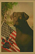
My local club from the second division in the States:
|
|
#
?
Feb 2, 2014 15:36
|
|


|
Here's our badge: The snake motif and the team motto both originate in this well-known cartoon by noted Philadelphia personage Benjamin Franklin: 
|
|
#
?
Feb 3, 2014 06:41
|
|
|
From the Icelandic top flight   
|
|
#
?
Feb 4, 2014 08:22
|
|

|
Same region, the Faroe Islands has a pretty awesome logo for their FA: Even a couple of great club logos, too, even though most of the clubs have terrible names like B68 and HB. 
|
|
#
?
Feb 4, 2014 08:39
|
|
|
For most african clubs, Branding really isnt priority so this is the best there is: My hometown club. Most successful team in Egypt and Africa, but tend to bend over when playing in the club world cup  and the second half of the Cairo derby, Zamalek, also pretty good  Enugu Rangers (Nigeria) Looks more like a pack of cigarettes 
|
|
#
?
Feb 4, 2014 09:28
|
|
|
Baabs posted:From the Icelandic top flight These are all sick
|
|
#
?
Feb 4, 2014 23:26
|
|
|
trem_two posted:
I'm so happy this exists.
|
|
#
?
Feb 5, 2014 00:44
|
|

|
Baabs posted:
This owns
|
|
#
?
Feb 5, 2014 03:11
|
|
|
  e: images are transparent not originally forum colored e2: im fairly sure that is a typo and should read soccer crab Bea Nanner fucked around with this message at 04:26 on Feb 5, 2014 |
|
#
?
Feb 5, 2014 04:22
|
|
|
Bea Nanner posted:e2: im fairly sure that is a typo and should read soccer crab No, that's the deception.
|
|
#
?
Feb 5, 2014 04:32
|
|


|
Persepolis and Esteghlal are the Rangers and Celtic of Iran. You can read more about their rivalry here: http://en.wikipedia.org/wiki/Sorkhabi_derby Persepolis FC is the older club and has a larger following that is mainly working class. Their crest used to be this, but then the Revolution happened and showing an Achaemenid emperor on your shirt wasn't a good idea.  For the next couple of decades, the club had to fight against multiple official efforts to change the name of the club, but the club and the staff managed to resist those moves and the new names never stuck. Still, you can only antagonize the Islamic Republic but so much, so now the crest looks like this:  Esteghlal FC was founded by a group of military officers. They used to be named Taj and had this as an emblem:  The Shah and a lot of the ruling elites were supporters of Taj. Unfortunately, "Taj" means "crown" in Farsi, so once the Revolution drove the Shah out of power, the government made Taj change its name to Esteghlal (which means "independence") and that name change was definitely mandatory. The club also had to alter the crest. Their crest now looks like this:  Unlike the Manchester City shield, Esteghlal's stars stand for real trophies (the club's two Asian Cups from 1970 and 1991). Despite the name and crest change, Esteghlal still has a more upper class fanbase and their fans say all sorts of hilariously snobby things about Persepolis fans. It's quite funny to watch.
|
|
#
?
Feb 5, 2014 04:52
|
|

|
To be fair, City has a league title for each of those stars. Granted, they were won in 1937, 1968, and 2012. But they're still top division titles. You don't reset your history when the Premier League comes into existance.
|
|
#
?
Feb 5, 2014 04:56
|
|
|
Captain Trips posted:To be fair, City has a league title for each of those stars. Granted, they were won in 1937, 1968, and 2012. But they're still top division titles. You don't reset your history when the Premier League comes into existance. Yeah, but City added those 3 stars in 1997 for looks. That was long before they won that 3rd title. http://www.mcivta.com/club/history.html I don't mind City, but that is kind of lame. It's too bad they had to change it from this one for trademark protection reasons. 
Eric Cantonese fucked around with this message at 05:14 on Feb 5, 2014 |
|
#
?
Feb 5, 2014 05:01
|
|
|
Drop shadows and bevels loving EVERYWHERE.
|
|
#
?
Feb 5, 2014 05:14
|
|

|
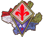
Some of my favorite crests from Brazil and Argentina.       
|
|
#
?
Feb 11, 2014 19:10
|
|

|
Back in the heady days of AOL Instant Messenger, I used this as an icon, and almost instantly had everyone on my list asking me why I had a pair of panties as my icon.
|
|
#
?
Feb 12, 2014 02:27
|
|


|
Frungy! posted:Some of my favorite crests from Brazil and Argentina. i think corinthians have my favorite crest in all of world football
|
|
#
?
Feb 13, 2014 04:13
|
|
|
The Corinthians crest made me look at a few Brazilian club crests and there were a few good ones. Bahia  Vasco da Gama  Boa Esporte  Nautico  Sport  Brasiliense  With the exception of Bahia, they all play in the 2nd and 3rd division.
|
|
#
?
Feb 15, 2014 01:56
|
|
|
Some more good ones from Brazil. A lot of them remind me of the 70s. Palmeiras  Cruzeiro  Coritiba  Botafogo. Elegant as hell, although it makes me think of Texas.  Madureira Also there's a couple places ripping off Santos:   
|
|
#
?
Feb 15, 2014 06:04
|
|


|
Some more Brazilian crest lookalikes The famous S�o Paulo FC  Atl�tico Goianiense in the second division  Fortaleza in the third division  Also, some more Brazilian lower division football goodness Guaratinguet� in the third division  Genus in the fourth division 
|
|
#
?
Feb 15, 2014 06:23
|
|
|
Costa Rica's "big four" have classy old school badges, except for the ridiculous purple firesnake when Saprissa were owned by a 10 year old or something. To be fair they have gone back to their old design, which is merely boring  Honduras' big 3:    And on the other side of the world, I've always found Celta de Vigo's badge to be pretty cool 
|
|
#
?
Feb 15, 2014 06:33
|
|
|
Some more stuff from Central America    
|
|
#
?
Feb 15, 2014 06:56
|
|
|

|
| # ? May 4, 2024 12:22 |
|
|
Drogadon posted:Some more stuff from Central America This is one of the most bizarre crests I've seen. Why is there a lovely clipart BMW on it?
|
|
#
?
Feb 15, 2014 07:05
|
|