

|
PicklePants posted:I'm going to suggest designing with the silhouette in mind. It helps to get things to read, before getting into a bunch of detail. I'd love to see that hidden monster arm. Well, let's step back from that image in particular since I have a nude silhouette that was already presented to my teacher:  I've already changed a bit about it (and a bit of the following), but here's a more neutral sketch of her so at least you have an idea of her anatomy:  The ground floor of her character is "berserker," so picked bits and pieces up from already established designs. Mantles seemed to be a must and that's what the bony appendages on her shoulders are. But the pelvic buckle's my own and I love it. 
|
 #
?
Apr 26, 2014 11:00
#
?
Apr 26, 2014 11:00
|
|


|

|
| # ? May 6, 2024 00:45 |
|
|
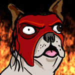
Das Boo posted:But the pelvic buckle's my own and I love it. WARNING: INCOMING WHINING + BAD ART I've been in a bit of a funk lately; I'm trying to get better at drawing human anatomy in complex poses from the imagination and everything that's been coming out looks really blocky, lifeless, and not always even correct. The frustration has trickled down into the rest of my work, and I'm getting like zero satisfaction from my art. Does anyone have any tips? I tried doing five-minute poses without looking at the models too much, but whenever I'm not drawing directly from them the poses become really stiff:  maybe this is something that requires a two-step process, where I explicitly sketch out the chunky geometric mannequins and then try to ink some fluidity into them? I tried that here and it looks especially heinous:  The lovely inked figures took like 20 minutes, while the pose on the right was 5 minutes (w/o shading, which came later from the imagination) and the goofy bird monster couldn't have taken more than 2 minutes. How come I can't reconcile those two worlds and draw decent human figures from the imagination?  lion drawn from memory. definitely hosed up in some places, the most notable being the creepy human forearm.  yaks... yaks are easy. they're just giant boxes you can throw some legs and a head onto and it looks fine 
snucks fucked around with this message at 23:26 on Apr 26, 2014 |
|
#
?
Apr 26, 2014 21:40
|
|
|
Would you guys be opposed to me putting NWS in the next thread's title so that people can post life-drawings and such without linking, or should we keep things as they are now?
|
|
#
?
Apr 26, 2014 22:55
|
|

|
Humboldt Squid posted:Would you guys be opposed to me putting NWS in the next thread's title so that people can post life-drawings and such without linking, or should we keep things as they are now? It's an art thread. Nudity comes with the territory so yes.
|
|
#
?
Apr 27, 2014 00:26
|
|


|
snucks posted:maybe this is something that requires a two-step process, where I explicitly sketch out the chunky geometric mannequins and then try to ink some fluidity into them? I tried that here and it looks especially heinous: A book I'd recommend is Force: Dynamic Life Drawing for Animators. It helped me a lot with capturing the gesture of the figure. Until I picked up the book I always thought gesture drawing was doing really quick sketches with wild lines going everywhere. But really it's about capturing the interplay of forces bouncing all around inside the figure, and that's really where the 'life' of the figure comes from. A technique you might want to try (after reading up on gesture) is drawing the gesture of the figure first, and then using your knowledge of anatomy to add to the figure (rather than drawing your mannequin figurines with correct anatomy first and then trying to 'bring them to life' with interesting lines).
|
|
#
?
Apr 27, 2014 03:13
|
|

|
al-azad posted:It's an art thread. Nudity comes with the territory so yes. Yeah - I was a little mystified why people are putting spoiler tags around NSFW stuff in this thread. I thought that was cleared up years ago. I doubt many workplaces would be offended by (poorly) drawn nipples / genitalia etc. Of course, they could just take the FYAD approach and laugh about it at your expense. You just never know with some work places. snucks: ... Because drawing perfect anatomy from memory is loving DIFFICULT! One idea is to draw first with non repro pencil and then draw over that in pencil or pen. Remove the non repro blue digitally later. Plenty of people use the equivalent of this in photoshop. Light blue layer first for the loose gesture stuff. Then an "ink" layer with a black brush set to taper with pen pressure. Or some variation. Don't be afraid to draw over your work, or just redraw something 2-3 times until it looks better. Being unhappy with your art work is natural. After all, if you were overly happy with your work, you might not feel the need to progress at all! raging bullwinkle: Nevermind. I was thinking of FORCE: Character Design From Life Drawing. sigma 6 fucked around with this message at 04:11 on Apr 27, 2014 |
|
#
?
Apr 27, 2014 03:59
|
|

|
raging bullwinkle posted:A book I'd recommend is Force: Dynamic Life Drawing for Animators. It helped me a lot with capturing the gesture of the figure. Until I picked up the book I always thought gesture drawing was doing really quick sketches with wild lines going everywhere. But really it's about capturing the interplay of forces bouncing all around inside the figure, and that's really where the 'life' of the figure comes from.
|
|
#
?
Apr 27, 2014 04:20
|
|
|
I accidentally almost posted these in Thunderdome. What a fiasco! I spent the long weekend with my family and spent Thursday night's practice session drawing my mother.  I'm not posting those because if crudely-drawn pictures of my mum ended up on FYAD, I think I'd die of shame. I'm not posting those because if crudely-drawn pictures of my mum ended up on FYAD, I think I'd die of shame.Friday:  Saturday:  (eyes are wonky as poo poo) And also I drew some bananas and glasses from life because there was no good reason not to:  
|
|
#
?
Apr 27, 2014 09:41
|
|

|
Avshalom posted:I accidentally almost posted these in Thunderdome. What a fiasco! The problem you're having imo is that you're outlining stuff still (glasses, lips, eyes, lit side of the face). Try and get away from outlines, edges of forms are contrasted by their background, either from color or just value alone (light face by a darker wall). The bananas suffer the least from this and definitely look the best in comparison, try to draw something without using any outlines, it might help a lot.
|
|
#
?
Apr 27, 2014 10:39
|
|

|
Aww, those bananas. Is there something magical about this fruit that makes it look so great on paper? My mother always points to a drawing of a banana as my only piece of work that wasn't time wasted. Is there something magical about this fruit that makes it look so great on paper? My mother always points to a drawing of a banana as my only piece of work that wasn't time wasted.
|
|
#
?
Apr 27, 2014 10:56
|
|
|
This one is great. I feel like I can understand her a bit more now. Avshalom posted:I'm not posting those because if crudely-drawn pictures of my mum ended up on FYAD, I think I'd die of shame. Every ones work goes into FYAD, they just go for the lowest hanging fruit usually. That said I actually enjoy that thread, and its better that you hear it from them. Channel their ironic posting style into improving your own craft. Also your bananas are good.
|
|
#
?
Apr 27, 2014 10:56
|
|
|
Das Boo posted:Well, let's step back from that image in particular since I have a nude silhouette that was already presented to my teacher: Okay! That really addressed my issue! I do really like the pelvis, in the first picture it was just kind of getting muddled in there between all the folds and the conch. I like the more neutral pose, because we can see things clearly. Let us know how it goes?  Needs lots more work. I gotta nudge his nose back over, work more on the arms, and then the shoulder stuff. But, it's what I've been doing.
|
|
#
?
Apr 27, 2014 11:01
|
|
|
Typical posted:Every ones work goes into FYAD, they just go for the lowest hanging fruit usually. That said I actually enjoy that thread, and its better that you hear it from them. Channel their ironic posting style into improving your own craft. Also your bananas are good. supermikhail posted:Aww, those bananas. Jewel posted:The problem you're having imo is that you're outlining stuff still (glasses, lips, eyes, lit side of the face). Try and get away from outlines, edges of forms are contrasted by their background, either from color or just value alone (light face by a darker wall). The bananas suffer the least from this and definitely look the best in comparison, try to draw something without using any outlines, it might help a lot.
|
|
#
?
Apr 27, 2014 11:09
|
|
|
Polypainting is for clowns.
|
|
#
?
Apr 27, 2014 13:27
|
|
|
Done. It's not good, but there are no outlines! loving TEETH 
|
|
#
?
Apr 27, 2014 13:39
|
|
|
Are they normally that round? Your shading is pretty good but step back and do some constructions lines. The proportions are what is killing you.
|
|
#
?
Apr 27, 2014 13:42
|
|
|
Avshalom posted:Done. It's not good, but there are no outlines! 
|
|
#
?
Apr 27, 2014 16:09
|
|

|
Avshalom posted:Done. It's not good, but there are no outlines! Your pencil drawings are much better, and you seem to have a good idea of form, but you are still drawing what you think a face should look like rather than what's actually there. You're being held back by a conceptual problem, not your drawing ability. Look at this very crude example:  If you simply draw what you see, it's just blobs of shadows. You're getting a lot of good advice here from people, but your drawings are 99% the same. Try making radical changes and stepping out of your comfort zone.
|
|
#
?
Apr 27, 2014 18:37
|
|

|
'Nother shot. I nixed the stitches and robes and replaced the latter with fur. And an anatomical outline to avoid confusion:
|
|
#
?
Apr 27, 2014 19:29
|
|
|
Das Boo posted:'Nother shot. I nixed the stitches and robes and replaced the latter with fur. And an anatomical outline to avoid confusion: NOTHER DAY NOTHER DOODLE 
|
|
#
?
Apr 27, 2014 20:07
|
|
|
Avshalom posted:Done. It's not good, but there are no outlines! Probably the reason the teeth and mouth appear abrupt is that often teeth and the sclera aren't that much whiter than the face of a Caucasian person. Try to make those values mesh a little more perhaps? e: 
|
|
#
?
Apr 27, 2014 20:53
|
|
|
I drew a bubble witch
|
|
#
?
Apr 27, 2014 23:50
|
|
|
So, I don't know where to post this, so I may aswell post my days's work here. Its... also kinda big, fair warning.  With Gradient Map  Without Gradient Map So yeah, I am map making~ Its for a thing I am doing, also because I want to practice photoshop use. Basically, using a combination of brushes, references and filters, I snitched together different pieces of geography to achieve this. After that, I took a gradient map and mapped it so that I could create a height map to some effect.
|
|
#
?
Apr 28, 2014 02:17
|
|
|
Some dude doodles. And a quick study of a face. 
|
|
#
?
Apr 28, 2014 05:21
|
|

|
I made another Princesses of Wrestling illustration, casting Snow White as the Undertaker.
|
|
#
?
Apr 28, 2014 05:52
|
|
|
I did this in Krita, a free painter program. This is the first time I've busted out my Wacom since October, so it was hard to get used to.  Edited to add: I went back and fixed the pose, thanks to the FYAD thread. His head isnt aligned quite right but i'll call it quits for now. Blue Star fucked around with this message at 22:21 on Apr 28, 2014 |
|
#
?
Apr 28, 2014 06:31
|
|

|
 I tried to focus on actually drawing the eyes rather than what I think eyes should look like, with... mixed results. On the other hand, painting onto a midtone background makes shading much easier, so at least I've definitely learnt something this month! e: Just realised I forgot to erase my construction lines.  At least they're faint. And I guess this shows that I do use them, although it might seem like I don't. At least they're faint. And I guess this shows that I do use them, although it might seem like I don't.
Avshalom fucked around with this message at 10:47 on Apr 28, 2014 |
|
#
?
Apr 28, 2014 10:42
|
|
|
Work in progress for my illustration class. The assignment is costume design inspired by art nouveau, futurism, constructivism, dada, or surrealism. I chose art nouveau. It's inspired a bit by the posters from Brazil (the movie). There's going to be a flag/banner with text making a fake propaganda poster. Unfortunately I have to pull an all nighter because I'm bad at working on things in a timely manner. edit: It's going to be dealing with the militarized police state/surveillance. 
dog nougat fucked around with this message at 11:26 on Apr 28, 2014 |
|
#
?
Apr 28, 2014 11:23
|
|
|
 Angriest Monkey. Finally got Clover Paint whipped into shape, and it's so nice and happyworkflow.
|
|
#
?
Apr 28, 2014 11:49
|
|
|
You all have some nice stuff on this page! Current state of a drawing for another Wheel of Time piece. This is the character Egwene al'Vere riding Bela while trying to escape the ruins of Shadar Logoth and the mist creature Mashadar. Still pretty rough in places, no face for Egwene, and the misty tendrals and hands will read much better when they're in "paint" form and not just flat line art. 
|
|
#
?
Apr 28, 2014 15:48
|
|

|
Whelp. almost 6 hours later and I'm finished enough I guess. It's kinda dumb, and not really quite art nouveau enough for my liking, but it'll certainly do 15x20  edit: finished the boots. 
dog nougat fucked around with this message at 16:33 on Apr 28, 2014 |
|
#
?
Apr 28, 2014 16:07
|
|
|
Beelzebub posted:You all have some nice stuff on this page! Love your stuff. If you don't mind me asking, how long does it take you to get to that level of line work you've shown in that example? To contribute, here's a couple things I did over the weekend. Here's some blues dude I drew from a photo reference while hanging out in a coffee shop:  I also am continuing to try to learn color. I'm pretty happy with this, not because it's wonderful, but because I didn't do any line work at all: just painted, which is something I have a real hard time doing, as I'm so used to lines. 
|
|
#
?
Apr 28, 2014 16:27
|
|


|
Lumpy, I probably worked on it for a good 6 hours. That doesn't include time spent shooting and gathering reference, setting up a perspective grid for the background, or any little ansillery studies like thumbnail sketches.
|
|
#
?
Apr 28, 2014 16:43
|
|
|
I love the horse/rider/mist, the only thing I'd suggest is that the horse looks a lot more 3d than the rider - it feels like they need a lot more Z-axis compared to the rest of the piece. e: Lumpy posted:I'm pretty happy with this, not because it's wonderful, but because I didn't do any line work at all: just painted, which is something I have a real hard time doing, as I'm so used to lines. Christ, you and me both. petrol blue fucked around with this message at 16:58 on Apr 28, 2014 |
|
#
?
Apr 28, 2014 16:55
|
|
|
Thanks for the crit Petrol! Hopefully I can clear that up some when I'm laying down values. I think I approach line art from a different perspective than you guys might be. For me it's an essential part of the creative process and not a handicap to overcome. I look to solve as many design and composition problems as possible early on with just flat line art. From the line art I move on to laying down values and color to create a "finished" study that I reference to complete the final painting. However, throughout the whole process I keep in mind that the line art will not be visible at all in the final. I put together a tutorial that should help explain my process a little more in depth. http://joshhass.com/randomstuff/tutorial.pdf
|
|
#
?
Apr 28, 2014 17:25
|
|
|
Ah, I figured what made it feel like that to me - I'm deliberately cherrypicking lines of action here, but most of them point to the horse rather than the rider - both are really nicely done, but the lines imply the horse is more important than the rider to me: Guess who's got a copy of Framed Ink 
|
|
#
?
Apr 28, 2014 18:30
|
|
|
Awesome! Thanks for pointing that out and great analysis! The mist like stuff will be glowing, giving me a lot of control of the lighting, so I think I can shift the focus back to the rider when I start working with values. But your analysis shows that I'm going to have to get tricky with some blown out edges as well. It probably doesn't help that the girl doesn't have a face yet either.
|
|
#
?
Apr 28, 2014 18:40
|
|
|
Really, everyone should get a copy of framed ink - it's pretty much the best money I've spent on art-stuff. It's written from a storytelling / art director point of view, so it's a completely different take on creating stuff, very focused on 'what your art is telling the viewer' instead of 'how to art better'. Doesn't hurt that it's all demo'd in the monochrome style I aim to do... It's absurdly expensive, but it's so worth it.
|
|
#
?
Apr 28, 2014 18:46
|
|
|
Beelzebub posted:Thanks for the crit Petrol! Hopefully I can clear that up some when I'm laying down values. Wow, thanks for the tutorial. Re: line art. I don't think of it so much as a handicap, as it's a crutch I lean on too heavily as I try and learn color. If I do line work, then paint under it, (or on top with color modes, etc.) and then turn off my line layer, all I have left is a mid-range ambiguous blob of "yuck". I know that as I progress I'll start mixing the two, but I've done nothing but line for years, so I want to sort of intentionally ignore it for a while.
|
|
#
?
Apr 28, 2014 19:01
|
|
|

|
| # ? May 6, 2024 00:45 |
|
|
I'm just gonna dump these   They're all 12 x 12 inches. Only doing 2 more for a series of 7. DK and Pokemon Stadium.
|
|
#
?
Apr 28, 2014 19:40
|
|