|
Kallikrates posted:Maybe this is the wrong thread, but I want to visualize some data, the visualization isn't the problem (yet) the problem would be modeling data. Kalman filters are inefficient for what you need. The Mahoney-Madgwick algorithm will be a good choice, and they're really quite light and accurate. http://www.x-io.co.uk/res/doc/madgwick_internal_report.pdf Don't use the provided code, it's subtly wrong in a really irritating way.
|
 #
?
Oct 15, 2014 01:18
#
?
Oct 15, 2014 01:18
|
|


|

|
| # ? May 4, 2024 02:09 |
|
|
Revolution Analytics released Revolution R Open 8 yesterday. It boasts, among other things, improved performance over base R. Edit: This might help. http://mran.revolutionanalytics.com/documents/rro/open/
|
|
#
?
Oct 16, 2014 21:03
|
|
|
Sinestro posted:
How so?
|
|
#
?
Oct 17, 2014 21:23
|
|

|
I think this thread would be a good place for this question (more so than the Excel thread?). I'm trying to create a (linear scatter) chart to show trends over a 50-year period. Running into problems in getting it to look the way I envision it. For example, say I want to show the most popular pizza topping between 1950-2000. I have a column with years and a column for the pizza topping. In my mind it would be years at the bottom (x-axis) with the scatter marks appearing in one of six spots in the y-axis. The chart would have a line connecting the different marks to visually show popular opinion jumping around year to year. Right now, I have scatter marks but no line connecting them when they differ year to year. My questions: - is a linear scatter chart the best means to depict this? (If not, what is?) - how can I fix my data set or chart settings to depict this? - am I even using the correct terminology (linear scatter chart?) Thank you!
|
|
#
?
Oct 21, 2014 14:06
|
|

|
Awesome thread with perfect timing! I was just getting in to Google Charts because I am scrub-tier at Javascript. I learned jQuery first, and D3 is looking really promising as a gradual transition to develop my own visualizations with DOM flexibility.
|
|
#
?
Oct 21, 2014 18:47
|
|

|
This might be better in 'post pictures of stuff you're working on', but it's pretty so I think it goes here. I'm working on a perceptual image hash like pHash for an image search engine. This is a visualization of the distance matrix for a few hundred sample images. I have a list of 1000 images. Each image is permuted in one of five ways (ident, scale, zoom, rotate, noise) and hashed. The hashes are next to each other in a big list. Then the inter-hash distance is calculated. Big distances are lighter. A hash obvious has zero distance from itself to itself. An ideal hash function would return zero for each 5x5 region about the line x=y and one for everything outside of that. A really strict hash function (like a cryptographic one) returns white everywhere except the identity. Here's pHash. It's really good: 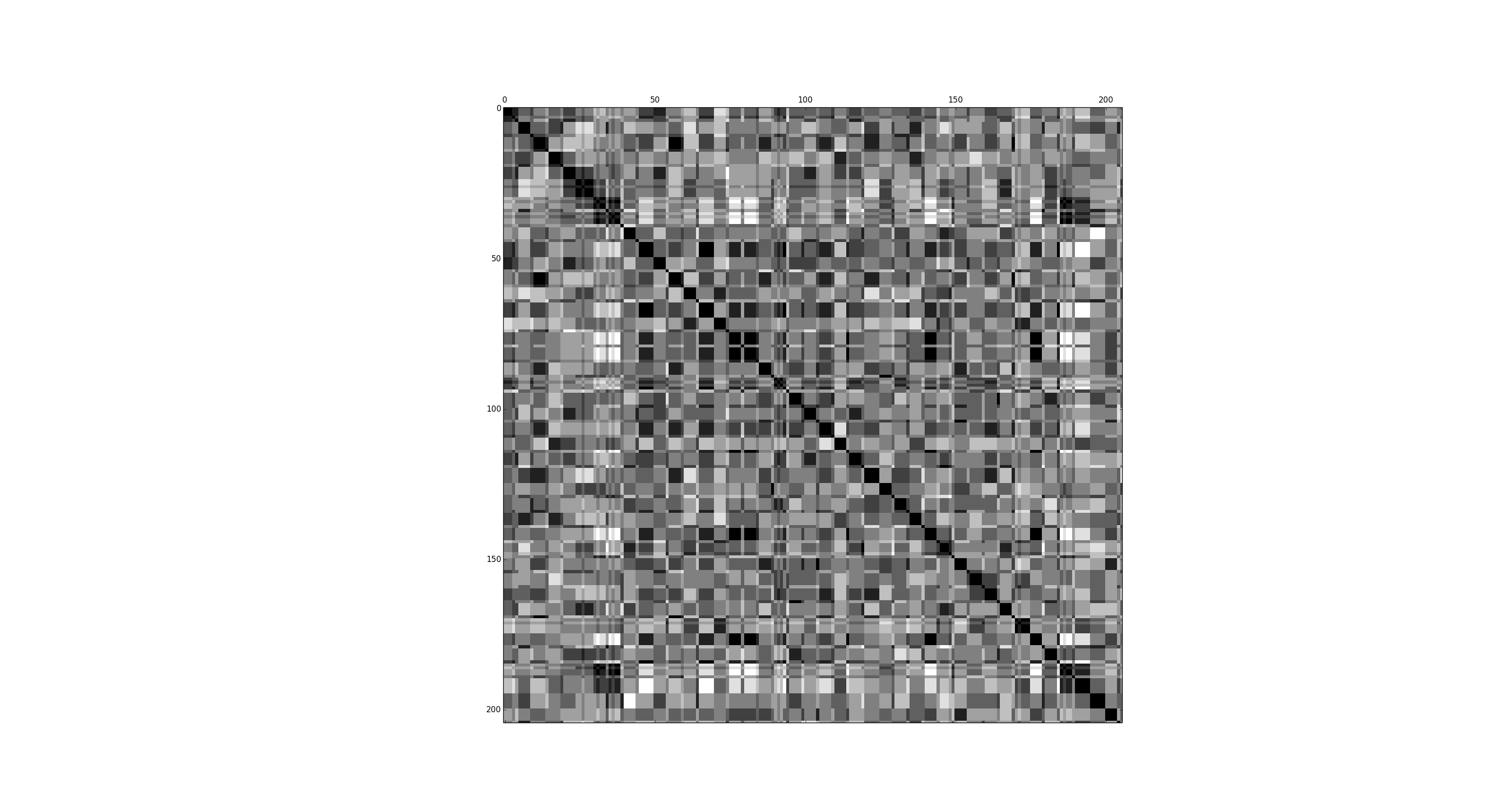 Here's my hash. It's okay: 
|
|
#
?
Oct 22, 2014 19:31
|
|


|
Where do people get "ideas" for data visualization projects? I don't have any pressing need to visualize something, but I still want to practice it. I've looked at a bunch of data sets like government stuff, agriculture, CPIs and poo poo, but nothing's speaking to me.
|
|
#
?
Dec 5, 2014 22:38
|
|


|
Pollyanna posted:Where do people get "ideas" for data visualization projects? I don't have any pressing need to visualize something, but I still want to practice it. I've looked at a bunch of data sets like government stuff, agriculture, CPIs and poo poo, but nothing's speaking to me. It helps to have a pressing need. First, ask a question. Then, build a visualization to try to answer it.
|
|
#
?
Dec 5, 2014 23:19
|
|

|
Pollyanna posted:Where do people get "ideas" for data visualization projects? I don't have any pressing need to visualize something, but I still want to practice it. I've looked at a bunch of data sets like government stuff, agriculture, CPIs and poo poo, but nothing's speaking to me. What "industry" are you in? There's countless opportunities for applying visualization in every single problem domain. If you want some inspiration about what's happening in academia, check out the IEEE Visualization Conference at ieeevis.org (particularly the VAST and InfoVis sub conferences, SciVis is a bit less application driven).
|
|
#
?
Dec 6, 2014 02:19
|
|
|
fritz posted:How so? It's been a while, but I think there are a couple of flipped signs in the manually unrolled and super optimized math section. Unless you're trying to run it from a 8 bit hellmicro, there's not much reason to do it like that instead of using functions.
|
|
#
?
Dec 6, 2014 03:49
|
|
|
Pollyanna posted:Where do people get "ideas" for data visualization projects? I don't have any pressing need to visualize something, but I still want to practice it. I've looked at a bunch of data sets like government stuff, agriculture, CPIs and poo poo, but nothing's speaking to me. I do that every day. I draw diagrams on graph paper, about 2D graphics rendering algorithms, VGA display mode timing information, register maps and memory layouts. It starts with a need, then some pen and pencil to figure out what I want to see, and then code. Sometimes.
|
|
#
?
Dec 6, 2014 04:03
|
|

|

|
| # ? May 4, 2024 02:09 |
|
|
There's a new book on Data Viz by Tamara Munzner, possibly the first comprehensive textbook covering every aspect. Harvard's CS department is using it and industry professionals are excited. http://www.amazon.com/Visualization-Analysis-Design-Peters-Series/dp/1466508914 Analytic Engine fucked around with this message at 00:46 on Jan 26, 2015 |
|
#
?
Jan 24, 2015 19:55
|
|