


|
Venus lander illustration, and original concept sketch. 
Prolonged Panorama fucked around with this message at 01:48 on Jul 1, 2016 |
 #
¿
Jul 1, 2016 01:15
#
¿
Jul 1, 2016 01:15
|
|


|

|
| # ¿ Apr 29, 2024 09:38 |
|
|
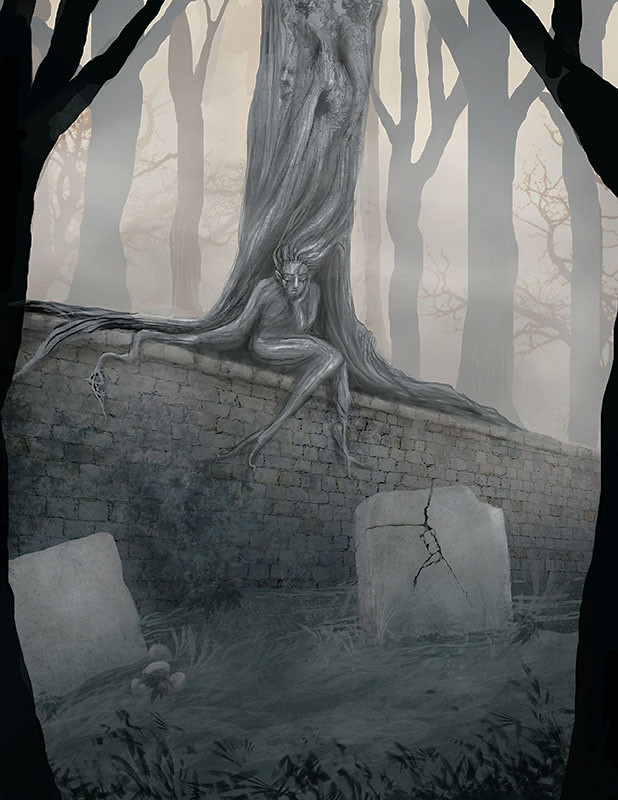
sigma 6 posted:Thanks. I added that last because the stones looked far too plain with nothing on them. Definitely need to work on the lettering. There's an awkward tangent between the crack on the top of the right hand tombstone and a joint in the brick wall behind it: it looks like the tombstone crack continues upward in to the background. The foreground trees are an ok framing device, but I feel they're a little too symmetrical and obvious in filling that role - either make them a little more prominent (currently they just barely serve their purpose, and figuring out what they are, because they're cut so close by the edge of the piece, is a slight distraction) or remove one or the other and box us in some other way. Personally I'd try making the left hand tree come further in to the frame (and make it more than just straight almost-black, give it some dimension) and play up the dark foreground brush. I'd also make the background trees not quite so regular and straight. Here's a quick and dirty paintover.  Overall I think it could end up pretty strong with some adjustments to refine the composition and mood! Prolonged Panorama fucked around with this message at 23:16 on Nov 19, 2016 |
|
#
¿
Nov 19, 2016 23:03
|
|
|
you could take your more-anti-aliased lines and duplicate their layer (possibly more than once), then mess with the opacities until it looks exactly like you want. I think the main issue is that you're working with one or two pixel wide brushes. There's not enough resolution in the "canvas" to capture what's happening at the "edge" of your brush. If you scale up the pixel dimensions of the project you could be working with larger brushes for the same final line weight, and the hardness falloff will be a lot easier to control.
|
|
#
¿
Feb 11, 2023 22:48
|
|