


|
Just started this one. It's neat! And now I'm sad that it's apparently dead.
|
 #
¿
May 24, 2015 07:17
#
¿
May 24, 2015 07:17
|
|


|

|
| # ¿ May 3, 2024 11:42 |
|
|
CelticPredator posted:May I just put one slight possible defense of that page? Well, maybe 2. That was the first page I actually drew when I started this thing about a year ago, so I'd like to maybe ink one in the middle and post it up here, because the other pages are not quite the same as that one. But then again, they could be worse! Most of the previous criticisms still apply. But yes, the color does improve things a bit by adding some mood and separating the elements apart from one another. I say go ahead and post a more recent page. I'm curious now. Edit: Your grass effect (the one for the lawn) isn't working for you. You may want to consider experimenting a bit with better ways to handle that. I sympathize though. Grass is a bitch to draw well. readingatwork fucked around with this message at 15:28 on Jan 26, 2016 |
|
#
¿
Jan 26, 2016 15:23
|
|

|
Space-Bird posted:I find the hair color thing really strange, in general. There's almost always a small set of people who immediately go 'but that's not a natural hair color!' ...which I really don't understand. Comic making has a lot to do with simplifying, stylizing and contextualizing things...and if you look at anyone's hair closely they always seem to have a lot of nuance in the hair color..and you can choose to expressively represent that nuance if you want. Anime tends to be more expressionist than impressionist, which leads some people to confuse an expressive art choice with "ANIME!!!aarrghaghahgskg!" To play devils advocate a bit there's a LOT of cargo cult artistry in the anime genre and weird hair color choice is often a part of that. Blue hair is fine if your character is a punk or you have a very expressive setting/style. However if you're trying to tell a grounded slice of life story about living with cancer it may be a better idea to stick with a more natural palette.
|
|
#
¿
Jun 8, 2016 20:14
|
|
|
a bloody icon posted:and also comics are pretend and your main character can have blue hair if you like it and think that it's cool. that's just as valid a reason as any I'm going to fight you on this one because it's an attitude a lot of artists have and it annoys the crap out of me. Yes, you can do whatever you want in art but you're far more likely to make successful aesthetic decisions if you think them through and try to make your small choices work with your larger ones. That's not to say there's no room for weirdness or experimentation, but it should be intentional. Just doing whatever is a recipe for weird tonal dissonance at best (think "moe girls in Auchwitz") or a boring muddled mess at worst.
|
|
#
¿
Jun 9, 2016 20:07
|
|
|
^^^ E: To further be a contrarian rear end I'd argue that most art is at it's core about communication in one way or another. Art carries messages, even if they aren't intentional or are as simple as "these oranges look really good in this lighting". You CAN just make art for yourself if that's what you want, but in most cases you'll want to pay at least some mind to how your work is perceived by others. This is why outside critique is so valuable since it teaches you which artistic decisions communicate well and which don't. That's not to say that only popular work has value or that you should always try to be liked (quite the opposite actually). I'm just saying that "make art only for yourself" may not always be the best advice. sweeperbravo posted:I think readingatwork is just throwing in a devil's advocate sort of point here and not trying to discourage DrSunshine from making his/her comic, which is kind of the tone I'm sensing here. I could be wrong on either point but, I dunno, I think it's a good thing to just get that other point of view now and then. That's what makes art cool. Yeah I should have specified that I was speaking broadly and not really singling out DrS. Sorry about that. readingatwork fucked around with this message at 17:57 on Jun 10, 2016 |
|
#
¿
Jun 10, 2016 17:12
|
|
|
Also don't forget the rule of thirds. There's a lot happening around the halfway points of the page and it's making the composition a bit static. You also might want to stretch her arms a bit so her hands breach the rightmost panel. It's a little thing but I think it would add a to her sense of forward momentum. I like you're figure work on the bottom left panel btw. Good perspective!
|
|
#
¿
Jun 18, 2016 17:30
|
|
|
I enjoy this. Please make an English version at some point.
|
|
#
¿
Jul 13, 2016 17:26
|
|
|
The Ayshkerbundy posted:what are some good ink pens for comics? Should I get nib or fountain or brush? I'm looking for a least one that could get nice thick lines (along with the obvious thinner ones for thinner lines). If you're on a budget regular old Sharpies work surprisingly well. The fat ones are great for filling in large black areas and the thin ones give you a nicely dark line at a thickness equal to a standard micron. That aside nib pens are awesome and get my vote. Just be aware that they come with a somewhat brutal learning curve.
|
|
#
¿
Sep 6, 2016 19:04
|
|
|
Freehand looks better when done right IMHO but digital is quicker and more flexible (plus It's easier to fix spelling goofs). If translation is definitely going to be a thing I'd definitely go digital. Haven't used GIMP though so I can't help you there. I imagine it would work fine.
|
|
#
¿
Sep 20, 2016 20:04
|
|
|
Mods please put this in the OP: https://www.youtube.com/watch?v=aOLzS2MmkzQ
|
|
#
¿
Dec 3, 2016 19:13
|
|
|
Squidster posted:I don't think we'll see another mega-platform again. Newsgrounds was obsolete in the 90s, much in the same way Keenspot, Keenspace, and the other platforms rapidly became. The market got bored, and newer competitors offered entirely different kinds of content. It wasn't a platform feature or instant messaging that killed them, it was competitors offering newer and more exciting brands of content. Personally I think there's a big market for some sort of Deviantart-style platform that focuses on webcomics. All you'd really need is DA's basic design along with the ability to add navigation buttons and some way to upload a buffer that will update on a set schedule. I know I'd probably sign up since I want to do a few short comics at some point but don't want to commit to the workload/maintenance required by a full-blown website.
|
|
#
¿
Dec 10, 2016 03:18
|
|
|
the floor is baklava posted:I'm desperately in need of guidance regarding copyright and trademark issues, as in, what are the steps I should follow to protect my intellectual property? I'm about to post some of my work online and try to sell some images but I haven't found much useful information to that effect.  Disclaimer: I am not a lawyer! Also I'm assuming you're in the US. Disclaimer: I am not a lawyer! Also I'm assuming you're in the US.If this is going to involve a lot of money I'd highly suggest you talk to a copyright lawyer before doing anything else. That said, my understanding is that your work (but not necessarily the "branding" around it. That's covered by trademarks) is automatically protected by copyright law. Once you make it you technically don't need to DO anything else. If you want to though you can file for a copyright with the US government (I'm assuming you're in the US btw) and pay a $45 or so fine per work to get additional protection in case you need to sue someone. From here you can release the rights to your work in whatever way you see fit. For example you can lease out the right to just use a work personally or for someone to use it in a business context. You can also limit the formats your work is used in (print vs electronic). The general best practice is to give out few rights as absolutely necessary. Since you're selling your work online this means that your checkout page will likely need some legalese added specifying that all works are copyrighted and that purchases are for non-commercial use only. You can probably find something useful already written online if you look around. You can also sell your work through a pre-existing company like DeviantArt or something if you want, which will have the benefit of them already having a checkout system with these protections in place. If you're planning to sell anything for commercial use (like an ad or logo) then you should seriously consider getting a written contract rather than having clients go through a website. You can find books of pre-made contracts online for general use. However, again, if you're dealing with something complicated or worth a lot of money it would be worth your time to hire a lawyer. Here's a really good book on the topic. You should probably grab a copy when you get the chance since it can provide much better info than I can: https://www.amazon.com/Graphic-Artists-Handbook-Pricing-Guidelines/dp/0932102166
|
|
#
¿
Jan 30, 2017 04:17
|
|
|
Cut and Paste seduces you with promises of glory, power and easy to create art but will ultimately betray and destroy you in the end. Beware, for some tools were not meant to be wielded by human hands.
|
|
#
¿
Apr 29, 2017 23:12
|
|
|
Das Boo posted:I got 24 pages of this poo poo and it seems like a lot to just image dump. Upload them to imagur and just leave the links. You could also save them all into a PDF and put that out on Google Drive or whatever. Or  them all. That's fine too. them all. That's fine too.
|
|
#
¿
May 2, 2017 20:57
|
|
|
Das Boo posted:The Imgur thing should work fine. I was curious about the most digestible format, so here's what I got so far. Love it and want more. Your art is generally pretty darn good and your characters are nicely expressive so it was easy for me to like everyone from early on. You've also set up an interesting scenario that I'm genuinely interested in seeing play out. Which is hard to do in so few pages so good work. As for nitpicks I'll echo Fangz comments on the gutter size. They're not a huge issue but I think making them a tad bigger in places would improve the readability of the work. The "two upanddown to the left of one tall" layouts are also technically a mistake, though I didn't notice them until Fangz pointed them out for what it's worth. The only other criticism I have is that the reveal that the pair are collaborators was a touch too subtle (or I could just be dumb). It took me a few pages more than it should have to figure out what was going on and I wonder if that could throw off other people as well. But that's kind of it. You should absolutely get a website and start posting this online.
|
|
#
¿
May 4, 2017 01:55
|
|
|
Das Boo posted:I finally got around to finishing out my chapter. Good poo poo. Congrats on finishing chapter 1!
|
|
#
¿
Jul 22, 2017 17:38
|
|
|
Nice!
|
|
#
¿
Nov 29, 2017 19:48
|
|
|
Schneider Heim posted:I would like to make comic scripts. Are there any references or online courses for that? I'm more of a prose writer who writes short stories and the occasional novella. Don�t know about comics specifically but I�m sure there�s a ton of material (a lot of it probably free) on writing screenplays for TV and film. I�m sure a lot of the same rules would apply.
|
|
#
¿
Dec 5, 2017 22:31
|
|
|
I�d read it.
|
|
#
¿
Dec 21, 2017 20:57
|
|
|
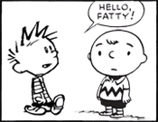
Donald J Trump posted:fat people are impossible to draw loving drat it Do more self portraits!
|
|
#
¿
Jan 10, 2018 22:30
|
|
|
Av does not shitpost. She makes art your puny mortal minds just can�t comprehend. 
|
|
#
¿
Apr 4, 2018 00:26
|
|
|
TheHan posted:So I was wondering if there were any comprehensive guides on coloring or even just some tips and tricks. For reference here�s an almost completed page of a thing I�m doing. Minor gripe: You have two wildly different color schemes happening on the same page. They don�t conflict with each other per se but they don�t feel like they�re working together either. In future pages consider bringing at least some colors from one scheme into the other to give more of a sense of unity (for example, having the sunset be pink or the plates be blue). If anyone has any video/book recommendations on choosing color palettes I�d also be interested btw. I�ve been struggling with this stuff lately myself. readingatwork fucked around with this message at 17:22 on Apr 5, 2018 |
|
#
¿
Apr 5, 2018 17:20
|
|

|
First off: Congrats on finishing and printing a comic! Most people don�t get that far so feel proud! Criticisms: You have a good seed for a story here but I feel like it�s not being explored as well as it could be. The biggest issue I noticed was that you simply aren�t using your pages and panels efficiently. Your comic has a grand total of 15 panels spread across 8 pages, 5 of them being splash pages. That�s a mere 1.9 panels per page and to be blunt not enough is going on in your panels to warrant spreading your material that thin. For example 2 and 3 could easily be combined into a single page as could 4, 5, and 6. This would free up 3 whole pages for you to play with that could add information and texture to enrich the world. Speaking of which, your central conflict could be tightened up a bit as well. We are told that the machine is oppressive but never shown why. Hell, the machine seems to know she�s the one defacing it and it�s response is to helpfully provide a safe public place for our protagonist to express themself. Not exactly terrifying considering that people get shot by police for tagging in real life. If you were to free up a few pages you could take the extra panels to show the conditions your character lives in as she walks through the city and make us sympathize a bit more with her cause. As a side note I liked the last 2 panels of your comic. The alternating color schemes and perspectives said a lot without you being super on the nose about it. I�d comment on the art itself more but I�m phone posting and running out of time so I�ll leave it there for now and post more tonight if I�m able. Overall though it�s fine.
|
|
#
¿
Apr 30, 2018 22:41
|
|
|
OK, art discussion time! There are definitely better people than me around here to get art advice from but it's the internet and I can so I'm going to put my two cents in anyways. Let's use page two as an example since it has a good mix of perspective, buildings, and people. The first thing I'm noticing is that your pages are kind of small on a high resolution monitor. In the future I'd consider making the images you upload at least 30% bigger even if the final printed work will be fairly small. Also navigating your site is kind of slow for some reason which is odd because it's only loading text and a couple pictures. Is anyone else having this issue? As for perspective, I feel like you're putting your vanishing points just a tad too close to each other. Consider pulling them apart a bit, particularly for zoomed out shots like in the first panel. Remember that as a general rule the closer your VPs are to each other the closer the camera feels to the objects in focus. Also take a look at this thing I did:  Green: Good! Yellow: Good enough. Orange: You tried to eyeball the perspective didn't you? Red: Keep an eye out for this kind of thing. The human eye subconsciously looks for little details like the corners of objects for visual cues so when they aren't right it takes the reader out of the image even if they don't quite know why. To quote RLM "You may not have noticed anything wrong but your brain did" Also I'm not really feeling your architecture here. You describe the city as a machine but it seems made entirely out of concrete (why not metal?) slabs that have had random chunks taken out of them. I'm also not really getting a feel for how this place functions. I normally wouldn't mind too much but the city is basically your main antagonist so I'm paying more attention to the details than I normally would. That said your tone/atmosphere is good and you have a nice sense of depth. You just need to work a bit more on the details. Finally we have your character designs which get the job done well enough but feel a bit rigid and cartoony to me. Little details like the necks feel unnatural and aren't working great as stylistic exaggerations. I'm also not getting a sense that these are three dimensional objects. Your legs on page five in particular feel like doodles to me that aren't describing a real form. Do more life drawing and keep practicing (shocking advice, I know). Fortunately these kinds of issues improve naturally as you draw people more. Hope that was useful! You have an interesting style developing so keep it up. readingatwork fucked around with this message at 05:44 on May 1, 2018 |
|
#
¿
May 1, 2018 05:38
|
|
|
RoryBlank posted:
I enjoyed this.
|
|
#
¿
Jun 29, 2018 01:29
|
|

|
Just use Comic Sans. I mean, �comic� is right in the title! (please don�t ban me)
|
|
#
¿
Feb 5, 2019 20:40
|
|
|
That�s a good question I�d like to know the answer to as well (it�s been a long rear end time since I thought about making a webcomic). I wouldn�t worry too much about loading times for images though since most modern internet connections can handle even fairly large sizes just fine. Perhaps a better question: Is there a way to upload a large image and have it display at a custom sizes based on different criteria (phone vs pc, window size, etc). It would be nice to be able to scale up the image size down the road as people�s screens get better without having to update hundreds of individual pages.
|
|
#
¿
Jun 13, 2019 17:49
|
|
|
Flying-Chip posted:Welp, I finally published the first chapter of my comic CONTACTO VIOLENTO on Tapas and Webtoon, here goes: I prefer normal comics pages to the current format but other than that I think you have a promising start here. Your character designs are fun and executed in a unique way which is more than most comics can say. My main advice would be to keep practicing the fundamentals and work what you learn into your work. Proportions in particular seem a tad off here and there and the result is that your more human characters look just a tiny bit too cartoony to me. Overall I like it though and you should definitely make more.
|
|
#
¿
Jul 1, 2019 22:21
|
|
|
Strangely enough Twitter seems to be the best way to actually talk to your audience/other creators these days. There are obvious downsides to that method though.
|
|
#
¿
Jul 7, 2019 23:07
|
|
|
Goon Project: Invite all the webcomics people here and offer to buy them accounts.
|
|
#
¿
Jul 10, 2019 19:41
|
|
|
Dang that�s a good comic! Nice work. Neon Noodle posted:Thanks a lot, that means a lot to me. I'm trying to figure out how to get this poo poo out of my system without falling down a bottomless pit. I did Cute poo poo for so long and I wish I could return to the innocence of that, but obviously that's not how life works. Do what I do and use cute art to explore the hosed up things that piss you off.
|
|
#
¿
Aug 21, 2019 21:09
|
|
|
Those are good comics Neon!
|
|
#
¿
Sep 8, 2019 04:35
|
|
|
TheHan posted:What�s the general consensus on breaking the Z format of panel reading order? Sometimes on pages I�ll lead try and lead the reader in more of a S shape, if there�s something on the far left side I don�t want them to see yet or if things come together naturally. That sounds like an insanely frustrating decision with no real benefit but I guess anything can work if it's done well enough? Do you have an example you can show us?
|
|
#
¿
Nov 25, 2019 15:40
|
|
|
Yeah don�t do that anymore. Sentence this of equivalent comic the basically It�s. It�s good that you�re trying new things but this REALLY isn�t working for you. That page you posted goes directly against how you�d normally read a page and there are no context clues either in the panel layout or in the panel contents themselves to clue you in to the correct order. You could have easily flipped the order and nothing would have been lost. As for switching the layout up to something like: 1_______2 ________3 ____4 5 That doesn�t work either. My eye wants to read the panels from the bottom up before reading them backwards like that. I�d just do something like this instead: 1_______2 3 ____4 ________5 The bottom line is that your toolset is somewhat limited in terms of raw panel layout. If you�re looking to spice things up maybe instead consider having bigger/smaller panels, more/less panels per page, have characters break the panel boarders, or have non-standard panel shapes instead. Hope that was helpful. readingatwork fucked around with this message at 19:18 on Nov 25, 2019 |
|
#
¿
Nov 25, 2019 19:16
|
|
|
Hi guys. Just FYI, this month's Artdome is about creating comic pages so I figured I'd see if anyone here was interested. For those not already aware the Artdome is a monthly art contest where people submit art based on a prompt. The winner gets to pick the next prompt and act as that round's judge. It's basically Thunderdome but for visual stuff and with no penalty for losing. Everyone gets good feedback and winner even gets a neat gang tag made by our own former champion Al!. It's a pretty fun way to get some practice in so if that sounds at all interesting to you please consider checking it out. E: Link to the current prompt: https://forums.somethingawful.com/showthread.php?noseen=1&threadid=3890426&pagenumber=14&perpage=40#post502640914
|
|
#
¿
Feb 24, 2020 04:29
|
|
|
DrSunshine posted:Interesting. I can definitely see where your inking adds a lot of weight and strength to the images, like with the slight bit of shadow under the eyeball dude's leg in panel 7 and 8. Overall, it's really a good sign of a talented inker where you add substantially to bringing the pictures to life, rather than just tracing over. I can see in the 'pencils' that the pictures would be a bit flat if the line consistency was maintained as it was originally. Great work! A couple thoughts. First, I love the line art. That city is fantastically designed and the detail is amazing. The coloring though isn�t working for me at all. It�s messily applied, which conflicts with the more precise line art, and feels �muddy�, as you said. A lot of this is caused by the colors you use for base colors and shadows. As a general rule if you are lighting an object with a warm light the shadow will be a cool color, usually a gray-blue of some kind(and the opposite goes for cool lighting). You should NOT be just using a darker version of the base color. Ever. Here�s an incredibly lovely example of what I�m talking about with a yellowish light source.  (I�m drawing with a mouse here cut me some slack!) Also, desaturate your brightest colors a bit. I�m seeing several colors here that are at 100% saturation and that�s generally a big no-no. Particularly regarding blue, which is an attention hog to begin with. If an element isn�t supposed to aggressively dominate a scene consider dragging that color bar a bit more towards gray. Finally, limit your color pallets a bit more. Your cityscape has colors from all over the color wheel. Try instead to find 2 or 3 major colors and a couple slight variations of each and then work with just that. As long as it�s clear what�s light/shadow or warm/cool you can get away with a LOT even if it�s not perfectly accurate to real life. Hope that�s helpful. Feel free to ignore me if somebody who actually knows what they�re talking about chimes in. E: And yes, practice like mad. That�s always the most useful thing.
|
|
#
¿
Jun 30, 2020 06:41
|
|


|
DrSunshine posted:Tried incorporating some of readingatwork's comments. I lightened the big panel, and went for slightly fewer saturated colors. Anyway, I am done fiddling with this page, I've been working on it for way too long!! Nice! Definitely an improvement!
|
|
#
¿
Jul 5, 2020 20:52
|
|

|
mrfart posted:Also, some of these bright colors will disappear when converted to CMYK, though, I don't know if anybody still cares about printing, but I have to. It's been a while since I've dealt with printing but I remember that being a huge issue as well. DrSunshine: You may want to do a test print of one of your comics to see if you'll hit any snags with color fidelity since I remember that blue is one of the colors that looks the most different when printed. On a screen it really pops because it's being made with light but on paper it looks way more dull. quote:Congratulations! It came out good. I love that I can tell exactly what's going on even though I can't read a single word of it. Well, except for "huh?". Apparently that word is universal. Do you have a Twitter/website/etc I can follow your art at? (The same goes for everybody in the thread btw I'd love to add people to my reading list)
|
|
#
¿
Jul 9, 2020 15:14
|
|

|
Johnny-on-the-Spot posted:Your "Bobs" are adorable, can I be one of your students?
|
|
#
¿
Jul 15, 2020 14:29
|
|
|

|
| # ¿ May 3, 2024 11:42 |
|
|
Finally started making a comic called John Doe about a guy stuck in a computer simulation. My goal is to get the first chapter done before the end of the year (approx 12 pages). Let's see how far we get! 
|
|
#
¿
Jul 26, 2020 09:02
|
|