

|
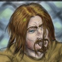
A combo of digital pics and sketchbook pencil sketches. Same rough principles, but I'm generally messier with the Digital. First, some random facial construction/flat shade characters. Borak is an rear end in a top hat. Do not seek his approval.  The tavern maiden here has a smile that doesn't reach the eyes. But she still tries to cheer folk up.  A private dick, and another attempt at foreshortening and dutch angles with character design.  Aaaand a floating priestess because... Why the hell not? 
|
 #
¿
Jul 23, 2015 13:06
#
¿
Jul 23, 2015 13:06
|
|

|

|
| # ¿ May 11, 2024 17:10 |
|
|
Delta Echo posted:I don't think the problem is so much the chickenscratch lines, but accepting the result. Sometimes I spend a lot of time drawing with a digital brush thickness of 1 pixel, with a lot of repeated strokes until the form develops in the overlap. I also use an eraser liberally, but with a reduced hardness so the sketch is removed gradually and without sharp edges. With digital, this is exactly my position. On a more finished image, I'd either clean up the lines or lower the opacity of the "chickenscratch" linework, then do it over on a new layer. Then, because I'm using Krita rn, which makes all layers above the background transparent by default (And the default for creating a new image is a BG layer and a transparent one), I can slap a new layer under it, and immediately start laying down some tone/colour/whatnots. Example: This is another WIP of mine from a while back, which will, once it and its brethren are done (There's no hurry), will be for a Magicka 2 LP. You can currently still see some "chickenscratch", but it's easily dealt with by the time of the final product, because I still have all my layers intact. The staff is a whole different problem. :P  EDIT: As far as accepting the result goes, with the Gumshoe I'm actually pretty happy, considering it was a twenty minute sketch. I'm getting better at proportions and perspective (The farthest hand excepted), I'm using my construction lines more effectively (And remembering to use them), and I can, at this point, rough out an idea and be happy with it in under half an hour. My light (again with the exception of the hand with a lighter in it) is getting more consistent (I groaned when I realised The Tavern Maid's arm is lit at the opposite angle to everything else.) Considering not a single one of these used a reference, just shape construction? Yeah, I'm improving, and I'm starting to show it. Entenzahn posted:I still hate ellipses. Yeah, clean ellipses pretty much require either a construction box using perspective or a lot of mumbling and grumbling while holding a putty eraser a little too tight ") . Right now, I'm using construction box methods for them, saves me time in the long run. This book had the best tutorial on using them I've seen so far, although I'm sure there's web tutorials on it too: Foundations in Comic Book Art: SCAD Creative Essentials . Right now, I'm using construction box methods for them, saves me time in the long run. This book had the best tutorial on using them I've seen so far, although I'm sure there's web tutorials on it too: Foundations in Comic Book Art: SCAD Creative Essentials
JamieTheD fucked around with this message at 00:18 on Jul 24, 2015 |
|
#
¿
Jul 24, 2015 00:06
|
|