

|
This month's theme is arthropods! Insects and crustaceans and arachnids and so forth Albrecht Durer  Qi Baishi  M.C. Escher  Vincent Van Gogh (this is one of my favorite paintings)  Leonardo da Vinchi  aaronjohngregory  traheripteryx  emesse92  Me, I did this one inspiration blogs gently caress yeah arthropods Bug of the day arthropod art Invertebrata arthropod tag on Pintrest
|
 #
?
Jan 2, 2016 05:53
#
?
Jan 2, 2016 05:53
|
|


|

|
| # ? May 2, 2024 22:26 |
|
|
 I wasn't feeling super creative so I ended up using a game book for some references.
|
|
#
?
Jan 2, 2016 09:04
|
|

|
A little sketch dump from last year... 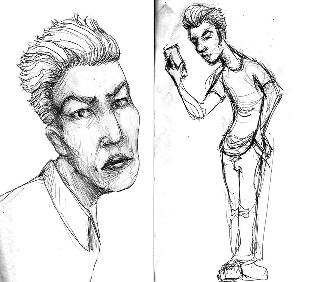  Also, a failed (?) graphic design experiment from many years ago I found on a zip drive recently. 
sigma 6 fucked around with this message at 12:28 on Jan 2, 2016 |
|
#
?
Jan 2, 2016 11:10
|
|


|
"If you want a picture of the future, imagine a I was too late for the last thread, but I'm still posting! 
|
|
#
?
Jan 2, 2016 13:05
|
|

|
I've challenged myself to draw a cat every day. Here are the first two. 
|
|
#
?
Jan 2, 2016 16:38
|
|


|
One day I will learn to draw. Until that time, here is a lobster with heavily simplified and fictionalized anatomy.
|
|
#
?
Jan 3, 2016 07:34
|
|
|
^^^^^^ I actually really like the simplicity of that lobster, it's a decent drawing! Today's cat- 
|
|
#
?
Jan 3, 2016 17:44
|
|
|
 Just some quick cartoon faces today.
|
|
#
?
Jan 4, 2016 04:23
|
|
|
Starting in on the next ten
|
|
#
?
Jan 4, 2016 06:09
|
|
|
A stillframe from an animation test and the very first page of my new 2016 sketchbook -neither of which has nothing to do with the thread's theme.  
|
|
#
?
Jan 4, 2016 09:08
|
|


|
"If you want a picture of the future, imagine a Just matching the kidney shape between the footprint and the fetus. Already admitted it was bad graphic design. ;-) 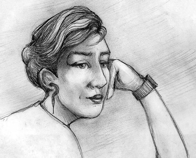
|
|
#
?
Jan 4, 2016 09:15
|
|
|
Bugs ink sketch 
|
|
#
?
Jan 4, 2016 18:15
|
|
|
Hey guess who used the same wikipedia image for a beetle study tonight!  That'll teach me.
|
|
#
?
Jan 5, 2016 01:01
|
|
|
Rondette posted:I actually really like the simplicity of that lobster, it's a decent drawing! Thank you. Your cats are far superior however, so please post more.   I'm not really sure what I was going for with the texture on this.
|
|
#
?
Jan 5, 2016 04:21
|
|
|
 Tried a ladybug and then more cartoon faces.
|
|
#
?
Jan 5, 2016 05:49
|
|
|
halfway there
|
|
#
?
Jan 5, 2016 10:16
|
|
|
Here are my cats from the previous two days- Today I came across some links of Napoleonic war veterans in their awesome uniforms which inspired me -  http://mashable.com/2014/10/27/napoleonic-wars-veterans/#CuEx0QWIEkqC If you want to have a look
|
|
#
?
Jan 5, 2016 17:07
|
|
|
A WIP paint, using a reference, of my face. The shirt needs work, as does the hair, but considering this is two hours in? I'm relatively happy!
|
|
#
?
Jan 5, 2016 21:32
|
|
|
Fanart AND on theme! I'm on a roll tonight. It's Muffet from undertale. 
|
|
#
?
Jan 6, 2016 01:16
|
|
|
 More sketches. Google imaged searched up some face s to practice on.
|
|
#
?
Jan 6, 2016 03:53
|
|
|
JamieTheD posted:A WIP paint, using a reference, of my face. The shirt needs work, as does the hair, but considering this is two hours in? I'm relatively happy! the study is fine (youve sure got a lot going on with that mustache) but whatever brush/settings you are using give it a really cheap/gross looking blendy airbrush effect, i feel like the texture would look much nicer if you used something that simulated a more authentic texture or just used a straight up hard round brush. That might be too subjective of a thing to suggest but that blendy gradient on the edge of the strokes just screams 'digital art circa 2002' to me also don't be afraid to push the color temperature, try using some purple in the shadows on the face to make it pop more
|
|
#
?
Jan 6, 2016 05:41
|
|

|
Rondette posted:Here are my cats from the previous two days- Don't stop!  
|
|
#
?
Jan 6, 2016 08:09
|
|
|
 
|
|
#
?
Jan 6, 2016 11:50
|
|
|
Today's offering, another Napoleonic cat.
|
|
#
?
Jan 6, 2016 16:35
|
|
|
Brought out the tablet for a little digital sketching. Man, I had no idea how much development has gone on in tutorials and education materials for digital artwork, not to mention brush designs and other tools. Youtube is full of the stuff. It's inspiring!  
|
|
#
?
Jan 6, 2016 19:09
|
|

|
Wowporn posted:the study is fine (youve sure got a lot going on with that mustache) but whatever brush/settings you are using give it a really cheap/gross looking blendy airbrush effect, i feel like the texture would look much nicer if you used something that simulated a more authentic texture or just used a straight up hard round brush. That might be too subjective of a thing to suggest but that blendy gradient on the edge of the strokes just screams 'digital art circa 2002' to me Okay, gonna have to jump on you for this one. I know you're trying to be helpful, and constructive. I appreciate that. But you suck at it. That's exactly the tonal shift I'm seeing in your advice (from "It's fine, I like that your mustache has a lot going on" to suddenly "But your poo poo looks gross and blendy."), and over half your advice isn't useful. For example, what I'm almost certain you mean to say is "Use a hard round with the pressure sensitivity turned off, make the gradients less gradienty" (Because guess what... The oil and watercolour brushes for Clip Studio are... DUN DUN DUUUUUN! Hard Round Brushes with colour lift settings and pressure sensitivity. And so, funnily enough, is a blend brush.) Similarly, "Simulated a more authentic texture". What, you mean like the artists shorthand hatched lines we've come to accept as signalling certain bits of the face? Or do you mean like the actual texture of my face, which is somewhat craggy? Both of those are, in their own senses, authentic, and both are, in the case of this image, useless. Because that's not what I'm going for. Also, "DIgital Art Circa 2002"? What the gently caress was wrong with 2002 specifically? Were the digital artists of the world suddenly and inexplicably hit with a poo poo-ray in 2002? It's not a useful phrase. The useful part is right at the end, and fails to take into account the word "WIP". It's very nice advice. But funnily enough, I do actually know about colour balance. Why do you think there is a (EDIT: Desaturated)blue aura surrounding a mostly (EDIT: Saturated) red/brown image? Because it helps the image pop. I will see if that is useful in this self-portrait when it's appropriate to do so. And, because I hate posting in this thread without a pic, here is a very quick doodle about expectations. Or maybe it's just a skull with the hint of lips smoking a cigar because gently caress it. Who knows? 
JamieTheD fucked around with this message at 20:14 on Jan 6, 2016 |
|
#
?
Jan 6, 2016 20:06
|
|
|
Mein Eyes! posted:Brought out the tablet for a little digital sketching. Man, I had no idea how much development has gone on in tutorials and education materials for digital artwork, not to mention brush designs and other tools. Youtube is full of the stuff. It's inspiring! I wish Youtube had as much useful stuff for traditional media. Both of these are good studies. I especially like the blue highlights on the black part of the boot. I've been trying to sketch every day in pen. And some digital studies, one of an old lady and one of your mom. 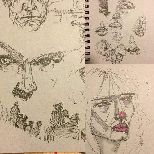 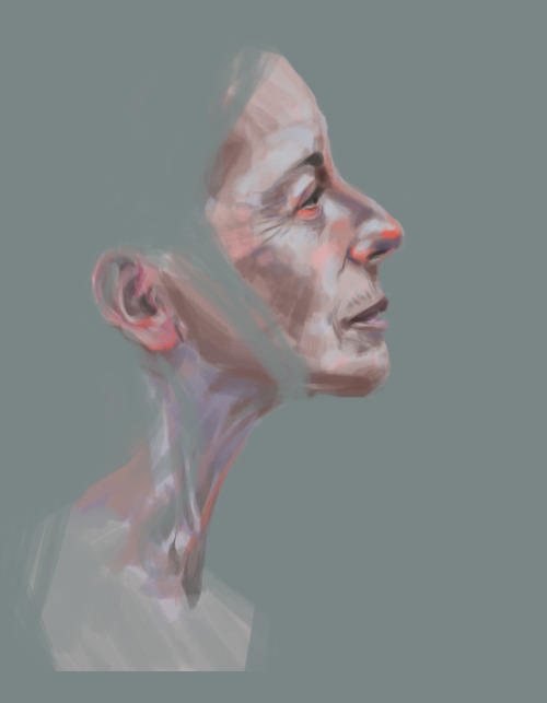 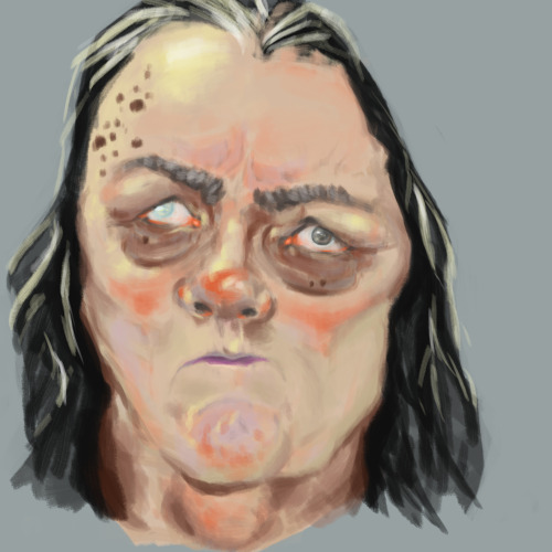
|
|
#
?
Jan 6, 2016 20:47
|
|

|
smallmouth posted:I wish Youtube had as much useful stuff for traditional media. Both of these are good studies. I especially like the blue highlights on the black part of the boot. I like Jeff Watts' channel. It's mostly plugs for his online school but his Friday Night Workshops show the whole process of gouache studies, inkings, illustrations, etc.
|
|
#
?
Jan 6, 2016 21:09
|
|
|
JamieTheD posted:Okay, gonna have to jump on you for this one. I know you're trying to be helpful, and constructive. I appreciate that. But you suck at it. That's exactly the tonal shift I'm seeing in your advice (from "It's fine, I like that your mustache has a lot going on" to suddenly "But your poo poo looks gross and blendy."), and over half your advice isn't useful. For example, what I'm almost certain you mean to say is "Use a hard round with the pressure sensitivity turned off, make the gradients less gradienty" (Because guess what... The oil and watercolour brushes for Clip Studio are... DUN DUN DUUUUUN! Hard Round Brushes with colour lift settings and pressure sensitivity. And so, funnily enough, is a blend brush.) Similarly, "Simulated a more authentic texture". What, you mean like the artists shorthand hatched lines we've come to accept as signalling certain bits of the face? Or do you mean like the actual texture of my face, which is somewhat craggy? Both of those are, in their own senses, authentic, and both are, in the case of this image, useless. Because that's not what I'm going for. Also, "DIgital Art Circa 2002"? What the gently caress was wrong with 2002 specifically? Were the digital artists of the world suddenly and inexplicably hit with a poo poo-ray in 2002? It's not a useful phrase. Settle down Bevis. The correct response when you get a critique you don't agree with is not to get defensive and just say "thanks" and ignoring it FYI. That said their critique isn't wrong, to be honest. I'm guessing what they mean by "simulating a more authentic texture" is that right now the entire piece has exactly one texture to it, which is "smudged". While I'm guessing it's a caricature I'm also supposing that you're not trying to make yourself look like a Simpson's character.  I didn't do much to develop any textures here due to time, but I played around with color balance and curves, as well as snuck in some purples and greens to break up the solid blocks of color, as well as darkened the background to create contrast.
|
|
#
?
Jan 6, 2016 22:59
|
|
|
Humboldt Squid posted:Settle down Bevis. I do apologise that I came off defensive there, but clarity is kind of important. For example, yes, it is smudgy at this point, and that's something I need to work on. Colour balance is a little more of a difficult thing to talk about, because on the one hand, the purple shadows for the glasses and the neck do indeed help make it more natural, as does shifting the reds more toward the lighter, slightly less saturated colours and adding something to make the glasses more clearly glasses, but not only did you demonstrate what you wanted to show (And thank you for that), you also mentioned why you did it. As opposed to "It looks like something from 2002 (EDIT: Seriously, why 2002 specifically? Is older stuff automatically bad?), and why didn't you use a hard-round (Which I was using 90% of the time, part of why I was so irritable about it.) Both versions have their ups and downs. On the one hand, my own WIP is a warmer piece overall (Perhaps because the original image is rather warm, and so looks less "natural" out of context. Also because Clip Studio's colour picker seems to be picking deeper toward the reds and saturated areas than I was expecting. Maybe I'm just getting the freckles and pores each time somehow?) On the other, the hair is a total mess, the farthest cheek needs tightening up, as do the eyebrows, the shadow in the nearest corner of the mouth doesn't actually make as much sense as it should, the glasses need *some* colour to them (They're actually a very dark green, so I have to lighten them somewhat... And add the brass connector), and the lenses... Well, that's a tough one, because...  ...As you can see, there's not a whole lot of reflection going on there (Some on the farthest lens, but that's about it.) As you can also possibly see, the expression is not technically faithful. But it is definitely very me, so I kept it. So yes, my irritability was more with the tone of the advice and lack of clarity, because if I were actually someone new to art, or someone who didn't have at least a rough idea of what was being said? The advice would have been useless for the most part. Notice how you're using only a little purple, mostly pink, for the deeper shadows, with what looks like (Slightly colourblind, so forgive me if I misidentify) a kind of teal using a simulated bristle brush to break up the cheek and the chin.) Now compare that to "Some purple for the shadows." Anyways, thank you, Humboldt, for that quick demonstration, it's useful to me for creating a more natural seeming image, and even though I need to practice the whole "Breaking poo poo up with strokes that don't seem natural at first, but add texture" thing, know that it's a trick I do want to learn. JamieTheD fucked around with this message at 23:51 on Jan 6, 2016 |
|
#
?
Jan 6, 2016 23:25
|
|
|
JamieTheD posted:Okay, gonna have to jump on you for this one. I know you're trying to be helpful, and constructive. I appreciate that. But you suck at it. That's exactly the tonal shift I'm seeing in your advice (from "It's fine, I like that your mustache has a lot going on" to suddenly "But your poo poo looks gross and blendy."), and over half your advice isn't useful. For example, what I'm almost certain you mean to say is "Use a hard round with the pressure sensitivity turned off, make the gradients less gradienty" (Because guess what... The oil and watercolour brushes for Clip Studio are... DUN DUN DUUUUUN! Hard Round Brushes with colour lift settings and pressure sensitivity. And so, funnily enough, is a blend brush.) Similarly, "Simulated a more authentic texture". What, you mean like the artists shorthand hatched lines we've come to accept as signalling certain bits of the face? Or do you mean like the actual texture of my face, which is somewhat craggy? Both of those are, in their own senses, authentic, and both are, in the case of this image, useless. Because that's not what I'm going for. Also, "DIgital Art Circa 2002"? What the gently caress was wrong with 2002 specifically? Were the digital artists of the world suddenly and inexplicably hit with a poo poo-ray in 2002? It's not a useful phrase. Woah there fella, not trying to start a brawl.I said the drawing was fine and that I didn't like specifically the brush/texture, as in the properties of the brush you were using makes your strokes look bad even thought they aren't bad strokes. Yeah when I said hard round I meant without any opacity change applied to pressure sensitivity, I should have specified having pressure adjust brush size is a better way to go, especially in places like the hair where the brushe's uniform width is gimping your ability to make the ends of the hair look natural. 'Authentic texture' meaning looks like a texture from an actual real life tool like a paintbrush or conte crayon or graphite rather than a gradient created by a computer program. And yeah everything humboldt squid said was right, having the range of color in the face be yellow to red seemed limiting, you could follow what he was doing but use less desaturated purple and more pink or magenta so it has more depth without cooling it down too much
|
|
#
?
Jan 7, 2016 02:29
|
|
|

|
|
#
?
Jan 7, 2016 04:34
|
|
|
 Took about an hour for this kinda sparse page.
|
|
#
?
Jan 7, 2016 05:23
|
|
|
CAAATTTTSSSS INNNN SPAAAAAAACCCCCCCE!!!!!
|
|
#
?
Jan 7, 2016 20:08
|
|
|
Gesture practices. 30 second, 60 second  60second, 2 minute  5 minute 
|
|
#
?
Jan 8, 2016 05:36
|
|
|

|
|
#
?
Jan 8, 2016 07:53
|
|
|
Love the bone ") We went to Liverpool today, so my cat(s) today are a Beatles themed one. 
|
|
#
?
Jan 8, 2016 22:51
|
|
|
Bugs and cats all in one. ha!
|
|
#
?
Jan 8, 2016 23:26
|
|
|
Humboldt I love your little bug and bone balls up there.  Cross-posting from the Star Citizen thread. I messed this one up when I drew the head, blew it up to fit a better canvas, and then lost resolution. Didn't notice until it was done and I really didn't feel like fixing it.
|
|
#
?
Jan 9, 2016 05:56
|
|


|

|
| # ? May 2, 2024 22:26 |
|
|
Tried Iterative Drawing. 20 heads with the same angle  after that I realized I didn't know ears very well so I did 30 ears  Then 20 more heads with the ear practice. 
|
|
#
?
Jan 9, 2016 08:18
|
|