|
Admiral H. Curtiss posted:Slick looking maybe, but it somehow manages to be the only game (at least that I can think of) that doesn't show all your moves at once, which is just inconvenient. I was going to mention this as well- Uranium managed to gently caress up one of the most timeless elements of the Pok�mon franchise: the user interface. Pok�mon , for all its faults, had the interface down perfectly from the word "go." Not only was it able to convey a large amount of information on screen at one time using simple but effective design elements, but it was able to do so without looking overly-cluttered or having to completely cram everything together or spacing information out through multiple screens. Like compare these:    To this:  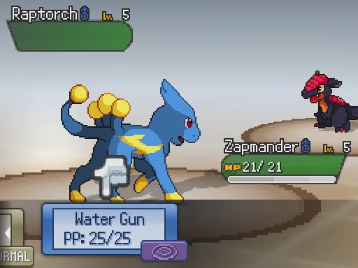 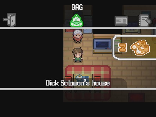 Notice anything? For one, the actual battle screen is a confusing mess. I think I see what they were trying to go for: a single-screen version of the DS generations, where big colorful buttons exist on the bottom screen to be ogled and pressed , and the actual battle screen plays out on the top. Problem is, not a single Pok�mon game has forced you to scroll through your attacks to be able to even see all of your choices. Then again, the game technically does this with the dumb as gently caress "affinity quiz" at the beginning, which prevents you from seeing the starter you chose until you actually chose it. Even Tie's LP pointed out how loving awful of a feature this is. These is no world where this design element makes sense. Then comes the HP and XP bars. Why the are they so big? Why does the XP bar look like the HP bars of previous games? It hurts to even stare at for a short amount of time, and takes up an unnecessary amount of space. poo poo, look at the pause interface in the overworld- look at how well laid out it is in the actual games. Everything is neatly packed into an easy to understand corner (since it's a loving kids game), and has a neat little description that explains what each button does (since it's a loving kids game). Like, I get that this is
|
|
|
|
|
| # ¿ May 5, 2024 11:28 |
|
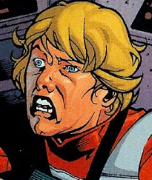
Oh hey! It's that time again! Imagine that you've never even seen Pokemon Uranium, and you're asked to identity who the player character is in this picture: 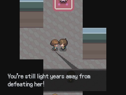 ignore the tail of the dialogue bubble Now, had you seen nothing about this game save for this photo, could you reliably identify the player character? No, probably not. Why? Take a look at every other main character of the Pokemon series. Notice anything?  They're all wearing loving hats. Not only that, but they also wear clothing that is both unique and much more detailed in comparison to their average opponents. The player character, whether they choose boy or girl, is immediately identifiable from the ugly, frothing masses of trainers and losers thanks to their bright colors and hat. This include Red's signature hat, Brendan's white knit cap (that people thought was hair for the longest time) and so on. So let's compare Dick Solomon (gently caress that sounds like a goddamn Clive Cussler character) to his canon counterparts. 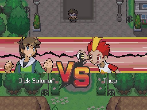 Okay, no hat, and that loving highlighter green (it's uranium, get it!  ) shirt won't be doing him any favors. What about the full body sprite? ) shirt won't be doing him any favors. What about the full body sprite?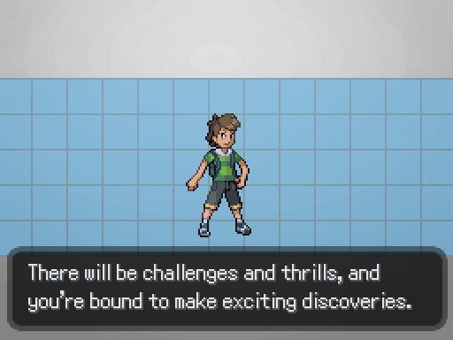 Not much better, honestly. The shirt still doesn't really help, especially when you're comparing sprites while walking around throughout the region. His hair looks too similar to that of the Ace Trainers of previous games, and the rest of his clothes lack the kick you see with other player characters. Like I'm pretty sure Red's jeans make him distinct from like 90% of the original games alone. The funny thing is, Theo's bright and spiky hair is actually a pretty good indicator of an important character in the Pokemon games. At the very least, it sets his personality (as annoying as it may be) even before you hear him open his mouth. It also makes it easy to identify him on-screen, something I struggle with when looking at Dick Solomon. Like, if they wanted to forgo the hat, they should have made the player character's hair more identiable than just a dull brown carpet.  gently caress
|
|
|
|
Straight White Shark posted:Holy poo poo, I think this might be the laziest goddamn pokemon design of all time. So it's a regular ant, whose name is just a very tangentially related common noun, not any sort of pun or portmanteau or wordplay. 
|
|
|
|
Tunicate posted:Wait, wait Barewl looks like the result of a mad scientist attempting to splice a Bidoof with a Seedot, held together by shoddy cybernetics and the blood of unpaid interns.
|
|
|
|
Ramos posted:He also activated a ~mysterious~ machine. Well, from the words "Stasis Tank", and knowing how 'edgy' this game tries to be, the pod contains what's left of your mom while your dad fucks with radiation to try and bring her back. Or a legendary Pokemon, that works too.
|
|
|
|

|
| # ¿ May 5, 2024 11:28 |
|
 edit: Goddamn the rival sprite aging 10+ years in under a minute still wonks me out. PBJ fucked around with this message at 09:58 on Aug 26, 2017 |
|
|


