

|
This thread is for map infographic whether they're good, bad or just stupid share any you find interesting. I'll start with China is totally hosed This site lets you pick countries and move them around and it adjusts the mercator projection as you do it http://thetruesize.com/  http://flood.firetree.net/?ll=34.5206,97.6687&zoom=5  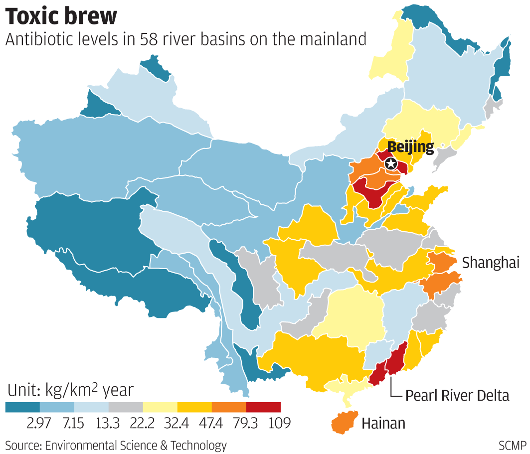  This is the currently air quality around the world  Night lights can be used to estimate pollution 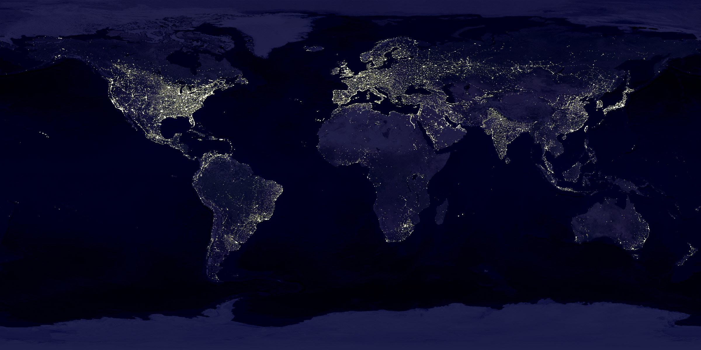  Here are some bad maps  
|
 #
¿
Mar 27, 2017 18:37
#
¿
Mar 27, 2017 18:37
|
|


|

|
| # ¿ May 2, 2024 15:57 |
|
|
its got proper reporting unlike the rest of central/south america would be my guess. Its also a bigger economy so more factories etc Pornhub does good maps   
Jose has issued a correction as of 14:19 on Mar 28, 2017 |
|
#
¿
Mar 28, 2017 14:16
|
|
|
that seems fairly low for a central american country or am i missing something
|
|
#
¿
Apr 12, 2017 08:49
|
|