


|
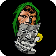
Kalli posted:Huh, that's cool. The local high school uses a clip art tiger. Literally the tiger from Microsoft's clip art book from the 90's. I really want to design a custom logo for them. 
|
 #
?
Nov 22, 2022 02:31
#
?
Nov 22, 2022 02:31
|
|


|

|
| # ? May 8, 2024 23:58 |
|
|
The uniform designs I did are being featured on Uniwatch. https://uni-watch.com/2022/11/26/more-nfl-defunct-franchises-resurrected-part-the-first/ https://uni-watch.com/2022/11/26/more-nfl-defunct-franchises-resurrected-part-the-second/ There's twenty-six teams and twenty seven designs (Dayton has a modern and retro uni)
|
|
#
?
Nov 26, 2022 17:21
|
|
|
just compiling these four from the past few weeks in one spot, pay me no mind   
|
|
#
?
Feb 14, 2023 01:55
|
|

|
Toaster Beef posted:just compiling these four from the past few weeks in one spot, pay me no mind 
|
|
#
?
Feb 14, 2023 02:05
|
|


|

|
|
#
?
Feb 14, 2023 02:09
|
|


|
I love your work toaster beef ty
|
|
#
?
Feb 14, 2023 17:16
|
|
|
Toaster Beef posted:just compiling these four from the past few weeks in one spot, pay me no mind I'm still blown away how you're able to nail this kind of joke using only stick figures.
|
|
#
?
Feb 14, 2023 17:26
|
|
|
I'm thinking of updating some of the teams that played in the AAFC. For those that don't remember it was a rival league that played for four years before merging with the NFL. That's where the Browns and 49ers started. The Los Angeles Dons were one of the teams that didn't successfully make the jump to the NFL. Like the Brown's Brownie, the Don's featured a cartoon character in much of their advertising,  There was other, less absurd advertising.   And the full wordmark was featured on one of the programs.  I focused in on the hat and also drew someone to wear the hat. Essentially a Hispanic counterpart to the Raiders and Buccs logo. Testing it out on the helmet the hat seemed to work better than the full logo.  The Dons had a very bright blue uniform with bright red pants and I wanted to use those colors but also do more than copy it.  This is what I came up with.  The hat is meant to have a subtle "D" shape in the brim, although the D used in the actual wordmark is much different. Having the uniform number on the other side is something I hadn't done before and thought it might look nice. I thought about having the Helmet stripe go down the pants but realized that would be a pain to sew in real life. I'm planning on working thru the other defunct teams of the AAFC, specifically the Miami Seahawks, the Chicago Rockets / Hornets, the New York Yankees, the Brooklyn Dodgers (yup, those were football teams) and maybe the Buffalo Bison/Bills and the original Baltimore Colts. What do you think?
|
|
#
?
Feb 19, 2023 21:46
|
|
|
That�s awesome
|
|
#
?
Feb 19, 2023 22:05
|
|
|
I'm working on the Miami Seahawks next. If you look for their logo this is what comes up.  Pretty crappy. Their colors were orange and green which is a headache inducing mix. I did find this, a copy of a program with a better detailed version of their logo.  I drew out a version of the logo in Flexisign, which is like Corel or Illustrator.  And played around with colors.  This is after playing with it a bit more. The logo on the left is meant to be the basis for a helmet logo. It still needs work.  I'm trying to figure out how to use orange and green and not have it look like a parrot. I could use some opinions. Darth Brooks fucked around with this message at 06:40 on Feb 25, 2023 |
|
#
?
Feb 25, 2023 06:37
|
|
|
I can't offer any opinions because I have the art instincts of a two year old. However since you offered options of what team to do next (once you're finished with this one), I was thinking maybe you'd give the original Baltimore Colts a shot. I really enjoy your work.
|
|
#
?
Feb 25, 2023 06:55
|
|
|
The Colts are on the list. For a few teams it's going to be weird. The OG Colts wore green instead of blue but the revision borrowed logos from the earlier version. The Buffalo Bison became the Buffalo Bills a decade before the Buffalo Bills of the AFL. The Brooklyn Dodgers of the AAFC borrowed from the earlier Brooklyn Dodgers of the NFL. There was a New York Yankees and of course the Browns and 49ers kept playing.
|
|
#
?
Feb 25, 2023 07:41
|
|
|
Darth Brooks posted:I'm trying to figure out how to use orange and green and not have it look like a parrot. I could use some opinions. Have the Miami Hurricanes ever done anything like a logo with Sebastian the Ibis? Their colors are also orange and green, and I think go back to when the team started in the 20s, so maybe that�s where the AAFC Seahawks got some inspiration.
|
|
#
?
Feb 25, 2023 13:18
|
|
|
I don't know college logos all that well.Nit Wit Dog poo poo posted:I can't offer any opinions because I have the art instincts of a two year old. Any opinion is fine, from "I don't like any of these" to "That one there is OK/better than the rest." It's all something. Anyways here are the Yankees. The football logo is from 1946, which is the same year the baseball and top hat Yankees logo came out. 
|
|
#
?
Feb 28, 2023 19:32
|
|
|
Pinstripes actually work surprisingly well on a football uniform
|
|
#
?
Feb 28, 2023 20:16
|
|
|
Darth Brooks posted:Any opinion is fine, from "I don't like any of these" to "That one there is OK/better than the rest." It's all something. Anyways here are the Yankees. I'm an art dumb dumb who just likes to smile and clap looking at the pretty pictures you make, but the one opinion I will voice is for me the tongue matching the throat color makes it look like it is supposed to be showing transparency. It reminds me of this diagram showing how a woodpecker's tongue wraps around its skull.  Not sure if I would have made the connection without the zoomed inset at the end of them all, though. My favorite is the brown and white in the bottom right, which is sad because it isn't in the team colors, but you're right about orange and green being tough to see as anything but a parrot. Also agree with Febreeze about the pinstripes.
|
|
#
?
Feb 28, 2023 23:08
|
|
|
Darth Brooks posted:Any opinion is fine, from "I don't like any of these" to "That one there is OK/better than the rest." It's all something. Anyways here are the Yankees. Nice and simple - the blue and white is very comparable to the PSU uniform. I like it. Blowjob Overtime posted:I'm an art dumb dumb who just likes to smile and clap looking at the pretty pictures you make... Haha! This is me 100%.
|
|
#
?
Mar 1, 2023 03:49
|
|
|
seahawks: not sure i would stay married to the turning of all that shading from the original 'detailed' logo into 3 distinct and fully separate colors like that. i can see the 3 technical shades in the original and how that carries over, but it doesn't necessarily feel like a direct translation that is a good idea to split very different colors between. that said i don't understand art things like you do at all so it might be the best or only thing to do. and i sure don't have any better idea. maybe a green bird with the muted orange color for detail flourishes/accents and then the regular orange could be strictly for the beak + football. or keep plugging away til it looks right. dunno
Cavauro fucked around with this message at 17:07 on Mar 1, 2023 |
|
#
?
Mar 1, 2023 17:05
|
|
|
I'm still playing with it. I might try an orange based color palette. Rick Ruben was talking about producing music and how to shake it up and break out of a block. Play it faster, play it slower. Add elements, take away elements, rearrange parts. You try different things and then suddenly something hits. The design seems close to that point.
|
|
#
?
Mar 1, 2023 21:08
|
|
|
Debating between a couple different approaches on the Seahawks. An evil chicken or a bronze gold bird. I like the basic layout of the helmet logo. The edges and size of the "tail" seem to work out better than anything else I've tried and it's got a subtle "M" with the edges. I don't think either of these is the finished version. I found an online collection of very old football programs. http://hapmoran.org/Programs.html It goes from 1921 to 1946 and there are some hidden gems in there,  I went thru it looking for the first version of this, the "official" logo of the Providence Steam Roller.  With all the searching I've done I still have no idea where it came from. It seems to be a copy of something. I didn't see the original in the programs. I did find this in a 1928 program;  I think it's a better layout than the drawing I did, so I will probably do something based on it.
|
|
#
?
Mar 2, 2023 06:48
|
|
|
I like the ones on the left. It does give it a sort of parrot feel, but it still looks interesting.
|
|
#
?
Mar 2, 2023 15:39
|
|
|
 I might change the eyebrow up a bit and make a definite pattern for the top but this might be it.
|
|
#
?
Mar 3, 2023 08:17
|
|
|
 I went back and forth on the colors and was ready to go with a green seahawk when I looked at the unis for the Dolphins and The U. Miami has enough orange and (shade of) green unis, although the irony is that the Seahawks were probably first. For the sleeves I drew a little inspiration from this guy. 
|
|
#
?
Mar 8, 2023 07:26
|
|
|
Those look rad as hell
|
|
#
?
Mar 8, 2023 18:30
|
|
|
I had to try one with orange and green. I went with Cavauro's idea of cutting out the detail. I'm done with this one now.
|
|
#
?
Mar 9, 2023 21:26
|
|
|
Darth Brooks posted:I had to try one with orange and green. I went with Cavauro's idea of cutting out the detail. It's like a bloody mary in uniform form. I like it.
|
|
#
?
Mar 10, 2023 06:19
|
|
|
i can't tell what's better but i like the last two. think the first one wins
|
|
#
?
Mar 10, 2023 06:30
|
|
|
Nit Wit Dog poo poo posted:It's like a bloody mary in uniform form. I like it. XFL needs to fully lean into this after The Rock paid himself to be the official tequila sponsor. The league's first expansion team, the Miami Bloody Marys, vs the new and improved DC Beer Snakes. I'm at the front of the ticket line with one of each in my hands (and probably kicked out in the first quarter, but so it goes).
|
|
#
?
Mar 10, 2023 06:37
|
|
|
Cavauro posted:i can't tell what's better but i like the last two. think the first one wins I really can't tell either. The originals were laid out like this:  Which makes for some eye bleeding combinations on the road jerseys. I like the helmet on the second one. It looks like a piece of candy masquerading as a football helmet. I know I've been the road jersey color for the home pants but I don't like the orange pants and may make them white with a different stripe like the first one (and like the originals). I love the detailed drawing of the osprey but it doesn't work with variations of a single color. EDIT: Like this  Next up is the Chicago Rockets. Their logo looked like this:  The AAFC seemed to have a thing for cartoony logos. This is the logo I've come up with:  Darth Brooks fucked around with this message at 08:09 on Mar 10, 2023 |
|
#
?
Mar 10, 2023 07:43
|
|
|
I actually love the orange-red and radioactive green color scheme in the abstract. But something about it screams TACO BELL to me and ruins the effect. The poor guys look like human Fire sauce packets paired up with a refreshing Baja Blast. This is not your fault at all, my stupid brain just can't unsee it. The two tone bird looks better than the three tone I think. Especially the full body bird (vs just the head), it looks incredible. I just can't get over the colors Docjowles fucked around with this message at 08:50 on Mar 10, 2023 |
|
#
?
Mar 10, 2023 08:40
|
|
|
Docjowles posted:... I'm at the front of the ticket line with one of each in my hands (and probably kicked out in the first quarter, but so it goes). This is a statement comes from someone who I obviously need to hang out with at a football game. Or a wiffle ball competition. Either one works. 
|
|
#
?
Mar 10, 2023 08:45
|
|
|
Nit Wit Dog poo poo posted:This is a statement comes from someone who I obviously need to hang out with at a football game. Or a wiffle ball competition. Either one works. If you ever find yourself in northern colorado, beers on me my friend
|
|
#
?
Mar 10, 2023 08:53
|
|
|
Darth Brooks posted:
I don't know why I didn't notice it until this post, but I really like the widening horizontal lines across the top of the chest with the logo on one side.
|
|
#
?
Mar 10, 2023 15:12
|
|
|
Docjowles posted:If you ever find yourself in northern colorado, beers on me my friend A man with a plan. Excellent.
|
|
#
?
Mar 11, 2023 06:21
|
|
|
 This did not take as long. I didn't use any of the historic imagery. The colors were red and white and I added black and NASA blue.
|
|
#
?
Mar 12, 2023 05:26
|
|
|
Those helmets are great
|
|
#
?
Mar 12, 2023 05:37
|
|
|
I told myself I was done farting with this one. I might be done this time. Changed the orange and some details on the bird and main logo. Only thing that bugs me is the wordmark might be hard to read.
|
|
#
?
Mar 14, 2023 06:04
|
|
|
Darth Brooks posted:I told myself I was done farting with this one. I might be done this time. Changed the orange and some details on the bird and main logo. Looks good. I usually use readers to read online, but I'm not wearing them tonight and I can read the wordmark.
|
|
#
?
Mar 15, 2023 05:16
|
|
|
Wanna feel old? It's been a hair over 10 years since Febreeze and the Farthouse made it to ESPN. https://www.youtube.com/watch?v=Vh_NiZ7l6dM&t=112s Relive the fun!: https://forums.somethingawful.com/showthread.php?threadid=3499370&userid=0&perpage=40&pagenumber=110#post412949682 Jesus Christ where does the time go
|
|
#
?
Mar 22, 2023 02:49
|
|
|

|
| # ? May 8, 2024 23:58 |
|
|
I've been doing this poo poo for a full decade gently caress me
|
|
#
?
Mar 22, 2023 06:15
|
|