


|
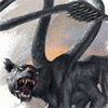
syntaxrigger posted:Digging Ganesha watercolor! Looks really good. The skin choice weirds me out a bit, I thought Ganesha had blue skin? I dunno. Looks like human skin heh. Varies. Can be blue, but normally has pinkish/whitish skin. Vishnu and Krishna (an incarnation of Vishnu) are the famously blue gods.
|
 #
?
Dec 12, 2019 16:58
#
?
Dec 12, 2019 16:58
|
|


|

|
| # ? May 11, 2024 05:55 |
|
|
Angrymog posted:Varies. Can be blue, but normally has pinkish/whitish skin. Vishnu and Krishna (an incarnation of Vishnu) are the famously blue gods. Ok interesting. Good to know. I asked an Indian co-worker if there was more than one elephant god in the Hindu pantheon and she said no then said "Wow, who drew that?". So I had to explain the forums and art dome. She liked it tho.
|
|
#
?
Dec 12, 2019 17:01
|
|


|
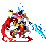
Hellbeard posted:Probably mess with it some more later: A few thoughts~ I think the composition would have been helped here with a bit more contrast control to add gravity to your focal areas (the characters). Specifically, I think your background is fighting a little bit with your characters for attention. There are three compositional tools that come to mind here; value, density, and color. Your major palette is pretty limited (green, violet, cool gray) and is largely shared across both your characters and the environment, so we can't expect to lean on it too much for creating clarity. Working with a constrained or even monochromatic palette is totally possible, but it means that the other elements have to pick up the slack, and they are also a bit muddled. We have similar density of detail and similar middling value ranges across almost the entire canvas. As a tool for evaluating composition I often will pull out to a thumbnail view and look at my work in grayscale, and if doing this causes large swathes of the image to run together and become unclear, then I know there's Problems. When I view your piece in this way, the skeleton's spear arm is almost totally lost and much of the interior detail from the sternum down is a little hard to pick out. Almost the whole goblin character lacks for anything to draw the eye. I took the liberty of spending like a minute with a soft brush to push some background away and slightly lighten some foreground elements, just to demonstrate the difference in readability. This is creating not only value contrast, but it quieted down some of the busier background detail in order to let the characters come forward. 
|
|
#
?
Dec 12, 2019 18:39
|
|

|
Here is my Thursday watercolor, I do these while the boys are at swimmingclass and there is no work I can do offline on my laptop.
|
|
#
?
Dec 12, 2019 20:49
|
|
|
Keetron posted:Free to a good home: Drawing on the Right side of the brain. I'd be pretty interested in checking out the book (if its still available), but I'm not really a beginner. Also, I kinda doubt I'd make time for it in my schedule. Has anyone done a thread about it where you could follow along with it?
|
|
#
?
Dec 12, 2019 23:25
|
|

|
|
|
#
?
Dec 12, 2019 23:29
|
|

|
 Hey cheers for making this educational effortpost that put into words and pictures all the stuff I couldn't quite put my finger on.
|
|
#
?
Dec 13, 2019 01:46
|
|

|
I am become death destroyer of deer. Look upon my works and despair!! So I ruined this deer which feels bad but I do feel I have a bit better of an idea about how to use these marks I tried to use for the fur. 
|
|
#
?
Dec 13, 2019 03:23
|
|
|
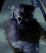
Working on mah artdome before the deadline! Not done done but the functional idea is set Why can�t I find a legit good gold ink?????
|
|
#
?
Dec 13, 2019 03:31
|
|

|
dupersaurus posted:Why can�t I find a legit good gold ink????? Which have you tried so far? I've used a few to varying results and I can look them up if you'd like.
|
|
#
?
Dec 13, 2019 05:57
|
|

|
Scoss posted:A few thoughts~
|
|
#
?
Dec 13, 2019 06:04
|
|

|
Johnny-on-the-Spot posted:I'd be pretty interested in checking out the book (if its still available), but I'm not really a beginner. Also, I kinda doubt I'd make time for it in my schedule. Has anyone done a thread about it where you could follow along with it? I would love to see that thread, please pm me your address?
|
|
#
?
Dec 13, 2019 07:30
|
|
|
Doodlin' around in Procreate. I think I like it.
|
|
#
?
Dec 13, 2019 09:27
|
|
|
Finished my artdome piece - I'm not totally happy with it, a smarter person would have done the background wash before the main figure, but live and learn. I still feel like a super beginner at using colour, I'm so much more comfortable in mono. e: Needs more black. Yeah, looking at it up on the screen, I shoulda done the whole bkg solid black for contrast, given the hair more texture, more deep shadows all round, etc. I think when I do a pic in colour my brain just goes 'well then I'll worry about shadows later, no need to draw much in now!' lofi fucked around with this message at 18:52 on Dec 13, 2019 |
|
#
?
Dec 13, 2019 18:47
|
|
|
IkeTurner posted:Which have you tried so far? I've used a few to varying results and I can look them up if you'd like. Pentouch, posca, various liquidtex, and a few for printing. Pentouch is like 80% there but it has problems with doing large areas. I think the liquidtex acrylic ink might be good on paper but it's garbage on clayboard.
|
|
#
?
Dec 13, 2019 19:58
|
|
|
dupersaurus posted:Pentouch, posca, various liquidtex, and a few for printing. Pentouch is like 80% there but it has problems with doing large areas. I think the liquidtex acrylic ink might be good on paper but it's garbage on clayboard. How about embossing powders?
|
|
#
?
Dec 13, 2019 21:12
|
|
|
Babby's first digital "art". 1 hour. Not proud but not ashamed either, so that's something! I realize now, looking at it that it has one ear in the back of its skull..
|
|
#
?
Dec 13, 2019 21:28
|
|
|
dupersaurus posted:Why can�t I find a legit good gold ink????? This is technically watercolours, but they got reeeeeal nice coverage:  https://www.aliexpress.com/item/33057578391.html There's several pearly colour sets in the link, but the "starry sky" set is what I have and like.
|
|
#
?
Dec 13, 2019 22:17
|
|
|
Gonna learn me how to gouache. (I cannot currently gouache, you may notice)
|
|
#
?
Dec 13, 2019 23:47
|
|
|
Angrymog posted:How about embossing powders? I was just about to ask: has anyone tried adding a gold mica to their inks? In the context of printmaking for me, but I welcome any input. I have an absolutely idiotic print in mind, and it would very much be enhanced with a gold shimmer in one small section.
|
|
#
?
Dec 14, 2019 00:48
|
|


|
could you print some sort of glue and then put gold leaf over it?
|
|
#
?
Dec 14, 2019 00:54
|
|
|
Scoss posted:A few thoughts~ How does this look, trying to improve the drawing: 
|
|
#
?
Dec 14, 2019 02:36
|
|
|
dupersaurus posted:Pentouch, posca, various liquidtex, and a few for printing. Pentouch is like 80% there but it has problems with doing large areas. I think the liquidtex acrylic ink might be good on paper but it's garbage on clayboard. My best results have been with these. For filling large areas, this ink applied with a brush: Jacquard Pinata Rich Gold Alcohol Ink And for detail work, these pens: Uni Ball Signo Gel Ink Pens -Medium Point 1.0mm-gold Also, I've had some success with applying a gold ink, letting it dry, then going over it with a clear or glittery lacquer style ink that adds shine/glisten, depending on the specific effect i was going for. IkeTurner fucked around with this message at 06:57 on Dec 14, 2019 |
|
#
?
Dec 14, 2019 06:54
|
|
|
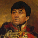
Franchescanado posted:There's a really good book called Art & Fear which I keep on the shelf, next to my papers, my notebooks, my anatomy books, my references. As an artist, you're probably prone to anxiety or fear or impostor syndrome. Open up Art & Fear and read a few passages, pick up your pencil or pen and start drawing for the sake of drawing. The parcels I promised are shipped, thank you for helping me clean up clutter. from the book posted:Compared to other challenges, the ultimate shortcoming of technical problems is not that they are hard, but that they're easy. Keetron fucked around with this message at 21:14 on Dec 14, 2019 |
|
#
?
Dec 14, 2019 16:22
|
|
|
Hellbeard posted:Excellent critique - thank you. In addition to the value stuff, I think there's some other things holding the composition back in this drawing. Mainly, none of the poses are very dynamic, and you have many, many perfectly horizontal lines in the composition. For a shot that's supposed to be full of action, having everything eying perfectly vertically or horizontally really puts a visual damper on that. Some examples:
I finished my entry for the ArtDome (surprisingly, this is the 3rd time I've entered and only the 1st time I've completed anything).  quote:"Window of St. Smashley the Younger at Sunrise." I wish I had more time to work on this as I feel I could have created a truly magnificent gothic stained glass window and cathedral wall but I'm proud of having kept the scope of the drawing to something I could manage with everything else that's going on in my life right now.
|
|
#
?
Dec 14, 2019 21:26
|
|
|
Angrymog posted:How about embossing powders?  Sharpest Crayon posted:This is technically watercolours, but they got reeeeeal nice coverage:  IkeTurner posted:My best results have been with these.  time to spend some money...
|
|
#
?
Dec 14, 2019 22:51
|
|
|
shoulder pads doodle series   and a wip from a still 
|
|
#
?
Dec 15, 2019 00:20
|
|

|
Been doing some exercises out of a book today, here's the first one that could be considered a finished piece. It's done on some 300gm bockingford paper, using arteza tube watercolours, which seem to be really good for the price (no cadmium red or yellow, but has decent substitutes) My brushes are a total hodgepodge in terms of quality. The only technique I wasn't happy with was splaying a brush to do the thin branches, but I was using one of the cheapest ones for that, which probably didn't help. Also, I need a hair dryer. Angrymog fucked around with this message at 02:24 on Dec 15, 2019 |
|
#
?
Dec 15, 2019 01:53
|
|
|
Keetron posted:Reading this now, thank you so much for the suggestion. I'm glad you're getting something out of it! If you're open for another suggestion, the other art book I always refer back to is The Art Spirit by Robert Henri. That and Art & Fear are, for me, two essential art books that aren't reference or technique.
|
|
#
?
Dec 15, 2019 03:25
|
|

|
Angrymog posted:Also, I need a hair dryer. They're handy, but be aware that some things will dry a little differently when you use one. Hard to describe, but you get a feeling for when you should let it dry naturally pretty intuitively in my experience.
|
|
#
?
Dec 15, 2019 05:17
|
|
|
another wip, it's about halfway done but it looked good just at this stage
|
|
#
?
Dec 15, 2019 08:10
|
|
|
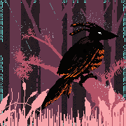
Nice, love the composition.
|
|
#
?
Dec 15, 2019 09:37
|
|
|
lofi posted:They're handy, but be aware that some things will dry a little differently when you use one. Hard to describe, but you get a feeling for when you should let it dry naturally pretty intuitively in my experience. My initial thought is that washes etc. you might want to let go natural, but for wet on dry work the hair dryer will be fine.
|
|
#
?
Dec 15, 2019 09:58
|
|
|
Say no to hairdryers, just find your peace in the wait. Seriously. Some ideas I had for the art dome, none really worked out the way I wanted so I am competing with the one I like best. 
|
|
#
?
Dec 15, 2019 17:25
|
|
|
You did pics after all! 
|
|
#
?
Dec 15, 2019 17:31
|
|
|
lofi posted:Nice, love the composition. thank you! im really out of my wheelhouse with portraiture so my real struggle has been being able to paint something and have people immediately go "oh this is [that person]" i dont think ive done it with this one yet.
|
|
#
?
Dec 15, 2019 17:33
|
|
|
lofi posted:You did pics after all! Well, after seeing yours and gmc9987s entry, I was like, yeah, there is no way I am winning this, I don't even have an idea yet :dammit: So then that book was mentioning that appreciation is super important which made me think of instagram likes and so on. And there it was, the religion I am apparently praying to. Then after that, I kinda made some sketches (not pictured, it is a rather small thing with thick pages so photographing it is stupid), put a whole bunch of effort in the perfect hand and heart. That was the top left one. When painting it, I screwed up a bit here and a bit there and then I hated it. I rather do the ink in one go but simply am not yet good enough to get away with that. But you know, let's try the ink-and-go method! That was the top right one. Meh. To be honest, I like the "rough-pencil-sketch, rough-pen, sloppy watercolor" method mosts of all, it just feels best. And I wanted to wet-in-wet one now I had everything on my desk anyway. Out came the bottom one that I indeed liked most and entered the dome with. It is not a winner overall, but it is winning in my personal heat of attempts. To all: do check out the traditional arts thread, I am doing a small give away of materials.
|
|
#
?
Dec 15, 2019 18:11
|
|
|
Keetron posted:So then that book was mentioning that appreciation is super important which made me think of instagram likes and so on. And there it was, the religion I am apparently praying to. Oh yeah, I totally got that straight away, it's a really nice idea.
|
|
#
?
Dec 15, 2019 18:45
|
|
|
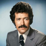
I haven't been regularly trying to do any drawings or anything since I was a teenager. Since then I've just doodled in notebooks and effectively practiced drawing a handful of very similar faces and expressions. Recently I got some brushes and india ink and I've trying to get better at drawing different people/things and using something other than ball-point pens. Here's one I did today - it's supposed to be Tim Heidecker commenting on the cool hat in the I Think You Should Leave sketch, although I don't think I really nailed the look.
|
|
#
?
Dec 16, 2019 00:09
|
|


|

|
| # ? May 11, 2024 05:55 |
|
|
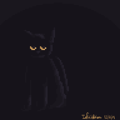
 My brother's new cat, for christmas. 
|
|
#
?
Dec 16, 2019 00:32
|
|