


|
Phylodox posted:http://dafont.com I used to use dafont quite a bit, but its recently come to my attention that there's a lot of fonts marke as "free" on there that are actually just rips of existing paid fonts so you'll still need to do a bit of research on the font in question to be 100% safe. EDIT: Lofi, I love the color palette and think the tarot theme is solid. gmc9987 fucked around with this message at 11:36 on Jan 28, 2019 |
 #
¿
Jan 28, 2019 11:22
#
¿
Jan 28, 2019 11:22
|
|

|

|
| # ¿ May 10, 2024 10:12 |
|
|
Al! posted:trying some digital painting for a while helped me with my gifs It's cool how that all works - almost nothing you choose to learn about ends up being useless. Character Design References hold a themed character design contest every month. Somehow I ended up with some free time this weekend (thanks grandparents who babysit) so thought I'd try to do an entry for this one. The theme is Alebrije Creatures, so here's my two-headed fire-breathing bat-snake-alpaca linework.  Ya'll have been killing it this month. Ibblebibble, you may not be able to recognize it yet since you're just starting out on your drawing journey but you're improving with every drawing, keep drawing. Lofi, love the dragons. AI, that last gif is really cool.
|
|
#
¿
Mar 17, 2019 01:43
|
|
|
Al! posted:im still figuring out this digital painting thing, could use some critique or suggestions Here's what your last 3 images look like with all the color taken out.    The first thing I notice with your paintings is that you don't have much contrast in values. Most of the pictures are sort of middle-dark gray, with very little in the way of very light light and very dark areas. This aesthetic mostly works in your animated pieces because you have movement to help guide the viewers' eyes around, but with still images I think you could use more value contrast to do the same thing. For example, in the pic of the heron in the cave, I think you should totally brighten the hole in the upper left - like, almost to blow-out levels of brightness - and then have a god ray coming from the hole diagonally onto the heron. This would also help give the heron a reason for being so light when it's in the middle of a dark cave; right now it stands out as not fitting into the environment. I think it would also help for you to think more about the light sources in your images. In the flying hawk, for example, you have this hawk flying through a cloudless sky in the middle of the day. The central mountain (which could also use some more value contrast, as sunny midday light is about as high-contrast as you can get in nature) shows that the sun is above and somewhere to our right - but the foreground cliffs look as if they're being lit from an overcast evening scene - the colors are dull and muddy. The hawk also doesn't have any indication that sunlight is hitting its back at all. If you're using Photoshop you can make a solid black layer at the top of your stack and set the blending mode to "color" to see what the image looks like in black and white without having to convert the image to grayscale and then back again, I do this to help make sure I'm picking colors that are actually lighter and darker than each other rather than ones that just appear to be.
|
|
#
¿
Mar 25, 2019 10:40
|
|


|
sigma 6 posted:This should probably be for the digital art thread but it's an art dome so I am hoping for critique before final submission. Do you have any thoughts in your mind about what sort of music the band Adequate Revelation plays? Because knowing that would probably influence my feedback. At the moment, the things that catch my attention are:
|
|
#
¿
Jun 30, 2019 22:39
|
|


|
"Garbage" is not how I'd describe it at all, the tiles looks pretty nice so far! As for colors, with this current version I think you may be thinking too literally in terms of colors - dirt = brown, snow = white, etc. The first game that sprang to my min as an example was Celeste. That game takes place almost entirely in a snowy alpine region, but most of the screenshots you can find on Google show a very "unnatural" palette of yellows, purples, and pinks. There are some blue areas to make a particular icy hazard stand out, but overall the palette is very limited and restricted. Have you tried picking out a palette of 5 or 6 colors that you like together, and limiting yourself to only those colors plus a couple shadow/highlight colors?
|
|
#
¿
Jul 1, 2019 21:46
|
|
|
Chakan posted:Ok, so I don�t know if this is the right place, but it seems so? I�ve been drawing for about 5 hours weekly for the past two months, so I�m basically nowhere & I know that. But I�m having real troubles doing figure sketches/drawing, and it�s starting to become annoying. Well, the main way to get better at drawing is to keep drawing, unfortunately there's no shortcut around spending the hours putting own stuff in your sketchbook. The next most important thing is to find a group of people willing (and skilled enough!) to give you honest critiques about your drawing. This could be in a drawing class, or online like in this very thread or some other art community, like concept art.org or somewhere else. Finally, you should get used to drawing things that don't turn out the way you want them to. Every artist does it, it's OK to have a drawing not work out and it's OK to try again a second, or third, or fourth time. Attempt to draw some challenging things that you know are beyond your skill level in addition to the practice heads and other "comfort" drawings, no way to get better without attempting it. If you want to draw a good figure, you've got to draw a bunch of lovely ones first. I would say post some stuff in here! We're all super friendly while also being honest if people actually want critiques of their stuff. Plus, we can't give you anything more than very general pointers without seeing your work.
|
|
#
¿
Jul 26, 2019 08:10
|
|
|
Angrymog posted:I've got a question for people - with watercolours, what's the best way to add texture to my sea to make it look more watery? I don't have any water-specific advice, but some things you can try that will vary the texture effects you get on your paintings:
Been a long time since I posted any art of my own here, I'm making a bit of Rowdy 3 fan art so I have at least one new thing to show at our open studio this weekend - turns out working full-time with a small child at home is bad for personal art.  I'm sure there's some big glaring anatomy issues that I haven't noticed since I mainly work on this piece from about midnight to 2am, feel free to pick it apart and I'll see how much I can improve it between now and Thursday, when I have to print it. This is a really awesome color scheme and layout, I like it a lot.
|
|
#
¿
Aug 27, 2019 11:09
|
|


|
The likenesses aren't as good as I want them to be but it's the best I can do by this weekend and still have it colored an printed. Got an open studio this weekend that my wife, our their studio mate, and I are participating in, and I have literally 0 new personal pieces one since the last open studio. Couple that with this weekend also being the 10-year anniversary of the studio being open so having a party there as well, plus my parents flying in for a visit, plus another friend flying in for a visit, and I just want this weekend to be done and over with already.
|
|
#
¿
Aug 29, 2019 00:14
|
|
|
I guess this is as done as I can get this tonight. Hopefully the printer is nice to it. Edit: The printer was not nice to it. gmc9987 fucked around with this message at 21:47 on Aug 30, 2019 |
|
#
¿
Aug 30, 2019 00:52
|
|
|
Revol posted:
Welcome back to drawing! I'd also second Keetron's suggestion to reconsider streaming as a way to hold yourself accountable - streaming on Twitch can potentially be pretty demoralizing, especially for new artists (not that you're totally a "new" artist, but hopefully you know what I mean), since it gives you a numeric indicator of success (viewer count and chat activity) that isn't related at all to how successful your drawing is, or how successful you are at maintaining a mindful schedule for yourself. BUT, do what you think is best for you, and it you decide to stream post a link in here and and your schedule! I drew a Nosferatu. 
|
|
#
¿
Sep 12, 2019 11:22
|
|

|
Neon Noodle posted:what should I animate, goons? A skeleton who climbs out of a grave, and then trips and hits its head and dies and becomes a ghost.
|
|
#
¿
Sep 25, 2019 22:28
|
|
|
Inktober! Time to start out with good intentions for drawing every day then gradually fall behind because your toddler wants to have parties in the middle of the night every night. https://twitter.com/McThrill/status/1179033557685215232?s=20 Also, social media protip: if you never change your halloween avatar/display name on all your accounts, eventually you stop looking lazy and start looking prepared instead.
|
|
#
¿
Oct 2, 2019 11:51
|
|
|
None of my inktober drawings are going to be "finished" drawings this year thanks to time constraints, but I am really enjoying prototyping ideas that I want to expand on later. https://twitter.com/McThrill/status/1179466327943196672?s=20
|
|
#
¿
Oct 3, 2019 08:59
|
|
|
Inktober train continues. https://twitter.com/McThrill/status/1179865919725735941?s=20 E: Uh, not sure why it's posting the parent tweet as well. Anyone who's more tech-savvy than me who wants to enlighten me, I would be grateful. lofi posted:
This is fantastic. gmc9987 fucked around with this message at 22:33 on Oct 3, 2019 |
|
#
¿
Oct 3, 2019 22:31
|
|

|
 All ya'll are killing it for Inktober this year.
|
|
#
¿
Oct 4, 2019 21:14
|
|
|
 Almost caught up. Today has had some really weird energy, we'll see how it translates into my drawing.
|
|
#
¿
Oct 6, 2019 20:59
|
|
|
Sharpest Crayon posted:Inktober - Enchanted. I like this a (axo)lot(l). I want to go to a party where I don't know anyone else with Orbo, he seems like the kind of person who'd be good at talking smack about people while we drink beer paid for by someone else. I managed to get caught back up on Inktober, although I had to dip into a stupid pun to get through day 6.  
|
|
#
¿
Oct 7, 2019 23:49
|
|

|
 These are great!
|
|
#
¿
Oct 9, 2019 10:22
|
|


|
Keetron posted:I had fun making this! That's a nice swing. I'll post more often if you can find me a free babysitter for weekday evenings. 
|
|
#
¿
Oct 9, 2019 22:50
|
|

|
lofi posted:
This is awesome, I love the pattern and the colors. 
|
|
#
¿
Oct 10, 2019 23:05
|
|

|
I have somehow managed to keep up with Inktober this year.    Sotsa posted:Hamfistedly trying to actually make the type of dumb joke i base a lot of my pictures on understandable. Gravitational lensing guy is perfect.
|
|
#
¿
Oct 14, 2019 23:52
|
|

|
lofi posted:
Oh man this is so good.  
|
|
#
¿
Oct 16, 2019 22:56
|
|

|
lofi posted:Woah, wait a gosh darn, where's my mouseworld awesomeness? It's still there, imagine that a mouse is just behind the camera frantically scrambling away. I trie to work one in there, but it just wasn't happening and I needed to get to sleep. Any formal complaints about content or lack thereof should be addressed to my 2-year-old who has recently decided that mommy and daddy have been getting entirely waaaaaay too much sleep and has taken it upon himself to rectify that.
|
|
#
¿
Oct 17, 2019 09:36
|
|
|
I spent much more time on one of these prompts than the other one, can you guess which one? 
|
|
#
¿
Oct 19, 2019 11:25
|
|
|
Rim lighting is always cool and appropriate for wizards. I am so far behind on Inktober - work, kid, getting sick, everything is conspiring against me.   
gmc9987 fucked around with this message at 20:01 on Oct 26, 2019 |
|
#
¿
Oct 26, 2019 19:06
|
|

|
syntaxrigger posted:Wow! I didn't know archive had so much stuff! This book cover gave me nightmares, yeesh. Congrats on getting over your fear and posting your work, you're off to a good start. Also you can safely ignore pretty much any "How to draw [X style]" books, as well as literally anything written by Chris Hart. We found a magazine/book rack for my son (who's 2 and a half right now) that I'm decorating to put in his room. I asked him what he wanted on it and he said, "Green ducks, ladybugs, and three ghosts." So I bought some Posca markers and went to work.   There's more than three ghosts on there but he hasn't complained yet. There's going to be a big giant ghost on the front saying, "BoooOOoookSs!" but I need some bigger markers for that one.
|
|
#
¿
Nov 10, 2019 12:08
|
|
|
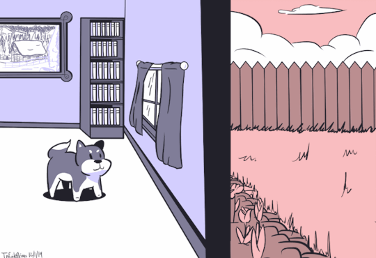
IDClip doggy is the best. The Dregs posted:I just realized after reading this again that I have no idea what a contrast layer is. Google isn't helping much. Could someone please take the time to explain it to me? Been a while since I painted with oils, but I think what hole-y ghost is referring to is that you can take a small amount of paint and mix it with a large amount of medium to get a transparent color. You can get some real neat effects by layering transparent glazes of various colors on top of an underpainting.
|
|
#
¿
Dec 2, 2019 22:53
|
|
|
Lot of good stuff this week! I think I'll be able to have this Christmas card colored and printed by next week to sell at our holiday art market, but I doubt any of my friends will be receiving my card before Christmas.  Cartyisme posted:Dumping some oil painterings and ink drawins. Oh hey you're still around! You sent me an ink drawing of a hipster a few years back, just thought you'd like to know that it made it over to Europe and is still hanging in my living room. Glad to see you're still making rad art.  Please forgive the late-night working alone on digital art crappy lighting photo.
|
|
#
¿
Dec 9, 2019 00:26
|
|
|
syntaxrigger posted:You are not wrong. At this point I find myself getting afraid too, oddly. I am not certain of what. Sometimes I think about drawing and I get afraid. I have been able to push through it so far but I am not sure why it is happening. My only guess is a fear of failure. I am on day 10 of 66 of drawing at least 15 mins a day, so at least I got that going for me. For what it's worth: You're doing very well to be sticking with the drawing for even 10 days in a row, and you've definitely improved from when you started and now. I find that the biggest thing with drawing is learning to give yourself permission to suck at drawing. Even professional, highly-acclaimed artists draw stuff they're not happy with - sometimes ratings just don't work out and that's cool. Often, if I have a string of bad drawings or am otherwise stuck creatively, I'll sit down and do some "comfort drawings:" things that I know how to draw well, that I find aesthetically pleasing, and that are fast to do. For me, that's drawing ghosts (like, the simple wispy blob kind, with just some circles for eyes and a mouth). Basically, just do something fun and not serious that you know you'll be happy with to give yourself a "win." A couple drawings like that and then I'm ready to get back on with doing more challenging stuff. Is there anything you've drawn so far that you really enjoyed? Why not go back and give something like that another go for a day? I managed to get the Christmas card I started as finished as it will be, since I have to do a rush printing job to have it ready for this weekend. 
|
|
#
¿
Dec 10, 2019 15:36
|
|
")
|
Hellbeard posted:Excellent critique - thank you. In addition to the value stuff, I think there's some other things holding the composition back in this drawing. Mainly, none of the poses are very dynamic, and you have many, many perfectly horizontal lines in the composition. For a shot that's supposed to be full of action, having everything eying perfectly vertically or horizontally really puts a visual damper on that. Some examples:
I finished my entry for the ArtDome (surprisingly, this is the 3rd time I've entered and only the 1st time I've completed anything).  quote:"Window of St. Smashley the Younger at Sunrise." I wish I had more time to work on this as I feel I could have created a truly magnificent gothic stained glass window and cathedral wall but I'm proud of having kept the scope of the drawing to something I could manage with everything else that's going on in my life right now.
|
|
#
¿
Dec 14, 2019 21:26
|
|

|
Sharpest Crayon posted:I do wish a couple of people who actually make a living with commissions or art would answer your question 'cause I'd love to know, too. Ey, peeps with art money! Get in here and tell Lofi how to make the big bucks! I'm still trying to figure out how to make the big bucks, but I've made enough small/medium bucks over the last 5 years doing freelance work to pay most of our rent and food. The main lesson I've taken from my time freelancing is to have cool friends who know or work for companies needing art, and also to have a very supporting spouse who is willing to put up with irregular an late paychecks. Those probably aren't the most important lessons I should have learned but I've manage to luck into some regular paying gigs just thanks to friends. The main advice I'd give people looking to start freelancing is to please, for the love of go stay off of sites like UpWork, Freelancer, E-Lancer, and any other international freelance site. All they o is take an additional percentage of your money from jobs you get on there, and as a bonus you have to competitively price yourself against people who live in places where their rent is like $100 a month. All these sites do is just rive down the cost of your work. Merry Christmas, ya'll!
|
|
#
¿
Dec 24, 2019 11:44
|
|
|
What would "Dawnuary" entail? My wife loves snails so I drew her a party snail on the outside of her Christmas gift. 
|
|
#
¿
Dec 28, 2019 23:52
|
|
|

|
| # ¿ May 10, 2024 10:12 |
|
|
Angrymog posted:Drawing once a day in January. We can do a prompt list if people like those. For some reason I read what you posted as "Dawnuary" so that's why I got confused. Re-reading it correctly, "drawnuary" seems like a pretty simple concept, sorry for sounding dense.
|
|
#
¿
Dec 30, 2019 10:55
|
|