


|
Tree Bucket posted:GUYS loving incredible  
|
 #
?
Dec 14, 2021 10:59
#
?
Dec 14, 2021 10:59
|
|

|

|
| # ? May 2, 2024 07:46 |
|
|
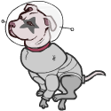
Sitting Here posted:loving incredible Aw thanks. It may or may not be inspired by having a ten-year-old daughter. I posted this picture to the Dune thread and one poster called me a shaitan and another began correcting the cuneiform. Good thread. Tree Bucket fucked around with this message at 03:22 on Dec 15, 2021 |
|
#
?
Dec 14, 2021 11:15
|
|
|
Some great work so far. Deadline tomorrow.
|
|
#
?
Dec 16, 2021 07:21
|
|


|
SHOW ME WHAT YOU GOT!!
|
|
#
?
Dec 17, 2021 20:18
|
|
|
Artdome feels like it needs a format change. It really shouldn't be taking 6 weeks to prompt, submit, and judge a handful of doodles.
|
|
#
?
Dec 18, 2021 17:12
|
|
|
I don't know about you guys, but I finish mine like 2 weeks in and then it's just twiddling thumbs. I like ArtDome because without a prompt I find it hard to just create something. I'd personally prefer a tighter timeline.
|
|
#
?
Dec 18, 2021 17:24
|
|
|
I think the idea was to have it be the anti thunder dome, which is weekly, but tweaking the format is always an option.
|
|
#
?
Dec 18, 2021 20:24
|
|


|
Looking at the OP, there's nothing that says the deadline has to be set for a month or whatever. So whoever wins next can set whatever timeline they want. That said, we're coming up on the new year. Over in Thunderdome, we use this as a chance to reboot the thread and make changes based on community feedback. Maybe something similar would be good for artdome? I'd definitely love to see this thread stick around as a CC tradition because it's very cool and gets me drawing.
|
|
#
?
Dec 18, 2021 23:37
|
|
|
For sure. Artdome is good to have around, I want more of it! I'll throw out a few thoughts/year end feedback... -I think we can do two domes a month. Two-ish weeks seems like a good amount of time. -Judge on the 1st and the 15th. The constant changing date just makes it hard to keep track of. A fixed schedule would make it easier to check in on. -To streamline the process, when you submit art for the current dome, along with your submission should be your prompt for the next dome if you win. -That way the judging and prompting aren't holding each other up. All the judge has to do is post the winner on the 1st or 15th. Everyone can start working on the prompt that person already gave, and crits can come after so the judge isnt totally stuck trying to fit it in a specific day beyond a single post to announce their favourite. Even if the winner doesn't notice they've won for a bit, people can be working from their prompt. If you've won you can acknowledge and add detail to your prompt if you want, but people can be moving along. -I think we can ditch signups. I encourage people to say they are "in" because I think it helps people feel like they are committing to it and its nice to have an idea how many people are trying to make something for the prompt. But since we're not toxxing it seems sort of irrelevant to set any sort of date associated with when signups end. Just judge whatever gets submitted, its never been a huge number. -I'd like to encourage more types of art. We're very visual art focused and I don't see any reason we can't have domes where people make music, or poetry, or papercrafts, or lego or whatever. We can branch out. -Artdome has always felt more casual and I like that. -It would be nice if people could submit for a prompt and opt out of winning/judging. Participate, but avoid the potential need to judge the next round. Some people just don't have the time. If we tied it in with the idea that when you submit you need to also submit your prompt, then not providing a prompt seems like an easy way to avoid having to judge anything. -We could even go so far as to say that critiques are welcome but not a required part of judging. Just announcing a winner. The judges official critiques don't have to have any depth to them at all as far as I'm concerned. Any comment is appreciated. Judges who go the extra mile are even better. That's my thoughts at the moment but its been a  kinda day. kinda day.
|
|
#
?
Dec 19, 2021 02:50
|
|
|
As someone who is kinda crazy with a young baby right now I am in favor of ditching signups because I think I don't commit out of fear of not being able to do it but if it was a faster more regular thing I would probably participate more in dribs and drabs as I found little pieces of time on my hands. Or I would like to at least.
|
|
#
?
Dec 19, 2021 03:06
|
|

|
Great thoughts! I think two artdomes a month is reasonable. Maybe we can set this next round so that it ends on the 31st (so the new prompt could go up on the 1st)? Then reboot the new thread with a new prompt and updated rules. I think there's absolutely room for all kinds of art! That should ultimately be up to the person judging, I think. re: signups: I think it's important to have signups just because honestly this thread gets buried pretty fast (in my bookmarks, anyway) and having at least a handful of new posts each month means it never looks totally dead. I'm wary of having a prompt and then 0 responses; I don't think that encourages participation. That said, there doesn't necessarily need to be a signup deadline. That way, people could still jump in at the last minute if they find some spare time. I think some of the issues with signups would be mitigated by shorter rounds, also. I agree that crits don't need to get posted with the judge post, however I think feedback is such a rewarding part of this sort of format. I worry that making them not a requirement will mean no one will write critiques at all. I think the purpose of a friendly competition should be at least in part to help people hone their craft. Ultimately this is a community-driven choice, but my gut feeling is that if someone has time to judge, they have time to write a sentence or two about the entries. That said, people can absolutely sign up and exempt themselves from judging IMO. Over in the ol' Thunderdome you can disqualify your own entry so you can't win. If someone absolutely can't make a prompt, I'll jump in and make one, or someone who has one ready to go can take over. I'm a little bit leery of making people write a prompt with their entry. I don't have an especially good reason to not want to do it, just feels a little cumbersome. That said, it's really up to what people want to do!
|
|
#
?
Dec 19, 2021 10:35
|
|
|
For me shorter artdomes would work better as not every prompt resonates with me. Skipping one would be easier. In any case, this dome and the one on the discord help me keep art something of a habit, so whatever we do, please continue.
|
|
#
?
Dec 19, 2021 13:14
|
|
|
The fewer rules here, the better. I'd like to see more participation and adding processes increases the barriers of entry. I do like the shorter competition rule changes as well as opting out of critiques if you don't want to be judged. As for how we do prompts, I think I've been doing these competitions for a year+ now and I've only seen delays on the prompts once or twice. I'm not sure we need any new procedures there. Just a note in each prompt that contestants should be thinking about a future possible prompt before they win.
|
|
#
?
Dec 19, 2021 13:30
|
|
|
Two prompts a week sounds like a good idea. Also I'd be happy to abandon sign-ups if there was something else to keep the thread ticking over during quiet periods.
|
|
#
?
Dec 19, 2021 13:59
|
|
|
Tree Bucket posted:Two prompts a week sounds like a good idea. Also I'd be happy to abandon sign-ups if there was something else to keep the thread ticking over during quiet periods. Not sure if it would work well but maybe instead of just contest judge critique an opportunity to get feedback on our own work or WIP? More discussion or questions about techniques etc?
|
|
#
?
Dec 19, 2021 14:08
|
|
|
More discussion and feedback in general would be nice. I think its a bit of an artifact of the thunderdome rules. Thunderdome is pretty strict about how submissions are done and no editing. So I know I've avoided posting variants or updates in an attempt to not clutter up the thread for the judge at times or make it confusing as to what is supposed to be judged. But not posting that sort of stuff can make it awfully quiet and makes the thread less active. Maybe encourage people to somehow denote their "submission" post just so we can filter out the things the judge needs to look at a little easier. Like in Thunderdome the submission is supposed to have, title, wordcount, text, etc and it makes it very clear that theres a delineation between chat posts and submissions. If we just suggested people mention in their post that it is intended as a submission we can chat freely otherwise and not have to constantly mention if a piece isnt done yet or whatever. For your consideration...
|
|
#
?
Dec 19, 2021 20:23
|
|
|
From my perspective I am not like a full fledged working artist yet but I hope to be one day so any feedback on my prints, good or bad or otherwise is always super welcome.
|
|
#
?
Dec 19, 2021 21:24
|
|
|
LET'S DO THIS! Krispy Wafer: Points for historical accuracy. In fact - too close! I thought it really was an old comic panel and didn't even give it a thought. Everything from the font to the paper texture is very accurate but I am not sure if it really fits the "Creepy but Cute" description. She's hideous. I mean that in a good way but yeah... hideous. Also - nice to learn something about Hela. That she was the OG "Two Face". As for critique: Lack of shading stands out to me here in the sense that a lot of the color is solid color. Hela herself has the most color variation and so the eye is attracted to that detail and of course the detail in the rotting flesh etc. That's the best part here but it definitely feels like her shoulders and head are out of proportion in relation to each other. Basically, she's got a big head compared to her body. There is weird incongruence between the gross detail in the rotting Hela and the very cartoony idea of animals crying anthropomorphic tears. The fox is particularly anthropomorphic. EC comics was over the top gross most of the time. Almost nothing in it was every cute to my memory. So - the cute part is definitely missing here. Hela is uh... well.. the animals are cute anyways.  Sedgr: I really like this one! It's 3d - which is my wheel house AND it's animated!! However the technical artist in me is annoyed at a few of the technical errors here. Poly smooth or subdivide that glass. The faceted look of the glass kills it. I know it will increase polycount x4 for each object you smooth but it's worth it for things liked curved glass. Same thing with those legs er... tentacles... I mean polysmooth everything! Especially if there is no particular polycount limitation. That would have allowed you to animate them more like tentacles and maybe with spline IK for example. The tentacle animation should feel more like tentacle animation with more flexing vs. insect like movement. Eyeball needs veins badly. Almost half an eyeball is red + veins usually. Balls of lighting could use glow or at leas more glow. Tentacles need contact shadows if they are touching that plane ... if not then push the fact that the character is floating. Always animate the center of gravity or at least the center of your character first. Instead of just animating the eye floating up and down you should animate the floating base first and then animate the eye against that gently. So when the base floats up, then the eye floats down and vice versa. Also - although maybe excessive - animated bubbles would have been great in the tank here. To imply there is liquid in the tank. Which feels sorely missing here. What is that eye is floating in? Definitely needs some bubbly alien mystery fluid to float in.  void_serfer: Conceptually, yours might be my favorite piece. Execution needs work though. Maybe photobash the crab parts into the woman first and then paint that? Anatomical detail is missing in BOTH the crustacean and lady bits. Fingers missing for example and ... no swimsuit? Is this a nude crab lady? I can't tell. It looks like yes. So don't be shy about copying figure studies and real anatomy. Needs a lot more detail in that dept. Sunset lighting is a great idea though and a perfect example of back lighting. Use this to your advantage and darken EVERYTHING in the figure while making the rim light pop. This would have been a good way to hide the lack of detail in the body. Where is the light from the front coming from? The sun is behind her and so the lighting should reflect that! She should be almost completely in shadow!! I love the body parts buried in the sand though and sand castle might be the "cutest" part here. Would have been cool to see cast aside sand castle shovel or other kids toys to re enforce it was a kid she ate.  Johnny-on-the-Spot: Is this smog monster a sticker yet? Because it should be. You were right to up the cute fact by using pastel colors. That helps a lot to up the cute factor. Only downside is that it loses pop here in making everything feel washed out. This doesn't read well from a distance because it feels washed out. Like it has been under the sun for years. If it was a sticker and did fade it would fade that much quicker given the color palette. Make the lines POP. Especially the eyes. I know it is a smog monster so... make it more wispy? The tentacles feel jelly like an undersea monster but I think they should be wispier and in fact the WHOLE thing should feel wispy vs. jelly. The lightning kinda makes sense for smog but the tentacles don't. Character should me more amorphous if it is a gaseous smog monster. Change him from jelly to smog and make the eyes glow to make them pop in the smog. Just my 5 cents. Gaseous / smoky monsters are often hard to get right. See the Loki series for a fairly good example.  sigma 6 fucked around with this message at 22:24 on Dec 19, 2021 |
|
#
?
Dec 19, 2021 22:02
|
|
|
Tree Bucket posted:Two prompts a week sounds like a good idea. Also I'd be happy to abandon sign-ups if there was something else to keep the thread ticking over during quiet periods. Do you mean a prompt every two weeks? Two prompts a week would be some impressive art hustle  Sedgr posted:More discussion and feedback in general would be nice. I think its a bit of an artifact of the thunderdome rules. Thunderdome is pretty strict about how submissions are done and no editing. I think it would be pretty easy for people to post WIPs/discuss feedback here, so long as all entrants understood that they needed to something like SUBMISSION (or for your consideration, that's nice) at the top of the post they'd like the judge to consider for the contest. The important thing, in my experience, is that there is at least some degree of consistency. Thunderdome is funny because there aren't actually that many rules, we're just pretty firm about the ones we have because they make the competition run better. That said, it's pretty clear that the bar brawl-style competition isn't what the visual art (and beyond) community is looking for, and that's cool because we can keep making artdome its own thing with its own style. One thing that might promote more activity and discussion is if folks felt comfortable giving their own feedback about the pieces posted. This would take some of the pressure off the judge to be the singular source of feedback. Here's what I'm getting so far: 1. Faster rounds�two rounds a month. 2. Signups optional (but should still be encouraged, IMO) 3. A clear way to delineate between WIPs/discussion and an official submission (to promote discussion and workshopping) 4. Open the competition up to other types of art 5. Option to decline critique 6. Option to participate without being considered for the win (for those who don't want to judge) 7. Remind people to have a prompt ready to go should they win Am I close to the mark with these?
|
|
#
?
Dec 19, 2021 22:16
|
|
|
Thanks for the crit Sigma 6! Good info in there. Sitting Here: yeah sounds about right to me.
|
|
#
?
Dec 19, 2021 22:28
|
|
|
All of the points seem valid to me and I don't see any problem with any of them. Would welcome the challenges to be 2 in a month and think #3 is especially important.
|
|
#
?
Dec 19, 2021 22:28
|
|
|
Idle Amalgam: Was really trying to figure what was cute and / or creepy about yours but then I noticed the comment about the avatar. It's maybe a little funny at a stretch but feels crude overall. This can be excused because you are learning a new tool (digital tablet) but it doesn't change the fact that it feels crude and unfinished. Aren't pretty is an understatement. Draw / paint from reference! If you are painting from reference then look at it very closely and maybe make a value study first. Sitting Here: This one was going to be the winner until I saw the last entry. Sorry but maybe that extra week wasn't a good idea (?!?) Was hoping to get more entries but I am not sure if extra time was the right way to do it. Is it a skull? If so, what happened with the teeth? I feel like if it had more skull features (hole in the nose, defined teeth) it would have won hands down. Everything else I really like. The swirls in the brain and the trippy color palette. The Hitchhiker's Guide To The Galaxy tongue and the lightning bolt head phones. Very cool imagery! Even the molotov cocktail as a creepy prop. This really should be finished and made into a sticker also! Add more outlines to make it pop more. Consider adding a label to the bottle and bumps to the tongue. This could EASILY be some DJ's logo and probably should be. DJ BRAIN LICKER ... or something. See Ed Roth for more inspiration for this style and a lot more detail. Add another iteration of detail and / or line work and I think it's almost there. It is screaming to be made in vector (illustrator or inkscape) with bold outlines. Mimic or copy the flame shapes for the flame reflections. Add more shading and definition to the brain folds - especially add value to the sides. Flat shading should only be on the lightning bolt uptop IMO. Lightning should connect to the middle of the headphones vs top - allowing for one more large zig zag connecting to the middle of the cylinder. The ghost of Keith Flint is whispering "I'm a firestarter... twisted firestarter..."  Tree Bucket: You have made the manga equivalent of "put a bird on it" Or maybe ... "put googly eyes on it"?? As much as I want to dismiss it as exploiting pop culture and gimmicky ... well ... it works. That's ultimately all that matters. Appeal. Probably you got a chuckle out of almost everyone who saw the image and that's what makes a successful image. Some kind of immediate visceral reaction. Even if it is silly and ridiculous. Who thinks to put a bow on a sand worm? Ok. Don't answer that. You win. Extra points for the framing and weather effects. Never thought I would vote up anything "kawaii" but here we are. 
sigma 6 fucked around with this message at 22:54 on Dec 19, 2021 |
|
#
?
Dec 19, 2021 22:33
|
|
|
I almost missed your critique! I really appreciate it! I did kinda rush a fair bit of my entry, so I'll definitely be mindful of those moving forward! Thank you so much, and congrats to the winner!
void_serfer fucked around with this message at 23:16 on Dec 19, 2021 |
|
#
?
Dec 19, 2021 23:12
|
|

|
void_serfer posted:I almost missed your critique! I really appreciate it! I did kinda rush a fair bit of my entry, so I'll definitely be mindful of those moving forward! Thank you so much, and congrats to the winner! You are welcome! With ONLY a sunset lighting your figure you will get very little detail from bounce light. I took this photo and although it is marginally NSFW it shows off what I mean. If you are going for super strong rim light make the silhouette the important part or the outline the rim light creates. Now that I think of it... if there was a small bon fire in the foreground it would give you two point lighting and that would make the effect you are after. With a warm glow from the front and a strong rim light for the (grotesque) shapes to really pop in the sunset light. sigma 6 fucked around with this message at 23:33 on Dec 19, 2021 |
|
#
?
Dec 19, 2021 23:29
|
|
|
sigma 6 posted:You are welcome! This is excellent, I'm seriously going to etch into my brain that using reference as much as possible is a good thing always.
|
|
#
?
Dec 19, 2021 23:35
|
|
|
Thankyou for accepting kawaii huwud into your heart. I'll do a proper post later but for now, in the spirit of a leaner faster and ever-friendlier Artdome, the upcoming prompt is:  Welcome to Ad-Dome Welcome to Ad-Dome I find myself lurking and posting in the same twenty-something threads. I guess many of us are in a similar posting rut. So... Make/draw/paint/sew/construct/code/summon/etc an image depicting a thread or subforum that you particularly enjoy- one you wish had more posters. Make something that reflects the delights, wonders and weird in-jokes of your favourite thread. You might look to book covers, movie posters, travel ads and online dating profiles for inspiration-! The winner will be the image that makes me think, "wow the Guinea Pig Grooming thread sounds incredible! I can't wait to lurk there!" Please also include a link to your beloved thread or sub forum so we can all be disappointed. Submission date: last day of 2021, Australian Eastern time Winner announced the following day. The winner needs their prompt ready to go straight away. Critiques to be posted... slowly, as I'll be phone posting on a beach Tree Bucket fucked around with this message at 21:22 on Dec 20, 2021 |
|
#
?
Dec 19, 2021 23:40
|
|
|
In for sure.
|
|
#
?
Dec 19, 2021 23:52
|
|
|
Thank you for the critique. I haven't printed stickers yet but was planning on it and will definitely use your advice on picking out a new color pallet that will be a bit bolder. Thank you again!
|
|
#
?
Dec 20, 2021 00:19
|
|
|
Thank you for the feedback! I can't be mad about kawaii hulud snagging the win, I think it's fair to say it won all our hearts. I'm in for this round
|
|
#
?
Dec 20, 2021 01:50
|
|
|
So would it be reasonable to set the final submission date for, say, Friday 14th January? With a winner announced the next day, to set the challenge for the back half of January. That gives everyone half a month to work on stuff; I assume the Christmas-New Year's week is going to be a write-off for most people. (Also thanks Sigma for those critiques- I feel like a really learnt something reading them. That's a high bar going into 2022.)
|
|
#
?
Dec 20, 2021 06:10
|
|
|
If the goal is to speed things up and do two a month we could do this one as cleanup and close on Dec 31, judge on Jan 1st. Start fresh in the new year. But thats just my thinking.
|
|
#
?
Dec 20, 2021 16:51
|
|
|
Thanks for the feedback. There�s no shame to losing to kawaii sand worms. I�m in for this last prompt of 2021. I also think this should be a short round, with new year new me, new you, new everything.
|
|
#
?
Dec 20, 2021 17:09
|
|
|
In. Thanks for the crit on my elementary scribbles, Sigma. I'll put more heart into this moving forward and look forward to the coming year.
|
|
#
?
Dec 20, 2021 17:11
|
|
|
Sedgr posted:If the goal is to speed things up and do two a month we could do this one as cleanup and close on Dec 31, judge on Jan 1st. Start fresh in the new year. But thats just my thinking. I am also going with this, the one thing that always works for me is get an idea and slap something together in a short period. What is the aspect ratio for a forums ad anyway?
|
|
#
?
Dec 20, 2021 20:06
|
|
|
Keetron posted:I am also going with this, the one thing that always works for me is get an idea and slap something together in a short period. 150kB max, exactly 468x60px, GIF, PNG, JPG if you are feeling really keen, make it an ad for artdome!
|
|
#
?
Dec 20, 2021 20:51
|
|
|
Ok. Winner announced jan 1 Australian time. Let's wrap up this terrible long year with some rad quick art! I'm not stressed about signups, but please have your 2022 inaugural challenge idea ready to go.
|
|
#
?
Dec 20, 2021 21:16
|
|
|
sebmojo posted:150kB max, exactly 468x60px, GIF, PNG, JPG OK - you sold me on this idea.
|
|
#
?
Dec 20, 2021 22:26
|
|
|
So, in the spirit of promoting some fun cross-collaboration on the forums, I'm sharing this thread, in which a goon is looking for some casual art (they're pretty open as to what kind) for their winter game jam game. I understand the value of your time and effort so by all means don't feel pressured to provide free art. However, if you have some existing stuff that you know you're not going to do anything with, consider helping a goon out. I'll be crossposting about this, but again, no pressure whatsoever.
|
|
#
?
Dec 20, 2021 22:28
|
|
|
I wanted to try a bit of video editing this time around. Stock footage and some music. Nothing too fancy. One of the forums hidden gems I think. Tucked away in the Science, Academics and Languages subforum is the Space/Spaceflight thread. https://forums.somethingawful.com/showthread.php?threadid=3580990 Great thread with lots of good information available. Quite active too! So this is a video edit/trailer type of advertisement. If I get some time I may try to touch it up some more but just in case. For your consideration... https://youtu.be/VY26sEkZgso
|
|
#
?
Dec 22, 2021 20:05
|
|
|
|
| # ? May 2, 2024 07:46 |
|
|
Hey, Artdomists! Closing time is closing in. Why not put an art-shaped cherry upon the absolute CUPCAKE of a year that was 2021?
|
|
#
?
Dec 30, 2021 23:47
|
|