


|
dear god this is hideous and nigh-illegible why is there comic sans cursive cyrillic on a flag
|
 #
¿
Oct 13, 2021 05:12
#
¿
Oct 13, 2021 05:12
|
|


|

|
| # ¿ May 21, 2024 06:43 |
|
|
OH GOD I CAN SEE FOREVER
|
|
#
¿
Oct 14, 2021 07:30
|
|

|
well hey let's not leave out the not-CIS then (sorta, idk, since Moldova and Azerbaijan are still in the CIS despite being in the "gently caress Russia" bloc):  technically they don't have a flag exactly, but if they did it'd presumably feature this basketball with four boobs
|
|
#
¿
Mar 20, 2022 06:06
|
|

|
Teriyaki Hairpiece posted:People in America don't know the tune of the Soviet anthem well they should it fuckin slaps im a bit skeptical of the stars and bars connection given that it is an old Russian naval jack and that while western europe may know american popular culture from the dukes of hazzard era, soviet consumption of american TV was rather limited
|
|
#
¿
Apr 23, 2022 07:10
|
|
|
Count Roland posted:Is the change a popular measure? It must be such a hassle to change alphabets that I have a hard time imagining regular people being onboard, whatever the justification. they at least managed to renege on the original laughably bad proposal where Nazarbayev fancied himself a master alphabet designer and decreed that the new alphabet be fully compatible with standard english keyboards. to achieve this, since you can't represent Kazakh with only 26 letters, they just shoved in apostrophes will-nilly rather than using diacritics or digraphs like a sane spelling system Teriyaki Hairpiece posted:When you guys are thinking "Soviet anthem" are you talking about The Internationale? that was in use until 1944, after which they wrote a new one with a bunch of lyrics glorifying stalin leading them to victory in WWII. this presented a bit of dilemma a decade later, so there were two decades where it was entirely instrumental before they figured out a revised set of lyrics. Russia has since re-adopted it as the anthem again with yet another new set of lyrics because the Yeltsin-era anthem was trash (and because Putin wanted to invoke Soviet nostalgia)
|
|
#
¿
Apr 23, 2022 21:36
|
|
|
i was about to butt in and say "who stole the flag of the East Turkestan Republic" before actually reading the post, and then actually read the post instead, have the also-relevant flags of the (defunct) second East Turkestan Republic and Uzbekistan   that said it's unlikely the ETR flags took inspiration from other central asian states, since those were parts of the USSR at the time (which, sure, had blue in their flags, but so did most of the other SSRs), and weren't really nations prior (the Emirate of Bukhara had a flag, but it wasn't particularly turkic, and turkic nationalism in central asia was only barely a thing within the russian empire at the time the USSR came into being)
|
|
#
¿
Sep 4, 2022 10:25
|
|
|
the bottom middle delicate arch where it crosses line boundaries looks a bit too... idk, modern graphic design-y for a flag. the flat one with the star on the right looks much more flag-like that said the rest arent proper 2010 corp redesign. what we really need is a flag with some horrid globohomo people 
|
|
#
¿
Sep 10, 2022 00:59
|
|
|
as i prepare to go visit countries nearby instead of the countries here, i just wanna reiterate that the flags of kazakhstan and kyrgyzstan are bitchin  having now looked it up, the stars in the uzbek flag sorta spelling "Allah" in arabic script is kinda neat  but on the other hand, it only works if you squint at it real hard and already know the intent, and also seems kinda weird given that "we need to reject arabic script because it's impractical for us outside a narrow religious context" was an important trend of thought when the nation was taking shape. i mean sure, the soviets kinda screwed that up by going "actually just do cyrillic everywhere, who cares if that doesn't really fit either" immediately after, but still
|
|
#
¿
Apr 11, 2023 06:03
|
|
|
they should use the blue/yellow/red rectangles from riverside plaza
|
|
#
¿
Nov 10, 2023 20:23
|
|
|
Xelkelvos posted:The Loon is a bit too much like a sports team logo, but I do like the violet, gold and cyan tricolor and the sports team in question's logo already blows all the flags out of the water
|
|
#
¿
Nov 11, 2023 03:31
|
|
|
Tnega posted:
Qtotonibudinibudet posted:they should use the blue/yellow/red rectangles from riverside plaza hot dog someone DID do it combine it with the north star cross shape and you've gold the vertical version may be a bit evangelion-y but whatever
|
|
#
¿
Nov 12, 2023 10:56
|
|

|
galagazombie posted:1953 and it�s not even a contest. the subtle state outline wins it
|
|
#
¿
Nov 22, 2023 05:04
|
|
|
Badger of Basra posted:1953 is a Texas flag ripoff, derivative as hell bring back the CA flag ripoff with a giant mosquito
|
|
#
¿
Nov 22, 2023 06:27
|
|
|
every US state flag is just the US flag but they color one of the stars blue
|
|
#
¿
Nov 24, 2023 04:17
|
|
|
the government of kyrgyzstan is trying to change the flag because the current one is "too sunflower-y". or because it's a bunch of right-wing popularists prone to stupid gestures that look important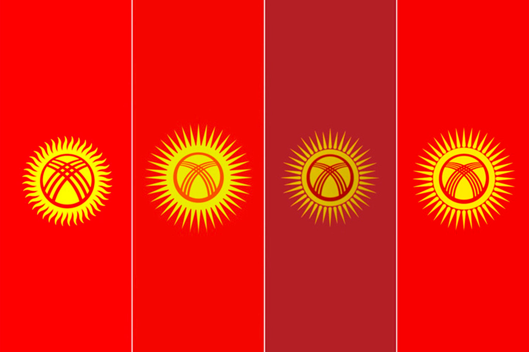 (current one on the left) the public is generally displeased https://twitter.com/_24_kg/status/1731907030854549601 https://twitter.com/Blue_Domes/status/1731701701684437392
|
|
#
¿
Dec 5, 2023 19:57
|
|
|
Phlegmish posted:It reminds me of the Xbox cheevo symbol, but it's a cool flag regardless. I don't see why you would want to change it. ChubbyChecker posted:the colors are good as is, but the symbol isn't simple enough the symbol is great, it's looking through a yurt roof at the sun, whose rays correspond to the number of tribes united by Manas to form the Kyrgyz nation in their eponymous national epic  sure, not as simple as a basic-rear end cross, but it wraps up a lot of meaning in a very small number of components
|
|
#
¿
Dec 5, 2023 21:19
|
|
|
Edgar Allen Ho posted:And to not just shitpost, here's the most popular united Turkestan flag did they... forget turkmenistan, but include a tajik flag minus the samanid crown for some reason? thems both fightin words
|
|
#
¿
Dec 14, 2023 22:13
|
|


|
im confused by the "texas knockoff" label when the texas flag _does not_ have the shape of the state represented i feel like "has stripes and one or more stars" and "has a block on the left side" is rather broad to assign to texas specifically
|
|
#
¿
Dec 16, 2023 02:56
|
|
|
Edgar Allen Ho posted:Kazakh only uses cyrillic because of a certain mustachio�d man of metal and his sparkling prison camps. Education is back to using the latin alphabet and the full switch is supposed to be completed by 2025. It�s underway atm in stuff like i mean different circumstances and all but <looks askance at uzbekistan> yes, the switch will definitely be completed on schedule, 100% that said, at least it's not the old "oops all apostrophes" proposal
|
|
#
¿
Jan 3, 2024 14:43
|
|
|
Phlegmish posted:There was actually a huge increase in the Turkish literacy rate in the decades following the switch, although there were obviously multiple reasons for that, and it's not a simple causal effect. One of the reasons they phased out the old writing system is that it was notoriously difficult and unintuitive for laypeople to master. not sure how much it applies to Anatolian Turkish/Oghuz family, but at IIRC least for Uzbek there are some aspects of the language that regular Arabic script is inherently bad at expressing due to the lack of vowel notation (hence why contemporary Uyghur script includes them) orthographies also just kinda decay in how well they reflect the language as spoken, so if it hasn't been reformed in a while you end up with a bunch of warts where you just have to know that the literal text doesn't express the sound
|
|
#
¿
Jan 4, 2024 18:19
|
|
|
Pope Hilarius II posted:It's kind of darkly funny we're discussing the merit of script systems for various languages while posting in English, a language notorious for its baffling spelling rules, written in Latin script, a script that's historically awful at handling languages with complex vowel systems like in Germanic languages. in a thread about uh... flags, to boot 3D Megadoodoo posted:the fact that long and short vowels are phonetically somewhat different is somehow important when writing language down, when it's not. they are though? the purpose of an alphabet is to represent sounds such that you can correctly pronounce an unfamiliar word. the fact that written english doesn't represent different vowels with different letters is an artifact of it having infinity dialects and no spelling reform ever. written english words are like halfway to being hanzi where it's just an arbitrary visual symbol that you mentally translate to your particular dialect's pronunciation comparatively, both Belarusian and Russian vowels are subject to akanye rules: an "о" may reduce to an "а" sound depending on what syllable is stressed, and that stress may change depending on what prefixes/suffixes to attach to a word root. Russian writes the original vowel; Belarusian writes the reduced one. the difference absolutely matters, but for Russian you can't determine the correct sound from the letter in isolation and have to infer it from the reduction rules
|
|
#
¿
Jan 6, 2024 01:00
|
|
|

|
| # ¿ May 21, 2024 06:43 |
|
|
Subjunctive posted:Is this actually the case, or is an alphabet (like an ideographic writing system) primarily intended to convey meaning to a reader, and may guide pronunciation as a common way of using it in the context of a spoken language? that is generally how intentional alphabets are designed, yes: they represent spoken sounds because this is a very effective means of spreading literacy. phonics works yo not all alphabets are intentionally designed (you definitely get plenty of poo poo like the aforementioned turkic adoption of arabic for turkic sounds because they encountered arabic writers that already had an alphabet; easier to just borrow that and make do than make your own from whole cloth, especially if you gotta do business with them anyway) and not all alphabet designers necessarily get it right, but something like, say, hangul is clearly tailored to the sounds of a specific language conveying meaning is the opposite approach, and arises in situations like the sinitic languages, where you've got a ton of people that need to communicate across a lot of very different BonHair posted:Eventually, you probably get enough variation that written Indian English is not readable to rural Texans, but that's pretty much the same as the spoken varieties. english (maybe also french, but i have no experience with the francophone world) does this weird thing where it preserves "correct" orthography, so it remains entirely readable in that sense, but language diverges in other ways--i wish i could find it again, but i definitely encountered some local audience indian english opinion piece that was just bizarre because it was clearly using very correct spelling and grammar, but the conventional sentence structure, word choice, and... idk, overall higher-level aspects just felt incredibly foreign. "do the needful" on steroids, essentially: you recognize all the words, but have no idea why they're being used that way
|
|
#
¿
Jan 6, 2024 08:55
|
|