


|
Speaking of Mondo, here's a cool Oblivion poster from them.
|
 #
?
Apr 26, 2013 00:32
#
?
Apr 26, 2013 00:32
|
|


|

|
| # ? May 28, 2024 10:45 |
|
|
Tewratomeh posted:I think it's just a side effect of most of those posters being created in a vector art program. Basically they're not bothering to blend the colors together, and I've no idea if that's a deliberate stylistic choice or they just can't be bothered to touch it up in Photoshop (or, god forbid, actually hand paint a poster on physical paper or canvas). I want to say the shading issue has to do with the limitations of the screenprinting process. A lot of screenprints only use 3-6 colors, either for artistic intent or to keep them within a certain ink budget, which can make otherwise detailed shadow delineation look splotchy. The right artist who works with the medium can make it work well (using a less detailed graphic-stencil style, or using halftone dots for shadow gradients), but otherwise it can often just come out looking like a downgraded image. If these were gicl�e inkjet prints, I'd imagine you could probably retain detail at a minimal price, but it's essentially like buying any reprinted poster from an online shop, though the paper stock is usually pretty good. With screenprints, it seems you're getting a handmade product that is more labor intensive and individualized, at the potential cost of that detail. This is just a somewhat-educated guess, though, so somebody feel free to rip this to shreds.
|
|
#
?
Apr 26, 2013 00:59
|
|

|
Origami Dali posted:I want to say the shading issue has to do with the limitations of the screenprinting process. A lot of screenprints only use 3-6 colors, either for artistic intent or to keep them within a certain ink budget, which can make otherwise detailed shadow delineation look splotchy. The right artist who works with the medium can make it work well (using a less detailed graphic-stencil style, or using halftone dots for shadow gradients), but otherwise it can often just come out looking like a downgraded image. If these were gicl�e inkjet prints, I'd imagine you could probably retain detail at a minimal price, but it's essentially like buying any reprinted poster from an online shop, though the paper stock is usually pretty good. With screenprints, it seems you're getting a handmade product that is more labor intensive and individualized, at the potential cost of that detail. This is just a somewhat-educated guess, though, so somebody feel free to rip this to shreds. You're mostly right here, but limitations of the medium have little or nothing to do with it. As you already pointed out, if an artist has the time and inclination, there's no upper limit on the number of colour-layers they can use, so you can have a lot more blocks of tone than these Mondos use, if you're going for a smooth gradient. You can also do a simple halftone, but the resolution really wouldn't be too low; these screens typically have a very fine mesh. You can have dots measurable in fractions of a millimeter, if you're so inclined. Although smaller dots are slightly harder to print, having the tendency to get clogged with ink more easily, it's really not difficult if you know what you're doing. When you see really low-res halftones, like noticably low-res, they're typically being employed deliberate effect, for the look of a cheaply-printed newspaper ad or something. Using pretty much the same technique, you can do a 4-colour separation (Cyan, Magenta, Yellow, blacK) that will be indistinguishable from a photograph from a short distance - the overlapping dots will create a full range of tone and value, the same way a colour printer or RGB monitor will. You can also blend multiple inks within a single layer to create an extremely smooth gradient effect. And that's just the really basic stuff, since it's possible to pull off effects similar to watercolour, and so-on. And then, you can use inks that are reflective, metallic, fluorescent, etc. - stuff a computer monitor can't replicate (and in fairness to mondo, they do use the metallic stuff fairly often). There's pretty much no real limit. Mondo's posters only look the way they do because they've been sketched up in Adobe Illustrator, with an eye to using the minimum number of colours. Though, admittedly, they don't seem to have just used a 'posterize' filter, the effect they've created is basically the same. It's just 'vector art', which is apt when you're doing a picture of Iron Man merch, and not so much when it's supposed to be a human face. Vector art screams math and computers. It's way too clean, for me. SuperMechagodzilla fucked around with this message at 03:48 on Apr 26, 2013 |
|
#
?
Apr 26, 2013 03:45
|
|

|
Improbable Lobster posted:Speaking of Mondo, here's a cool Oblivion poster from them. That's the vinyl being released tomorrow, actually. Here's the poster which has already been sold: 
|
|
#
?
Apr 26, 2013 04:00
|
|

|
They aren't currently hanging anywhere since I was trying to reduce the number of pop-culture based household decorations I had a few years back, but for the longest time I had these. Pulp Fiction  and American Beauty  I don't even particularly love American Beauty as a movie (although I do like the poster) mainly I've hung on to it because I just happened to be visiting my tiny hometown and when I went to the theater some dude was changing out their posters and I asked if I could have it and he said "sure" and handed it over, it's on really nice paper too; semi translucent so it looked good on the backlit display they had. And since I had to google American Beauty to find a poster I had the joy of finding this lovely creation: 
|
|
#
?
Apr 26, 2013 04:09
|
|


|
I'm happy just having this: I have the Tron Legacy Daft Punk glow-in-the-dark poster too, but that's more of a Daft Punk poster than a movie poster.
|
|
#
?
Apr 26, 2013 04:16
|
|


|
Hey, here's a pretty okay poster for an upcoming kinda horror, kinda not horror movie that's coming out: and here's a pretty awful poster for another movie coming out by the same director that also has Michael Cera in it. 
|
|
#
?
Apr 26, 2013 05:50
|
|


|
Found this one while looking for 5th Element posters: I'm not sure if I should question my taste for thinking about buying one.
|
|
#
?
Apr 26, 2013 05:50
|
|

|
It looks like The Fifth Element as depicted in South Park.
|
|
#
?
Apr 26, 2013 06:07
|
|


|
axleblaze posted:Hey, here's a pretty okay poster for an upcoming kinda horror, kinda not horror movie that's coming out: So what's the unseen that we're supposed to beware of? It would be nice if it actually let us know what the movie's called.
|
|
#
?
Apr 26, 2013 06:14
|
|

|
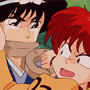
Hmmm. I like Ghost in the Shell, but I also love in-jokes. I wonder how I can combine these two interests into one pile of poo poo. I know! I'll make a minimalist poster!  http://i.imgur.com/pwyWEPY.jpg http://i.imgur.com/pwyWEPY.jpg Here's the original GITS poster, for comparison: http://i.imgur.com/WFnI915.jpg And I think I found the shittiest Akira minimalist poster. 
|
|
#
?
Apr 26, 2013 06:16
|
|

|
axleblaze posted:Hey, here's a pretty okay poster for an upcoming kinda horror, kinda not horror movie that's coming out: Man, I can't wait to see that cast in the film Sebastian Silva: Beware of the Unseen.
|
|
#
?
Apr 26, 2013 06:42
|
|

|
Lance Streetman posted:And I think I found the shittiest Akira minimalist poster. You're probably right. Any yet...     PILLS!  Baby!   "A fake poster of the proposed American Akira remake... alongside one of the first actors rumored to be starring in it." 
|
|
#
?
Apr 26, 2013 06:56
|
|
|
Lance Streetman posted:And I think I found the shittiest Akira minimalist poster. It could always be repurposed.... 
|
|
#
?
Apr 26, 2013 06:59
|
|

|
It's been a while since I saw it, but I'm pretty sure she didn't have nipples  Randallteal posted:
Pattinson teaming up again with Cronenberg for an Akira remake? Sure, why not.
|
|
#
?
Apr 26, 2013 07:20
|
|
|
a kitten posted:And since I had to google American Beauty to find a poster I had the joy of finding this lovely creation:  Just when you thought it couldn't get worse, someone invents minimalist child pornography.
|
|
#
?
Apr 26, 2013 07:47
|
|

|
Dissapointed Owl posted:It's been a while since I saw it, but I'm pretty sure she didn't have nipples Nope, she had them. Gave me an excuse to rewatch this again: https://www.youtube.com/watch?v=uK8V9jG7Wjg&t=316s
|
|
#
?
Apr 26, 2013 08:31
|
|
|
Lance Streetman posted:Nope, she had them. Gave me an excuse to rewatch this again: I should really rewatch GitS.
|
|
#
?
Apr 26, 2013 08:59
|
|
|
Are we still doing the "I have this movie poster" thing? I only have this one, framed and printed on cheap canvas. I got it off a Blockbuster when they were going out of business and selling all of their poo poo.  I rather like it. They also had some old Bond posters, and the Thunderball one was sick as hell:  Unfortunately, nice poster aside, Thunderball kinda sucks. And the idea of having a sweet poster for a poo poo movie on my wall is anathema to me. I really wanted the From Russia With Love one they had, since it's my favorite Bond film:  But the only one they had was water-damaged as gently caress 
|
|
#
?
Apr 26, 2013 09:02
|
|

|
Dissapointed Owl posted:I should really rewatch GitS. You should. It's still a really interesting film, and the animation holds up surprisingly well. It didn't get it's reputation for no reason. Ed: It's also the only film I know of that manages to have a high-intensity tank fight with such calming music, and make it all work.
|
|
#
?
Apr 26, 2013 09:05
|
|
|
Lance Streetman posted:You should. It's still a really interesting film, and the animation holds up surprisingly well. It didn't get it's reputation for no reason. Try to avoid the Ghost In The Shell 2.0 edition (note: not the sequel) that was put out a couple years ago. It is remastered, but the CGI animation jars horribly with the existing animation and doesn't really add anything. Also, they changed the audio in that firefight: the tank's miniguns are much, much louder, but are a slower "budda-budda-budda" instead of someone sticking a bunch of bullets into a blender. They probably got audio from a .50 caliber machinegun for the remaster, but it's too slow firing to match what's going on. It felt real off watching that scene. The interesting thing is that they also redid the color palette to more resemble the sequel Ghost In The Shell: Innocence, which has a more golden tone over the original's greens, although the joke is that The Matrix sequels poisoned green color grading so much that Mamoru Oshii retroactively changed it from green to gold.
|
|
#
?
Apr 26, 2013 09:36
|
|

|
You know what that needs? A skull and a laser. 
|
|
#
?
Apr 26, 2013 09:57
|
|


|
Improbable Lobster posted:Speaking of Mondo, here's a cool Oblivion poster from them. That's by Killian Eng, who is an unreal concept artist.
|
|
#
?
Apr 26, 2013 09:58
|
|

|
Randallteal posted:
Why thank you for reminding me of this thing:  [edit] Oh god, there's more... 
testtubebaby fucked around with this message at 13:56 on Apr 26, 2013 |
|
#
?
Apr 26, 2013 13:47
|
|


|
.
boom boom boom fucked around with this message at 01:35 on Oct 6, 2014 |
|
#
?
Apr 26, 2013 15:23
|
|

|
zenintrude posted:Why thank you for reminding me of this thing: Please... stop... such awful fan casting...
|
|
#
?
Apr 26, 2013 15:28
|
|

|
Randallteal posted:
The photoshop work is loving awful but I kinda like the idea and aesthetic they're going for 
|
|
#
?
Apr 26, 2013 15:43
|
|


|
Sockser posted:The photoshop work is loving awful but I kinda like the idea and aesthetic they're going for I don't. All I can think of is the Devil May Cry reboot.
|
|
#
?
Apr 26, 2013 15:49
|
|

|
Lizard Combatant posted:Please... stop... such awful fan casting... Wasn't Keanu Reeves actually supposed to be making a Cowboy Bebop movie?
|
|
#
?
Apr 26, 2013 16:13
|
|

|
Cacator posted:I'm happy just having this: I have a tiny 11x17 of this up with some other posters, it rules.
|
|
#
?
Apr 26, 2013 16:15
|
|

|
Eau de MacGowan posted:Wasn't Keanu Reeves actually supposed to be making a Cowboy Bebop movie? Development hell. Hopefully it remains so until Reeves is too old to star in it.
|
|
#
?
Apr 26, 2013 16:17
|
|
|
"Foreign Exchange Student of Chucky"
|
|
#
?
Apr 26, 2013 16:23
|
|

|
Lizard Combatant posted:Development hell. Hopefully it remains so until Reeves is too old to star in it. Keanu would have been great as Jet. Now they can have Joseph Gordon Levitt play him.
|
|
#
?
Apr 26, 2013 16:26
|
|
|
Paper Jam Dipper posted:Keanu would have been great as Jet. Jet or Spike?
|
|
#
?
Apr 26, 2013 16:35
|
|
|
GonSmithe posted:That's the vinyl being released tomorrow, actually. Here's the poster which has already been sold: The vinyl just got put up. Not sold out immediately, at least. http://www.mondotees.com/Oblivion-Original-Soundtrack-2XLP_p_923.html
|
|
#
?
Apr 26, 2013 17:04
|
|
|
I guess someone really liked the McFarlane Tetsuo action figure. 
|
|
#
?
Apr 26, 2013 17:05
|
|

|
zenintrude posted:Why thank you for reminding me of this thing: Was Stephen Dorff really a big name in 2003? Or ever?
|
|
#
?
Apr 26, 2013 17:33
|
|

|
There can't be a Cowboy Bebop movie unless John Cusack reverts to his 30 year-old self to play Spike. On that note:  Nicolas Cage wasn't available I guess?
|
|
#
?
Apr 26, 2013 17:40
|
|

|
One reason why this rules: Bond/Connery wearing flippers and making it work. Who else in fifty years has ever pulled off flippers in a movie's ad campaign? Who else has even tried?
|
|
#
?
Apr 26, 2013 17:43
|
|


|

|
| # ? May 28, 2024 10:45 |
|
|
Lobok posted:One reason why this rules: Bond/Connery wearing flippers and making it work. Who else in fifty years has ever pulled off flippers in a movie's ad campaign? Who else has even tried? If you try to make fun of the flippers OR the pink background he'll shoot you with a harpoon. He's loaded, who knows what he's capable of!
|
|
#
?
Apr 26, 2013 17:45
|
|