|
dukeku posted:Joel Sternfeld Wish more people had quoted this because Sternfeld owns and this is one of my favorite pictures ever.
|
 #
?
Feb 8, 2012 08:18
#
?
Feb 8, 2012 08:18
|
|


|

|
| # ? May 14, 2024 13:07 |
|
|
nebojsa mladjenovic, he can be quite "experimental" at times but his latest project is inspired.
|
|
#
?
Feb 8, 2012 14:59
|
|
|
 Really enjoyed this series by David Semeniuk.
|
|
#
?
Feb 10, 2012 02:23
|
|

|
Paul Shambroom  
|
|
#
?
Feb 10, 2012 17:25
|
|

|
I wonder how many places in the world you could get a basketball court, a church, and a missile in the same frame.
|
|
#
?
Feb 10, 2012 17:32
|
|

|
xzzy posted:I wonder how many places in the world you could get a basketball court, a church, and a missile in the same frame. Quite a few, at least here in the south.
|
|
#
?
Feb 10, 2012 18:44
|
|

|
Went to an Andreas Gursky exhibition yesterday, and I was floored! His pictures is SO impressive when you look at them in big and good c-prints. If you ever get a chance.. Also, his picture Rhine II (below), is the worlds most expensive picture!    Trivia: He sometime uses 300 pictures to make on single picture!
|
|
#
?
Feb 10, 2012 20:00
|
|
|
Rhine II really doesn't impress me (maybe its better in person?) I still don't understand why it commanded such a high price. His other stuff is awesome though, I love the F1 pit stop photo.
|
|
#
?
Feb 10, 2012 21:17
|
|

|
I saw the original giant print comps of the F1 stuff and it left me completely cold. Aside from forcing comparison to tableaux vivant, there is almost nothing of substance there. It's supposed to be focused on the theatrical I suppose, but it just draws attention to the empty spectacle of the work.
|
|
#
?
Feb 10, 2012 21:22
|
|
|
Reichstag posted:I saw the original giant print comps of the F1 stuff and it left me completely cold. Aside from forcing comparison to tableaux vivant, there is almost nothing of substance there. It's supposed to be focused on the theatrical I suppose, but it just draws attention to the empty spectacle of the work. I guess I don't speak "art" but I have no clue what you're saying. Could you explain it to me like I'm five? I'm actively learning some art history and works I should know and I'm struggling to understand a lot of it without having someone that can explain it. I don't get the first image at all. I don't dislike it, it's just completely flat and boring to me. The F1 shot is fascinating and looks like it had to have been staged, but I love the theatrical vibe it gives. The third is interesting because it's such a weird landscape.
|
|
#
?
Feb 10, 2012 21:35
|
|
|
Tableau vivant is the style where everybody is in the middle of an action (usually exaggerated) and everybody is dramatically/theatrically lit. It may not be the best example, but I always think of The Last Supper. If you look at that, everyone is gesturing wildly and is in the middle of moving. Personally I think the Pit Stop image reminds me of a medical theater, where they have onlookers at the top watching the surgeons below. In that regard I think it's kind of cool, but I don't see the love for the Rhine photo.
|
|
#
?
Feb 10, 2012 21:40
|
|

|
Can't believe Rhine II sold for $4.3 million. I'm sure he put a ton of work into it, but it looks like something anyone with a DSLR can go out and shoot.
|
|
#
?
Feb 10, 2012 21:47
|
|
|
wizard sticks posted:Can't believe Rhine II sold for $4.3 million. This is not a very good argument as to why that picture is not worth 4.3 mil.
|
|
#
?
Feb 10, 2012 22:10
|
|
|
wizard sticks posted:Can't believe Rhine II sold for $4.3 million. Effort is a horrible baseline for a value system. Cy Twombly heard a lot of "but my kids could do that!" too. They didn't though. A rubric of "anyone with X can do Y" undermines everything, ever and nothing you, I or anyone else here would ever create could survive it.
|
|
#
?
Feb 10, 2012 22:27
|
|

|
Awkward Davies posted:This is not a very good argument as to why that picture is not worth 4.3 mil. I see where he is driving at, it looks like a unedited nikon RAW file when you have hit zero on everything in lightroom. I know he shopped out a few things to make it cleaner but as the sky is cloudy and dull I can't see how much more there would be to do. I suspect this price tag is for the invisible silk and pixie thread to be honest as it's a rather dull picture even by modern art standards when you actually study it, it's as about as innovative and creative as a brand new modern flavour of pepsi. Medusula fucked around with this message at 22:38 on Feb 10, 2012 |
|
#
?
Feb 10, 2012 22:35
|
|
|
My value system for art is to answer the "would I want it to hang on my wall" question. The Rhine photo, the answer is no. It's boring and doesn't make me think at all. The F1 is more interesting and I wouldn't mind hanging it. Final dollar figure is a function of how many people decide they want to hang the image on their wall. By this metric, lots of people have terrible taste and want to hang boring pictures of rivers in their home.
|
|
#
?
Feb 10, 2012 22:59
|
|
|
You really can't judge the price without seeing the print. We are seeing a small jpg on a computer screen. Seeing something in person in it's intended size changes a person's perspective. The image (per wikipedia) is 73 by 143 inches, not quite something you can shoot with a DSLR. The subject may have been a bit more personal to the buying audience as well.
|
|
#
?
Feb 10, 2012 23:18
|
|
|
Civil War photos on the Atlantic. A few are  . .  The Places The People Stereographs Most of it is from the LOC.
|
|
#
?
Feb 10, 2012 23:27
|
|

|
How would that F1 pic have been lit? I absolutely love it personally and would like to try something similar myself this year if it can be done with a bunch of 430s and 580s.
|
|
#
?
Feb 10, 2012 23:35
|
|


|
I gotta say, seeing Rhine II in person, in big and fancy print - I was converted. There is just something about it. The big flat green nothing. It is to me, really intriguing. Like his other pictures, I wanna explore it, but it is quite a hard task, as there is nothing to see. Only a orange thing and a stair that leads to nothing. But his pictures really is waaay better in big print. They are often very very detailed, and that is what is interesting to me. Except Rhine II, that one I just love for some reason - maybe it is the empty peacefulness.
|
|
#
?
Feb 10, 2012 23:37
|
|
|
ThisQuietReverie posted:Effort is a horrible baseline for a value system. Cy Twombly heard a lot of "but my kids could do that!" too. They didn't though. You are absolutely right. I didn't convey what I meant well enough. I should have said that it is something which I don't find particularly interesting enough to shell out that much money. That being said, as someone else just mentioned, someone did feel that way, which makes it "worth it".
|
|
#
?
Feb 10, 2012 23:40
|
|
|
A5H posted:How would that F1 pic have been lit? I absolutely love it personally and would like to try something similar myself this year if it can be done with a bunch of 430s and 580s. We had a guide on, that told that every complete Formula 1 picture consists of several 100 pictures, taken all over the world. Apparently all the pit stops are similar, same architect, so that the drivers always know how they look. Not sure how it looks, but it is a huuuge collage! Pretty much every detailed is super controlled, stitched in and most likely really altered in post process. Looks awesome still! And on the c-prints the colors are just much much more vivid. It is really insane.
|
|
#
?
Feb 10, 2012 23:40
|
|
|
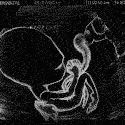
East Lake posted:Is it just me, or is something insane going on with the DOF here? It's like there's a circle of in-focus area around the soldiers and as you get towards the edge it blurs out. Is this darkroom trickery? I love the contrasty look to it too.
|
|
#
?
Feb 10, 2012 23:49
|
|
|
Would have something to a large format camera and crappy lens optics in those days?
|
|
#
?
Feb 10, 2012 23:59
|
|
|
LAchristus posted:We had a guide on, that told that every complete Formula 1 picture consists of several 100 pictures, taken all over the world. Apparently all the pit stops are similar, same architect, so that the drivers always know how they look. Not sure how it looks, but it is a huuuge collage! Pretty much every detailed is super controlled, stitched in and most likely really altered in post process. But where are the lights!!?
|
|
#
?
Feb 11, 2012 00:00
|
|
|
A5H posted:But where are the lights!!? Frustrating - I know! Was thinking the same when I saw it! My guess is, it could be daylight mixed with calibrated HMI. I've seen him, in a documentary, mix daylight with HMI. But it is only a guess.
|
|
#
?
Feb 11, 2012 00:25
|
|
|
xzzy posted:Is it just me, or is something insane going on with the DOF here? It's like there's a circle of in-focus area around the soldiers and as you get towards the edge it blurs out. Is this darkroom trickery? Could be shot using a Petzval lens?
|
|
#
?
Feb 11, 2012 00:39
|
|

|
Bobsledboy posted:Could be shot using a Petzval lens? It's likely just from being shot on an 8x10 negative, creating some really wild DOF effects.
|
|
#
?
Feb 11, 2012 00:43
|
|

|
Hotwax Residue posted:Would have something to a large format camera and crappy lens optics in those days? I bet someone could make themselves a decent living creating "period" lenses these days. They make some really neat effects. I guess most of it can be done in software now, but there's something juicy about doing it in the camera.
|
|
#
?
Feb 11, 2012 01:09
|
|
|
This guy's wife let him photoshop their engagement photos:
|
|
#
?
Feb 11, 2012 09:20
|
|

|
Run, the empire is breaking our tables with AT-AT walkers and they are pink.
|
|
#
?
Feb 11, 2012 13:55
|
|


|
It looks like it was a wide-angle shot by itself, and putting it in the distant background makes the overall perspective pretty wonky; like it's about to fall over or its legs are different lengths. It's a pity.
|
|
#
?
Feb 11, 2012 14:38
|
|

|
Arguing about the auction value of a piece of work is always kinda silly. Auction prices don't directly reflect cultural value. Why did Rhine II go for $4.3 million? Because someone with $4.3 million didn't want anyone else to own it. Gursky's got pieces in some pretty big museums and his work's been steadily fetching more and more money at major auctions, that tends to make bidders a lot more aggressive. It's certainly still art, but art wrapped up as a luxury commodity. I've been a runner at some art auctions before. It's a pretty weird feeling to stand there on stage holding up canvasses I've recognized from my art history textbooks while old rich jerks get into bidding wars over them. Oh boy! I'm holding something worth $250,000 and getting ten bucks an hour to babysit it!
|
|
#
?
Feb 11, 2012 20:48
|
|

 is go
is go
|
Athens in Flames http://www.theatlantic.com/infocus/2012/02/athens-in-flames/100244/  
|
|
#
?
Feb 14, 2012 09:56
|
|
|
South African photographer Roger Ballen hooked up with Die Antwoord to direct one of their videos: http://www.youtube.com/watch?v=8Uee_mcxvrw It's awesome to see his distinctive style in motion.
|
|
#
?
Feb 14, 2012 17:06
|
|


|
My Sentimental Archives by Nicolas Dhervillers is an amazing series. I'm in love with it. He took archive photos from a local council in Sion, Switzerland which contained old residents of the place (as in 1840's old) and then incorporated them into his modern photographs of the place. It's utterly gorgeous, have a look.
|
|
#
?
Feb 14, 2012 19:31
|
|

|
wrong thread, sorry!
AceClown fucked around with this message at 01:05 on Feb 15, 2012 |
|
#
?
Feb 15, 2012 00:55
|
|

|
yowayowa camera woman diary Tokyo photographer shoots levitating people (mostly self-portraits), and has two cats. DanTheFryingPan fucked around with this message at 15:02 on Feb 15, 2012 |
|
#
?
Feb 15, 2012 14:58
|
|

|
DanTheFryingPan posted:yowayowa camera woman diary That is pretty cool actually. Japs are weird that way I guess. (USER WAS PUT ON PROBATION FOR THIS POST)
|
|
#
?
Feb 15, 2012 22:55
|
|
|

|
| # ? May 14, 2024 13:07 |
|
|
I don't know the photographer, but I was quite taken aback by this.
|
|
#
?
Feb 17, 2012 03:31
|
|