|
alkanphel posted:Here's something I saw on a walk around the city: This is pretty great and works really well in B&W. Out of curiosity, what colours were there originally? I'm not so sure about the house in the foreground though. I'd like to see either a more abstract shot of the main subject without the house in it at all, or if you'd prefer to keep it there to give the photo some context, then I'd like to see it included a bit more creatively. At the moment it's just kind of there in the shot. That roof looks like it's corrugated? Maybe a front-on shot using the lines in the corrugation to be kind of similar-but-different to the lines in the big wall? Haven't done much shooting in a while (or editing for that matter - I still have tons of holiday shots to work through from months ago, thanks Skyrim), trying to shake off the rust.  Banks Peninsula 1 by euannz, on Flickr  Banks Peninsula 2 by euannz, on Flickr There's a leprechaun hiding in this one, can you spot him?  Banks Peninsula 3 by euannz, on Flickr Wafflecopper fucked around with this message at 06:48 on May 27, 2012 |
|
|
|
|
| # ? May 11, 2024 18:07 |
|
Wafflecopper posted:This is pretty great and works really well in B&W. Out of curiosity, what colours were there originally? I'm not so sure about the house in the foreground though. I'd like to see either a more abstract shot of the main subject without the house in it at all, or if you'd prefer to keep it there to give the photo some context, then I'd like to see it included a bit more creatively. At the moment it's just kind of there in the shot. That roof looks like it's corrugated? Maybe a front-on shot using the lines in the corrugation to be kind of similar-but-different to the lines in the big wall? quote:There's a leprechaun hiding in this one, can you spot him?
|
|
|
|
The second and probably most visually striking of the views i took pictures of near Skye:  I can't really decide between the blue and the green though. My flatmate prefers the blue but I feel that it kind of permeates the image washing things out and that the green just "pops" more. Again, this could probably be cropped better, but i need to figure out a way of getting around the hdr/stitching/image size variation problem before diving deeper into the image. The individual exposure layers are perfectly crisp, but autopano seems to fluctuate the final renders ever so slightly in dimension and FOV (even though it's rendering from the same source image files but just with different exposure levels). I thought that being out by under a hundred pixels wouldn't be that bad for something on this scale, but it looks like I'll need to try and get it 100% to remove any kind of "blur" from the final image. Aliencowboy, when you mentioned standardised cropping sizes, do they generally still apply to panoramic projects like this?
|
|
|
I prefer the green, personally. The blue looks a lot less natural. The green has that nice natural landscape feel, plus it breaks the image up a little bit. The blue image just has way too much blue.  Other than that I think I might add a bit of contrast to the photo (but not too much) and that's about it! If you really wanted to go nuts on post you could do a light green/dark purple split tone to give it that really "airy" feel that I find works well on bright daylight photos like this, but you may want to wait until after you've fixed your stitching problem before doing that. alkanphel posted:
Taken MrBlandAverage's advice from my last photos (thanks for that, you're definitely right that they were getting too touristy) and I hope I've improved a bit:  San Pietro by hookshot88, on Flickr 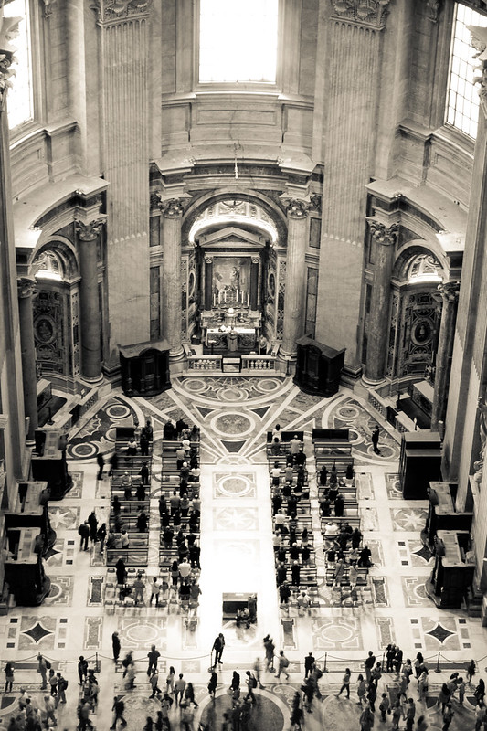 San Pietro by hookshot88, on Flickr  Neues Museum by hookshot88, on Flickr HookShot fucked around with this message at 14:38 on May 27, 2012 |
|
|
|
|
HookShot posted:
When I first looked at the top photo, I immediately thought that it needs to be rotated counter-clockwise. On closer inspection, the top of the main building looks level, so that's not the issue. I think maybe the slight angle of the leading line at the bottom of the frame is throwing me off. Maybe you can try messing around with cropping out that part? The composition is pretty solid, but I don't like how the very top of that pillar is cut off. Also, the vignette is too strong for my tastes. In the second photo, I see that you were attracted to the symmetry of the shot. It's a nice idea, but I get the feeling you weren't standing in the middle of the balcony, because the perspective looks wrong. The middle window at the top looks like it's rotated clockwise, whereas the pews appear to be pointing to the left a bit. If the photo is about symmetry and the symmetry is lost to perspective distortion, that kind of kills the photo for me. But hey maybe it's not about symmetry and I'm just simple-minded. Speaking of symmetry I took this one of MIT that I kind of like.  DSC01406_a by Large Hadron, on Flickr
|
|
|
|
HookShot posted:
I don't know what the etiquette is for editing someone else's work, but in an effort to see if I'm learning how to crop better, does this shot look better cropped in this way using the 1x1 size:  edit: I think it's because the main focus of the shot is maybe slightly more vertical in size than horizontal (or, at the very least, equal) meaning that landscape is perhaps too wide for it? Kin fucked around with this message at 17:07 on May 27, 2012 |
|
|
^^ That's a great idea, I actually really like it in 1x1, so I think I'll change it, thanks!!LargeHadron posted:When I first looked at the top photo, I immediately thought that it needs to be rotated counter-clockwise. On closer inspection, the top of the main building looks level, so that's not the issue. I think maybe the slight angle of the leading line at the bottom of the frame is throwing me off. Maybe you can try messing around with cropping out that part? The composition is pretty solid, but I don't like how the very top of that pillar is cut off. Also, the vignette is too strong for my tastes. In the second photo, I see that you were attracted to the symmetry of the shot. It's a nice idea, but I get the feeling you weren't standing in the middle of the balcony, because the perspective looks wrong. The middle window at the top looks like it's rotated clockwise, whereas the pews appear to be pointing to the left a bit. If the photo is about symmetry and the symmetry is lost to perspective distortion, that kind of kills the photo for me. But hey maybe it's not about symmetry and I'm just simple-minded. I'll definitely play around with the first one as you suggested. I 100% agree with you about the top of the pillar, and I hate myself for not getting it, but I really wanted the birds and they were flying away so quickly that I took it so quickly I didn't even notice that rookie mistake. As for the symmetry, you're right. The dome of St. Peter's is basically a photographer's hell. Not only do they have a wire mesh cage where the holes are about 1x1 centimeter (I guess they don't want people to be able to get a foothold if they have the idea that they can get to heaven faster by jumping into the Altar at St. Peter's) but you can only walk around 1/3-1/2 of the dome area, and the area where you can go stops LITERALLY about 2 feet to the left of where the symmetrical center would be. So I did my best, but yeah, I really, really wish they had consulted a photographer before building where they did  For your MIT one, I really like it. I like that it's clear enough that you can read the words and the date on the building, even though it's a pretty high contrast B&W conversion. I'd just suggest maybe cropping at the bottom to get rid of the splotchy bits of the pavement. That kind of crop would also help getting 1/3 pavement, 1/3 building, 1/3 dome+sky, which I think would help improve it.
|
|
|
|
|
krackmonkey posted:
quote:
quote:
I just got a loan of Light: Science and Magic, and I'm trying out the dark field glass lighting technique. 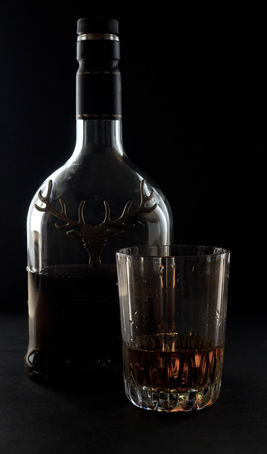 148/366 - Whisky by fuglsnef, on Flickr
|
|
|
|
HookShot posted:I love this so much I wanted to critique it. It's awesome. Honestly, the only thing that bugs me just a tiny bit is I'd love it if that roof was a light grey, as I think the white overwhelms the picture just a little bit, but I guess you can't always get what you want. I love the composition and I think a 1:1 ratio works really well for this picture. quote:
I think for the 2nd shot, like what LargeHadron was saying, symmetry would have made it better but circumstances probably didn't permit you to do it. I wonder if you could create the symmetry by adjusting the perspective in Lightroom/Photoshop? Sometimes it works if you have enough image resolution to crop. LargeHadron posted:Speaking of symmetry I took this one of MIT that I kind of like. David Pratt posted:I just got a loan of Light: Science and Magic, and I'm trying out the dark field glass lighting technique.
|
|
|
|
alkanphel posted:I think you're getting there but there's still a bit too much light spillage and the light accents on the glass body edges are a bit thick. Perhaps you can try adjusting the size/position of the black and white cards? More likely you'd have to make the black card much large I think. Thanks, that's exactly the sort of feedback I was after  I had the black card standing on its short edge, so I'll try it on its long edge next time. I had the black card standing on its short edge, so I'll try it on its long edge next time.
|
|
|
|
HookShot posted:
I like the feel of the photo even if it's some kind of post-processing magic to give it the "old" feel. The subject itself is fine, I think you took a nice clear shot of the building and can tell what you wanted to achieve from it, however a few things take me out of the photo. The spires very tip is JUST cut off and it leaves this sort of annoying feeling in my brain to not see it. The other, can't be helped, it's the dreadful tourists. I look at that guy at the bottom left hand and just get pissed at him for ruining a decent shot. I do really like how the birds are just floating about though. I prefer to take shots at night to minimize the chance of people mulling about looking stupid in my photo! Okay.. time to suck it up Jet.. bring on the pain.. here are my photos. These were taken on vacation in 2008 and I'm quite happy with them with the exception of a few flaws. These are by no means a perfect picture because the resolution and clarity upsets me.. I was using just a dinky point and shoot (Powershot A 590 IS) which was ALREADY getting old at the time I took these. I whimper at night thinking about how much better the shots may have been had I actually had a DSLR or something. First up is a nighttime shot of the Asakusa Kaminarimon Shrines. My camera was lovely, as mentioned just above, and to top it all off I had a cheapo fisheye lens that could attach to it. You can see what I was going for even if the edges are blurred as a result of the cheap lens. I'm happy with the two buildings on the right side, but am upset with the composition of the building on the left. It was covered by trees and I couldn't do much about it.  Second is a shot of a little dinky bridge in a park somewhere in Tokyo I happened upon when I was wandering aimlessly around. I've been told by friends they don't like the shot because it's too colorful, but I refuse to turn it into one of those "black and white pictures.. but wait.. that bridge is bright red!" kind of deals.  Finally one of my more favorite photos of the trip, due to the emotion I felt it captured. The very far background, where you see the building behind the trees, is a bit underwhelming to me but I couldn't really help it. But the narrative of this father and his son I think strikes a chord. Everytime I look at this picture I think to myself what they look like now, or what they are doing. It's a picturesque view of a father and son relationship I wish I had with my father. 
|
|
|
|
Jet Ready Go posted:Finally one of my more favorite photos of the trip, due to the emotion I felt it captured. The very far background, where you see the building behind the trees, is a bit underwhelming to me but I couldn't really help it. But the narrative of this father and his son I think strikes a chord. Everytime I look at this picture I think to myself what they look like now, or what they are doing. It's a picturesque view of a father and son relationship I wish I had with my father. The emotion that you feel toward this photo isn't really conveyed to me. Maybe it's because I have a good relationship with my dad or I'm just some kind of
|
|
|
|
Yeah I think you're right. The sky is too bland and the water isn't exactly picturesque upon inspection. I guess my eye was too busy at the treeline and the trail. I suppose I'm too busy wondering how awesome of a dad that is to notice this stuff. I guess everyone knows where my mind is now.. haha. Think it would have been better had I the ability to cut the photo like so?  David Pratt posted:I just got a loan of Light: Science and Magic, and I'm trying out the dark field glass lighting technique. I find the deer and the droplets of water inside the tumbler to be a little distracting. I think maybe if you had another light source illuminating the design on the bottle as well it would look cooler? Jet Ready Go fucked around with this message at 18:07 on May 28, 2012 |
|
|
|
Jet Ready Go posted:Yeah I think you're right. The sky is too bland and the water isn't exactly picturesque upon inspection. I guess my eye was too busy at the treeline and the trail. I suppose I'm too busy wondering how awesome of a dad that is to notice this stuff. I guess everyone knows where my mind is now.. haha. Yeah, cropping it might be a good idea. Maybe try a few different crops. The one you chose might work, but the resolution will be kind of sad.
|
|
|
|
LargeHadron posted:
I like what you're doing here, but what really sticks out to me is the plastic cap on the bottle. Everything else in the shot seems really classic and timesless and having a modern plastic cap just sort of ruins the mood. LargeHadron posted:
This is a nice shot but you might want to try a more conservative tone curve. As is the foliage seems way too dark and it makes all of the elements in the frame feel a bit disjointed. Here are some blue things.  
|
|
|
|
Augmented Dickey posted:
That's a great location! I love the color. I could easily see a portrait session there, if that's your thing! Here's one of mine, been awhile!  IMG_8470 by avoyer, on Flickr
|
|
|
|
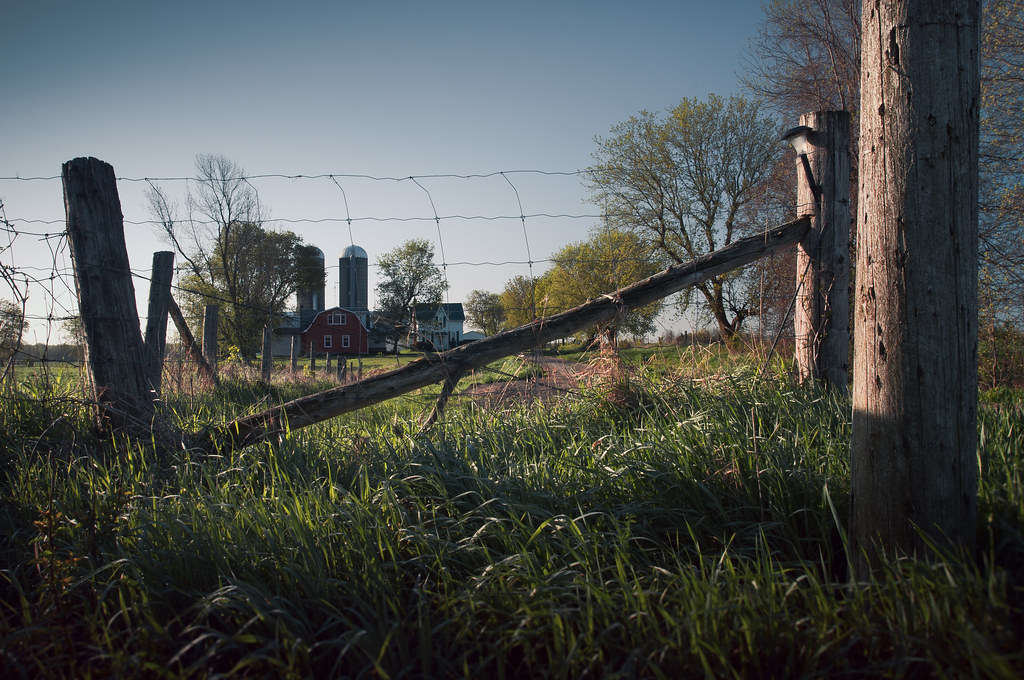
I wasn't going to comment on this, since plenty of others did, but I'm not much good at keeping my opinion to myself! Anyway, one of the first things that strikes me about this image is how flat it is in comparison to most of your other pieces. While there's still the expected light play and post-work, it isn't as heavy in contrast and depth of shadow, and it creates a much more muted tone for the overall picture. I get the idea of the gate functioning as a "no entry", but feel the actual farmhouse and silos are a little removed in distance, lessening the impact of the gate and fence (I'm not sure if you could have used a perspective trick to make the fence more imposing). I actually like the palette you've chosen. While it's a slightly different direction from the norm, it does create a sense of intrusion by virtue of the colder colours. While I was previously bemoaning the lack of heavy contrast between the light, it does provide a sense of uneasiness. It's always good to try things, even if they don't always quite come off. (Incidentally, your pic of glencoe you linked to reminds me of a painting. I'll need to go check the museum again for the exact details). My crap: 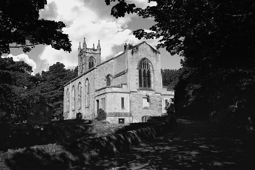 The auld kirk by falamh, on Flickr 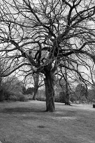 Branching out by falamh, on Flickr
|
|
|
|
I know most of this is a limitation of the lens, but here's what I would do if you have the chance to go there again: - Go up to f/11 or higher to get a star shape to the lights. Right now the yellow lights in the middle are mostly just blobs. I know from experience that it's basically impossible to avoid them entirely at Asakusa, so I'd try and make up for it by making them look somewhat nice. - I'd probably try and crop out the buildings on the left hand side. The light pours out of those windows so strongly that it just makes big white blobs that are distracting. Plus, at the moment it looks as though you've got the tower in the middle of the frame, and I hate things being in the middle of the frame if the point of the photo isn't symmetry. - Just a tiny thing, but I would have taken one or two steps forward to cover up the light popping out from behind the big lantern. It's a bit bright and distracting. quote:- I love the composition of this photo, but I think you need to add some contrast. The fall colours of the leaves are absolutely gorgeous, and it doesn't show in the photo. It really just gives the impression of a well composed holiday snap. Take it back into LR and add some contrast, maybe a TINY bit of vignetting, and play around with the other settings (blacks, vibrance, etc) until the photo really pops. quote:- I agree with the person who suggested a tighter crop. At the moment, it's hard to understand that's what you're going for because your subjects are so small in the photo. Also, I think the leaves coming in from the top are badly placed and detrimental to the photo, so the crop getting rid of those can only be a good thing. Other than that, it's pretty good. I especially like the one bright yellow tree in the back. Here's some from my day trip to Poland:  Szczecin by hookshot88, on Flickr 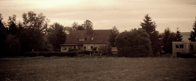 Poland by hookshot88, on Flickr  Poland by hookshot88, on Flickr
|
|
|
|
|
HookShot posted:More travel shots. Sorry this is not a critique but I'm just curious; do you travel for work or something? Or did you just do some massive world tour a year ago that you're still getting through the photos of?
|
|
|
Lon Lon Rabbit posted:Sorry this is not a critique but I'm just curious; do you travel for work or something? Or did you just do some massive world tour a year ago that you're still getting through the photos of? I'm just travelling until the middle of next month. I'm a couple days behind on my photos, I'm in Helsinki now. I run my own business online, and so does my husband, so as long as we have an internet connection we can work from anywhere. 
|
|
|
|
|
HookShot posted:
You have some really good stuff on your photostream, but these two just aren't doing anything for me. The first one seems to lack a cohesive subject; there is a lot going on in the frame and my eyes aren't drawn to any particular theme or object. I think the second shot could have been cooler if it was taken closer to the building to capture more detail in the bricks and text. The light pole also seems to be in the way and doesn't add anything into the shot.  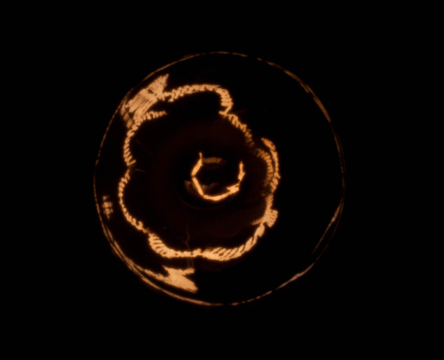
Bouillon Rube fucked around with this message at 01:56 on Jun 1, 2012 |
|
|
|
xenilk posted:Here's one of mine, been awhile! I don't like the jeans, frankly. I think the style ages the model (who already looks a bit old anyway). I'm not sure exactly what you're going for. Is she supposed to be alluring? Inviting? Threatening? This is more of a snapshot a day photo, but since Soundmonkey wants everyone to post here...  (USER WAS PUT ON PROBATION FOR THIS POST)
|
|
|
|
torgeaux posted:The two macro types really only work for me on that level, "oh cool, something small!" Mind you, that's a good thing, but the first one is a better photo if you get me. The colors are nice and rich, the composition leads one's eye to the flower, and it's just overall very nice. I love this. The colors are really pleasant and that combined with the perspective and the pose and the facial expression just create a tone that makes me smile. It would make a fantastic front page or magazine story photo. So I've been helping a coworker of mine make an indie film. What that means is I basically stand around doing fuckall until they need someone to hold a reflector or something. Today I brought my camera and took shots of the cast and crew between takes. These were my favorites. None of these were posed in any way.   
|
|
|
|
xenilk posted:That's a great location! I love the color. I could easily see a portrait session there, if that's your thing! I like the tones in her jacket, it really provides some nice contrast with the scenery and helps define her body. I'm not sure how much post you like to do, but the veins popping out in he foot don't exactly seem flattering. 
Bouillon Rube fucked around with this message at 23:44 on Jun 2, 2012 |
|
|
Wafflecopper posted:Haven't done much shooting in a while (or editing for that matter - I still have tons of holiday shots to work through from months ago, thanks Skyrim), trying to shake off the rust. This is really beautiful - incredible texture and contrast. If you can get back there, standing closer and getting just the doors might make for a nice companion shot. This man was dressed up for Motor City Pride:  Prince lookalike by Stephen Tyndall, on Flickr Protestors and counterprotestors photograph each other while trading insults and holding signs outside the gates of the Motor City Pride festival, Detroit: 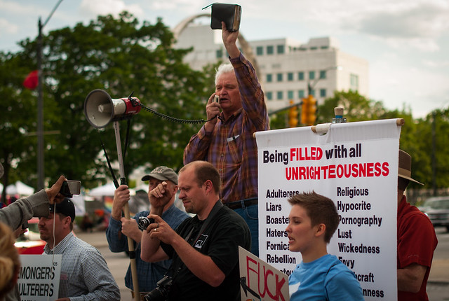 Protestors outside the gates by Stephen Tyndall, on Flickr Counterprotestor's sign: 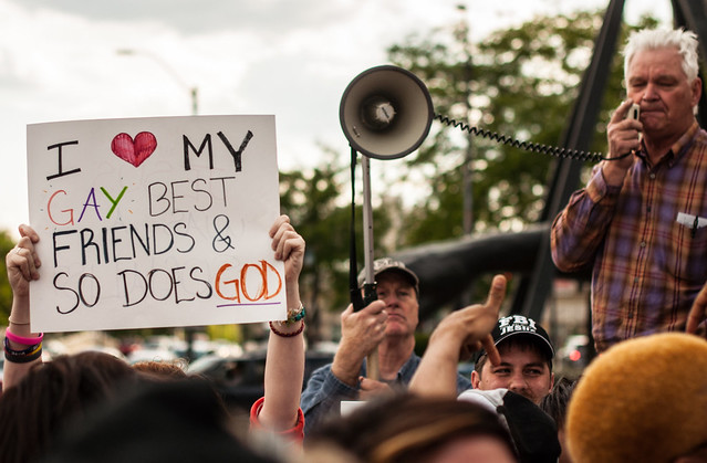 Counterprotestors by Stephen Tyndall, on Flickr
|
|
|
|
Augmented Dickey posted:I like the tones in her jacket, it really provides some nice contrast with the scenery and helps define her body. I'm not sure how much post you like to do, but the veins popping out in he foot don't exactly seem flattering. I love the symmetry in this one. However, I would maybe crop out the very bottom part of the bridge at the bottom of the photo, the part that's visibly grey whereas most of the rest of the photo is black, and it sort of detracts from it. I would also maybe play with the blacks/contrast a bit more in Lightroom to try and make the parts of the city come out completely black. Also, if you played with the settings to make the clouds stand out more I think that would be cool, because I really like the cloud patterns in the photo but they don't really stand out very much at the moment. Here's one of mine, I apparently like taking photos of buildings lately: 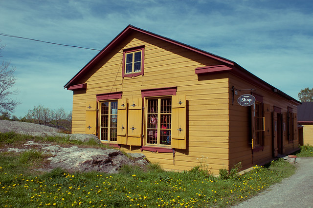 Suomenlinna Island by hookshot88, on Flickr
|
|
|
|
|
Augmented Dickey posted:I like the tones in her jacket, it really provides some nice contrast with the scenery and helps define her body. I'm not sure how much post you like to do, but the veins popping out in he foot don't exactly seem flattering. I would rotate it a smidge clockwise. If that messes up the horizon line, try a perspective shift on the structure.
|
|
|
|
LargeHadron posted:If that messes up the horizon line, try a perspective shift on the structure. Sorry for being a total scrub but what do you mean by this?
|
|
|
|
Augmented Dickey posted:Sorry for being a total scrub but what do you mean by this? Oh sorry. I'm speaking Gimp, maybe Photoshop has a different term for it. Your editing program (might?) have a tool that lets you warp the image to account for perspective distortion. In the case of this picture, since your horizon line looks pretty straight, the slight angle of the structure (i.e. the right side appearing higher than the left) might have been caused by your camera not being perfectly perpendicular to it. Or something. Either way you can fix that by warping the right edge to make the structure level without actually rotating the image and messing up your horizon. Sorry I didn't comment on the picture itself. I actually like it a lot and I'm completely nitpicking.
|
|
|
|
xenilk posted:That's a great location! I love the color. I could easily see a portrait session there, if that's your thing! my first thought: "this wall really needs someone in front of it"
|
|
|
|
Augmented Dickey posted:I like the tones in her jacket, it really provides some nice contrast with the scenery and helps define her body. I'm not sure how much post you like to do, but the veins popping out in he foot don't exactly seem flattering. Thanks I'll need to play with that, totally paid more attention to her face and the tones and not her feet, oops!
|
|
|
|
a foolish pianist posted:This is really beautiful - incredible texture and contrast. If you can get back there, standing closer and getting just the doors might make for a nice companion shot. The first one is a little awkward because there is a lot of negative space above him and you crop off his legs below the knee joint. It's always better to crop limbs above the joint instead of below. I also think it'd be a lot better if you came up close on him and made it into more of a portrait than a candid. As for your last two photos they kind of tell the same story, but the second one is a bit more dynamic. In the first one there is a lot of people to look at so it's hard to see what your subject really is. If the subject is the crowd, I think a wider shot with a LOT more people wouldn't have told the story a little bit better. Overall I think I like your third photo the best because the sign is clearly defined as your subject and it stands out as such. Would love a critique on my photos here. It's the first time I was using high speed sync, and I was having some difficulties. I couldn't get a good flash above 250, and my sync speed is 200 so I know it was working, just not as well as I'd have liked it to. If you're interested in seeing the rest of the series it's here: http://www.clarkphotographic.com/blog/   
|
|
|
|
Tamgerine posted:
The middle pose makes her look hippy. You need to be careful of that with someone built like she is, with a muscular butt. Also, black bottom, white top. Good setup for missing exposure a lot if you depend on your camera. On that note, the middle shot is nicely exposed, more so than the other two, I think.
|
|
|
|
torgeaux posted:The middle pose makes her look hippy. You need to be careful of that with someone built like she is, with a muscular butt. Do you think I should bring up the shadows in the skirt a little?
|
|
|
|
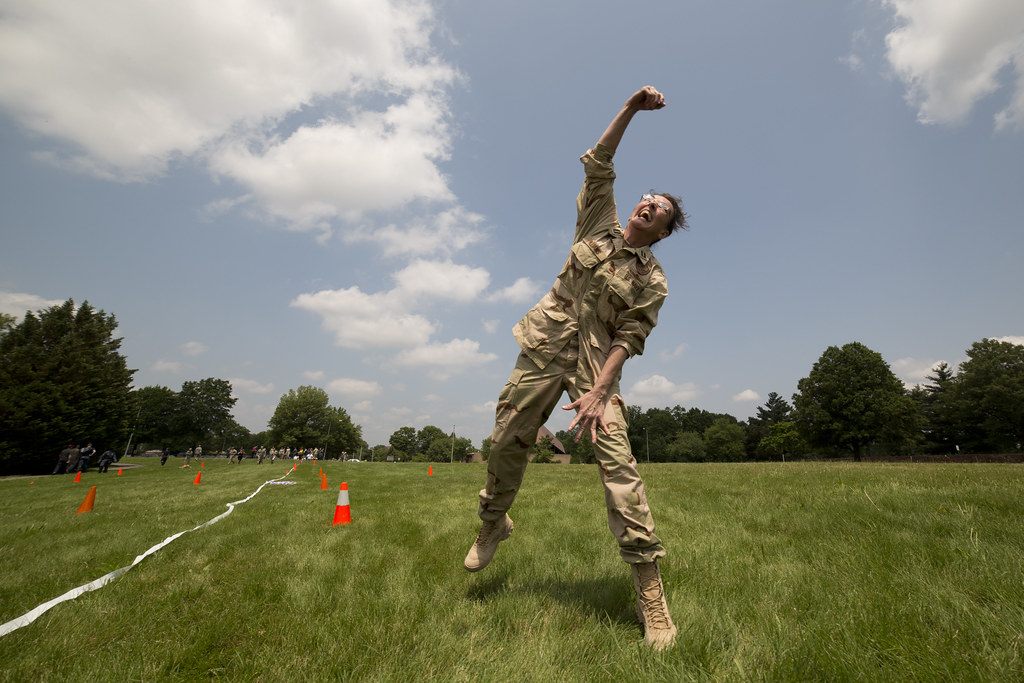
I don't have much to comment on what you asked for, but I do want to add that the idea of jumping in front of clouds like that is a loving rad idea.
|
|
|
|
Tamgerine posted:The first one is a little awkward because there is a lot of negative space above him and you crop off his legs below the knee joint. It's always better to crop limbs above the joint instead of below. I also think it'd be a lot better if you came up close on him and made it into more of a portrait than a candid. My only critique would be that most of them were posed with you being lower than your subject. That is rarely flattering for women so I would suggest having 70-80% of the pictures taken eye level and above and 20-30% of the pictures being from below eye level. 
|
|
|
|
Tamgerine posted:Do you think I should bring up the shadows in the skirt a little? Take a look. Could bring out detail, could wash it out, depends on how much is in the raw file. xenilk hit the nail on the head, you were shooting low. That makes a body look funny.
|
|
|
|
Tamgerine posted:Would love a critique on my photos here. It's the first time I was using high speed sync, and I was having some difficulties. I couldn't get a good flash above 250, and my sync speed is 200 so I know it was working, just not as well as I'd have liked it to. If you're interested in seeing the rest of the series it's here: http://www.clarkphotographic.com/blog/ Your backgrounds look great, your subject does not so much. Well, I'm kinda digging the lighting in the middle, but the pose is awkward as has been mentioned. I did a photoshoot with a coworker yesterday. She may or may not have been a model in Paris at one point in her life.   
mr. mephistopheles fucked around with this message at 07:34 on Jun 5, 2012 |
|
|
|
mr. mephistopheles posted:Your backgrounds look great, your subject does not so much. Well, I'm kinda digging the lighting in the middle, but the pose is awkward as has been mentioned. Great picture! The only complain I would have is about the last one. She looks like she has a huge neck because of the light hitting it weirdly. Otherwise the post/postures are great. 
|
|
|
|

|
| # ? May 11, 2024 18:07 |
|
The first one is pretty boring apart from the sign. I'd have gone for a close-up on just the sign. The second one is great though. Took me a while to realise what it was which is a cool thing to achieve in a photograph. I really like this series, but this one seems the weakest. It could do with being either a lot wider - as the composition's half-and-half - or a lot taller in a regular portrait orientation. As it is, it feels a bit squashed. HookShot posted:
I love the colours in this. It might have been nice to take some straight-on shots to exploit the symmetry of the windows. Perhaps a little more empty space on the right-hand side for balance (but these are nit-picks). Tried to get the sky looking like the Martian sky on this one: 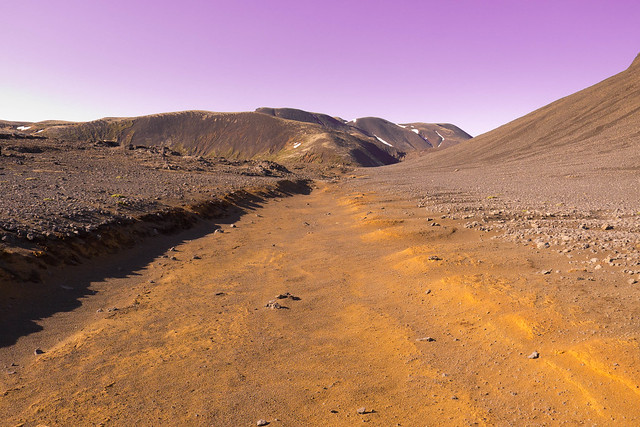 155/366 - The Martian Surface by fuglsnef, on Flickr 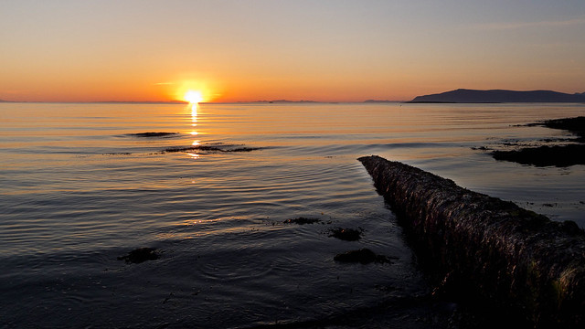 153/366 - Sunset Nine Billion by fuglsnef, on Flickr 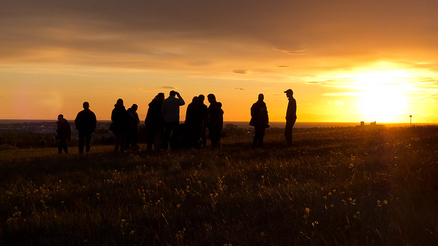 157/366 - Venus by fuglsnef, on Flickr
|
|
|


