|
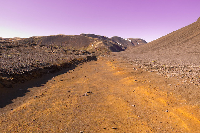
David Pratt posted:Tried to get the sky looking like the Martian sky on this one: I find the purple sky distracting. I guess the sky could look like that sometimes with the right scattering, but most of the time Mars will have a yellowish/brown sky. That's extreme nitpicking, I know, but I just find that purple to be very artificial looking. The rest of the picture is good, though I get the sense that we've lost the scale of the mountains in the back. Where was it taken? It reminds me of Mauna Kea. quote:
I like this a lot, the exposure and flow of the water gives it a great mood. quote:
I like this one as well, except that I wish that the sun and clouds had a bit more features in them. Maybe combining two exposures would have done the trick? Trip to Hawaii last month. 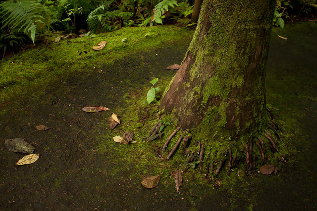 IMG_4505 by Kiri koli, on Flickr I've been trying and having very little luck getting good star shots. I can't seem to find a good foreground object ever and my stars just seem blah. 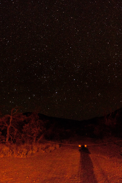 IMG_4680 by Kiri koli, on Flickr  JCMT by Kiri koli, on Flickr
|
 #
?
Jun 7, 2012 01:58
#
?
Jun 7, 2012 01:58
|
|


|

|
| # ? May 21, 2024 18:21 |
|
|
Kiri koli posted:
Maybe try dropping your iso down? It seems like you've got a ton of noise going on in that shot. Sure you'll lose some stars, but it'll probably look a bit more natural. The white balance can probably be tweaked to get rid of that reddish tint too.
|
|
#
?
Jun 7, 2012 03:47
|
|


|
quote:
1) The processing on the shot is pretty; good green saturation without anything being too bold, and the light balance is good. Despite that though the subject doesn't stand out at all and I barely noticed it. The photo is okay as a snapshot without the subject, but the subjects lack of dominance really hurts the photo. 2) Stop shooting at 1600 iso. That white balance is also bad. Don't feel the need to keep foreground objects in star shots; mountainous horizons and silhouettes are just as good. 3) I like abstract shots. The convergence of lines in the bottom right is nice, but it bugs me that it doesn't line up quite right. You should also try burning the highlights to see if you can get anything out of that bright spot.
|
|
#
?
Jun 7, 2012 05:32
|
|
|
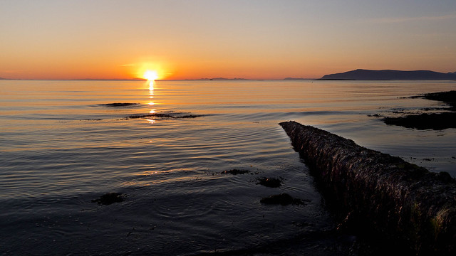
Kiri koli posted:I find the purple sky distracting. I guess the sky could look like that sometimes with the right scattering, but most of the time Mars will have a yellowish/brown sky. That's extreme nitpicking, I know, but I just find that purple to be very artificial looking. The rest of the picture is good, though I get the sense that we've lost the scale of the mountains in the back. Where was it taken? It reminds me of Mauna Kea. Looking at more pictures from the surface you're right. I had it in my mind that it was really pink but it's definitely more muted. It was taken in �ingvellir national park in Iceland.
|
|
#
?
Jun 7, 2012 10:50
|
|
|
Kiri koli posted:I've been trying and having very little luck getting good star shots. I can't seem to find a good foreground object ever and my stars just seem blah. Yeah, I find the foreground in this one kind of distracting, especially the shadow. I feel like it would be a lot better with just the mountains there in silhouette. Also echoing Mr. Despair: Shoot at a lower iso, you shouldn't need to crank it that high to get some decent stars. Got my first roll of 120 film back today, be gentle.   Gran's Orchid by Tim Breeze, on Flickr  Stobo Water Garden Sapling 2 by Tim Breeze, on Flickr  Stobo Water Garden Cascades by Tim Breeze, on Flickr
|
|
#
?
Jun 7, 2012 21:29
|
|
|
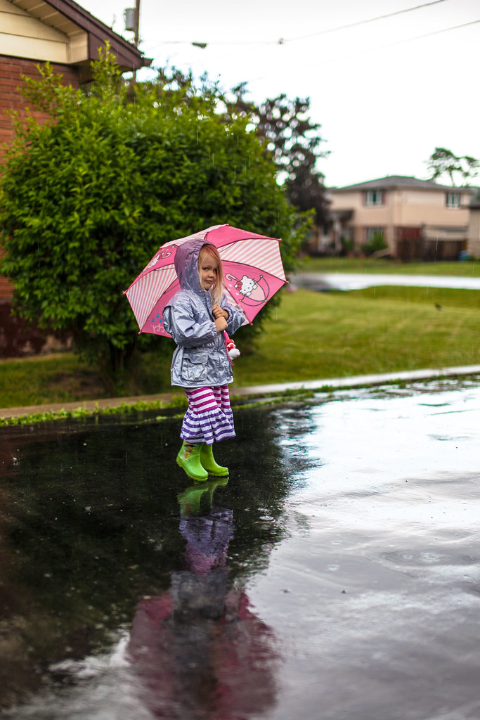
TomR posted:And then it did rain. Beautiful use of the light, slow enough shutter to get the rain, and that model you call a child hit the perfect pose/expression. torgeaux fucked around with this message at 11:42 on Jun 8, 2012 |
|
#
?
Jun 8, 2012 00:49
|
|

|
Thanks torgeaux. I let her pick the outfit.
|
|
#
?
Jun 8, 2012 01:51
|
|
|
This is a great "taked to PAD for critique" example (and a good photo), but it would be cool if people included "crossposted from badthread (or whatever)" in the quote.
|
|
#
?
Jun 8, 2012 04:18
|
|


|
This is beautiful. In the future, I am not sure about the amount of light directly above your subject, I think it draws the eye away. Additionally the top left quarter is pretty much all dead space and I think it kind of detracts from the photo. The colors are beautiful though, and the focus is spot on. Good job.
|
|
#
?
Jun 8, 2012 16:36
|
|

|
torgeaux posted:Cross-posted from the "other" thread. The wet pavement and perfect DOF really make this a fantastic picture. Field behind my house:  tree-in-field3 by ralph-brewer, on Flickr
|
|
#
?
Jun 8, 2012 18:41
|
|
|
dowdy_pants posted:Field behind my house: I like the silhouette and the soft, pastel shades in the sky. The foreground is really distracting though. It's too bright/saturated and looks unnatural and really jarring next to the great sky. Plus I can see where you've been brushing and missed parts (the bottom left corner especially.)  Banks Peninsula 4 by euannz, on Flickr
|
|
#
?
Jun 8, 2012 20:08
|
|


|
Wafflecopper posted:I like the silhouette and the soft, pastel shades in the sky. The foreground is really distracting though. It's too bright/saturated and looks unnatural and really jarring next to the great sky. Plus I can see where you've been brushing and missed parts (the bottom left corner especially.) I really like the depth of field in this photo and the composition is nice. The vignette works in this photo - adds a nice dreamy quality to the picture. I'm just a beginner so I can't really provide a great critique for you because I don't really know what I'm looking for. I can say, however, this is pleasing to the eye. The high ISO creates a bit of noise but it doesn't take away from the photo...actually looks kinda subtle and cool. Gives it a vintage feel. Here's one I did with a friend's band's album cover in mind. While I like some aspects of it and it was fun to paint a cap gun with spray paint, it didn't turn out as well as I hoped.  DSC_0046 by Jordan M Zephyr E, on Flickr
|
|
#
?
Jun 8, 2012 21:04
|
|

|
Dandy Cheddar posted:I really like the depth of field in this photo and the composition is nice. The vignette works in this photo - adds a nice dreamy quality to the picture. I'm just a beginner so I can't really provide a great critique for you because I don't really know what I'm looking for. I can say, however, this is pleasing to the eye. The high ISO creates a bit of noise but it doesn't take away from the photo...actually looks kinda subtle and cool. Gives it a vintage feel. Think more about the composition of this. Why are you shooting it at an angle? Why are his hands cut off? Why is it shot at that height? What are you trying to emphasize? Additionally, because it is a black and white shot, and everything in the shot appears to be white, everything blends together to create the uniform grey. Think about changing the lighting to provide some contrast, or changing the wardrobe.
|
|
#
?
Jun 8, 2012 21:15
|
|
|
e: Wrong thread.
carcinofuck fucked around with this message at 04:08 on Jun 9, 2012 |
|
#
?
Jun 9, 2012 03:56
|
|
|
removed.
Revolucion fucked around with this message at 21:42 on Nov 29, 2020 |
|
#
?
Jun 9, 2012 08:01
|
|

|
dowdy_pants posted:The wet pavement and perfect DOF really make this a fantastic picture. I really like this, compositionally, but something seems really unnatural about it for such a natural subject. The green grass in front is really brightly lit, whereas the tree is almost black..it makes me think that there's two light sources (which very well may be the case) and is messing with my mind a little bit. Overall, a good picture I just wish the tree was more in line with the rest of it, tonally. 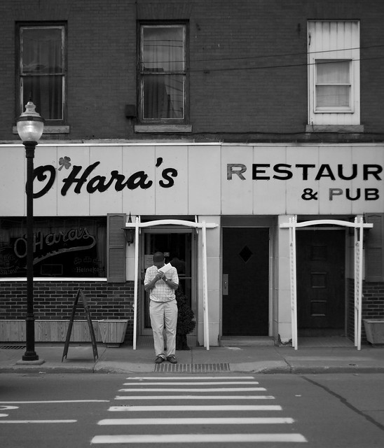
|
|
#
?
Jun 9, 2012 17:00
|
|

|
dowdy_pants posted:
This is really too yellow. And because the grass is so saturated it's chopping the flow of the photo at the very bottom. If it's possible I would retake and move up 15/20 feet so there isn't any green foliage, or photoshop it out. If you want to keep it, balance them with each other. Kiri koli posted:
Sponge tool on the red. Or you could crop the photo just where the shadow of your head is, and keep everything up, focusing on the stars. If not, I can still see your shadow. Love night shots though, I like this one.  http://www.flickr.com/photos/penpal/7169639595/ another from the winter: 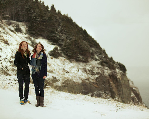 http://www.flickr.com/photos/penpal/6953920623/ forest spirit fucked around with this message at 19:40 on Jun 9, 2012 |
|
#
?
Jun 9, 2012 19:37
|
|


|
Penpal posted:another from the winter: The snow looks greenish yellow. It should be white, so I think your white balance is off.
|
|
#
?
Jun 9, 2012 22:26
|
|


|
The snow looks fine for me?
|
|
#
?
Jun 9, 2012 23:36
|
|

|
a foolish pianist posted:The snow looks fine for me? Nope.  It's a really nice shot. The girls are framed well by the trees and there's a ton of personality in their expressions. The snow falling in front of the trees looks really good too. The foggy shot of the water has a nice mood to it too, but I wish the sky or the water was favoured more. I think simpler shots like these are a bit more demanding of bolder composition choices. burzum karaoke fucked around with this message at 00:19 on Jun 10, 2012 |
|
#
?
Jun 9, 2012 23:57
|
|

|
a foolish pianist posted:The snow looks fine for me? If the original looks fine to you, or aliencowboy's edited version seems to you to have bad colours, you should calibrate your monitor. Windows 7 has a tool to do basic adjustment built in, search for "calibrate display" in control panel.
|
|
#
?
Jun 10, 2012 00:14
|
|


|
I am reading this thread on a circa-2006 macbook, so I'm sure the colors are far from exact. I can see some difference in the two versions aliencowboy posted, but I don't know that I'd necessarily prefer the whiter version.
|
|
#
?
Jun 10, 2012 04:11
|
|
|
I like how the person is framed by the white thing and the eye is lead nicely by the crossing, but I still think there is too much going on in the image and the guy is a little small. You could crop it just above the O'Hara's sign and I think that would make it stronger. ----- Too blue?  Disappearing Act by Paul.Simpson, on Flickr e: wasn't straight
Hotwax Residue fucked around with this message at 05:19 on Jun 10, 2012 |
|
#
?
Jun 10, 2012 04:20
|
|
|
Hotwax Residue posted:Too blue? No, but crop the left to make the trees even on both sides. e: On second though, ignore me. I put my hand up over it to check and it looks funky like that. I thought you were going for symmetry (my word of the month, I swear), but I can see that it's probably not actually about that... LargeHadron fucked around with this message at 05:10 on Jun 10, 2012 |
|
#
?
Jun 10, 2012 05:06
|
|


|
LargeHadron posted:No, but crop the left to make the trees even on both sides.
|
|
#
?
Jun 10, 2012 05:17
|
|
|
I like this a lot- I think your composition is pretty good as the horizon sits almost perfectly along the bottom third of the frame. The only suggestion that I would have would be to add a little more contrast in the water to emphasize the nice textures hiding down there. Not sure if that would kill the bleak mood of the shot though.  also an older one that i've always kind of liked. 
Bouillon Rube fucked around with this message at 02:53 on Jun 11, 2012 |
|
#
?
Jun 10, 2012 18:55
|
|


|
This is one of my first photographs, I don't yet have an eye to tell whether it's good or trash yet. I'd love to hear what you guys think, maybe you can help me make the next shots better. I think if anything the sky in this picture maybe should have been cropped out and the unintentional lens flare is a little obnoxious. The colors maybe are a bit oversaturated. As for the picture above mine by Augmented Dickey with the valve thing, I think it'd be a lot more compelling without the white blob distracting away from the background, and maybe if there were some way to pull up the darks just a little. Nikon D5100 with AF-S Nikkor 18-55mm 1:3.5-5.6G Lens in AUTO mode. 
Voronoi Potato fucked around with this message at 20:04 on Jun 10, 2012 |
|
#
?
Jun 10, 2012 19:54
|
|
|
I think the colors are quite nice. The problems with it are mostly composition related. There's no subject really, it's just some trees, grass, and part of a road. The trees and grass certainly look nice enough and the clouds are always good.. but there's not really any place where it's comfortable for the eyes to settle and enjoy the photo. The sliver of a lake is kind of distracting also. An example of what might have worked is maybe have someone sit on the railing, step to the right about 10-15 feet, and take the picture.
|
|
#
?
Jun 10, 2012 23:08
|
|

|
Voronoi Potato posted:This is one of my first photographs, I don't yet have an eye to tell whether it's good or trash yet. I'd love to hear what you guys think, maybe you can help me make the next shots better. I think if anything the sky in this picture maybe should have been cropped out and the unintentional lens flare is a little obnoxious. The colors maybe are a bit oversaturated. To expand on xzzy, you have some leading lines, strong lines, in the road/rail. But they lead the eye away from everything, not to any subject. Then, it's obvious, there is no subject.
|
|
#
?
Jun 11, 2012 00:46
|
|
|
.
Jose Pointero fucked around with this message at 05:44 on Aug 28, 2019 |
|
|
#
?
Jun 11, 2012 01:57
|
|


|
torgeaux posted:To expand on xzzy, you have some leading lines, strong lines, in the road/rail. But they lead the eye away from everything, not to any subject. Then, it's obvious, there is no subject. Thanks Torgeaux, I was wondering what he meant exactly and that makes much more sense. I'll keep posting here and hopefully I'll get better.  This is a picture of some fruit on my desk. I know the composition is bad but I don't really know how to make it better and still hold focus with such strong DOF. Is it possible to crop the picture in a more interesting way or should I keep trying to shoot it at different angles? As for the picture before mine, I don't really know if I have the skill level to critique it, but have you tried cropping out the dark space on the right of the photograph? I've been looking at it for a few minutes both zoomed in and out, and I think if maybe you cropped out some of the vertical and some of the right aligned space it might make it more compelling. That being said I love it, and I think it's a beautiful photograph.
|
|
#
?
Jun 11, 2012 02:55
|
|
|
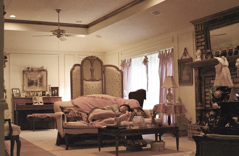
Jose Pointero posted:Hmm, I guess SaD is gone? Man, I've been away for a while... I reaaaly like everything about the composition and setting of this shot...but the grain seems a bit out of control in the shadows. I know you mentioned that it didn't bother you but it just doesn't look like 'nice' grain to me. Bouillon Rube fucked around with this message at 02:59 on Jun 11, 2012 |
|
#
?
Jun 11, 2012 02:56
|
|
|
Jose Pointero posted:Hmm, I guess SaD is gone? Man, I've been away for a while... I love the palette and soft lighting. The lady on the couch doesn't look very relaxed though. She's all hunched up and seems to be aware of the camera. If she were more stretched out and sleeping peacefully I think it'd fit the mood of the rest of the photo better. Also what Augmented Dickey said about the grain.  Wellington 2 by euannz, on Flickr  Wellington 3 by euannz, on Flickr I'm not quite sure about how to edit this one. The photo overall looks better in B&W but the subject gets a little lost. (In colour the other foliage is all green but the subject is bare and silvery.) I'd like to make it stand out more but I'm not sure how to go about it.  Wellington 4 by euannz, on Flickr Wafflecopper fucked around with this message at 03:12 on Jun 11, 2012 |
|
#
?
Jun 11, 2012 03:02
|
|
|
dowdy_pants posted:The wet pavement and perfect DOF really make this a fantastic picture. I'm in the crowd of people that will say I like this. I like it because it's unnatural looking. I've seen a field with a tree about 1,000,000,000,000 times I feel like so this almost cartoon/computer generated look is neat. It's not HDR-glowfest so I'm happy with it. If you were trying to make it look realistic then you failed hard. Here's some photos from my vacation: 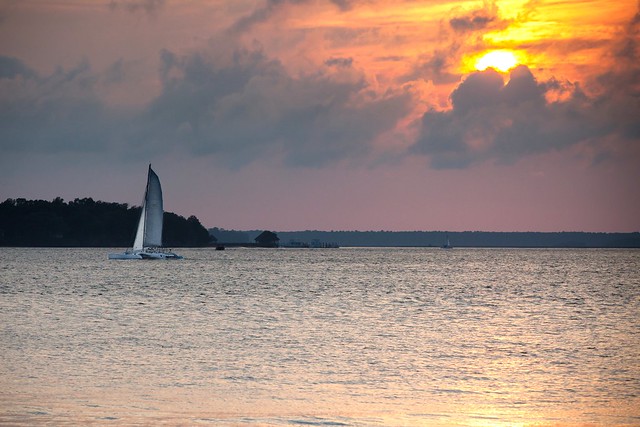 Sailboat by benisntfunny, on Flickr  Dianie by benisntfunny, on Flickr  View from Chimney Rock by benisntfunny, on Flickr
|
|
#
?
Jun 11, 2012 03:10
|
|
|
Jose Pointero posted:Hmm, I guess SaD is gone? Man, I've been away for a while... I like that she doesn't look very relaxed or natural, but that is kind of my thing. I love the colours, I think it suits the image really nicely and the one colour scheme makes it seem a bit eerie. I don't like the part of the wall that juts into the frame on the left though. It's not completely vertical and feels like it cramps the space in a bit for me. I'd crop it out and tilt the picture slightly clockwise as it seems a touch off vertical at the moment.
|
|
#
?
Jun 11, 2012 03:29
|
|

|
David Pratt posted:
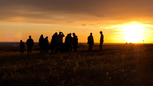
I really like this one. It feels like a snapshot from a TV show or something. It would be better if all the silhouettes were separated, but other than that it's technically strong. I like the color of your sky/whole image really and I like the way the "lines" in the grass leads us toward the sun. It's my favorite followed by the purple sky one. -- This was really just me testing my new 60D under lovely conditions. really happy with the upgrade from the Rebel XT, this thing is amazing! Anyway, who doesn't like ducklings!!  Quack1 by king colliwog, on Flickr  Quack4 by king colliwog, on Flickr Tried something different for this one. 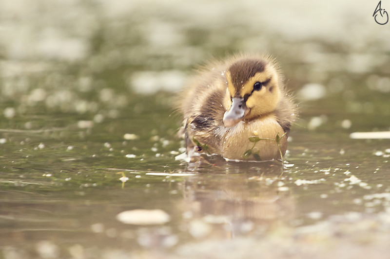 Quack2 by king colliwog, on Flickr
|
|
#
?
Jun 11, 2012 03:35
|
|

|
.
Jose Pointero fucked around with this message at 05:44 on Aug 28, 2019 |
|
|
#
?
Jun 11, 2012 04:01
|
|
|
KingColliwog posted:Tried something different for this one. I like the color on this one a lot more than the previous two. It goes from being a pretty generic but nice photo of some ducks to having this sort of dreamy feel that makes it feel a lot more distinct and interesting. Here's some more from the model shoot I did last weekend. This time I tried to see how versatile I could be with black and white and hopefully use it to match/enhance the mood of the photo the same way I tried to with my previous color set. 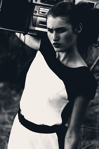  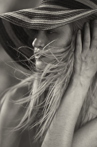
|
|
#
?
Jun 11, 2012 08:07
|
|


|
Wafflecopper posted:
|
|
#
?
Jun 11, 2012 17:45
|
|

|

|
| # ? May 21, 2024 18:21 |
|
|
Wafflecopper posted:I love the palette and soft lighting. The lady on the couch doesn't look very relaxed though. She's all hunched up and seems to be aware of the camera. If she were more stretched out and sleeping peacefully I think it'd fit the mood of the rest of the photo better. Also what Augmented Dickey said about the grain. This is really great, how many exposures did you use here?
|
|
#
?
Jun 11, 2012 18:29
|
|