


|
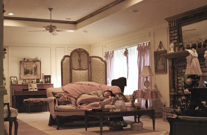
benisntfunny posted:I'm in the crowd of people that will say I like this. I like it because it's unnatural looking. I've seen a field with a tree about 1,000,000,000,000 times I feel like so this almost cartoon/computer generated look is neat. It's not HDR-glowfest so I'm happy with it. Of the three, the middle is my favorite. The colors look great, and all the lines seem to lead directly to your subject. The top one is ok, but I don't care for the lighting. The sailboat looks too dark and all of the colors except for the top of the sky are pretty drab. I like the last one except for the scary face in the bottom right corner. I just got my first roll of film developed (ok it's not actually my first roll since I shot a roll of Tri-X before it, but I haven't had the Tri-X developed yet). In general I wasn't too happy with the pictures, but I'm liking these ones the more I look at them. Crosspost from film thread:  R1-05027-020A by Large Hadron, on Flickr  R1-05027-008A by Large Hadron, on Flickr  R1-05027-021A by Large Hadron, on Flickr
|
 #
?
Jun 11, 2012 21:25
#
?
Jun 11, 2012 21:25
|
|


|

|
| # ? May 21, 2024 14:34 |
|
|
Saint Fu posted:I really like these. Munkaboo posted:This is really great, how many exposures did you use here? Aw thanks guys.  Just one exposure and some tweaking in lightroom. (Lowered the contrast, some split toning and a couple of graduated filters.) Just one exposure and some tweaking in lightroom. (Lowered the contrast, some split toning and a couple of graduated filters.)
|
|
#
?
Jun 12, 2012 00:12
|
|


|
Voronoi Potato posted:Thanks Torgeaux, I was wondering what he meant exactly and that makes much more sense. I'll keep posting here and hopefully I'll get better. -----  Remarkables by Paul.Simpson, on Flickr
|
|
#
?
Jun 12, 2012 02:14
|
|

|
benisntfunny posted:I'm in the crowd of people that will say I like this. I like it because it's unnatural looking. I've seen a field with a tree about 1,000,000,000,000 times I feel like so this almost cartoon/computer generated look is neat. It's not HDR-glowfest so I'm happy with it. These are just great. Love all three, with the middle being my fav. I went back to the field for the tree picture. I think I dig this one the best.  tree-field4 by ralph-brewer, on Flickr And some random wild flowers:  flower-closeup-night by ralph-brewer, on Flickr
|
|
#
?
Jun 12, 2012 02:57
|
|
|
dowdy_pants posted:I went back to the field for the tree picture. I think I dig this one the best. If I were you I would have messed around more with the exposure layering to get the tree/grass a little brighter. Really nice sky though!
|
|
#
?
Jun 12, 2012 04:52
|
|
|
LargeHadron posted:If I were you I would have messed around more with the exposure layering to get the tree/grass a little brighter. Really nice sky though! How about this? 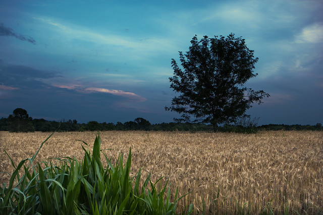 tree-in-field5 by ralph-brewer, on Flickr
|
|
#
?
Jun 12, 2012 15:30
|
|
|
dowdy_pants posted:How about this? I'm going to throw out a suggestion you may not be fond of. I think it would look better if the green leaves in the foreground were a tad bit lower and spread out across the bottom rather than just in the left. I understand what I'm implying by that and might not be something you want to do with your photos.
|
|
#
?
Jun 12, 2012 15:37
|
|
|
dowdy_pants posted:How about this? Yes, it looks a lot better like that.
|
|
#
?
Jun 12, 2012 16:30
|
|
|
mr. mephistopheles posted:So I've been helping a coworker of mine make an indie film. What that means is I basically stand around doing fuckall until they need someone to hold a reflector or something. Today I brought my camera and took shots of the cast and crew between takes. These were my favorites. None of these were posed in any way. The biggest thing I would recommend is to give the subjects a bit more space. These should be more "environmental" shots if that makes sense. Show them in their setting is what I'm trying to say. I see what you are trying with the first but it looks like he is having a heart attack. The second is best but may have been improved with a wider scope (including the boom/set/etc.). I think someone else touched on the third. Dandy Cheddar posted:
Someone else gave you critique on the composition and processing. I agree with him/her. I would also flatten the tablecloth and from a wardrobe angle... next time use clothespins to tighten up the loose material. I think the candle could be removed, it's kind of distracting. Cross-post from portraits: Fiancee  Girl going to prom + date  Girl going to prom + date + moms 
|
|
#
?
Jun 12, 2012 20:37
|
|


|
Jesus Christ, is that what they wear to prom now?
|
|
#
?
Jun 12, 2012 22:06
|
|

|
Munkaboo posted:Jesus Christ, is that what they wear to prom now? I was sort of expecting this comment... I was talking to her sister and apparently she had to go to a bridal shop as none of the dresses elsewhere could accommodate her... proportions. That was one of the only dresses there that would fit. So yeah... getting back on track, what do you think of the photos?
|
|
#
?
Jun 12, 2012 22:43
|
|
|
Oprah Haza posted:I was sort of expecting this comment... I was talking to her sister and apparently she had to go to a bridal shop as none of the dresses elsewhere could accommodate her... proportions. That was one of the only dresses there that would fit. I guess that explains the goofy look on the dude's face. The photos are good. Nice exposure on the white clothing. I don't care as much for the bottom one w/ moms, probably because you got low and put their heads at the treeline. Just looks awkward for some reason.
|
|
#
?
Jun 12, 2012 23:10
|
|
|
^^ e:f,b No wonder that kid looks so smug.
|
|
#
?
Jun 12, 2012 23:17
|
|
|
LargeHadron posted:
quote:
quote:
This one is nice! I like the colours a lot, they work really well. It would have been nice if she was smiling a bit more, and if her hair had been brushed just a little bit more (although as someone who has thin hair I know how ridiculously quickly it messes up after brushing). I think a combo of those two would have made it look a tiny bit less like a snapshot, and a bit more professional portrait like. If you were going for more of a snapshotty look, well awesome! One tiny detail that I really love is that her necklace matches the flowers in the background. That really rules.
|
|
#
?
Jun 13, 2012 00:23
|
|
|
Oprah Haza posted:The biggest thing I would recommend is to give the subjects a bit more space. These should be more "environmental" shots if that makes sense. Show them in their setting is what I'm trying to say. I see what you're saying, but I'm not sure why you're saying it. Is this coming from a place of the general rules of photography or your own personal preference with regards to portraits? Because I find your photos later in the post rather static with all of the environmental space around the centered subjects and not to my own personal taste. The fiance photo especially, why is she exactly dead-center in the frame? They're nice portraits, but I don't see what the environmental space adds to them, especially the big blank gray space above their heads. I do appreciate the advice, I just wonder if it is more of a case of stylistic preference than any hard and fast rules about photography. I do see how getting the whole boom pole could add some more context to the middle shot, but I don't know that the large amount of empty desert background required to do so would result in a net positive for the overall composition. I also personally feel that knowing exactly what he's doing in that shot with so little of the equipment in frame really calls into question whether it's necessary to see the "more" that you already know is there. Again, though, I really do appreciate the feedback and it's nice to have to justify for myself why I shot this way instead of that. It makes me feel like I'm developing a style. Like if you'll look at my model shots I posted later, those are also really tightly framed, and the other people I shot with that day ended up with more photos like you're describing where the subject is more of an object in the middle of a scene rather than the entire focus of the photo. I like that sort of uncomfortable intimacy, though, where you feel like you're right in the subject's personal space (or that's what I'm going for at least) rather than viewing them from afar.
|
|
#
?
Jun 13, 2012 16:08
|
|


|
dowdy_pants posted:How about this? This is mostly nit-picking, but some of the clouds actually look like dust spots on the sensor, I would probably heal brush those out since even though they're not dust, they look just a little bit distracting.  Bird at Jokulsarlon by hookshot88, on Flickr  Iceland by hookshot88, on Flickr  Iceland by hookshot88, on Flickr
|
|
#
?
Jun 13, 2012 21:34
|
|
|
mr. mephistopheles posted:I see what you're saying, but I'm not sure why you're saying it. Is this coming from a place of the general rules of photography or your own personal preference with regards to portraits? Because I find your photos later in the post rather static with all of the environmental space around the centered subjects and not to my own personal taste. The fiance photo especially, why is she exactly dead-center in the frame? They're nice portraits, but I don't see what the environmental space adds to them, especially the big blank gray space above their heads. I don't really believe that there are very many "hard" rules when it comes to photography. I don't really care about rule of thirds or cutting heads (I'm surprised no one jumped down your throat about that, people used to get up in arms over something like that). The reason I said you should pull back is because of the nature of the assignment. I thought I had read that you were on as set photographer but it now appears to be that you were on set helping and taking pics in between. If you were hired as set photographer it would be important to pull back in order to provide context. Yeah, I'm not big on "rules" but was thinking about it from your "client" side. But... now you've got me thinking about them.... Somewhat pedantic rules that were broken: Picture 1: Joint cut out, crotch exposed. Picture 2: Cut off forehead, line going through head, distracting block of something in bottom right corner. Having said that, a lot of rules don't really matter. If the photo is compelling enough those things will not really matter. It's personal vision. For the prom photos, they wanted very traditional photos. I actually was hired a few hours before meeting them and didn't know the location in advance (had to follow them from their home). I also only had them for about twenty minutes or so. While it would have been nice to have had a bit more time and advance knowledge to experiment, they are in the end paying for my service and for a certain kind of product. I use my off-time or more creative shoots for that kind of stuff. ") For my fiancee, I prefer some space when I shoot people (stylistic preference, as you mentioned). How would you have shot/framed it? I'm curious! Don't say rule of thirds. I put some further space to minimize the impact of the foliage line through her head and to give a bit more balance to the picture by including the leaves above.
|
|
#
?
Jun 13, 2012 23:03
|
|
|
Jose Pointero posted:
I like the processing of that picture, mind sharing what you did? I like the room but it feels to me like there could be so much more to that picture. That kind of editing would go well with a portrait where you somewhat have more connection with the model or where the model takes more in the frame, but that's me. Dandy Cheddar posted:I really like the depth of field in this photo and the composition is nice. The vignette works in this photo - adds a nice dreamy quality to the picture. I'm just a beginner so I can't really provide a great critique for you because I don't really know what I'm looking for. I can say, however, this is pleasing to the eye. The high ISO creates a bit of noise but it doesn't take away from the photo...actually looks kinda subtle and cool. Gives it a vintage feel. It's been said before, I think the concept/idea is neat but the perspective / crooked angle is throwing me off... I would see you facing the model with a lower perspective and wider lens maybe. Here are some shots from a recent trip to NYC.  IMG_9151 by avoyer, on Flickr  IMG_9123 by avoyer, on Flickr  IMG_1135 by avoyer, on Flickr
|
|
#
?
Jun 14, 2012 06:06
|
|

|
Oprah Haza posted:I don't really believe that there are very many "hard" rules when it comes to photography. I don't really care about rule of thirds or cutting heads (I'm surprised no one jumped down your throat about that, people used to get up in arms over something like that). The reason I said you should pull back is because of the nature of the assignment. I thought I had read that you were on as set photographer but it now appears to be that you were on set helping and taking pics in between. If you were hired as set photographer it would be important to pull back in order to provide context. Oh, yeah, if that had been the case absolutely. I was just messing around while helping out a friend with whatever was needed during the shot. I was actually holding a reflector a majority of the time. The stuff about looking at it from a client perspective is some great advice, though, and definitely something I'll keep in mind should I ever be in a position like that in the future. Oprah Haza posted:For my fiancee, I prefer some space when I shoot people (stylistic preference, as you mentioned). How would you have shot/framed it? I'm curious! Don't say rule of thirds. I put some further space to minimize the impact of the foliage line through her head and to give a bit more balance to the picture by including the leaves above. I actually tried taking the photo and cropping it a lot tighter just to see what impact it would have and didn't feel like it made much difference, although after your explanation I can see why you composed it the way you did. I'm a bit torn on the photo because there really isn't anything I think could be improved by changing the composition given how static everything is. Like it's a very cute photo that shows some personality, but it doesn't really capture a particular moment or mood that I feel you could accentuate any way in post. It's a very nice portrait, but that's all it will ever be, you know? Which is not a bad thing by any means. I like to say I prefer candid photos where the person is unaware that their photos is being taken, but I think part of it is that I am bad at posing people/making them feel comfortable with the lens trained directly on them, so I'm pretty envious of people who are able to do that. xenilk posted:
I think the first would be a great shot if the person was facing towards the camera rather than away. I don't think there's enough going on in the background to make up for the lack of her face. I like the colors, though. I just straight up love the second one. The moment is great and the framing is pretty much perfect.
|
|
#
?
Jun 14, 2012 06:41
|
|
|
Dandy Cheddar posted:Here's one I did with a friend's band's album cover in mind. While I like some aspects of it and it was fun to paint a cap gun with spray paint, it didn't turn out as well as I hoped. It freaks me out seeing the muzzle pointed so close the model's hand. Nobody who's been around guns would put their hand there.
|
|
#
?
Jun 14, 2012 06:45
|
|


|
HookShot posted:
|
|
#
?
Jun 14, 2012 13:41
|
|

|
mr. mephistopheles posted:Again, though, I really do appreciate the feedback and it's nice to have to justify for myself why I shot this way instead of that. It makes me feel like I'm developing a style. Like if you'll look at my model shots I posted later, those are also really tightly framed, and the other people I shot with that day ended up with more photos like you're describing where the subject is more of an object in the middle of a scene rather than the entire focus of the photo. I like that sort of uncomfortable intimacy, though, where you feel like you're right in the subject's personal space (or that's what I'm going for at least) rather than viewing them from afar. I just wanted to add to this: I agree that it's good to develop a style, but for some reason these particular ones don't have that magic for me. Looking at your photostream, I think you have quite a few that nail that intimacy and the idea of the person being the whole image, which I am a fan of, but not in these ones. The composition is my problem with the first one: it's neither intimate nor environmental and the way you framed it looks like an accident. The second and third don't have anything that moves me in them for an intimate portrait. This one, for example... ...is far stronger, as are some others in your flickr. It's the combination of the intimacy of the crop, the shapes and lines involved and the abstraction of the environment. It adds a romance and a mystery to it, whereas the ones from the indie film don't grab me in the same way (I love the shot I quoted, by the way )Here I go again, making ill-advised ventures into landscape. I find it really hard to get something meaningful out of a landscape image: it's just not my strength. I do like to have a go though. Anyway, here are three attempts. I know what I like and dislike about them (mostly dislikes), but I'll leave the slate clean for you to make your own decisions. I've tried to go for different feelings in each image. Please click through for larger on black, if you would   
|
|
#
?
Jun 14, 2012 20:22
|
|

|
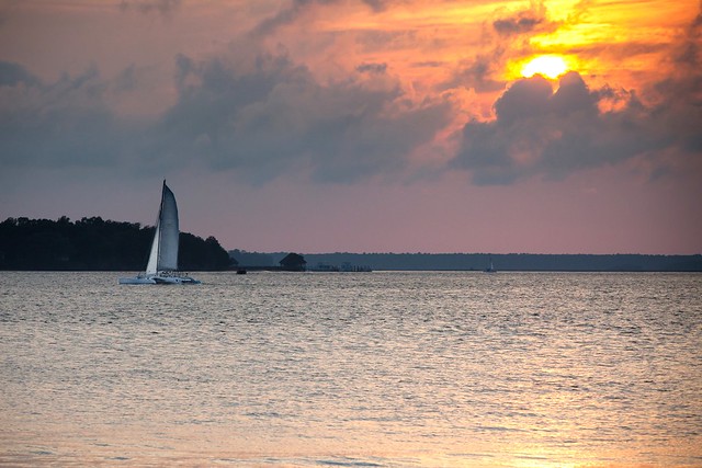
Gazmachine posted:Here I go again, making ill-advised ventures into landscape. I find it really hard to get something meaningful out of a landscape image: it's just not my strength. This one is pretty good, the muted colours and the person in there. Seems serene in a way.
|
|
#
?
Jun 15, 2012 00:51
|
|


|
As is, I think the second one is the strongest. I would have been tempted to crop in on the kid in the 3rd one and put him more to the right in the frame and a bit to the bottom, losing roughly the bottom 3rd of the frame and a bit off the left and right sides.
|
|
#
?
Jun 15, 2012 02:21
|
|

|
Santa is strapped posted:This one is pretty good, the muted colours and the person in there. Seems serene in a way. My concern with that one was that she needed to be a bit more to the left than she is. Otherwise it was also my favourite. EDIT: My biggest concern is that they're basically boring and insignificant. I'm starting to think that a great landscape is a drat sight harder than a great portrait, because you have to pull drama and feelings out of a non-living subject (flora excepted ).
Gazmachine fucked around with this message at 09:15 on Jun 15, 2012 |
|
#
?
Jun 15, 2012 08:39
|
|
|
I lurk almost daily in the Dorkroom but often don't have the confidence to post anything. I snapped this two weekends ago at a living history siege camp and was really quite pleased with how it turned out, though I think my post processing needs a lot of work. It mostly consists of manipulating curves in GIMP, which is unacceptable, really. My goal is to go though the post proc thread and make notes   Soldier Boy 1 by chauss�e, on Flickr Wayfaring Stranger fucked around with this message at 09:51 on Jun 15, 2012 |
|
#
?
Jun 15, 2012 09:46
|
|

|
Wayfaring Stranger posted:I lurk almost daily in the Dorkroom but often don't have the confidence to post anything. I snapped this two weekends ago at a living history siege camp and was really quite pleased with how it turned out, though I think my post processing needs a lot of work. It mostly consists of manipulating curves in GIMP, which is unacceptable, really. It's not as bad as you think it is. Maybe just too saturated and a touch underexposed. e: On second look, I wouldn't say underexposed. Your blacks just look clipped so maybe lost the blacks playing with the curves. LargeHadron fucked around with this message at 16:50 on Jun 15, 2012 |
|
#
?
Jun 15, 2012 15:29
|
|
|
Wayfaring Stranger posted:I lurk almost daily in the Dorkroom but often don't have the confidence to post anything. I snapped this two weekends ago at a living history siege camp and was really quite pleased with how it turned out, though I think my post processing needs a lot of work. It mostly consists of manipulating curves in GIMP, which is unacceptable, really. You know, you don't have to extensively process all photos.
|
|
#
?
Jun 15, 2012 16:31
|
|
|
Awkward Davies posted:You know, you don't have to extensively process all photos. You are saying things that I recognize as words, but they are arranged in ways that make no sense to me.
|
|
#
?
Jun 15, 2012 16:54
|
|

|
Wayfaring Stranger posted:I lurk almost daily in the Dorkroom but often don't have the confidence to post anything. I snapped this two weekends ago at a living history siege camp and was really quite pleased with how it turned out, though I think my post processing needs a lot of work. It mostly consists of manipulating curves in GIMP, which is unacceptable, really. The post seems alright to me - maybe a little saturated, as others have said, but essentially fine. I would work on composition etc etc etc first and try not to put too much emphasis on processing. No amount of processing will make a badly framed or uninteresting shot exciting. He's decently framed - is this a crop? I quite like the way he looks pretty unhappy about having to dress up and stand there in the heat, so there's a bit of story to tell. What sort of story did you want this photo to tell? EDIT: Another landscape...thing. Does this do anything for anyone? 
|
|
#
?
Jun 15, 2012 18:12
|
|
|
Gazmachine posted:EDIT: Another landscape...thing. Does this do anything for anyone? It's good that you have foreground interest, but it's still not very interesting. Eh, the more I think about it the more I like it. Gloomy beach day, empty chairs, nobody in sight. Kind of cool sense of desolation. Still though it's the photo's concept that I like, not the photo itself. I can't really put my finger on what it is I don't like. Maybe the background elements (large pier, small pier, ocean, sky) feel too cluttered?
|
|
#
?
Jun 15, 2012 18:46
|
|
|
LargeHadron posted:It's good that you have foreground interest, but it's still not very interesting. Eh, the more I think about it the more I like it. Gloomy beach day, empty chairs, nobody in sight. Kind of cool sense of desolation. Still though it's the photo's concept that I like, not the photo itself. I can't really put my finger on what it is I don't like. Maybe the background elements (large pier, small pier, ocean, sky) feel too cluttered? Yeah, I can't figure it out either. Although, from what you've said, you may have touched on it - it may be that, for a scene that sort of is supposed to portray a slightly empty, desolate sort of feeling / showing us a long, empty view toward the horizon, it's actually sort of busy.
|
|
#
?
Jun 15, 2012 19:12
|
|
|
Gazmachine posted:EDIT: Another landscape...thing. Does this do anything for anyone? It's alright. I can't tell that the thing in the foreground is a beach chair until I stare at it for a bit. The wind ruined it. Honestly I would have liked it better without that foreground beach chair, it gives a little bit more of that desolate look I think you were going for. 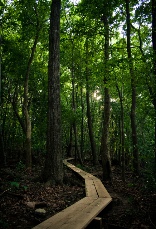
|
|
#
?
Jun 15, 2012 21:58
|
|

|
the posted:It's alright. I can't tell that the thing in the foreground is a beach chair until I stare at it for a bit. The wind ruined it. I have seen this same picture a thousand times. It just seems very done. It's boring. I think you could push yourself a lot more.
|
|
#
?
Jun 15, 2012 22:23
|
|

|
CarrotFlowers posted:I have seen this same picture a thousand times. It just seems very done. It's boring. I think you could push yourself a lot more. How could I shoot that area differently? Or should I just avoid it altogether? If you're referring to specifically me and that photo, I have posted one that was similar, but it was at least a mile away from this spot. And, the problems with that earlier photo (bad lighting, blown out, etc) I think were fixed with this photo, and it was probably the different location and time of day that did it.
|
|
#
?
Jun 15, 2012 22:45
|
|
|
I don't think you should avoid such shots necessarily, but the "path in the woods" shot is a lot like railroad photos: everyone's done it. It's probably still a good thing to attempt because there's so many examples out there for you to compare against and learn from. I really like the processing on it, the colors came out nice and everything seems nice and sharp. The only failing is there's no draw that makes the image create a lasting impression.
|
|
#
?
Jun 15, 2012 22:53
|
|
|
the posted:How could I shoot that area differently? Or should I just avoid it altogether? It's not specifically you and that photo, it's everyone and that photo. There have been many poster in the dorkroom alone (which is a small subset of everyone who posts photos) who have done that photo. Just the very cliche shot of the wooden bridge in the forest shot. I honestly do not believe that you could salvage it. Do the woods, yes, but don't do foot bridges in the woods from that angle. I know you have better ideas in your head. Follow those instead.
|
|
#
?
Jun 16, 2012 00:38
|
|
|
the posted:It's alright. I can't tell that the thing in the foreground is a beach chair until I stare at it for a bit. The wind ruined it. In the words of Joe McNally, "I never met a landscape I couldn�t make better by putting a person in front of it." I think a lot of landscape photography these days is going larger for more impact. Maybe next time you could try something like a panorama or image stitching. With a subject like this it's really difficult to make something that isn't really similar to a lot of other photos. The exposure, composition, and color are all fine. It's just your subject. My husband and I went to the beach today to try out some photos. I wanted to try and practice a shot I had actually seen Joe McNally do, and trust me, I think he had a much easier time of it than I did. My husband sacrificed his glasses to the ocean for this shot. We originally tried it with him holding a honeycombed flash on a stand, and that didn't work. We ended up where I'm holding the flash in my left hand, the camera in my right, and I couldn't go for very long one handed because I lifted a bunch of weights today and it was killing me! Finally got the last shot and just accepted it for what it was.  Then I snapped up two random couples on the beach for some portrait work. The first couple was easier to work with, and the photo is okay. I like the second photo a lot better, but it was some high school couples that was really, really awkward. She looks amazing, but he looks really uncomfortable.   Would really appreciate some extra critique on these images.
|
|
#
?
Jun 16, 2012 03:45
|
|
|
Tamgerine posted:In the words of Joe McNally, "I never met a landscape I couldn�t make better by putting a person in front of it." I think a lot of landscape photography these days is going larger for more impact. Maybe next time you could try something like a panorama or image stitching. With a subject like this it's really difficult to make something that isn't really similar to a lot of other photos. The exposure, composition, and color are all fine. It's just your subject. Dear Tamgerine: As part of an entirely random and just-now-made-up prize program, since this appears to be your first post in PAD (or at least your first post in some time), and because that head-in-the-water shot is a REALLY good homage to the Joe McNally shot, you are eligible for a prize worth about $20. PM me for details. The lesson here: Posting good photos in PaD can end well.
|
|
#
?
Jun 16, 2012 03:51
|
|


|

|
| # ? May 21, 2024 14:34 |
|
|
SoundMonkey posted:Dear Tamgerine: Wowza! Yeah I mostly just read this thread and don't post too often. I'm glad I did though, neat! I don't have PM's though, if you could please e-mail me at mototrain @ gmail.com I'd really appreciate it! Thanks! I don't suppose the prize is my husbands glasses that you happen to have fished out of the ocean, is it?
|
|
#
?
Jun 16, 2012 04:09
|
|