|
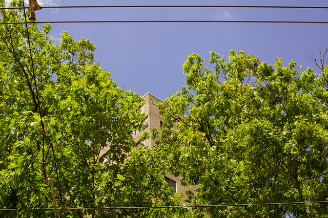
LargeHadron posted:I shot this photo. The scene was appealing to me, probably because the trees seem to part and make way for the building, and the wires act as a frame. There are probably millions of other photos out there that do this same thing better, but I am very recently becoming interested in photographing hidden beauty in scenes that are typically ignored or considered ugly at first glance. Yay or nay? I like where you're going with it. I don't like the wires, the frame of the photo acts as a frame, no need for wires. I did a very quick edit, cropped it square (because I've been shooting MF and I'm into squares oh well) and edited the colours a bit. The blue being flat, I don't understand that. Not every single sky in every photo needs crazy clouds to make it interesting. Sometimes it's good to keep things simple - 1 part plain blue sky, 2 parts textured leaves, 1 part hidden building.  Now that I look at the edit again, I would have preferred keeping it horizontal.
|
 #
?
Jun 26, 2012 02:46
#
?
Jun 26, 2012 02:46
|
|


|

|
| # ? May 12, 2024 06:26 |
|
|
^^^E: Yeah, I didn't understand that either, clear skies are flat blue and trees have texture in their leaves. It is normal.LargeHadron posted:I shot this photo. The scene was appealing to me, probably because the trees seem to part and make way for the building, and the wires act as a frame. There are probably millions of other photos out there that do this same thing better, but I am very recently becoming interested in photographing hidden beauty in scenes that are typically ignored or considered ugly at first glance. Yay or nay? I love your idea to look for hidden beauty in overlooked places, and I really want to see you continue it because I think there's a lot of potential there. This particular shot isn't conveying that to me very effectively. When I look at it, I can see that you've thoughtfully composed it, as you mentioned about the placement of the building and the frame created by the wires, etc., but it still manages to retain an indeliberate quality that I'm not sure you wanted. As far as unlikely beauty, I'm struggling to see the elements coalesce into something greater. It's not unusual or aesthetically pleasing enough in an abstract way to accomplish it, and I don't find a clear subject. So, start to think about how exactly you want to go about illustrating your concept. Is the building, as the focal point, the secretly beautiful thing? They can be, but this is just a nondescript corner. Is it the composition of the elements themselves? Again, you may try presenting these ordinary things in a more unusual light. --- Haven't been shooting much at all lately, so I forced myself to do something today to get the gears working again. It's so hellishly hot that half my state is bursting into flame   Heat Wave by E Banker, on Flickr Kingdom of Sin fucked around with this message at 03:05 on Jun 26, 2012 |
|
#
?
Jun 26, 2012 03:03
|
|

|
TheJeffers posted:
This kicks so much rear end--in my opinion, car photography is simultaneously one of the the most over done and difficult types of shooting (more so than pets, even!) In this photo, though, you've obviously taken a picture of a car, but the immediate message isn't: "lookit this cool car." It's the result of great lighting and processing, adding depth to your photo. I think what really makes me like this photo is the fact that the parts of the photo that allow me to recognize the the car act as lines framing the true subject. Again, nice shot. I recently got the Rokinon/Samyang/Vivitar/etc. 85mm f/1.4 (for $250 USD why wouldn't I?), and my first opportunity to use it was at a local dance performance that I covered:  Untitled by renburress, on Flickr  Untitled by renburress, on Flickr Here's a self-portrait with the same lens:  Self-portrait by renburress, on Flickr
|
|
#
?
Jun 26, 2012 03:20
|
|

|
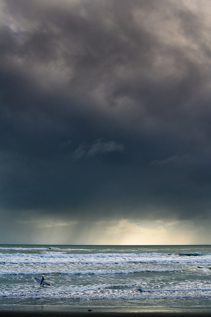
Trambopaline posted:
I'm a huge fan of verticality in photography, so this really struck a chord with me. The division of ocean, sky and clouds creates a very pleasing flow. As was stated previously, it feels a touch underexposed in the bottom third. Other than that, it's terrific! ---------------- A friend wanted to do some vanity photos so I obliged her!  EDIT: The usual complaint about the color/tone shifting when uploading... should be less yellow than it is now.
|
|
#
?
Jun 27, 2012 01:50
|
|
|
ogopogo posted:
I like the color. The tight crop, especially with her shoulders not being completed, makes them look really wide and odd, and it makes her arms look fat. I also would have liked her hair with more volume. Right now it looks rather slick since it's pulled back behind the head. I've also read in portrait photography books that the person should never face directly shoulders square into the camera (although this rule is quite often broken), but here I think that holds true. It just doesn't look right.
|
|
#
?
Jun 27, 2012 01:57
|
|

|
The lens flare is not very well placed here, it pretty much just washes out her face. The shot doesn't do her much justice - it's more you trying for the style than for the girl if that makes sense. Next time you could probably move her to cover the sun and have her backlit if you want a similar feel but want to show her off. Do you have any others from the session? The photo is also a bit unbalanced (very bright/yellowed at top, black at bottom). I would personally crop it or just add a layer to the bottom to balance it out a bit. the posted:I've also read in portrait photography books that the person should never face directly shoulders square into the camera (although this rule is quite often broken), but here I think that holds true. It just doesn't look right. That's mostly for wider angled female posing but it is done fairly often with tighter crops, especially when large breasts are involved.
|
|
#
?
Jun 27, 2012 02:28
|
|
|
ogopogo posted:I'm a huge fan of verticality in photography, so this really struck a chord with me. The division of ocean, sky and clouds creates a very pleasing flow. As was stated previously, it feels a touch underexposed in the bottom third. Other than that, it's terrific! If you're getting color shifting from uploading your color profile in Windows 7 isn't set right.
|
|
#
?
Jun 27, 2012 03:12
|
|

|
Kingdom of Sin posted:
I almost like this. I wish it was at a lower angle instead of almost perpendicular to the ground like this. Also, the processing just doesn't say "hot" to me. I think I finally got out of my landscape funk. I still need to sit down and work on post more. I can visualize a lot in my head, but it's just not coming out right when I start working in lightroom.   
|
|
#
?
Jun 27, 2012 05:07
|
|

|
Oprah Haza posted:The lens flare is not very well placed here, it pretty much just washes out her face. The shot doesn't do her much justice - it's more you trying for the style than for the girl if that makes sense. Next time you could probably move her to cover the sun and have her backlit if you want a similar feel but want to show her off. Do you have any others from the session? Thanks for all the critique guys! As far as the look/style goes, this is what she asked me to do. She was looking for low contrast, super flare, etc. I feel the vibe she was desiring came through, and she was happy. I'm always looking to improve so this was fun practice and not for a paying client. As far as the color upload, I'm outputting from PS on a Mac, but I've had this problem before and still haven't figured it. Here are two more from the same session. EDIT: i'm gonna hunt down the solution to this color shift problem because the first photo shouldn't be that green at all. Apologies.   Casu Marzu - I like the second photo a lot, but feel like the exposure could come up 1/3 stop on the bottom right third of the frame. Other than that, I feel like the lines from the cloud and the lines of the grass/water intersect in a really pleasing way, which frame the house in an interesting fashion.
|
|
#
?
Jun 27, 2012 23:30
|
|
|
ogopogo posted:Thanks for all the critique guys! As far as the look/style goes, this is what she asked me to do. She was looking for low contrast, super flare, etc. I feel the vibe she was desiring came through, and she was happy. I'm always looking to improve so this was fun practice and not for a paying client. As far as the color upload, I'm outputting from PS on a Mac, but I've had this problem before and still haven't figured it. Here are two more from the same session. I am sorry the flare in picture #2 totally turns me off. Let me explain why , it take all the place in the picture, it overwhelm your subject and you constantly loose focus to it. I really like picture #1 more if only you had a better background. edit : ugh I did not see that it was already critiqued ! I have not posted in a while because I have been busy as hell. I took a few picture last week, I had my camera stored for quite some month and I was happy to finally take it out. This dude was floating and I really liked the water effect.  canard (1 of 1) by J-YG, on Flickr Tourism souvenirs :  lakegeorge (1 of 1) by J-YG, on Flickr This picture pretty catch the essence of Lake George :  lakegeorge (1 of 1)-2 by J-YG, on Flickr Niagalack fucked around with this message at 02:00 on Jun 28, 2012 |
|
#
?
Jun 28, 2012 01:32
|
|

|
ogopogo posted:Thanks for all the critique guys! As far as the look/style goes, this is what she asked me to do. She was looking for low contrast, super flare, etc. I feel the vibe she was desiring came through, and she was happy. I'm always looking to improve so this was fun practice and not for a paying client. As far as the color upload, I'm outputting from PS on a Mac, but I've had this problem before and still haven't figured it. Here are two more from the same session. I have to agree with the poster who said her hair looks really slick. I'm not sure if it's the wind or what, but it looks really quite greasy and unappealing. I think it might have to do with the wind looking quite strong, but because her hair is wrapped around her neck, it looks really heavy and, well, greasy. I also think her face could use an exposure boost in the first one. You're going to blow out the background when you backlight it like that anyway, might as well at least bring her face up a bit. I also agree that a better background would give more context and make it a better image. Either that or I'd crop in closer to eliminate a lot of the background. But yeah, the lens flare on 2 is really quite strong and overpowers the whole thing. Especially since she's also squinting. Squinting is rarely a good look, I think.
|
|
#
?
Jun 28, 2012 01:57
|
|

|
I love the composition in this shot. The angle of the car in the frame, combined with the weeds growing up around the base of it, creates a sense of motion in the frame, like it's escaping its decrepit surroundings and heading back to the road (or something.) Either way, it's really beautiful and effective.  Bug by TheJeffers, on Flickr
|
|
#
?
Jun 28, 2012 04:09
|
|


|
I really dig the first one here, I don't know if it's just because it's a familiar scene or what, but I love the atmosphere about it and appreciate the view. However, I don't think the road is really that essential to the composition as a whole, at least not meriting so much of the bottom of the frame, and it feels like it's really soft on where I want to concentrate, like the silo and the houses. Looking at the original blown up it's a lot nicer, but I wonder what it would look like around f/16 or so since the exif says f/5.6. For the second one, "god drat kids!"  TheJeffers posted:I love the composition in this shot. The angle of the car in the frame, combined with the weeds growing up around the base of it, creates a sense of motion in the frame, like it's escaping its decrepit surroundings and heading back to the road (or something.) Either way, it's really beautiful and effective. I'm surprised at how iconic the vents are. I didn't have to think about what I was looking at when I saw it, and drat dat yellow. There's a small grasshopper on one of the vent stems, but I don't mind it paired with the cracked rubber and chipped paint. I do have to wonder what it would look like with a polarizer though, but then again I don't really mind that the glass warps into the tree silhouettes. [/end noob] Was trying for some texture/abstractness that I enjoy, but never really had any experience with:  Cracked and chipping by pageod, on Flickr Pretty sure I only like the view for nostalgic purposes:  Trestle by pageod, on Flickr And the one shot from the trip that I really wanted to turn out, but I'm just not sure how to make it work:  Buy Me by pageod, on Flickr
|
|
#
?
Jun 28, 2012 04:36
|
|
|
bakahentai posted:I really dig the first one here, I don't know if it's just because it's a familiar scene or what, but I love the atmosphere about it and appreciate the view. However, I don't think the road is really that essential to the composition as a whole, at least not meriting so much of the bottom of the frame, and it feels like it's really soft on where I want to concentrate, like the silo and the houses. Looking at the original blown up it's a lot nicer, but I wonder what it would look like around f/16 or so since the exif says f/5.6. Yeah, I wish I planned this shot out more than I did. I haven't shot much for landscapes in quite some time so it didn't even occur to me until I started processing that I should have gotten my tripod out and stopped down a lot more. Alas, I guess it's just a thing to remember for next time.
|
|
#
?
Jun 28, 2012 06:23
|
|
|
bakahentai posted:Was trying for some texture/abstractness that I enjoy, but never really had any experience with: Just chipping in to say I really like this. I'm a sucker for this kind of shot, but this one is really well done. There's lots of variance in the colour of the paint and the sizes and shapes of the patches where it's come off entirely, which makes it interesting and holds my attention longer than just "oh hey that's a cool texture, okay next photo." It's also nicely composed with that one white bit anchoring it on the right, the vertical line of lighter paint just off the centre and the little bare patch in the bottom left all drawing my eye to different parts of the picture. Keep it up! bakahentai posted:And the one shot from the trip that I really wanted to turn out, but I'm just not sure how to make it work: For this one I think maybe it might have worked better if the cow was the main subject. (Maybe it's intended to be?) I didn't even notice it at first, mostly I just saw the crowd, which reminded me of sitting in a lecture hall, bored. There's not really any movement or anything going on with the crowd to make them interesting, they're all just sitting there. If the cow were somehow made to stand out more it might work better. I'm not sure how you'd go about doing that though. Here are some Christchurch earthquake photos. This is from a memorial for the victims of the February 2011 earthquake. Each chair represents one of the 185 dead.  Christchurch Earthquake Memorial by euannz, on Flickr Sunrise over Cashel Street. Part of the Red Zone, the cordoned off area of the central city off-limits to the public since the quake. Fences keep the living out and the zombies in.  Cashel Street Sunrise by euannz, on Flickr Christchurch Cathedral, the city's namesake and symbolic heart at the centre of the city.  Christchurch Cathedral by euannz, on Flickr Wafflecopper fucked around with this message at 12:56 on Jun 28, 2012 |
|
#
?
Jun 28, 2012 06:56
|
|


|
Are they making plans to rebuild it? I hate seeing old buildings fall apart. 
|
|
#
?
Jun 28, 2012 14:40
|
|

|
I've been going through some Lightroom tutorials since I just got LR4, and now I'm going back through some old photos to see what I can do. Here are a couple from the San Francisco Academy of Sciences aquarium. First up is a jellyfish. I think the DOF on this was too shallow, but I was shooting at ISO 1600 already. This was in the deep sea creatures exhibit so lighting was extremely minimal, but looking at the EXIF data this was shot at 1/200 so I probably could have stopped down a little bit and still got the shot. 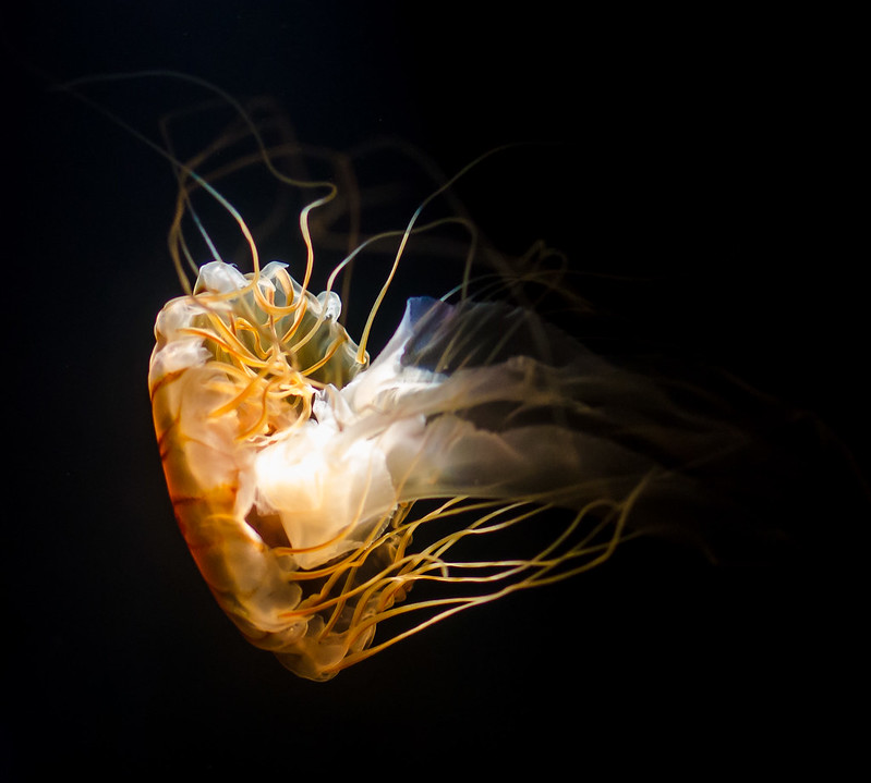 Jellyfish by b.kilkenny, on Flickr The next one is a fish feeding where they dressed up as Santa. It was Dec. 23rd so the holidays were in full effect. I'm not crazy about the murkiness of the water, but I have no idea how to approach that. It probably doesn't help that this was shot through like 6 inches of glass. Any tips? 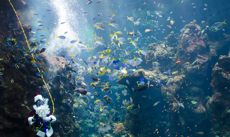 Scuba Santa by b.kilkenny, on Flickr
|
|
#
?
Jun 28, 2012 18:21
|
|

|
Wafflecopper posted:Christchurch Cathedral, the city's namesake and symbolic heart at the centre of the city. drat, those pictures break my heart. I used to work at the corner of Columbo and Gloucester when I lived in NZ, and walked by the Cathedral every day on my way to work from the bus hub (can't remember the name).
|
|
#
?
Jun 28, 2012 19:53
|
|

|
xzzy posted:Are they making plans to rebuild it? I hate seeing old buildings fall apart.  Probably to late to save it now, unfortunately. Probably to late to save it now, unfortunately.
|
|
#
?
Jun 28, 2012 21:06
|
|
|
SeamusMcPhisticuffs posted:I've been going through some Lightroom tutorials since I just got LR4, and now I'm going back through some old photos to see what I can do. Here are a couple from the San Francisco Academy of Sciences aquarium. I think the jellyfish shot still works good. The jellyfish is already translucent and whatnot, so having a little bit of blur on the edges doesn't seem like that big of a deal, and with that solid black background I think it's awesome. As far as the second shot, maybe try a polarizer? Hard to tell if that would help or if the water really is that murky in real life though. 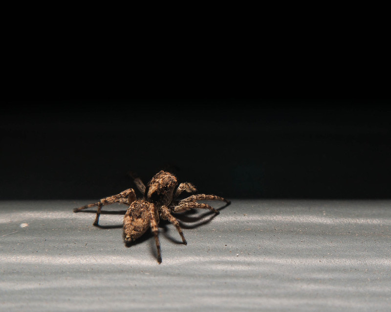 DSC_0225.jpg by MrDespair, on Flickr 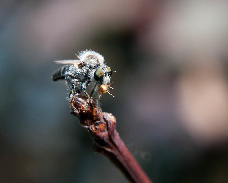 DSC_0236.jpg by MrDespair, on Flickr
|
|
#
?
Jun 29, 2012 04:24
|
|


|
bakahentai posted:And the one shot from the trip that I really wanted to turn out, but I'm just not sure how to make it work:
|
|
#
?
Jun 29, 2012 19:38
|
|

|
Mr. Despair posted:
I would prefer the whole spider to be in focus. Likewise, I wish you had gotten the back end of the bee in focus. Maybe you are using too narrow a depth of field? I can't quite tell, but it looks like the bee's holding something in his mouth, which is pretty neat. I like the pictures of the critters, but it's more interesting to me to see every single bit in sharp focus, because I don't often get to see them big, and it's nice to get to really see all the details. =========================== Just got back from a week-long trip in Monterey, CA for a teacher training institute. Took a buncha pictures. I took around 300. Maybe a dozen were worth fooling around in post, and there are a couple that I actually really like. My ratio is improving! Tiny flowers outside our hotel room.  Flowers-6 by prismaticglasses, on Flickr Birds of Paradise  Flowers by prismaticglasses, on Flickr I feel like I captured a nice moment with the girl sitting down. I wish the fella behind her weren't there, but I like this one. What could I do/have done to make it better?  Untitled by prismaticglasses, on Flickr Geese are ridiculous. Just sayin'.  Geese! by prismaticglasses, on Flickr I know about the noise issue. I'm still trying to make that better with different ISOs and longer shutter times. What are things that I could do better in post? Am I abusing the sliders too much, or do these look ok?
|
|
#
?
Jun 30, 2012 03:56
|
|

|
Yeah, I wasn't going to get much more DoF on those shots. I was already stopped down pretty far, and any further wound up hurting the shot more then helping it. As far as your shots, the big thing that jumps out to me is that the horizon doesn't seem straight. I think your processing in general is good tbh. (Lightroom4 has pretty good noise reduction too, if you want an easy way to get rid of it).
|
|
#
?
Jun 30, 2012 07:46
|
|
|
Valdara posted:I would prefer the whole spider to be in focus. Likewise, I wish you had gotten the back end of the bee in focus. Maybe you are using too narrow a depth of field? I can't quite tell, but it looks like the bee's holding something in his mouth, which is pretty neat. I like the pictures of the critters, but it's more interesting to me to see every single bit in sharp focus, because I don't often get to see them big, and it's nice to get to really see all the details. For the flower shots, I think you picked a bad time of day to shoot them. The light seems really hard and personally I feel shots of flowers should try and have the softest light possible. Also the shadow on the top right of the first flower is really distracting. On the third, I really like the rock formation and composition (though the horizon line is crooked) but I dunno if the people really add anything to it. The last one seems kinda snapshotty, try and get closer or play with the depth of field. Here's one from a babby shoot today. 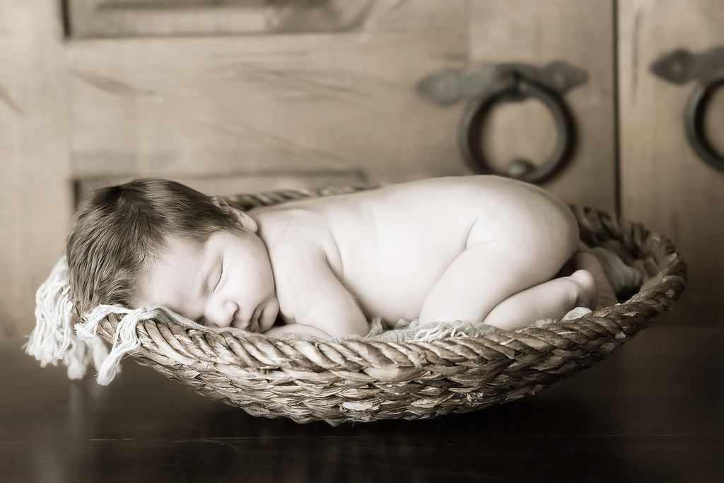 Mason Matteo by francography, on Flickr
|
|
#
?
Jul 1, 2012 01:14
|
|


|
dead baby
|
|
#
?
Jul 1, 2012 02:05
|
|
|
Hmm, I'm not sure what gives you the impression the baby is dead, care to elaborate? I don't really get that feeling.
|
|
#
?
Jul 1, 2012 02:27
|
|
|
Desaturated sleeping babies never look good and are a common theme in the horrible photographers thread.
|
|
#
?
Jul 1, 2012 02:45
|
|
|
Valdara posted:I feel like I captured a nice moment with the girl sitting down. I wish the fella behind her weren't there, but I like this one. What could I do/have done to make it better? Is there any way to get a tighter crop on them? You're absolutely right about the guy though. I think you could saturate the colors a little more on the blues to keep it from looking so drained and beige. I know that's mostly owing to the time of day though. But yeah the guy being there keeps me from enjoying her moment - or maybe that could be the story? That said, I enjoy the contrasting textures a lot. I've been taking photos for years but I've never taken any classes.  Classing Up Duck Paintings by lexingtondisoro, on Photobucket  Stay Out of the Rain by lexingtondisoro, on Photobucket I haven't really done cropping before and I promise I shoot in color too. These were the two I was most interested in getting crit. e: fixed itself somehow SHVPS4DETH fucked around with this message at 11:17 on Jul 1, 2012 |
|
#
?
Jul 1, 2012 03:38
|
|


|
TheLastManStanding posted:Desaturated sleeping babies never look good and are a common theme in the horrible photographers thread. Does this work better for you?  masonmatteo_color by francography, on Flickr Personally, I still dont see the "dead baby" in the first one. I almost prefer it but I'm not sure. I like the warm tones. I tried to go through the bad photographer thread to see the examples you're referring to, but they are beyond awful. It's a weird reference point for me.   
|
|
#
?
Jul 1, 2012 11:02
|
|
|
somnambulist posted:Personally, I still dont see the "dead baby" in the first one. I almost prefer it but I'm not sure. I like the warm tones. I tried to go through the bad photographer thread to see the examples you're referring to, but they are beyond awful. It's a weird reference point for me. This is the most horrifying photo I've seen in recent memory. 
|
|
#
?
Jul 1, 2012 11:16
|
|
|
My picture must sucks I did not get any crit!
|
|
#
?
Jul 1, 2012 11:16
|
|
|
Sorry man I just went with the most recent post.Niagalack posted:This dude was floating and I really liked the water effect. As you describe it, it sounds like more of a snapshot, and it shows in the composition. There just isn't enough going on that seems unique enough to be notable. It's a duck in vast gray water. If it was more about the duck it would just end up as a photo of some duck, which while well-taken is just sort of there. It's also too dark overall to see any colors clearly. Niagalack posted:Tourism souvenirs : With this one I don't see the point of interest. The center third where there is an un-illuminated streetlight is a non-starter and there aren't any horizontal or vertical lines with which to align. The big tree in the left third draws my eye, but there's nothing to build on from there. Niagalack posted:This picture pretty catch the essence of Lake George : This is a really fantastic wide panoramic shot, but the artifact over the center-right tree is very distracting. If it was cropped above that it would be stupid wide but the background is stunning. The distant gray peaks contrasting with the foregrounded green ones is wonderful. e: vvv HUGE improvementvvv SHVPS4DETH fucked around with this message at 14:12 on Jul 1, 2012 |
|
#
?
Jul 1, 2012 11:48
|
|
|
Christopher Irvine posted:Sorry man I just went with the most recent post. Thank you ! My lens was dirty and I only found out when I was back home  . Is there any way to remove this with Lightroom or Photoshop? . Is there any way to remove this with Lightroom or Photoshop?edit : I tried the clone tool !  lakegeorge (1 of 1)-3 by J-YG, on Flickr Niagalack fucked around with this message at 13:00 on Jul 1, 2012 |
|
#
?
Jul 1, 2012 12:52
|
|
|
somnambulist posted:Does this work better for you?
|
|
#
?
Jul 1, 2012 13:55
|
|

|
somnambulist posted:For the flower shots, I think you picked a bad time of day to shoot them. The light seems really hard and personally I feel shots of flowers should try and have the softest light possible. Also the shadow on the top right of the first flower is really distracting. I don't get the dead baby vibe from this. People overreact to black and white pictures of sleeping babies and think they all look dead. I think the ones in the terrible photographers thread look that way because the posing is terrible as well, but I think you did a good job. pretty sure the parents and everyone else looking at it aren't going to assume omg dead baby. The worst dead baby pictures are the ones where the baby is selectively desaturated. I don't think when the whole image is, it gives that look. I'd keep it b&w.
|
|
#
?
Jul 1, 2012 18:49
|
|
|
somnambulist posted:For the flower shots, I think you picked a bad time of day to shoot them. The light seems really hard and personally I feel shots of flowers should try and have the softest light possible. Also the shadow on the top right of the first flower is really distracting. The place I work for do these shots with newborns literally every time. Their eyes are closed most of the time anyways. There are only so many poses that won't bother the baby. Another popular one is dad holding the baby in the palm of his hand. But that's about it. Change the background, change the baby poser, and you have a set, basically.
|
|
#
?
Jul 1, 2012 20:58
|
|
|
babies that "fresh" are really hard to take pictures of and that's really all you can do with them. when i worked at sears this one mom (of a 7 day old (!) baby) started breastfeeding in the middle of the shoot with no warning, that was interesting. Honestly it's a good picture, i don't think the baby looks dead. looks like a sleeping baby. It's the kind of shot that the parents love and it sells.
|
|
#
?
Jul 1, 2012 21:32
|
|

|
Niagalack posted:Thank you ! My lens was dirty and I only found out when I was back home This to me is perfectly balanced. Just a little bit dark in places. The other photos seemed kind of snapshot-esque and unplanned. I really enjoy the panorama. Some more stuff I'm trying to work on.  Blow it All Away. by Scott LaChapelle, on Flickr  Love is All. by Scott LaChapelle, on Flickr  Dirty Paws. by Scott LaChapelle, on Flickr These were all scanned negatives inverted on my Canon Pixma. That's what's accounting for the bands of light. coronalight fucked around with this message at 05:56 on Jul 2, 2012 |
|
#
?
Jul 2, 2012 05:53
|
|

|
Christopher Irvine posted:Is there any way to get a tighter crop on them? You're absolutely right about the guy though. I think you could saturate the colors a little more on the blues to keep it from looking so drained and beige. I know that's mostly owing to the time of day though. But yeah the guy being there keeps me from enjoying her moment - or maybe that could be the story? That said, I enjoy the contrasting textures a lot. This was taken in Monterey as the fog came in during the evening. The light was pretty terrible, and I was fighting exposure the whole time. The fella was her father, and she was sitting there enjoying the moment while he was bored and on his cellphone trying to get her to leave because it was windy and chilly. One second later, and I would have missed that shot. I'll fuss with the sliders and some cropping to see what I can do. Christopher Irvine posted:I've been taking photos for years but I've never taken any classes. I can't really tell what these two photos are about. I'm trying really hard to find a subject/focus, and not coming up with much. You can't really tell what the paintings are of in the first one. The thing that jumps out at me is that big, empty column smack in the middle. I do like the exposure and how all the lines move my eyes from right to left, but I really want them to move my eyes somewhere with a purpose. The second one also has nowhere for my eyes to land. I think the horizontals are a little off (I still do this a lot, and don't know how to fix it in post yet). Are we looking at the house? The tree on the left? The texture of the ground in the foreground? I feel like the exposure is off. The light source and reflection are super bright, and everything else is super dark. I was trying to take a photo of a light a few days ago at dusk, and what seemed to work ok was having a very low ISO with a slower shutter speed. I don't remember what I did with aperture. Wafflecopper posted:Sunrise over Cashel Street. Part of the Red Zone, the cordoned off area of the central city off-limits to the public since the quake. Fences keep the living out and the zombies in. I get that the first one is a sunrise, so it's supposed to be dark, but I feel like it's too dark. Is there a way to brighten the buildings and make them easier to see while keeping the exposure of the sunrise? They're kind of muddy and might could be used to frame the brightness better. I like the reflections of the colors in the window. Maybe increase the contrast or saturation or whatever it is that makes colors pop more. The second one is also a little underexposed, unless that's on purpose, since it's sad that there is so much damage. I'm not getting that kind of emotion from that picture. The picture is so far back that it's hard to tell there's so much damage (aside from the giant, gaping hole). Maybe try to get a closer look, show some broken blocks, a shot into the giant, gaping, dark hole, cracked windows, or something else that gives some detail. Or you could focus on the rebuild, and take pictures of any stacked building material ready to go to rebuild the city's heart. The current framing doesn't really convey that this is a super important, cherished building that MEANS a lot to the town. It's also suffering from how all the buildings look to be leaning backward due to the angle you're taking the picture. Valdara fucked around with this message at 06:33 on Jul 2, 2012 |
|
#
?
Jul 2, 2012 06:09
|
|
|

|
| # ? May 12, 2024 06:26 |
|
|
scotty posted:
I really wish I could offer some good criticism, but this is my first foray into photography.... I think these pictures are amazing, only the third one doesn't have the contrast to make it pop like the first two. But the feel of the photographs is really beautiful - grainy and raw. This is my first photo with a proper camera (Sony NEX-5N), it's sunset in Kaam Samnor, Cambodia, a town so small it doesn't even show up on Google Maps. I've never tried actually composing a photo before, so consider this the first.  Sunset over Kaam Samnor by alangrainger, on Flickr Metalslug fucked around with this message at 08:29 on Jul 3, 2012 |
|
#
?
Jul 3, 2012 03:09
|
|