


|
Metalslug posted:I really wish I could offer some good criticism, but this is my first foray into photography.... I really like your picture , I can't say much post work you put into this but you have lens flare just over the crop in the trees. All the tree are black except for a few that a way to greenish it make me loose focus on that little point. Composition wise it's great in my opinion. I don't know what impact you would get if you straighten the horizon line to.
|
 #
?
Jul 3, 2012 04:04
#
?
Jul 3, 2012 04:04
|
|


|

|
| # ? May 11, 2024 16:42 |
|
|
Niagalack posted:I really like your picture , I can't say much post work you put into this but you have lens flare just over the crop in the trees. All the tree are black except for a few that a way to greenish it make me loose focus on that little point. Composition wise it's great in my opinion. I don't know what impact you would get if you straighten the horizon line to. Thanks. ") I did try with the horizon straight and I felt it didn't look as good. I didn't notice the lens flare so will get rid of that. I did try with the horizon straight and I felt it didn't look as good. I didn't notice the lens flare so will get rid of that.Regarding the green in the trees..... I'm colour-blind and I don't see it.  This might be harder than I thought!! Are you talking about the two tall trees closest to the sun? This might be harder than I thought!! Are you talking about the two tall trees closest to the sun?
Metalslug fucked around with this message at 05:01 on Jul 3, 2012 |
|
#
?
Jul 3, 2012 04:59
|
|

|
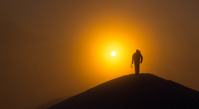
Metalslug posted:This is my first photo with a proper camera (Sony NEX-5N), it's sunset in Kaam Samnor, Cambodia, a town so small it doesn't even show up on Google Maps. I've never tried actually composing a photo before, so consider this the first. That's the best first "actually trying" photo I've ever seen...
|
|
#
?
Jul 3, 2012 05:47
|
|


|
Metalslug posted:I really wish I could offer some good criticism, but this is my first foray into photography.... There's some weird green colours going on in the treeline, other than that, I think it would benefit from shifting the yellow in the sky a bit more orange and maybe desaturating the greens slightly, but it it's a killer shot. Good job!
|
|
#
?
Jul 3, 2012 06:17
|
|

|
It seems to me like there's some lens flare or something going on in the trees causing the green spots.
|
|
#
?
Jul 3, 2012 06:51
|
|


|
Thank you for the compliments! I've just bought some photography books so hopefully things improve from here.aliencowboy posted:There's some weird green colours going on in the treeline, other than that, I think it would benefit from shifting the yellow in the sky a bit more orange and maybe desaturating the greens slightly, but it it's a killer shot. Good job! Sounds like good advice. I will try give it a go and see if I can figure out how to do that. Colours are going to be my achilles heel. Might have to start playing some more with black and white.... Metalslug fucked around with this message at 07:45 on Jul 3, 2012 |
|
#
?
Jul 3, 2012 07:42
|
|
|
somnambulist posted:Hmm, I'm not sure what gives you the impression the baby is dead, care to elaborate? I don't really get that feeling. I have never actually seen a dead person in real life, but I have seen a lot of rotting corpses in movies, and they almost always have that skin tone. The first word I think of when I look at the photo is "pallid." That's probably not a reaction you want with a photo of a baby. It's technically a lot better than the poo poo in the terrible photos thread, and you're a good photographer, but I think you missed the mark on this one. I unfortunately didn't see the colorized version before you took it down, but I can't imagine it not being an improvement. Also seconding the check your verticals. It's such a slight slant, but that's what makes it stick out so much, and straightening for the door wouldn't have any real impact on the overall composition of the subject. scotty posted:
I like this one a lot. It brings out a lot of your subject's character between the pose and expression, and the lighting really enhances the mood of it. The other two aren't bad, but they don't really stand out the way this one does. Metalslug posted:
Aside from nitpicky stuff already mentioned, this is great. On your flickr, the other sunrise shot is good too, but I don't find it as interesting without the man there. The field shot feels a little too "colorful" and it ends up looking unnatural to me. That oversaturation works on these dripping sun shots, but not so much on a midday field. You're off to a great start.
|
|
#
?
Jul 3, 2012 08:05
|
|


|
Since you are colour-blind let me help you then! I just took a print screen of your picture. I hope there is no offence in what I did. I can't wait to see your work in a few month if this is just a start. edit : LargeHadron posted:That's the best first "actually trying" photo I've ever seen... I second this! Niagalack fucked around with this message at 11:57 on Jul 3, 2012 |
|
#
?
Jul 3, 2012 11:52
|
|
|
Niagalack posted:Since you are colour-blind let me help you then! I just took a print screen of your picture. I hope there is no offence in what I did. I can't wait to see your work in a few month if this is just a start. Definitely no offence! I made the changes suggested above regarding the orange/yellow/desaturating green, and I think that helped the lens flare, at least to my eyes. However, using those colour sliders is amazing!!! It helps me a lot because I can completely desaturate a colour and then I'm able to tell how much of the image was really green, or yellow, or whatever. I used it to fix the daylight field shot and make it much less over-saturated. Thank you Niagalack and aliencowboy for pointing me at that feature. I also tried using the spot removal tool in Lightroom but I'm not really sure how well it worked. Not sure if there was some other way to correctly fix that. Unfortunately I didn't realise that re-uploading to Flickr changed the link, so now the original photo is broken.  Sunset over Kaam Samnor by alangrainger, on Flickr
|
|
#
?
Jul 3, 2012 12:35
|
|
|
Metalslug posted:I really wish I could offer some good criticism, but this is my first foray into photography.... Wow this is a good photo! Is the horizon crooked a little bit? I'm trying to figure if it is with my fingers (no proper software at work), if it is it might be better to straighten it. I would have looked if the subject was just a bit more exposed but with those kind of shots I can understand it's not always possible. Here are two of mine: Small editorial for swimwear:  IMG_0435 by avoyer, on Flickr And a bachelorette:  IMG_9632-2 by avoyer, on Flickr xenilk fucked around with this message at 16:11 on Jul 3, 2012 |
|
#
?
Jul 3, 2012 16:08
|
|


|
xenilk posted:And a bachelorette: I don't like this one because the background is so blown out that it's difficult to tell what those shapes are. Somehow that makes them more distracting than if it were more obvious that they were people.
|
|
#
?
Jul 3, 2012 17:00
|
|
|
xenilk posted:Small editorial for swimwear: why is the lovely shot of the stream so blurry?? - or - probably a bad idea to put your subject past one of the thirds of the frame.
|
|
#
?
Jul 3, 2012 17:02
|
|


|
Metalslug posted:
Agreed - this is really a great first try. I have an NEX-5N too; are you shooting raw or jpeg? The jpeg engine has some wonky color issues, so I wasn't sure if some of that color cast came from the jpeg engine. What lens were you using out of curiosity? The flare looks like what I have gotten on occasion from the kit 18-55. I can take this and delete it - just let me know - but I downloaded a jpeg and altered it slightly in Lightroom 4. I am no expert so it could be poo poo, but the odd color cast was fixed by taking the yellow hue -20 and the green hue -16. Green saturation -51 and luminance -16. Exposure +.60, highlights -45 and whites +40. This is not of course "the right way to do it" by any means (and I am still learning too so take this as you will) but I just wanted to get it looking right to me, and have you see the difference with however the colorblindness is affecting you. P.S. you might want to deal with the greens differently, not quite sure what to do with those. I also did nothing with the flare. 
|
|
#
?
Jul 4, 2012 03:47
|
|

|
xenilk posted:Small editorial for swimwear: Agreed with guidoanselmi - it feels like there's not quite enough room above her head, looks like she's struggling to fit inside the frame. A little bit unrelaxing to look at. However I love the colour feel and the lighting, it looks great on her. rio posted:Agreed - this is really a great first try. I have an NEX-5N too; are you shooting raw or jpeg? The jpeg engine has some wonky color issues, so I wasn't sure if some of that color cast came from the jpeg engine. What lens were you using out of curiosity? The flare looks like what I have gotten on occasion from the kit 18-55. I'm shooting jpeg as I like to be able to use all the extra creative modes, and you can't do some of them with raw. And I don't feel I'm really going to make any good use of raw at this point in my photo career. Maybe later. I'm using the kit 18-55.I honestly couldn't tell much difference between yours and mine except the green section to the left of the buffalo looks a bit more grey. This is going to be fun - a photo journal of the world through the eyes of a colour-blind man. I did raise the exposure a bit on mine based on your one. I might try splitting the scene in photoshop and increasing the exposure of the foreground while leaving the sky the same. Thanks for the suggestions! Here's my first go at black and white processing (screw you, colour!). This is the generator that powered the neighbourhood in the tiny town I was staying.  The only power in town by alangrainger, on Flickr e: vvvv Yeah, there are some extra modes on the NEX like an auto HDR mode that only work when you're using jpeg. Metalslug fucked around with this message at 05:38 on Jul 4, 2012 |
|
#
?
Jul 4, 2012 05:09
|
|
|
Metalslug posted:I'm shooting jpeg as I like to be able to use all the extra creative modes, and you can't do some of them with raw. ...wha...?
|
|
#
?
Jul 4, 2012 05:13
|
|
|
Metalslug posted:e: vvvv Yeah, there are some extra modes on the NEX like an auto HDR mode that only work when you're using jpeg. I think it's more...you're severely limiting yourself if you shoot only in jpeg creative modes. If you shoot in raw, you can do anything the in-camera creative modes can do, but you have significantly more control and way more information to work with. In camera processing is easy mode, but you're relying solely on the camera to do things for you, and are really limiting yourself to what it thinks is best. You want HDR? Do it yourself! You'll get way better results and you'll learn a lot more about your camera. Seriously, don't rely on in camera creative modes, there is no reason to go that route.
|
|
#
?
Jul 4, 2012 05:52
|
|

|
CarrotFlowers posted:I think it's more...you're severely limiting yourself if you shoot only in jpeg creative modes. If you shoot in raw, you can do anything the in-camera creative modes can do, but you have significantly more control and way more information to work with. In camera processing is easy mode, but you're relying solely on the camera to do things for you, and are really limiting yourself to what it thinks is best. You want HDR? Do it yourself! You'll get way better results and you'll learn a lot more about your camera. Hmmmm.... I see what you're saying. I think perhaps I didn't explain myself well though - I don't use the "toy camera"/popart/etc modes, but I have been using the colour adjustment modes. The reason I'm using the inbuilt HDR is that I don't have a tripod. I'm backpacking from Thailand to Spain and only have 8kg of stuff and nowhere to put a tripod. I will see how easy it is to shoot in RAW and then switch to jpeg if I want to do an HDR shot. I guess I am a little scared of raw... 
|
|
#
?
Jul 4, 2012 06:01
|
|
|
Metalslug posted:Hmmmm.... I see what you're saying. I think perhaps I didn't explain myself well though - I don't use the "toy camera"/popart/etc modes, but I have been using the colour adjustment modes. The reason I'm using the inbuilt HDR is that I don't have a tripod. I'm backpacking from Thailand to Spain and only have 8kg of stuff and nowhere to put a tripod. I will see how easy it is to shoot in RAW and then switch to jpeg if I want to do an HDR shot. When I started out I had the same problem. The camera seemed so cool and it was my first real non-film camera so I wanted to use all of the features. After getting Lightroom and with a few months of practice, though, the in camera features started to pale next to what was possible in post processing raw - both in terms of creative choices and quality. Try to set it to shoot raw+jpeg. You will still have your jpeg and you can try to process the raw and compare it to the jpeg for reference if you like the in camera processing style. I promise that it is worth it. There are a couple of modes that don't work in raw+jpeg (like auto HDR) but they are arguably not worth it anyway. --- I haven't posted looking for a critique in a while, but have still been shooting a lot. My own self critique has gotten pretty heavy. My wife wants me to save shots that I am quick to trash because they are not perfect, and I am afraid that I may be too far on the self critical side sometimes but I would rather be there and think that my shots are poo poo and need a lot of work than be complacent. 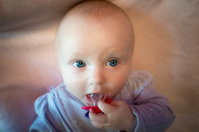 Sophia by northpaul., on Flickr Our daughter is about 4 months now and getting easier to photograph. However there is a lot of mixed light sometimes, and I was dealing with that here. In LR4 the temp brush is great, but at the same time I do not like to completely lose the sense of what the lighting was actually like in the picture, so I used the brush but not so much that it seems like the light source is uniform. I don't know if that is the way to go, though. 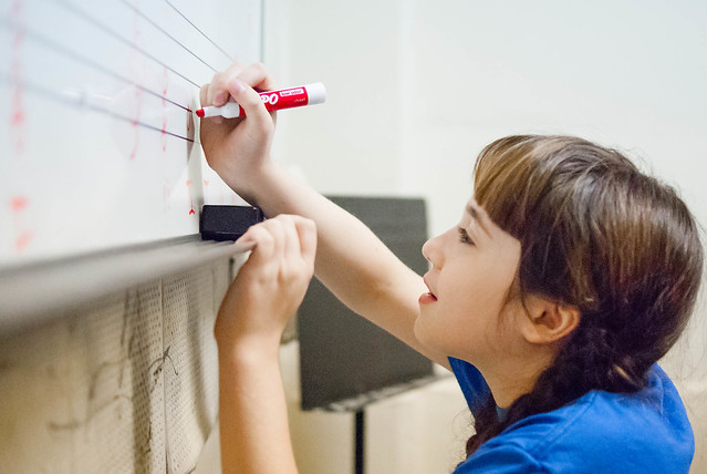 piano camp by northpaul., on Flickr This was from a theory class, and I liked the shot for some reason. I am a bit worried that she is too far down in the frame and that the composition is not quite right. My gut does like it, though, but my brain is second and third guessing it and trying to think how could I do it differently next time. (edit: there is a bit of room around this that I cropped out trying to get a bit tighter)  reflection 3 by northpaul., on Flickr This one is a rough one. I was out shooting some pretty clouds on the lake and this set of geese suddenly took off. I was all *snapsnapsnapsnap* trying to frantically get it and being that I was some distance away with a 30mm lens on, this is cropped fairly tight. I could go further in and lose some of the geese on the sides...I feel like unless this is larger size that the geese are somehow lost and the reflection is not as apparent as I would like. I am also not sure that I like the processing. If it would help, I could post a picture of the lake itself with more of a natural look for reference, but I really wanted to bring attention to the reflection and processed accordingly. rio fucked around with this message at 06:28 on Jul 4, 2012 |
|
#
?
Jul 4, 2012 06:25
|
|
|
rio posted:
I really like this candid, but I agree, I wish the composition was a little more loose in the bottom right. It's keeping my eye stuck down there, away from the rest of this awesome photo. I really enjoy that bright, bright red of the marker against the other subtle colors in the photo.
|
|
#
?
Jul 4, 2012 16:29
|
|

|
rio posted:
Until I read your description, I didn't see the geese at all. I think a tighter crop of even three or four geese instead of the whole thing would bring more attention to them, and also if you made the background not quite so dark so the geese can pop. I did a very quick crop/lighten job in Lightroom to show what I mean. I cropped to five geese so there was still some amount of sky and reflection.  ========================= My camera only has the option to shoot in .jpg. The nature of the best, and the best I can do for now. I figure that I'm spending my first few weeks/months practicing working on just getting down exposure and composition and fiddling with the settings. If I can get good results with an absurdly small sensor, then hopefully I'll have a leg up when I eventually get better equipment. Here are some photos I took today at the local senior community garden. I'm just starting to mess around with the sliders in Lightroom, and after reading the thread of terrible photographs, I worry that I'm over processing these. Am I? Turns out that old folks give you weird looks when you're sprawled on your belly in the middle of their garden trying to shoot pretty flowers. I wished them a good morning and kept on shooting. 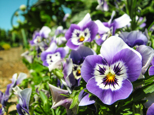 Garden-12 by prismaticglasses, on Flickr I was snapping fast trying to get the bugs in the frame. This thing was about 12' away, so I'm very happy with the focus while having to zoom in so much.  Bees! by prismaticglasses, on Flickr This is a picture of a rock retaining wall near my apartment complex. I liked the textures, so I snapped a few. This really has very little post, but I worry that it looks like I cranked a bunch of sliders to crazy extremes, even though I didn't.  Rock by prismaticglasses, on Flickr
|
|
#
?
Jul 4, 2012 23:04
|
|

|
Thanks to you assholes in this thread, I started shooting RAW so yesterday I had to go out to town and buy a bigger SD card and a tiny travel tripod so I can try my hand at some HDR shots.  Valdara posted:
This is beautiful to me in terms of colour, with plenty of texture on the petals. Composition-wise, I'm not really sure the rules with this kind of shot, but it looks pleasing. Valdara posted:
This I don't like so much. It sounds like you were intentionally trying to get the bugs in the shot, but they look more like intrusions that wreck an otherwise nice sunflower. Also the exposure seems a little dark. Valdara posted:
I also like the textures here, but it definitely needs to be straightened, and I'm sure there's a better crop you could do here. --- Here's my first shot from RAW.  The last beam by alangrainger, on Flickr I like this a lot, but I also like this closer crop below because of the easily visible textures. Can anyone tell me WHY one of those is the better photo?  The last beam (detail) by alangrainger, on Flickr Metalslug fucked around with this message at 07:07 on Jul 5, 2012 |
|
#
?
Jul 5, 2012 03:13
|
|
|
rio posted:
The lighting looks okay to me (though I'm far from an expert on portraits) and I love her expression, especially how her eyes are looking up and out of the shot, but I'm not so sure about the background. It looks like your baby is resting in some giant amorphous blob of flesh which I find kind of unsettling. There's also some lumps of something (food?) either in her mouth or in her dummy/pacifier which is a bit distracting. rio posted:
I like the composition in this one. The way the girl is reaching up to the whiteboard emphasises the idea of learning something from an early age. I would like to see just a bit more depth of field though, so that we can see some of what is written on the board to give the photo some more context. If it weren't for the title I wouldn't have known she was learning about music. Perhaps an instrument or something placed inconspicuously in the background would help reinforce that too. The last shot feels like a missed opportunity due to the wrong lens or whatever. It looks like it could have been a really great shot, but it's so out of focus and the geese are so lost that although I hate to say it, I wouldn't bother trying to salvage it. Sorry.  Here are some more Christchurch quake photos. I really need to learn how to do that multiple exposure poo poo. This one was backlit all to hell so the sky was completely blown out. Did what I could to salvage it and ended up with something okay... I think? A demolished house on the outskirts of the central city. 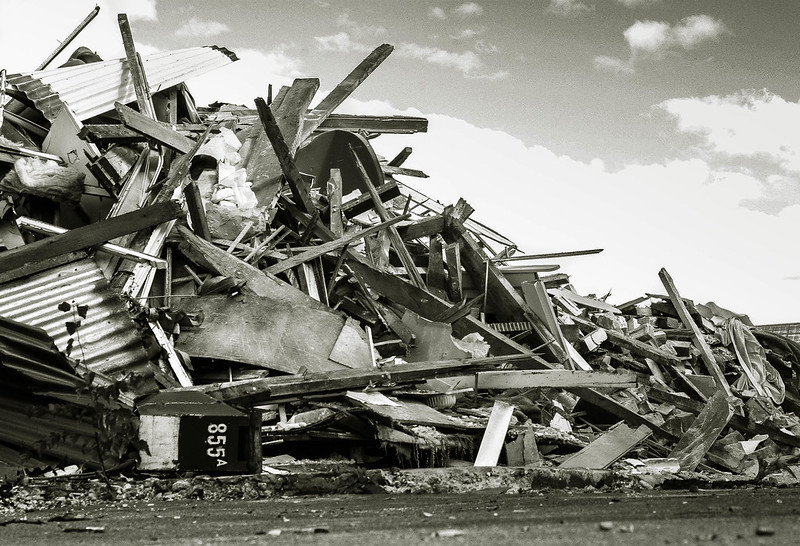 855A by euannz, on Flickr Typical scenes from around the outskirts of the cordoned-off "red zone".  Gloucester St 1 by euannz, on Flickr  Manchester Street by euannz, on Flickr Wafflecopper fucked around with this message at 14:15 on Jul 5, 2012 |
|
#
?
Jul 5, 2012 14:10
|
|


|
Metalslug posted:
In contrast, the second feels very squashed. As a nitpick, I'd line up the wall at the bottom with the image border and have the person not centered. Wafflecopper posted:
quote:Typical scenes from around the outskirts of the cordoned-off "red zone". quote:
 175/366 - Epic Alex Silhouette II by fuglsnef, on Flickr  176/366 - Another misty morning by fuglsnef, on Flickr  183/366 - Attic by fuglsnef, on Flickr
|
|
#
?
Jul 6, 2012 01:42
|
|
|
David Pratt posted:The first one is better because the composition is superior. There is more negative space, and the eye flows more freely around the image. Your attention is first drawn to the top of the frame, then drawn down by the diagonal lines to the human subject. I agree that the first one is better as well - all of that structure and the guy below, the way he is holding the beam, the shape of the structure in the frame. It looks epic. I think the guy in the middle also feels a lot more epic than if it were not centered as it makes him interact with the scene in a very different way than if he were moved.
|
|
#
?
Jul 6, 2012 03:08
|
|
|
 Cincinnati Bell 4 by TheJeffers, on Flickr This is a rough version of this subject that I'm going to refine over the next couple of days. I'm not satisfied with the lighting, the DOF that I chose, or the car in the background, but I like the interplay of colors in the scene. With more DOF and better lighting, I think it'll really come together.
|
|
#
?
Jul 6, 2012 07:01
|
|

|
Metalslug posted:
The first one is definitely stronger. The first thing my eye went to was the person standing with the construction equipment. The fact that this person has their back turned to the camera and isn't moving shows that they are probably looking at something interesting which acts as another subject. Thus, the construction behind the person is more visually interesting when I can visualize the entirety of what that person is looking at it. This is achieved in the first version. In the second version you crop out the structure focusing solely on the worker. By doing that you created a photographically weaker composition because a picture of a person from behind is significantly more boring without something else to support it. Here are a couple of a forest and one from the foothills of the Sierra Nevada. There is a major flaw with the 3rd image with the person.   
|
|
#
?
Jul 6, 2012 09:16
|
|
|
Eclogite posted:The first one is definitely stronger. The first thing my eye went to was the person standing with the construction equipment. The fact that this person has their back turned to the camera and isn't moving shows that they are probably looking at something interesting which acts as another subject. Thus, the construction behind the person is more visually interesting when I can visualize the entirety of what that person is looking at it. This is achieved in the first version. In the second version you crop out the structure focusing solely on the worker. By doing that you created a photographically weaker composition because a picture of a person from behind is significantly more boring without something else to support it. The forest picture has so much potential !! but something is not right and I can't tell what it is.
|
|
#
?
Jul 7, 2012 01:28
|
|
|
The third pictures seems like it wants either more grass and less sky or more sky and less grass.
|
|
#
?
Jul 7, 2012 05:37
|
|

|
Eclogite posted:The first one is definitely stronger. The first thing my eye went to was the person standing with the construction equipment. The fact that this person has their back turned to the camera and isn't moving shows that they are probably looking at something interesting which acts as another subject. Thus, the construction behind the person is more visually interesting when I can visualize the entirety of what that person is looking at it. This is achieved in the first version. In the second version you crop out the structure focusing solely on the worker. By doing that you created a photographically weaker composition because a picture of a person from behind is significantly more boring without something else to support it. THIS!! This is the kind of thing I was asking for. Thank you so much, this makes perfect sense!! Wow, there is so much in photography that I have never considered before. David Pratt posted:
To me, Wow. Perfectly balanced. Very relaxing to look at, and very interesting because I'm not sure who the subject is and what he is holding in his hand. David Pratt posted:
I'm not sure what the focal point is here, and it looks a little flat in terms of tonal range. David Pratt posted:
This one I opened up in the lightbox on Flickr and I love it! It took me a little while to figure out what exactly I was looking at, but as an arty piece I think it does very well. edit: Ok, now I think I'm getting the hang of this black & white thing. What's the feedback on this? Less in terms of composition (although that's very helpful), but more in terms of processing. Also the most effort I've put in to a photo so far - the end of the alley was completely blown out, so (thanks to raw!) I made another copy with the exposure drastically lowered and composited them with Photoshop. I really need to buy a mouse, this netbook is a pain...  Back alley by alangrainger, on Flickr Thank you! Metalslug fucked around with this message at 09:31 on Jul 7, 2012 |
|
#
?
Jul 7, 2012 06:49
|
|
|
I'm a film student and I take a lot of 35mm stills on set: Alice and Rob by Quantum Of Phallus I wish I was wider on this one and it wasn't so overexposed on the right of frame.  Hero by Quantum Of Phallus This is out of focus and I'd prefer that the blacks were deeper.  Will by Quantum Of Phallus I like this one but was wondering what people thought of the framing?
|
|
#
?
Jul 7, 2012 11:35
|
|

|
I love this. Beautiful candid. Definitely keep up with the documentary style stuff, would love to see more. I also wish on the first shot you were wider, it looks like it could have been a real interesting shot. Here's some stuff from the past week:  Young Americans. by Scott LaChapelle, on Flickr  gently caress Yeah, America. by Scott LaChapelle, on Flickr  Better Times. by Scott LaChapelle, on Flickr I need to get a film scanner.
|
|
#
?
Jul 7, 2012 18:24
|
|
|
scotty posted:I love this. Beautiful candid. Definitely keep up with the documentary style stuff, would love to see more. I also wish on the first shot you were wider, it looks like it could have been a real interesting shot. This is great. Perfectly captures 4th of July. Awesome work. Edit: okay maybe it would have been perfect if there were a flag in there. Otherwise, amazing.
|
|
#
?
Jul 7, 2012 18:42
|
|
|
scotty posted:I love this. Beautiful candid. Definitely keep up with the documentary style stuff, would love to see more. I also wish on the first shot you were wider, it looks like it could have been a real interesting shot. Thanks very much I have a film scanner, it saves me loads in the long run but it does give all the scans an odd blue tint. It's OK if you color correct in PS but for anything importsat, I'd still bring it to a proper photography shop.
|
|
#
?
Jul 7, 2012 18:45
|
|
|
I'm trying to salvage this photo: 59940027 by spikespikespike, on Flickr I tried a vertical crop but it looked a little too hemmed in so I went for a horizontal crop:  59940027.jpg by spikespikespike, on Flickr I like it, but I can't tell if that's because I just really like the photo. And before you start telling me there's too much noise, it was shot with 1600 speed film that expired in 2006.
|
|
#
?
Jul 7, 2012 19:30
|
|
|
I personally really enjoy film errors like that. I say keep it.
|
|
#
?
Jul 7, 2012 19:41
|
|
|
scotty posted:I love this. Beautiful candid. Definitely keep up with the documentary style stuff, would love to see more. I also wish on the first shot you were wider, it looks like it could have been a real interesting shot. All three are really cool! I like the framing/vibe of the second one the best but I like the tone/concept of the third one. Pretty neat. The grains adds to them also, I think  IMG_0601 by avoyer, on Flickr  IMG_0615 by avoyer, on Flickr As for myself I've been pretty busy going to a festival here in Ottawa so here are two pictures taken there.
|
|
#
?
Jul 7, 2012 20:35
|
|
|
scotty posted:I personally really enjoy film errors like that. I say keep it. This is one I got when I was in California last year  Apocalypse Cow by Quantum of Phallus
|
|
#
?
Jul 7, 2012 23:10
|
|
|
Quantum of Phallus posted:This is one I got when I was in California last year What the gently caress? I lived it CA for 23 years and I never saw a green hill like that. Everything was always dead. What part? e. Good photo by the way, excepting the error.
|
|
#
?
Jul 7, 2012 23:21
|
|
|
Metalslug posted:This is my first photo with a proper camera (Sony NEX-5N), it's sunset in Kaam Samnor, Cambodia, a town so small it doesn't even show up on Google Maps. I've never tried actually composing a photo before, so consider this the first. I like this picture. If I was editing it personally I might either try to recover more detail from the dark parts of the photo (might not be possible with the exposure), or darken them further as to make more of a silhouette of the man on the ox. Right now though, the non-sky parts of the picture have enough detail that my eyes want to be able to make out more, but can't. I think you made a great exposure for the sky, so I would probably go with the latter of the two and darken the foreground a bit. Just personal preference, though I suppose, it still looks quite nice. As for the crop, look up and read about the rule of thirds - it makes things look much more pleasant. Right now I feel like there is some extra space on the right side of the image that could be taken out with a 4x6 crop, and you would end up with the sun and the man on the ox closer to being on rule of thirds lines. Also I'm colorblind-ish too and didn't see the green so you're not alone http://www.pictocolor.com/portrait.htm <-- this is the plugin I use to help deal with skintones and white balancing off multiple objects in one scene.Quantum of Phallus posted:
I've been starting to like square now that I've been shooting MF, and I think this photo looks nice with it like so:  The original crop isn't bad though. And I really like the second picture you posted! scotty posted:
It would be silly to nitpick about anything like the foreground exposure or a deeper DOF because this is an awesome moment captured that is totally AMERICA gently caress YEAH. Here are some of the photos I've taken recently that I've been happy with, please destroy me:   
|
|
#
?
Jul 7, 2012 23:43
|
|

|

|
| # ? May 11, 2024 16:42 |
|
|
Man_of_Teflon posted:I've been starting to like square now that I've been shooting MF, and I think this photo looks nice with it like so: quote:And I really like the second picture you posted! LargeHadron posted:What the gently caress? I lived it CA for 23 years and I never saw a green hill like that. Everything was always dead. What part? God I wish I could remember, all I know is it was somewhere along the drive from SF to LA inland, not by the coast. I know that's really vague but I'm only in America once every 2 years or so and I can't for the life of me remember exactly where it was. If it's any consolation, I took this nearby so it's not all super-green fields: 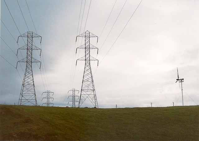 Power by Quantum of Phallus
|
|
#
?
Jul 8, 2012 00:06
|
|