|
xenilk posted:I've had a few minutes to play with a couple of shots I took last weekend: I really like where you're going with these but I feel you're still at odds with composition. I think a full-frame camera would help you. It seems like important parts of the images are getting clipped off. Now, you could work that out with the camera you're using, but full frame might make it easier. I really think you should study composition more and more, and, dare I say it, be a little more conventional. Be really conventional and straightforward and master that, and then break the rules. Otherwise I think you're going in a direction that could start making you good money. Other things I don't like about these shots in particular: the background is not so great. The big mound of sand is not very pretty. But, that's basically a nitpick and I think with compositions comes the attention to backgrounds and if you focus hard on that your pictures will improve. You have some great props by the way! And good models, and good wardrobe, and good make-up. Kudos! ... A slightly older picture from May. I have been shooting a ton of B&W lately with my Hasselblad and haven't developed any of it yet. It's "more of the same" so to speak, so I would expect the same reactions. It's definitely easy to fall back on this kind of photography, and I want to branch out into other areas but I'm struggling with it. 
|
|
|
|
|
| # ? May 13, 2024 09:35 |
|
Mannequin posted:I want to branch out into other areas but I'm struggling with it. I really liked that one shot you posted a while back where you were talking about walking round dodgy areas of town taking photos. What happened to that project? If you're struggling to take stuff you're happy with, post it anyway and get some feedback, maybe it will help! That's the whole point of PAD isn't it? Everyone who is regular here is familiar with your street portraits and the vast majority think they're really good, but when you're still posting the same kind of stuff you were posting months ago, there's not much to critique that hasn't already been said.
|
|
|
|
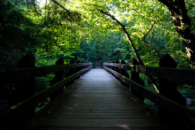
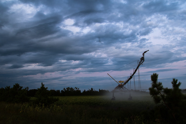
Casu Marzu posted:The first one doesn't really evoke anything for me at all. drat, your black and white on the second one is amazing. Could you tell me how you achieved that? It's extremely rich and while there's a lot of contrast in the whole image, it's very smooth and forms a nice gradient from the almost pure white of the sky up top to the almost pure black of the field in the lower part of the image. I really like it. Someone else said something about the irrigator exiting the frame and they are right, the third one with a similar processing would probably look stellar since it has better composition overall in my opinion, but it might not work since a lot of the appeal of that third image is in the nice tones and color of the sky which might not translate that well in black and white. The first image is also very good. It's simple, but the symmetry of the bridge and the way its broken by the branch is interesting to me. Nice contrast too, once a gain great transition from almost pure black to almost pure white. Good job on the exposition, it's the kind of scene where it's easy to get something overexposed or too much of the image in the dark. --- A few pictures from my hiking trip : 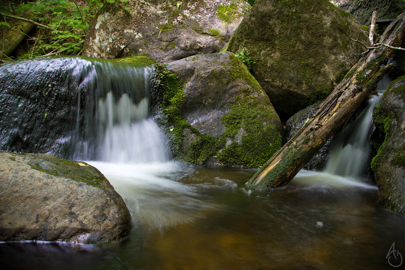 IMG_1181 by king colliwog, on Flickr Pseudo-vintage post processing. Does that work well or does it look like poo poo? 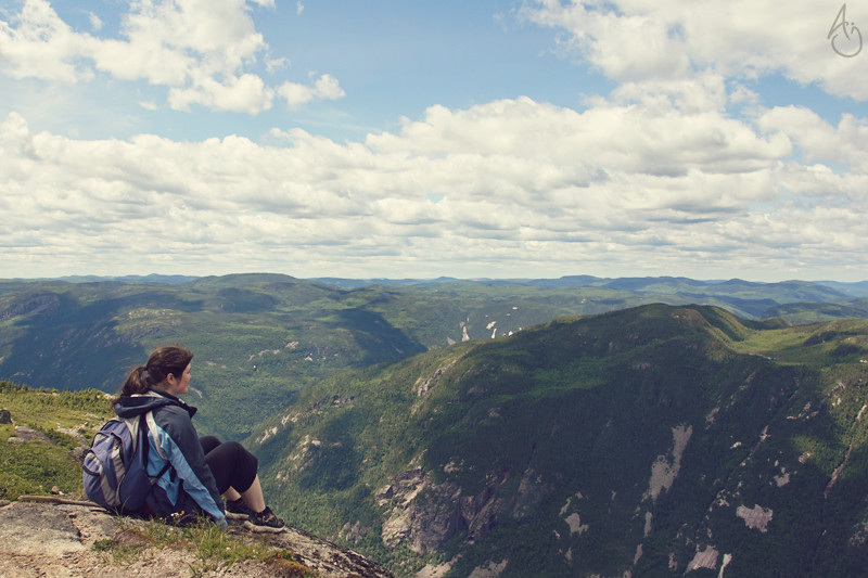 IMG_0988 vintage by king colliwog, on Flickr  IMG_0999 by king colliwog, on Flickr
|
|
|
|
 DubliNeon by Quantum Of Phallus Went around Dublin a couple of nights ago with my Pentax taking photos of the neon, did it on a whim so I didn't have a tripod with me, I might do it again with faster film as well, only used Fuji C200 (USER WAS PUT ON PROBATION FOR THIS POST)
|
|
|
|
I love this shot over in Low Effort: I aspire to someday be this good.
|
|
|
|
Wafflecopper posted:I really liked that one shot you posted a while back where you were talking about walking round dodgy areas of town taking photos. What happened to that project? If you're struggling to take stuff you're happy with, post it anyway and get some feedback, maybe it will help! That's the whole point of PAD isn't it? Everyone who is regular here is familiar with your street portraits and the vast majority think they're really good, but when you're still posting the same kind of stuff you were posting months ago, there's not much to critique that hasn't already been said. Well, you can still critique it if you see something wrong with it or think of ways it could be improved. I do plan on eventually working on my other projects. .... KingColliwog posted:A few pictures from my hiking trip : I'm left feeling a little uninspired from these two. Landscapes (typically) look best in the right light. If you were going for magical vistas, these don't live up. In the second, I don't find the mountains that interesting. Maybe you could have composed it differently or panned the camera to the left or right. Or shot from a different vantage point, such as lower down so that you could peer upwards. There appears to be a somewhat lack of detail, especially in the background, which adds to the somewhat dullness here. I think if you're going to take these kinds of landscapes of beautiful vistas, you have to work really hard at it. Be there at the right time, in the right spot, ready to go. It can take hours of planning, waking up at 3:00 a.m. to drive to the right spot so you can hike up to your spot, and then waiting for the sun to rise. It's real work. These appear to be more like photos you would stick in an album to remind you of the trip, but not something that you could print and sell in galleries. Mannequin fucked around with this message at 14:13 on Jul 15, 2012 |
|
|
|
Quantum of Phallus posted:
Good picture for a handheld picture. You know what it made me think about?  Now I cant get it out of my head. Now let's get serious . Now I cant get it out of my head. Now let's get serious . You could crop the brick out I don't need to see it to know that it's a window. It look more like a quick snapshot. There is weird colouring inside ( weird purple ).I don't shoot film so I might not understand the work behind it.
|
|
|
|
Krakkles posted:I love this shot over in Low Effort Thanks! KingColliwog posted:A few pictures from my hiking trip : The processing works, but I do agree with Mannequin's sentiments. I guess it depends if you're taking your camera with you on a hike or if you're hiking to take photographs. If the former, just take in the view and don't worry too much about getting anything other than snapshots around 10am-2pm. Use this time to make note of what might like good based on where the sun will be later. There are the odd occasions where midday light is the right light, but it almost never is. If you want to hike with the intention of taking photos, try to be there for early morning, late afternoon or both. I like the changes you've made since the portrait thread. Nice stuff! burzum karaoke fucked around with this message at 07:47 on Jul 15, 2012 |
|
|
|
edit: whoops
|
|
|
|
I feel that this wonderful image is woefully un-commented on, so I will try to change that. First of all, as you probably guessed by now - I like it. But I think there are a couple of things that could take this shot from awesome to perfect. First of all I don't mind the light on the rollers, I think it's good as it is. I like the added mystery of figuring out what the shadow on the man's back is. The main focus is on the two subjects anyway. And that's where I'm having some problems; the shot works well with it's very graphical nature so I don't have much to nitpick with the composition, but I can't help to notice that the focus is not on the face, but on the folds of the shirt instead. I guess auto-focus foiled you there. Then, the other almost bigger thing is that the earpieces of your husband's(?) glasses obstruct his eyes - this is visually quite painful as their black line goes straight through to where his iris and whites should be. Ouch. Last but not least the expressions, mostly his could have been a bit better. Of course this is not so much photography-related as choosing the right version/iteration of the picture. VomitOnLino fucked around with this message at 16:41 on Jul 15, 2012 |
|
|
|
I'm totally in love with how you've lit this, criticisms about the rollerskates being too dark aside, I think it's a wonderful couple shot. Can I ask how many lights you had here/what your setup was? I *think* it's 2 but I could be wrong. This is the first proper shoot I've done in months and the first time I've tried using all 3 of my lights at once. Oh, and first time I've shot a snake. Also the models first encounter with a snake, she was fine after a couple of glasses of wine (the model not the snake)  Kirsten & Jake by Shannow, on Flickr
|
|
|
|
KingColliwog posted:drat, your black and white on the second one is amazing. Could you tell me how you achieved that? It's extremely rich and while there's a lot of contrast in the whole image, it's very smooth and forms a nice gradient from the almost pure white of the sky up top to the almost pure black of the field in the lower part of the image. I really like it. Someone else said something about the irrigator exiting the frame and they are right, the third one with a similar processing would probably look stellar since it has better composition overall in my opinion, but it might not work since a lot of the appeal of that third image is in the nice tones and color of the sky which might not translate that well in black and white. In all honesty, I just got really lucky. I have about 20 shots similar to this one that looked like hell and nothing I did made them interesting. But apparently standing knee deep in mosquito infested ditch water makes the lighting gods favor me or something. I just bumped up the shadows slightly in LR, then straightened and cropped. I think I need to revisit those two irrigation images in a while to see if I can find a more favorable crop for both. KingColliwog posted:A few pictures from my hiking trip : I really, really like the processing on both of these, but they feel way too claustrophobic.
|
|
|
|
Shannow posted:This is the first proper shoot I've done in months and the first time I've tried using all 3 of my lights at once. Oh, and first time I've shot a snake. Also the models first encounter with a snake, she was fine after a couple of glasses of wine (the model not the snake)  I like it, maybe the rim/hairlight behind could be lighting up the whole rim of her hair, halo-style, and possibly the fill at camera left is softening the shadows a bit for my personal tastes; the glory of the heavens should cast a harsher light..? Also, I think less might have been more with the jewellery - you've got the snake, tha apple, the nice lighting - the fingerbobs plus the necklace look a bit cluttered. Lovely hair colour, that - looks a lot like my friend 'Trina's;  Single flash with knock-off Fong lambency diffuser, luck of the Gods  Though every time I look at this pic I see the twisted dress strap - I'll fix it in Photoshop one day, but its a good reminder to give your scene a onceover before you pick the camera up, much easier to miss this stuff through the viewfinder. Though every time I look at this pic I see the twisted dress strap - I'll fix it in Photoshop one day, but its a good reminder to give your scene a onceover before you pick the camera up, much easier to miss this stuff through the viewfinder.
|
|
|
|
Thanks a lot for the comments guys, I remember why I used to like PAD so much back before we had that SAD phase.Mannequin posted:I'm left feeling a little uninspired from these two. Landscapes (typically) look best in the right light. If you were going for magical vistas, these don't live up. In the second, I don't find the mountains that interesting. Maybe you could have composed it differently or panned the camera to the left or right. Or shot from a different vantage point, such as lower down so that you could peer upwards. There appears to be a somewhat lack of detail, especially in the background, which adds to the somewhat dullness here. I think if you're going to take these kinds of landscapes of beautiful vistas, you have to work really hard at it. Be there at the right time, in the right spot, ready to go. It can take hours of planning, waking up at 3:00 a.m. to drive to the right spot so you can hike up to your spot, and then waiting for the sun to rise. It's real work. You're right, this was more of a "hiking trip with the girlfriend where I also happen to take photographs" than a "hiking trip planned around taking photographs". I wish I could have been there way early, I might go again alone later in the summer or even better in the autumn and I'd do that. I have some more from different angles and I'll see if I can find one with a more compelling composition/more interesting mountains. Thanks for the comment once again. aliencowboy posted:Thanks! Yep, I know you're right and I generally try to take landscape in the right light (which explains why I take so few landscape nowadays). Like I said unfortunately (well not really since it was an amazing trip) this was more of a vacation with the girlfriend and I brought the camera along, more than the opposite. Casu Marzu posted:In all honesty, I just got really lucky. I have about 20 shots similar to this one that looked like hell and nothing I did made them interesting. But apparently standing knee deep in mosquito infested ditch water makes the lighting gods favor me or something. I just bumped up the shadows slightly in LR, then straightened and cropped. I think I need to revisit those two irrigation images in a while to see if I can find a more favorable crop for both. Lighting gods are the best gods. It would be worth revisiting them for sure. What do you mean by claustrophobic? And thanks for the processing, there's really not much that was done.
|
|
|
|
NoneMoreNegative posted:Key light needs to be brighter if it's representing God I really wanted to have the hair light illuminating more but had literally nothing to stick the flash to  You are quite right about the jewelerry though, I should have mentioned that was intentional, my MUA is a jewellery designer and the shoot was for her business cards/website. That's a beautiful shot of ytour friend by the way, I wouldn't have noted the twisted strap unless you'd mentioned it. You are quite right about the jewelerry though, I should have mentioned that was intentional, my MUA is a jewellery designer and the shoot was for her business cards/website. That's a beautiful shot of ytour friend by the way, I wouldn't have noted the twisted strap unless you'd mentioned it.
|
|
|
|
KingColliwog posted:
The way both the photos are framed, I keep wanting to see just a little bit more. You have this awesome looking scene, but even though you're shooting this huge expansive landscape, it feels cramped. If you could have gotten a bit higher and wider, the second one would be a lot more appealing, imo. Edit: oh drat, that was already at 17mm? Huh. Also
|
|
|
|
Casu Marzu posted:The way both the photos are framed, I keep wanting to see just a little bit more. You have this awesome looking scene, but even though you're shooting this huge expansive landscape, it feels cramped. If you could have gotten a bit higher and wider, the second one would be a lot more appealing, imo. Oh ok, unfortunately like you noticed, this was impossible! I don't have a wide angle lens, the best I can get is 17mm on my tamron. Also yeah, 60D woot! Just bought mine it's all sorts of awesome (coming from a rebel XT it's just crazy awesome) NoneMoreNegative posted:
I... You just flashed through a dome diffuser? On camera or off camera? Can't wait to receive my lambency and test it out, because even if your model is really good looking, the light is pretty good. Slightly hard for my tastes, but it works well with your subject. Other than that, I like the pose, but it gives a lot of emphasis to her boobs which I really don't mind and is not necessarily bad, but is something to think about if it wasn't done on purpose. Didn't notice the strap either by the way. ---- A couple more pictures from that same trip  IMG_0923 by king colliwog, on Flickr  IMG_0968 by king colliwog, on Flickr  IMG_0898 by king colliwog, on Flickr KingColliwog fucked around with this message at 15:10 on Jul 16, 2012 |
|
|
|
VomitOnLino posted:Previous critique Okay! Here are some new pictures from today's and yesterday's photo-walks. Mainly I was trying to get a feel for the new 75mm (35mm equiv.) focal length. There's two pictures which I like and one picture where I'm unsure how I feel about it.  untitled by polysynthesism, on Flickr  untitled by polysynthesism, on Flickr  untitled by polysynthesism, on Flickr
|
|
|
|
VomitOnLino posted:I'm going to comment on the hippo picture first, because I like it the best out of the three posted. The black and white really gives the hippo's skin some nice definition. Also the crop is the most interesting, too as it indicates movement. Thanks for the feedback. I toyed with cropping the hippo photo, but I liked the light segment of water just in front of the hippo and the wave crescent, I will probably revisit it and re-process it when it's less fresh in my mind. Flipping the Third picture is obvious and I can't believe I didn't bother. The large area of focus and heavy textures is quite intentional however - the cats are Jaguars and actually were very difficult to spot in their enclosures, blending and melding into the background quite easily. I should also admit that the last two were shot through horribly reflective plexiglass!
|
|
|
|
KingColliwog posted:
Are these cropped at all? To me they're restraining the vastness of the area, I want to see more of what she's looking off at in the first one, and more of the river in the second. I tried shooting an autocross race that a friend was participating in, unfortunately it went from 10:30am - 2pm on a hot summer's day and there weren't any clouds. I know that the exposure on these could stand to be a bit faster, but do these work well even with the bit of bluriness?  Nissan GT-R by tylerhuestis, on Flickr  Nissan Pulsar GTi-R by tylerhuestis, on Flickr
|
|
|
|
Why would you want a faster exposure? Most motorsport photographers try to get their shutter as slow as possible to blur the background and create a sense of speed. It probably would have helped you with the dull scenery too. As for the colors, what kind of post did you do? I bet you could brighten things up a bit with some slider chicanery. Motorsports is tough.. keep at it though and it'll pay off.
|
|
|
|
I was wanting a bit more definition on the plate/badges on the GT-R and on the guy's arm. Where I was shooting from in those shots had the cars moving at a pretty good spped (the GT-R especially) For post, mostly just made them a bit darker, I tried adjusting some colour setting last night, but I kept getting this halo effect at the back around the buildings whenever I got the grass the colour I liked. I'll give it another shot later today. I was a bit disappointed in the scenery too; it was on an army base next to a live fire range and, apparently, last time there were helicopters buzzing around doing formations, wasn't expecting canola fields and light shrub.
|
|
|
|
Shannow posted:I'm totally in love with how you've lit this, criticisms about the rollerskates being too dark aside, I think it's a wonderful couple shot. Can I ask how many lights you had here/what your setup was? I *think* it's 2 but I could be wrong. Clean up the hair on the right so it looks less messy. Or at least I would anyway. But yeah, haven't seen you post photos in a long time?! KingColliwog posted:
Where was this? guidoanselmi fucked around with this message at 19:54 on Jul 17, 2012 |
|
|
|
guidoanselmi posted:Where was this? The hike is called "L'acropole des draveurs" which would translate to acropolis of the draveurs (no idea how to translate draveurs, they are the baddass that carried wood on rivers like so :  ). ).It's located in the Parc National des Hautes-Gorges-de-la-Rivi�re-Malbaie in Charlevoix, Qu�bec. You can get more info here : http://www.sepaq.com/pq/hgo/index.dot?language_id=1
|
|
|
|
KingColliwog posted:The hike is called "L'acropole des draveurs" which would translate to acropolis of the draveurs (no idea how to translate draveurs, they are the baddass that carried wood on rivers like so : Sup qc goon!
|
|
|
|
Sir: When you call these "low effort" we goons are concerned you're off your meds. Jesus, man. You're attention to detail is phenomenal. Thanks for posting again. woot fatigue posted:
woot fatigue posted:
|
|
|
|
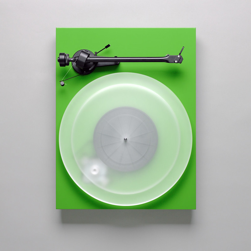
I like the rectangles and circles.
|
|
|
|
Is that a Pro-ject Debut III turntable? Your shot is a hell of a lot better than those on their website. loving nice, I love a good product shot.
|
|
|
|
KingColliwog posted:I... You just flashed through a dome diffuser? On camera or off camera? Can't wait to receive my lambency and test it out, because even if your model is really good looking, the light is pretty good. Slightly hard for my tastes, but it works well with your subject. Other than that, I like the pose, but it gives a lot of emphasis to her boobs which I really don't mind and is not necessarily bad, but is something to think about if it wasn't done on purpose. Didn't notice the strap either by the way.  Katrina is an old-hand model and burly girl, she knows how to give good pose at a moment's request so I'm sure the chest was 100% intentional... She'll also be on the cover / inside of September's Playboy if you guys read it for the articles  I'm liking Silver EFX a lot, the point controls for individual areas of the picture are really well implemented.  Eliza DeLite - B&W by NoneMoreNegative, on Flickr What, me, a big fan of grainy pics!?  KingColliwog posted:Pseudo-vintage post processing. Does that work well or does it look like poo poo? nthing what folks have said here - theres a lot more story off out of the frame that we want to see, the pics look like a tv-version of a widescreen movie  The fix? Take a bunch of pics and stitch them together, then crop off any rough edges; I think the functionality has been in PS for the last couple versions, and I'm sure there are some decent open-source stitchers out there... You'll end up with some dramatic, cinematic pieces and never go back to 'just one shot' landscapes 
NoneMoreNegative fucked around with this message at 22:55 on Jul 18, 2012 |
|
|
|
VomitOnLino posted:
This one feels a bit unbalanced to me. There's so much going on in the bottom half and then the top is all grey and white and flat. There's pretty much a line running right through the middle horizontally. I think this would work a lot better if you'd put that line on a third or just cropped out the top half entirely. VomitOnLino posted:
This is my favourite of the three. Only thing is I almost missed the man in the window. VomitOnLino posted:
I love the overgrown, sheltered feel of the foreground, but I find the background really distracting and jarring. The lines of the building draw my eyes away from all those pleasant greens and I feel suddenly reminded I'm not in some serene woodland, I'm in someone's back yard in suburbia. Maybe that's what you were going for but it still feels a awkward compositionally. I climbed a mountain.  Mount Isobel 3 by euannz, on Flickr  Mount Isobel 2 by euannz, on Flickr  Mount Isobel 5 by euannz, on Flickr
|
|
|
|
I climbed a mountain. Mount Isobel 3 by euannz, on Flickr I'm very hard to please when it comes to landscape pictures but I really like that one. The color/textures make it for me  Thinking about it I like the 3rd one as well, especially for the foreground/background contrast. Here are two of mine, done for an editorial: 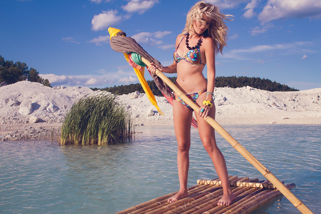 IMG_9989 by avoyer, on Flickr 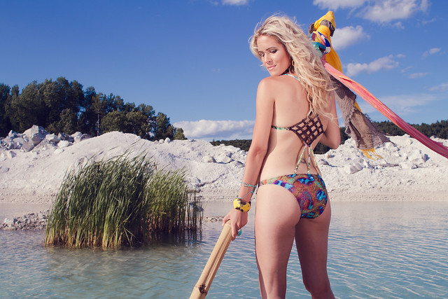 IMG_0029 by avoyer, on Flickr
|
|
|
|
There's something slightly off about those.. I get the sense she was photoshopped into a stock background even though I know that's not the case.
|
|
|
|
xenilk posted:I'm very hard to please when it comes to landscape pictures but I really like that one. The color/textures make it for me Thanks. With the first one I think I hosed up by not focusing on the foreground. I was able to compensate somewhat by using the sharpness slider in lightroom but it still doesn't quite look right. Welp. Lesson learned, but if I managed to impress someone who is picky with landscapes I must be doing something right, which is heartening.  I'd like to know why the second one doesn't appeal to you as much though. With yours I'd like to know more about what you're going for for this editorial. The the composition, colour and exposure all look really great, but I'm afraid to be any more critical without some more context. e: I'm getting way too much positive critique lately. I'm know not that good and I want to improve. Nitpick me motherfuckers. Wafflecopper fucked around with this message at 13:13 on Jul 20, 2012 |
|
|
|
Wafflecopper posted:This one feels a bit unbalanced to me. There's so much going on in the bottom half and then the top is all grey and white and flat. There's pretty much a line running right through the middle horizontally. I think this would work a lot better if you'd put that line on a third or just cropped out the top half entirely. I think the first and the third are much stronger than the second. The focus on the second seems to be on a hill which just isn't very interesting to look at. I shot a show recently, and am feeling incredibly dissatisfied with the result. I want to ask some advice about the following pictures. Basically, my issue is that they're all extremely flat. Do you all have any advice on trying to get her to pop out from the scene a little bit more? I tried playing with the contrast but it didn't do all that much.  IMG_0107.jpg by spikespikespike, on Flickr  IMG_0222.jpg by spikespikespike, on Flickr  IMG_0213.jpg by spikespikespike, on Flickr
|
|
|
Awkward Davies posted:I shot a show recently, and am feeling incredibly dissatisfied with the result. I want to ask some advice about the following pictures. Basically, my issue is that they're all extremely flat. Do you all have any advice on trying to get her to pop out from the scene a little bit more? I tried playing with the contrast but it didn't do all that much. The light in the scene seems very strange. I think the only think that could really have saved these pictures would be better lighting when they were taken. It seems some video or other kind of projection was going on, you would probably have had to use a flash that could drown that out on her face, at least.
|
|
|
|
|
nielsm posted:The light in the scene seems very strange. I think the only think that could really have saved these pictures would be better lighting when they were taken. Yeah there was a projection component to the show. It didn't really feel appropriate to use a flash at the show (it was a sit down thing, and I felt bad standing in front of everyone sitting looking at a raised stage and using a flash) but I'm thinking I should have just gotten over it and used the flash.
|
|
|
|
xenilk posted:
A step backwards and a bit of extra space all round would help anchor her in the pic and make her look less like a paste-in job.
|
|
|
|
 Morning, Morning. by Scott LaChapelle, on Flickr  Lying on the Floor. by Scott LaChapelle, on Flickr  Fourth of Maggie. by Scott LaChapelle, on Flickr (USER WAS PUT ON PROBATION FOR THIS POST)
|
|
|
|
 (USER WAS PUT ON PROBATION FOR THIS POST)
|
|
|
|
|
| # ? May 13, 2024 09:35 |
|
I really enjoy that shot a lot, but maybe tone down the vignetting a bit?
|
|
|


