


|
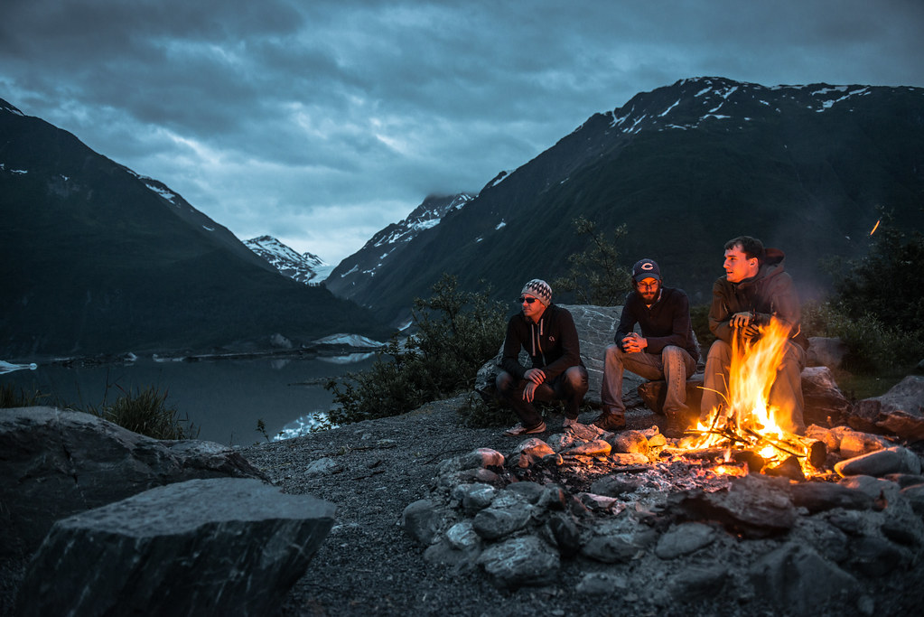
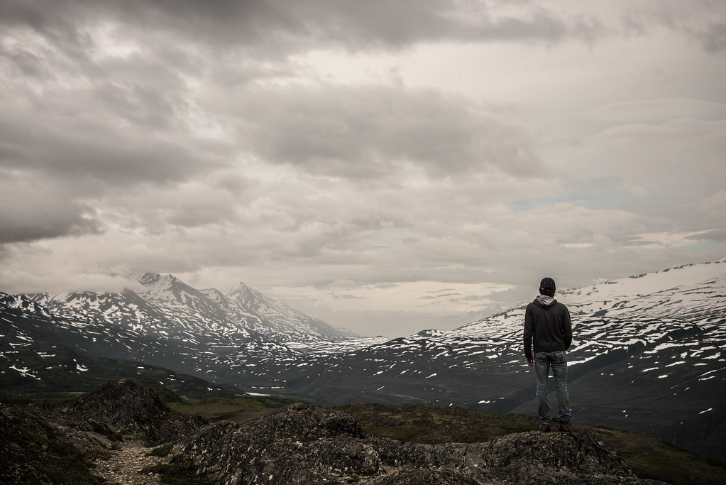
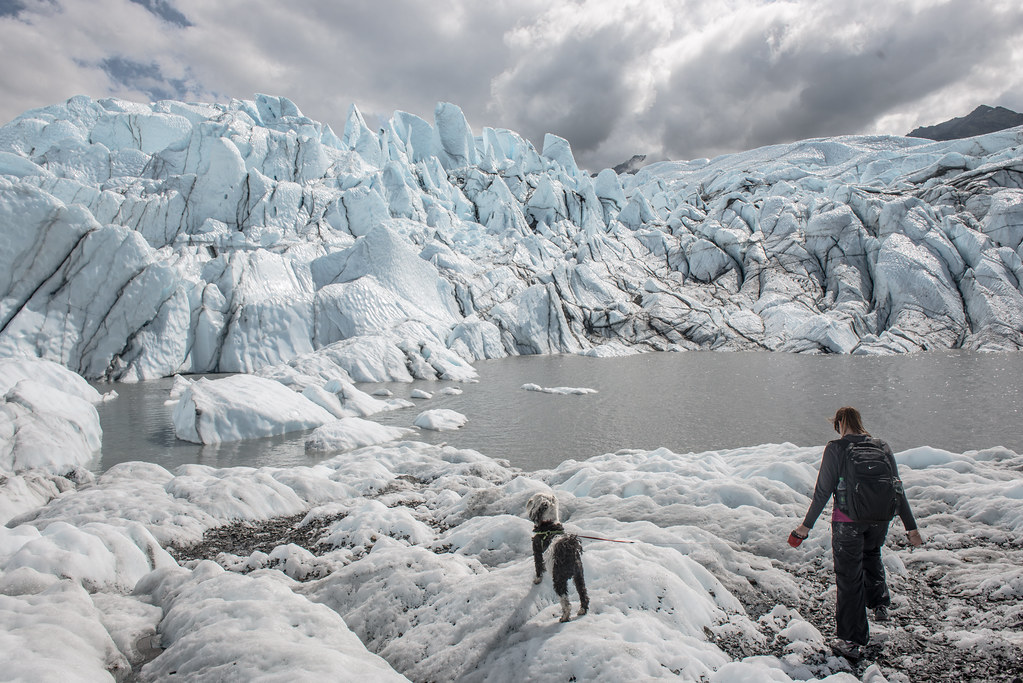
RangerScum posted:Here are three shots up for portfolio consideration: I look at (and take) a lot of pictures of people on mountains so I thought I'd add my thoughts here. The first one is solid campfire shot, good exposure for the fire and a lovely glow on the people's faces. I don't like that two of them are looking bemusedly at something off frame and I wish the foreground were sharper, but those are pretty minor criticisms. I think the second is the weakest of the three, although I can't put my finger on exactly why. The guy's legs and lower back do blend into the background pretty badly, though. I don't know what your intent is with these photos, but I often get people in big landscape scenes with muted colours like this to wear more contrasting clothing. If they've got a brightly coloured t-shirt under their jacket or have a raincoat in a different colour then adding or removing a layer often stops them vanishing into the scenery. The last one is awesome, by far my favourite. You have a little of the same problem with the dog blending into the dirty ice, but it's not nearly as bad here. Take out the dust spot in the top right of the picture and don't change another thing.
|
 #
?
Aug 3, 2012 15:50
#
?
Aug 3, 2012 15:50
|
|


|

|
| # ? May 11, 2024 08:08 |
|
|
From a recent trip through Thailand, Cambodia, Malaysia and Singapore Some women hanging out and talking in Kuala Lumpur, Malaysia  Untitled by Ebola Cereal, on Flickr Fire breathers in Singapore  Teamwork! by Ebola Cereal, on Flickr (USER WAS PUT ON PROBATION FOR THIS POST)
|
|
#
?
Aug 4, 2012 03:26
|
|
|
Tyorik posted:From a recent trip through Thailand, Cambodia, Malaysia and Singapore I would love if the firebreather shot was cropped just a tiny bit more from the top and the right. I don't know if it's just me but the little bit of fire on top of that stick is kinda bothering me being cutoff. Beautiful shots. Do you have anymore street shots to post? I particularly enjoy those types of shots. e: I just checked out your flickr, and the other shot of the firebreathers is fantastic. Here are some recent shots:  Walk Away. by Scott LaChapelle, on Flickr  Homeward Bound. by Scott LaChapelle, on Flickr  Get Pretty. by Scott LaChapelle, on Flickr
|
|
#
?
Aug 4, 2012 07:15
|
|

|
scotty posted:I would love if the firebreather shot was cropped just a tiny bit more from the top and the right. I don't know if it's just me but the little bit of fire on top of that stick is kinda bothering me being cutoff. Beautiful shots. Do you have anymore street shots to post? I particularly enjoy those types of shots. Might not be a bad idea to just cut that flame out altogether. I'll work on that one. I wasn't too happy that the fire wasn't exposed even remotely right in the second picture, but the lighting situation was just too tough to get the shot I wanted. I do like that one though Here are a couple similar street shots: A large open market in Bangkok  Untitled by Ebola Cereal, on Flickr An awesome Tuk-Tuk driver in Siem Reap, Cambodia, taken while also in a Tuk-Tuk!  Untitled by Ebola Cereal, on Flickr
|
|
#
?
Aug 4, 2012 08:28
|
|
|
scotty posted:I would love if the firebreather shot was cropped just a tiny bit more from the top and the right. I don't know if it's just me but the little bit of fire on top of that stick is kinda bothering me being cutoff. Beautiful shots. Do you have anymore street shots to post? I particularly enjoy those types of shots. There's a great intimate feel to this shot. We don't see her face in the mirror and I really like it because you're almost drawn to look to see who she is. It's like play on the typical bride-doing-her-make-up-in-the-mirror shot that is almost expected to be seen these days. Add that to the fact that she's facing away from you, it gives you the feeling that she could be anyone and makes you more curious. Makes me want to dig out my medium format temperamental Yashica again.  Unblurred by geeves, on Flickr
|
|
#
?
Aug 4, 2012 18:48
|
|

|
Tyorik posted:
I really like the framing, but I think the cables and loudspeaker up top are a bit distracting. They draw my eye away from the people and action in the shot. I don't have a very discerning eye for it just yet, but I like the color and exposure aside from the dark spot on the right. This is my first time with this kind of thing though, so I'd like to hear if you think differently. Here's a few of the first shots I've taken with my first big boy camera (Sony NEX-7). For the last 2 I was seeing what I could do with night shots. A few "auto" clicks in lightroom later, here we are.  tree by emptypockets304, on Flickr  street scene vertical by emptypockets304, on Flickr  street scene horizontal by emptypockets304, on Flickr edit: spelling Empty Pockets fucked around with this message at 04:44 on Aug 5, 2012 |
|
#
?
Aug 5, 2012 04:22
|
|
|
Tyorik posted:
The second picture is definitely stronger here; the first one lacks a clear subject and makes my eyes wander. It's well exposed, and the framing is nice, but there isn't anything too interesting being framed. If any of the people who are in focus were looking at the camera, it would be much better. The second one I really like; it just makes me happy. Great colors and expression. Here's the first roll (Ektachrome 100VS) I've taken with my new Contax G1:  David Bowie Cat by renburress, on Flickr  Untitled by renburress, on Flickr  Untitled by renburress, on Flickr
|
|
#
?
Aug 6, 2012 02:50
|
|
|
Dr. Cool posted:
I don't think my idea came across as well as I had hoped for the first shot; I wanted the guy in the white shirt to be the main feature, with the rest of the people around him mostly just objects. As if there's all of this chaos going on, but this one guy is calm and collected, comfortable in his surroundings. I think if I could figure out a way to blur the people beside him it might draw the eye to him and keep it there. I don't know In some ways the middle picture you posted I feel has the same trouble as mine. I'm not sure where I'm looking other than at the chaos and sloppiness of the driving and infrastructure. That's what I got anyway. The CocaCola sign draws the eye maybe a little more than it should, unless that's a feature you wanted to show? A couple more A night market vendor puts on a jazz tune for the passing customers  Untitled by Ebola Cereal, on Flickr Side view of the hotel in Singapore that hosts a world famous Skybar (the top curved structure)  Untitled by Ebola Cereal, on Flickr A shot of the city from said Skybar  Singapore By Day by Ebola Cereal, on Flickr
|
|
#
?
Aug 6, 2012 03:48
|
|
|
scotty posted:
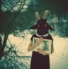
Please do more of these, they sell an amazing sense of mystery and intrigue for your faceless subject. Are they intended to be the start of a story? May I ask what scanning software you use? I was lucky today in that I was the photographic techincian for a local artist who does excellent things with grotesque shapes. Even more lucky in that we had time for me to arrange a portrait for myself with a couple of props.  ArtsShootSelfie by TimFPictures, on Flickr The colour cast appears to change depending on where I post it, it seems a little too magenta now its in jpeg, but oh well.
|
|
#
?
Aug 6, 2012 14:38
|
|
|
Tyorik posted:I don't think my idea came across as well as I had hoped for the first shot; I wanted the guy in the white shirt to be the main feature, with the rest of the people around him mostly just objects. As if there's all of this chaos going on, but this one guy is calm and collected, comfortable in his surroundings. I think if I could figure out a way to blur the people beside him it might draw the eye to him and keep it there. I don't know I like the first one the most, I think it's just because of the human element. I wish I could get rid of the shadows on his face, then again his eyes stand out more because of the way the shadows land. The second looks great, I can't really see anything that would make it better. While I like the third, it seems a little distant. The horizon is great, but I feel like there is something wrong in the foreground. Maybe crop out the blue and yellow on the the right? Giving it a more uniform color scheme. ---------------------------- I went to the butterfly festival at the Powell Gardens, and in my opinion this was one of my better shots. Still looking for some suggestions. Also, I'm not sure what caused the background to become, blurred? I'm not sure what actually happened. It looks like there are less colors than in the original.  Moth by kamakaze9, on Flickr
|
|
#
?
Aug 6, 2012 15:58
|
|
|
Kamakaze9 posted:I went to the butterfly festival at the Powell Gardens, and in my opinion this was one of my better shots. Still looking for some suggestions. Also, I'm not sure what caused the background to become, blurred? I'm not sure what actually happened. It looks like there are less colors than in the original. this would work better if you'd taken the image with the butterfly up against the black background instead of partially obscuring the leaves.  Untitled by changezi, on Flickr
|
|
#
?
Aug 7, 2012 06:55
|
|
|
carcinofuck posted:bg is blurred because the leaves aren't at the same focal distance as the butterfly. No, I understand the focal length and the blurred leaves. What I'm confused about is that the black background is actually dark green leaves and shadows, which are clearly visible on the original and not so much on the upload
|
|
#
?
Aug 7, 2012 16:05
|
|
|
Kamakaze9 posted:No, I understand the focal length and the blurred leaves. What I'm confused about is that the black background is actually dark green leaves and shadows, which are clearly visible on the original and not so much on the upload Jpeg compression, going from 16-bit to 8-bit colour, browser colour-space handling, there are a range of reasons why the image would appear different on the internet that in Photoshop. To my mind it was probably in the conversion, if you were shooting Adobe1998 and you went to sRGB you lose fine detail in the darks allll the time. (At least in my experience.)
|
|
#
?
Aug 8, 2012 02:42
|
|
|
Kamakaze9 posted:
The composition of this shot doesn't work too well for me. Something about that black background... and the body of the moth seems cluttered in flowers, so it's tough to find the beginning and end of it. I'm not typically a fan of selective color, but this seems like a good candidate for it. All else B&W with the moth in color? I don't know, it seems good in my head but I don't know if it would work in practice. Ok, this is a new style for me for post, so I really went out on a limb with it and am curious what other people think of it. I'm still a little up in the air about it  Quick Trip to Paradise by Ebola Cereal, on Flickr
|
|
#
?
Aug 8, 2012 04:35
|
|
|
Tyorik posted:The composition of this shot doesn't work too well for me. Something about that black background... and the body of the moth seems cluttered in flowers, so it's tough to find the beginning and end of it. I'm not typically a fan of selective color, but this seems like a good candidate for it. All else B&W with the moth in color? I don't know, it seems good in my head but I don't know if it would work in practice. It looks like fake TS. Is it? I personally don't like it when it's added in post. TS can work well for some subjects, portraits for example, but landscape isn't one of them. I kind of want to see the original to compare against.
|
|
#
?
Aug 8, 2012 06:45
|
|


|
If you're going to blur the image that obviously, either free lens the shot, use a lens baby or tilt shift lens.
|
|
#
?
Aug 8, 2012 06:46
|
|

|
Tyorik posted:
I'm pretty sure this would be a awesome photo without the t/s effect. With it, it makes my head hurt. carcinofuck posted:
I wish there was more of the airplane's window or less of the window. The current crop makes it feel incidental.    I don't know if this last one is working at all. I feel like it's way too dark, but every time I try to futz around, things look worse. Edit: also, startrails 
|
|
#
?
Aug 8, 2012 07:30
|
|

|
So the general consensus is, do exactly what I did, except in reverse. Got it.
|
|
#
?
Aug 8, 2012 07:36
|
|
|
Tyorik posted:The composition of this shot doesn't work too well for me. Something about that black background... and the body of the moth seems cluttered in flowers, so it's tough to find the beginning and end of it. I'm not typically a fan of selective color, but this seems like a good candidate for it. All else B&W with the moth in color? I don't know, it seems good in my head but I don't know if it would work in practice. I agree with everyone else, and would also say that there's no good reason for the blur to be there. This photo is like my friends on Instagram (shut up) who use the fake TS function with absolutely no regard for what it's actually supposed to do. If you're married to it, personally I think you should pick something you want to highlight, like for example that speed boat with people jumping off of it, and put them in focus and the rest out of it.
|
|
#
?
Aug 8, 2012 15:37
|
|
|
Casu Marzu posted:
I like the look of everything in your first shot until I get to that sky. That featureless white sky which is just sort of sitting there as a bright strip of nothing at the top of the frame. The brightness of it draws me up to it, but then there's nothing there to look at. I like the shot, I just wish there was something in that sky. For your last I think you just need to be closer to the clouds and the lightning. You've got a really really cool shot there in the middle of your frame with a whole lot of not much interesting going on around the edges. Try cropping it in closer and see how that looks maybe? Here's a couple things I've done lately that I'd love to get some thoughts on:  Bus number one by fralbjabar, on Flickr I like this, seemed far more interesting to me than just taking a picture of the sunset itself. I don't know about the post processing though, on two of my monitors it looks fine to me but on the third it looks very magenta and way overprocessed. 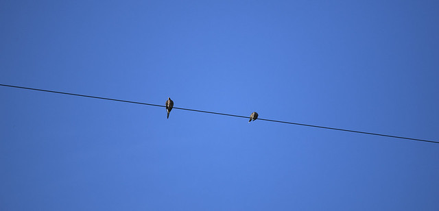 On a line by fralbjabar, on Flickr This one I like but I can't really articulate why, and that bothers me. By all rights it should be nothing but something in the back of my head keeps going "hey, this looks really cool"
|
|
#
?
Aug 8, 2012 17:44
|
|

|
fralbjabar posted:
I really like the first one. The balance is very warm, but it's a dang sunset. Those are supposed to be orange and magenta. I think it looks awesome and makes me nostalgic for those old three-hour bus rides across the state of Oklahoma to march during a half-time football show in often sub-zero temperatures. Ok, not so much nostalgic. The second one doesn't do much for me. If you had caught one of the birds landing or taking off, or a bird in mid-flight, then it might be more interesting, but birds on a high wire just sitting there especially with the super wide crop seems off somehow. A tighter crop with more details on the birds might be nice. Although, if you're going for a huge-negative-space photo, then it might be just what you're after. ===================== This is my fist attempt at photoshop pretty much ever. I posted a photo a few weeks back where I had upped the exposure so much the sky and sea turned yellow, so this is my attempt to put together the original exposure that had pretty sky/sea with the adjusted on top so you can see the rocks/people. All I can see is the spots where the mask screwed up, so any commentary towards how to do that better besides "be less lovely with a mouse" and if I did more good than harm by cobbling two photos together.  Rocks2 by prismaticglasses, on Flickr Edit: Tried a second attempt. I think it turned out a little better. Valdara fucked around with this message at 09:15 on Aug 9, 2012 |
|
#
?
Aug 9, 2012 08:49
|
|

|
XTimmy posted:Please do more of these, they sell an amazing sense of mystery and intrigue for your faceless subject. Are they intended to be the start of a story? May I ask what scanning software you use? This is absolutely fantastic, although I wish the object in your hands were a little more illuminated so it was more obvious that it was some bizarre shape and not something that I just can't discern because it's too obscured by shadow. I also wish you were wearing some really fancy wingtips or something to complete the look because the socks don't quite fit the tone. Otherwise it's one of the best portraits I've seen on here, self or otherwise. Doesn't look magenta at all on my IPS, also.
|
|
#
?
Aug 9, 2012 09:03
|
|


|
Fairly happy with this shot. It was a perfect calm day with a full moon taking softening the shadows. Hope to go to Maine again and actually get some real work done. Maine Is Beautiful by Paul Frederiksen, on Flickr fralbjabar posted:
Can't say I like it much. It's a bit of a cliche shot. The blues are way too blue and it's vignetted. The photo just isn't all that unique or interesting to look at. vxsarin fucked around with this message at 16:07 on Aug 9, 2012 |
|
#
?
Aug 9, 2012 16:04
|
|

|
Pukestain Pal posted:Fairly happy with this shot. It was a perfect calm day with a full moon taking softening the shadows. Hope to go to Maine again and actually get some real work done. Can't say I like it much. It's a bit of a cliche shot. The blues look too blue. The photo just isn't all the unique or interesting to look at. (As someone from Maine)
|
|
#
?
Aug 9, 2012 20:49
|
|
|
Awkward Davies posted:Can't say I like it much. It's a bit of a cliche shot. The blues look too blue. The photo just isn't all the unique or interesting to look at. Har.
|
|
#
?
Aug 9, 2012 21:26
|
|
|
 DSC_0669 by FarmeerHank, on Flickr Walking through the local Korean market, I shot this image (of mostly American things) and I am torn. I like the vectors, I like how it points to the one lady bending over getting stuff but I don't enjoy the pocketbook lady. But, what am I too do, tell her to stop shopping? Yet maybe the whole image is cliched, and I am just lame.
|
|
#
?
Aug 9, 2012 21:40
|
|
|
But really, it is pretty cliche and it does look like you adjusted the blues (maybe I am wrong about the blues).
|
|
#
?
Aug 9, 2012 22:43
|
|
|
FarmerHank posted:
If you were really interested in how the lines converged at the lady bending over, maybe putting her in focus would have made that more apparent to the viewer. e. And about the other lady in the frame, yeah you can't really tell her to stop shopping but what I do sometimes is bring toys to throw as a way of luring people out of the frame. I let them keep them too.
|
|
#
?
Aug 9, 2012 23:05
|
|

|
Awkward Davies posted:But really, it is pretty cliche and it does look like you adjusted the blues (maybe I am wrong about the blues). Barely touched the photo. The only color I adjusted was dodging the house a bit and straightening horizon.
|
|
#
?
Aug 10, 2012 00:33
|
|
|
FarmerHank posted:
I would have had no idea that you were trying to make that woman noticeable based on the focus here. In fact, I didn't see her until you mentioned it. I thought it was just a random shot of the juice isle or something. However, don't be discouraged. Your thought process is there partially, but you need to bring it to the moment when you shoot and take that awareness to choose things like focus and composition more carefully to try to make your intent crystal clear.
|
|
#
?
Aug 10, 2012 03:14
|
|

|
Valdara posted:
This is great and interesting location, however it feels claustrophobic because of how it's cropped (landscape vs. portrait). Also, the people in it don't add much of anything in terms of balance or contrast (and I don't mean in a color way). If they were placed a bit a way from the vertical rock, the photo could have been better balanced. -- 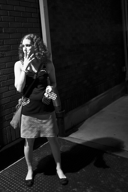 Saturday by geeves, on Flickr
|
|
#
?
Aug 10, 2012 03:38
|
|
|
geeves posted:
--- I tried something new. Not overly happy with the result but keen to have another crack at it.  Stary Sky by Paul.Simpson, on Flickr
|
|
#
?
Aug 10, 2012 04:23
|
|
|
fralbjabar posted:
gently caress tha hatahs, this is awesome. Although it is a little too vignetted.
|
|
#
?
Aug 10, 2012 14:07
|
|
|
Hotwax Residue posted:
This is fantastic. The foreground and sunset are great themselves, but throwing in some stars was a real stellar move. Do you usually try to nail hyperfocal focusing on shots like this? I haven't had great luck with that, but feel its the only way to get everything in focus.
|
|
#
?
Aug 10, 2012 14:29
|
|

|
Falco posted:This is fantastic. The foreground and sunset are great themselves, but throwing in some stars was a real stellar move. Do you usually try to nail hyperfocal focusing on shots like this? I haven't had great luck with that, but feel its the only way to get everything in focus. Understand what hyperfocal focus is accomplishing and approximate it as opposed to 'nailing' it. If the scene is too dynamic for an approximation to work, chances are perfect hyperfocal technique won't help. Look at some charts for your most-loved focal lengths and if they say 24mm @ f/11 is about 16' (just guessing--haven't looked), just focus on something about 16' away and let 'er rip. Things will turn out fine.
|
|
#
?
Aug 10, 2012 14:59
|
|
|
Tyorik posted:A night market vendor puts on a jazz tune for the passing customers I like the candidness, but he's obscured almost entirely by the light. Tyorik posted:
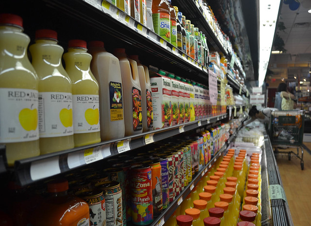
with the TS I can't seem to find a focus in the picture, my eyes are just flying around everywhere. The island in the distance, which would normally be imposing contrasted against the boats loses it's power in the frame when it's blurred - especially around it like a halo. I like the area/premise, but I don't think it was pulled off entirely here. I really like this one, because it takes you a second to realize that it's just a watering system. It's very high key and I like that, and it's almost perfectly divided into fourths - I would say the sky could stand to be brighter (creating a light/dark/light/dark thing) but I like this one [/quote]Now THIS one is nice, BUT it neeeeeds to be cropped in the bottom right. You've got so much junk on the left of the frame that you don't notice the LIGHTNING BOLT(!!!) - cropping in won't make the bolt too apparent, and it'll still be a nice pin to draw your eye in. Would have been better if the woman in the back was in focus and the foreground was out, but it's a shot that's hard to feel satisfied with (vanishing point lines shooting outside the frame) but I would focus on the colours/contrasts of items on the shelves for more visual information
|
|
#
?
Aug 10, 2012 21:24
|
|


|
Every photo has already been commented on!Valdara posted:
I agree with the framing comment, but you also could make this instantly better by raising the shadow level. Your subjects are lost in the dark at the moment. What say the goons on this photo? It was taken by accident from the back of an elephant. 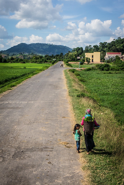 Village life by alangrainger, on Flickr
|
|
#
?
Aug 11, 2012 07:18
|
|

|
Metalslug posted:I agree with the framing comment, but you also could make this instantly better by raising the shadow level. Your subjects are lost in the dark at the moment. In photoshop, it's about eight shades lighter, and you can actually see the people. What do I do to make the saved file from PS actually look like the file in PS? It also looks much better big. The point of the photo is the people. I saw that girl sitting there enjoying the sunshine while her dad impatiently stood behind her bored and fiddling with his phone. Maybe I'll try a different crop. Metalslug posted:
I love it for having been taken from an elephant, especially by accident. The unusual vantage point makes it much more interesting. I like the little girl in the foreground turning around and looking like there's something interesting behind her, but she isn't looking at the camera, because elephants are WAY more awesome than cameras. I almost feel like you're trying to put too much in it. You have road and near people and far people and further hills and big puffy clouds. Maybe try cropping out the hills and clouds so the focus is more on the curious little girl and the burdened woman who's ignoring anything interesting around her.
|
|
#
?
Aug 11, 2012 19:17
|
|
|
Falco posted:This is fantastic. The foreground and sunset are great themselves, but throwing in some stars was a real stellar move. Do you usually try to nail hyperfocal focusing on shots like this? I haven't had great luck with that, but feel its the only way to get everything in focus. I don't usually bother with hyperfocal, the distance markers on my wide angle only go to 3 feet and then infinity anyway. My normal technique is to focus about a third of third of the way into the photo which, most of the time, is close enough to setting the focus ring to infinity.
|
|
#
?
Aug 11, 2012 20:58
|
|
|

|
| # ? May 11, 2024 08:08 |
|
|
Hotwax Residue posted:I like how easy it is to guess the context of this, and how I want to know what see is looking at. The harsh light helps with the context but it might just be a little too blown out. And it is a shame about the position of the pipe, although it isn;t quite growing out of here head it does cut the frame and make it feel to heavt on the left side. Not overly happy my rear end. You have a brilliant shot. The only thing I think you can do to improve is, I don't know. Actually getting a better shot of the stars would be what you can improve.. But you need the 85L to do so. As for your feedback: Thank you - I agree about it being a little blown out - for me, I'd rather it be casual and blown out otherwise That said, thank you, esp about the gutter. Situational Hazard unfortunately.
|
|
#
?
Aug 13, 2012 00:40
|
|