


|
Oh yeah I remember that artist(s) on Batgirl. They were all about crazy loving proportions in the name of "fluidity." I can recall seeing scans floating around the internet that demonstrated that mission both well and terribly, and unfortunately it more often made the wonderful Cassandra Cain look well, more  than she already was. than she already was.E- New Page; Genuinely not sure of the source, but Street Fighter have had quite a few comics and this is a great use of style you don't normally see with the characters. Not sure what work/s it's aping though:  Again not sure of the source, but I love how this artist manages to take so many disparate costume creations over the years and manage to make them all look like part of a cohesive "unit", especially since this artist clearly only has one female and one male physique that he uses and understands how to use posing and scale to make all the characters distinct. It also gets props for making the ultra-retarded Huntress ab-window costume look ok. Bat-Family 2010:  Lastly I believe this is a Kevin Maguire (or at least Maguire-inspired) piece from one of the JLI/Booster Gold series that began appearing after the justifiable backlash a small contingent of fans had when Dan Didio and crew started killing them off for tragedy porn purposes:  I bring it up because it's an excellent example of overall page composition. Note how Booster is always on the left and is constantly shown pushing Cyborg back with varied aggressive stances until the very final panel when he moves on. It's a fantastic example of using visual-spatial relations to convey the tone of a conversation without needing to read a word at all. Yes it's simple, but it's remarkable how little that kind of convention is followed and worth celebrating. Another thing that Maguire and artists like him get a lot of flack for are their weird "who poses like that?" faces, and while I can't find it this page is a good example of his facial poses philosophy when it works. There was a Wizard interview where he says that he always tries to capture the moment of strongest emotion in an exchange as the writer outlines for him. That's why sometimes you'll find him drawing faces where the person is all puffed or smooshing their lips in a way that'd only exist for a second at most in an actual conversation--but that's the point, it's the moment when their emotions are the plainest, and this page is a great example of how that philosophy can be used to employ a great visual story that doesn't need words. The words then get to only add depth. It's wonderful. mind the walrus fucked around with this message at 17:06 on Aug 18, 2012 |
 #
?
Aug 18, 2012 16:49
#
?
Aug 18, 2012 16:49
|
|


|

|
| # ? May 11, 2024 08:43 |
|
|
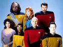
mind the walrus posted:Lastly I believe this is a Kevin Maguire (or at least Maguire-inspired) piece from one of the JLI/Booster Gold series that began appearing after the justifiable backlash a small contingent of fans had when Dan Didio and crew started killing them off for tragedy porn purposes:
|
|
#
?
Aug 18, 2012 19:19
|
|
|
mind the walrus posted:
Really? Because I think this looks loving terrible.
|
|
#
?
Aug 18, 2012 22:20
|
|
|
Then elucidate why or contribute something of your own instead of making GBS threads in the thread like it's an outhouse. This is a thread for good comic art. Y'know, using words and pictures to tell a story in sequence? That means that good art isn't necessarily confined by the constraint of "how cool would this look on a poster/t-shirt/tattoo/side of my van." Art that tells a story effectively, even when it's not the prettiest, deserves to be celebrated in this thread too. Another contribution:  The anatomy and proportions get wonky, and the perspective feels rushed like it most likely was. That said the use of framing from panel to panel manages to accentuate the speech in a way similar but distinct from how a cinema camera would frame the same scene. It's good comic art, despite its flaws, because it tells a story well. You can take it on its own merits without the words and it still tells a story.
|
|
#
?
Aug 18, 2012 22:39
|
|
|
mind the walrus posted:Then elucidate why or contribute something of your own instead of making GBS threads in the thread like it's an outhouse. That's interesting, because I really don't take the view that art has to be "beautiful" to be effective. I do think, however, that anything that makes the reader stop and go "that looks awful" is, by definition, bad comic art (another thing this thread was made to highlight). By pulling you out of the narrative it fails on the central criteria by which should be judged. I would also take exception to your assertion that this page of Captain America tells a story that doesn't need words. Without the lengthy dialogue, the story of this page is this: 1. Captain America irritably twists his head at an un-natural angle. 2. Captain America holds his arms up in the air. 3. Captain America then holds an open hand down to the ground. 4. Captain America scowls. 5. Deformed people look scared. There are plenty of pages that can tell stories wordlessly. I really don't think this is one of them. HorseHeadBed fucked around with this message at 23:27 on Aug 18, 2012 |
|
#
?
Aug 18, 2012 23:25
|
|
|
Friends Are Evil posted:Goddamn, they could not have picked a better artist to tackle this. Okay, I don't know what's going on in these images, but I'm really, really intrigued. Is all of Animal Man like this, or is this just a one-issue deal?
|
|
#
?
Aug 19, 2012 01:54
|
|


|
HorseHeadBed posted:I would also take exception to your assertion that this page of Captain America tells a story that doesn't need words. Without the lengthy dialogue, the story of this page is this: Yeah, I would not say those cap panels are good comic art. Is cap yelling at me, the Lord Reader? Why is he looking up? Did I float down to his high level? Was he talking to those people the whole time and they were floating above him? Why are those people between the sizes of The Head Detective and Yao Ming?
|
|
#
?
Aug 19, 2012 02:28
|
|
|
SpeedofLife posted:Okay, I don't know what's going on in these images, but I'm really, really intrigued. Is all of Animal Man like this, or is this just a one-issue deal? Travel Foreman did the first 6 or so issues and his artwork is grotesquely beautiful. The comic itself is about Animal Man vs something called the Rot (and from that name alone you should get an idea of what things are supposed to be). Each issue contained something horrific like Hippos having their stomachs burst open from the inside or disgusting growths. This perfectly set the mood of the comic and was amazing, however it apparently took a bit of a toll on Foreman who left the title (I think due to exhaustion or something like that). The new artist, whose name currently escapes me) is doing a good job keeping up the style but Foreman was knockng it out of the park.
|
|
#
?
Aug 19, 2012 03:04
|
|

|
mind the walrus posted:Genuinely not sure of the source, but Street Fighter have had quite a few comics and this is a great use of style you don't normally see with the characters. Not sure what work/s it's aping though: I'd like to think of myself as one of the biggest SF fans, especially when it comes to trivia and obscure characters, so I recognize EVERY single character there including the Final Fight mooks and the backstory-only characters like Zeku. Except for one guy. I know I should, too, but I can't place him: the dude with the metal left eye. Looks like Kano from Mortal Kombat, and he appears three times, once in a fireman uniform, once in a hoodie on the right and (I think) in a robe behind Ken in the middle. What's he from?
|
|
#
?
Aug 19, 2012 04:21
|
|

|
Mister Roboto posted:I'd like to think of myself as one of the biggest SF fans, especially when it comes to trivia and obscure characters, so I recognize EVERY single character there including the Final Fight mooks and the backstory-only characters like Zeku. That's the Shadaloo Cyborg. He appears in those forms during the Street Fighter II anime. They turned that movie into a game for Playstation called Street Fighter II: The Interactive Game. In it, you simply watched the entire movie while taking pictures at certain points and with the ability to read files on characters and locations. The more correct pictures you take, the stronger the Cyborg becomes. Then at the end, you're placed in a fight with Ryu and it FINALLY becomes an actual game. If you lose, it plays the ending of the movie. If you win, Bison prepares mass production of these guys and Ryu shows up to put an end to it.
|
|
#
?
Aug 19, 2012 04:45
|
|


|
Gavok posted:That's the Shadaloo Cyborg. He appears in those forms during the Street Fighter II anime. They turned that movie into a game for Playstation called Street Fighter II: The Interactive Game. In it, you simply watched the entire movie while taking pictures at certain points and with the ability to read files on characters and locations. The more correct pictures you take, the stronger the Cyborg becomes. Then at the end, you're placed in a fight with Ryu and it FINALLY becomes an actual game. If you lose, it plays the ending of the movie. If you win, Bison prepares mass production of these guys and Ryu shows up to put an end to it. Ooooooh yeah, that was for the Saturn, too. Good lord that's an extremely obscure reference, I was like 5 years old when that was out. No wonder I don't recall the character. I'm going to assume the artist is Japanese since the game was definitely not as popular here in the US. Is the guy behind Ken the same guy? For that matter, is football helmet at the bottom the same guy too?
|
|
#
?
Aug 19, 2012 04:48
|
|
|
Yep.
|
|
#
?
Aug 19, 2012 04:50
|
|
|
I was puzzled about the guy smashing bricks near Joe and Sean until I realized it was meant to be SF1 Ryu with his shirt off. I recognized the cyborg, but only because of... a certain... street fighter... flash video... Also, bonus points for the "Oh! My car!" guy way in the back near Blanka smashing a car. Really just an excellent, fun piece of art.
|
|
|
#
?
Aug 19, 2012 05:09
|
|


|
Lurdiak posted:I was puzzled about the guy smashing bricks near Joe and Sean until I realized it was meant to be SF1 Ryu with his shirt off. I recognized the cyborg, but only because of... a certain... street fighter... flash video... Yeah, it's a testament to how, in comics, we recognize characters' outfits far more than their faces. Take Guy in the upper right, it took me a while to realize he had his Final Fight gi unbelted and that's why it looked strangely like a vest. Another nice touch is Sagat in the upper left. He's not just lying there scratching his butt, he's lying like the statue in his stage.
|
|
#
?
Aug 19, 2012 05:11
|
|
Mister Roboto posted:Yeah, it's a testament to how, in comics, we recognize characters' outfits far more than their faces. Take Guy in the upper right, it took me a while to realize he had his Final Fight gi unbelted and that's why it looked strangely like a vest. Well he's got his SF1 design and art style, which has a very different face and haircut than what we think of as Ryu. Just like how everyone from Final Fight 1 is slouchy and has more muted colors, everyone is drawn in their appropriate art styles, which is pretty neat. Dig on Sakura abandoning SF Alpha Ryu for the much more iconic SF2 design!
|
|
|
#
?
Aug 19, 2012 05:14
|
|
|
I saw that Street Fighter picture before while browsing an arcade flyers site. http://flyers.arcade-museum.com/?page=thumbs&db=videodb&id=3558 Apparently Capcom had a thing about releasing insane promo material in Japan. Now this isn't about comic art any more but I have to spooge my favorite stuff from these. Street Fighter III 2nd Impact  Street Fighter EX: Turns out putting 2D characters in a 3D game is a horrifying traumatic experience.   but Zangief papercraft!  Marvel Vs Street Fighter: Make a dress up doll of that weird secret character.   LEGO Strider 2 
Teenage Fansub fucked around with this message at 06:26 on Aug 19, 2012 |
|
#
?
Aug 19, 2012 06:09
|
|

|
Teenage Fansub posted:Street Fighter EX: This is incredible.
|
|
#
?
Aug 19, 2012 20:09
|
|


|
Based on the EX series, it was a horrifying experience for us, too.
|
|
#
?
Aug 20, 2012 15:03
|
|

|
 Batman: The Dark Knight #12 Can someone tell me how David Finch became a superstar artist again? This is just sad. (DAT CHEST PILLOW) (I don't know whose fault it is, but I also enjoy just how uh, well integrated the draped costume on the right-hand side is with the rest of the scene.) redbackground fucked around with this message at 04:45 on Aug 21, 2012 |
|
#
?
Aug 21, 2012 04:36
|
|

|
Apparently Crane just wants to draw attention to his gimped arm but Batman's abdomen has collapsed in on itself causing him to pass out.
|
|
#
?
Aug 21, 2012 05:08
|
|


|
redbackground posted:
So that is Liefeld's Captain America without his shirt on, right?
|
|
#
?
Aug 21, 2012 05:24
|
|
|
I always liked Finch's stuff on the Ultimates, I hated it at first though. My animator friend hates his style, says it's "too real".
|
|
#
?
Aug 21, 2012 10:13
|
|

|
Quantum of Phallus posted:I always liked Finch's stuff on the Ultimates, I hated it at first though. My animator friend hates his style, says it's "too real".
|
|
#
?
Aug 21, 2012 14:12
|
|
|
 Whoops. Whoops.
|
|
#
?
Aug 21, 2012 14:35
|
|
|
If there's anything I've learned from this topic it's that with DC and Marvel, and the artists that emulate their style, the coloring is what ruins it 99% of the time. I'm looking at these artists' pencils/inks and they're usually great but then the coloring job sucks away all personality and appeal like an artistic black hole.
|
|
#
?
Aug 21, 2012 16:02
|
|
|
I would agree with that quite a bit of the time. It seems to mostly be that they want to make the coloring slightly more complex than if it were a cartoon, or comic from fifty years ago, but don't actually want to spend the time it would take to make it look interesting and original. I think the worst is when people do shading by using the gradient tool to go 'color 1 -> lighter version of exact same color' and call it good. It lets them get it done and out much faster, but is completely boring to look at. On a positive note, stuff like that is what makes work from people like James Stokoe so awesome.
|
|
#
?
Aug 21, 2012 20:16
|
|

|
Ruin Completely posted:I think the worst is when people do shading by using the gradient tool to go 'color 1 -> lighter version of exact same color' and call it good.
|
|
#
?
Aug 21, 2012 20:22
|
|
|
redbackground posted:Can someone tell me how David Finch became a superstar artist again? Quantum of Phallus posted:I always liked Finch's stuff on the Ultimates, I hated it at first though. My animator friend hates his style, says it's "too real". Endless Mike posted:David Finch is not Bryan Hitch.
|
|
#
?
Aug 22, 2012 01:05
|
|

|
redbackground posted:
My god, he's trapped batman behind a headless manikin made of burlap and hams!
|
|
#
?
Aug 22, 2012 01:29
|
|


|
redbackground posted:
I like everything in that panel, except Batman and Scarecrow.
|
|
#
?
Aug 22, 2012 04:40
|
|


|
Gorilla Salad posted:I like everything in that panel, except Batman and Scarecrow. Even Scarecrow isn't that bad. Batman's anatomy is way bad, but other than that it's pretty good, I think.
|
|
#
?
Aug 22, 2012 04:51
|
|


|
NorgLyle posted:I guess that answers that. Seriously, we might be in 'hired the wrong one-legged wrestler' territory.
|
|
#
?
Aug 22, 2012 15:02
|
|
|
I can't hate him just because he gave the batsuit back it's yellow oval emblem. Stupid Jim Lee.
|
|
#
?
Aug 24, 2012 01:04
|
|
|
You mean stupid Bob Kane.
|
|
#
?
Aug 24, 2012 02:27
|
|
|
Endless Mike posted:You mean stupid Bob Kane. You really mean awesome Bill Finger, gently caress you Bob Kane bobkatt013 fucked around with this message at 06:55 on Aug 24, 2012 |
|
#
?
Aug 24, 2012 02:50
|
|
|
Teenage Fansub posted:I can't hate him just because he gave the batsuit back it's yellow oval emblem. That wasn't Jim Lee who undid it; Batman had a big black bat all the way through Brubaker and Rucka's runs from the end of No Man's Land.
|
|
#
?
Aug 24, 2012 02:50
|
|

|
bobkatt013 posted:You really mean awesome Bob Finger, gently caress you Bob Kane Anyway, here is some art I appreciated from The Shade #11.   
Endless Mike fucked around with this message at 03:56 on Aug 24, 2012 |
|
#
?
Aug 24, 2012 03:52
|
|
|
Endless Mike posted:Eh, they both had influence on the original design I think? Everything recognizable about batman is due to Finger.
|
|
#
?
Aug 24, 2012 03:58
|
|
|
Endless Mike posted:Eh, they both had influence on the original design I think? I really like the art in The Shade, except for the faces. They're just... weird looking in a way I can't really explain.
|
|
#
?
Aug 24, 2012 05:14
|
|

|

|
| # ? May 11, 2024 08:43 |
|
|
d00gZ posted:That wasn't Jim Lee who undid it; Batman had a big black bat all the way through Brubaker and Rucka's runs from the end of No Man's Land. I know he didn't always have an oval, but Jim undid it this time. I loved the Inc suit.
|
|
#
?
Aug 24, 2012 05:15
|
|