


|
Santa is strapped posted:Thanks for the comment. I went with the lightened cyclist but kept the low key of the rest of the scene. I guess I can lighten the path as well, that would help with the canopy overpowering everything else. Nope but relying more on color and curves adjustments to correct for exposure and wb problems rather than going nutso with the Lightroom sliders.
|
 #
?
Aug 21, 2012 02:21
#
?
Aug 21, 2012 02:21
|
|


|

|
| # ? May 21, 2024 17:01 |
|
|
Ah ok. That's always key - to know what the problem is and how to fix it, not to just go wild with filters and split toning sliders.
|
|
#
?
Aug 21, 2012 02:37
|
|


|
Awkward Davies posted:Monastery of Christ in the Desert, New Mexico: I love the detail and colors in the cliff side but I feel like I'm sort of getting lost in the empty sky beyond it. I can see where a lot of the other critiques are coming from in that you may have been going for the emptiness in the shot and this might take a way from it but I almost think I might like the shot more if it cropped in a little closer to the cliff and emphasized that cloud that seems to mirror the movement of the cliff side. I like the repetition it provides a lot myself but feel it sort of gets lost to the other sky space which doesn't feel as interesting to me. vildman posted:
I really love the movement and vibrancy in the city and the way the cliff side repeats off of it and contrasts with it. I sort of wonder how much bringing out the colors a bit more might help in making the city stand out a little more distinct from the cliff side though. And since you mentioned it I like the sharpness on it too, the amount of the picture that feels in focus, I think anyways, helps me recognize the distinctness in the shapes that the vegetation and the urban area make. Hope these critiques are okay, been forever since I've critiqued any photography in or out of a class room setting. Also hoping to get a better idea as to where to go with my own work, especially with post-processing work; that's an area I've not had a lot of practice with beyond some real basic light-room tweaking colors and exposure.  IMG_3471 by Opals25, on Flickr 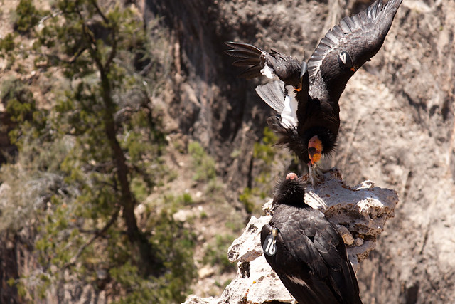 IMG_3921 by Opals25, on Flickr  IMG_4498 by Opals25, on Flickr
|
|
#
?
Aug 21, 2012 06:58
|
|


 Nevertheless, the colours are alright in that "grey heat"-kind of way which was what I wanted, and I enjoy the detail in the shot. I believe I might have overdid the sharpening slightly. So in general, I really love this shot and wish I could see what you would have pulled off with a wider lens.
|
Opals25 posted:
I think the first picture would be better if cropped to fit a head/shoulder portrait. The legs are sadly poorly lighted (not your fault) and I feel like the 2/3 of the bottom of the image aren't saying much since it's busy and the lines are crooked. I would crop it from the 2 light source to the top left of the picture, it might look better that way. Third image is pretty neat, I love the scenery/colors and how it's cropped. As for me, here's what I've been working on lately:  IMG_2222 by avoyer, on Flickr  IMG_2239 by avoyer, on Flickr  IMG_2026 by avoyer, on Flickr xenilk fucked around with this message at 16:31 on Aug 21, 2012 |
|
#
?
Aug 21, 2012 16:29
|
|

|
xenilk posted:
 Beautifully done. Love it. Beautifully done. Love it.
|
|
#
?
Aug 21, 2012 16:58
|
|

|
Awkward Davies posted:My strength is not taking pictures of empty scenes, so I wanted to post those and see what the reaction was. I personally think that's excellent, because I never carry a camera with me unless I'm "going out to shoot", and I can't recall the number of times I've regretted not having one on me. But it's a bit difficult for me because I'm either rushing to work or rushing to get home, and that's usually when something interesting happens and I don't have my camera. I think it's great that you follow your instincts, and it's okay if pictures don't always work. (Also keep in mind that just because my critique leaned more towards the negative doesn't make it factual or conclusive. It's just my observation and other people might feel differently.) I will be posting work here soon -- maybe in a few weeks, money is a bit tight right now -- that veers far off the course of my typical work. Like you, I'm trying new things, pushing myself out of the zone of comfort I've become accustomed to, and will eventually have to do the unthinkable: post the pictures here and ask for critique. Undoubtedly I will have some failures, and I'm sure a few people will lob some shots my way, not to be rude but because it's sort-of the nature of critique. Especially here. My advice to you, if it's worthy of taking, would be to not stop doing what you're doing because the more photos you take the better you get at it, so long as you maintain an interest in it. And I think it's very clear that you do. quote:That's what happened with the subway picture. There's something about the linear nature of the lines in the subway that really appeals to me, and I've been almost compulsively taking pictures of it since I moved to New York. I take the path into the city from Jersey City and I get out at various stops in New York. If you ever venture towards West 9th, head towards the steps that lead you down into the path. If you are interested in linear lines you will find them in spades there. I haven't yet taken photographs here but I do plan on it in the future, unless you beat me to the punch. The one thing I have found about conveying subjects of any kind is that they have to be bold, even if the attempt is to be subtle. In other words, if you are showing something that is subtle it should boldly be subtle so that it's clear to the viewer. If it's clear only in your mind at the time and doesn't resonate more strongly than that, the picture won't work. I say this having taken photos that I thought at the time would be really great, and when I got the film back was horribly let down. Whatever magic I felt at the time was definitely not there, sitting at my desk, looking at it. And I realize from my own experience that to convey something, it has to really be strong, even if what you're trying to convey is something simple or subtle. That's what I wasn't getting from your pictures, and was the basis of my critique. But I still think it's worth following your instincts and if that subway is as beautiful and interesting as you describe, I believe it. You just have to show it a little differently maybe.
|
|
#
?
Aug 22, 2012 03:10
|
|
|
KingColliwog posted:/. There's something off about the lighting on this one for me, but I can't quite put my finger on it. It might be that it's a bit uneven, I think? The top half of the family is more than well-enough lit, but the bottom half seems like it's stuck in the shade. It's the difference between them that I find disconcerting. --- Here are a couple of shots from a trip to the lake this weekend. I admit I've had a lot more fun beboppin' around with a point and shoot than with my DSLR; people are less cautious when you don't have a lot of glass between them and you.  Shot of the bf's dad and stepmom together by the lake.  And the bf, his sister, and dad, just having a conversation after being apart for a while. I didn't do much pp on these, though I did crop them down to a different form factor and printed a couple of 8x10s the next day to give the parents.
|
|
#
?
Aug 23, 2012 03:47
|
|

|
Opals25 posted:
The first picture I don't much like; there's no transition from the out of focus areas to the subjects, who are arranged unfavorably with the bottom bird facing away from the camera and the top bird a hard to decipher jumble. Also, the angle it's being shot from is confusing to me. The second picture I really like. The tail swooping goes perfectly with the curve of the road, the color of the horses with the terrain, and the symbolism of horses with no saddles running free into the gorgeous scenery is great. I might experiment with a closer crop to get rid of some of the space on the top and right of the photo but that could detract from the curve of the road. Nice shot! I finally managed to stop my ADD and shoot more than one picture with the same subject: rainy days (which I love).    The last one I feel is the weakest, but I really like the rooftop of that building in the bottom.
|
|
#
?
Aug 23, 2012 04:43
|
|

|
mediaphage posted:There's something off about the lighting on this one for me, but I can't quite put my finger on it. It might be that it's a bit uneven, I think? The top half of the family is more than well-enough lit, but the bottom half seems like it's stuck in the shade. It's the difference between them that I find disconcerting. Thanks a lot, I already tried to fix it but I'll give it another go.
|
|
#
?
Aug 23, 2012 14:01
|
|

|
NoneMoreNegative posted:I had to look at this for a while before what bothered me clicked; you know how you should never photo a pretty girl straight-on kneeling on a beach as it makes her look like shes been hacked off at the knees? I got the same double-amputee vibe here* Just to point something out, from a recent magazine cover: http://i.imgur.com/VBFdZ.jpg (mild  ) )maybe stumps are in this year, I dunno 
|
|
#
?
Aug 24, 2012 01:22
|
|


|
NoneMoreNegative posted:Just to point something out, from a recent magazine cover: I think "stumps" is a problem photographers inflict on themselves. It's one of those things that's definitely a flaw in composition, but most people lack the background to ever pay attention to composition. They only notice the rear end and tiny slice 'o boob. Dudes who shoot pictures for a living have trained themselves to look for those things and it's like the fedex arrow.. you can't force yourself to un-see it.
|
|
#
?
Aug 24, 2012 01:40
|
|

|
xzzy posted:I think "stumps" is a problem photographers inflict on themselves. It's one of those things that's definitely a flaw in composition, but most people lack the background to ever pay attention to composition. They only notice the rear end and tiny slice 'o boob. I guess you're right; just when I saw this on a news site with headlining OMG L@@K AT THIS COVER and saw the fedex limb I felt a bit poo poo for bringing it up to crit Xenilk's otherwise nice shot... I suppose this is a 'once you know the rules go ahead and break them if you need to' things.
|
|
#
?
Aug 24, 2012 02:48
|
|
|
NoneMoreNegative posted:I guess you're right; just when I saw this on a news site with headlining OMG L@@K AT THIS COVER and saw the fedex limb I felt a bit poo poo for bringing it up to crit Xenilk's otherwise nice shot... You shouldn't feel poo poo about pointing it out, it was a fair critique! It is obvious for most of us here when we look at the picture and is something you should look to correct during a shoot. But yeah, I guess in an editorial shoot if it's really a good shot odds are it'll still make it at the end of the day because it's only people like us who sees it and odds are people up there making the decisions don't really care/notice. Edit: drat it, now back to the drawing board as to who bought me that avatar! Kidding
|
|
#
?
Aug 24, 2012 03:00
|
|
|
Yeah I wasn't trying to say you were giving bad critique.. just that once you get out of photographer circles the rules don't apply the same way. It was more to give some food for thought than anything.
|
|
#
?
Aug 24, 2012 03:10
|
|
|
Man_of_Teflon posted:
I love rainy days! The first picture out of the three is the one I really like. I like the "tunnel effect" (not sure what it's called) of the railway's depth and the colors. I'm pretty picky when it comes to grain/noise but I think it works well with the rain theme in this case! As for me, I've been working with a make up artist lately. Helps a lot when it comes to post processing and having opinions while shooting.  IMG_2779 by avoyer, on Flickr  IMG_2787 by avoyer, on Flickr  IMG_2846 by avoyer, on Flickr
|
|
#
?
Aug 24, 2012 04:37
|
|
|
xenilk posted:As for me, I've been working with a make up artist lately. Helps a lot when it comes to post processing and having opinions while shooting. I'm not sure what it is, but something about the first 2 throw me off a bit; like, I expect the background to be more in front of her face on the right side of the picture rather then on the left. It's probably nothing but for some reason I keep getting distracted by it. Everything else looks great and I think the third one is fantastic! Man_of_Teflon posted:I finally managed to stop my ADD and shoot more than one picture with the same subject: rainy days (which I love). I actually really like the last one; it has interesting patterns in it in the buildings and I've always really liked that. It feels like it keeps my eyes moving around it between the patterns. The first one looks like a really great composition but it feels a bit blurry or muddy to me, like no part of it feels sharp enough to jump out as more of a "subject." Man_of_Teflon posted:The first picture I don't much like; there's no transition from the out of focus areas to the subjects, who are arranged unfavorably with the bottom bird facing away from the camera and the top bird a hard to decipher jumble. Also, the angle it's being shot from is confusing to me. Yeah, I do wish the background was far less busy. I liked how dynamic the pose of the birds was but overall it was an odd place to shoot from. The picture is from one of the touristy overlook areas at the Grand Canyon looking down at another cliff that the birds were flying back and forth from. Since it's practically looking straight down the background was all ground rather then something less busy. Thanks everyone for the crits though! Here's a few more shots for the day.  IMG_4937 by Opals25, on Flickr  IMG_5325 by Opals25, on Flickr  IMG_3401 by Opals25, on Flickr
|
|
#
?
Aug 24, 2012 05:22
|
|
|
Opals25 posted:
This one has an awesome perspective, like an isometric RTS game. And the colours play really well into that as well.
|
|
#
?
Aug 24, 2012 19:17
|
|
|
The first thing I thought was the original Syndicate game. Looks great.
|
|
#
?
Aug 24, 2012 20:16
|
|

|
Opals25 posted:Thanks everyone for the crits though! Here's a few more shots for the day. I'm going to go ahead and jump into the two weaker shots you've posted here. Not to be an rear end in a top hat, you understand, just to give you some feedback ") The architectural one feels a little too busy to me. More importantly, it's the combination of the busyness and the composition that leaves me a little lost in the photo: I don't really know where to look. I think a very busy image can be cool and look good, but there needs to be an overall structure to the composition, a sort of framework in which we can view the busyness. The concert shot is nicely exposed and comped, but my problem would be that (and this may just be me and my personal opinion of music photos) it feels like any other concert shot like this - wait for guy to sing a word with a long vowel in it, get your settings right, take the shot. It's perfectly competent and done well, I just feel like it's a bit stale and I've seen it many times before. Nothing wrong with it technically, for sure. I come to the Dorkroomers with a question: here is a shot wot I did:  oof by Gareth Dutton Photography, on Flickr Ignore the fact that I need to straighten it slightly (just seen that). This is part of my photo project some of you might be aware of. I have about a thousand other shots from this week of shooting, so it's not the biggest deal, but I like the comp of this and something about it just makes me happy. The problem is, his face is a little bit too out of focus...I think. I've added some gentle sharpening to try and salvage it a little, but I can't decide whether it looks too lovely. What do people think? The other question is, is it worth saving in the first place? Am I doing that thing where you get a bit too attached to a photo which is actually not that great? Bear in mind it's part of a series that makes more sense as a whole, I'm mainly concerned about whether the composition is as pleasing as I think it is, as there is a significant chance I may be being somewhat deluded. TL:DR Is his face too out of focus? Is it a good enough shot to bother with in the first place (personally I find it pleasant). EDIT: For reference, the focus has landed on his shoulders. Gazmachine fucked around with this message at 10:52 on Aug 25, 2012 |
|
#
?
Aug 25, 2012 10:48
|
|

|
xenilk posted:I love rainy days! The first picture out of the three is the one I really like. I like the "tunnel effect" (not sure what it's called) of the railway's depth and the colors. I'm pretty picky when it comes to grain/noise but I think it works well with the rain theme in this case! For one, I'd like to see the cropping in the other third, with the space to the right of the face. For another, it's too on-line. If she's going to look over her shoulder, I'd like to not be dead on line with the shoulder, so I could see part of her chest, not just in profile.  Cuban Boa Constrictor by torgeaux, on Flickr
|
|
#
?
Aug 25, 2012 21:36
|
|

|
torgeaux posted:
I enjoy the way that the patterns of the snake's skin are echoed in the flaking paint of whatever concrete surface it's sitting on. The way the snake is positioned adds a bit of dimension to the photo, since its body leads over the top and off the back of the concrete thing rather than leading the eye out of the photo. I'm not a fan of the direct flash, as it's harsh and unnatural-looking and that contrasts with the organic subject matter in an unpleasant way.    TheJeffers fucked around with this message at 05:02 on Aug 26, 2012 |
|
#
?
Aug 26, 2012 04:33
|
|

|
xenilk posted:
I like the color and processing a lot, but I'm really not feeling the pose. It doesn't feel natural at all. Also her hand on the front of her leg there makes her hand look huge. I also kinda wish the composition had her more to the right of the frame instead of so centered. Cool location, though. All of the real work I do is at work and the company I work for owns the copyrights to all of the work, but these are some self-portraits I've done in the last week. I know people are going to say the stark white window is distracting on the first one, but as shot you could see my backyard and it's incredibly boring. I wavered on whether or not an empty suburban backyard or white nothingness better fit the overall tone I was going for, and decided 'nothing' was more compelling than reality. Also I don't smile ever.   
|
|
#
?
Aug 27, 2012 04:14
|
|


|
mr. mephistopheles posted:I like the color and processing a lot, but I'm really not feeling the pose. It doesn't feel natural at all. Also her hand on the front of her leg there makes her hand look huge. I also kinda wish the composition had her more to the right of the frame instead of so centered. Cool location, though. The first one is my favourite by far. I have no problem with the white space as it's clearly a stylistic choice and I find it pleasant. I think the image would've been a lot stronger if you had removed the chairs and cropped out the two lampshades creeping into the top of the image. As it stands, the lampshades don't look intentional. The chairs add nothing to the image for me, either. If you removed those elements, you would have a very pleasing, minimalist image which put lots of emphasis on the basic lines and shapes running through the image. It would also make the white window space a more cohesive element in the shot as whole, it being another minimalist shape that makes sense with the others in the frame. As it stands, I would argue the chair and lampshades are the real distractions here. As for the other two, I don't really get anything from either of those. The side-lit self port seems oddly lit, with shiny bits on your head and hair that is half there, half missing. None of it feels intentional. Also the expression is a bit overcooked. As for the lift one, and I apologise for being so reductive here, it just looks like "saw a mirror on the ceiling, took a snap". The lines aren't geometrically pleasing nor is the comp as whole. Also, it's sort of what everyone does when they see a ceiling mirror: it's one step up from taking a photo of yourself in the mirror with your expensive kit and converting it to black and white, before making it your Flickr profile or website bio pic. So, as you can tell, that would be my least favourite of the three.
|
|
#
?
Aug 27, 2012 10:16
|
|
|
mr. mephistopheles posted:Also I don't smile ever. SMILES? WHO NEEDS 'EM.  1. The window on the first one is only really distracting in the thumbnail for me, BUT I think it works well in the fullsize version. If I had to suggest anything, maybe place something in the foreground/on the table to help lead the eye toward you a little better. 2. I like that you caught both eyes in the light and the love the definition of the harsh shadows across your face. I'm not going to pretend that all portraits need a rim or fill light, but your camera-right side could use a some definition to balance out how brightly you're lit by the main light, even if just to carve out the faintest outline. The amount of chest in this crop seems a little superfluous too, you could probably crop just below the armpit. 3. I agree with Gazmachine on this one, but as someone who took a shot of himself in a storefront mirror yesterday, I understand the temptation. There's a reason we've all seen these pictures before; they're fun to take. If anything, just rotate it 90 degrees clockwise. First two don't do anything for me, but this one is absolutely fantastic. burzum karaoke fucked around with this message at 12:12 on Aug 27, 2012 |
|
#
?
Aug 27, 2012 12:04
|
|

|
Thank you for the great feedback! I'll start by saying that you take great self portraits, I remember seeing a few before in the show yourself thread. The non-smiling works great also, I hate it when people smile for no apparent reason it always seems off to me and less intimate/in the moment. As other people have stated the first one is great, the window doesn't bother me much and works with the picture's vibe. Second one I'd have some sort of reflector on the side to push a bit more light on the other side of your face. Expression and posture is great tho, nice chin/neck definition. I actually like the third one but I think it needs to be rotated 90degree. The color/vibe is great... and sure it's been done before, but really who cares? The clothes/feeling/lines work great for me.
|
|
#
?
Aug 27, 2012 15:52
|
|
|
I am ridiculously new at anything involving trying to take not-poo poo photographs, so in the interests of bettering myself, thought I'd put this up. What I like about it: Pretty much the subject - this is from the Natural History Museum in London and it seems that in the roughly 15 years since I last went they've set up an enourmous room complete with a massive metal globe and a set of statues representing....something. This is about the only shot that came out from my attempts. What I don't like: Something about the focus seems off but I can't quite put my finger on what. The light from the windows is way too harsh compared to the rest of the scene but I haven't had any luck in scaling it back. The statue was super dusty, hard to see in the .jpg (the compression is pretty poor actually which doesn't help) but there was a good 1cm layer on top - you'd think they'd clean this sort of thing seeing as it's a national museum. Powerful Two-Hander fucked around with this message at 23:28 on Aug 27, 2012 |
|
#
?
Aug 27, 2012 23:25
|
|


|
Gazmachine posted:
I always found people working as a fascinating subject and love to take pictures of it when I can so I want to like it, and do like some of your shots of (I believe) game developers working but something about this just isn't clicking for me. The space to the left of the picture feels sort of wasted and inactive and the background behind his head feels way too bright and distracting while the subject himself looks a bit underexposed in comparison. The PlayStation logo straight above his head is a nice touch but I actually lost it in the background the first few times I looked at it so I wonder if the picture might be better served with a tighter crop towards his head. You know, I think this looks like a really good start. It's definitely on the dark end and you should try and bring the brightness up on the bulk of the image a bit. Might need to I'd also pull the crop down a bit, the tension on the fingertips of the statue, especially if it's brighter kind of throws me out of the frame. You might also need to straighten it just a tad. The ceiling's windows look like the make an crooked horizon line. A few from a recent trip to Nashville. Playing a bit with square crops since I've never really done that before.  IMG_6449 by Opals25, on Flickr  IMG_6430 by Opals25, on Flickr  IMG_6416 by Opals25, on Flickr
|
|
#
?
Aug 27, 2012 23:53
|
|
|
Powerful Two-Hander posted:I am ridiculously new at anything involving trying to take not-poo poo photographs, so in the interests of bettering myself, thought I'd put this up. You mention the focus seeming wrong. I can't tell properly due to the combination of low resolution and dark scene, but there is a chance your camera auto-focused on the ceiling rather than on the foreground objects. Even then, the focal length used (16mm, apparently somewhere around normal perspective on the camera's sensor size) means that you get very little depth of field, i.e. very little difference in definition between in-focus and out-of-focus areas. Ideas for you to work with: Your camera surely has a "focus lock" function, usually you can point it at something, press the shutter button halfway down to focus on that object, then turn the camera to change what will actually be in the photo, then press the shutter the rest of the way. "Focus and recompose." Check if you have an aperture priority mode on the camera. In aperture priority, you ste a fixed f/stop value (aperture size) for the camera, and the camera adjusts the exposure time automatically. The aperture size controls depth of field, larger aperture (smaller f/stop value) gives less depth of field, i.e. more foreground and background blur. Depth of field also depends on focal length, which you can control by zooming. The longer the focal length, i.e. more zoomed in, the less depth of field you get at the same f/stop value. Of course, zooming more in means you'll have to walk further away to catch the same elements in the frame. I don't think the harsh light from the ceiling windows is necessarily a bad thing, it can work quite well to create interesting contrasts. What you might want to consider is the position of your foreground subjects in relation to the windows in the background. It looks like the sphere-thing almost fits with the curve at the far end of the windows, if you had moved a bit right to align those more, the photo might have been more pleasing to look at. That would also have avoided the arm and head of the statue slightly overlapping the windows.
|
|
#
?
Aug 28, 2012 08:26
|
|


|
Thanks for all the feedback everyone! The elevator mirror definitely was a blah shot compositionally, but I played with the color a lot to try to make it more interesting. Guess it salvaged it for some and not for others. Was so close to pulling out a reflector on the second shot. I would say I didn't because I liked how my one eye is just a beady glare, but mostly I was just being lazy.Gazmachine posted:As it stands, I would argue the chair and lampshades are the real distractions here. Ah! Thanks for reminding me. I meant to edit the lamps out but forgot in the process of getting the look I wanted. I like the empty chairs there, though. I think they're a part of the "mood" of the photo. It definitely could have been placed differently so it wasn't so jarring over the blank space, though. I wonder if the single chair across from me would maintain the same feel. Probably. Maybe once I get over the pain in the rear end of editing the blinds I'll tinker with it some more. Here's the edited version. It's not perfect, but I don't think it's noticeable if you're not looking for it. 
|
|
#
?
Aug 28, 2012 09:42
|
|
|
nielsm posted:You mention the focus seeming wrong. Thanks this is all good stuff - particularly on things liek the angle + composition which is something I am (so far) pretty bad at except in hindsight when it seems obvious.
|
|
#
?
Aug 28, 2012 21:57
|
|
|
Opals25 posted:
I can't quite put my finger on it but this image looks slightly tilted to me. Maybe it's the building on the left?
|
|
#
?
Aug 28, 2012 23:09
|
|


|
Christopher Irvine posted:I can't quite put my finger on it but this image looks slightly tilted to me. Maybe it's the building on the left? No, it is slightly tilted. On the size posted in the thread, it falls by about 1 pixel from left to right. Although I think the grass patch at the bottom also affects the perception a bit, how the right hand corner of it has a slight wedge. I'd suggest cropping off the grass, then checking the rotation of the picture, maybe even use a perspective correction tool. (Yes, it is very slight, but the very straight verticals amplify the skewedness a lot.)
|
|
#
?
Aug 28, 2012 23:17
|
|
|
I really like this one. The subject is interesting and it's well composed. I agree with nielsm that the window light is fine. The contrast between the windows and the soft light over the rest of the shot is nice, as is the contrast between the blues and reds. I've been playing with my film camera again. Turns out the film was black and white. Who knew? (Not me.)  Waikuku on Film 3 by euannz, on Flickr  Waikuku on Film 4 by euannz, on Flickr  Waikuku on Film 5 by euannz, on Flickr
|
|
#
?
Aug 29, 2012 03:01
|
|

|
Wafflecopper posted:I really like this one. The subject is interesting and it's well composed. I agree with nielsm that the window light is fine. The contrast between the windows and the soft light over the rest of the shot is nice, as is the contrast between the blues and reds. I like this one, but the blown out sun is pretty distracting. Maybe try a crop to get rid of that and leave the focus on the road? Or at least kill the highlights a bit? It's the strongest picture of the three to me either way. I just shot some black and white film too.  40mm041.jpg by MrDespair, on Flickr  40mm019.jpg by MrDespair, on Flickr  img145.jpg by MrDespair, on Flickr (ok, the last one was actually Portra)
|
|
#
?
Aug 29, 2012 06:44
|
|


|
Wafflecopper posted:I've been playing with my film camera again. Turns out the film was black and white. Who knew? (Not me.) I like the first two, but the third one seems a little uninteresting to me; I love the textural effects that the grain lends to the sky, but nothing in it draws my eye. I agree with Mr. Despair that the second one's the strongest. The first one could be improved (in my opinion) if you try a panoramic crop:  I shot some black and white too (and one color)!  Midnight, Open Space Preserve by atomicthumbs, on Flickr  Onward and Upward by atomicthumbs, on Flickr  Welcome to Morro Bay by atomicthumbs, on Flickr
|
|
#
?
Aug 29, 2012 08:42
|
|
|
Hey there, PAD! So, I've been going through a hobbyist-photographer's mid life crisis recently, after looking at my flickr with pictures from the past 4+ years and realizing that 99% of the stuff was just.. snapshots, with HDR-like processing, too contrasty, over saturated nonsense. I realized I have a lot to learn about photography, so I'm trying to 'start over' and learn more about it. From a technical standpoint, I think I know a lot: I know all about different cameras and sensors and lenses and processing and all that.. it's pretty much all I've ever read up on, so I 'get' that stuff pretty well, but composition? I know next to nothing. Sure, the rule of thirds means something to me, but not much beyond that. I'm reading a couple books right now, 'The Hotshoe Diaries' and 'The Photographer�s Eye - Composition and Design for Better Digital Photos', those two seemed like I could learn a lot from them. I also just switched from a Pentax K-x to an Nikon D5100, and I'm ready to start taking it a little more seriously! That being said... reading up on some things from http://digital-photography-school.com/, I found the concept of 'First Wait, then Shoot' to be really inspiring. So that's exactly what I did. Went to a little park and just sat for a while, didn't touch the camera for at least 10 minutes, and found something I thought might be interesting to capture, thought about how to frame it and such, then took the photo.  Fall is approaching by kevincarafa, on Flickr I'm not 100% happy with it, but I think it's a strong 'start'. I don't like how the clouds behind the bushes get brighter and make it look like they are glowing (I promise this wasn't an HDR over processed photo, there was a little bit of the 'clarity' slider in Lightroom but nothing crazy), and I don't like how the clouds have a blueish tint to them in places, but overall, I think it's not bad.
|
|
#
?
Aug 29, 2012 19:49
|
|
|
atomicthumbs posted:
I like these two a lot. At first glance the 2nd one might seem a little underexposed, but seeing the star trails and the dark areas creates a really 'brooding' feeling.
|
|
#
?
Aug 29, 2012 19:52
|
|
|
kahm posted:Hey there, PAD! So, I've been going through a hobbyist-photographer's mid life crisis recently, after looking at my flickr with pictures from the past 4+ years and realizing that 99% of the stuff was just.. snapshots, with HDR-like processing, too contrasty, over saturated nonsense. I realized I have a lot to learn about photography, so I'm trying to 'start over' and learn more about it. From a technical standpoint, I think I know a lot: I know all about different cameras and sensors and lenses and processing and all that.. it's pretty much all I've ever read up on, so I 'get' that stuff pretty well, but composition? I know next to nothing. Sure, the rule of thirds means something to me, but not much beyond that. I'm reading a couple books right now, 'The Hotshoe Diaries' and 'The Photographer�s Eye - Composition and Design for Better Digital Photos', those two seemed like I could learn a lot from them. I also just switched from a Pentax K-x to an Nikon D5100, and I'm ready to start taking it a little more seriously! I actually really like the composition of this. The problem is the halo affect between the clouds and the bushes. This is usually caused by pushing sliders too far or too much tonemapping. The middle section of the bushes is also brighter than the other bushes. I'd try burning that section a bit (maybe even the left side too) and see what you get.
|
|
#
?
Aug 29, 2012 19:53
|
|
|
kahm posted:
I looked through your photostream and do see what you mean about the snapsottish nature of your previous photos. This one does stand out in that regard from your other pictures, so well done. Personally, I am not a fan of the extent and type of processing here so keep that in mind with what I say as I am not objective. I don't like when skies are forced to be brought down in exposure at the expense of whatever is right next to the sky - in this case some of the leaves are noticeable darker because of whatever gradient or slider you used to get the effect in the image (like what pukestain was talking about in the previous post). I also first did not look at the title, and was wishing that I could see what the bench is looking out at rather than what is behind it (which is not that interesting to me), but then realized that you were trying to suit the tone of your image to the title as well as trying to create the sky encroaching on the bench. I think this would have been more powerful if there were something more fall related behind the bench (than simply a cloudy sky and some dead leaves that got lost in the color scheme of your processing), making it very apparent what you are trying to present. If you would like to make it more about the sky, then it would have been good to take some steps back and include more of it, minimizing the bench and creating more of that encroaching feeling that I seem to get you trying to portray. If it is about the leaves, then try to make them more apparent. Instead of simply thinking about composition in your preliminary 10 minutes, think about what you are trying to say and be very clear about it in your picture. Think about where you want your viewer's eye to be drawn, and what is the subject in the picture. If it is something like a bench, then you better make it interesting somehow - try multiple vantage points, even if it is not one you initially envisioned, and be brutally honest with yourself before editing about which is the best and then is is worth spending your time editing it. I don't want to discourage you so please keep thinking the way you were and keep shooting as much as you can! atomicthumbs posted:
Just wanted to chime in quickly to say I really like these. I initially also thought that no.2 was underexposed but the more I looked at I started to appreciate the contrast of the horizon vs. the foreground and vs. the sky. I might have been tempted to include more sky and less immediate ground but who knows if that would have worked without having been there. Love the color one too. ------ There is a contest at a local orchard that will be my first entry in any contest, and there is no theme (honestly, from what I have seen the entries have been fairly cliche, so I did not want to do a shot of my kid with an apple or an apple on the tree etc.) - the first two shots were taken with that goal in mind. I am not 100% pleased with the first shot due to the time of day and I think my processing might need to go back to square one (if it is worth the time at all). I did want to get any input you all might have, though, as I might return at another time of day to try again at this spot. My wife likes it which further confuses me. 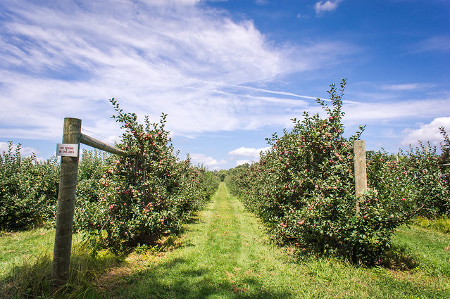 DSC07856.jpg by Paul Hofreiter, on Flickr This is also potentially for the contest, which is in their ppick your own flower spot, which is a great chance to practice shooting butterflies. It is my first real try at a macro and was done with a manual focus lens. Is the DOF too shallow? I feel like it might have been better with the flower more in focus, choosing a higher ISO and closing the aperture more. (I think this was 5.6 or 8...can't remember). I'm also wondering if the reds are clipped and if the processing is too much. 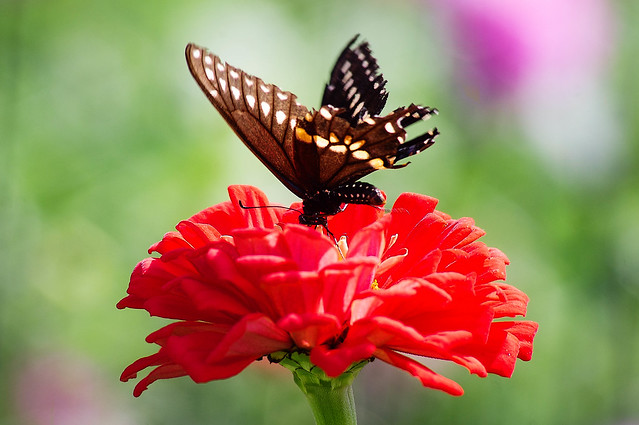 DSC07949-Edit.jpg by Paul Hofreiter, on Flickr The last one I took today, and while I am drawn to it and somewhat pleased I really wish I had stood like half a step to the left. I also wish that I shot it in this orientation...this is crop from the middle of a 18mm horizontal shot.  DSC07994-Edit.jpg by Paul Hofreiter, on Flickr
|
|
#
?
Aug 30, 2012 05:52
|
|

|

|
| # ? May 21, 2024 17:01 |
|
|
kahm posted:Hey there, PAD! So, I've been going through a hobbyist-photographer's mid life crisis recently, after looking at my flickr with pictures from the past 4+ years and realizing that 99% of the stuff was just.. snapshots, with HDR-like processing, too contrasty, over saturated nonsense. I realized I have a lot to learn about photography, so I'm trying to 'start over' and learn more about it. From a technical standpoint, I think I know a lot: I know all about different cameras and sensors and lenses and processing and all that.. it's pretty much all I've ever read up on, so I 'get' that stuff pretty well, but composition? I know next to nothing. Sure, the rule of thirds means something to me, but not much beyond that. I'm reading a couple books right now, 'The Hotshoe Diaries' and 'The Photographer�s Eye - Composition and Design for Better Digital Photos', those two seemed like I could learn a lot from them. I also just switched from a Pentax K-x to an Nikon D5100, and I'm ready to start taking it a little more seriously! I'll chime in and say I really like the scene as well. The processing is also great I also took a look at your feed and I think you're right. It's a lot of snapshots but I also saw a lot of potential from your recording shots, the composition on those is good!As for me, I did a shoot with two people who never met to see how good I could get the chemistry by guiding them throughout the shoot. It was a pretty cool challenge, learned a lot.  IMG_4848 by avoyer, on Flickr
|
|
#
?
Aug 30, 2012 05:59
|
|