|
Cat Mattress posted:Once you've clicked the blue arrow to reveal the boss' ultimate form, open your browser's javascript console and type this magical incantation: this is fantastic
|
 #
?
Sep 1, 2012 20:44
#
?
Sep 1, 2012 20:44
|
|

|

|
| # ? May 28, 2024 21:42 |
|
|
Ariong posted:Yup, in chrome all the text turns to squares. Mac Chrome reporting in, I'm seeing the text just fine.
|
|
#
?
Sep 1, 2012 20:55
|
|


|
The last two updates have been incredible. (I just really hope this nightmare doesn't end like the last one did  ) )
|
|
#
?
Sep 1, 2012 22:30
|
|
|
SpookyLizard posted:this is fantastic edit: Never mind, I figured it out, that is amazing. Also, holy poo poo this update.
|
|
#
?
Sep 2, 2012 07:51
|
|


|

|
|
#
?
Sep 2, 2012 23:05
|
|

|
Ursine Asylum posted:Mac Chrome reporting in, I'm seeing the text just fine. You say you see the text just fine, but your screenshot shows tons of squares? I'm a Mac Chome user, and I see the Zalgotext just fine. There is one single no-character-box, right where the "t" in "Fanart" should be.
|
|
#
?
Sep 3, 2012 04:58
|
|

|
Chrome user, text is a-ok for me.
|
|
#
?
Sep 3, 2012 05:33
|
|
|
Who What Now posted:Chrome user, text is a-ok for me. Heart, on the other hand? Stopped for a minute.
|
|
#
?
Sep 3, 2012 06:18
|
|


|
Welp, that's the first time a webcomic has made knock my keyboard to the floor. Glad there weren't any drinks around.
|
|
#
?
Sep 3, 2012 06:56
|
|
SpookyLizard posted:this is fantastic I really agree. Ctrl-Shift-K in Firefox and "omgwtfishappening();" for any Firefox users out there who haven't seen beyond the veil after clicking the blue arrow, go do it.
|
|
|
#
?
Sep 3, 2012 08:23
|
|

|
You can also just type "javascript:omgwtfishappening();" in the address bar instead.
|
|
#
?
Sep 3, 2012 10:16
|
|
|
 about fonts: about fonts:The Zalgo text doesn't work on Chrome on Windows because the page uses Verdana, which doesn't have the Zalgo characters. Macs work because Macs don't have Verdana; they have Geneva. Other browsers work because if a font doesn't have a character, they'll use a different font, but Chrome doesn't do that because  . .For the full effect, you can get Stylish and plug this code in: code:Fake edit: BabelMap is a pretty cool program for troubleshooting this kind of stuff.  
|
|
#
?
Sep 3, 2012 10:19
|
|
|
Liquid Dinosaur posted:You say you see the text just fine, but your screenshot shows tons of squares? I've taken no screenshots, I think you have me confused with someone else.
|
|
#
?
Sep 3, 2012 14:23
|
|
|
JESUS BLOODSICLES!  That scared the piss outta me! I guess I know what page to recommend to everybody now! EDIT: Also, guess I should mention I was listening to this while I was reading the update... works shockingly well. Though it probably didn't help with the pissing pants thing. Also also, what the hell is with the suggestions thread? Why are a bunch of people trying to do stuff like "give it a hug! pour all your love into it!" when there should be pages and pages of people screaming "RUN! RUN NOW!"? It's jerks like that that I'm gonna blame when this kitten gets stabbed in the neck... again.
SatansBestBuddy fucked around with this message at 20:24 on Sep 3, 2012 |
|
#
?
Sep 3, 2012 20:17
|
|
|
FronzelNeekburm posted:You can also just type "java script:omgwtfishappening();" in the address bar instead. I don't get it, what exactly does this do?
|
|
#
?
Sep 3, 2012 20:25
|
|


|
It starts spinning the comic pane around clockwise.
|
|
#
?
Sep 3, 2012 21:24
|
|
|
Holy poo poo, another update!
|
|
#
?
Sep 5, 2012 04:26
|
|
|
The art on that one was sweet as hell, but the update itself was a bit underwhelming.
|
|
#
?
Sep 5, 2012 04:35
|
|

|
Are the words always supposed to be way the gently caress up top? i've got chrome fullscreened and even then i can't see the 'full' picture.
|
|
#
?
Sep 5, 2012 05:04
|
|
|
I don't like that I have to shrink the page size to actually see what's going on 
|
|
#
?
Sep 5, 2012 05:07
|
|
|
I don't think you should really want to. kaaat kat hey kat He just wants to talk to her after all! Right?
|
|
#
?
Sep 5, 2012 05:39
|
|
|
Volmarias posted:I don't like that I have to shrink the page size to actually see what's going on I think that you're supposed to have to scroll up to see the words. Like, that's part of the experience.
|
|
#
?
Sep 5, 2012 05:46
|
|
|
Who What Now posted:Holy poo poo, another update! I'm afraid to check it.
|
|
#
?
Sep 5, 2012 05:51
|
|
|
Methinks someone found Katia passed out in the chapel.
|
|
#
?
Sep 5, 2012 09:42
|
|
 oh yes oh god yes form the head FORM THE HEAD unghhhh...
|
No, the monster just wants to play! 
|
|
#
?
Sep 5, 2012 09:57
|
|

|
MikeJF posted:I'm afraid to check it. She's not dead yet.
|
|
#
?
Sep 5, 2012 10:16
|
|

|
Cat Mattress posted:She's not dead yet. Screw Katia, after last time I was more afraid the monster was going to burst out of my screen and eat me.
|
|
#
?
Sep 5, 2012 10:44
|
|
|
Funkz posted:No, the monster just wants to play!
|
|
#
?
Sep 5, 2012 13:04
|
|

|
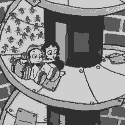
So, the king-beast is curled around... vertical bars? Like a jail cell? Such as one which might be at the beginning of a video game, containing a protagonist? Or perhaps I am looking too far into this. Anyway, is it supposed to just end with the words "kaaat kat hey kat"? Because it's not continuing after that point which makes it feel like something might be loving up, code-wise.
|
|
#
?
Sep 5, 2012 17:18
|
|

|
MoonwalkInvincible posted:Anyway, is it supposed to just end with the words "kaaat kat hey kat"? From the comment section: Lowblock posted:Does he just go �kat hey kat� and then it stops?
|
|
#
?
Sep 5, 2012 17:32
|
|
|
Volmarias posted:I don't like that I have to shrink the page size to actually see what's going on I've been getting really mixed reactions on that so far. Some people like the "bigness" of having to scroll to see everything, other people are just frustrated that they can't get it all on one screen. I think a lot of people assume they have to scroll around a lot to find what's happening before they miss it, but the scrolling itself is actually an input that determines the animation timing. The fires will not start spreading until you scroll down to them, Katia will not look up until you move the scrollbar up, and the text will not change until you see it. My biggest design failing here was probably that it's not entirely clear that you are in control the timing. Unlike the stairs update where the scrollbar was very clearly controlling the action, this one is made to feel like one big image and the control kept more subtle. But on the bright side, unlike the last one this is a relatively short update so it's easy enough to hit F5 if you feel like you missed something. The scrollbar interactivity has been this dream sequence's main thing, and I'll probably play with it a little bit more to see if I can hit that sweet spot where it is Just Really Awesome For Everyone.
|
|
#
?
Sep 5, 2012 17:46
|
|

|
Yeah, you definitely have to make it obvious that scrolling does something if you want things to be paced by scrolling doing something. I definitely applaud what you're doing with the medium and it's its given me a few site design ideas I'd like to implement, but the bulk of users hate scrolling up to see new content because they've been trained that there's nothing new up there. Similarly, people hate having to scroll left or right because of the way the internet, and computers in general, have taught us to vertically process new content. Though this is said from the perspective of a soulless web developer who's exclusively worked for marketing firms. Acute Grill fucked around with this message at 18:06 on Sep 5, 2012 |
|
#
?
Sep 5, 2012 18:02
|
|
|
Kazerad posted:I've been getting really mixed reactions on that so far. Some people like the "bigness" of having to scroll to see everything, other people are just frustrated that they can't get it all on one screen. Another problem is that we don't know when the animation is done. Does it end with hey kat kat kat or is there more? Do I click on katya? Do I click on the fire? Am I going to miss something because I'm impatient? It ends up getting a little frustrating not being able to control the narrative in this way. I'd recommend that you err on the side of leading your viewers around by the nose towards your main content, while still rewarding them for exploring a little. Volmarias fucked around with this message at 18:33 on Sep 5, 2012 |
|
#
?
Sep 5, 2012 18:18
|
|
|
One of the other reasons the stairs update went off better is because the scrolling was all down. Scrolling up is... unnatural. (Although the stairs update did bug me because I missed content on account of scrolling at the wrong pace and only learned it due to this thread) And yeah, when you cross being unable to tell whether there's any more with unknown ambiguous event triggers with oft-buggy web browsing, you're basically creating a recipe for frustration and the user not knowing if it's done or if they've messed up or of it's broken. On a different note, can I throw in a kudos for a loving terrifying monster sequence? MikeJF fucked around with this message at 19:28 on Sep 5, 2012 |
|
#
?
Sep 5, 2012 19:17
|
|
|
Volmarias posted:It ends up getting a little frustrating not being able to control the narrative in this way. I'd recommend that you err on the side of leading your viewers around by the nose towards your main content, while still rewarding them for exploring a little.
|
|
#
?
Sep 5, 2012 19:40
|
|
|
Well, Homestuck had it so that when an animation was done, a little button appeared that let you go back to the beginning. Not a bad way to let people know there's no more to see.
|
|
#
?
Sep 5, 2012 21:41
|
|

|
Phylodox posted:Well, Homestuck had it so that when an animation was done, a little button appeared that let you go back to the beginning. Not a bad way to let people know there's no more to see. What we need here is a spinning O rune.
|
|
#
?
Sep 5, 2012 21:51
|
|
|
The appeal of these dream sequences is that they blur the line between the user and the story. A big IT'S OVER! icon breaks the immersion. A little bit of uncertainty is a good thing. It helps blur that line if you're not quite sure what you should be doing to move the story forward, or if you should be doing anything at all.
|
|
#
?
Sep 5, 2012 22:00
|
|


|
RandomFerret posted:The appeal of these dream sequences is that they blur the line between the user and the story. Man, speaking about blurring the line, I wonder if the whole HTML5 wizardry shenanigans will end up with the reader having to Adblock the King or something in order to get to the happy end. That would be delightfully clever, if a bit of deus ex machina. But the readers couldn't complain about that DEM because they're the ones who brought it! (Sorry Kazerad if I totally spoiler the ending to the whole dream sequence arc.)
|
|
#
?
Sep 5, 2012 22:06
|
|
|

|
| # ? May 28, 2024 21:42 |
|
|
Don't be even a little tempted to stop breaking the "rules" of reading. Send us all over the goddamn page and screw the babies crying about the horrible faux pas of putting new content back where you came from. So far you've been really good about using visual queues to tell the reader where to go, like how Young-Katia looks up at the beam of light, indicating that there's something to scroll up and see. That being said, it wouldn't be a terrible idea to put a few unobtrusive icons on this sort of animation, like a little arrow off to the side that points towards the next thing to see if the reader lingers too long in one spot. Also, making a little icon that indicates "nothing else to see here!" that could appear at the bottom somewhere is good. That would also help with your goal of establishing a brand, since it would be something unique to the comic that readers would see every time they finish an update and would eventually associate it with Prequel.
|
|
#
?
Sep 5, 2012 23:33
|
|