


|
2 casual portraits I shot of friends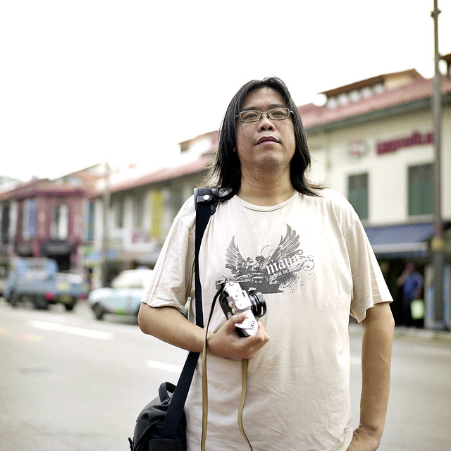 The Photographer by alkanphel, on Flickr 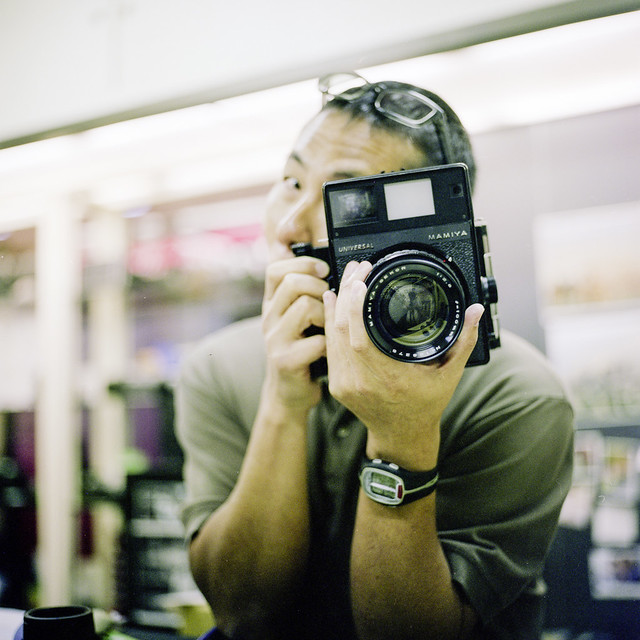 Chii Fei 2 by alkanphel, on Flickr
|
 #
?
Sep 4, 2012 00:31
#
?
Sep 4, 2012 00:31
|
|


|

|
| # ? May 21, 2024 04:13 |
|
|
^^ I like #1. Did you try it as a black and white?
|
|
#
?
Sep 4, 2012 01:52
|
|

|
TheAngryDrunk posted:^^ I like #1. Did you try it as a black and white? Thanks, I haven't actually tried it as b&w since I used colour film for the photos but maybe I'll give the conversion a try and see how it turns out.
|
|
#
?
Sep 4, 2012 18:02
|
|
|
Got to shoot a co-worker and his family on Monday: 
|
|
#
?
Sep 5, 2012 04:02
|
|
|
I haven't posted here in a while. The following are from a shoot I did over the weekend. I like the shots, but at the same time I feel underwhelmed with them. Maybe someone here will notice?    
|
|
#
?
Sep 5, 2012 04:10
|
|


|
Overall your subject either feels detached or has rigid, unnatural posing. Processing looks good. I really like the second shot. It catches me off-guard and has some really nice tones. The composition/light in the fourth shot rules. That said, her posing is very unnatural here. I'd even suggest to meter for the light instead of the shadow in this case. Reshoot this one, making sure her shadow is isolated in the light, there's a lot of potential here. As for the other ones, they feel more like snapshots than something from a shoot. Use the environment you're shooting in to an advantage and to play up your subject's posing, give your model a motivation. The posing doesn't have to spell anything out, but it should be evocative of something. burzum karaoke fucked around with this message at 04:54 on Sep 5, 2012 |
|
#
?
Sep 5, 2012 04:33
|
|

|
Yeah, I think all of those shots would be wonderful if they were of a model with a little more charisma or... well, any semblance of facial expression.
|
|
#
?
Sep 5, 2012 04:36
|
|

|
I like this, but I think it's because it's kinda weird.
|
|
#
?
Sep 5, 2012 04:53
|
|
|
Not quite a portrait, but I really like this one. Looks like a video game.
|
|
#
?
Sep 5, 2012 04:54
|
|
|
aliencowboy posted:Overall your subject either feels detached or has rigid, unnatural posing. Processing looks good. I know what you guys are saying about the posing. She told me she's not good at posing and I admit that I suck at posing other people too. I actually did shoot the fourth one while exposing for the light streak, and she is more isolated in the light. I'll edit it and post it up, it was purely a coin toss between the two. I need to get a wider lens for environmental shots, these were shot with an 85 on full frame. I have some full body shots but I'm meh on the background, I'll see what I can do with them. QPZIL posted:Yeah, I think all of those shots would be wonderful if they were of a model with a little more charisma or... well, any semblance of facial expression. This was our first time shooting together (she's my gf's friend so I know her but never shot her), next time we go for a shoot I'll discuss the posing with her/facial expression with her. Elite Taco posted:I like this, but I think it's because it's kinda weird. I'll take it! TheAngryDrunk posted:Not quite a portrait, but I really like this one. Looks like a video game. It does seem a bit isometric, and her pose is like a robot's! Thanks for the comments guys! She likes the photos, but I think I'll have to schedule another shoot to improve on things. PS. I can't wait for the MF shots though! Just need to process them.
|
|
#
?
Sep 5, 2012 05:09
|
|
|
Santa is strapped posted:PS. I can't wait for the MF shots though! Just need to process them. I just solved the mystery of why you were underwhelmed.
|
|
#
?
Sep 5, 2012 05:34
|
|

|
This is baller. In the others she just looks bored for no reason? Was it what you guys were going for and why?TheAngryDrunk posted:Not quite a portrait, but I really like this one. Looks like a video game. Also, noice ink. evil_bunnY fucked around with this message at 11:49 on Sep 5, 2012 |
|
#
?
Sep 5, 2012 11:45
|
|

|
A snapshot of my youngest. He's being held by his big sis.
|
|
#
?
Sep 5, 2012 18:14
|
|
|
Reichstag posted:I just solved the mystery of why you were underwhelmed. Ha, we will see on Friday evil_bunnY posted:This is baller. In the others she just looks bored for no reason? Was it what you guys were going for and why? The theme was a loose interpretation of "girl walking in the city, daydreaming of the forest". The photos in the woods didn't come out as good as I had hoped, but I will revisit them in a few days, may be they'll look alright then. Here is the re-done photo, which is now actually two photos stitched together. Why - because the exposed-for-the-ray-of-light photos do not include the speed bump and surrounding area AS WELL as the girl being in the right place, which I liked in the original. I like the wider view, however that STOP HERE sign is bugging me and I was not able to successfully clone it out. 
bobmarleysghost fucked around with this message at 03:01 on Sep 6, 2012 |
|
#
?
Sep 6, 2012 02:58
|
|
|
I kind of like the stop here, with the way that she is stopped, but facing the other direction. Makes me think there's a story here and wonder what it is.
|
|
#
?
Sep 6, 2012 04:11
|
|

|
A shot I took out at dinner the other night. The colour is a little wacky from heat lamps overhead, but I really like the texture on the scarf/sheet thing (It's a cover for feeding a baby in public) First post ever so here goes. 
Uncurtailed fucked around with this message at 16:45 on Sep 6, 2012 |
|
#
?
Sep 6, 2012 04:55
|
|

|
All natural light despite me being eager to use strobes that day. Fashion at 300mm #1 by Rick0r McZany, on Flickr Busy, yes.
|
|
#
?
Sep 6, 2012 05:36
|
|
|
Santa is strapped posted:Here is the re-done photo, which is now actually two photos stitched together. Why - because the exposed-for-the-ray-of-light photos do not include the speed bump and surrounding area AS WELL as the girl being in the right place, which I liked in the original. I like the wider view, however that STOP HERE sign is bugging me and I was not able to successfully clone it out.
|
|
#
?
Sep 6, 2012 19:01
|
|

|
Ric posted:The first one you posted is far better, with her head against the ramp and her shadow within that of the stop sign.
|
|
#
?
Sep 7, 2012 16:54
|
|
|
evil_bunnY posted:Yeah I like the tension in the first one better. Where can we see the first one, lurked a few pages of his flickr and couldn't find it
|
|
#
?
Sep 7, 2012 17:10
|
|

|
I like the new one better. The flow feels better to me, looking at it.Cyberbob posted:All natural light despite me being eager to use strobes that day. This one is kind of like... you wanted to shoot fashion so you stick a girl in a dress and put her near something cool? But it feels like getting so excited to do that, you left out a lot of details. The emphasis should be on the clothing, and the structure should only be used to enhance that. But the structure doesn't echo anything in the dress and feels like it's just there because it's "cool." The fence and pole on the right is also very distracting and looks messy. The theme of the clothing should complement the photograph, but it hardly seems part of it.
|
|
#
?
Sep 7, 2012 17:47
|
|


|
Ric posted:The first one you posted is far better, with her head against the ramp and her shadow within that of the stop sign. evil_bunnY posted:Yeah I like the tension in the first one better. What I did like more in the first photo is that her head is against a one colour background, she is pretty well distinguished. In the second, she seems a bit cramped. However, I like the light and shadow play more in the second shot. KingColliwog posted:Where can we see the first one, lurked a few pages of his flickr and couldn't find it Here is the original  nonanone posted:I like the new one better. The flow feels better to me, looking at it. I think I will keep the new one for now.
|
|
#
?
Sep 8, 2012 03:05
|
|
|
nonanone posted:This one is kind of like... you wanted to shoot fashion so you stick a girl in a dress and put her near something cool? But it feels like getting so excited to do that, you left out a lot of details. The emphasis should be on the clothing, and the structure should only be used to enhance that. But the structure doesn't echo anything in the dress and feels like it's just there because it's "cool." The fence and pole on the right is also very distracting and looks messy. The theme of the clothing should complement the photograph, but it hardly seems part of it. also, at 300mm which seems to be something you want to emphasize, you get almost no connection with the model. especially to get a full length shot like that, with background elements, you must have been so far away.
|
|
#
?
Sep 8, 2012 03:09
|
|

|
Yea cheers for that. I was there assisting my wife as she shot this particular model, and just wanted to try a few full length yet long focal length (because compression), and got those type of shots. Initially I was pretty happy with it but after a few viewings, found the background to be too distracting more than anything.
|
|
#
?
Sep 8, 2012 03:25
|
|
|
Cyberbob posted:Yea cheers for that. I was there assisting my wife as she shot this particular model, and just wanted to try a few full length yet long focal length (because compression), and got those type of shots. Initially I was pretty happy with it but after a few viewings, found the background to be too distracting more than anything. That's fair, especially since you were assisting. As other mentioned tho there's no way I could picture myself communicating with a model at anything higher than 85mm, specially for a full body shot. The idea of the bus background is neat, makes me wonder what it would have looked like at a bigger aperture and closer to the model, you should share what your wife came up with! ") Here's what I've been up to:  IMG_5364 by avoyer, on Flickr  IMG_5298 by avoyer, on Flickr
|
|
#
?
Sep 8, 2012 20:04
|
|

|
I dig. Don't like her hand in frame 2, but that's a sharp knees level criticism.
|
|
#
?
Sep 9, 2012 01:51
|
|
|
I was asked to do some basic portraits for a friend of mine who is starting her own business and needed a picture for her website. It's a health and fitness business so we opted to go for a natural look outside. IMG_5713 by Breanne Unger, on Flickr  IMG_5718 by Breanne Unger, on Flickr
|
|
#
?
Sep 9, 2012 06:42
|
|
|
^ Looks good! I assume she was happy with them?
|
|
#
?
Sep 9, 2012 07:14
|
|
|
 Michelle 1 by xxyzx road, on Flickr  Michelle 2 by xxyzx road, on Flickr
|
|
#
?
Sep 9, 2012 08:34
|
|
|
CarrotFlowers posted:I was asked to do some basic portraits for a friend of mine who is starting her own business and needed a picture for her website. It's a health and fitness business so we opted to go for a natural look outside. This is one is perfect for a friendly business headshot - it seems really warm and genuine. Good show TheAngryDrunk posted:
I would give her legs a bit of a cleanup - you can see the dappling on them from the breezy weather. My editorial work is picking up again, so I decided to do some shoots with friends for the sake of it. I have a couple of others that fit the bill a bit better than these, but my overall theme is "stills from a film". Admittedly, I did zero preparation for these, other than discuss wardrobe with her a bit, but I thought it'd add to that "turn up, work it out on the spot" feel that my editorial stuff ends up being, so it would be good practice. Anyway, here you go. I can't decide whether they're a bit boring. I have three more I will post when I've worked on them a little bit that fit the "movie stills" theme a little better.   Went a bit "Xenlik-y" on that one ") It's not straight out of camera, admittedly, but the green to red lighting effects are from your friend and mine the sun, as opposed to a gradient filter or anything. I'm a bit worried it looks like a filter. It's not straight out of camera, admittedly, but the green to red lighting effects are from your friend and mine the sun, as opposed to a gradient filter or anything. I'm a bit worried it looks like a filter.I really want to do an 80s themed night portrait session. I don't mean cheesy 80s, I mean dark, neon, slightly sinister 80s. I know exactly which model I want (I'll be using a "proper" model for that one) but I need to work out kit, locations etc. It's just an image in my head at the moment.
|
|
#
?
Sep 9, 2012 09:07
|
|

|
If you're going for a movie stills look, try a 16:9, 2.35:1 or another common cinematic aspect ratio. Wide lenses are a bit tricky for portraits, but I think the first one is really nice albeit a little too centre-weighted.
|
|
#
?
Sep 9, 2012 09:30
|
|
|
aliencowboy posted:If you're going for a movie stills look, try a 16:9, 2.35:1 or another common cinematic aspect ratio. Wide lenses are a bit tricky for portraits, but I think the first one is really nice albeit a little too centre-weighted. Thanks. I was slightly worried I got a smidge too close on the first one and distorted her face a little: I may have been better off switching back to the 85. She seems less round-faced in the second shot. Although the stills thing is an idea I'm looking to experiment with a bit more, I'm mainly using it as a means of getting movement into the shoot and removing awkwardness. I remember McMadCow mentioning this as an important way of removing stiffness and awkwardness from ports. It's something that's so bloody obvious when you think about it but needed spelling out to me. EDIT: That isn't to say "yeah but I wasn't really going for movie stills" because I was, and I didn't get it right. Just realised that might have come across as "yeah well I meant to do that". EDIT 2: The other two.  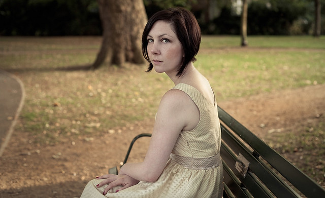 Particularly interested in thoughts on the second one, as I have done pretty much zero female posing. I tried to keep it loose with a couple of minor rules. Gazmachine fucked around with this message at 15:53 on Sep 9, 2012 |
|
#
?
Sep 9, 2012 10:56
|
|
|
I like he feel/processing on all of them. The second one looks good to me, by looking at the photo I can easily make up a back story to the photo, so I'm guessing that's job well done on your theme.
|
|
#
?
Sep 9, 2012 16:17
|
|
|
First one is a bit of an awkward crop, second one rules. The bench and tree both lead into and frame her head nicely.
|
|
#
?
Sep 9, 2012 20:38
|
|
|
Gazmachine posted:Although the stills thing is an idea I'm looking to experiment with a bit more, I'm mainly using it as a means of getting movement into the shoot and removing awkwardness. I remember McMadCow mentioning this as an important way of removing stiffness and awkwardness from ports. It's something that's so bloody obvious when you think about it but needed spelling out to me. Could you please elaborate on this? To contribute: Of the four, I really like the first one. What's pleasing is the to me is the background, tone, perfect hair (2 and 3 have some loose hairs accentuated by the strong backlight), and the "in-between expressions" look. I like the fourth a lot, too.
|
|
#
?
Sep 9, 2012 21:01
|
|
|
Thanks for the nice words, everyone. Yeah I agree the crop is a tad awkward on the first of that second pairing: I think I was sort of trying to force an aspect ratio I couldn't get out of the image. Might go back and recrop. Sovi3t posted:Could you please elaborate on this? I remember McMadCow saying (and I'm going to take a leap here and paraphrase the great man) that he will give his models an area to walk through and move around in and he snaps as they go and as they do stuff. This takes out that stiffness of someone posing and waiting for a shot to be taken. I don't think he always does that, but it's a good way of getting movement and feeling into a shot. As she is not a model, my approach was I gave her little bits of acting to do. It was all a bit silly and the acting was...not amazing, but that was fine because 1.) It eased her nerves when we laughed about it and 2.) It gave her a motion to perform, something to think about. So I had her turning into shots and moving into shot, stuff like that. I gave her a bit of motivation and a very simple scene to play out in her head. When I compare that to when I was getting her to stand in position to get an idea of background and exposure and those shots are stiff and awkward. You don't have to use this particular "method", and I would advise against doing anything the way I do (completely unprofessionally and as it comes to me) but it works for me, you just need to figure out an approach that works for you and your subject. It's different for a proper model, because part of their job is to do ludicrous things with absolute confidence and zero irony: that's why you get such lovely movement and unusual poses with good model photography.
|
|
#
?
Sep 9, 2012 22:18
|
|
|
TheAngryDrunk posted:^ Looks good! I assume she was happy with them? I haven't shown her yet :P I wanted to get some opinions first, but she's picking them up tonight so I hope so! I'm happy with them
|
|
#
?
Sep 10, 2012 01:03
|
|
|
Gazmachine posted:Thanks for the nice words, everyone. Yeah I agree the crop is a tad awkward on the first of that second pairing: I think I was sort of trying to force an aspect ratio I couldn't get out of the image. Might go back and recrop. To add to this, if you want to remove the stiffness from a model simply give them something to do. It can be "play with your hair a certain way, repeat it slowly" or "walk there slowly and at a certain point glance in that direction and stop for a min and walk again slowly". Works quite well
|
|
#
?
Sep 10, 2012 03:00
|
|
|
I just yell at them until they cry so I can capture their true emotions
|
|
#
?
Sep 10, 2012 10:27
|
|

|

|
| # ? May 21, 2024 04:13 |
|
|
"dance, rummy" is always a winner.
|
|
#
?
Sep 10, 2012 10:57
|
|