|
quote:In 1957, Avedon was commissioned to take a portrait of the couple, who were notoriously photo-savvy � way ahead of the curve of today�s paparazzi-beleaguered movie stars and royals. Knowing that they were dog lovers, obsessed with their own collection of pugs, Avedon is said to have told them that the taxi he had taken to meet them had run over a dog (which wasn�t true). The couple grimaced sympathetically, and � snap! � Avedon took the picture, which is on view in �Richard Avedon: Photographer of Influence� at the Nassau County Museum of Art in Roslyn Harbor. The photograph
|
 #
?
Sep 10, 2012 14:43
#
?
Sep 10, 2012 14:43
|
|


|

|
| # ? May 17, 2024 16:03 |
|
|
Those 2 were loving assholes anyway.
|
|
#
?
Sep 10, 2012 14:54
|
|

|
Ha! Amazing.
|
|
#
?
Sep 10, 2012 14:57
|
|

|
That reminds me I have to go light a candle at my Richard Avedon altar (peace be unto him). He's so great 
|
|
#
?
Sep 10, 2012 15:16
|
|

|
I got to do a pretty cool shoot this weekend with two dancers. We didn't get nearly as much time to shoot as I would have liked, but I did get this shot that I'm pretty happy with.  model: Aurora Black
|
|
#
?
Sep 10, 2012 15:19
|
|
|
Gazmachine posted:Thanks. I was slightly worried I got a smidge too close on the first one and distorted her face a little: I may have been better off switching back to the 85. She seems less round-faced in the second shot. I really like both of these, especially the second. There's something lovely about her pose there; it's stiff, but not unnatural at all.
|
|
#
?
Sep 10, 2012 15:41
|
|

|
Meeting in a friend's studio + some remaining frames on a roll of Astia = headshots! Jun by alkanphel, on Flickr  ABC by alkanphel, on Flickr
|
|
#
?
Sep 10, 2012 23:51
|
|

|
I love those. It feels nice. It's nice.
|
|
#
?
Sep 11, 2012 00:13
|
|
|
bisticles posted:I got to do a pretty cool shoot this weekend with two dancers. We didn't get nearly as much time to shoot as I would have liked, but I did get this shot that I'm pretty happy with. Love the single point perspective in this, works really well with the leading lines in the tiles. I took a portrait today that I'm really loving happy with so please knock me down a peg or 3 before I start thinking I'm some kind of pro.  (Sorry for the watermark, it's on there for facebook self promotion)
|
|
#
?
Sep 12, 2012 00:14
|
|

|
AceClown posted:Love the single point perspective in this, works really well with the leading lines in the tiles. I like it! The skin, especially her face, seems a bit overexposed but the rest of the picture is awesome. She has great eyes and you've separated the neck from the chin line which is always awesome.
|
|
#
?
Sep 12, 2012 00:22
|
|

|
AceClown posted:Love the single point perspective in this, works really well with the leading lines in the tiles. Her face is a bit smudgy you could probably even out the consistency The hair is a mess, what's going on with the strand peeping over her left shoulder, on the other side there looks like a strand clumped off. There's good messy hair and bad. This one isn't great because it looks like it's trying to be styled. Why a square crop? What is your reason behind it? Shooting at a slight down angle has made her neck disappear. Sorry if that was more pegs than three! It's a good start. If it's little things that are the issues you're on the right track.
|
|
#
?
Sep 12, 2012 00:45
|
|

|
   Thoughts?
|
|
#
?
Sep 12, 2012 03:52
|
|
|
I like them, but that watermark 
|
|
#
?
Sep 12, 2012 05:12
|
|


|
AceClown posted:Love the single point perspective in this, works really well with the leading lines in the tiles. I really like this, but it's a bit overexposed for sure. You can easily fix this though, it's not completely blown out. I really love her expression and the eyes. The hair is definitely messy, you can fix this in post as well, a lot of selections, cloning, and liquify would do wonders. It's a great start though. ")
|
|
#
?
Sep 12, 2012 05:14
|
|
|
somnambulist posted:I like them, but that watermark I know... I know.  It's on there for Facebook marketing purposes. I'm trying to get in contact with a graphic designer to overhaul my "brand" and website. It's on there for Facebook marketing purposes. I'm trying to get in contact with a graphic designer to overhaul my "brand" and website.edit: few more, this time from flickr and so no watermark   flickr dakana fucked around with this message at 05:47 on Sep 12, 2012 |
|
#
?
Sep 12, 2012 05:26
|
|
|
dakana posted:
I like them, first one the posture makes her seem a little stiff / uncomfortable tho, especially because of her shoulders going way up. Small derail but I don't understand the need for watermarks in facebook pictures. Never used it still get business.
|
|
#
?
Sep 12, 2012 05:48
|
|
|
xenilk posted:I like them, first one the posture makes her seem a little stiff / uncomfortable tho, especially because of her shoulders going way up. Ah, I definitely see what you mean. The railing was a bit high, for sure. Also, word? I'm not married to the idea of branding Facebook photos. I mean, I guess I don't REALLY need to since I'm posting them from my photography Facebook page. People'll still see "so and so shared Kneer Photography's photo". The only time I wouldn't be as visible would be when people make something their profile picture. I'm still kicking it around. Maybe if I get a mark that isn't hideous it'd be better. I am not a designer.
|
|
#
?
Sep 12, 2012 06:41
|
|
|
My brother ran in the Dirty Dash with his wife and a couple of their friends. 3 miles with an obstacle course, mud & water. I only got the start and finish - had to watch the kids.     
|
|
#
?
Sep 12, 2012 19:52
|
|

|
A bit of a cliche, but I like it. He's a model friend who wanted a shoot for celebrating two years sober. 
|
|
#
?
Sep 13, 2012 00:27
|
|
|
Cyberbob posted:A bit of a cliche, but I like it. He's a model friend who wanted a shoot for celebrating two years sober. I think it's a very cool concept when you know the context. Very well done too.
|
|
#
?
Sep 13, 2012 01:15
|
|

|
Cyberbob posted:A bit of a cliche, but I like it. He's a model friend who wanted a shoot for celebrating two years sober.
|
|
#
?
Sep 13, 2012 04:03
|
|
|
XTimmy posted:Concept is great, composition is a little unbalanced though, reading left->right I have this bigass empty space to trawl through before I hit the meat of the photograph. I don't think it would make sense the other way around tho.
|
|
#
?
Sep 13, 2012 05:27
|
|
|
XTimmy posted:Concept is great, composition is a little unbalanced though, reading left->right I have this bigass empty space to trawl through before I hit the meat of the photograph. Yea, we couldnt decide between two crops. Theres that full one, and one cropped up to his collar (same aspect ratio), so its just enough space for both heads.
|
|
#
?
Sep 13, 2012 11:46
|
|
|
I like it with the empty space, kind of draws attention to it, like as if the ghost is the spirit of his past, and the empty space represents his future without that.
|
|
#
?
Sep 13, 2012 15:06
|
|


|
I'm sad this thread is on page 2. Bumping this with some portraits   Jessica by francography, on Flickr  Jessica by francography, on Flickr 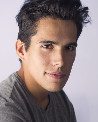 david1 by francography, on Flickr 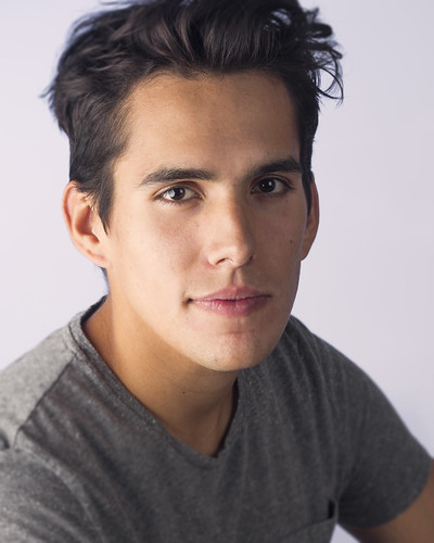 david2 by francography, on Flickr
|
|
#
?
Sep 23, 2012 03:15
|
|
|
somnambulist posted:I'm sad this thread is on page 2. Bumping this with some portraits I always enjoy your portraits. Is that some subtle split toning? It looks very nice. To nitpick, the background on the second looks like it is gradienting, most obviously with a line about eye level. Great expressions, though.
|
|
#
?
Sep 23, 2012 03:25
|
|
|
 Mercedes by xxyzx road, on Flickr  Mercedes by xxyzx road, on Flickr
|
|
#
?
Sep 23, 2012 19:08
|
|

|
Her face in the first one is a strange color. Looks really yellow compared to the rest of her skin
|
|
#
?
Sep 23, 2012 23:58
|
|

|
CarrotFlowers posted:Her face in the first one is a strange color. Looks really yellow compared to the rest of her skin Thanks. Yeah unfortunately there was a strong reflection from the grass in front of her. I tried to fix it here:  MercedesFix by xxyzx road, on Flickr Better?
|
|
#
?
Sep 24, 2012 01:13
|
|
|
Mucking around outdoors at night with my friend's Olympus toy model.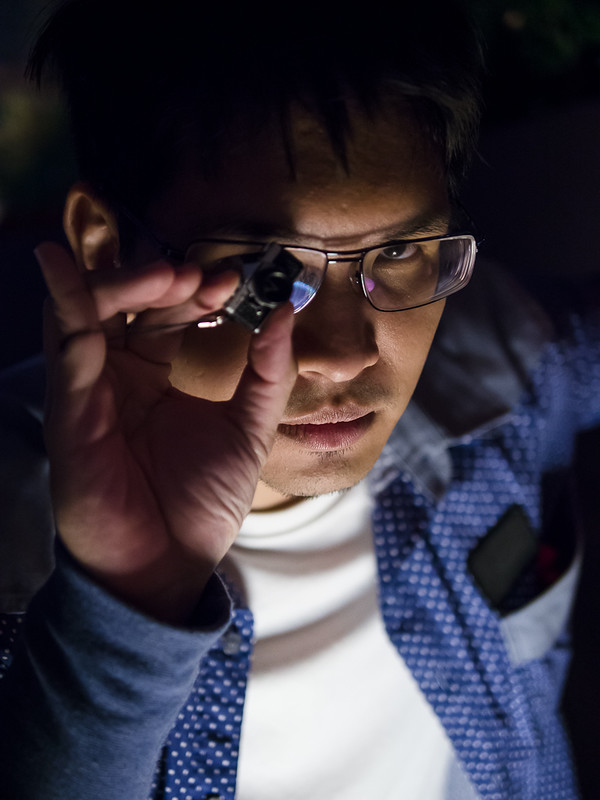 Olympus Model 1 by alkanphel, on Flickr
|
|
#
?
Sep 24, 2012 02:33
|
|
|
TheAngryDrunk posted:Thanks. Yeah unfortunately there was a strong reflection from the grass in front of her. Yeah looks much better to me.
|
|
#
?
Sep 24, 2012 03:47
|
|
|
dakana posted:I always enjoy your portraits. Is that some subtle split toning? It looks very nice. Thanks No split toning, just a bg light with a gel. I'm still learning how to use a bg light, you're right- it's not very even.I spent a little more time in post on this one:  gavin by francography, on Flickr Maybe I went a little overboard on this one, but I was bored and wanted to play around a bit. 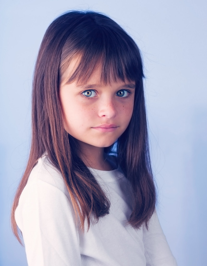 jessica by francography, on Flickr somnambulist fucked around with this message at 06:18 on Sep 24, 2012 |
|
#
?
Sep 24, 2012 04:35
|
|
|
oops, wrong thread.
|
|
#
?
Sep 24, 2012 05:34
|
|
|
somnambulist posted:Thanks I was about to say that you tight cropped those pictures but then you posted these and it's all good TheAngryDrunk posted:
These are great! I agree that the second version is better tho, the skin was green-ish before. Solid work!
|
|
#
?
Sep 24, 2012 14:01
|
|
|
So I work for a portrait studio called Picture People. They recently had a photo contest for the summer and one of my photos made it to the finals. Liking the image means you placed a vote for it. I would really appreciate help with the contest as I get a pretty big bonus for winning. And as always, if you would like to critique it go for it (post here, not on facebook). It is one of the better sittings I've had since I started working there 3 months ago and would love to see how I could improve. http://www.facebook.com/photo.php?fbid=10151259102886804&set=a.10151250267901804.519519.121599011803&type=3&theater Edit: Also click if you want to see the world's happiest baby. rcman50166 fucked around with this message at 20:24 on Sep 24, 2012 |
|
#
?
Sep 24, 2012 20:17
|
|

|
........
Erostratus fucked around with this message at 21:30 on Jan 16, 2013 |
|
#
?
Sep 26, 2012 06:21
|
|
|
I've been back and forth between this pic and Ms. Boo from Middlesbrough way trying to decide if its a real small world and she's gone au naturel with the hair and piercings, or if she just has a doppelganger  
|
|
#
?
Sep 26, 2012 15:25
|
|


|
Shot sone goons. Makes me really ready for fall:
|
|
#
?
Sep 26, 2012 15:51
|
|
|
That guy is really hot. And no, I haven't suddenly gone all PIMM- he's sweating from his pits and you can see it...
|
|
#
?
Sep 26, 2012 16:15
|
|

|

|
| # ? May 17, 2024 16:03 |
|
|
I love the background but he's squinting his eyes and the frames of her glasses are sort of cutting across her eyes so I've rather lost eye contact with the pair of them. They also both look a bit forced in the pose department, her mouth for instance. Not sure what's going on there. But the background is making me jealous.
|
|
#
?
Sep 26, 2012 16:23
|
|