


|
Back in February...Xom posted:Check out this tool I made that sorts a list by asking the user to decide comparisons. It's one of those things I've been meaning to hack together forever, but somehow I managed to get off my rear end and build this one. Jonnty posted:Fun little idea. Would be made better by being able to link people to both quizzes and results - you wouldn't even necessarily need to store anything. Example: http://xomnom.com/preference.html?P...IpMiYxoFtZz4%3D
|
 #
?
Sep 19, 2012 22:53
#
?
Sep 19, 2012 22:53
|
|


|

|
| # ? May 9, 2024 03:43 |
|
|
Not good enough! GUIDs are long and ugly, I demand you create and BIND a new subdomain for every quiz.
|
|
#
?
Sep 20, 2012 22:34
|
|


|
Your site seems to be down.
|
|
#
?
Sep 20, 2012 22:46
|
|

|
Scaramouche posted:Not good enough! GUIDs are long and ugly, I demand you create and BIND a new subdomain for every quiz. Grawl posted:Your site seems to be down.
|
|
#
?
Sep 21, 2012 23:23
|
|
|
I have slowly been working on a chess game for Windows 8 Metro; I am close to finishing the game logic. Some artwork has also been finished. I am proud of the chess pieces I designed, they are modern but recognizable: All I need to do now is choose a color for the background, some decorative elements and I believe I will be ready for the 26th Oct launch.
|
|
#
?
Sep 23, 2012 03:25
|
|
|
Pseudo-God posted:I have slowly been working on a chess game for Windows 8 Metro; I am close to finishing the game logic. Some artwork has also been finished. I am proud of the chess pieces I designed, they are modern but recognizable: I don't think the king and queen are distinguishable enough from each other. The defining characteristic of the king is usually the cross on top and the queen's is the spiky crown. They both look like queens to me.
|
|
#
?
Sep 23, 2012 04:09
|
|


|
Volte posted:I don't think the king and queen are distinguishable enough from each other. The defining characteristic of the king is usually the cross on top and the queen's is the spiky crown. They both look like queens to me. Yeah, definitely. My kid of 3 can recognize the different pieces between multiple chess sets because the standard ones follow certain rules to identify pieces. The King should definitely have some sort of cross for it to be recognized as such.
|
|
#
?
Sep 23, 2012 04:20
|
|

|
Volte posted:They both look like queens to me. A fat one and a  one to be precise :P. I like the rest of the pieces though. one to be precise :P. I like the rest of the pieces though.Please tell me you are removing that counter thing from the top left. What are you doing in terms of AI?
|
|
#
?
Sep 23, 2012 07:43
|
|
|
Volte posted:I don't think the king and queen are distinguishable enough from each other. The defining characteristic of the king is usually the cross on top and the queen's is the spiky crown. They both look like queens to me. The king is the one wearing a dress, making it look like more of a queen to me.
|
|
#
?
Sep 23, 2012 07:44
|
|
|
shrughes posted:The king is the one wearing a dress, making it look like more of a queen to me.
|
|
#
?
Sep 23, 2012 10:44
|
|
|
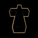
The point of the king and queen was to differentiate them on body shape; the queen has a dress and the king is fat. However, I can see that people are still confusing them, so I guess a small change is in order. A cross is not possible for the king, since all figures are made up of triangles. The counter at the top-left is just for debugging purposes, it will obviously not be in the final game. It represents a part of the internal logic of the board, namely, the coordinates of the last dragged piece. The blue background will not be used, since it does not fit in with the rest of the color scheme. As for the AI, I am not knowledgeable to implement a good one in just a few days, so I will be using a free one I found: https://github.com/douglasbagnall/p4wn/blob/master/README.rst OR http://forwardcoding.com/projects/ajaxchess/chess.html To be honest, the AI is not the main focus of the program. My main goal is to have a cloud based multiplayer game, with matchmaking, rankings, profiles, tournaments etc. We will see if I can get this done in a month. I went back and made some low-res prototypes for a new king. Check them out:  Red are the old king and queen, green are the ones I think are the most promising. I will make the detailed sketches later. I believe the top-left figure is distinguished from the rest by being slightly wider, having more details, has a crown-like shape on top, and unlike the queen, also has a "gem" on top, which serves as a traditional cross. I am adding theme support to the program from the start. I plan to have one more theme ready by launch, probably a traditional shape. If any of you guys would like to take a crack at it, I'd be glad to include it in the final program. Pseudo-God fucked around with this message at 13:08 on Sep 23, 2012 |
|
#
?
Sep 23, 2012 12:27
|
|
|
Pseudo-God posted:The point of the king and queen was to differentiate them on body shape; the queen has a dress and the king is fat. However, I can see that people are still confusing them, so I guess a small change is in order. A cross is not possible for the king, since all figures are made up of triangles. I diamond on top of the crown would be evocative of a cross, while still maintaining the style.
|
|
#
?
Sep 23, 2012 13:02
|
|
|
I made this, what do you guys think?  
Pseudo-God fucked around with this message at 15:31 on Sep 23, 2012 |
|
#
?
Sep 23, 2012 15:01
|
|
|
Yeah, I'm sure that looks better side by side with the rest. Now every top mark is different between piece types.
|
|
#
?
Sep 23, 2012 15:06
|
|
|
I can't not see the latter two as businessmen with varying tie lengths, surrendering. Maybe not have the wide arms-like look on the spire? Literally just the triangle pointing up, and possibly one more from the ends, I think might be a better option.
|
|
#
?
Sep 23, 2012 16:22
|
|

|
prolecat posted:My personal preference for creating terrain with noise is a sort of modified version of the ridged multifractal algorithm. It can create nice rocky looking mountains with smoother valleys, and even really nice sand dunes depending on the parameters. It's been a while since I've done terrain stuff, so I don't really remember the specifics, but I initially read about it in Texturing and Modelling: A Procedural Approach. Don't know of any decent online references for it off the top of my head though. Thanks for the hint, I'll look into those algorithms. In the meantime, I just spent a good three days attempting to add texturing and mipmapping, using just OpenGL and DevIL for image loading. This is two and a half days longer than I would have liked, but at least I've figured it out now.  I also added a quite simple debug VAO to represent a water plane of sorts. A bit too blue, but it's fine just for testing. e: Could have sworn someone had posted after me, sorry about that.
|
|
#
?
Sep 23, 2012 18:27
|
|

|
 http://i.imgur.com/hoG9r.png What do you guys think of this? Background color and pattern is nicer, the new king fits nicely, and I've added the borders on clicked figures.
|
|
#
?
Sep 24, 2012 00:08
|
|
|
I can't stand all of that art. Complete miss for me. Rook looks like that one boss from Zelda. Knight is a horse with a huge eye, like a birth defect that he's really depressed about. Proportions are also super wrong, so he looks mopey. Sort of reminds me in Yoshi in a way. Bishop is  . .Queen is so shocked, her jaw drops and her crown jumps up. King looks like a mafia boss with a sombrero. Pawn looks like a donut where the top part was extracted from the bottom part.
|
|
#
?
Sep 24, 2012 02:10
|
|

|
Suspicious Dish posted:I can't stand all of that art. Complete miss for me. You're just bitching for the sake of bitching. I think the art looks nice and fits the Metro style. Grawl fucked around with this message at 02:46 on Sep 24, 2012 |
|
#
?
Sep 24, 2012 02:43
|
|
|
Grawl posted:You're just bitching for the sake of bitching. No, I'm not. It just doesn't work well at all, to me. I recognized the pieces solely based on their initial positions, and then worked backwards to see what the shape was supposed to be. If we were in the middle of a game, I'd recognize the knight, and maybe the pawn by how many there are, and only if there were that many left on the board. If you release the chess app, I'd prefer a more traditional theme, maybe as a setting.
|
|
#
?
Sep 24, 2012 03:01
|
|
|
The knight and bishop are easily recognizable, as are the pawns, but yeah the rooks, queen and king still seem a bit samey. I think the problem is they're all the same height and shape. If you make the rooks shorter and give them a flat top that would make them pretty distinctive, and if the king had the queen's crown plus a diamond on top (instead of a different crown entirely) that would make it clearer which is which.
|
|
#
?
Sep 24, 2012 03:24
|
|
|
It really does feel like programmer art. If you're a programmer, take that as a compliment and find a designer. If you're a designer, welp
|
|
#
?
Sep 24, 2012 03:58
|
|

|
I have also been working on a bit of Eve Online market related code, inspired by the tools that have disappeared or otherwise gone stale. Everything is very much a WIP. The first goal of the tool was to calculate margin trading opportunities in the major market hubs and also the value of different reactions that can be run; now I am beginning to expand it to calculate trade routes as well. Some details: Built with Django, Twitter Bootstrap, JQuery, and a few charting libraries Hooked into the EMDR firehose Background processing powered via celery Ajax data loading Mysql... MyIsam...  Margin Trades  Market Explorer - A navigable Tree Map of margin trades  Ajax stream of updates to the Jita market hub. Data comes in a lot faster than this, as this only shows when data actually changes, and only for Jita. No page caching at the moment, so initially some pages will take several seconds to load. Also the treemap will take a few seconds to load after the page does as there is a lot of data there. Subpages like Ships should load much quicker Surface fucked around with this message at 06:35 on Sep 24, 2012 |
|
#
?
Sep 24, 2012 06:26
|
|
|
The only way I can even function in a game of computer chess is with the standard 2D pictograms. I can't play on a 3D rendering of a chess board, and I can't play with weirdo reinterpretations of the pieces. It affects the way I perceive the board. The standard chess icons have been around since the 19th century at least, so why change them?
|
|
#
?
Sep 24, 2012 13:23
|
|
|
Pseudo-God posted:
The board needs to get rid of those "cut corners". The whole Metro interface paradigm is rectangular tiles, and you've violated it with the chopped corners. Plus, at different resolutions, you'll run into that "ghost dot" optical illusion (you border on it now in your screenshots) See: http://en.wikipedia.org/wiki/Grid_illusion to see what my words poorly describe =) The tiled pattern you use to denote "selected" tiles is visually confusing - it's physically hard to look at; the eye "slides away" from that since the pattern is too small. Again, look to the Metro UI guidlines to see suggested "selected" tiles should be handled. Ditto the background pattern. It induces eye strain and offers nothing of benefit to the user. Again, the Metro UI is based on "flat" colors, and you violate that here. Perhaps a very, very subtle top to bottom gradient (so subtle you can't tell it's there unless you really look) might help, but read the Meto UI guidelines and follow them. The board colors compete with the color of the pieces a bit too much in certain cases; the contrast of dark piece on dark tile and light piece on light tile isn't as strong as it should be to my eye. You get a lot of contrast on the light piece / dark tile and dark piece light tile, so the board seemingly places visual importance on those squares, as the eye is drawn to them, while the others "fade back" because of the reduced contrast. Play around with different tile colors, or a contrast border on the pieces (black pieces get white border, and white pieces get black border.) I won't get into the actual piece artwork / icons (i'm not a big chess player), but they need a bit more breathing room from the edges. They are "cramped" and I think some padding might help that. Resources: http://en.wikipedia.org/wiki/Metro_(design_language) http://msdn.microsoft.com/en-us/library/hh202915%28v=VS.92%29.aspx http://channel9.msdn.com/events/MIX/MIX10/CL14
|
|
#
?
Sep 24, 2012 18:43
|
|


|
Lumpy posted:The board needs to get rid of those "cut corners". The whole Metro interface paradigm is rectangular tiles, and you've violated it with the chopped corners. Plus, at different resolutions, you'll run into that "ghost dot" optical illusion (you border on it now in your screenshots) See: http://en.wikipedia.org/wiki/Grid_illusion to see what my words poorly describe =) That is a very useful post that I will look again when designing the interface for my program, nice suggestion. About the chess pieces, I agree that they are not very clear, some of the pieces come from 2 separate graphic patterns (queen and pawns) and all others are a whole piece.
|
|
#
?
Sep 24, 2012 19:07
|
|
|
Lumpy posted:The board needs to get rid of those "cut corners". The whole Metro interface paradigm is rectangular tiles, and you've violated it with the chopped corners. Plus, at different resolutions, you'll run into that "ghost dot" optical illusion (you border on it now in your screenshots) See: http://en.wikipedia.org/wiki/Grid_illusion to see what my words poorly describe =)
|
|
#
?
Sep 24, 2012 19:13
|
|
|
Surface posted:I have also been working on a bit of Eve Online market related code, inspired by the tools that have disappeared or otherwise gone stale. Everything is very much a WIP. Humm, very nice and useful piece of software, I stopped playing Eve last month, maybe I will be back, need to find a good corporation thou.
|
|
#
?
Sep 24, 2012 19:48
|
|
|
fcbarros posted:Humm, very nice and useful piece of software, I stopped playing Eve last month, maybe I will be back, need to find a good corporation thou. Thanks. Have you considered joining up with goons? Being able to join and play with GoonSwarm is what made me rejoin Eve after years away. Rather than me derailing this thread by trying to plug Goonswarm check out the link (if you have not already seen it) and/or feel free to send me a PM.
|
|
#
?
Sep 24, 2012 21:07
|
|
|
Athas posted:I'm working on McCLIM, a GUI toolkit. Here are some screenshots from applications that use it. I haven�t written all of these myself. Hey your work on Climacs looks great. Very impressive. Hope you continue writing. Follow your dreams~
|
|
#
?
Sep 25, 2012 17:42
|
|
|
Not a picture but I'm working on my portfolio website. I'm trying to use the newer technologies available like Html5 and CSS3. The website itself will be part of my portfolio which is pretty  http://www.pluswebhost.com/portfolio/ It's not even close to being finished yet -it probably has terrible cross-browser / older browser support- but it's coming along pretty OK. Knyteguy fucked around with this message at 06:05 on Sep 26, 2012 |
|
#
?
Sep 26, 2012 06:01
|
|


|
Blackdog420 posted:Hey your work on Climacs looks great. Very impressive. Hope you continue writing. Follow your dreams~ Holy thread resurrection batman, that post is ~4 years old.
|
|
#
?
Sep 26, 2012 06:15
|
|

|
Knyteguy posted:Not a picture but I'm working on my portfolio website. I'm trying to use the newer technologies available like Html5 and CSS3. The website itself will be part of my portfolio which is pretty Why are the images on your site all the way on the right, also why is the centre panel thing so wide, also it looks (probably as a consequent of those last two things) really weird when I look at the page in a browser that's only taking up half my browser window. Also you should try out some different fonts because the default serif font you're using is pretty tacky.
|
|
#
?
Sep 26, 2012 06:47
|
|


|
Also, you desperately need a different color scheme.
|
|
#
?
Sep 26, 2012 06:49
|
|
|
piratepilates posted:Why are the images on your site all the way on the right, also why is the centre panel thing so wide, also it looks (probably as a consequent of those last two things) really weird when I look at the page in a browser that's only taking up half my browser window. Thanks for the input. I only started this this morning so there's definitely some work to be done. I'll likely change the text to Arial or something, I'm not a huge fan of serif fonts either. When you say in a browser that's only taking up half my browser window, do you mean a browser that isn't maximized, or do you mean the page looks funky when you initially load it because content isn't there? If it's the latter I'm planning to add some default stuff there eventually (probably the first panel). If you click one one of the images it brings up a larger image in the left panel, and where details and code samples will go. I'll be adding some sort of tooltip balloon to let visitors know that clicking on the images brings up more details. If it's the former it's all fixed width but maybe I'll have to adjust it for lower resolutions. Suspicious Dish posted:Also, you desperately need a different color scheme. Ugh I know it's terrible right now. Color schemes is one of the hardest parts of design for me, even if I use those web color scheme generator tools :\.
|
|
#
?
Sep 26, 2012 07:09
|
|
|
Knyteguy posted:Not a picture but I'm working on my portfolio website. I'm trying to use the newer technologies available like Html5 and CSS3. The website itself will be part of my portfolio which is pretty I hope you don't take this personally, but design-wise this needs a lot of work. There are so many issues that I don't think it is worth trying to salvage -- I highly recommend starting over with something like Twitter Bootstrap as a base to give you a good starting point. Here are some of the bigger issues that I see:
There are other issues but those are the biggest ones. Hopefully this helps you. Good luck!
|
|
#
?
Sep 26, 2012 07:19
|
|
|
Knyteguy posted:Thanks for the input. I only started this this morning so there's definitely some work to be done. I'll likely change the text to Arial or something, I'm not a huge fan of serif fonts either. I browse with a browser window that only takes up half my screen (actually a bit more) because it's easier to read things and lets me do things on the side, your site seems optimized to only be used in a maximized browser window, otherwise you have a lot of dead space but a scrollbar when there doesn't seem to be the need for one. Also think about how your website would look on a tablet since that's about the same as I look at it right now. edit: As far as colour schemes go, Adobe Kuler is a good way to go for inspiration, also you can go through Google Web Fonts and see if you like any of them, for some reason I really like using Droid Sans Mono on every single thing I'm doing which probably isn't a good idea. piratepilates fucked around with this message at 07:39 on Sep 26, 2012 |
|
#
?
Sep 26, 2012 07:28
|
|
|
Gordon Cole posted:I hope you don't take this personally, but design-wise this needs a lot of work. There are so many issues that I don't think it is worth trying to salvage -- I highly recommend starting over with something like Twitter Bootstrap as a base to give you a good starting point. Thanks for taking the time to give me your critique ") Really a lot of the design stuff is a huge work in progress, jQuery isn't my strongpoint so I was really working on the technical side of it. Twitter bootstrap I've heard good things about, but since I'm showcasing mostly my web work I really am trying to hand-write the entire thing (even passing on pre-made jQuery plugins). [*] The font for "Image Sample" and "Description" when you click on an image is super tacky. Don't use fonts like that unless you really know what you're doing. Haha I was having some fun with the new @font-face, but noted thank you. [*] The whole header situation is really bad. It looks like a work in progress so I don't know what you actually intend for it to look like, but the font is bad, the rounded corners on the nav are bad, the padding underneath the nav is bad, and the underlines on the buttons are bad. It's also weird that the content area has a shadow and the header doesn't, which makes the header sink into the background. Yes it's definitely a work in progress. I got tired of messing around with the color scheme and decided to start working on the functionality. This is the first site I've built which features some CSS3 and HTML5 stuff so I'm probably going a little overboard because this stuff has been so long coming. I might be trying for the "LOOK AT ME! I can do CSS3!" too much (barring the header which is the web page step child right now) [*] The blue box at the top in the background is weird. It bugs me because it looks like I have a big empty area of the page selected, so it makes me want to click to make it go away. Agreed. I'm not the best at finding/making backgrounds, but this is kind of a usability issue too so I will definitely try some other things. [*] When you select an item, that item should stay highlighted so that you know where you are in the list. I was actually trying for this. The problem I'm having is I have the default opacity to change on mouseIn and mouseOut, so if the mouse moves off the image the opacity won't stay. I tried forcing this with addclass on click and removeclass on clicking another picture that contained opacity: 1.0 !important, but it wasn't working. Definitely a feature I want in before I forward this to any potential employer though. I really like the semi-transparent thumbnail look but I actually changed it to full opacity for now based on the input. [*] Initially there's no indication that there will be content on the left when you click on an image on the right, so it just looks like there's this big awkward unused space. Try filling it with some placeholder content ("Select an item for more information"), or even better, use that space to have some brief introductory content ("Hi I'm so and so, I'm a programmer and..."). Definitely will be doing this. For now I (just) added code to make it load the first 'tab' picture, but an introduction would likely be better Also I'm going to try mirroring the layout to put the images on the left. Thanks again for taking the time to give your input. It was helpful! E: quote:I browse with a browser window that only takes up half my screen (actually a bit more) because it's easier to read things and lets me do things on the side, your site seems optimized to only be used in a maximized browser window, otherwise you have a lot of dead space but a scrollbar when there doesn't seem to be the need for one. Also think about how your website would look on a tablet since that's about the same as I look at it right now. Interesting that reminds me of a web design article someone linked in here regarding the width of text paragraphs to make it more readable to visitors. Maybe I should try browsing at less than maximized instead of turning my browser into what I call 'old person mode' where I just zoom the hell out of a page so I can read it easier. I'm definitely a maximized browser kind of guy, so my designs tend to reflect this (which is bad I know), but fluid widths aren't very good practice either. I was attempting to load it on a mobile browser but the images weren't optimized yet so it pretty much ran out of memory. I'll have to go back and better conform it to different browsing habits, because there's a good chance employers will check this if I apply for any sort of web job. Re: Kuler thanks I forgot about that resource. Google web fonts sounds awesome, I will definitely be checking that out when I get off work tomorrow. Knyteguy fucked around with this message at 07:57 on Sep 26, 2012 |
|
#
?
Sep 26, 2012 07:41
|
|
|
Knyteguy posted:Twitter bootstrap I've heard good things about, but since I'm showcasing mostly my web work I really am trying to hand-write the entire thing (even passing on pre-made jQuery plugins). I understand, but if I were an employer looking at a portfolio I would be more likely to appreciate the one from the developer who had the resourcefulness to use what was already out there rather than reinventing the wheel. And using something like Bootstrap doesn't mean you can't design on top of it -- it just gives you a nice set of base styles to work with. I would also be extremely unlikely as someone looking at a portfolio to investigate how it was implemented, so whether or not you use a jQuery plugin would make no difference at all. Knyteguy posted:I was actually trying for this. The problem I'm having is I have the default opacity to change on mouseIn and mouseOut, so if the mouse moves off the image the opacity won't stay. I tried forcing this with addclass on click and removeclass on clicking another picture that contained opacity: 1.0 !important, but it wasn't working. Definitely a feature I want in before I forward this to any potential employer though. The hover opacity is trivial to do with css, there's no need to bring mouse events into it. Toggling it with a class is also easy. Here's both: CSS code:JavaScript code:quote:I'm definitely a maximized browser kind of guy, so my designs tend to reflect this (which is bad I know), but fluid widths aren't very good practice either. This is exactly the kind of thing Bootstrap is great at. Just use its grid system and they've figured it all out for you. They even have a responsive layout setup so it will adjust the layout for different devices and screen sizes. dizzywhip fucked around with this message at 08:14 on Sep 26, 2012 |
|
#
?
Sep 26, 2012 08:10
|
|
|

|
| # ? May 9, 2024 03:43 |
|
|
Gordon Cole posted:I understand, but if I were an employer looking at a portfolio I would be more likely to appreciate the one from the developer who had the resourcefulness to use what was already out there rather than reinventing the wheel. And using something like Bootstrap doesn't mean you can't design on top of it -- it just gives you a nice set of base styles to work with. quote:Edit: Hm looking at their website it actually looks really good, I'll probably see what I can do it with it thanks for the heads up.
|
|
#
?
Sep 26, 2012 15:38
|
|