


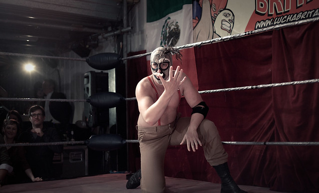
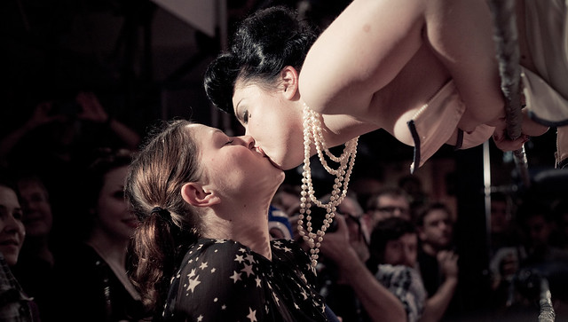
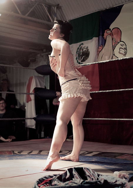
|
Jesus this is good. So good it is now my desktop at work, so thanks! Getting back into photography, been busy with work this past year or so and haven't had a chance to get out there. I'm doing a solo road trip at the end of December so I'd like to get better before then.  I'm still trying to get away from post processing as much as I did when I first started out, doing the "less is more" stance, but the photos always seem to boring to me. I'm guessing its just a crutch to cover lackluster photos. Edit: Is there any chance I could get a 1080P version of that photo? My screen isnt doing it justice sitting in the middle of a black background ")
|
 #
?
Oct 2, 2012 22:14
#
?
Oct 2, 2012 22:14
|
|


|

|
| # ? May 21, 2024 13:35 |
|
|
Casu Marzu, seconded on a desktop-sized photoblackmanjew posted:
For me, it's a good concept. I think your problem here is it looks like it was shot at high noon and it washes everything out a bit and "forces your hand" to work in some post-processing to enrich the photo. If you were to take this photo at dawn or dusk during the golden hour you already add a new element through the lighting of everything without having to think about what you would do in post. You like the photo you quoted, so even though it would take an extreme about of patience, an awesome sunset light could give the sky a nice color to fill in the blown out sky. 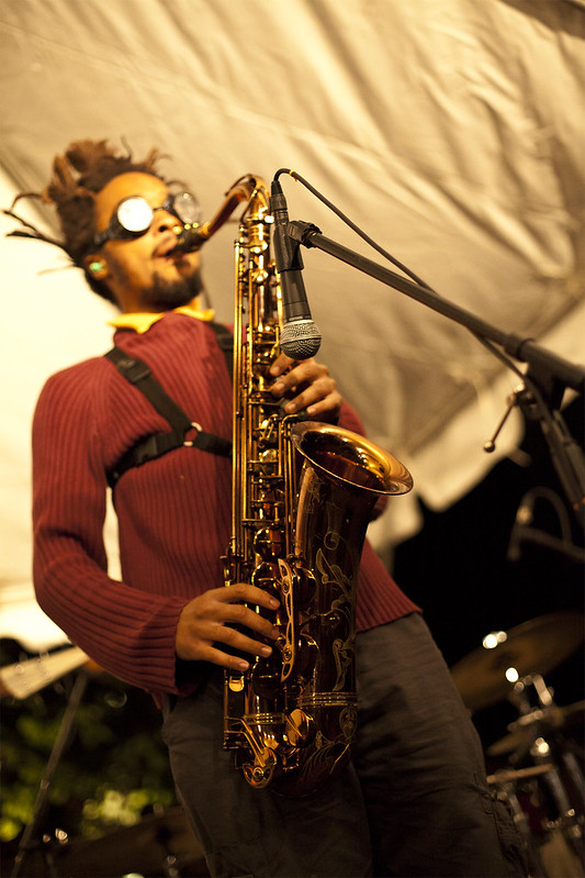 Jazz Sax by geeves, on Flickr
|
|
#
?
Oct 3, 2012 02:36
|
|

|
geeves posted:
|
|
#
?
Oct 3, 2012 04:52
|
|

|
blackmanjew posted:
Here's a 1080 version of that photo for you guys. I'm so glad you like it. I really was bummed out over my photos for a long time, and I'm finally getting back into the groove  Spime Wrangler posted:I've been trying to take pictures of the awesome foliage this fall, and am having a harder time than I expected. These are the only two I've liked so far, but there should be another week of great color before they go downhill. I really love how it feels like the trees are on fire in your photos. What time of day were you shooting at? I feel like they would benefit from shooting really early or really late. The sunlight is a bit too harsh and it's detracting from some of the textures you'd otherwise get from all the individual leaves. Also, maybe a step back or two to get more of the tree in frame would be rockin. Speaking of Autumn:   
|
|
#
?
Oct 3, 2012 06:32
|
|


|
The Eau Claire Dells are so identifiable. I shot an autumn wedding there several years ago--it was awesome. The first shot is very solid. Very bright and pleasing. The second I feel could use a bit more brightness in the midtones, but my work monitor is dark.
|
|
#
?
Oct 3, 2012 14:46
|
|
|
Casu Marzu posted:Here's a 1080 version of that photo for you guys. I'm so glad you like it. I really was bummed out over my photos for a long time, and I'm finally getting back into the groove Man, oh man, do I miss the Dells! I haven't been there in ages! It looks exactly as I remember it. Missy Higgins  Missy Higgins by Paul Frederiksen, on Flickr (USER WAS PUT ON PROBATION FOR THIS POST)
|
|
#
?
Oct 3, 2012 15:00
|
|

|
geeves posted:Casu Marzu, seconded on a desktop-sized photo Appreciate the criticism man. Love that picture by the way, the color on it is great. Was blurring the players head a conscious decision? Or did it just kind of happen that way? Taking your advice, I showed up to work earlier today (where the original picture was taken), but had to actually start working about 10 minutes before the sun came over the horizon. Never the less, I see what you are saying about high noon, as this shot was a lot more towards what I was looking for. 
|
|
#
?
Oct 3, 2012 15:57
|
|
|
Leviathor posted:The Eau Claire Dells are so identifiable. I shot an autumn wedding there several years ago--it was awesome. Pukestain Pal posted:Man, oh man, do I miss the Dells! I haven't been there in ages! It looks exactly as I remember it.  Yay, people know where I'm shooting! Yeah, I love this stretch of forest. There's something fantastic to shoot all year round here. Yay, people know where I'm shooting! Yeah, I love this stretch of forest. There's something fantastic to shoot all year round here.Also, it's probably my monitor, not yours. I'm processing on a Thinkpad with a screen that is slowly dying until I can afford to build a desktop. 
|
|
#
?
Oct 3, 2012 16:29
|
|
|
I'm going to assume this guy was about to snatch up some dinner. The curve of the neck, the straightness of the bill, and the absolute intensity of its eyes give me a feeling of anticipation. I think birds have pretty intense stares as is, but wow. ---  Thicket by pageod, on Flickr Pretty cloudy day, but I think I went a lil crazy with the burning. VVVV Thanks. It's in Wegerzyn Gardens in Dayton, OH. It's a woven wood installation by Patrick Dougherty. bakahentai fucked around with this message at 18:50 on Oct 3, 2012 |
|
#
?
Oct 3, 2012 18:33
|
|

|
bakahentai posted:I'm going to assume this guy was about to snatch up some dinner. The curve of the neck, the straightness of the bill, and the absolute intensity of its eyes give me a feeling of anticipation. I think birds have pretty intense stares as is, but wow. Holy crap you need to put someone (model/couple) in there! Where is that? Great work with the lightning/colors, it looks awesome. As for me... portraits!  IMG_7448 by avoyer, on Flickr and trying something different for a belly session:  IMG_7084 by avoyer, on Flickr
|
|
#
?
Oct 3, 2012 18:37
|
|

|
Leviathor posted:The Eau Claire Dells are so identifiable. I shot an autumn wedding there several years ago--it was awesome. I was going to post the same thing... Sometimes I miss central WI.. Sometimes.
|
|
#
?
Oct 3, 2012 21:52
|
|
|
As much as I wish I was elsewhere sometimes, I absolutely love Wisconsin. So many hidden areas just waiting to be photographed and outside of the metro areas, very under appreciated by photographers.quote:I'm going to assume this guy was about to snatch up some dinner. The curve of the neck, the straightness of the bill, and the absolute intensity of its eyes give me a feeling of anticipation. I think birds have pretty intense stares as is, but wow. Yeah the ponds are stocked with crawfish and he was hunting for an afternoon snack. Casu Marzu fucked around with this message at 22:12 on Oct 3, 2012 |
|
#
?
Oct 3, 2012 22:00
|
|
|
blackmanjew posted:Appreciate the criticism man. Love that picture by the way, the color on it is great. Was blurring the players head a conscious decision? Or did it just kind of happen that way? Thanks! Yes, I intentionally shot it like that. I took one of the entire band and it was kind of boring and really didn't capture the type of music they were playing so I got low and focused on the sax. quote:
It's better. I think it's still suffering from a boring / overcast sky. What direction does it face? One thing that's been helping me plan is an app my friend made called Sun Surveyor. It's been helping me plan when and when to shoot. It's worth the 6 bucks. Speaking of the sun, There was an absolutely gorgeous sunset tonight (I'm in Pittsburgh) and I missed it by being stuck on the bus. But it's all over facebook and instagram.
|
|
#
?
Oct 4, 2012 00:52
|
|
|
xenilk posted:
I normally cringe when it comes to maternity photos, but I think this is well done. Especially because you didn't photoshop a fetus into the womb along with clown fish. It takes great taste and subtlety to take a solid photo of a woman with a huge belly and make it look good. It's something simple and playful and shows (both with the ultrasound and the out of focus mother-to-be) without being overbearing. Anyone speak farsi?  farsi balls by geeves, on Flickr  SPACE Mirror by geeves, on Flickr geeves fucked around with this message at 02:10 on Oct 4, 2012 |
|
#
?
Oct 4, 2012 02:04
|
|
|
xenilk posted:and trying something different for a belly session: I think this works nicely, and I like your processing; after seeing so many poo poo bump shots in the bad photo thread and facebook this is a nice contrast. My wife saw this over my shoulder and was like "ooohh I wish we had done that" so you've got the mom POV vote as well. geeves posted:
Starting with the second photo, I think it's cool. What is going on there and what is up with the girl's glasses? I like that you are in the reflection, and the composition is simple and solid which works well to have the viewer looking all around the reflection. Part of me wishes that the dudes on the right weren't there blocking the screen thing but it's no biggie. The first photo - also wondering what this is, an art exhibit? I am not liking the shallow DoF and think that something else could have been done with all of that high contrast black and white, the repeating circular shapes and general strangeness/ambiguity of what it is that the view is looking at. As it is, the ball you have chosen to focus on doesn't really seem to have any special meaning or reason for being the sole in focus object, and although fun to look at in its own way I can't help but think that there is some other way to portray the scene that would be even more interesting. Agreed about the sky - it is a lot of negative space and doesn't really do anything for the scene. ------ Had a couple wedding gigs on the beach that I stayed afterwards to walk around and shoot, was hoping to get some feedback. I actually have about 6-7 I would like feedback on (it was so pretty there and I need to weigh in regarding if the pictures are good or if my memory is shading them) but will post the other batch later after there are some other pictures to critique. There are elements of each of these that I like but each also has something that makes me feel that it needs improvement, and I can't even put my finger on what it may be.  DSC09026.jpg by Paul Hofreiter, on Flickr  DSC09048.jpg by Paul Hofreiter, on Flickr 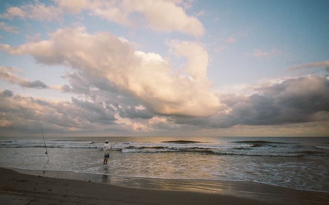 DSC09066.jpg by Paul Hofreiter, on Flickr
|
|
#
?
Oct 5, 2012 03:18
|
|

|
rio posted:Starting with the second photo, I think it's cool. What is going on there and what is up with the girl's glasses? I like that you are in the reflection, and the composition is simple and solid which works well to have the viewer looking all around the reflection. Part of me wishes that the dudes on the right weren't there blocking the screen thing but it's no biggie. Thanks for the feedback. The Farsi ping pong balls was an art installation. White walls with white balls and calligraphy. Brightly lit. See below for alternative shot. As for SPACE. This was a visual / sound / performance art installation. There was a constant jackhammer sound throughout the room (hence her headphones) that was pulsing and created a vibe of paranoia and claustrophobia. Aviator goggles just added to it. (After this photo, the girl crawled under the mirrored half-sphere and randomly pointed a laser from underneath in different directions). As for the guys on the left, one of them is my good friend (an immaculate photographer) and another friend talking about the newly purchased Fuji mirrorless camera. But I get why you might want them out of the frame. quote:Had a couple wedding gigs on the beach that I stayed afterwards to walk around and shoot, was hoping to get some feedback. I actually have about 6-7 I would like feedback on (it was so pretty there and I need to weigh in regarding if the pictures are good or if my memory is shading them) but will post the other batch later after there are some other pictures to critique. What beach is this? They are good and I like them. However for me, they feel a bit detached - that's not a bad thing. I just think as an alternative, what if they were more intimate and up close? Especially with the couple in the 2nd photo and the fisherman in the 3rd. As for the 1st photo, I wish there were no tire tracks or people just nice flat sand, contoured by water sand (maybe a set of footprints to break it up) - I know that's out of your control though. The light through the clouds is excellent. 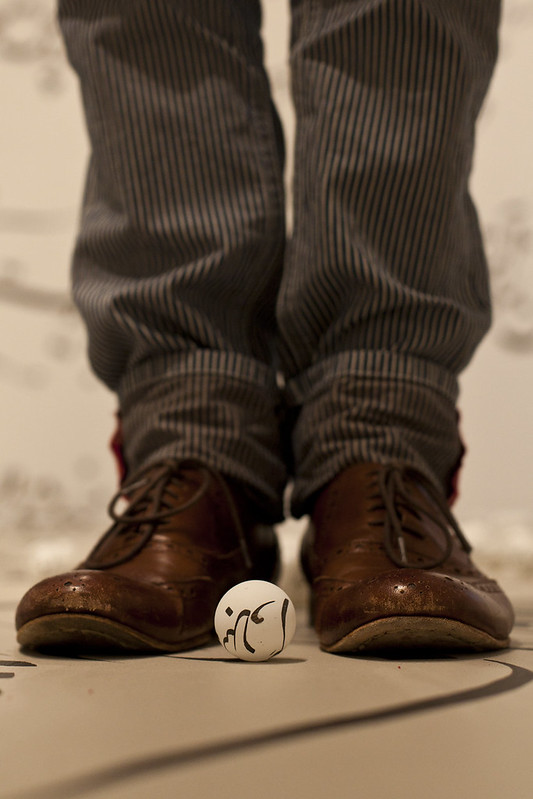 Farsi Shoes by geeves, on Flickr 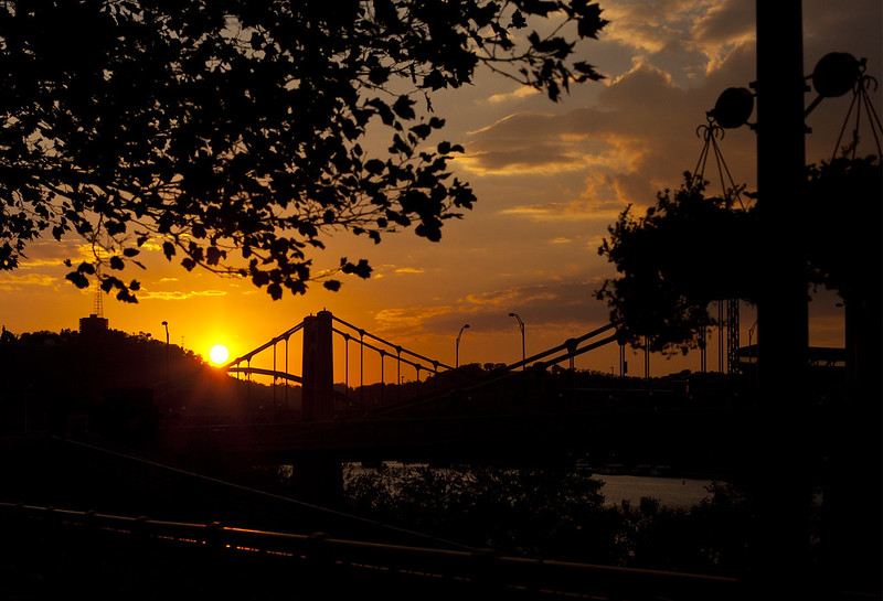 Clemente and 7th St Bridges by geeves, on Flickr
|
|
#
?
Oct 5, 2012 03:43
|
|
|
rio posted:
First one is awesome. The people, the god-rays, the buildings: the eye is just drawn along it very naturally. The second one, I wish the people were bigger, or above the horizon, although if this was printed up really big they'd probably be an ok size. Third - the dude fishing isn't really contrasting enough with his surroundings. If you'd taken it from a lower angle to have him mostly above the horizon it would be better. The clouds on this and the previous one are amazing looking and nicely exposed. geeves posted:
The first one is nicely composed, but I feel that it's using shallow-dof for the sake of it. Most of the picture is blurry with only the ball and the tips of the shoes in focus. This sort of composition would be better with everything in the foreground in focus. The second one I don't like at all. The sky is nice, but none of the foreground silhouetted stuff looks good - there's too much of it and no clear subject. The bridge merges with the planter and the trees in the background and doesn't pop out well. I think a lower angle to get more of the bridge against the sky would have been better.  275/366 - Hiver Nomade by fuglsnef, on Flickr 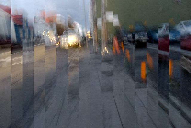 271/366 - Movement by fuglsnef, on Flickr  268/366 - Bird and Road by fuglsnef, on Flickr
|
|
#
?
Oct 5, 2012 14:05
|
|
|
David Pratt posted:
The shallow DoF was a result of one I posted earlier. This one, my friend just stepped right in front of me to get this exploitative shot while I was on the ground. More people were also starting to come in to the exhibit, so I didn't have time to get multiple shots, I didn't even change settings, just focused and got that one shot. Thanks for the feedback on the second. I haven't done many silhouette shots before. I have a couple other shots that I haven't gotten around to yet.
|
|
#
?
Oct 5, 2012 22:18
|
|
|
Sovi3t posted:The first one was an experiment with light, color, and perspective. I used pink for my face, and blue for the background. It was a new challenge to me to balance two light sources and gel them. I did use a tripod, gave some thought to the composition, and took a few dozen shots, so a snapshot was the last I was aiming for (though I was trying to create as stupid of a look as possible). Well, fair enough. You may have wanted to provide some context because it was not clear that you were using strobes and experimenting with light. I would not have said what I said if you put the photo in context. It looked like some gimmicky fisheye lens type of picture, from a camera positioned on your desk, and the lighting came from a desk lamp. But I appreciate working with strobes and experimenting with light -- silly expressions aside. That's not really relevant anyway. So I guess then, the fisheye adds an interesting an element and you were generally successful with the lights. I am not very good, personally, at gelling lights so my hat off to you for that. Despite what I said, I generally do not want to discourage people from taking pictures unless they are really taking pointless type of shots, (which is easy to do in the digital age), and when asked for criticism there's not a lot to offer. But this isn't that so my apologies on the initial reaction.
|
|
#
?
Oct 6, 2012 05:44
|
|
|
The Something Awful Forums > The Finer Arts > Creative Convention > The Dorkroom > Photo a Day: Wherein You Post a Photo, but only if it has a clear and preplanned point, or else.
|
|
#
?
Oct 6, 2012 06:13
|
|


|
Mr. Despair posted:The Something Awful Forums > The Finer Arts > Creative Convention > The Dorkroom > Photo a Day: Wherein You Post a Photo, but only if it has a clear and preplanned point, or else. Well, if you're posting something for criticism and it lacks any foresight or any real thinking, stern critique is not inappropriate. The purpose of this thread is to educate, I think. When I post something and receive critique, I take it into consideration and maybe I agree or maybe I don't. But I could learn from it, as I have often have done in the past. Different perspectives lend foresight that I may have missed. So if a photo is unclear in its intention or context, sometimes explaining does need to be done so that we're not mislead. But it's okay. We figured this one out. He was experimenting with lights (I didn't know this) and that was really the purpose of his posting the photo. It didn't appear that way, but now that I know that it makes a big difference. You know how it goes.
|
|
#
?
Oct 6, 2012 20:02
|
|
|
Mannequin posted:Well, fair enough. You may have wanted to provide some context because it was not clear that you were using strobes and experimenting with light. I would not have said what I said if you put the photo in context. It looked like some gimmicky fisheye lens type of picture, from a camera positioned on your desk, and the lighting came from a desk lamp. But I appreciate working with strobes and experimenting with light -- silly expressions aside. That's not really relevant anyway. No worries, mate! However, the lack of context was intentional. I was hoping for subjective critique, and didn't want to sway any feelings. geeves posted:
Interesting angle. I couldn't figure out if it was macro or just a large aperture. The one thing that bugs me is that the ball I look at first is out of focus while the ones surrounding it are sharp. For a quick snap, I think it turned out pretty good!
|
|
#
?
Oct 6, 2012 21:32
|
|
|
David Pratt posted:
I'm a sucker for weird abstract stuff like this. I love the first one, it takes what appears to be a boring picture and makes it something interesting to look at, my mind is seeing it as pieces of a puzzle and is trying to put the photo back together in my head. The last one, is it a manipulation or a double exposure? I'm guessing the latter, i like it. Honestly, the first one doesn't do much for me. Needs more context, i think.  
|
|
#
?
Oct 6, 2012 23:08
|
|

|
whereismyshoe posted:I'm a sucker for weird abstract stuff like this. I love the first one, it takes what appears to be a boring picture and makes it something interesting to look at, my mind is seeing it as pieces of a puzzle and is trying to put the photo back together in my head. The last one, is it a manipulation or a double exposure? I'm guessing the latter, i like it. Honestly, the first one doesn't do much for me. Needs more context, i think. I like the first one, the lightning and colors (I'm guessing film or some really neat post-process) is top notch. Second one is nice but doesn't strike a cord for me, but it's personal opinion since nothing is particularly bad with the picture itself except maybe the brand new car which clash a little bit with the old vibe of the signs. As for me... engagement pictures!  IMG_8562 by avoyer, on Flickr  IMG_8695 by avoyer, on Flickr  IMG_8807 by avoyer, on Flickr
|
|
#
?
Oct 8, 2012 04:44
|
|
|
xenilk posted:I like the first one, the lightning and colors (I'm guessing film or some really neat post-process) is top notch. I really like the first one and think the processing and color choice goes well with the feeling you were trying to achieve. For whatever reason, I feel like it would be nicer see a bit more of the guys head. I also feel like now that I've seen her teeth, being one of the brightest portions of the photo, it's the only thing I see. Her eyes are stunning though. I had to double take on the 2nd photo because at first glance the dogs bodies seemed to meld into each other at about chest level. The position of the woman in relation to the dogs, despite her leaning on one just seems kind of strange. I would also have liked to see it without the building directly behind the guys head. I like the idea of the last one but would have preferred that they been a bit closer if they were going to hold that pose since at that distance, being black and white, there midsections blend together. I'm cross posting a few from the low effort thread as I would like to get a serious critique on some of my first shots using a light box. I don't have a proper flash and ended up lighting this with natural light coming in from a nearby window and a cheap-o ring flash I layed on the top of the box.  IMG_9181.jpg by wildfoxmedia, on Flickr  IMG_9121.jpg by wildfoxmedia, on Flickr  IMG_9073.jpg by wildfoxmedia, on Flickr
|
|
#
?
Oct 8, 2012 06:07
|
|
|
WildFoxMedia posted:
Emptyquotin' as crit. This is nice as hell.
|
|
#
?
Oct 8, 2012 08:07
|
|


|
I really like the color treatment you've given these, it kind of has an old movie feel to it. I feel like with some more photos or a refinement in selection you could come up with a pretty awesome set that tells a storey.  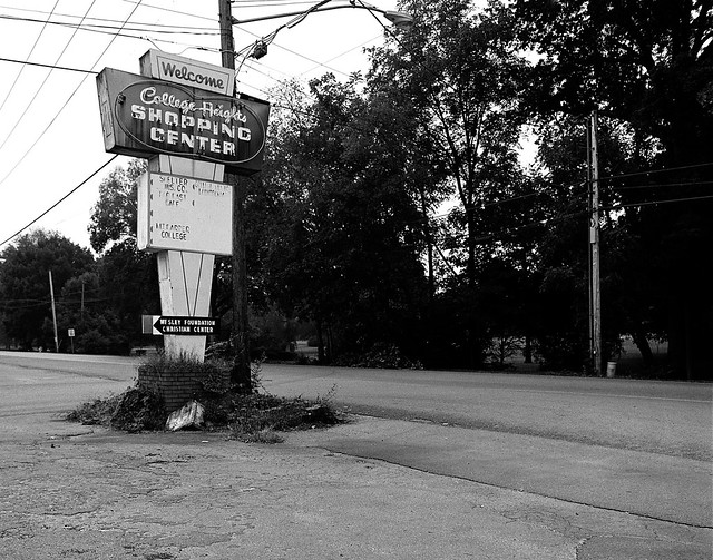
|
|
#
?
Oct 8, 2012 16:25
|
|

|
xenilk posted:I like the first one, the lightning and colors (I'm guessing film or some really neat post-process) is top notch. drat that is a great picture. The color and exposure on this are perfect. The only critic I would have is that you cut off the guys head a little too much. I took what you guys said about waiting for the golden hour, and snapped a picture looking in the opposite direction of my previous one. Still was a boring sky (lots of smoke in the air from forest fires), but I like it alot more over all.  edit: decided to up the exposure a bit.
|
|
#
?
Oct 8, 2012 19:16
|
|
|
blackmanjew posted:drat that is a great picture. The color and exposure on this are perfect. The only critic I would have is that you cut off the guys head a little too much. Thanks a lot! Here is the original  IMG_8562-Edit by avoyer, on Flickr and another crop:  IMG_8562-Orig by avoyer, on Flickr I think the last one is the best but I think the guy didn't like the picture because his ear was red, if I can tone that down I think I could sell them that one instead because I agree the square crop doesn't do it justice.
|
|
#
?
Oct 8, 2012 19:45
|
|
|
WildFoxMedia posted:
The contrast is pretty strong in the first one, maybe a little too strong. The composition is nice and it feels well balanced, but there isn't much of a subject that interests me. It feels like maybe this is part of a series on a town - is it? The second one also feels super contrasty, I'd like to see some more detail in the trees. Same feeling as the previous one regarding subject, it doesn't captivate me on its own but might make more sense as part of a larger whole.  278/366 - Geese by fuglsnef, on Flickr 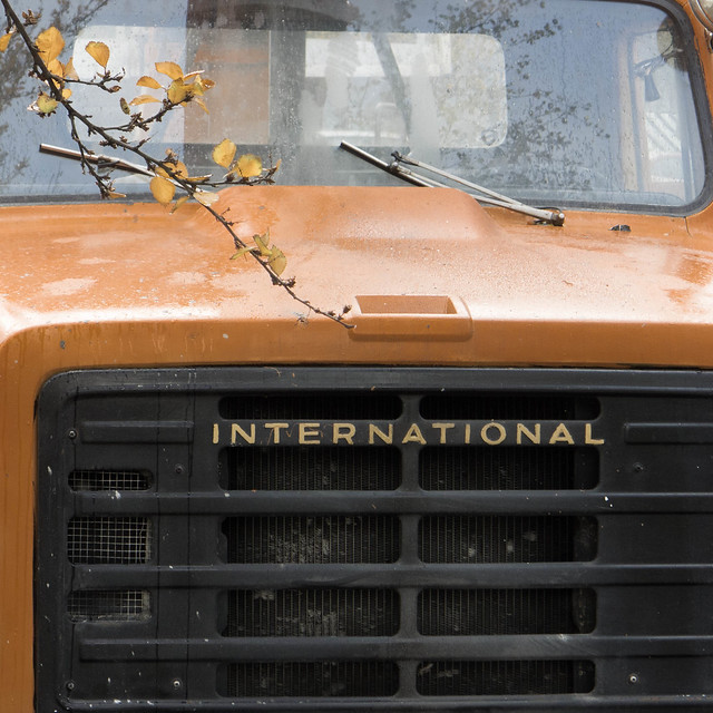 P1110746.jpg by fuglsnef, on Flickr  P1110764.jpg by fuglsnef, on Flickr
|
|
#
?
Oct 8, 2012 21:48
|
|
|
David Pratt posted:The contrast is pretty strong in the first one, maybe a little too strong. The composition is nice and it feels well balanced, but there isn't much of a subject that interests me. It feels like maybe this is part of a series on a town - is it? It's the start of a set I've been considering putting together, I should have written that when I posted the pictures. I was concerned that I had overdone the contrast but felt it worked, I'll try tweaking it some more. Thanks for you're input.
|
|
#
?
Oct 8, 2012 22:41
|
|
|
XTimmy posted:I'm a little exhausted so if this comes across as overly picky don't sweat it, but can you justify the split toning? To me it's just an afterthought to an interesting angle, and being one of those anti-instagram-assholes I can't help but call it out on the unnecessary post processing. Enjoying this immensely. Curious as to whether you did this in 1 heroic take or collaged later in photoshop? I am liking everything about this image except for the crop cutting off the hand on the right. Probably because it's something I do accidentally all the time but it does seem to work againt the image here, the dimensions seem a bit off as a result. Ineed I think it could stand to have and inch or 2 breathing room either side here. I have not posted in a while, because I have shot very little. These 3 are from last week. Intention was to shoot something for a club poster/flyer that's happening in a month with a vaguely halloweenish theme, so I was shooting (mostly) a little wider than I really needed to to allow for text surrounding. Objective 2 was to get some decent shots for the MUA's portfolio, and thirdly, some good ones for myself. The concept is more than a little tired but I was fairly eager to work with the model who did a drat good job despite the cold/filth/floor covered in feces etc. Actually finding it really hard to decide which ones I do and don't like out of the set, every time I cracked open lightroom after taking these I'd find myself unflagging old favs and selecting ones I'd previously rejected, which is unusual for me.  Living Dead Girl 8 by Shannow, on Flickr  Living Dead Girl 11 by Shannow, on Flickr  Living Dead Girl 16 by Shannow, on Flickr
|
|
#
?
Oct 9, 2012 00:17
|
|


|
David Pratt posted:
First shot: Nice, not too complicated but it draws the eye across the frame well and the exposure is spot on. Second shot: Not really feeling this one- the reflections in the glass are really distracting and the branch being slightly out of focus bugs me. I think this could have worked better if you had either backed up a bit to get the entire truck into the frame, or gotten closer to choose a specific component of the truck to shoot. Third shot: I love the textures in this one, not much to say other than that. 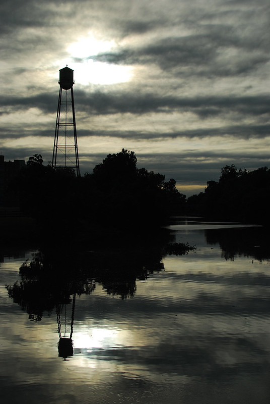 DSC_3169 by lwmyers, on Flickr  DSC_3146 by lwmyers, on Flickr
|
|
#
?
Oct 9, 2012 03:06
|
|


|
Augmented Dickey posted:
I like the silhouette in the top half of the photo - the water tower (?) is a nice feature and the reflections while slightly spoiled by the water movement are still nice and sharp. I think the photo might look nicer in B&W with a little more detail in the shadows but that could spoil the photo you had in mind. The same shot with a clear sky at sunrise or sunset would look excellent in my opinion. I like the second photo, the sign along with the muted colours give a nice derelict feel. I'm a little bit distracted by the tank in the bottom right though, my eye was drawn to the sign and then up the building by the windows but then back down to the tank. Maybe it's just me . Clover by cardboardpig, on Flickr I feel I might have gone too far with the sharpening on this one, and I'm not too sure I like the out of focus clover/grass in the foreground.
|
|
#
?
Oct 9, 2012 09:32
|
|

|
Love this one, the lightning and scene appeals to me. I dig the colors, nice processing. Don't really know why I like shots like these, maybe because it looks vintage? The idea seems so simple, but it looks very nice. It made me look up on how to do a double exposure using a Dslr, seems like I can't with my camera.  A little too noisy, but I liked the idea at the time.  I think the horizon is a little off, not sure if I shoulf fix it. 
|
|
#
?
Oct 9, 2012 14:38
|
|

|
El Laucha posted:The idea seems so simple, but it looks very nice. It made me look up on how to do a double exposure using a Dslr, seems like I can't with my camera. Triple exposure  . If you want to do it after-the-fact, you can import the photos as layers in your image editor of choice and set the blend mode to screen I think. Or multiply. Something like that . If you want to do it after-the-fact, you can import the photos as layers in your image editor of choice and set the blend mode to screen I think. Or multiply. Something like that ")
|
|
#
?
Oct 9, 2012 19:00
|
|
|
El Laucha posted:Love this one, the lightning and scene appeals to me. I dig the colors, nice processing. Don't really know why I like shots like these, maybe because it looks vintage? I like the first one. There's a sense of mystery and intrigue to it that makes it very compelling. I like the second one for the simplicity and natural beauty of it. Congratulations on those two. I think the last photo is one that I would consider, more or less, a "typical picture taken in a zoo." If you were in Antarctica and photographing polar bears in their natural habitat and captured something similar to this -- but in the snow and ice of the arctic, I would find it 1,000 times more interesting. But it's a picture from a zoo, which seems clear, so my interest wanes. I guess the composition is nice, I like the B&W transition, but at the end of the day it fails to impress. But keep in mind I'm a harsh critic and you may find others who like it.
|
|
#
?
Oct 10, 2012 04:23
|
|
|
xenilk posted:Thanks a lot! I think the original is the best -- (it's less in your face / more balanced) -- and it's easy to fix his ear. Use the clone stamp tool in Photoshop or content aware fill, if it doesn't go haywire on you.
|
|
#
?
Oct 10, 2012 04:28
|
|
|
ruro posted:
I agree about the processing, you've got some haloing going on with the flower. Would have been nice to get a higher angle on it so you have more in focus grass too. A tighter crop to get rid of some of the blurry grass can probably help too. Like, maybe even really tight, just the hoverfly and the flower maybe. That said I really like the idea.
|
|
#
?
Oct 10, 2012 05:13
|
|
|

|
| # ? May 21, 2024 13:35 |
|
|
Does this have anything going for it?
|
|
#
?
Oct 10, 2012 06:14
|
|