


|
Mathturbator posted:Does this have anything going for it? The square thing at the bottom left is really distracting and pulling my focus to the bottom of the frame. It's a really cool picture though. Good use of colour and shape. I'd almost want to play with the reflection to highlight the transition from balconies and windows at the bottom to the clarity of the sky's reflection at the top.
|
 #
?
Oct 10, 2012 06:22
#
?
Oct 10, 2012 06:22
|
|


|

|
| # ? May 11, 2024 16:59 |
|
|
Mathturbator posted:Does this have anything going for it? I think it's quite pretty. A bit red on my screen, though.
|
|
#
?
Oct 10, 2012 07:24
|
|

|
Mathturbator posted:Does this have anything going for it? It has a great loving deal going for it. I love your composition here. If there's an uncropped version with the tip of the building at the very top of the frame, I'd love to see it to see how it compares. David Pratt posted:
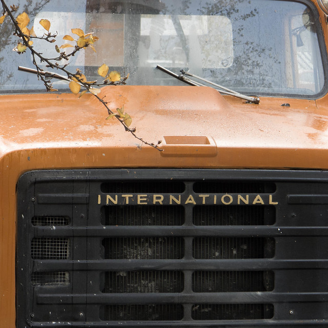
I like the idea you're going for here, but I'm not sure the execution works out as-is. I'd stand directly in front of the truck and go for some symmetry on the grille and with the hood scoop; you could use the branch to break the symmetry if you chose. This feels like it's tilted a little clockwise, and I'd crop it more towards a panoramic aspect ratio to get rid of some of the blank sky up top. It's pretty nice otherwise, though! 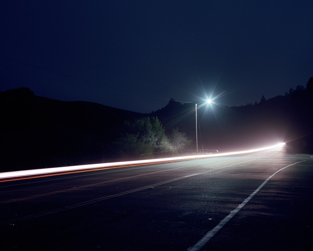 The Impression of Speed by atomicthumbs, on Flickr 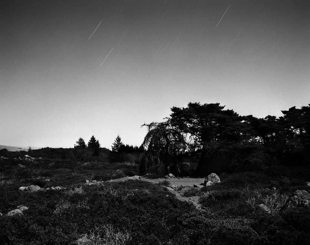 Chaparral Plains by atomicthumbs, on Flickr 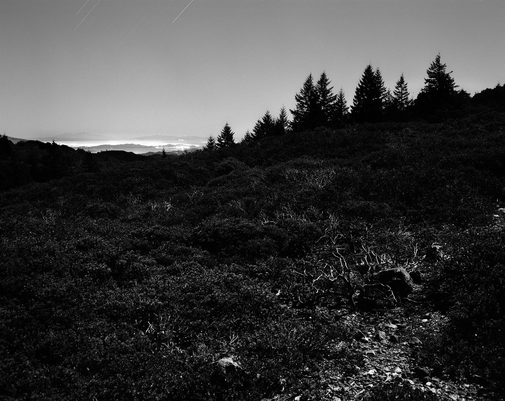 East Bay, North Bay by atomicthumbs, on Flickr
|
|
#
?
Oct 10, 2012 10:02
|
|


|
aliencowboy posted:The square thing at the bottom left is really distracting and pulling my focus to the bottom of the frame. It's a really cool picture though. Good use of colour and shape. I'd almost want to play with the reflection to highlight the transition from balconies and windows at the bottom to the clarity of the sky's reflection at the top. Thanks, I cloned that out. I'm not sure what you mean about the reflection?  Atomicthumbs, I've attached the almost-uncropped, original for your enjoyment ") Goes to show how much the color balance changes the image... It's got an ugly chimney right on top, which I've just cropped out here, but it could easily be removed in post. Goes to show how much the color balance changes the image... It's got an ugly chimney right on top, which I've just cropped out here, but it could easily be removed in post.I like the very tight crop better, because you get so close to the apartments that you can't help but wonder about the people living there (at least when I look at the high-res image...). When the top is included you get that much further away. What do you think? 
|
|
#
?
Oct 10, 2012 21:27
|
|
|
Mathturbator posted:Atomicthumbs, I've attached the almost-uncropped, original for your enjoyment I actually like the cropped one better. I guess the horizontal lines in the apartment mesh better with the whole image than topping it with a curve does.
|
|
#
?
Oct 11, 2012 01:16
|
|
|
Augmented Dickey posted:
I really love the setting and what you had to work with, I wish the bright spot wasn't quite so bright and harsh, it's the one rough edge on something that is so smooth and tranquil in all other aspects. Even the ripples in the water don't bother me, although I agree that you should try and get a similar shot on a still day to see what calm water does for the image. I'm cross-posting these from the low-effort thread and I'll get rid of them there, in case this isn't kosher. It's time to wade in a little deeper. 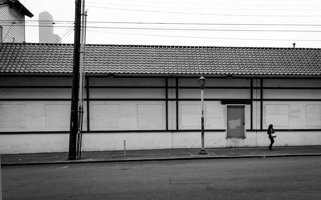 linear by Trip Sixes, on Flickr 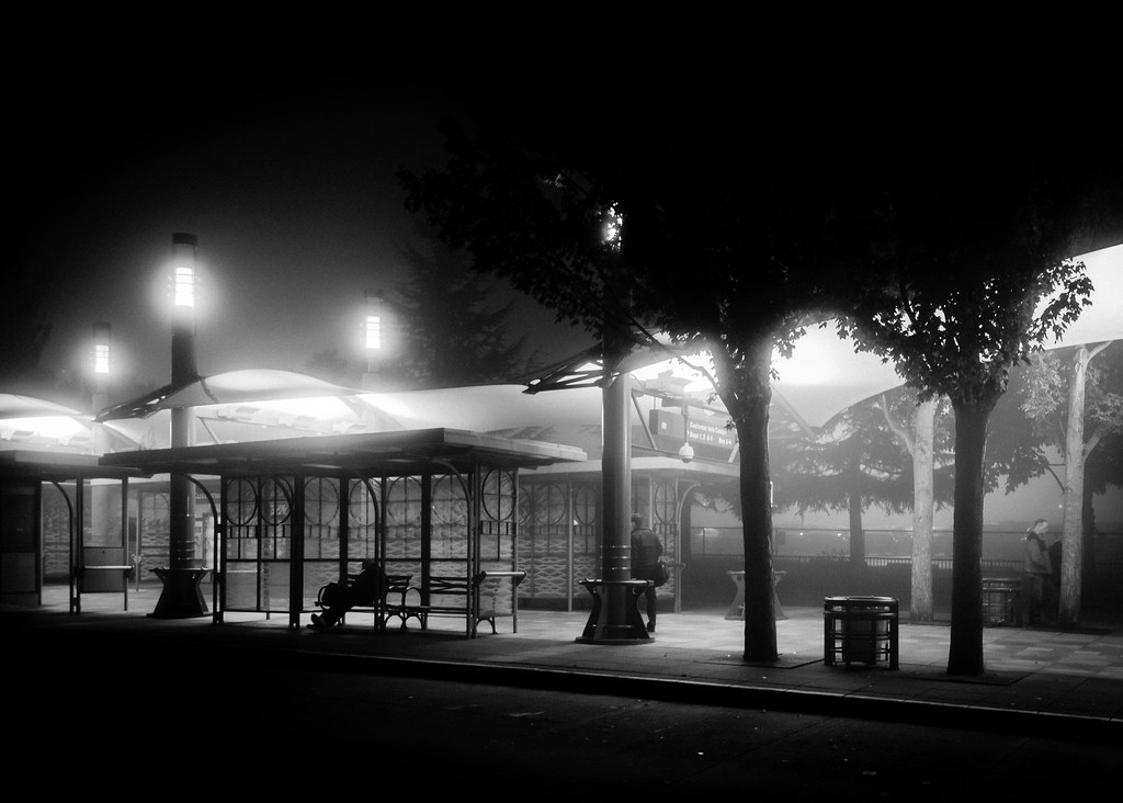 shift's end by Trip Sixes, on Flickr
|
|
#
?
Oct 11, 2012 04:35
|
|
|
Mathturbator posted:Thanks, I cloned that out. I'm not sure what you mean about the reflection?  I don't really know how to say it, but I was thinking something like this, where the light of the reflection is clearly defined against the shadows of the interior. I didn't notice this until I opened the file, but there's a person sitting at their desk mid-frame, it's a really cool detail and gives some context beyond it just being an architectural shot. Maybe find a way to crop the image to play it up?
|
|
#
?
Oct 11, 2012 06:08
|
|
|
krackmonkey posted:
Hardly worth mentioning but I think the only thing I would have changed is I would have waited for the two standing men to leave and just taken the shot with the person sitting on the bench if possible.
|
|
#
?
Oct 11, 2012 08:53
|
|
|
Mathturbator posted:Does this have anything going for it? It most certainly does. Great composition, great light. There are slight distractions but it's a strong picture. It looks good. Nice work!
|
|
#
?
Oct 12, 2012 01:45
|
|
|
Hope this isn't creepy or off base, but I had two of your pictures printed to hang up in my room. Let me know if I can toss some bones or a forums upgrades at you! 
|
|
#
?
Oct 13, 2012 20:18
|
|


|
blackmanjew posted:Hope this isn't creepy or off base, but I had two of your pictures printed to hang up in my room. Those turned out great, awesome photos too. 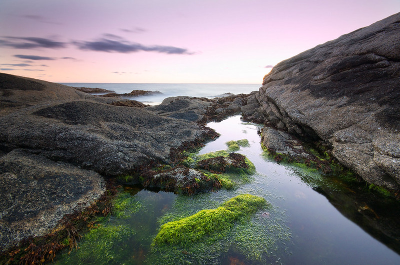 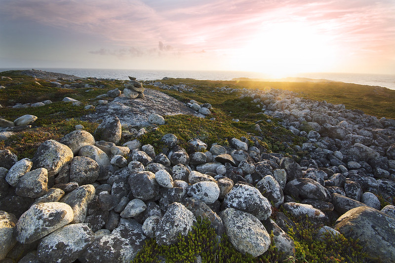 whaam fucked around with this message at 00:11 on Oct 16, 2012 |
|
#
?
Oct 15, 2012 15:46
|
|
|
^^^ I really like both of those. Unlike a lot of landscape photos, there's a lot of little things going on that really make me want to blow the photos up and look around for a while. The vivid green from the seaweed in the first and the awesome texture you picked up on the rocks in the second really make the photos.blackmanjew posted:Hope this isn't creepy or off base, but I had two of your pictures printed to hang up in my room. Oh man, those turned out great. You have better prints of my stuff than I do now! I'm good, I'm just glad someone else appreciated my photos enough to pay money and print them out to hang. The theme lately has been fog: 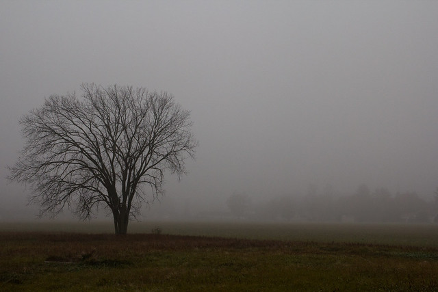 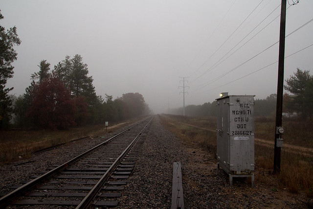  Casu Marzu fucked around with this message at 08:29 on Oct 18, 2012 |
|
#
?
Oct 18, 2012 05:24
|
|

|
whaam posted:Those turned out great, awesome photos too. Love your post processing on those pictures. Usually not a fan of landscape as well but those are top notch. As for me... it's Fall which translates into family pictures crazyness  IMG_9196 by avoyer, on Flickr  615880_445462192171339_506194081_o by avoyer, on Flickr
|
|
#
?
Oct 18, 2012 14:34
|
|

|
Casu Marzu posted:^^^ I really like both of those. Unlike a lot of landscape photos, there's a lot of little things going on that really make me want to blow the photos up and look around for a while. The vivid green from the seaweed in the first and the awesome texture you picked up on the rocks in the second really make the photos. Not a fan of the first one, seems darker than it needs to be to me. The second one is quite nice (although probably a bit clich�, but whatever, it works real nice with the fog). The third one really stands out of the three though. Very dark and foreboding. I like it. I shot some landscapes after my shift earlier this week. 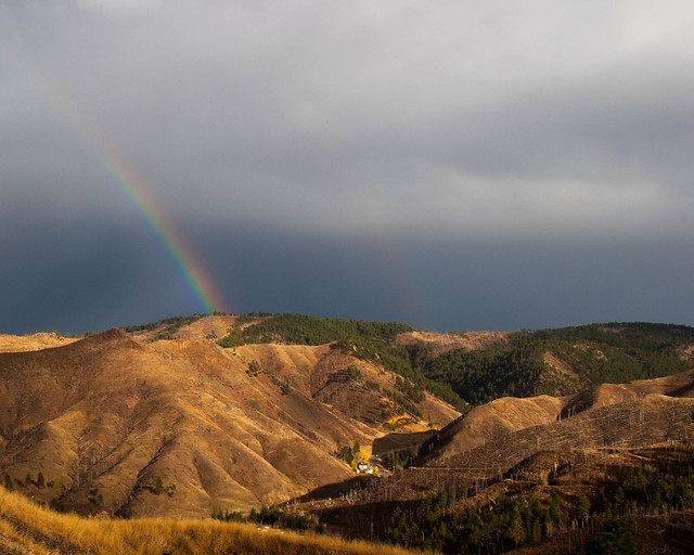 Double Rainbow by MrDespair, on Flickr 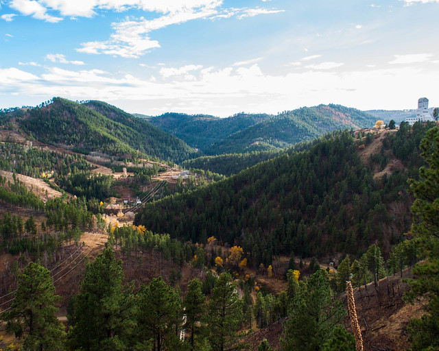 DSC_0454.jpg by MrDespair, on Flickr 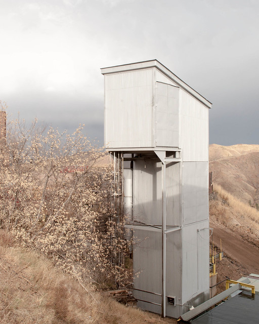 DSC_0452.jpg by MrDespair, on Flickr
|
|
#
?
Oct 18, 2012 16:43
|
|


|
Mr. Despair posted:Not a fan of the first one, seems darker than it needs to be to me. The second one is quite nice (although probably a bit clich�, but whatever, it works real nice with the fog). Yeah, that first shot I need to reprocess. My monitor is a bit wonky so I usually process what I think is nice, and usually have to correct later on again. :/ I love that third shot. I've been past that building a couple times a week for the last year and I've been hoping for a great foggy day exactly like that one. I really like the first one. The rainbows are nice. I wish there was a bit more of the foreground in the picture though. I think it would give a bit more sense of scale to the background.
|
|
#
?
Oct 18, 2012 16:51
|
|
|
xenilk posted:
This is a beautiful photo. The editing on it works perfectly. You should be really proud of it. I wouldn't change anything about it.
|
|
#
?
Oct 18, 2012 20:31
|
|

|
Pukestain Pal posted:This is a beautiful photo. The editing on it works perfectly. You should be really proud of it. I wouldn't change anything about it. Seconding that, really stands out. Got a new body and can't stop shooting, sorry for spamming PAD. 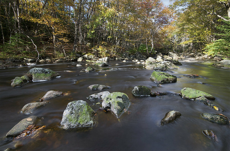 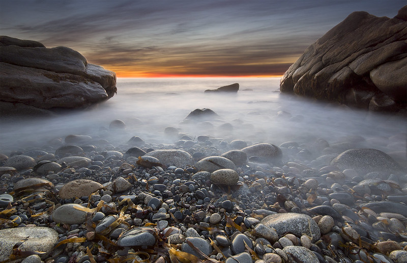 (USER WAS PUT ON PROBATION FOR THIS POST)
|
|
#
?
Oct 19, 2012 02:23
|
|
|
Absolutlely love the symmetry on this shot. Fantastic job. More like this! These are some shots from my trip to Barcelona/Paris over the last ten days. Still waiting on the lab for the more composed medium format stuff.  Mediterranean Gaze. by Scott LaChapelle, on Flickr  Ducks in a Row. by Scott LaChapelle, on Flickr  Weathered Sailor. by Scott LaChapelle, on Flickr
|
|
#
?
Oct 19, 2012 14:30
|
|

|
scotty posted:
I really like this shot; the parallel lines between the door/windows/girl contrast really well against the angle of the sidewalk. scotty posted:
I want to love this shot, but it just seems like the subject is too close to dead center to really make it work. The bit of black on the bottom left corner is also a little distracting, maybe try cropping it out?  DSC_3401 by lwmyers, on Flickr  DSC_3433 by lwmyers, on Flickr Bouillon Rube fucked around with this message at 19:22 on Oct 20, 2012 |
|
#
?
Oct 20, 2012 19:20
|
|


|
scotty posted:
Would have liked a lower angle on this one, so we could follow his gaze out to sea. quote:
This is great!
|
|
#
?
Oct 21, 2012 07:46
|
|


|
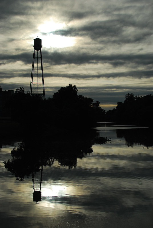
So first post in this thread, still catching up on looking through the pictures for composition ideas and so on. I'll talk about a couple of my photos rather than critique others at this point since it has just crossed a week of buying and owning my camera, more controls than a point and shoot! The first picture I've tried to frame using the tree and another headstone, not quite sure if it has worked. Haven't done much post work to the image other than auto tone to try and pull a bit more detail from the shadows but I guess the lighter areas are still blown out a lot more than they ought to be. Not sure how I like the subject in the centre of the image, feels like I should go back and try a different vantage point, since it doesn't really "pop" and that is what I wanted to be the focal point of the whole thing.  DSCF0468.jpg by GreyishOrange, on Flickr Second image could have done with better something (oh god, I'm not quite sure what I mean by this yet) and not having the blown out bit to the left, but at this point I was carrying the weeks shopping home so didn't have a chance to re-frame really.  DSCF0782.jpg by GreyishOrange, on Flickr Trying to constantly improve and the camera is always on me now.
|
|
#
?
Oct 22, 2012 00:34
|
|

|
Greyish Orange posted:
You hit the nail on the head about the subject being in the centre. It really doesn't work. The lighting over it is also very flat. If you were able to take this photo at a time of day when the sun filters through the trees and lights up the subject it would work a lot better. quote:
Apart from the blown-out corner, the lighting is nice. It has a nice gradient. The DOF has a nice feel too, the background blur works well. It's kind of hard to tell what the subject is though. It looks like some kind of dead rodent but at first glance I mistook it for some kind of debris, and like your other shot, it doesn't really pop. I think this is partly because it's not quite in focus and party because it's mostly in a darker part of the photo. While the lighting and DOF give the scene a nice moody feel, the subject itself isn't really benefiting from it.
|
|
#
?
Oct 22, 2012 01:00
|
|
|
atomicthumbs posted:
I really love these two. I love how they have enough contrast to make me wonder if at first it's just a really contrasty day shot, then notice the star trails in the sky and realise it's a night shot. The black and white was an awesome choice for these. I really love the misty/glowing city in the top left of the second picture. The first shot of the road and car trails you posted is nice, but I feel like I've seen it so often it doesn't do much for me anymore. But those last ones are really awesome. ------------------- I did this shoot in June, and I've been sitting on it since then, barely touching it because I actually really ended up hating it in the end. I think my biggest issue was that I tried shooting in daylight when I wanted a darker look to them, and then struggling to get that feel in post was a mistake. I also feel like I staged it way too much, and it just came out feeling really cheap. I wanted to post them anyway so that I could get some feedback on what else I could change and how they look to other people. I feel like this shoot was a failure, but I also learned a ton from it so I guess it's not a complete write off. Here are 3 from it:  IMG_2956-2 by Breanne Unger, on Flickr  IMG_3119 by Breanne Unger, on Flickr This is the only one I'm decently happy with:  IMG_3145 by Breanne Unger, on Flickr
|
|
#
?
Oct 22, 2012 04:41
|
|

|
CarrotFlowers posted:
My only nitpick is in the last one, and it's the vertical row of cups, etc... on the right side of the frame, I feel like they frame in the subject too much instead of hinting that there is a continuance of the world you're creating outside of the image area. If that makes any sense? Back on the subject of second-guessing myself - here's a cross-post from the low-effort thread- although I did put more than low effort into them, and I had to chase spotty light breaks mere minutes before a torrential downpour to get these shots. The spot I wanted on a bridge lower and slightly right from my vantage point was already camped in by a few other more "serious" photogs with big white lenses. This left me opting for the higher point and having to integrate the brush I had to deal with as a result. The bottom one had me smacking myself in the head that I didn't manage to get the foreground tree in sharper focus along with everything else. I've made this mistake a couple of times now and it's kept what could have been much better shots from really hitting the mark. I include it as my public shaming, in the hopes it helps me remember to avoid this in the future.  cloudbreak by Trip Sixes, on Flickr  briefly illuminated by Trip Sixes, on Flickr krackmonkey fucked around with this message at 05:10 on Oct 22, 2012 |
|
#
?
Oct 22, 2012 05:00
|
|
|
krackmonkey posted:Of the 3, the last 2 are by far the strongest images. I can see why you may be unhappy with them, but I honestly feel like if you hadn't prefaced the pictures with your explanation, there would be a fair amount of people who would never guess that you weren't happy with the outcome. I second guess pretty much everything I do, and I am always surprised at what people like from my stuff versus the things I find strongest or better. It's tough to be critical of yourself, and the common approach is usually to be far less fair on yourself than you would be on others. I dig the first one. No complaints there. The second one I'm not as big of a fan of. The tree is just blocking too much of the buildings, and the buildings just seem more interesting to me. 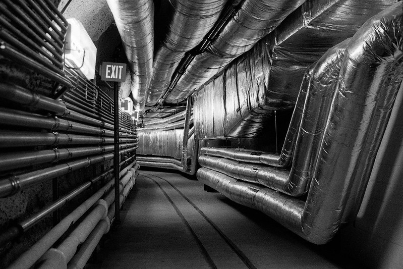 hp5021.jpg by MrDespair, on Flickr 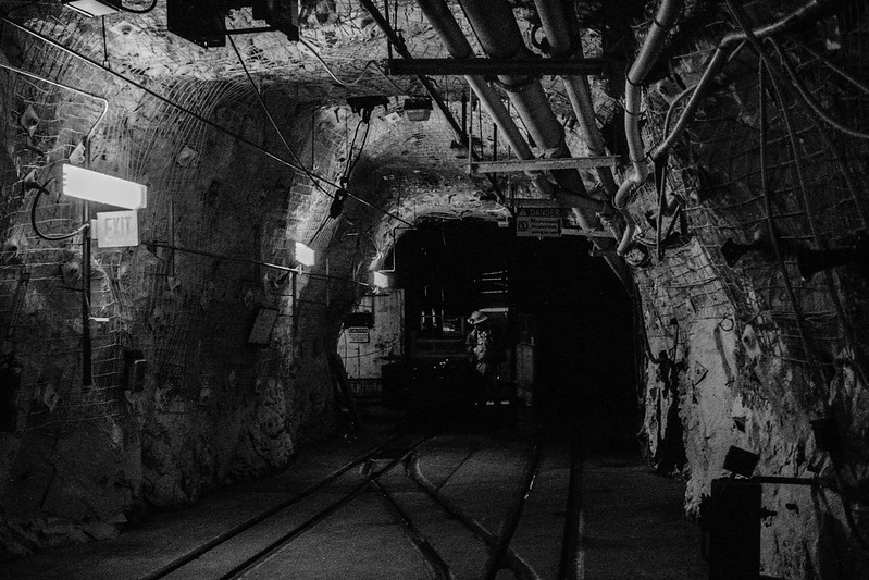 hp5036.jpg by MrDespair, on Flickr
|
|
#
?
Oct 22, 2012 05:54
|
|
|
This is a very impressive shot. The richness of color, the mist, the nice contrast. The processing gives it almost a super-reality, it's more real than real. The mist and the use of that ND filter makes the scene look super quiet and still. 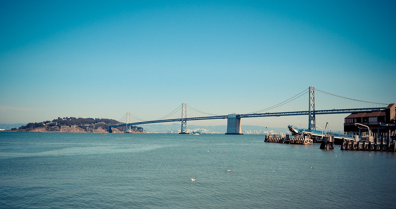 SF (13 of 28) by jpitha, on Flickr I'll admit it. I like that old-timey preset too much. I'm not good enough of a post-processor to get anything else I like out of the photos I take. Is there any decent online classes or modules or things about post processing in Lightroom? I feel like I bought software that I don't know how to use properly because "that's what you use to process your photos"
|
|
#
?
Oct 22, 2012 19:05
|
|


|
Shampoo posted:This is a very impressive shot. The richness of color, the mist, the nice contrast. The processing gives it almost a super-reality, it's more real than real. The mist and the use of that ND filter makes the scene look super quiet and still. This just isn't doing it for me. It's all over the place. My eye doesn't settle on anything. Your eye should usually be lead to a point in the photo. It might do better with more of the left side cropped.
|
|
#
?
Oct 22, 2012 20:00
|
|
|
Pukestain Pal posted:This just isn't doing it for me. It's all over the place. My eye doesn't settle on anything. Your eye should usually be lead to a point in the photo. It might do better with more of the left side cropped. I wondered about that. I chose to keep the whole island in the shot just so that it wasn't cut off. I'll crop again tonight and see how it looks.
|
|
#
?
Oct 22, 2012 20:43
|
|
|
Shampoo posted:I wondered about that. I chose to keep the whole island in the shot just so that it wasn't cut off. I'll crop again tonight and see how it looks. I'd say definitely crop past the white building on the left, it catches the eye. The wide aspect ratio does suit the composition though. krackmonkey posted:
I really dig this. Have you tried cropping it slightly wider to the right? I feel like the difference in angle between the taller building and the frame is a little distracting, but I'm not sure if that can be helped. Great shot though.  I did some shooting in Egypt earlier this year, and I've been fiddling with this shot for the last few days. I like the composition, but I'm having a hell of a time getting the tones on the minaret where I'd like them. Not sure if I should just move on or not. Shiruan fucked around with this message at 00:15 on Oct 23, 2012 |
|
#
?
Oct 23, 2012 00:12
|
|
|
krackmonkey posted:
The first one's great, but the composition on the second one isn't very good. I'd have taken a couple of steps to the left to get the tree more to the right of the frame, or gone lower to make the branches frame the tops of the buildings. Mr. Despair posted:
These are fantastic, great composition, lovely tonal range especially in the first one. The first could do with a human subject, probably standing at the end of the tunnel, and the second could do with more empahsis on its subject, perhaps by using a well-concealed strobe up in the pipes. Shampoo posted:
The colours are nice. The composition is boring though - bridges are done to death and you really need to think about making it look interesting and fresh if they're going to be your subject. The vignette is a bit over done, and looks quite artificial (I'm guessing it is since you mentioned Lightroom). Speaking of Lightroom, Adobe have a fairly decent online tv station with a channel specific to Lightroom: http://tv.adobe.com/product/lightroom/ I recommend Julieanne Kost's videos, she usually says which keyboard shortcuts she's using as she goes through the tutorials which is really helpful. 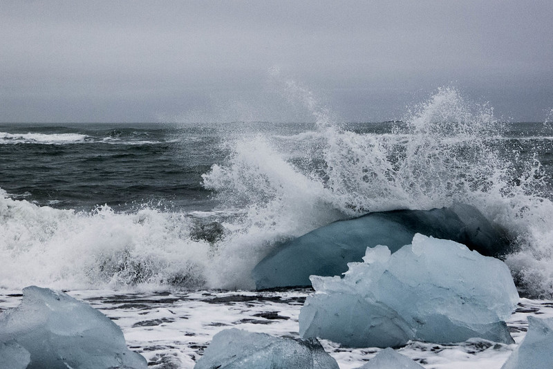 286/366 - Icebergs on the Beach by fuglsnef, on Flickr  295/366 - Slitscan Experiment Five by fuglsnef, on Flickr 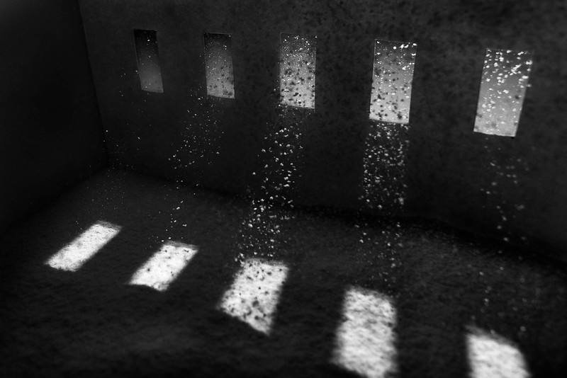 296/366 - Beams by fuglsnef, on Flickr
|
|
#
?
Oct 23, 2012 00:15
|
|
|
This falls outside of the purview of Photo a Day, but I cropped and reprocessed that photo: SanFran (13 of 28) by jpitha, on Flickr Shiruan posted:
I don't think so. I like the otherworldly look the darker tones give it. Anything I suppose you could mask the sky out and boost the exposure of the bottom a little, but I think that might just make it look artificial.
|
|
#
?
Oct 23, 2012 01:21
|
|
|
Shampoo posted:This falls outside of the purview of Photo a Day, but I cropped and reprocessed that photo: I think it's better, but the photo just isn't all that interesting. It is getting to the point where the 'interestingness' is being forced, which you don't want.
|
|
#
?
Oct 23, 2012 01:58
|
|
|
Pukestain Pal posted:I think it's better, but the photo just isn't all that interesting. It is getting to the point where the 'interestingness' is being forced, which you don't want. Fair enough, it's just a bridge.
|
|
#
?
Oct 23, 2012 02:06
|
|
|
quote:
CarrotFlowers Great concept, very much like the idea, but to echo the other comments the first one doesn't seem to fit with the feel of the other two. The second and third ask a lot of questions and work very well, the first one just comes across as a bemused girl in the woods. Stepped out of my comfort zone for these, heavily inspired by an article I was reading on Gursky's Rhine II   (img host is a free thing because imgur is beings lovely to me)
|
|
#
?
Oct 23, 2012 19:44
|
|
|
David Pratt posted:
I would like to see the structure continue out of frame left. Great concept.
|
|
#
?
Oct 23, 2012 20:39
|
|
|
I love the colours in this image, I always have trouble getting the sky not overexposed or the land underexposed when taking images on that kind of day. If you could see the pole from the life saver it would be a much more pleasing image to my eye, but I'm new to this!  Hair Cut? by GreyishOrange, on Flickr I feel the green sign takes the eye way to far from the point of the image, may be another one to go back to when it isn't an overcast/foggy day I guess.
|
|
#
?
Oct 24, 2012 00:05
|
|
|
TomR posted:I would like to see the structure continue out of frame left. Great concept. Good point. Next time I'm going to build a bigger model and use icing sugar instead of flour. Unless anyone knows a finer material?
|
|
#
?
Oct 24, 2012 00:30
|
|
|
If you have icing sugar dust in the air it's hard to see, but it will show up with a flash very well. You don't need any of the actual sugar falling.
|
|
#
?
Oct 24, 2012 01:00
|
|
|
I like the composition of this, but maybe try bringing out the texture in the trees a little. Some more contrast between the pillbox and the trees might help too. But yeah, really pleasant shot. Shampoo posted:
Yeah, I've already pushed it quite a bit. Any more and it just gets muddy. Here's a version with less dodging, which I like in its own way. I'm going to print one off once I get my printer back up and running, I'm hoping it comes across better in the flesh. In any case, here're a couple shots from a recent trip back home. The second's kinda' a glorified snapshot, but I like it for some reason.  
I am actually a man from Nantucket. It blows. Shiruan fucked around with this message at 02:57 on Oct 24, 2012 |
|
#
?
Oct 24, 2012 01:36
|
|
|

|
| # ? May 11, 2024 16:59 |
|
|
AceClown posted:
I'd be curious to read that article if you wouldn't mind linking it. What was it that you were taking from the Rhine II into these pictures? I think that not knowing that all I can do is superficially compare and maybe guess - obviously the first picture is the easier to compare. I think I might like to see this bigger but as it is from imgur, the red object seems more like a curiosity than a contrasting feature from the landscape or subject of attention. In a minimal picture it is easy to nitpick, so it is also worth mentioning that the grass on the right doesn't really seem to help the image - that loss of the sharp line that is drawn across the frame is unfortunate. The sky is nice. I don't know if that elevates the photo though - the things that I like personally about pictures like Rhine II are interesting minimalistic patterns that emerge, movement and texture. I see the movement coming from the way that the clouds are framed, and the colors are pleasing but I'm not getting anything patternistic and the textures are one dimensional. I don't even know how much I would be nitpicking these things if you hadn't mentioned Rhine II. I like the second picture. Again I would have liked to see it bigger to really take it in, but based on what is here it has a lot more going on for it. The autumn colors are always an nice contrast vs. the blue sky - I don't know if I am calling this accurately but did you heavily squash the highlights of the trees? It kind of has that look but again at this size it is hard to tell. There is something wonky about the tones that I can't put my finger on; maybe I am imagining it. But I do like the picture. The one fluffy cloud is nice and serendipitous. David Pratt posted:
These all are great. What is going on with the second picture out of curiosity? Mr. Despair posted:
Like these a lot too, particularly the first one. I would print and hang it. Are these film? ----- I did a practice shoot with some friends of my wife and their new baby a couple days ago. I posted them all in the portrait thread with some questions and specifics but I wanted to post my 3 favorites here for any feedback you all might have judging them both as individual photos and if you were to view them as a product intended for a family who had hired a family photographer. 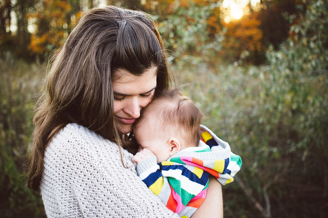 DSC09851-Edit by Paul Hofreiter, on Flickr  DSC09777-Edit by Paul Hofreiter, on Flickr  DSC09784-Edit by Paul Hofreiter, on Flickr
|
|
#
?
Oct 24, 2012 02:56
|
|
