|
Nail him with a can of matte spray paint, problem solved. 
|
 #
?
Nov 2, 2012 14:26
#
?
Nov 2, 2012 14:26
|
|


|

|
| # ? May 21, 2024 14:17 |
|
|
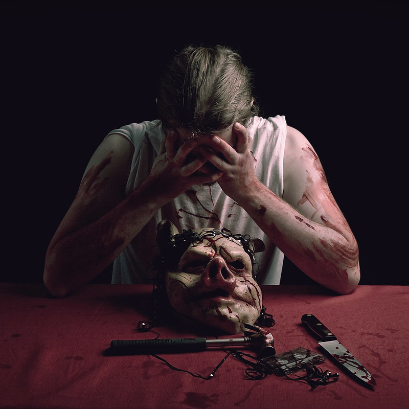
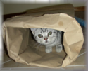
David Pratt posted:Yeah, it's a little white plastic dude painted black with a CD marker. Need to figure out a way to make him more matte, as the highlights are really giving away the scale and I wanted it to be as ambiguous as possible. I like the highlights. Perhaps try adding some texture to him..like some fake hair, rough up the pants with some sandpaper, etc.
|
|
#
?
Nov 2, 2012 17:47
|
|

|
Mathturbator posted:I have no idea why I love this picture so much... But I do! I have to say I love it too, something about the scale of where she is, reminds me of the scene in 127 hours when the guy is finally escaping his dire situation and here is this girl just whimsically strolling around a similar scene. Pukestain Pal posted:Photo I took in Maine this summer that I'm pretty proud of. It was taken during the blue hour just after sunset. Wow Maine and Nova Scotia look a lot alike. I like the composition here and as much as I hate to suggest a "gimmick crop" I think a really tight and wide crop just above and below the treeline and its reflection would be great. Its funny I think the shot wouldn't be nearly as strong without that warm light coming from the house, it really makes me feel cozy just looking at it and I'm imagining what it would be like to live there instead of just an arbitrary house shot.  (Side apology to dorkroom, got probated last week for not critiquing in this thread, been away from the forum for a long time and got confused about the SAD/PAD changes, should have read OP) whaam fucked around with this message at 00:14 on Nov 4, 2012 |
|
#
?
Nov 3, 2012 15:45
|
|


|
whaam posted:Wow Maine and Nova Scotia look a lot alike. I like the composition here and as much as I hate to suggest a "gimmick crop" I think a really tight and wide crop just above and below the treeline and its reflection would be great. Its funny I think the shot wouldn't be nearly as strong without that warm light coming from the house, it really makes me feel cozy just looking at it and I'm imagining what it would be like to live there instead of just an arbitrary house shot. The warm light of the cabin is why I love the shot so much. I actually dodged the house and light a bit to bring help bring it out.
|
|
#
?
Nov 3, 2012 15:54
|
|
|
rio posted:This owns. It it an action figure? Thank you for the kind words guys. These are all shot on film, and I've done no color adjusting or anything like that. The shot of the clock I edited the contrast because the guy who scanned the film did a horrible job and they all came out like poo poo. This was one of the only ones salvageable. I actually did straighten the first shot (if you look at the number twelve on the clock it's pretty straight) but I didn't spend much time on getting it perfect, mostly because I don't like the idea of heavily editing pictures. Probably stupid and stubborn but I don't obsess over those things. I would have rather shot that proper in the first place, I wish I took more time on it, and I don't remember what the hell that beam was. Honestly composing any shot when I was in Paris was difficult, I couldn't calm the gently caress down. The vignetting on the second shot was natural, and it has no crop. Through the viewfinder of my camera, the pole all the way to the left's reflection didn't extend that far. I kind of like the fact it came out that way though. Thank you again for all the kind words. -- Mathturbator posted:I have no idea why I love this picture so much... But I do! This is beautiful, and I must have missed it when it was posted, but just saw whaam's post. Beautiful colors. I would love to see a shot of her walking further away from you if you have it, I think it would give that feeling of being completely engulfed.
|
|
#
?
Nov 5, 2012 03:58
|
|

|
Gazmachine posted:So a game called Hotline: Miami came out recently. I made some images for the hell of it. It quit raining for a couple of hours today, so I went in search of fall colors  _B040059.jpg by Trip Sixes, on Flickr 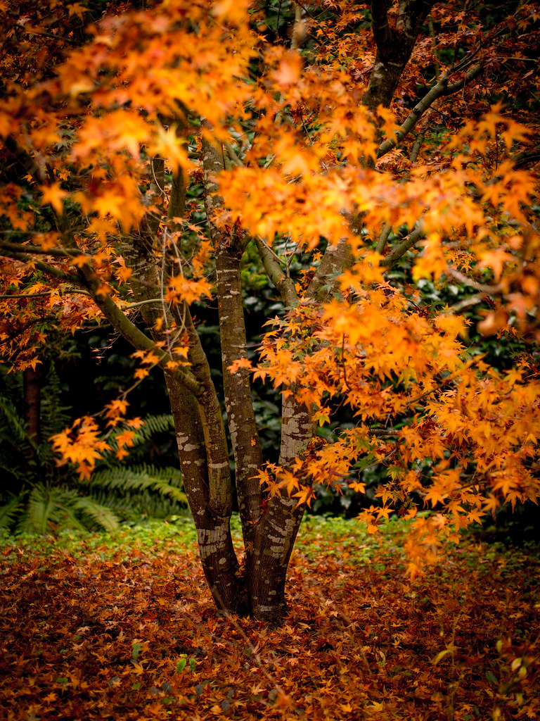 _B040118.jpg by Trip Sixes, on Flickr  crimson carpeting by Trip Sixes, on Flickr
|
|
#
?
Nov 5, 2012 04:05
|
|

|
krackmonkey posted:
I really really dig these. Just great colors and perfect DOF. Last one is my fav. I did an engagement shoot for some friends. This one is shot at Heaven Hill Bourbon warehouse in Kentucky.  (USER WAS PUT ON PROBATION FOR THIS POST)
|
|
#
?
Nov 5, 2012 15:16
|
|
|
krackmonkey posted:
I love the last 2. The first one isn't doing it for me though. The color is nice, but my eye doesn't ever really go anywhere.
|
|
#
?
Nov 5, 2012 15:53
|
|
|
krackmonkey posted:It quit raining for a couple of hours today, so I went in search of fall colors I like these a lot, the DOF really makes your eye less stick to certain areas. Good job! I also went on search of some fall colors here in Portland, after driving around and loving the atmosphere. Unfortunately, I feel like I didn't capture it that well. 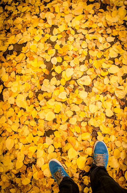 November 04, 2012 - 022 by kevincarafa, on Flickr After not really being able to encapsulate the feeling I was getting from being outside into some kind of photo, I looked down and saw something that was mildly interesting: my blue shoes against a ton of these orange / yellow leaves. I kind of like it, but it is on the boring side. 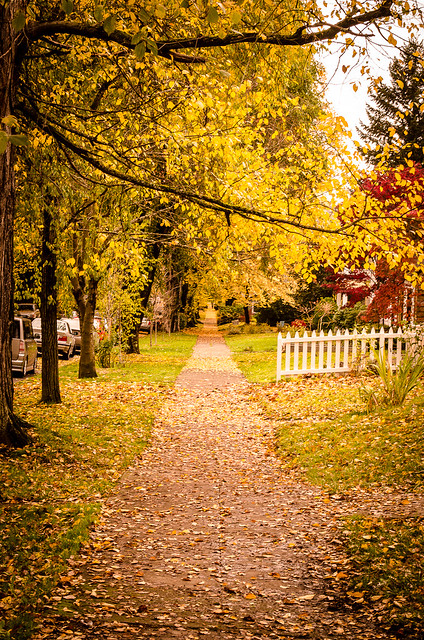 November 04, 2012 - 019 by kevincarafa, on Flickr One thing I noticed walking around on the streets was how the sidewalks lined with trees looked. Really lead you up the path. I don't know how well of a photo this makes, though. It's weird; I feel like it would be better with a wider angle lens to get the 'hugeness' of it into the picture, but then using the zoom to go in a little brought the really far part in a bit and I feel like that helped. I guess the bottom line is that I liked the idea of this kind of picture but I have no idea how to compose it. Ideas?
|
|
#
?
Nov 5, 2012 22:09
|
|
|
kahm posted:I like these a lot, the DOF really makes your eye less stick to certain areas. Good job! The concept of the first one really is awesome. You nailed it: the blue shoes and yellow leaves provide a nice contrast. I feel the composition is what holds it back. I would have done it horizontal with your feet in the middle + bottom part of the frame. Would have made an awesome wallpaper, imo ") With the second, I'm not so sure a wider angle would have improved the photo, if anything, it would take away from the "wonder" I feel it provides. Why? You would have seen more of the street and parked cars. Alternatively, when I look at the photo I can't help but follow the sidewalk up unto the "unknown" - making it wider would have made that point smaller. That said, I have no idea what the photo is really leaving out so you may be right. You should try the brenzier method with an 85mm or something. My contribution (from an ongoing surreal-y series I'm working on):  farewell by sumosteven, on Flickr sw1gger fucked around with this message at 23:17 on Nov 5, 2012 |
|
#
?
Nov 5, 2012 23:15
|
|
|
krackmonkey posted:
I like these shots. The third one is my favorite. I like the dof. In the first 2, I think focusing on the leaves that are blurred in the foreground rather than the tree trunk might look better. kahm posted:
I kind of wish the cars were not there, which might be hard to do because of the location. I also went to look for color.  IMG_6744 by Wilson!!!!, on Flickr phootnote fucked around with this message at 01:44 on Nov 6, 2012 |
|
#
?
Nov 6, 2012 01:39
|
|
|
kahm posted:
The first one I really like, the colour contrast really pops and its simple enough to just be a really cool image. The second I think isn't as good. A wide angle would make it worse in my opinion, and I think that shots like this (long path or road under fall trees) are better served when they are showcasing symmetry which this one is not thanks to the trees only being on one side. If anything I think moving further up to get that white fence out of the frame and using a longer lens would actually be better, make it a big more tunnel-vision and focus on the seemingly endless sidewalk. phootnote posted:
Two things that jump out at me for improving here is the exposure for one, the only thing exposed properly is the leaves high in the distant trees, the sky is blown out and the foreground is underexposed. Two exposures probably isn't necessary but if you shot it RAW and exposed for the foreground you could end up pretty balanced in post I think. The other is that shots like this that focus on a road moving toward the horizon often do better with a lower perspective, especially if they are enclosed and "tunnel-like" as this one is. Really great composition on this one though as far as positioning the road and it leading me into the distance. 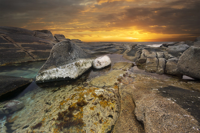 I went shooting here intending to get a telephoto landscape of the local lighthouse tourist trap, but when looking for a good vantage point I stumbled on this very strange tidal pool. Lots of colours you don't usually see around here thanks to the moss, kelp, barnacles and god knows what else. Believe it or not the saturation is almost straight from RAW, I think maybe a +15 cyan or something for the blues in the bottom left. CPL for the pool reflections and a grad ND which ended up butchering the rocks which I didn't see in the viewfinder at the time, luckily I took some shots without it as well. In particular I feel like it lost some of its contrast on jpeg conversion, maybe I'm converting wrong, but I don't want to just slide contrast up and break the knob off, is it a bit flat or have I been staring at it too long? whaam fucked around with this message at 20:09 on Nov 6, 2012 |
|
#
?
Nov 6, 2012 17:01
|
|
|
Great location. The abrupt change in foreground/background lightness is jarring (the sky and everything else). The light falloff on the foreground through the ocean and including that one rock on the right hand side needs a bit of reality introduced to it.
|
|
#
?
Nov 6, 2012 17:38
|
|

|
Leviathor posted:Great location. The abrupt change in foreground/background lightness is jarring (the sky and everything else). The light falloff on the foreground through the ocean and including that one rock on the right hand side needs a bit of reality introduced to it. Yeah you are right. Burnt it down a bit to make it a bit smoother of a transition. Also warmed it up a bit. whaam fucked around with this message at 20:09 on Nov 6, 2012 |
|
#
?
Nov 6, 2012 17:51
|
|
|
whaam posted:Yeah you are right. Burnt it down a bit to make it a bit smoother of a transition. Mucho gusto.
|
|
#
?
Nov 6, 2012 18:02
|
|
|
krackmonkey posted:
Like everyone else, I like the DOF on this one a lot, as well as the rich, vibrant colors. Is there a good amount of vignetting on this one, or is that just a side-effect of the DOF? It seems really dark in the corners, but that might be by design. I can't decide how I feel about the yellow leaves. Part of me would have liked to see them removed before the shot was taken to make the red carpet more monochromatic, but another part of me likes to see them there specifically to break up the pure field of red.  DSC_0063-3 by jpitha, on Flickr
|
|
#
?
Nov 6, 2012 21:45
|
|


|
Shampoo posted:Like everyone else, I like the DOF on this one a lot, as well as the rich, vibrant colors. Is there a good amount of vignetting on this one, or is that just a side-effect of the DOF? It seems really dark in the corners, but that might be by design. I can't decide how I feel about the yellow leaves. Part of me would have liked to see them removed before the shot was taken to make the red carpet more monochromatic, but another part of me likes to see them there specifically to break up the pure field of red. The vignetting was done in post intentionally, it's something I like but appreciate that it's not everyone's cup of tea. I tried it both ways and ultimately just liked the one with vignetting more than either the more subtle approach or the one without it altogether. As for cleaning up the leaves, I shot it as I found it.
|
|
#
?
Nov 6, 2012 23:35
|
|
|
sw1gger posted:My contribution (from an ongoing surreal-y series I'm working on): Shampoo posted:
 311/366 - Vortex by fuglsnef, on Flickr
|
|
#
?
Nov 6, 2012 23:45
|
|
|
Shampoo posted:
Lovely shot. Good composition. I like the color, post, or however you achieved it. I don't know why, but I feel like I am leaning back to look at the photo, like you were leaning back taking the photo. If that makes any sense at all.  IMG_6707 by Wilson!!!!, on Flickr
|
|
#
?
Nov 7, 2012 02:54
|
|
|
phootnote posted:Lovely shot. Good composition. I like the color, post, or however you achieved it. I don't know why, but I feel like I am leaning back to look at the photo, like you were leaning back taking the photo. If that makes any sense at all. Actually, I was leaning back. There was a large fence behind me, and I had to lean way back to frame the shot. The colors were all in post. I've been playing with Lightroom. IMG_6707 by Wilson!!!!, on Flickr [/quote] This has a chiaroscuro feel to it, and makes me think of Noir film (it might be the subject too.) That said, I feel the whites are blown out a little too much, but that might be a limit based on the camera or light or something beyond much control.
|
|
#
?
Nov 7, 2012 16:54
|
|
|
I turned the white down a bit. IMG_6707 by Wilson!!!!, on Flickr
|
|
#
?
Nov 8, 2012 05:26
|
|
|
phootnote posted:I turned the white down a bit. This is sweet, though I feel it could benefit from a tighter crop. The light's great, and I really hope you decide to go back there on another night and take this picture again when there isn't a large car parked directly in front of the shop. Some stuff I've shot recently: film (astia through a 500 c/m):  Untitled by renburress, on Flickr 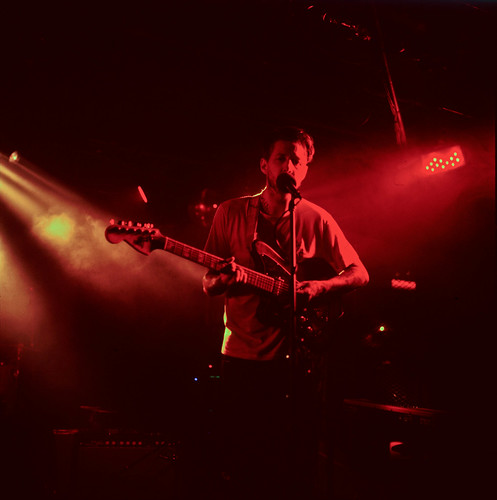 two towns by renburress, on Flickr and one digital:  Arthur by renburress, on Flickr
|
|
#
?
Nov 9, 2012 05:24
|
|
|
krackmonkey posted:
I really like the colors and composition of these, but the blurred leaves in the middle one feel a little too much "in your face" for my taste. They just get in the way of the rest of the image which I think is very nice. One from today, it was raining outside so goofed around with daughter's old dollhouse. 
|
|
#
?
Nov 10, 2012 21:46
|
|

|
Dr. Cool posted:
I don't really see a point to the first one; the colored moss is an interesting subject, but the out-of-focus foreground dominates the image. I would stop down, focus on the moss in front of the camera, or tilt it up. The second one is pretty darn good. It's got good composition, though if you were somehow able to freeze time and get the moment again I'd move over a tad to separate his mouth from the mic a bit. This is a nice shot, but I would personally go a little tighter on cropping out the bottom and/or left (or maybe the right), to emphasize the sunset sky more. Also, I'm not sure your horizon is exactly straight (though it might just be lens distortion). Here's some photos of mine that I think work as a series. Feedback about how folks feel they go together is appreciated (or just the photos themselves, either way). 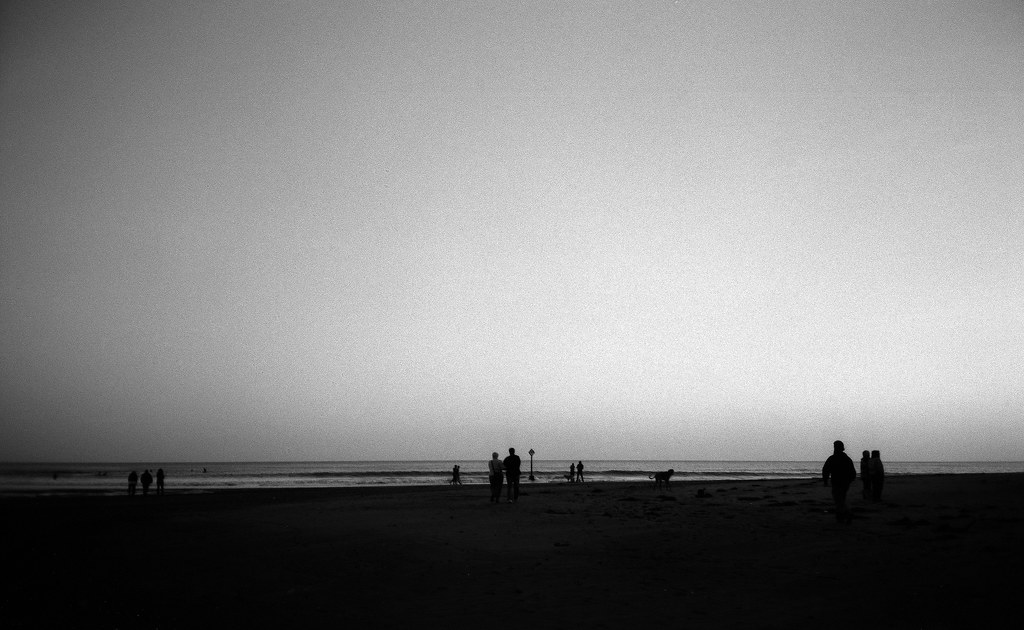 Nothing by atomicthumbs, on Flickr 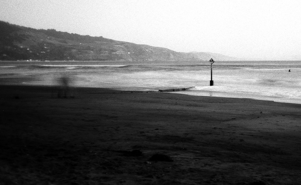 Break by atomicthumbs, on Flickr  A Home by atomicthumbs, on Flickr  Leaving by atomicthumbs, on Flickr
|
|
#
?
Nov 11, 2012 09:39
|
|

|
Went to see the Royal Winter Fair yesterday, which is basically a giant expose for all kinds of farmers in Canada, and even draws some from the states. It was a great opportunity to get photos of "wildlife." This was pretty spontaneous, but I think it captures the overall sense of exhaustion as the day was winding down:  This was shot in a passageway connecting two buildings on the CNE grounds. Both sides of the throughway were covered with classifieds for horses:  I'm guessing that this booth was showcasing genetically modified cows. Each cow on display was enormous and extremely tired (it looked as though breathing was a challenge). I tried to frame the shot such that the cow's rear end was right between the two booth attendants, but only got it partly right.  All photos were taken with my D800 and a 24-85 f2.8 AF-D. Auto WB and ISO. Aperture priority. (USER WAS PUT ON PROBATION FOR THIS POST)
|
|
#
?
Nov 11, 2012 14:49
|
|

|
krooj posted:Went to see the Royal Winter Fair yesterday, which is basically a giant expose for all kinds of farmers in Canada, and even draws some from the states. It was a great opportunity to get photos of "wildlife." You didn't critique anyone's photos; did you mean to post these in the other thread? Also, to make forums-sized images on imgur, just add an h before the . in the image URL.
|
|
#
?
Nov 11, 2012 21:06
|
|
|
krooj posted:Went to see the Royal Winter Fair yesterday, which is basically a giant expose for all kinds of farmers in Canada, and even draws some from the states. It was a great opportunity to get photos of "wildlife." I'm really not feeling any of these. The last one is more 'ha ha' than all that interesting. Are you proud of these photos? It looks like you are spending a lot of time stalking people instead of interacting. You'll find eye contact (or at least being able to see the whites of eyes) will improve things so much. People rarely will say no.
|
|
#
?
Nov 12, 2012 15:02
|
|
|
sw1gger posted:My contribution (from an ongoing surreal-y series I'm working on): 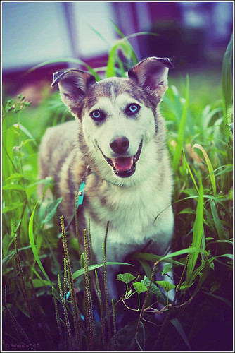 30 / 52 color me happy by sabarika, on Flickr I see it says no pets, but my dog is awesome. I know this isn't everyone's cup of tea, but I like shots that are way over-processed, heh. I'm just not sure how much I really like this, the original seemed boring but I still wanted to use it so I added a shitload of color actions. The collar/lead distract me, but what else can I do to improve?
|
|
#
?
Nov 12, 2012 23:55
|
|
|
huskyjackal posted:I really like the effect you achieved, it is definitely surreal. What I'd like to see is more space above the head so the hair is not cut off and more space off to the left where she's reaching, I keep expecting to see more than just smoke above her hand, like an orb of light or something. I am definitely drawn to that side. On my screen her forehead looks slightly over-exposed, that's minor. I dig this shot a lot, the lighting is just great. Your dogge is green 
|
|
#
?
Nov 13, 2012 00:18
|
|


|
huskyjackal posted:
You can never save a boring photo with trendy processing. If it's boring, it's boring. Discard and try again. Right now with the colours and the way the dog is staring at me, I feel like if I was on drugs I'd be tripping out.
|
|
#
?
Nov 13, 2012 04:50
|
|

|
huskyjackal posted:
The subject matter doesn't fit with your post-processing at all. The dog is apparently happy, but the strong green cast you've added makes it look sickly and unnatural and the vignetting or whatever makes the whole scene look dull and lifeless. You have well-processed photos elsewhere in your photostream on Flickr - this isn't on par with them.   TheJeffers fucked around with this message at 02:02 on Nov 14, 2012 |
|
#
?
Nov 13, 2012 23:00
|
|

|
 I really dig the contrast on this one and the difference between the slope of the road/powerline and house. However, I don't like how distracting the power lines are compared to the house--which I want to be the main focus. I do like how they mirror the slope of the road. I'm wondering if it would be stronger to just remove them or alter them towards a more neutral grey.
|
|
#
?
Nov 14, 2012 00:46
|
|
|
Chill Callahan posted:
First time critiquing so bear with me. I do like your exposure and the contrast it produced. I understand that you are trying to make the house the main focus, but the composition doesn't really catch my attention other than it showing a house, and overall, nothing really stands out. Maybe if you focused on a specific aspect or portion of the house(maybe the 3 windows to the left?) or moving up closer to the house, since the texture of the wall seems pretty unique and from that distance you can't really see much of it.  DSC_1395 by El Squared, on Flickr  DSC_1425 by El Squared, on Flickr  DSC_1522 by El Squared, on Flickr Blacksofa fucked around with this message at 08:18 on Nov 14, 2012 |
|
#
?
Nov 14, 2012 08:15
|
|
|
I really like this. There seems to be a nice balance of negative space, although I would almost prefer more. Is it a crop? To contribute, I was walking about tonight, and I happened to find this gazebo lit up for the holidays. Only after checking out the photo on my PC, did I notice the people under the shelter. 
|
|
#
?
Nov 16, 2012 04:05
|
|
|
Chill Callahan posted:
There's a strong sense of tension and unease I get from the building being at odds with the angle of the wires and road (which do work nicely to frame the house). I don't know if this was your attention, but I do like it quite a bit. burzum karaoke fucked around with this message at 04:56 on Nov 16, 2012 |
|
#
?
Nov 16, 2012 04:54
|
|

|
krooj posted:I really like this. There seems to be a nice balance of negative space, although I would almost prefer more. Is it a crop? The photo does not look to be in focus. See if you can get an angle without the tree in front of the gazebo on the right, or maybe a shot standing at the entrance of the gazebo. Other than, pretty cool shot.
|
|
#
?
Nov 17, 2012 05:37
|
|
|
Blacksofa posted:
I really enjoy the use of color here, and the angle really gives it a "big sky" feel. I'm not a fan of the power lines, but that might be an effect you're going for, but I do think that the bottom could have been darkened more so that the detail of the buildings and vehicles is obscured completely, to draw your eye upwards. I keep getting distracted by things I can just barely see in the bottom. Love that sky color though. 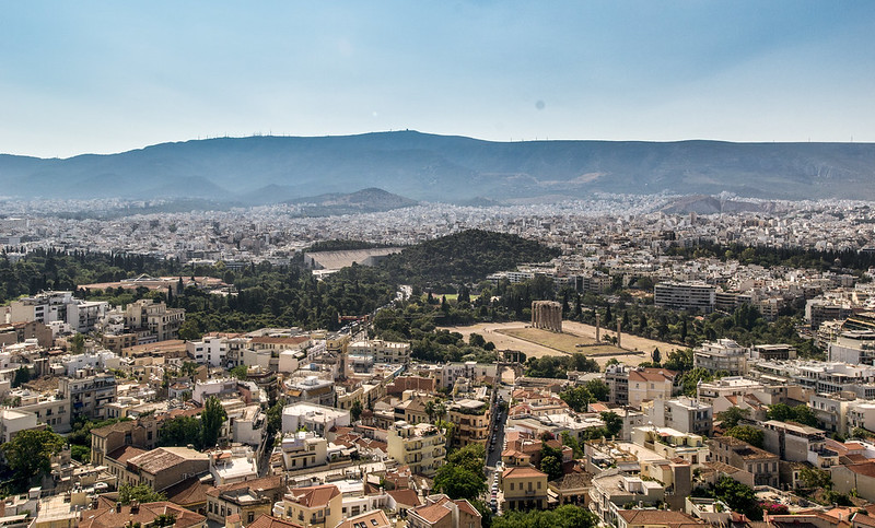 DSC_0253-3 by jpitha, on Flickr This is playing more with Lightroom, no presets used here, this was all me after watching some of those really informative videos. I really do learn by having someone show me rather than just pushing buttons and pulling sliders, even if they're just showing me in a video.
|
|
#
?
Nov 18, 2012 02:14
|
|
|
Shampoo posted:I really enjoy the use of color here, and the angle really gives it a "big sky" feel. I'm not a fan of the power lines, but that might be an effect you're going for, but I do think that the bottom could have been darkened more so that the detail of the buildings and vehicles is obscured completely, to draw your eye upwards. I keep getting distracted by things I can just barely see in the bottom. Love that sky color though. It looks like you have a large dust spot in the sky, it should be pretty easy to fix.
|
|
#
?
Nov 18, 2012 03:00
|
|

|
Shampoo posted:I really enjoy the use of color here, and the angle really gives it a "big sky" feel. I'm not a fan of the power lines, but that might be an effect you're going for, but I do think that the bottom could have been darkened more so that the detail of the buildings and vehicles is obscured completely, to draw your eye upwards. I keep getting distracted by things I can just barely see in the bottom. Love that sky color though. I really like this shot. The way the shadows come off the tops of the hills, contrast really well with the brightness and clarity of the city. I am curious if you decided to saturate the sky any in this shot? For my own stuff, I went flying the other day and took a few shots. We landed on a dirt strip on a farm. The last picture is some of the tools inside the barn.  IMG_3340.jpg by Captain Apollo, on Flickr 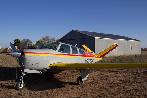 IMG_3146.jpg by Captain Apollo, on Flickr  IMG_3206.jpg by Captain Apollo, on Flickr Captain Apollo fucked around with this message at 04:50 on Nov 19, 2012 |
|
#
?
Nov 19, 2012 04:46
|
|
|

|
| # ? May 21, 2024 14:17 |
|
|
I'm a complete newbie at photography but I really like this shot. The depth-of-field really pulls you in while strongly emphasizing the statue. Also the contrast between the yellow and green leaves and bluish oxidization is pretty.
|
|
#
?
Nov 19, 2012 11:39
|
|