


|
Captain Apollo posted:I really like this shot. The way the shadows come off the tops of the hills, contrast really well with the brightness and clarity of the city. I am curious if you decided to saturate the sky any in this shot? Nope, I just darkened the exposure in the sky and I believe I upped the contrast just a little bit.
|
 #
?
Nov 19, 2012 17:04
#
?
Nov 19, 2012 17:04
|
|


|

|
| # ? May 12, 2024 16:21 |
|
|
Captain Apollo posted:
This has some really great lighting going on, but I am looking at the expanded image in Flickr and it doesn't seem to be in focus. Other than that, I guess there's opportunity for some decent macro work in this scene if you can get to it again. Getting different perspectives on the dust covering various items while the light hits it... could be good for either macro or shallow DOF shots. To contribute:  This is x-posted from the LED thread, but I'd like some feedback on it. I bought a license for LR4 which was the right thing to do instead of continuing with iPhoto... Presence (which was adjusted for this image, in addition to exposure and contrast) seems like it could go the HDR route: done well or horribly over-used and terrible.  This is a photo of a ceiling fixture in the foyer of a Toronto office building. Sometimes it's good to let go of focus.
|
|
#
?
Nov 19, 2012 19:08
|
|


|
krooj posted:This has some really great lighting going on, but I am looking at the expanded image in Flickr and it doesn't seem to be in focus. Other than that, I guess there's opportunity for some decent macro work in this scene if you can get to it again. Getting different perspectives on the dust covering various items while the light hits it... could be good for either macro or shallow DOF shots. Crop out most of the left side and you have yourself an interesting photo!
|
|
#
?
Nov 19, 2012 19:11
|
|

|
Pukestain Pal posted:Crop out most of the Here, I made this post more helpful.
|
|
#
?
Nov 19, 2012 19:38
|
|

|
Quick and dirty crop. Obviously you'd want to do better than this, but you get the idea.
vxsarin fucked around with this message at 19:46 on Nov 19, 2012 |
|
#
?
Nov 19, 2012 19:44
|
|
|
Pukestain Pal posted:Quick and dirty crop. Obviously you'd want to do better than this, but you get the idea. That's not an improvement - I think you made it boring. It doesn't have the tension from the two different light temperatures and between the flat wall and the space in the background anymore. I will say I wish the car weren't there, but your crop is the wrong way to resolve that.
|
|
#
?
Nov 19, 2012 19:55
|
|
|
You took a photo with dimension and perspective and made it into a boring, zero-perspective mess.
|
|
#
?
Nov 19, 2012 19:56
|
|

|
MrBlandAverage posted:That's not an improvement - I think you made it boring. It doesn't have the tension from the two different light temperatures and between the flat wall and the space in the background anymore. I will say I wish the car weren't there, but your crop is the wrong way to resolve that. Tension isn't always a good thing. I think the word you are looking for is 'distracting'.
|
|
#
?
Nov 19, 2012 19:58
|
|
|
dukeku posted:You took a photo with dimension and perspective and made it into a boring, zero-perspective mess. poo poo will always smell like poo poo. What was already there was a distracting mess. I just tried to add some lines to the photo. Obviously it's not a perfect crop, it's also not particularly well shot, so it's hard to make it look good regardless. (USER WAS PUT ON PROBATION FOR THIS POST)
|
|
#
?
Nov 19, 2012 20:00
|
|
|
Having only just arrived to this awesome derail that I was only just now made aware of, I'm gonna go back a page and see what all the bad vibes are about. Abilities to post will be adjusted shortly  EDIT: Well that wasn't that bad. Maybe just like, a good-faith suggestion to go for a walk outside in the fresh air, or maybe put down the internet and crack a really nice beer and watch a movie you've been meaning to watch. What I'm saying is take a break, if you're in the right or not, which surely everyone is. SoundMonkey fucked around with this message at 20:18 on Nov 19, 2012 |
|
#
?
Nov 19, 2012 20:07
|
|


|
Agree on the car being distracting. I will go back at some point this week and see if I can get a better shot with a tripod. I'll try to frame it with the alleyway again, because I do like the contrasting colours, and I can crop it later. Thanks for the feedback.
|
|
#
?
Nov 19, 2012 20:20
|
|
|
Pukestain Pal posted:Tension isn't always a good thing. I think the word you are looking for is 'distracting'. The car wasn't distracting, the blue light wasn't distracting, nothing was distracting. It was an interesting shot, and like people above me said - the colour temps being different is a welcome element. To crop out the part that actually makes this photo is very bad advice.
|
|
#
?
Nov 19, 2012 23:41
|
|


|
krooj posted:
Looks cool as a snapshot, but as something planned did you walk around and try to find the most interesting place to stand under the fixture to get an ideal composition? I have no idea what the fixture setup or size is, but just talking out of my rear end it would have been cool to try to exploit the the lines formed by the more sparse lights on the right, the higher density on the left or some balance between the two. Interplay of cool vs. warm colors could also be interesting. Right now it seems a little haphazard but fun to glance at. Captain Apollo posted:
Pretty loving cool to go flying to look for shots. I can't help but feel that the compositions are a little off though. I do like the colors in all of them though. The first one, did you frame it that way because the plane's shadow interested you? It makes the balance of the picture feel off, and the crooked horizon is doing you no favors. Judging by the lines in the flield in the background, did you crop this in post? The second one is better but I still wish it were framed differently as my eye is still not led through the picture in any kind of meaningful way. The third is interesting just to see all the random poo poo in there but I have to wonder if a different perspective (like looking at the wall straight on) might have been even more interesting, or looking at something in a more focused way rather than just present us with so much random clutter. ------ I have a poo poo ton of fall pictures to go through but have isolate a small group that I think are keepers, the first two here being a couple of them. The last picture was as I was leaving a building of sculptures and I only had my AE-1 on me so it was pretty quickly focused and shot, being that I wasn't sure if they were ok with photos in this building. I can think of some things I would have done differently now but would still like to submit it for critique.  DSC09630.jpg by Paul Hofreiter, on Flickr  DSC09642-Edit.jpg by Paul Hofreiter, on Flickr  012_26.jpg by Paul Hofreiter, on Flickr
|
|
#
?
Nov 20, 2012 08:07
|
|


|
rio posted:
So what about these makes them keepers for you? I mean, what were you going for? To me these really don't have strong design language. So unless there's some sort of narrative or conceptual aspect to why these succeeded for you, I think they sort of fall flat. The exposure is good and the colors are nice, but I don't really see either of those qualities as a reason for taking the picture. I'm not trying to be harsh, so let me know if there's some other angle you were going for. I'm just not going to be terribly wowed by "pretty colors" when I don't see any real decision making by you as the photographer. rio posted:The last picture was as I was leaving a building of sculptures and I only had my AE-1 on me so it was pretty quickly focused and shot, being that I wasn't sure if they were ok with photos in this building. I can think of some things I would have done differently now but would still like to submit it for critique. Your shadow in this shot instantly takes me out of it, as do the couple of miscellaneous items on the stairs. If you're going to turn a staircase (or any other everyday object) into a design study, then remove anything extraneous. Also, I think this could have used more DOF, as the railings and top stairs that go OOF also subtract from the strength of the visuals. What I'm really wanting to encourage is that you ask "why" when you press the shutter and when you make your edits. If you want to improve your work, there should be a considered reason behind each photo you make. Notice I didn't say take. Taking pictures of pretty colors is fine, but since you're posting here it seems like you're going for something beyond that. And speaking of needing to improve, here are the first non-people shots I've made in over 5 years!   Traffic Jam by McMadCow, on Flickr  Surbiton's Skyscrapers by McMadCow, on Flickr
|
|
#
?
Nov 21, 2012 22:26
|
|

|
McMadCow posted:
I don't really like the high contrast in this, it seems like a gentle scene, and the harshness of the contrast just kills that feeling somewhat. Particularly the foreground is bad at it, being very dark, but the boats being so bright it kills most detail on them.
|
|
#
?
Nov 21, 2012 23:19
|
|


|
McMadCow posted:So what about these makes them keepers for you? I mean, what were you going for? To me these really don't have strong design language. So unless there's some sort of narrative or conceptual aspect to why these succeeded for you, I think they sort of fall flat. The exposure is good and the colors are nice, but I don't really see either of those qualities as a reason for taking the picture. Thanks a lot for the criticism. I have been trying to think more when shooting, and that is why I chose those two as keepers initially, as I tried to go into both of them with a composition and purpose in mind. The first featured a timeline of fall colors, green to yellow to brown, with each section becoming larger in the frame. I also liked how it turned out a bit abstract, and that the branches spiderwebbing around the frame supported that and also connected the colors. If it just looks like pretty colors then I eitherdidn't present it well, or that is just the default purpose that a viewer first thinks of when looking at a autumn canopy image and it is just hard to present something in that vein as anything different. The second one was the weaker of the two, but the illumination of the branch against the darker higher branches caught my eye and portrayed something that I hoped to find on that walk, a branch that looked to be on fire (which is the title which Flickr didn't put here for some reason). Anyway, I would rather hear criticism than "nice capture nice colors" etc. anyway, so I do appreciate it. rio fucked around with this message at 00:51 on Nov 22, 2012 |
|
#
?
Nov 22, 2012 00:48
|
|
|
rio posted:
I actually think this one, in particular, is very beautiful. The riot of color and shape in the leaves makes me think about how such simple things can interact to form really impressive vistas. I'm a huge fan of watching leaves in wind though, and I suspect McMadCow isn't.
|
|
#
?
Nov 23, 2012 04:45
|
|

|
rio posted:
a foolish pianist posted:I actually think this one, in particular, is very beautiful. The riot of color and shape in the leaves makes me think about how such simple things can interact to form really impressive vistas. I'm a huge fan of watching leaves in wind though, and I suspect McMadCow isn't. 
|
|
#
?
Nov 23, 2012 06:59
|
|
|
a foolish pianist posted:I actually think this one, in particular, is very beautiful. The riot of color and shape in the leaves makes me think about how such simple things can interact to form really impressive vistas. I'm a huge fan of watching leaves in wind though, and I suspect McMadCow isn't. I think the critique of the leaves photo is that, yes, there's a theme of all the colours of the season being in there, but it doesn't seem like a very strong theme and image if "three different colours" is the only thing going on here. There are very many of these images around and, yes, leaves are pretty, and if I were to be in the park this tree was in, I'd enjoy sitting under it for a long time and watching it. If I were to take a photograph, however, I would be mindful that nearly everyone who ever picked up a camera and made an attempt to create an image has attempted this shot before, and this is a bit too literal a representation of some leaves. Every time I walk through my local park there is someone stood underneath a tree, dslr pointed up through the leaves. There's nothing wrong with taking photos of pretty leaf patterns but when posted in a critique thread for review, a valid response would be that, from a critical P.O.V, there's not much going on here that is interesting or that grabs the viewer as different or exciting. I admit, I have no idea how to make an interesting shot from this subject - I'm sure it's possible, but it needs something else, something different, to elevate it above "leaves".
|
|
#
?
Nov 23, 2012 08:44
|
|

|
[quote="rio" post="409765759"] DSC09630.jpg by Paul Hofreiter, on Flickr I can see both sides of the argument here. I actually really like the idea of the shot, as I find the form of trees (the lines and shapes of the branches in particular) fascinating, and I've often thought of trying to do something similar myself. I think it's really difficult to pull off though which is why I've seldom actually tried it. The colours here are great and give the shot a nice serene feel like I'm lying in the grass on a sunny day looking up at them. Two things I'd like to see though: Some more branches. The bold, dark lines you have are great, but I feel if you were able to get some more in on the other side of the photo it would balance the composition better and make it feel less snapshotty. Some more of the green leaves. You have this small area of green off to one side which contrasts really well with the yellow/orange leaves all over the rest of the shot. Their position and perhaps even their inclusion feels a bit random though. Again, I think the composition would feel less snapshotty if more were included to balance the orange better, and some more thought put into their placement. DSC09642-Edit.jpg by Paul Hofreiter, on Flickr This one is a lot weaker, I think. It's all yellow and lacks the big branches which leaves it (no pun intended) with very little structure or contrast. I visited a little arts & crafts community called Montsalvat in Melbourne recently, it felt like I was in rural France or Italy somewhere. Lots of rustic workshops and galleries which I completely failed to photograph in an interesting way. Did come away with a couple of random shots I liked though.  Montsalvat 3 by euannz, on Flickr  Montsalvat 4 by euannz, on Flickr  Montsalvat 5 by euannz, on Flickr Wafflecopper fucked around with this message at 09:50 on Nov 23, 2012 |
|
#
?
Nov 23, 2012 09:47
|
|


|
Wafflecopper posted:
I really like the evenness of the lighting and the composition of this. Did you do much post-processing, or is this pretty well how it came out of the camera? To contribute: I went and re-shot the the backdoor using a tripod. Thankfully, there was no car parked to the left this time.  This is also from last night:  I am not happy with what appears to be softer focus near the top of the phone.
|
|
#
?
Nov 23, 2012 14:16
|
|
|
It's been a million years since I posted something here I think it's the last time I ever do a wedding unless I get a lot of money for it. This took WAY too many hours and kept me from shooting stuff I like since I was swamped with post processing + my 2 regular jobs  IMG_2621-Edit copy by king colliwog, on Flickr  IMG_2354-Edit by king colliwog, on Flickr  IMG_1582 copy by king colliwog, on Flickr wow, I really need to clean up the hairs and such on this one. Don't know how I could forget about it -- Wafflecopper posted:
I love the mysterious vibe that is coming from this shot, but I feel like there's something missing. May be if she was wearing clothes that made her look more mysterious (the hat is a good step in that direction) or if she was even more underexposed or if you had used a flash to get some fill light and interresting shadows on her face. I feel it's super close to being a really good shot but there's something missing. It's the kind of spot I'd try to work with again because there's a lot going for it and if you have a flash you could do many awesome concepts there.
|
|
#
?
Nov 23, 2012 23:20
|
|

|
Wafflecopper posted:
I like this shot. Along the lines of what KingColliwog is saying, you could try have her looking away from the camera to add an aloofness. Conversely, she could be facing the light and lit up. I think that might look good with what she is wearing. Much sharper. I like the contrast of the two lights. I don't know what others feel about the extra ground at the bottom of the photo, but I think cropping that out might make the photo stronger. Well, I don't know. Each time I look at it it seems to work. What does it look like shooting that same area going up rather than going down?  IMG_6811 by Wilson!!!!, on Flickr  IMG_6864 by Wilson!!!!, on Flickr  IMG_6837 by Wilson!!!!, on Flickr phootnote fucked around with this message at 00:07 on Nov 24, 2012 |
|
#
?
Nov 24, 2012 00:00
|
|
|
phootnote posted:
I really like this one. It's pin sharp and well composted. I'm a sucker for those low angle shots, especially with the open road ahead. I'd almost think that you brightened up the road a little too much, but that's personal preference I think.  DSC_0194-3 by jpitha, on Flickr
|
|
#
?
Nov 24, 2012 01:00
|
|
|
phootnote posted:
After converging railroad tracks, empty roads leading into the distance are one of the most common subjects around and they're usually quite boring because they generally look very samey and evoke the same sort of general feeling. This is a technically fine picture, but it doesn't really "say" anything to me because it doesn't transcend the cliche of road pictures. quote:
This picture works better for me than the road shot. I'm curious why you included the amount of sky you did, because there's not a whole lot of interesting things going on in it. The main point of interest for me is the grass, the trees, and the two hay bales that bookend the picture, not the vast expanse of clouds with a streak of blue in the upper left corner that leads me out of the frame. If you were to crop it so that there was a more even distribution of grass/trees/clouds, it might work better since it's a pretty balanced composition in the most interesting part of the photo anyway. quote:
Much of what I said above could apply to this picture. The tree that's cut off by the frame edge on the right is a distraction and could be cropped out without losing anything. The cluster of red/green trees on the left edge is balanced by the fully visible tree on the right and provides a nice interplay with the two visible hay bales. As with the above shot, there is nothing going on in the sky and it doesn't really contribute much to the picture.
|
|
#
?
Nov 24, 2012 03:50
|
|

|
krooj posted:I went and re-shot the the backdoor using a tripod. Thankfully, there was no car parked to the left this time. It's been discussed already but I really love the contrast in color between the two sections of the photograph. For me though, the square format in this crop just doesn't seem to work. I just feel like compositionally, it was better suited to the standard aspect. The square feels like it leaves a lot of empty space at the bottom of the image, and maybe this is just because I saw the larger image, feels like I want to see more to the side. Shampoo posted:
I like the tones in this ones, it makes the image feel a lot warmer and conveys what I imagine is warm Mediterranean air really well. Here's a few older shots with some (maybe) interesting depth.  IMG_2472 by Opals25, on Flickr  IMG_2408 by Opals25, on Flickr  IMG_2471 by Opals25, on Flickr Experimented with some color changes in the post processing on this one, something I haven't really done a lot. Opals25 fucked around with this message at 08:34 on Nov 24, 2012 |
|
#
?
Nov 24, 2012 08:32
|
|

|
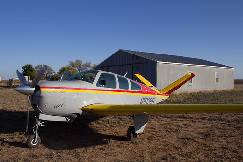
Captain Apollo posted:I really like this shot. The way the shadows come off the tops of the hills, contrast really well with the brightness and clarity of the city. I am curious if you decided to saturate the sky any in this shot? As much as I like planes, the first doesn't do much. It's kind of flat and straight on. The second is more interesting because of the V tail, but I think you miss the opportunity because the passenger door is open and you cut off the tip of the wing. With the position of the propeller, I think you you could have gotten an interesting close-up wide-angle view of the cockpit and the V tail out of the back. The third is solid. Lots of clutter without being too cluttered.  Allegheny Cemetery Sunset by geeves, on Flickr  Allegheny Cemetery Sunset by geeves, on Flickr  pool 01 by geeves, on Flickr
|
|
#
?
Nov 24, 2012 20:38
|
|

|
We drove down to LA for Thanksgiving, so I tried my hand at shooting from the car. I only had a few seconds to plan anything and look for interesting sights, so only a very few came out, but at least it kept me busy for a few hours of the drive. While down there, I took a few photos while we were walking around the neighborhood of our hosts. I was trying not to be left behind, so they are also taken with little lead-time. They live in a neighborhood with Moorish Revival architecture, most houses built around 100 years ago, and they have some really neat tiles inset into different places.  Staircase by prismaticglasses, on Flickr Heading towards dusk. I'd rather the trees were more in focus, but we were going 70 down the freeway.  Silhouette by prismaticglasses, on Flickr Opals25 posted:Here's a few older shots with some (maybe) interesting depth. I've tried to tell myself a story about each one of these photos, but visually they are pretty flat. I don't know exactly what to tell you to change, since I'm very new to post, but maybe some more contrast? They all feel dingy to me. geeves posted:
I like the color contrast and that you're shooting the back of the statue instead of the front. The only thing that stands out in a bad way is the super different lighting on the wings. The closer one has a harsh shadow right where it meets the back, so it gives the sense of it not being an intentional part of the statue. Valdara fucked around with this message at 07:08 on Nov 26, 2012 |
|
#
?
Nov 26, 2012 01:05
|
|

|
I like the cemetery sunset photos, but you've pushed the saturation a little too hard.
|
|
#
?
Nov 26, 2012 01:29
|
|
|
Valdara posted:They live in a neighborhood with Moorish Revival architecture, most houses built around 100 years ago, and they have some really neat tiles inset into different places. I really like this picture. It might just be my monitor but I think it can use a bit more intensity in the color. The motion of the staircase bounded by the palm and greenery just makes for some really interesting patterns and movement.  IMG_4609 by Opals25, on Flickr  IMG_0582 by Opals25, on Flickr
|
|
#
?
Nov 26, 2012 02:15
|
|

|
Someone's been to Utah recently! I really like the idea behind the checkerboard image, but I can't help but feel like it would have come out better at a different time of day. Zion's pretty badass, someday I want to spend a month in Utah because there is an absurd number of things to photograph there.
|
|
#
?
Nov 26, 2012 05:38
|
|

|
Here is a photo from Thanksgiving. I know they aren't technically perfect, but they certainly capture the mood of the evening. My husband is a human jungle gym, and the kids were all over him. They were running and screaming and wrestling and jumping and crying for a full five hours, except the half-hour we were all eating at the table. It was very dim indoor lighting, so I used a fairly slow shutter speed, large aperture, and high ISO. This was 1/8s, f/5.0, 800. The critique I'm asking for is on the post-processing (I have a hard time getting skin that isn't either too magenta or too yellow) and if I could have used better settings for indoors without a flash.  Kids by prismaticglasses, on Flickr They took turns doing this for about twenty minutes. Same settings.  Punching Bag by prismaticglasses, on Flickr phootnote posted:
I would like less sky, more colors. The sky isn't very interesting, and having the color all crammed down at the bottom makes it feel off. Maybe bump up the colors, since I would bet they were way more brilliant when you were looking at them. Maybe even crop out some of the trees on the right of both images, take out some sky, and boost the colors. The left bits are more interesting in both photos.
|
|
#
?
Nov 26, 2012 07:43
|
|
|
xzzy posted:Someone's been to Utah recently! Yeah, Zion was absolutely beautiful. We only spent a day there passing through on a family vacation so the time we stopped was the one time I got to take any shots. I'd love to go there myself sometime and just spend a few days at Zion; it has to be one of the most beautiful places I've ever been.
|
|
#
?
Nov 26, 2012 07:57
|
|
|
rio posted:
I like the shot, but as its been said, the shadow kinda ruins it.  Cantera de Lonco by Mijaeus, on Flickr
|
|
#
?
Nov 26, 2012 20:31
|
|

|
El Laucha posted:I like the shot, but as its been said, the shadow kinda ruins it. I like this photo, but I think the right side has a lot more interest and depth than the left side. The detail is gorgeous, but it makes the weird little yellow cart stick out a bit. So I'm just starting out, I'd really love to get any feedback I can get. I spent about fifteen minutes trying out different angles... I know the photos aren't great, but I feel like I could take an interesting picture if I was a little better. 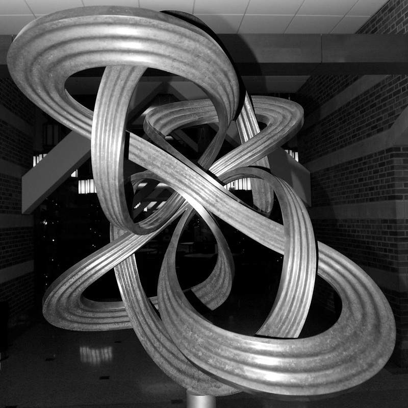 Ribbon - 1 by dopameanie, on Flickr 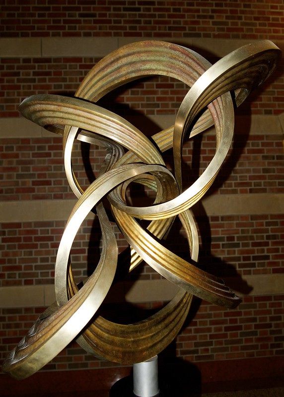 PB2A0292 by dopameanie, on Flickr 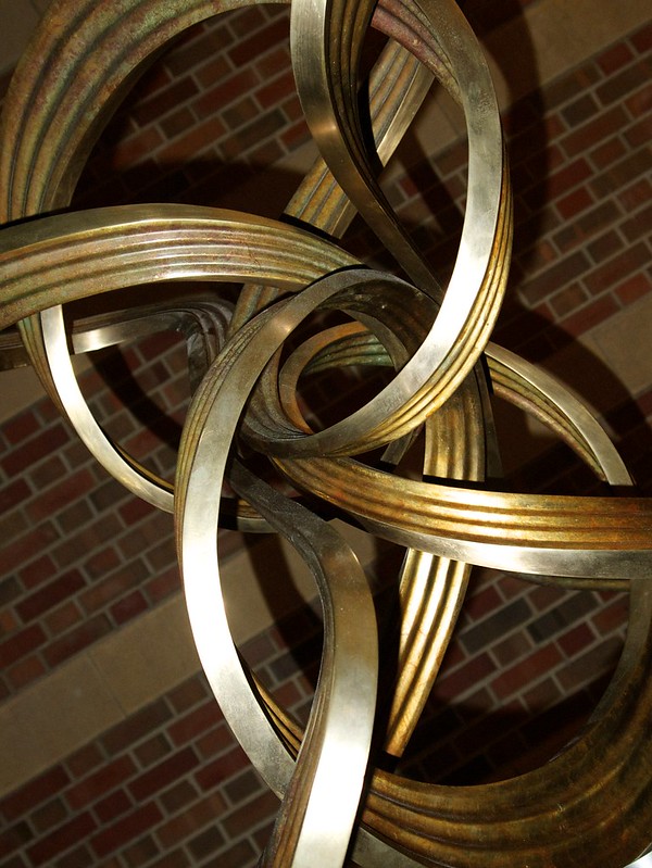 PB2A0284 - Version 2 by dopameanie, on Flickr dopaMEAN fucked around with this message at 02:49 on Nov 28, 2012 |
|
#
?
Nov 28, 2012 02:43
|
|

|
dopaMEAN posted:
Cool shape, but it doesn't really do much for me. I am not sure if you could make the photo interesting. Maybe shoot from further away. There isn't much contrast whether it is color, straight and curvy lines, or dark and light. Probably something easy to work on is composition (rule of thirds). The black and white one is your best imo. Did you use an on camera flash?
|
|
#
?
Nov 28, 2012 04:54
|
|
|
phootnote posted:Cool shape, but it doesn't really do much for me. I am not sure if you could make the photo interesting. Maybe shoot from further away. There isn't much contrast whether it is color, straight and curvy lines, or dark and light. Probably something easy to work on is composition (rule of thirds). The black and white one is your best imo. Did you use an on camera flash? I did for these ones. When I tried taking the pictures without flash, the camera was defaulting to ISO1600, which looked pretty bad. I'm still learning about exposure and such, so I played around with flash/no flash and different ISO settings until I settled on this. I struggled a lot with composition here, because I liked the brick wall as the background, but there wasn't enough space for me to get the brick wall without being very close to the sculpture itself. I actually didn't like the black and white one at first because I thought the background was distracting. I'll work on it some more! I think the next thing I'd like to figure out is how to adjust depth of field. From the brief primer my aunt gave me on the camera, it sounds like I could control how much of the background was in focus using this, but I can't figure out how to make it work yet. I should probably grab a photography book from the library, now that I'm thinking about it.
|
|
#
?
Nov 28, 2012 06:15
|
|
|
dopaMEAN posted:
----  Hotwax Residue fucked around with this message at 20:13 on Nov 28, 2012 |
|
#
?
Nov 28, 2012 06:23
|
|
|
Hotwax Residue posted:I think the 2nd and 3rd could have been interesting with the bricks in the background countering the smooth shape of the sculpture. But the flash ruins it with the harsh shadows. Try going back on an overcast day. It's indoors, but I can go back during the day, there will probably be more ambient light then! That photo is absolutely gorgeous- where did you take it?
|
|
#
?
Nov 28, 2012 06:36
|
|

|

|
| # ? May 12, 2024 16:21 |
|
|
I feel that while well executed, the wood in the foreground is not as interesting as the location itself, and I wish I were just looking at a straight up landscape featuring less water, the mountains/treeline and more sky. I also think that if you want to include the elements on the left of the photo that they should be more prominent. As they are now, it seems to be more of a distraction than an integral part of the composition. -----  end of autumn by Paul Hofreiter, on Flickr
|
|
#
?
Nov 28, 2012 07:17
|
|