|
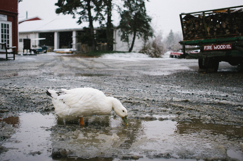
dopaMEAN posted:I think the next thing I'd like to figure out is how to adjust depth of field. From the brief primer my aunt gave me on the camera, it sounds like I could control how much of the background was in focus using this, but I can't figure out how to make it work yet. I should probably grab a photography book from the library, now that I'm thinking about it. rio posted:I feel that while well executed, the wood in the foreground is not as interesting as the location itself, and I wish I were just looking at a straight up landscape featuring less water, the mountains/treeline and more sky. I also think that if you want to include the elements on the left of the photo that they should be more prominent. As they are now, it seems to be more of a distraction than an integral part of the composition. With your photo I think you're including to much environment. My eye keeps getting pulled towards the white building at the top and its pretty busy up there.
|
 #
?
Nov 28, 2012 08:42
#
?
Nov 28, 2012 08:42
|
|

|

|
| # ? May 21, 2024 15:19 |
|
|
dopaMEAN posted:
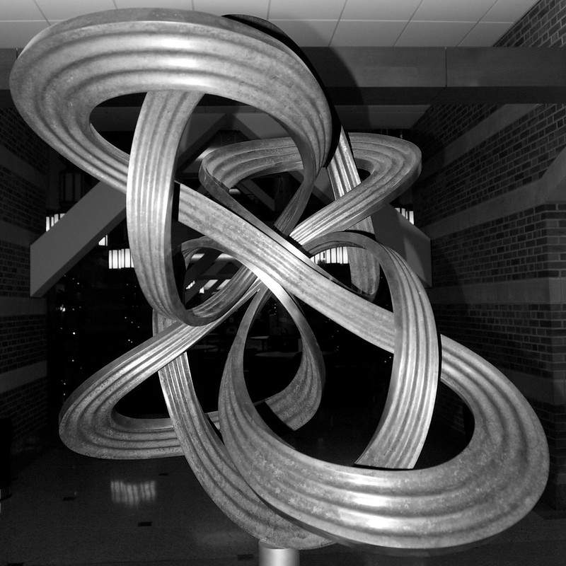
I think this would have worked if you went further back and used a longer focal length, so the entire sculpture was still in frame, but with less perspective distortion. I think that should also get you less of the walls captured. Also it should have some off-camera strobe light with pretty strong diffusion, placed close to the sculpture. My idea with that would be to light the sculpture but not the walls/floor/background as much, getting you essentially a black background. I realise that this requires some very particular equipment you might not have, and it might still not be fully possible since it seems there are some lights visible in the background too. Anyway, the sculpture might make for an interesting subject, but it's not easy to get right. The black/white works the best since the sculpture is really all about the geometry. The environment around it seems to mostly detract from the picture, so the photo with less of that works better.
|
|
#
?
Nov 28, 2012 10:06
|
|


|
Just got my Nikon D5100 a few days ago. My first entry to DSLRs, I've always used just my iPhone before that (3GS all the way up to the 5). Everything is still new to me, and I have a lottttttt to learn. But, only one way to find out what I'm doing wrong, so I'm probably gonna be a new mainstay in this thread. Here's 3 shots I've recently taken so I don't overwhelm:   Never done this stuff before. Also, the post processing after was just some small stuff in Photoshop like general contrast and level adjustments (not that I honestly really know how that's supposed to work either, I just use my eye). (USER WAS PUT ON PROBATION FOR THIS POST)
|
|
#
?
Nov 28, 2012 14:08
|
|

|
Hotwax Residue posted:Thanks! It was taken near Queenstown, New Zealand. This might help with understanding depth of field 89 posted:Just got my Nikon D5100 a few days ago. My first entry to DSLRs, I've always used just my iPhone before that (3GS all the way up to the 5). Everything is still new to me, and I have a lottttttt to learn. But, only one way to find out what I'm doing wrong, so I'm probably gonna be a new mainstay in this thread. Here's 3 shots I've recently taken so I don't overwhelm: I like the picture of the woman! I'm just starting out as well, and I've been using iPhoto for post processing so far. If you have access to that through a Mac I really recommend it! The Mac version is really easy to use, I've just been playing with levels and such and I was able to salvage a bunch of pictures I took through a window. You can also use it on the iPhone and iPad, but it gives you somewhat less information. Also, since you're starting out, check out the link Hotwax Residue posted. I'm reading up on post processing now! Here are the photos I messed with. They're still a little grainy, but they were really clouded before I started playing with iPhoto. I'm pretty sure I know what I did wrong with these - the cardinal has a poorly placed branch, the chickadee isn't in focus and the hoary redpoll is too small and has too much going on with the sticks. 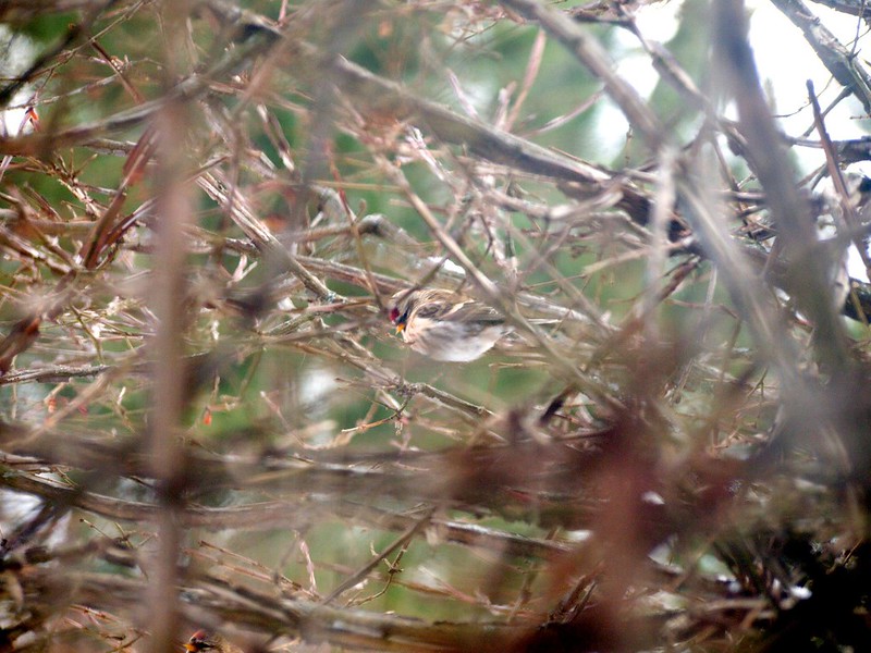 Hoary redpoll by dopameanie, on Flickr  Cardinal by dopameanie, on Flickr  Black-capped chickadee by dopameanie, on Flickr dopaMEAN fucked around with this message at 16:26 on Nov 28, 2012 |
|
#
?
Nov 28, 2012 16:05
|
|

|
89 posted:Just got my Nikon D5100 a few days ago. My first entry to DSLRs, I've always used just my iPhone before that (3GS all the way up to the 5). Everything is still new to me, and I have a lottttttt to learn. But, only one way to find out what I'm doing wrong, so I'm probably gonna be a new mainstay in this thread. Here's 3 shots I've recently taken so I don't overwhelm: Go read a copy of understanding exposure, it's really helpful! Then post a critic before you get probated for not posting critique. Otherwise I don't have much to add that wasn't already said in the other thread. I guess try and make sure your shutter speeds aren't too low and what you want is in focus, the only thing that seems sharp in any of those pictures is the guy in the third. dopaMEAN posted:That website is incredibly helpful, thank you so much! "I like the picture of the women" is pretty weak critique, but at least you did a little for yourself to make up for it. What lens were you using, and was it near dusk? I get the feeling that you either had the iso cranked way up, or you were using a short lens and wound up cropping heavily, and either way you wound up jacking up the noise reduction to compromise. One other thing, with the third pic you might want to consider setting your camera to spot meter, that way you can make sure it meters for the bird and not the sky. Also Go read a copy of understanding exposure, it's really helpful! Might as well post something since I'm here. 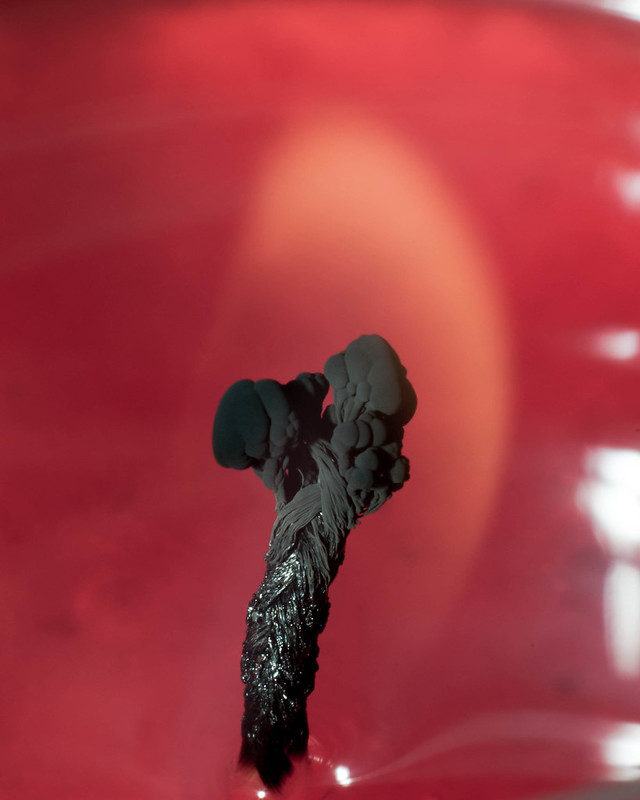 DSC_0686.jpg by MrDespair, on Flickr  DSC_0307.jpg by MrDespair, on Flickr  acros100007.jpg by MrDespair, on Flickr
|
|
#
?
Nov 28, 2012 16:53
|
|


|
dopaMEAN posted:I'm pretty sure I know what I did wrong with these - the cardinal has a poorly placed branch, the chickadee isn't in focus and the hoary redpoll is too small and has too much going on with the sticks. These remind me of some of the first shots I posted to SA. You've done well critiquing yourself. In general, unless the environment tells an intimate story about the wildlife, eliminate as much of it as possible to draw attention to your subject: Fill the frame with your subject. In short, "Get closer, noob." Walk, crop, buy a big gently caress-off lens. Get closer. Consider placing your subject off-center to give it "somewhere to go." If possible shoot the birds at eye-level. It's commonplace to go out and look up and see birds in a tree. Capturing this on film doesn't somehow make it more intriguing. Shoot several frames to try to get the bird looking at you or looking ... intent on doing something. For example, the redpoll looking down is depressing. If it had perked up a bit it'd be a more inviting subject. Spot-metering is probably the way to go (thank you Mr. Despair). Lighting birds is difficult, and since they're darker than the sky, well, you know where this is going. Shooting birds in low-light with the sun behind you will even the playing field, but the technological limitations of ISO and aperture start rearing their ugly heads.
|
|
#
?
Nov 28, 2012 17:00
|
|
|
dopaMEAN posted:Here are the photos I messed with. They're still a little grainy, but they were really clouded before I started playing with iPhoto. I'm pretty sure I know what I did wrong with these - the cardinal has a poorly placed branch, the chickadee isn't in focus and the hoary redpoll is too small and has too much going on with the sticks. For wildlife photography the reality is that you're going to get very few keepers. If these are backyard birds then you can improve your odds a bit by identifying where they are hanging out and removing branch clutter to improve your odds of getting a good shot, but otherwise you will just have to accept the fact that most of your shots are going in the recycle bin.
|
|
#
?
Nov 28, 2012 17:32
|
|

|
Mr. Despair posted:Might as well post something since I'm here. I feel like I'm about a million miles from being able to critique anything, but I very much enjoy the first photo. The detail shown in the wick (I find it to be creepy and phallic, but in a good way  ) is striking against the background. The white in the right side of the photo a little distracting (except for the pretty wisp trailing to the lower-right corner), and I wish the flame were a tiny bit more apparent, but I like this. ) is striking against the background. The white in the right side of the photo a little distracting (except for the pretty wisp trailing to the lower-right corner), and I wish the flame were a tiny bit more apparent, but I like this.I'm not sure what to think of the second photo. The contrast is striking to me, but I don't feel much looking at it. Not my cup of tea, that's all. The third seems a little fuzzy, which is frustrating. The texture of the bark is great. This also seems very tilted, but that's just the land, right? I'm not sure if that's undesirable or not, but it feels unnerving. 89 posted:(USER WAS PUT ON PROBATION FOR THIS POST) Hey, fellow "just got a D5100"er. I can totally understand the focus thing--it's exciting to be able to take photos with something better than a phone camera. I find myself taking lots of shots that are a little off focus-wise, as I'm trying to run through the loads of information I've read over the last couple of weeks (composition? line[s]? oh no), and I simply miss getting proper DOF/focus on the wrong thing. I'm sure that presence of mind will come with experience, though. I enjoy the concept of your third photo. I bet it was disappointingly easy to overlook the smaller aperture required to get the couple in the foreground of what should've been a cool shot. --- Here are some of mine. Christmas tree went up, so I tried shooting things up close in something beside daylight for the first time ever. I know essentially nothing, so hack away.  DSC_0096 by mxdv, on Flickr  DSC_0095 by mxdv, on Flickr  DSC_0056 by mxdv, on Flickr
|
|
#
?
Nov 28, 2012 22:21
|
|

|
Insanite posted:Here are some of mine. Christmas tree went up, so I tried shooting things up close in something beside daylight for the first time ever. I know essentially nothing, so hack away. The first picture seems to lack anything in particular to look at. The contrast with the ball and the tree is a bit lacking, but I think a little more light could help that out. I really like the angel topper, its got this creepy sort of vibe to it which is really awesome, the shadows and lighting are spot on, but the foreground has a lot of stuff in it, that would be my only critique. The last picture I really like, but I'm not sure if you where trying to make the alphabet block the focus or the glass bell. I really like how the alphabet block came out, but its fairly blurred in the front lower left, but then again I don't do a lot of macro stuff. --- These are a few from my summer in Maine:  Sunset in Camden Hills by bates.james.e, on Flickr  Sunset over Somes Sound by bates.james.e, on Flickr  Cutler Rainbow by bates.james.e, on Flickr
|
|
#
?
Nov 30, 2012 01:28
|
|
|
BigEast55 posted:The first picture seems to lack anything in particular to look at. The contrast with the ball and the tree is a bit lacking, but I think a little more light could help that out. I really like the angel topper, its got this creepy sort of vibe to it which is really awesome, the shadows and lighting are spot on, but the foreground has a lot of stuff in it, that would be my only critique. The last picture I really like, but I'm not sure if you where trying to make the alphabet block the focus or the glass bell. I really like how the alphabet block came out, but its fairly blurred in the front lower left, but then again I don't do a lot of macro stuff. I think the first one is pretty - the contrast gives it a dramatic feel - but it seems a little off balance. The lower left hand side feels empty, and the bit of tree peeking in is distracting. It might have been nice if the entire photo was shifted to the right slightly. Here's my practice for today! I played with "macro" mode on my camera. I put it in quotes, as I don't think I can actually do macros. It wouldn't take any photos in macro mode + AF, so I switched it to manual focus and got it to work that way. I think I was too close for AF to work. Anyways, I was focusing on composition, since that seems to be one of the biggest challenges for me so far. In this one, I tried to avoid centering the subject and played with empty space. The biggest issue I see is the inconsistency in lighting on the surface. Also, the rings could be better focused.  Rings 1 by dopameanie, on Flickr In this one I tried to work on having a diagonal line and tried to incorporate the texture of the background. I know this one and the last are tired and cliche, but I'm actually really happy with how this one turned out.  Rings 2 by dopameanie, on Flickr And this one was me playing with the 1/3rds rule. It's 1/3 cat, 1/3 shadow, 1/3 wall. This one suffers from the inclusion of the lamp and the cat tree behind the cat. I feel like backgrounds need to be perfectly controlled or the picture is ruined...  Shadowcat by dopameanie, on Flickr
|
|
#
?
Nov 30, 2012 06:01
|
|
|
dopaMEAN posted:
I am all about cat photos so let me just say that I want to pet that cat. It is good to keep the rule of 3rds in mind but do not do it to a fault where you try to make an image bend to its will so to speak. What you went for with the shot being divided in such a way did not work and you saw why, because of the background. Try being flexible and making it about the subject rather than the design if the image is not presenting itself. Get the cat's eyes in a nice place in the frame and draw attention to them and the background will not be an issue as much as it is here where the idea might have worked but the execution did not. I can kind of imagine a black and white shot without the clutter behind the cat and it ending up as a more interesting shot, but at the same time I use Instagram as a cat picture heaven so my critical eye concerning kitties might be skewed (cats are awesome, you see).
|
|
#
?
Nov 30, 2012 07:15
|
|

|
So I'm messing with exposure fusion and I've been staring at these too long, I need fresh eyes on this. How bad is it? I'm going for a subtle-ish look, or something. Not really sure. Untitled by Ebola Cereal, on Flickr  Buddha Tooth Temple, Singapore by Ebola Cereal, on Flickr (USER WAS PUT ON PROBATION FOR THIS POST)
|
|
#
?
Dec 1, 2012 04:40
|
|

|
Tyorik posted:So I'm messing with exposure fusion and I've been staring at these too long, I need fresh eyes on this. How bad is it? I'm going for a subtle-ish look, or something. Not really sure. I had to read up on exposure fusion. I would say the photos look natural. The clouds/sky seem a bit grey in the first one. I don't know if it is because of exposure fusion or not. Same thing for the top right in the 2nd shot or is it over exposed? That lamp post in the 2nd shot kind of distracts, but what can you do... Other than that, nice shots, awesome sharpness
|
|
#
?
Dec 1, 2012 05:49
|
|
|
Tyorik posted:So I'm messing with exposure fusion and I've been staring at these too long, I need fresh eyes on this. How bad is it? I'm going for a subtle-ish look, or something. Not really sure. The first one works very well. There seems to be a bit of white glow around the temple in the second, though, especially in the left hand side. Or is that just how the photos were taken? (Was that glow also present in the exposure you made for the sky?)
|
|
#
?
Dec 1, 2012 12:09
|
|
|
Tyorik posted:So I'm messing with exposure fusion and I've been staring at these too long, I need fresh eyes on this. How bad is it? I'm going for a subtle-ish look, or something. Not really sure. Love the first one, but the second one just has too much clutter in the foreground for me. I can sympathize as a lot of very cool buildings these days are surrounded by telephone poles, cars, street signs, ads etc etc. Was there a way to move a bit left and reshoot it? Would possible have gotten the lamp post out of the way if nothing else. But yeah, the first one is really nice. Maybe a bit green-ish at least on my monitor. To contribute, night exposure with the 5D2: 
|
|
#
?
Dec 1, 2012 21:57
|
|

|
dopaMEAN posted:
the glare on the second one seems really harsh, especially with the hard texture of the background. The more diffused light on the top one softens the background which I think makes it the better shot although you lost the detail in the rings. Tyorik posted:
I really wish the water was shot with longer exposure to smooth out those ripples. Clayton Bigsby posted:To contribute, night exposure with the 5D2: Seriously love the mood here. You really captured the feel of a snowy night.  Untitled by voodoorootbeer, on Flickr  Untitled by voodoorootbeer, on Flickr babby's first medium format. tear it up.
|
|
#
?
Dec 2, 2012 07:24
|
|

|
dopaMEAN posted:
Bird photography is one of the most difficult and frustrating things you can try. Leviathor had some good tips but I would like to add that one of the most important thing for "good" bird photos is having a nice background. Ideally you want some that will isolate the subject (the bird). Generally this is something that is plain so it is not distracting and try to avoid just a white sky background. Keep at it, while it is one of the most frustrating things I have tried when you get a good shot it is amazingly rewarding. ----- 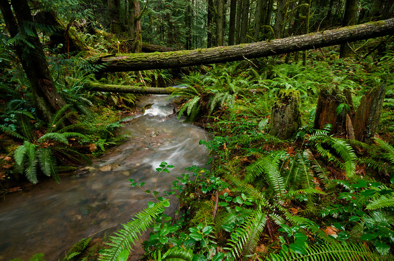
|
|
#
?
Dec 3, 2012 08:38
|
|

|
I really like this photo. My only sort of criticism is I wish the beginning of the creek took up more of the bottom of the photo. 20121124-img050-2 by Jordan_t_Brown, on Flickr  20121124-img048 by Jordan_t_Brown, on Flickr  20121125-img067 by Jordan_t_Brown, on Flickr  Forget by Jordan_t_Brown, on Flickr
|
|
#
?
Dec 3, 2012 12:00
|
|

|
Im That One Guy posted:
I like that the white balance and lighting immediately give me a sense of it being a cold, crisp morning/evening. I don't know if I'd personally try to recover a bit of the sky to make it a cold blue rather than a white. This weekend I went on a solo daytrip to Montpellier as I'll shortly be leaving France after 3 months and wanted to get some photos in of the city. This is my first time trying out a fake Cokin (Fauxkin?) setup with NDG filters to reduce the blown sky I was getting in previous outings. All taken with my 50mm 1.8 Click for big   
|
|
#
?
Dec 3, 2012 12:45
|
|

|
Where was this shot? I'm curious as to whether that horizon is characteristic of your locale or if it was just good luck. Regardless, I love the composition and warmth of the sky, although part of me wishes the foreground had deeper blacks. Would have been nice if the shed on the left were out of frame. Do you have other angles? Contribution:  A recently installed playground which is oddly situated directly under an expressway interchange. This was shot more for the contrasting colours than the composition, and once I was within the web itself, it was rather difficult to position the tripod while checking the viewfinder for composition.  this was shot on the walkway leading down to the playground / skate park, and I enjoy the harsh contrast between the night sky and and floodlights that have lit up the lower-level skate park. I'd still like to run this through photoshop and make sure the highway guard is level to the horizon, although the camera was shot level.
|
|
#
?
Dec 4, 2012 00:44
|
|

|
 Duck portrait by noartificialcolors, on Flickr I really like the way this shot ended up being composed, though I'm disappointed that his eye/face didn't come out sharper.  New Guinea Masked Lapwing by noartificialcolors, on Flickr I love this shot but I really wish I'd gotten its entire body in the frame, though I think it still came out pretty well balanced.  Macaw by noartificialcolors, on Flickr I really, really like the way his colors and textures came out but obviously I kind of wish I'd gotten both eyes in frame. Though in a way I think it might make it a bit more unique. I didn't do any post-processing to any of these, either. So obviously there's room for improvement in certain ways in those regards. I like what you're going for, but I feel like there could have been a better angle to it. Lower maybe?
|
|
#
?
Dec 4, 2012 04:31
|
|

|
I quite like both of these, they're both slightly unnerving in an interesting way. The first one especially, the contrast in colors that you mention work well. If there's anything I'd change, it'd be the trash can in the lower middle; it's an interesting visual touch, but it's not in a very interesting part of the frame. It'd probably look better moving it under the further arch where there's a natural gap in the web, although that's kind of nitpicky. I really like the way the second image is totally recognizable in the other half and almost abstract geometry in the lower half, it's vaguely surreal. It could use a little cleaning up in Photoshop like you mentioned, there's a couple smudges on the lens, and the flare from the light is pretty distracting.  DSC_0987 by Thearcology, on Flickr  DSC_0945 by Thearcology, on Flickr  DSC_0837 by Thearcology, on Flickr I wanted to post a couple of the first pictures I've taken with my first DSLR and get some thoughts on what I'm doing right/wrong. As a little background, I work as a graphic designer so I've had a lot of experience working with other people's pictures, but these are some of my first attempts at taking some of my own. (I never realized how difficult it can be to compose an interesting photo). I realize my subjects aren't particularly interesting and probably kind of cliche, but most of the time I've had to shoot has been while wandering around during my lunch break at work, and I'm still trying to make sure I have a good grasp of the technical basics before I plan out anything complex. The other issue I'm wondering about is whether I'm overdoing the post-production. Most of my experience working with photos is with a specific application in mind, so I'm a bit lost when I'm just fiddling with sliders aimlessly trying to make it look "better." Any opinions in that direction? (Also please please point out any technical uses with these oh God I am still trying to figure out how all the settings work together)
|
|
#
?
Dec 4, 2012 05:18
|
|

|
cory ad portas posted:Macaw by noartificialcolors, on Flickr I shot My First Wedding recently (as a second shooter); here are three of my favorites. I had trouble with lighting more than anything else - giant cathedral churches and all that.  I'm not sure how I feel about the amount of noise in this.  Again with the noise. I wish that I had gotten focus on their faces too and it was a choice about whether to make the stair rails even or keep the rest of the picture even. RAILS.  From the rehearsal dinner. The mother of the bride put up a frame for people to take pictures in. I like the color in this one - it looks kind of like film to me. edit: pictures should be shown Koala Food fucked around with this message at 05:26 on Dec 4, 2012 |
|
#
?
Dec 4, 2012 05:23
|
|

|
Arcology posted:
I like your first shot. Good composition, nice lines. 2nd is meh for me being just leaves. Sharp focusing, nice color, and cool texture though. 3rd maybe if the whole frame were symmetrical. I think your post processing is good. It is probably best to make your shots as good as possible to minimize post work. I think post work should be for enhancing and not for recovering a photo if that makes sense. phootnote fucked around with this message at 05:33 on Dec 4, 2012 |
|
#
?
Dec 4, 2012 05:29
|
|
|
Im That One Guy posted:
I'd like to see this without the fence on the left and shot on an overcast day around noon so there are no shadows from the trees. The focus could then be on the greens of the building, trees, and grass and repeating vertical lines of the wall and trees.
|
|
#
?
Dec 5, 2012 07:03
|
|
|
Arcology posted:The other issue I'm wondering about is whether I'm overdoing the post-production. If you'd like some more focused advice, why not post a before/after image in the post processing thread and we can give you some specific pointers. It's hard to know what post was done (unless it's heinous, which yours isn't) without seeing the original.
|
|
#
?
Dec 5, 2012 12:10
|
|
|
krooj posted:Where was this shot? I'm curious as to whether that horizon is characteristic of your locale or if it was just good luck. Regardless, I love the composition and warmth of the sky, although part of me wishes the foreground had deeper blacks. Would have been nice if the shed on the left were out of frame. Do you have other angles? It was a case of "luck favors the prepared". ") There is a highway about a hundred meters or so up the road, and when you have a cloudy/hazy evening the lights from the cars on it make the sky glow a fair bit in that particular area. There is a highway about a hundred meters or so up the road, and when you have a cloudy/hazy evening the lights from the cars on it make the sky glow a fair bit in that particular area.I debated a bit on both the shed and the foreground, but opted to keep it in since I liked the texture of it, and wanted a little more detail visible overall. I will go back and play with levels a bit and see if I can find a happy medium though where there is "enough" detail while still darkening things a bit. Thanks!
|
|
#
?
Dec 5, 2012 20:28
|
|
|
Bread Zeppelin posted:I'd like to see this without the fence on the left and shot on an overcast day around noon so there are no shadows from the trees. The focus could then be on the greens of the building, trees, and grass and repeating vertical lines of the wall and trees. I'm not sure about this. The colors and tonality is great, but I feel it should be shifted to either the left or right. The way it is, the lines are bouncing me back and forth toward the edges and off the sides of the image. 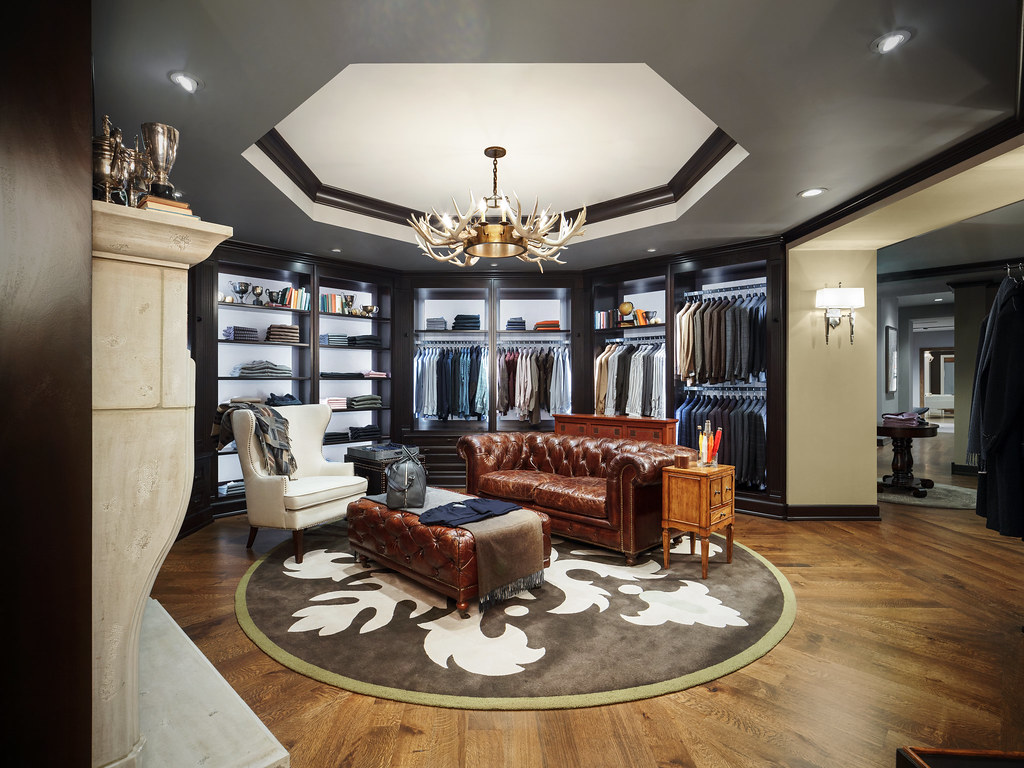   I don't have time to spend the usual week on each image, so I've been tweaking my shooting style and using artificial lighting to avoid post-processing as much as possible. I've processed about 150 these past two weeks and now need to put them together as a book... by the end of the week.
|
|
#
?
Dec 5, 2012 22:39
|
|

|
This photo irks me. The fireplace on the left seems imbalanced with the hallway extending into the distance on the right. There's also something about the furniture arrangement in the centre, particularly the leather couch. I'm not entirely sure, but I think the problem with the couch is that it's empty; everything else in the room carries something, but the couch just sits there, entirely void. All in all, I think this one is just not up to your usual standards.
|
|
#
?
Dec 6, 2012 00:32
|
|
|
The one with the table of ties looks off to me too. When I look at it in my peripheral vision, it seems to glow too much like it's an HDR with halos. It seems like it's bordering on blowing out highlights even though when I pixel peep everything seems fine.
|
|
#
?
Dec 6, 2012 00:44
|
|

|
xzzy posted:The one with the table of ties looks off to me too. When I look at it in my peripheral vision, it seems to glow too much like it's an HDR with halos. It's the awful LED strip lighting they put behind the shelf trim. It has a violet cast and the LEDs are spread out a bit so it shows up as super harsh pinpoints of blown out awfulness.
|
|
#
?
Dec 6, 2012 00:52
|
|
|
The fireplace on the left is killing this for me. It's intrusive, feels like it isn't adding much to the photo, and the trophies at the top are, in juxtaposition to everything else, much less crisp and defined from your usual pictures.
|
|
#
?
Dec 6, 2012 10:09
|
|

|
I think this is great, the colors and tonality borders on a cartoon-look - I knew immediately that these were your shots, before I looked at the username (and that's a huge compliment). The pillows/chairs (?) at the bottom annoys me, because I can't decide what they are - and the headrest (?) to the right irks the symmetry. Overall, I like every one of them though. Got that special lighting going on, that is unique for your style. I'd say you've done a pretty good job on replacing your post processing with controlled lighting.
|
|
#
?
Dec 6, 2012 15:49
|
|
|
I really like this picture, although I think I would like it more if the painting in the mirror on the right hand side were gone. I don't mind the chairs so much.  misc victoria 005 rc crop by vnlk65n, on Flickr  misc victoria 013 rc by vnlk65n, on Flickr  misc victoria 015 by vnlk65n, on Flickr I'm pretty new to photography and am still learning to work the camera from both a technical and creative aspect. I took these yesterday morning. I really like how the color turned out in pictures one and three, but I think picture two is the most interesting to look at, even if the composition could have been a little better.
|
|
#
?
Dec 6, 2012 17:41
|
|
|
BlueMax posted:
It is some neat hills in a light mist, getting a good sense of depth in the picture, but I think this is one of those cases where a longer lens would have been good for landscape. What really catches my eye in the picture is the bit of light (a small town?) in the right side, and I would have liked to see more of that. The EXIF says you shot it at 32mm focal length, I think if you had used something around 70-100mm you could have focused more on that point while still getting a good amount of distant hills-in-the-mist and the details in the sky, while getting less of the gray and black spaces in the top and bottom of the picture. Your other two pictures are not particularly interesting to me. The first one has a blown out sky, and the light on the ground seems pretty dull. It's a path but I don't get a sense of it leading anywhere, or coming from any particular place. The third has quite good light play on the ground, but the strong sun detracts from it. Did you try hiding the sun behind some branches to make it less of a white blob? Overall I also don't really see any subject in the photo; if you wanted to catch the light play on the ground I think it might have been better to the the tree(s) on the right out of the frame, right now they are just silhouettes blocking the view.
|
|
#
?
Dec 6, 2012 17:55
|
|
|
BlueMax posted:
I'm the same as you about being new, so my advice isn't worth much, but I have mixed feelings about this photo. I personally love big sweeping landscapes, but it's just a little too gray and dark, considering there's nothing to really grab attention. The light is interesting, and you caught it in the clouds at a really opportune time, but it needs something to focus on. I agree with nielsm that the town on the right could work. Here are a couple of mine:   These are two places I like in the city. In person, they're much more striking. The first one loses the sense of business around the plaza as well as the proximity to the train. I think it's still decent, but not a completely accurate representation. The second place is cool because you can see the smokestack just as you round the hill. However the photograph just doesn't really jump out the way it does in reality. Again, I don't know how to convey that sense. Annie Chickenstalker fucked around with this message at 07:08 on Dec 7, 2012 |
|
#
?
Dec 7, 2012 07:05
|
|


|
Oh. My. Zeus. posted:I'm the same as you about being new, so my advice isn't worth much, but I have mixed feelings about this photo. I personally love big sweeping landscapes, but it's just a little too gray and dark, considering there's nothing to really grab attention. The light is interesting, and you caught it in the clouds at a really opportune time, but it needs something to focus on. I agree with nielsm that the town on the right could work. I think the first would work better with a focus on the skyline. The tram + tall buildings just seem interesting to me, more so than the crowd of people wandering about. Or maybe it's interesting because they tower over the people so well. Basically I just wish the top of that building wasn't cut off. The 2nd pic I think might pop better if you tried it with the light coming from the back, so the buildings were better lit. Or maybe just move up enough that the building on the right there is out of the way, seems like it might be hard to get both sides of the street well lit at the same time.  DSC_0046.jpg by MrDespair, on Flickr  DSC_0029.jpg by MrDespair, on Flickr 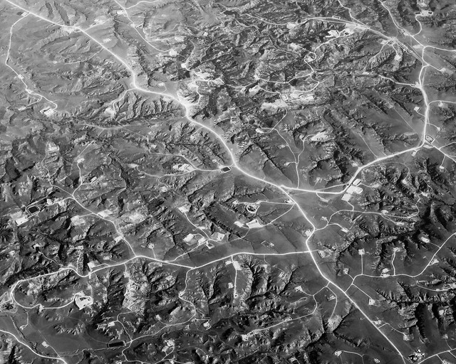 DSC_0112.jpg by MrDespair, on Flickr
|
|
#
?
Dec 7, 2012 07:40
|
|
|
Do you feel that the black box with the graffiti on is important to the scene? If not, try to get it out of view. (E.g. walk 10 steps forward so you can pretty much rest against it.) And echoing Mr. Despair, try to arrive at a different time of day where the sun is in your back, if that's possible at all. Edit: Mr. Despair posted:
Is this IR or something, with how the roads seem to be glowing? nielsm fucked around with this message at 10:17 on Dec 7, 2012 |
|
#
?
Dec 7, 2012 10:12
|
|
|
nielsm posted:Edit: Nope, just really white roads paired with some diffuse but harsh sun. Was also taken from the back of the plane so there's a bit if a haze from the jetwash too, that's a big reason why the "glow" is so strong in the center of the pic and not bottom, for example.
|
|
#
?
Dec 7, 2012 17:14
|
|
|

|
| # ? May 21, 2024 15:19 |
|
|
BlueMax posted:
If this were my photo, I'd crop out the left hand side - there is just too much going on with the branches and the sun is distracting. Otherwise, I quite like this one. The light on the moss is very nice Playing with bokeh:  _DSC_1397_2 by gratefulhume., on Flickr Speaking of a distracting sun...  _PA191757_2 by gratefulhume., on Flickr
|
|
#
?
Dec 7, 2012 22:29
|
|