|
GratefulHume posted:Playing with bokeh: I like this because you did something with nothing. I have trouble finding time/motivation to take my camera out these days because I work a lot, but this is very motivational to me somehow. Even if I don't have time to go out and find something great to shoot, I can work on doing more creative things at home. On to the critique itself : I'm not sure if it was deliberately left so blue, but I think you should work on the color balance of the indoor part of your shot. I think it's too blue at the moment and it's making it hard for me to enjoy this shot completely. The background is really nice and I love how the mosquito grid gives a nice texture to the bookeh. Nice colors too. --- going through some old photos 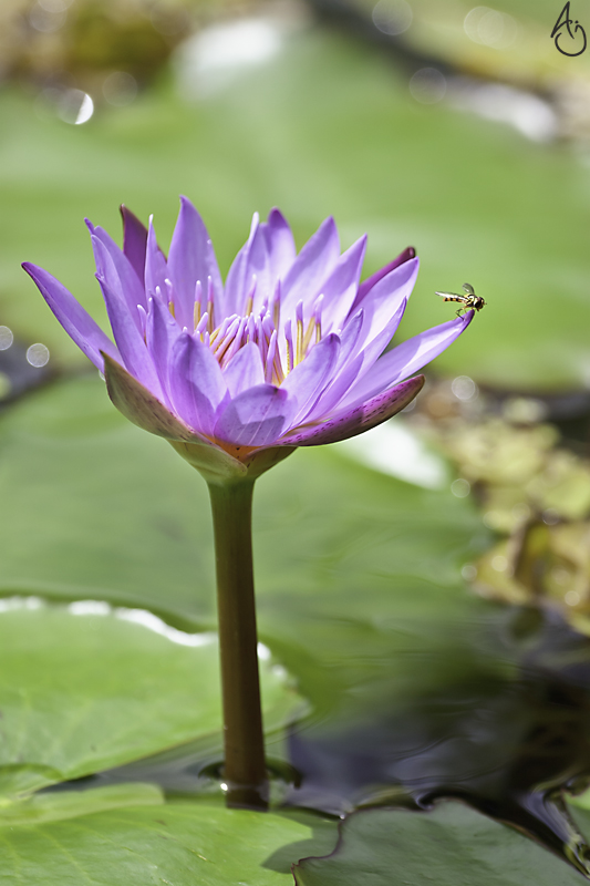 IMG_0687-Edit-Edit by king colliwog, on Flickr
|
 #
?
Dec 8, 2012 00:01
#
?
Dec 8, 2012 00:01
|
|


|

|
| # ? May 21, 2024 22:37 |
|
|
KingColliwog posted:going through some old photos Mr. Despair posted:
Here's one from me today: 
|
|
#
?
Dec 8, 2012 01:26
|
|

|
nevermind.
Primo Itch fucked around with this message at 04:32 on Dec 8, 2012 |
|
#
?
Dec 8, 2012 04:15
|
|
|
InternetJunky posted:I like everything about this shot except the crop. I just covered the bottom third of the picture and that seemed like a much better crop, imo. Thanks for the comment/good words. Are you suggesting that I change the ratio to something closer to a square crop and cut in the stem of the flower/put the flower itself almost dead center? I'm at work now but I'll try it when I come back home. Feel free to do a quick crop on the file if you're so inclined. -- I'm not sure of your shot. I get the whole symmetry thing, but I would have shot this straight to reinforce it. Other than that, there is a lot of dead space that doesn't contribute much/isn't particularly interesting since it's mostly a lot of gray. May be with a more interesting sky or something?
|
|
#
?
Dec 8, 2012 16:22
|
|
|
InternetJunky posted:
I feel the same way, although I think it might just be because a little more of the right face of the building is showing than the left face. I think if that were reversed you could get away with it, since at least my unprofessional eye gets drawn to the blue. A really cool shot nonetheless.
|
|
#
?
Dec 8, 2012 18:00
|
|
|
InternetJunky posted:Here's one from me today: I would have shot this from a much lower angle and left out most of the sky. Shooting from a lower angle you could have the bales looming above the trees in the background, making them look more striking. Plus all that flat grey sky is blah.
|
|
#
?
Dec 9, 2012 00:42
|
|


|
Mr. Despair posted:
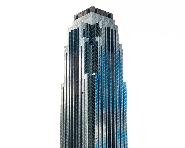
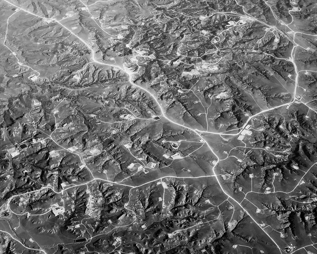
Really love both of these. The first is just so clinical - did you have to remove anything from the sky surrounding the tower, or was it as-shot? The second has a very alien feel to it, and you say it was just the light reflecting off of the roads themselves which gave the exposure we see? Contributing, I rented a 24-70 f/2.8 Nikkor. It's a nice lens, but I'm still not 100% sure (it's a lot of money for a compromise):  Shot of the intersection of Augusta & Baldwin St. Kensington Market, Toronto. I had an earlier shot of this with another lens, but the scene wasn't framed as I wanted it, nor was everything in focus. I feel this is a better shot.  This is almost exactly as it came out of the camera RAW, aside from a minor crop to the left. The composition isn't that interesting, but I do enjoy the lighting.
|
|
#
?
Dec 9, 2012 04:24
|
|

|
The first one I just pushed the exposure and highlights a bit (maybe a lot) to wash out the sky. Here's a more "nature" version of the same thing to give you an idea of how far I pushed it. 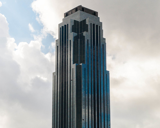 DSC_0029.jpg by MrDespair, on Flickr In the same manner here's an untouched shot that I took at the same time as the 2nd one above. Dropped exposure a bit, upped the contrast, and min/maxed the whites and blacks. 
|
|
#
?
Dec 9, 2012 04:39
|
|


|
Very cool. The contrast between the before/after in land shot is striking, to say the least. To be honest, I prefer the building with clouds and blue sky in the background, if for nothing more than context.
|
|
#
?
Dec 9, 2012 04:56
|
|
|
krooj posted:To be honest, I prefer the building with clouds and blue sky in the background, if for nothing more than context. I don't, I like the pure white background for that shot. Makes it almost abstract and gives the building a more mysterious feel. Helps with the symmetry thing too. Bought a wide-angle lens recently. It's amazing how much more I can fit in the frame. Here's a test shot that I liked.  Melbourne Central Station by euannz, on Flickr Wafflecopper fucked around with this message at 06:03 on Dec 9, 2012 |
|
#
?
Dec 9, 2012 05:42
|
|
|
Mr. Despair posted:The first one I just pushed the exposure and highlights a bit (maybe a lot) to wash out the sky. Not that there was anything wrong with the first version but this looks much better with the sky visible. The colors throughout the shot are smooth and soft. Also, the clouds actually make the tower look more impressive. There's a sharp contrast between the building's right angles and the random soft clouds.
|
|
#
?
Dec 9, 2012 08:24
|
|


|
KingColliwog posted:Thanks for the comment/good words. Are you suggesting that I change the ratio to something closer to a square crop and cut in the stem of the flower/put the flower itself almost dead center? I'm at work now but I'll try it when I come back home. Feel free to do a quick crop on the file if you're so inclined. Yeah, think I would really like that shot in a square crop. The bottom of the photo really isn't adding much.
|
|
#
?
Dec 10, 2012 01:55
|
|

|
Wafflecopper posted:Bought a wide-angle lens recently. It's amazing how much more I can fit in the frame. Here's a test shot that I liked. Wide angles are cool. This building structure thing is cool. It would be nice if you could lighten up the darker portion of the structure to get a bit more texture out of it. 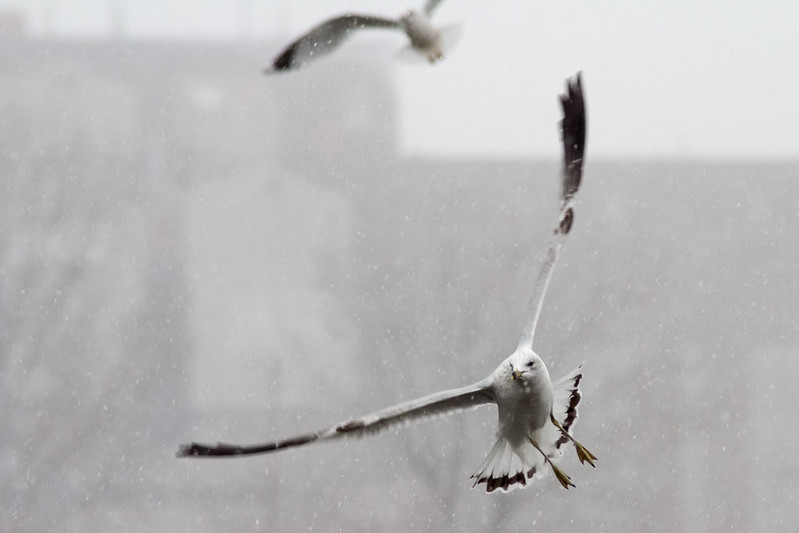 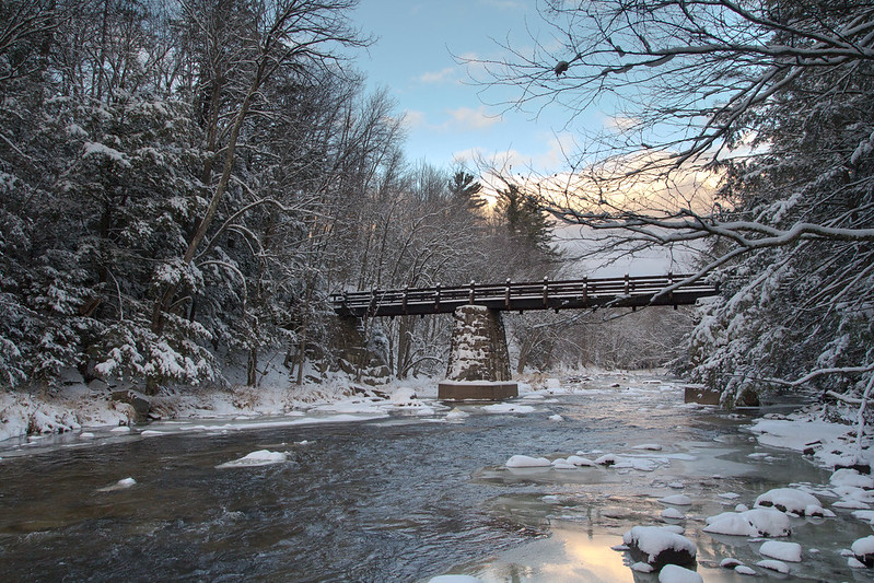 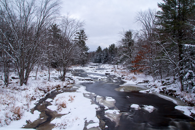
|
|
#
?
Dec 11, 2012 08:12
|
|
|
Wafflecopper posted:I don't, I like the pure white background for that shot. Makes it almost abstract and gives the building a more mysterious feel. Helps with the symmetry thing too. This is quite cool; the roof seems to be reaching out at you. I've got a few suggestions: -try to lower the contrast/clarity in the building in the middle--the detail in the bottom part keeps my eye going back there. -maybe try a b&w conversion? I feel like this is a shot that could further strengthened by it. Random recent shots:  Untitled by renburress, on Flickr  Reflections 4 by renburress, on Flickr self-portrait:  not pictured: my overgrown hair by renburress, on Flickr edit: please critique; I know I could really use it. Dr. Cool fucked around with this message at 04:55 on Dec 13, 2012 |
|
#
?
Dec 11, 2012 08:44
|
|
|
Wafflecopper posted:Bought a wide-angle lens recently. It's amazing how much more I can fit in the frame. Here's a test shot that I liked. Wide Angles are awesome. They're my favorite lens to shoot with, and I feel like I get the photos I like the best with them. Dealing with the distortion is sometimes an issue, but you can really put it to use sometimes. This photo doesn't feel very wall-eyed at all, and all the lines are very nice. The framing is good and the composition is spot on. The brick building seems a little washed out, but that might be a result of getting those very nice blacks in the girders.  DSC_0365-3 by jpitha, on Flickr I spent entirely too long standing around waiting for a shot with no people in it. Naturally, I also spent entirely too long trying to straighten the lines in Lightroom, and I still think there could be more done to it. It was drat blue that day. Edit: Dirty dirty sensor.
|
|
#
?
Dec 11, 2012 20:35
|
|


|
Casu Marzu posted:Wide angles are cool. This building structure thing is cool. It would be nice if you could lighten up the darker portion of the structure to get a bit more texture out of it. It is a shame the bird in the background isn't whole, I might have been tempted to crop/clone it out, but otherwise I really like the framing. I think the 3rd is the stronger of the 2 river photos, it feels colder and more wintery. Shampoo posted:
-----   Not sure if the cows are too small but unfortunately I couldn't get any closer. Hotwax Residue fucked around with this message at 03:47 on Dec 13, 2012 |
|
#
?
Dec 12, 2012 19:41
|
|
|
Hotwax Residue posted:
I like this one, but I can't help but feel like it needs at least 1 spot that would be lighter. The weather obviously makes this very hard, but there might be something you could do in post. May be the ground/cows could be lighter? I really like the composition. I'm really a sucker for those type of shot that have a ridiculous amount of interesting sky in it. The cows could be a little bigger, but to me they are fine as is since it adds a feeling of "immensity" to the picture that I like. Really digging this. I'd try cloning the other bird out since he's more of a distraction than anything else. I'm not sure he contributes anything to the picture and he should be easy to remove. The way the wings of the bird cover the frame is really nice to me. Nice curvy-diagonal-rule of third thing that works amazingly well. Looks like the kind of shot you could use to explain the rule of third. Really dig the mood of the overall picture. Good job on getting the bird in focus, I always fail these kind of shot or get horrible composition on the few shots that have great focus. What speed/autofocus mode/camera did you use? -- More flowers because I don't have time to shoot and I go through old folders of picture I took like a year or so ago and I had a bunch of unused flower shots. Deal with it!  IMG_0094-Edit as Smart Object-1 by king colliwog, on Flickr Tried to add some mad vintage feel to this just for fun. I kind of like it  pissenlit 2 by king colliwog, on Flickr KingColliwog fucked around with this message at 21:10 on Dec 12, 2012 |
|
#
?
Dec 12, 2012 21:04
|
|

|
Nice! As others have said, it would've been better if the second bird was whole. Right now its a little bit distracting. 
|
|
#
?
Dec 12, 2012 21:12
|
|
|
KingColliwog posted:Really digging this. I'd try cloning the other bird out since he's more of a distraction than anything else. I'm not sure he contributes anything to the picture and he should be easy to remove. Thanks! I am working on cloning the second bird out, and I do like the picture more. I shot this on my 60D with a Sigma 70-200 2.8. EXIF looks like f/6.3, ISO800, 1/500. This was shot in Av mode because I was dumb and wasn't paying attention when a huge flock of gulls came flying over. This and one other photo were the only ones that managed to be in focus out of probably 75 shots.  I need to go birding more often so I don't forget my camera settings. I need to go birding more often so I don't forget my camera settings.--- If I had to pick, I'd choose the second one you shot. The more subdued colors are easier on the eye and adds something nice to the photo.
|
|
#
?
Dec 13, 2012 07:21
|
|
|
Shampoo posted:Wide Angles are awesome. They're my favorite lens to shoot with, and I feel like I get the photos I like the best with them. Dealing with the distortion is sometimes an issue, but you can really put it to use sometimes. This photo doesn't feel very wall-eyed at all, and all the lines are very nice. The framing is good and the composition is spot on. The brick building seems a little washed out, but that might be a result of getting those very nice blacks in the girders. For a sunny day, that is a surprisingly very blue picture. Was it like that in real life as well? I've never been there myself, but in my Latin class back in high school, our teacher hung up a poster of that island that was shot with what I think was Kodachrome. I remember looking at it and thinking to myself: "I wish they still sold Kodachrome..." Anyways, the photographer shot his picture during sunset. After seeing your picture, I'm starting to think that he might have shot that to counteract the blueness of that location. Dr. Cool posted:
In a portrait, the first thing we usually look at is the head and the face. There's nothing wrong with cutting your head off for a portrait, but the attention should be taken by something else. Give the viewer something to focus on. Anyways, is it possible that you just tried to take a selfportrait but misjudged the crop accidentally cutting your head off?  Because your head is cut off rather awkwardly at the chin. Because your head is cut off rather awkwardly at the chin.Just to put my own hand in the fire, here are two portraits I took over the past few months. Are Tumblr links ok? I've pretty much abandoned my Flickr. Don't mind the white borders. We print on 24" printers at school and they're there to assist in cutting and making sure my fingers don't dirty the prints.  
|
|
#
?
Dec 13, 2012 23:05
|
|
|
That model needs more stubble. Also, for some more serious crit (?), there is something about the angle that annoys me, I think it might be too low. Or maybe it's just how the background generally clashes with what I expect from TF2.
|
|
#
?
Dec 13, 2012 23:30
|
|


|
Wafflecopper posted:
This is nice and contrasty. For the most part, I find the center of interest (where the ceiling converges) to be pleasing. If anything, it would be cooler if the edge of the building were lined up diagonally with the bottom-left corner of the frame (entering at 45 deg.). Another thing which would be cool is if the enclosed building were removed entirely. From last night:   Both of these were shot in the east-end of Toronto (Gerrard St.), which is still quite gritty. I so badly wanted to get a shot of an old asian fellow smoking in front of a brightly lit TTC shelter (with a gaudy GAP ad in the shelter frame), but I'm not quite at the level of just asking strangers if I can take their portraits. Guess I just need to nut up and ask.
|
|
#
?
Dec 15, 2012 00:19
|
|
|
Hotwax Residue posted:
I actually think the cows being so small works in this shot, as it lends you to see the storm as a lot bigger and more imposing once your eye finally catches them gathered up in the field. The one thing I think might be a little distracting is the depth of vignetting, especially there in the bottom left corner. At any rate - Hi there PAD thread. I'm a pretty new photographer, I've been shooting 'seriously' for about six months now with a DSLR and have been taking a small class at my local college to learn a bit more about photography as a whole. My work isn't nearly on the level of the people that post here, but since the OP said this thread is OK for people of all skill levels, I hope it's alright if I post a few things to get some feedback on.  This is probably what I would quantify as the "best" photo I've taken, but I know there's so much wrong with it. There could definitely have been something done to open up the shadow to the left side of him/his face... but I'm just not really sure what, since I've not really learned that yet. I would really love input as to what might be a good idea to try for things like this, especially with nature photography, as that seems to be what I do the most of.  The DoF on this one I think needs to be a little wider, and the light just a little stronger to bring out the shadows. My favorite part of it, though, is the texture of all the dirt on the jar. This one was shot in color then converted in Photoshop. That Damn Satyr fucked around with this message at 04:25 on Dec 16, 2012 |
|
#
?
Dec 16, 2012 04:22
|
|

|
krooj posted:From last night: I like the contrast of bright color and blackness a little on the first one, but for the most part these just look like random snapshots to me. What do you find interesting about them? The second one just looks like a random mess of shapes with a subject that is center composed for what feels like no real reason other than to get the entire setting, which really isn't interesting in its own right nor does it tell me anything about the subject. What are you shooting for? Are you trying to get something that is aesthetically pleasing? Are you trying to tell a story? Are you trying to capture someone's personality? I think these photos feel random and aimless because you don't know why you took them, and I think that's something that would be incredibly beneficial to focus on in the future. For example, if you think the scene in the second is interesting, why do you think it is interesting? The store being in complete disarray? The store clerk who looks like she hates being there? All of the random straight lines everywhere? The coolly lit cactus? Try to find what you think is most compelling about the image and then try to accentuate that element somehow rather than bunching it all together with no real discernible focus. These are pretty technically sound, especially for photos taken in situations with poor lighting, but they need something different composition-wise. mr. mephistopheles fucked around with this message at 05:11 on Dec 16, 2012 |
|
#
?
Dec 16, 2012 05:08
|
|


|
mr. mephistopheles posted:I like the contrast of bright color and blackness a little on the first one, but for the most part these just look like random snapshots to me. What do you find interesting about them? The second one just looks like a random mess of shapes with a subject that is center composed for what feels like no real reason other than to get the entire setting, which really isn't interesting in its own right nor does it tell me anything about the subject. Thanks for the feedback. To give some context/explanation of intent: I am basically walking about Toronto, capturing images from various neighbourhoods. In this instance, the target happened to be on Gerrard St. East, which contains a small south asian community. The photo in question (2nd) was meant to convey a scene of disarray, which I think characterizes the neighbourhood as a whole. Also, the items in the basket are corn ears, not cacti. I suppose to give context, a better composition would have shown more of the surrounding street, or perhaps a number of photos from this set should have been posted, along with explanations of each.
|
|
#
?
Dec 16, 2012 18:55
|
|
|
Shampoo posted:
This is pretty awesome. Did you use a polarizer for it, or multiple exposures or something? The only thing that catches my eye, and maybe you wanted it that way, is that the white balance is really really cool on the stone - really trending toward blue. I'd like to see at least the stone on the ground warmed up a tad but who knows if it would change it for the worse. These are some shots while I was taking a motorcycle trip with some friends: The only shot I managed to get of a meteor during the Geminid Shower  Geminid Meteor by Ebola Cereal, on Flickr  Shoreline Wavelength by Ebola Cereal, on Flickr
|
|
#
?
Dec 17, 2012 03:21
|
|

|
Sorry dude but I don't think that's a meteor.. it's a plane. If you're referring to the line of light with bright points on it near the top center that is.
|
|
#
?
Dec 17, 2012 03:35
|
|

|
Now that you mention it, I could see how the even spacing in the lights would be one. On the other hand, I was out there for about 45 minutes and never saw a plane the whole time, so it's kind of hard to say.
|
|
#
?
Dec 17, 2012 03:53
|
|
|
InternetJunky posted:Here's one from me today: I don't know whether it was your intent or not, but you exposed your snow in this image as middle gray. It's dull and boring and kind of gross. My brain expects snow to be white and it's really hard to get past that with this image. Dial in a stop or two of positive exposure compensation next time you have snow in your image so that it doesn't come out gray.  Untitled by TheJeffers, on Flickr
|
|
#
?
Dec 17, 2012 23:50
|
|

|
TheJeffers posted:
 This is just so awesome. This is just so awesome.
|
|
#
?
Dec 18, 2012 07:45
|
|
|
TheJeffers posted:
Yeah the contrast, lines and textures in this are all very nice. I like it a lot. Been trying take more pictures and been trying out some film. Not sure if the flare to the right is distracting but I liked the overall tone.  Scan10013-1 by boydy88, on Flickr
|
|
#
?
Dec 18, 2012 15:10
|
|
|
Dr. Cool posted:
I think your self-portrait would work better with the bush on the right cropped out. I find it a bit distracting and enjoy the shot more without it.  IMG021 by wallofinsanity, on Flickr
|
|
#
?
Dec 19, 2012 19:47
|
|


|
Mr. Despair posted:
I loved this picture and wanted to weigh in on the processed one vs. the 'natural' one. For me the image is far more striking when processed with the white background. It feels singular and monolithic in a way that the one with the natural processing and the clouds just doesn't. At least for me. Here is a picture from my Scotland trip. It's quite boring and 'generic' so I'm wondering if anyone has suggestions for processing or cropping that might make it less boring. 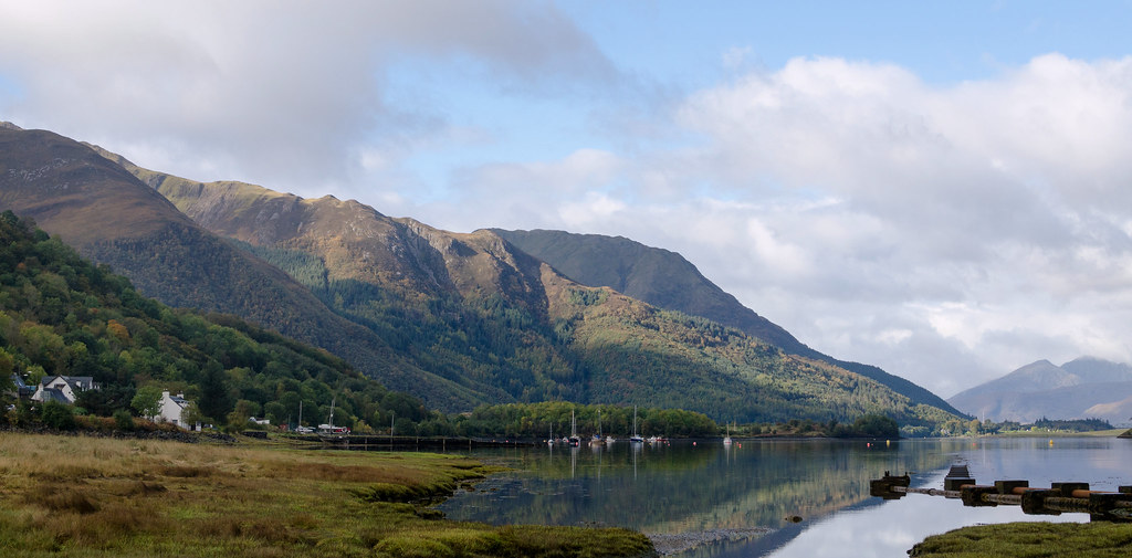 20121006-_DSC4355 by tijag, on Flickr
|
|
#
?
Dec 19, 2012 23:21
|
|

|
tijag posted:It's quite boring and 'generic' so I'm wondering if anyone has suggestions for processing or cropping that might make it less boring. If you feel that it is boring and generic then post will not save it and a crop might not save it either but it is at least possible. Anyway, it seems like you have the potential for two separate images here, one from the left with the buildings and layers of terrain behind them and one from the right with again the layers of terrain + reflections, the boats and the manmade stuff extending into the water. Unless some sort of post would help you portray what you are trying to more effectively, I think that part looks fine as is and is pleasing to look at nice and natural. Spime Wrangler posted:
The look here is great; Kodak Gold works great for stuff like this. The way you have the shot framed has my eye move around the frame - I think in part due to that little spot with the circular ripples around it in the lower right drawing my eye but then not having much to look at there it goes to surrounding areas. I'm pretty curious about what is going on in the upper left but not enough that I can't appreciate what I am looking at portrayed in this scene. TheJeffers posted:
----  Scan-121219-0026 by Paul Hofreiter, on Flickr 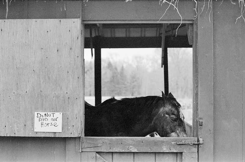 DO NOT FEED OUR HORSE by Paul Hofreiter, on Flickr  Scan-121219-0025 by Paul Hofreiter, on Flickr
|
|
#
?
Dec 20, 2012 06:10
|
|

|
rio posted:
Would like to see a wider shot of the first image if there is one. Not quite sure what you were going for here. The second is cute, I would say that the image needs a slight readjust in angle (horizon slightly off). I'm a hypocrite because my images are all off. The third is simultaneously cool but not cool. What do you do shoot on? The images seem kind of flat. Was it color that was scanned and converted?   
|
|
#
?
Dec 20, 2012 06:31
|
|
|
^ I like the 3rd one the most, the first I am having a hard time looking at because the focus seems to be the grass in the foreground and my brain is not sure what it is looking at it. To answer your questions, quote:Would like to see a wider shot of the first image if there is one. Not quite sure what you were going for here. quote:What do you do shoot on? Just got a Pentax ME Super and it was on T-MAX 400. I find it to be kind of flat sometimes too; it is not my first choice in b&w films but my wife got me a ton and I am trying to use it all. quote:The images seem kind of flat. Was it color that was scanned and converted? I am dealing with a pretty poo poo scanner (Epson Perfection 2580) and am also relatively inexperienced with scanning negatives so it might be that combined with the characteristics of TRI-X. Oh, and it was my second try at developing film so there is that too.
|
|
#
?
Dec 20, 2012 06:51
|
|
|
boydx posted:Yeah the contrast, lines and textures in this are all very nice. I like it a lot. This works pretty well with deep blacks contrasting nicely with the general warm tone of the picture. Maybe some wouldn't be fans of the loss of detail with the sky but it works in the way that you'd fondly remember a good place to hike. That's how I see this; it's just slightly more dream-like than capturing that location as is. Anyhow, the photo is balanced well in terms of lighting. Good composition. -- Both of these were kind of tough to work with. They're straight from JPEG's and the originals were blown out on the highlights and had white balance issues. Had I shot them with a bit more thought maybe I'd go in a different direction with them. As I said, much of this was a salvage. There's been work done to remove something from the wall and some light spot removal. Contrast has been dropped by a bit, highlights were reigned in but there wasn't much latitude there, and I did some color work to make the photo look not as garish. I'm pretty happy with how it came out editing wise.  This is a crop from a much larger image that was originally shot vertically. This one didn't require much work to get something I found to be pleasing to look at. I liked my friend's reflection in the window so I did a contrast filter to bring it out a bit more. Things I don't like about it are that I feel like the photos looks too hard which was a result of the massive crop I did and the strand of hair blocking her eyes. Not much I could do about that. 
|
|
#
?
Dec 21, 2012 10:25
|
|


|
Most of this is really nice. However the out of focus monument in the middle is extremely distracting and since its white you can't look away from it. I just really wish it wasn't there, because otherwise that spot is beautiful. 
|
|
#
?
Dec 21, 2012 10:53
|
|

|
TheJeffers posted:
Chiming in with everyone to say that this is very neat. The composition and post processing is top notch. My OCD tells me to remove the air intake thing at the end to make it cleaner but that's just me. As for me, here's my last shoot of this year and third studio shoot in my life ")  IMG_3854 by avoyer, on Flickr
|
|
#
?
Dec 21, 2012 18:02
|
|

|

|
| # ? May 21, 2024 22:37 |
|
|
xenilk posted:Chiming in with everyone to say that this is very neat. The composition and post processing is top notch. My OCD tells me to remove the air intake thing at the end to make it cleaner but that's just me. Me likey.... How about a little more darkness on the left to make the lightness on the right "pop" though? 
|
|
#
?
Dec 22, 2012 07:01
|
|