


|
thetzar posted:Fantastic stuff, all of it, and thanks for the insights. So who are these people, and how did you end up photographing them? All friends of mine that I've photographed many times before. Yeah, I have beautiful friends that make this a lot easier ")
|
 #
?
Dec 19, 2012 02:03
#
?
Dec 19, 2012 02:03
|
|


|

|
| # ? May 17, 2024 02:33 |
|
|
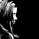
can i ask how you get the blacks to be not so black like this? vvvv also agreeing with the "dope" comment. awesome set. whereismyshoe fucked around with this message at 15:58 on Dec 19, 2012 |
|
#
?
Dec 19, 2012 05:46
|
|


|
this is dope whereismyshoe posted:can i ask how you get the blacks to be not so black like this? raise the low end in curves
|
|
#
?
Dec 19, 2012 08:19
|
|

|
aliencowboy posted:raise the low end in curves
|
|
#
?
Dec 19, 2012 10:22
|
|

|
I got bored and had to finish a roll of 120.  The dirtiest frame I've ever seen! No idea what happened to this particular shot, other frames are much cleaner.
|
|
#
?
Dec 20, 2012 06:24
|
|
|
Oprah Haza posted:
Let's put it this way, your camera is now completely devoid of any particle of dust. I see the same pattern with my 35mm stuff: every now and then, one random frame is ruined with dust.
|
|
#
?
Dec 20, 2012 10:38
|
|

|
Goddamn, dial it back with the Instagram filters; less is more, y'know!? 
|
|
#
?
Dec 20, 2012 11:22
|
|


|
NoneMoreNegative posted:Goddamn, dial it back with the Instagram filters; less is more, y'know!? HAHHA! That happens with my olympus stylus epic as well... and expired films will sometime do that too I think? Here's one of mine... last shoot of 2012.  IMG_3854 by avoyer, on Flickr xenilk fucked around with this message at 05:51 on Dec 21, 2012 |
|
#
?
Dec 21, 2012 05:46
|
|

|
Down by the waterside. Untitled by thetzar, on Flickr
|
|
#
?
Dec 21, 2012 13:56
|
|

|
thetzar posted:Down by the waterside. I like the setting and the composition here, but the model expression.. Not so much. xenilk posted:HAHHA! That happens with my olympus stylus epic as well... and expired films will sometime do that too I think? I like this very much. Scarf, composition, lighting, expression.. Everything.
|
|
#
?
Dec 21, 2012 15:26
|
|
|
xenilk posted:HAHHA! That happens with my olympus stylus epic as well... and expired films will sometime do that too I think? How did you get the scarf to do that? Did you have someone throw it up for you?
|
|
#
?
Dec 21, 2012 17:16
|
|
|
phootnote posted:How did you get the scarf to do that? Did you have someone throw it up for you? Exactly I had the makeup artist throw it. It really works well with light material, a heavier scarf would have just looked messy. And as for the light it's a softbox just above head head tilted about 45 degrees with a reflector at her feet.
|
|
#
?
Dec 21, 2012 18:00
|
|
|
Xenilk, that is a really cool concept, but I'm still going to tear it down because I'm a bit of a jerk and just a little disappointed that it didn't come out better. The first thing I noticed is that your background is kind of dirty. To me, this is uneven lighting, or a ruffled seamless background, or something. It looks like maybe you tried to light in a bit of a natural vignette into the frame, but it's not working for me. It looks more like the burn tool in PS, and kind of uneven, at that. I would say either go full-on obvious vignette, or go super clean and really make the negative space work for you. As it is right now it's sort of hanging out in the middle, and that's not working. There shouldn't be anything about a studio shot that looks unintentional. That's the whole point of working in a studio, after all. Secondly, your model's pose is just really boring, and a bit cliched. Here you have this really cool, dynamic action being created with the scarf, and nothing about the model really works in the context of being consistent with that motion. She's sitting there and nothing is blowing about, and she isn't moving either. The motion of the scarf just doesn't match. It's not a complete picture, to me. I guess I'm just saying don't go half-in. There's nothing interesting about that. If you have a cool idea, then explore it to its obvious conclusion. And speaking of bitchin flowing fabric shots, here's Nick Knight: 
|
|
#
?
Dec 21, 2012 18:35
|
|

|
McMadCow posted:Xenilk, that is a really cool concept, but I'm still going to tear it down because I'm a bit of a jerk and just a little disappointed that it didn't come out better. That's a fair critique and it's heartfully welcome! I'll try to make it better next time, the background was as dirty as it looks and I didn't add any post process vignette the thing is that I forgot to turn off a second soft box that was straight at the assistant so I had to remove that in post processing (still needs a bit of cleanup I think). The faded background was made from the softbox on top, I tried to kill it with another strobe pointing at the background but while it killed the shadow I wasn't able to get a clean white background and to be honest I kind of digged the washed out background but I guess that comes down to a personal preference I get what you mean about going half-out tho, I will work on that next time
|
|
#
?
Dec 21, 2012 18:42
|
|
|
McMadCow posted:
Eh, this could be a cool shot but it has some really sloppy masking (hair, left arm) and the artificial white background looks cheesy. The blur all around the models body also looks badly brushed in. Good pose and action, terrible lighting and execution. Is that really one of his photos? The rest of his stuff is flat out far above that.
|
|
#
?
Dec 21, 2012 19:04
|
|
|
Bottom Liner posted:Eh, this could be a cool shot but it has some really sloppy masking (hair, left arm) and the artificial white background looks cheesy. The blur all around the models body also looks badly brushed in. Good pose and action, terrible lighting and execution. Is that really one of his photos? The rest of his stuff is flat out far above that. blame the client. Check out the actual copy - http://shouldbechic.blogspot.co.uk/2011/02/hermes-ss-2011-campaign.html They couldn't even match the whites in the logos with the sloppy image cut out. But hey that probably paid for Knight's studio rent for a year so I'm sure he doesn't care so much. Usually at the top level if you see a bad picture it's usually because art directors tend to be terrible for some inexplicable reason. I've seen what gets delivered and what appears in the magazines sometimes and it's just crazy how much someone can murder an image after the fact. Paragon8 fucked around with this message at 19:11 on Dec 21, 2012 |
|
#
?
Dec 21, 2012 19:08
|
|

|
Paragon8 posted:
Wouldn't most photographers go the W. Eugene Smith route and demand control of their work and how it's published? Maybe because I'm nowhere near that level, but I wouldn't want to put my name on anything that I wasn't 100% happy with.
|
|
#
?
Dec 25, 2012 04:51
|
|

|
Not unless your last name is testino, probably.
|
|
#
?
Dec 25, 2012 15:09
|
|
|
red19fire posted:Wouldn't most photographers go the W. Eugene Smith route and demand control of their work and how it's published? Maybe because I'm nowhere near that level, but I wouldn't want to put my name on anything that I wasn't 100% happy with. because money. These guys are getting six figures for commercial jobs. They do enough editorial and personal work to prove they're good. Clients can be the worst. Ideally they'd book a photographer based on their proven work and style, but then they want to start micromanaging. "Oh I really like this shot, could you copy it exactly?" "oh this way that you've done all your work, I suddenly don't like it - could you do it like this?" It even happens at the highest level. If you look at some of the commercial campaigns Terry Richardson has done (Mango, H&M) etc. You wouldn't recognise his style at all because it's been so filtered through client demands. But one of those jobs lets him do whatever for a year so you take it. Sometimes you get good clients though, I assisted on one job which ended up being hte last issue for a magazine and they just told the photographer to do what he wanted and it was an amazing editorial. Paragon8 fucked around with this message at 15:28 on Dec 25, 2012 |
|
#
?
Dec 25, 2012 15:24
|
|
|
Ok, so the client wants to be able to say 'We hired Terry Richardson for this campaign' for the name factor, but not actually have Terry Richardson shoot the campaign. I read something similar by some blogger, that commercial clients want precisely average work, because being too edgy is dangerous.
|
|
#
?
Dec 25, 2012 17:31
|
|
|
red19fire posted:Ok, so the client wants to be able to say 'We hired Terry Richardson for this campaign' for the name factor, but not actually have Terry Richardson shoot the campaign. I read something similar by some blogger, that commercial clients want precisely average work, because being too edgy is dangerous. It depends. Like most of the time you'd really have no idea who shot the campaign unless you were sort of following the industry. What happens is that massive clients like H&M or Abercrombie will put their campaign in the hands of an ad agency who has contacts with photography agencies and they'll either have an idea of who they want specifically or the photography agencies will set up meetings with the photographer and the client or agency and from there they'll decide who to pick. Of course it doesn't work like that all the time but generally it's a system that favours connections and being "trendy" - although there are dozens/hundreds of photographers with the skill to shoot a h&m campaign - they can't get through the door because they don't have agencies etc. You will have massive brands that do get a photographer for their style. Like Terry Richardson shot an Aldo campaign which was very much his style and they were more hands off with it. It was a lot more fun and lively than his Mango/H&M campaigns. So that's a good thing. Ellen Von Unwerth's stuff for Guess and Absolut are very much her style too. I've only ever seen a photographer's name connected with the campaign on the copy and that's when Annie Liebowitz does the stuff for Louis Vitton. There's only 1-2 photographers the average person really knows the name off. So for the most part it isn't the name factor but rather the people with "name factors" have the connections that help them get into the room to pitch for big money jobs. There's a bunch of photographers you'd never have heard of that are "okay" - they're extremely competent and do a lot of commercial work and make a living on it. They're not in Vogue or anything but they've proven their ability to shoot to what the client wants/needs. So yeah, ultimately commercial work is predominantly boring and creates a weird hypocrisy in that to get to the point to shoot huge top tier campaigns you'd have to be a complete badass stylistically to stand out to get representation etc. but then you have to throw that to the side to shoot mundane copy for a store with 1000 locations.
|
|
#
?
Dec 25, 2012 18:16
|
|
|
You have to remember that as much as a photographer has a style/process/methodology that he or she adheres to, so does a store and/or brand. I was mulling this last week when I finally sat in front of a tv for the first time in over a year to watch a documentary and during the ad breaks was able to identify the makers (ie. stores/brands behind) of several adverts showing multiple products purely by the styling of their artistic direction. These adverts have different directors and are showing different stock from previous years, but they have a uniform style that they carry on from year to year, and each is subtly different from each other. At the end of the day, it's about consistency. A big brand wants someone that they know will be able to keep their particular ethos intact and not compromise their range of products - ie. you may need to represent the new without always phasing out the old (eg. for perfume/aftershave), so there needs to be a contextual contrast, but there also needs to be preservation. In the end, I guess it's more "we hired Terry Richardson because he has consistently shown he can adhere to one particular style with minimal, but visible changes to keep it contemporary over the years", than "we got him because we like that style". It's really no different from McDonald's, Starbucks or Budweiser preferring the consistency of their product creation to its actual flavour profile.
|
|
#
?
Dec 26, 2012 04:17
|
|

|
Yeah, exactly. It's a lot more fun when a client does book you for your style and trusts you to do it. My first lookbook job as a proper shooter was like "we want it to look exactly like this photo in your book" and it was great. The flipside is assisting this one photographer I ended up helping on two jobs that were more my style than theirs and it was incredibly frustrating to know what to do and how to shoot it and have to translate that to someone who is uncomfortable with changing how they work. That interface with clients, photography and the product is incredibly difficult to execute well although for the most part it works. It only stands out when you see Nick Knight getting a botch job like that early campaign. That's why one of the greatest skills as a photographer you can have is people skills. It helps much further beyond interacting with models but if you know what to say and how to say it you can help an art director trust you to deliver great photos rather than just that "yes sir" relationship some people fall into.
|
|
#
?
Dec 26, 2012 15:32
|
|
|
Fun shots at home with a main light and filler of my family. 1st try, shot manual.  Anna by HelloWorldEp1, on Flickr  Susan by HelloWorldEp1, on Flickr  Alan by HelloWorldEp1, on Flickr
|
|
#
?
Dec 27, 2012 01:12
|
|

|
thetzar posted:Down by the waterside. I like this a lot -- it's very well-lit and the color palette is nice. My one complaint is that I'm not sure I care for how the bridge runs right through her head. I can't immediately say how that would have been fixed, but I wonder if there would have been a composition where that could have been avoided while still keeping that cool background. Altogether, though, very well done. edit: also, looking at the large size, you might want to burn around her chest a bit to minimize the way her bra is showing through the dress.
|
|
#
?
Dec 27, 2012 02:57
|
|
|
dakana posted:I like this a lot -- it's very well-lit and the color palette is nice. My one complaint is that I'm not sure I care for how the bridge runs right through her head. I can't immediately say how that would have been fixed, but I wonder if there would have been a composition where that could have been avoided while still keeping that cool background. Altogether, though, very well done. All good points, thanks. As far as the bridge through her head goes, I noticed it after the shot. Doing it again, I'd probably move her a bit to the left.
|
|
#
?
Dec 27, 2012 06:41
|
|
|
I feel like this could benefit from a slight crop coming in from the top right, down to about the middle or base of that pointed object on the roof up top, keeping the aspect ratio in place. It would bring her a little more into the middle of the frame but at a more "comfortable" level. But I don't like replacing my pictures once I've uploaded them. I should have just got it right the first time. Anyway, I don't know who this lady is. She was outside Milk Studios where Michael Bastian was putting on a show last September. She could be an agency rep or a writer for a magazine, definitely not a model, though she was quite pretty.
|
|
#
?
Dec 27, 2012 19:42
|
|
|
Hell yeah, Mannequin back to true form
|
|
#
?
Dec 27, 2012 19:51
|
|

|
doodle_duck_dandy posted:Fun shots at home with a main light and filler of my family. Could just be my monitor but her hair is blending into the background pretty badly.
|
|
#
?
Dec 27, 2012 20:30
|
|
|
AceClown posted:Could just be my monitor but her hair is blending into the background pretty badly. I'm getting that too, It could really benefit from a hair light, given one is available to you.
|
|
#
?
Dec 27, 2012 20:46
|
|

|
Pulled the blacks up too much on that one to compensate for the background getting to much fill, plenty to learn.
|
|
#
?
Dec 28, 2012 00:05
|
|
|
Mannequin posted:I feel like this could benefit from a slight crop coming in from the top right, down to about the middle or base of that pointed object on the roof up top, keeping the aspect ratio in place. It would bring her a little more into the middle of the frame but at a more "comfortable" level. But I don't like replacing my pictures once I've uploaded them. I should have just got it right the first time. Anyway, I don't know who this lady is. She was outside Milk Studios where Michael Bastian was putting on a show last September. She could be an agency rep or a writer for a magazine, definitely not a model, though she was quite pretty. You're back! I will say first that I really enjoy how your pictures have a story without having a story. They are like a "build your own idea of this person" type of picture. I'm a fan.On the technical side I agree that the crop could have been better but while it's not perfect the point of the picture was to capture a moment that was brilliantly executed. What can I say, I'm a fan. As for moi, I'm working on Before/After for my website. 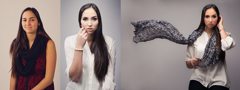 before-after by avoyer, on Flickr
|
|
#
?
Dec 28, 2012 05:08
|
|
|
Lots of great work in here lately! 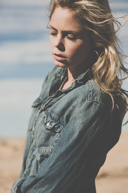 Broken by xxyzx road, on Flickr TheAngryDrunk fucked around with this message at 01:53 on Dec 29, 2012 |
|
#
?
Dec 29, 2012 01:50
|
|

|
TheAngryDrunk posted:Lots of great work in here lately! Is your monitor the "broken" part? Because your blacks aren't even close to black and your whites aren't even close to white.
|
|
#
?
Dec 29, 2012 02:14
|
|

|
it's intentional
|
|
#
?
Dec 29, 2012 02:15
|
|
|
And it looks great.
|
|
#
?
Dec 29, 2012 02:17
|
|
|
Bottom Liner posted:And it looks great. Thanks! Not sure if I'm imagining things, but my posts always seem to get some, uh, interesting responses.
|
|
#
?
Dec 29, 2012 02:23
|
|
|
Mannequin, post some pictures of me! ")
|
|
#
?
Dec 29, 2012 02:27
|
|
|
TheAngryDrunk posted:Thanks! Not sure if I'm imagining things, but my posts always seem to get some, uh, interesting responses. other photographers can be the worst at judging work as they tend to be pretty focused on what their style is and something they think looks good.
|
|
#
?
Dec 29, 2012 02:30
|
|
|

|
| # ? May 17, 2024 02:33 |
|
|
Paragon8 posted:other photographers can be the worst at judging work as they tend to be pretty focused on what their style is and something they think looks good. 
|
|
#
?
Dec 29, 2012 02:50
|
|