


|
Hotwax Residue posted:
I really, really love this. Only thing that's bothering me is that it seems to slant a little to the left. I checked in Photoshop, and the horizon is about .5* off level, which is not a lot, but still something. I think it's exacerbated by the slightly asymmetrical vignetting, which like Satyr said, is a bit distracting. I'd say bring the vignetting back a little, or at least rotate it just a bit clockwise. Either way, really great work. Here's a shot I've been fooling with off and on for a couple weeks. This guy was standing, blowing bubbles on a busy street corner in Cairo. Not selling anything, just... blowing bubbles. 
Shiruan fucked around with this message at 07:39 on Dec 22, 2012 |
 #
?
Dec 22, 2012 07:24
#
?
Dec 22, 2012 07:24
|
|


|

|
| # ? May 21, 2024 18:08 |
|
|
Shiruan posted:Here's a shot I've been fooling with off and on for a couple weeks. This guy was standing, blowing bubbles on a busy street corner in Cairo. Not selling anything, just... blowing bubbles. I really dig this shot. The bubbles seem to get a little lost with that big white car behind them, though, at least to my eye... and maybe the building in the background could stand to be burned down a little, it keeps drawing my eye back to that upper left area. I've been trying to work a bit on my post, but I'm not really sure if I'm doing anything "right" (if there even is a right way, I suppose). As I said in my post earlier in the thread, I've only really been taking photos seriously for ~6 months so I'm still very much in the learning phase.  Sunlight in the Trees by brainmurk, on Flickr It's ok to cross-post to here, right? I submitted this one for the monthly contest but I'd really like some input on it as well. I've had a lot of people (non-photographers) say they like this photo a lot... but I don't really see what's so special about it. Insight?  Never To Turn Again by brainmurk, on Flickr
|
|
#
?
Dec 23, 2012 03:52
|
|

|
That drat Satyr posted:
I really like this, the light is beautiful and I don't see anything majorly wrong with the processing. Only problem is my eye keeps getting drawn to the bright spot on road in the bottom right, away from the nice foliage and softer tones in the top left. I would consider cropping out maybe 20% of the bottom and right sides and see how that looks - there's not much going on round there anyway. Maybe making that bright spot ever so slightly darker would help too. The shot looks slightly out of focus too, which is unfortunate and may become more apparent if you do crop it. I took a ride on a steam train.  Puffing Billy by euannz, on Flickr
|
|
#
?
Dec 23, 2012 05:37
|
|


|
That drat Satyr posted:
The scene is nice, but I feel like the lighting is a bit too even. There needs to be more contrast to this in order to make it turn from a snapshot into something more. Also, maybe it's just me, but I feel like my eye is being drawn down the creek more than to the waterwheel, which I'm assuming is supposed to be the feature here.
|
|
#
?
Dec 23, 2012 06:07
|
|

|
Wafflecopper posted:I really like this, the light is beautiful and I don't see anything majorly wrong with the processing. Only problem is my eye keeps getting drawn to the bright spot on road in the bottom right, away from the nice foliage and softer tones in the top left. I would consider cropping out maybe 20% of the bottom and right sides and see how that looks - there's not much going on round there anyway. Maybe making that bright spot ever so slightly darker would help too. Focus has been something I seem to have struggled with a lot with my photos. Even when going between auto and manual and picking the focus area with the little selector, it seems like most of what I shoot ends up just slightly out of focus. I think there must be something I'm doing wrong, it's just hard to diagnose it when it's just me fumbling around like a fool.  I really love the motion of the steam train photo. I really had to sit and look at it and notice all the people further down the car - somehow I can't imagine riding around with legs stuck out is safe at all.  Casu Marzu posted:The scene is nice, but I feel like the lighting is a bit too even. There needs to be more contrast to this in order to make it turn from a snapshot into something more. That was kind of my confusion - to me it just seems kind of a mediocre at best shot (but, then again I think that about most of my work. I'm a student that's just started, I know I'm not going to be invited to Magnum any time soon.) I fooled around with it a little in Photoshop to try and make it a little more contrasty - does this help it at all? I also re-cropped it a little to try and draw the focus back to the structure/wheel, but I'm not really sure if it works.  Water Wheel v2 by brainmurk, on Flickr Honestly, I'm hesitant to edit my photos a ton because I've gotten yelled at in the photography class I just finished for over-processing my photos, so sometimes I'm not even sure where the "right" level of contrast should be in a photo (or really any piece). I mean, I know it's all really subjective, but still. I really appreciate the advice / push to go a little more on editing even if what I've done above isn't really 'right' because I really want to figure this out - there's only so much reading books and tutorials can do for you when you're hesitant to do it to your own work, and I need to get out of the mindset when I'm editing that I need to make it look like X person wants, and instead make it look like I want. Edit: Gosh, sorry this sounds so rambly and disjointed. I didn't mean to turn my reply into a personal pep-talk. 
|
|
#
?
Dec 23, 2012 06:42
|
|
|
It's overall still a pleasing shot for me. If I were to shoot the scene, I would have stepped back a bit, gotten lower to the ground, and probably stood in the creek. I think the angle which you shot is not the most favorable. This is all contingent that you could have stepped further back or stood in the creek, that is. ") Edit: What are you processing your photos with? Instead of a contrast bump, I think playing around with the shadows and darks a bit would help.
|
|
#
?
Dec 23, 2012 06:48
|
|
|
That drat Satyr posted:Focus has been something I seem to have struggled with a lot with my photos. I just had a look at the settings you used and noticed you shot both those at f4.5. Obviously the light was quite dim in the forest road photo so I guess that's why you went wide open. But getting focus right with such a wide aperture is HARD and your shutter speed is a relatively fast 1/350. Even if you don't have a tripod you can easily shoot hand-held with a slower shutter speed than that. Personally I avoid shooting with my aperture that wide unless it's a macro shot. That drat Satyr posted:I really had to sit and look at it and notice all the people further down the car - somehow I can't imagine riding around with legs stuck out is safe at all. The train was actually really slow and there's nothing you could kick anyway. I sat like that for a while and the only danger involved is a sore backside. Wafflecopper fucked around with this message at 07:18 on Dec 23, 2012 |
|
#
?
Dec 23, 2012 07:14
|
|
|
Casu Marzu posted:It's overall still a pleasing shot for me. Ah, fair enough on the positioning. The place is just a few minutes from my house so I reckon I'll venture back up there at some point and try and re-shoot it from a few different angles because I really do love the whole area anyway. I do all my processing in Photoshop CS6 currently, but I also have Lightroom... I just don't know very much about using it (yet!). Wafflecopper posted:I just had a look at the settings you used and noticed you shot both those at f4.5. Obviously the light was quite dim in the forest road photo so I guess that's why you went wide open. But getting focus right with such a wide aperture is HARD and your shutter speed is a relatively fast 1/350. Even if you don't have a tripod you can easily shoot hand-held with a slower shutter speed than that. Personally I avoid shooting with my aperture that wide unless it's a macro shot. Yes, it was not only getting dark but there was a very heavy fog set in as well making conditions... less than optimal. I'll definitely try and keep myself out of that more-open range while I'm out shooting, because I know that I do tend to take most of my shots in the <f/5.6 range.
|
|
#
?
Dec 23, 2012 07:38
|
|
|
Wafflecopper posted:
I really love this photo. The interplay between blur, and still life. While still life tries to capture the blur. 
djnkro fucked around with this message at 04:18 on Dec 24, 2012 |
|
#
?
Dec 24, 2012 03:49
|
|
|
Quick! Post a review of a picture above before a mod sees you! ;-)
|
|
#
?
Dec 24, 2012 03:55
|
|

|
 bud by bighoits, on Flickr  corona by bighoits, on Flickr  heineken by bighoits, on Flickr I was hoping that I could keep the lighting the same for each photo but each bottle required a different position of the flash underneath the table. I had originally intended them for a couple of frames in my bathroom but now I'm not so sure.
|
|
#
?
Dec 24, 2012 13:30
|
|
|
wanghammer posted:
Maybe it's just me, but I feel like the bud bottle is tipping a bit to the left. Also, the lighting is too inconsistent to really be a set. I know you said you were trying, but maybe find a way to fix in post? The bud has a gray background with a white table. Corona is gray throughout, and Heineken has a really bright background. Perhaps pick the bg you like best and layer it on all of them in photoshop.
|
|
#
?
Dec 25, 2012 22:08
|
|

|
Mr. Despair posted:
I have to agree with the others, this is way more interesting with the clouds. Did you shoot it with the intention of blowing it out? I could see this really popping in front of clearly-defined nimbus clouds. Never posted my own stuff in here before, it's kind of intimidating. Working with a Fujifilm FinePix JV100, trying to save up for a more proper camera but it's what I've got in the meantime.  Exhibit at a local art-hop.  We were having some pretty crazy skies last week, I went a little far with the saturation but it really was candy-colored. Magic Hate Ball fucked around with this message at 09:33 on Feb 18, 2014 |
|
#
?
Dec 26, 2012 01:48
|
|

|
Valdara posted:Maybe it's just me, but I feel like the bud bottle is tipping a bit to the left. echoing that comment, as for myself I like the corona's lightning better
|
|
#
?
Dec 26, 2012 02:12
|
|
|
 DSC_4320 by rfelgenhauer, on Flickr This was something of a chance shot. I was shooting photos of my university's homecoming football game a few months ago, and on the way from the stadium to a bar, I ran into this group and shot a few random photos. Of them, I think this is the best. I was trying to evoke the feelings of a college sporting event like this, by presenting a rowdy and disorganized group of people, all of who are showing different emotions through their actions. I can't decide if they blur worked for me, I think on one hand, it gets across the crazy atmosphere, but on the other hard, kind of diminishes the interesting expressions the people have. I think it's really interesting as a chance shot though, I really like the composition.
|
|
#
?
Dec 26, 2012 05:20
|
|

|
Dr. Platypus posted:
I never shoot people so feel free to disregard, but maybe crop out the half-cut people on either side of the frame. That ought to make the center group's expressions stand out more. Disagreed on the blur; yes it's part of the atmosphere but it's too strong here. The range of expressions is really good though.
|
|
#
?
Dec 26, 2012 12:34
|
|

|
djnkro posted:I really love this photo. The interplay between blur, and still life. While still life tries to capture the blur. E: I pushed some buttons real quick and made this happen. This is just for example  *Disclaimer: not a professional or a good photog @wanghammer: Heine is my favorite, that cap just straight chillin up against the stubby is such a nice touch. My only suggestion is that they could use a little headroom, the framing just seems a little to tight on top and bottom. I think if that were achieved they'd go from being great product photos to great photos regardless of the context. I've been lazy as poo poo with shooting lately, but even lazier with processing. Here's a few choice shots I finally got around to processing recently  Dizzyki 2 by DONT SLEEP, on Flickr Had lousy weather that day, thought the slightly dramatic lighting was a nice touch. Even if it was just a dog show.  Swing 3 by DONT SLEEP, on Flickr Shooting carnival rides is crazy fun. Somehow got some weird colour issues happening on the chains there.  Moon by DONT SLEEP, on Flickr I really want this photo to be better than it is. But it's not. I totally goofed and got some super obnoxious light coming through in the background there. The real killer is the photog in the background. Barely noticed him when I shot but man do I want him gone. I still think this shot has a lot of charm anyway. diddy kongs feet fucked around with this message at 15:55 on Dec 26, 2012 |
|
#
?
Dec 26, 2012 15:36
|
|

|
I'll also give the "not a pro or good photographer disclaimer"... ^^^^ Love the first and second one (especially the bored face on the second, adds an interesting layer to the pic), but the third really doesn't do it for me. Even if there wasn't the photographer, the background is really noisy and your subject just mixes with it a lot, probably because of the colours of her clothing and hair. If there was more light on her maybe, but the way it is I don't think it's interesting.  My first roll of tri-x (actually Arista Premium but it's supposed to be the same thing). I wish I hadn't cropped the sign on the left and I'm thinking that maybe one stop more of light would do good, there isn't much detail on his face right now. This is a scan of a print, so some detail/sharpness is lost. (is there an easy way of posting flickr images?)
|
|
#
?
Dec 26, 2012 23:47
|
|
|
Primo Itch posted:
You say you made a print of this. Maybe try making a new print, exposing about 1-2 stops less, i.e. making it lighter, possibly also at a softer contrast grade. I think that would make the background wash out more, his face less shadowy, and the picture overall easier on the eyes. (E: But still, the plaques in front of him should probably stay readable, they may need to be burned in a bit, possibly at a harder grade than the rest of the picture, if you do make a lighter print.) Primo Itch posted:(is there an easy way of posting flickr images?) Click the Share button on the photo's page. There is an option for BBcode which is ready for copy-paste.
|
|
#
?
Dec 27, 2012 00:12
|
|


|
milk thug posted:
I like the set up of the image, even if I'm a sucker for portraits done in that composition. The colours are nice and vibrant, but not over the top. (See my previous post) However, the owner's pose doesn't fit well with that of her dog's. The dog is at attention, in an almost regal fashion. The owner is a bit chaotic. She's looking at you, but at the same time her feet are pointed away. Her hands are awkwardly placed like she's trying to control the dog. She's looking a bit down as well, creating these huge shadows on her face. If you had a bit more one-on-one time with them, you might be able to get a better shot. Looking through your stream, it seems these were taken while she was exhibiting her dog during the show. It wouldn't hurt to ask her if she could spare a minute or two. These are just the little flaws and tips to improve an already pretty good shot though. The dog looks absolutely wonderful, and I love his pose. His coat has a great texture to it, and his owner has a dashing sense clothing.
|
|
#
?
Dec 27, 2012 01:58
|
|
|
Thanks a lot for the posing tips. I shoot at dog-shows a lot but feel like I never really know what I'm doing, so having something particular to work in is going to be good.
|
|
#
?
Dec 27, 2012 03:21
|
|
|
Personally, I think the disparate appearances add to the photo. If it were a promotional photo, however, it would most likely detract. It reveals, somewhat, that more time and effort is put into the dog's appearance than the owner's. They act as kind of foils for each other within the photo.
|
|
#
?
Dec 27, 2012 03:40
|
|
|
Thanks all for the critique! I will play around with that statue and see what I can do.rio posted:I am dealing with a pretty poo poo scanner (Epson Perfection 2580) and am also relatively inexperienced with scanning negatives so it might be that combined with the characteristics of TRI-X. Oh, and it was my second try at developing film so there is that too. Gotcha. Do you do any other post after scanning? I usually have to do a mild curves adjust. I am horrible with landscapes but I think this is pretty nifty. Any chance to burn the right side a bit for balance? Unless you were going for a dark --> light gradient in your image. xenilk posted:
Nice! One thing that I get nitpicked on a lot is evenness in the background, it may be my eyes but it looks kind of splotchy. Some more photos from the same day (some random Catholic shrine park I stumbled upon while driving).   
|
|
#
?
Dec 27, 2012 06:08
|
|


|
I'm interesting in specific feedback on this next image, though welcome any critique. Great gray owl:  This is the processed original:  As you can see, I extended the canvas and reconstructed the missing wing tips. What I'm curious about is if it's noticeable? There is nothing worse than getting a shot like this and clipping the wings, but it is so easy to do. If my reconstruction looks convincing then I can probably salvage a lot of other shots I've taken. milk thug posted:I've been lazy as poo poo with shooting lately, but even lazier with processing. Here's a few choice shots I finally got around to processing recently quote:
Dr. Platypus posted:
-- slanted building in the back -- the front guy is out of focus to the point of distraction -- side people should be cropped out That said, I really like the expressions and body language. You are right, the photo does have a lot of charm.
|
|
#
?
Dec 27, 2012 18:23
|
|

|
When I saw the reconstructed image, my first thought was "huh, wonder why he cropped the wing tip off when he linked the photo in the birding thread". So what I'm saying is, that's pretty well done.
|
|
#
?
Dec 27, 2012 19:17
|
|
|
InternetJunky posted:As you can see, I extended the canvas and reconstructed the missing wing tips. What I'm curious about is if it's noticeable? I only notices after I started looking for it - at first and second glance I did not see anything out of the ordinary but there are a couple of giveaways after actually looking for it. One is the horizontal line in the upper right. You should be able to take that out easily. The second is the tree branches on the upper left - I would take out one of those little crooks rather than having both. The horizontal line is much more noticeable. Great job and a very nice image.
|
|
#
?
Dec 27, 2012 22:47
|
|

|
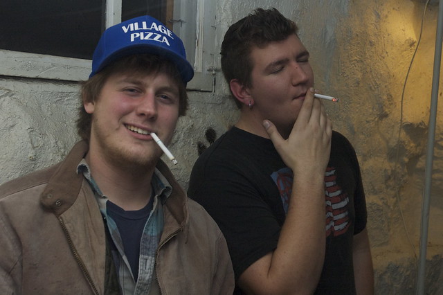 DSC_4626 by rfelgenhauer, on Flickr This photo was taken at a college party. These two guys were smoking in the corner all night, and I thought they made an interesting photo. I like how the guy on the right isn't really paying attention to the camera, and they guy on the left has a cool hat I find interesting. I think this was a more successful photo than the last one I posted on here.
|
|
#
?
Dec 28, 2012 01:54
|
|
|
Dr. Platypus posted:
|
|
#
?
Dec 28, 2012 03:04
|
|

|
See, I think my style is pretty snapshotish in itself. I like to capture the feeling of a particular moment, and, in my opinion, that often means taking a photo that is a little less polished.
|
|
#
?
Dec 28, 2012 03:38
|
|
|
Dr. Platypus posted:See, I think my style is pretty snapshotish in itself. I like to capture the feeling of a particular moment, and, in my opinion, that often means taking a photo that is a little less polished. There's a way of shooting that's "snapshotish" that is more effective though. Sure, you may feel the emotion when you see the photo but to anyone else... would they feel the same way? How can you get to that point? That is the question you should consider!
|
|
#
?
Dec 28, 2012 03:43
|
|
|
InternetJunky posted:I'm interesting in specific feedback on this next image, though welcome any critique. That's a pretty subtle edit. As other pointed out once you know it you can spot a few differences but otherwise I couldn't have told. Could you walk us through the process and about how long it took you approx.? As for me, I'm starting to pitch ideas of doing makeovers in my hometown. Here's one I've done recently (I tried to clean the background of the one with the scarf as per the review I got here) 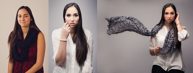 before-after by avoyer, on Flickr
|
|
#
?
Dec 28, 2012 04:54
|
|
|
xenilk posted:That's a pretty subtle edit. As other pointed out once you know it you can spot a few differences but otherwise I couldn't have told. Could you walk us through the process and about how long it took you approx.? Wow, that's the same girl? Impressive!
|
|
#
?
Dec 28, 2012 05:07
|
|
|
Oprah Haza posted:There's a way of shooting that's "snapshotish" that is more effective though. Sure, you may feel the emotion when you see the photo but to anyone else... would they feel the same way? How can you get to that point? That is the question you should consider! What might you suggest I do to get more effective snapshotish photos? I'm still pretty new to the whole photography thing, and I definitely like that snapshot style, but I'm not sure if I have it down yet.
|
|
#
?
Dec 28, 2012 05:29
|
|
|
I feel like part of the issue there is that you're not really communicating anything, or even telling me why I should care. Almost none of the information you gave in text is present in the photo, and when I first saw it the only impression I really got was "here's two dudes smoking and it's probably chilly", which makes it a snapshot in the tiniest, most banal way. The photo doesn't tell me that they were smoking in a corner of a party, which could be interesting. What you're looking for is probably something along the lines of street photography, which is, by its very nature, "snapshottish". From our very own Street Photography thread: I use this one because it's sort of similar to yours - isolated subject, very little context. But what can you say about this girl? A lot, probably, and most of that has to do with her expression, stance, and outfit. Taking a good snapshot photo doesn't just mean "less polished", you have to capture something, and I don't think you have with your pizza-delivering "cool hat"-wearing smoker. That's a Facebook photo. Of course, I say this as someone apparently so lame I can't even get critiqued here, but that's what I see here. I actually prefer the other photos you've got on your Flickr from (presumably) the same party, because they all say so much more than this one does. You do seem to have an issue with framing, too, which shits all over some of your better photos - tons of headroom, tilted camera (lots of this), etc.
|
|
#
?
Dec 28, 2012 07:29
|
|

|
I really love this. Have you considered cropping out the head in the lower left background? It would focus the attention on the man's face which I think are the better part of the photo versus the bubbles. This is a cross-post from this month's photo contest: 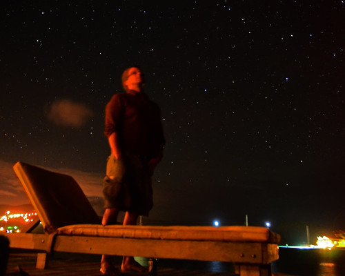 _DSC_1841_1 by gratefulhume., on Flickr And this was from the same night. It was during the Gemind meteor shower, but I didn't have any luck catching a shooting star during the exposures  _DSC_1880_1 by gratefulhume., on Flickr
|
|
#
?
Dec 28, 2012 19:55
|
|
|
I took this near my parent's house in western Norway, you can barely make out the North Sea between the slate sky and extreme background. It's the edge of a small pond that is somewhat inexplicably at the very summit of a hill/small mountain.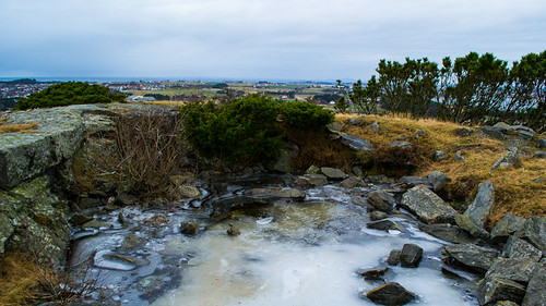 SA Shot it with my Nikon D3100, an Xmas gift, and twiddled with some knobs in Lightroom. I really, truly have no clue what I'm doing, but I liked the way it turned out. That said, I do notice that: - the horizon has a slant - the sky is uninteresting - the bushes to the right add clutter - again, there's a slant to the foreground terrain, although the grass to the right was genuinely lower than the granite to the left. tl;dr I made a photo Vlex fucked around with this message at 21:56 on Dec 29, 2012 |
|
#
?
Dec 29, 2012 21:52
|
|


|
GratefulHume posted:I really love this. Have you considered cropping out the head in the lower left background? It would focus the attention on the man's face which I think are the better part of the photo versus the bubbles. The first one is super red, was this a conscious decision? The horizon isn't totally level, is slanting up to the left, and the stars look slightly elongated. The rule is something like 500/shutter speed for your maximum before getting trails. There's no EXIF on flickr - do you remember the settings? Second one is awesome, you really get a feel for what it would be like being outside that night, maybe quite cold because of the wind, maybe warmer due to the fact that palm trees grow there. Only criticism is the trunks don't look totally in focus, or maybe suffer from some camera shake.  DSCF0335.jpg by fuglsnef, on Flickr  DSCF0325.jpg by fuglsnef, on Flickr  360/366 - Football by fuglsnef, on Flickr
|
|
#
?
Dec 30, 2012 03:05
|
|
|
Vlex posted:- the horizon has a slant For the horizon, press R to go into crop mode, then hold ctrl to get the ruler tool, and draw a straight line along the horizon to automatically rotate the image. For the bushes, try cropping them out. Maybe a square crop on the left part of the image or a panoramic crop of the pond taking the bushes out from the top?
|
|
#
?
Dec 30, 2012 03:08
|
|
|
David Pratt posted:For the horizon, press R to go into crop mode, then hold ctrl to get the ruler tool, and draw a straight line along the horizon to automatically rotate the image. Wow thank you for this! I was doing the first step (crop mode) and then rotating it and using the grid to make it align... with the ruler it's wayyyy better.
|
|
#
?
Dec 30, 2012 04:41
|
|
|

|
| # ? May 21, 2024 18:08 |
|
|
David Pratt posted:Only criticism is the trunks don't look totally in focus, or maybe suffer from some camera shake. That's probably just motion blur from the trees swaying in the wind.
|
|
#
?
Dec 30, 2012 05:53
|
|