


|
We need to have a new "dumb minimalist posters" photoshop thread.
|
 #
?
Feb 1, 2013 13:21
#
?
Feb 1, 2013 13:21
|
|


|

|
| # ? May 27, 2024 07:56 |
|
|
A bunch of poster comissioned for screenings of cult films: High Plains Drifter Sara Riel.  A bit too much grain but I like the general design. Captures the spirit of the film fairly well. Solaris[/b] by Dav�� �rn Halld�rsson.  I think this might be going for the same thing as "The Ultimate Trip" ads for 2001. Mor�saga(Murdertale) by Fri�geir J�hannes Kristj�nsson & J�nas Reynir Gunnarsson.  The list reads "Lust, Drugs, Twisted domestic life, incest, Disco" In The Realm of The Senses  I haven't seen the film but I'm told it has boobies and I think this gets that across fairly well. Classy,stylish, Asian boobies. Incredible Shrinking Man by Hugleikur Dagsson  I'm fairly certain this is supposed to be a joke. Maybe even a dig at mimimalist poster design. Santa Claus Conquers The Martians by Halld�r Baldursson  I really like this one. It's probably better than the film itself.
|
|
#
?
Feb 1, 2013 14:45
|
|

|
This just makes me realize how easy it would be to do a really really good live-action version of Nausicaa. And now I'm sad because nobody would ever actually make that really really good version.
|
|
#
?
Feb 1, 2013 15:15
|
|


|
Lance Streetman posted:And as long as I'm posting ghibli posters, we can't forget the best one: It's like the essence of every sci-fi VHS cover boiled down into one image.
|
|
#
?
Feb 1, 2013 15:23
|
|


|
Yodzilla posted:It's like the essence of every sci-fi VHS cover boiled down into one image. Yeah, but only three of those things actually show up in the movie. Sadly, there's no robot wizard dude firing laser blasts from his hand or a pegasus.
|
|
#
?
Feb 1, 2013 15:30
|
|

|
That's what he meant?
|
|
#
?
Feb 1, 2013 15:45
|
|


|
penismightier posted:
Still the best.
|
|
#
?
Feb 1, 2013 15:59
|
|


|
Yep, still don't make sense to me. I thought when I first saw that poster they were meant to be time travel paths but... well, the third and first do, but the second still doesn't. EDIT: oh, never mind. Was reading it in the wrong direction. Durf. MikeJF fucked around with this message at 16:40 on Feb 1, 2013 |
|
#
?
Feb 1, 2013 16:34
|
|


|
Is there a Primer version of those BTTF posters?
|
|
#
?
Feb 1, 2013 16:42
|
|


Echo Chamber posted:Is there a Primer version of those BTTF posters? Hold on a sec. e:  e2: gently caress, beaten and much better-looking too. 
SALT CURES HAM fucked around with this message at 17:25 on Feb 1, 2013 |
|
|
#
?
Feb 1, 2013 17:16
|
|
|
Done and done:
|
|
#
?
Feb 1, 2013 17:22
|
|

|
Terminal Entropy posted:Done and done: No, no, remember that the diagrams show alternate timelines too, like in BTTF2. (Just because I want to see someone try)
|
|
#
?
Feb 1, 2013 17:28
|
|
|
WickedIcon posted:Hold on a sec. Just retitle this 12 Monkeys.
|
|
#
?
Feb 1, 2013 17:39
|
|
|
MikeJF posted:No, no, remember that the diagrams show alternate timelines too, like in BTTF2. Ah, but there no diagrams in the movie itself. On the other hand there is a circle marked with A and B written in a notebook that shows up on the screen for mere seconds, thus making it the best poster choice.
|
|
#
?
Feb 1, 2013 17:40
|
|
|
There's nothing inherently wrong with a poster that speaks to people who have already seen the movie. That stuff is usually lovely because it's fan posters, not anything else.
|
|
#
?
Feb 1, 2013 17:42
|
|


|
Yodzilla posted:Just retitle this 12 Monkeys. Or Donnie Darko or Looper.
|
|
#
?
Feb 1, 2013 17:42
|
|
|
WickedIcon posted:Hold on a sec. Actually it would have to look something like this.  Even with the chart the movie is still baffling to me.
|
|
#
?
Feb 1, 2013 18:18
|
|

|
Young Freud posted:Since we were talking a week or two ago about people doing Vallejo or Franzetta "maximalist" poster to counter all the minimalist fan posters, I've been thinking about doing just that. Currently, the only one I can think of is Office Space, but what would anyone else want to see as some "muscle and tits fantasy art" rendition of a movie? Big Fish.
|
|
#
?
Feb 1, 2013 18:25
|
|

|
Lance Streetman posted:Castle in the Sky, as produced by New World Pictures:
|
|
#
?
Feb 1, 2013 18:34
|
|


|
FreudianSlippers posted:
A picture of a cut off dick would represent the movie better.
|
|
#
?
Feb 1, 2013 18:42
|
|


|
WickedIcon posted:Hold on a sec. This seems like an excellent time to post this comic which is too big to host an image. http://xkcd.com/657/large/ edit: The Punchline.... 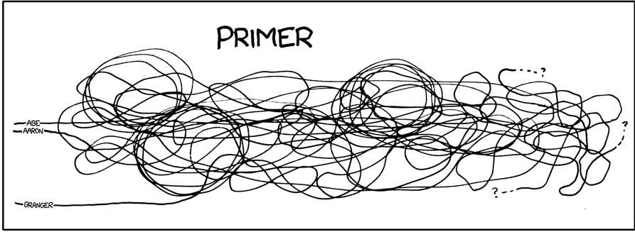
kiimo fucked around with this message at 19:29 on Feb 1, 2013 |
|
#
?
Feb 1, 2013 19:27
|
|

|
these things are so easy to do:
|
|
#
?
Feb 1, 2013 19:45
|
|

|
Terminal Entropy posted:This one? Looks more like the cover of an 80s rock single, honestly.
|
|
#
?
Feb 1, 2013 19:51
|
|


|
animal math posted:This one is done really well except for the fact that none of these characters even slightly resemble those that are in the movie. I'm not sure if that's supposed to be the point, but I've seen Castle in the Sky many times and I would have no idea what movie this is supposed to be without the title. Yeah, that's the point. It's a fan poster. Hence my "done by New World Pictures" comment. (New World Pictures did that horrible Warriors of the Wind cover.  ) )
|
|
#
?
Feb 1, 2013 19:51
|
|

|
Young Freud posted:Since we were talking a week or two ago about people doing Vallejo or Franzetta "maximalist" poster to counter all the minimalist fan posters, I've been thinking about doing just that. Currently, the only one I can think of is Office Space, but what would anyone else want to see as some "muscle and tits fantasy art" rendition of a movie? You've got Mail - the Hanks/Ryan version.
|
|
#
?
Feb 1, 2013 19:54
|
|
|
E: Nevermind, these are apparently fakes based off outdated designs.
Rahonavis fucked around with this message at 05:25 on Feb 2, 2013 |
|
#
?
Feb 1, 2013 19:58
|
|


|
Don't have mspaint on my phone, but let's see how easy these are: Almost Famous: ? > (picture of a door) Bullitt: a green rectangle with a black slightly longer rectangle under it Jurassic Park: water ripples Inception: the spinning top Drag Me To Hell: a coat button One Flew Over the Cuckoo's Nest: 3 cigarettes, 1 is broken in half and so on...
|
|
#
?
Feb 1, 2013 20:00
|
|

|
A GLISTENING HODOR posted:Inception: the spinning top No no, that would make sense.  Let's go with a bit of visual symbolism that will confuse anybody who hasn't seen the films.
|
|
#
?
Feb 1, 2013 20:06
|
|
|
Lance Streetman posted:No no, that would make sense. to be fair, that one you posted there would make (marginally) more sense to somebody who hasnt seen the film than the spinning top would. the top only had meaning when you have heard DiCaprio's character explain it in the movie, at least with this one you get the idea of falling through layers.
|
|
#
?
Feb 1, 2013 20:11
|
|
|
Based on the trailer, the "layers" can be understood. But you have to see the movie to get the top. So what would REALLY make it a pretentious douchebag minimalist poster would be some tiny obscure detail from the movie you have to piece together. Like a sand castle or Mol's dress or the numeric code for the vault.
|
|
#
?
Feb 1, 2013 20:19
|
|
|
A GLISTENING HODOR posted:Don't have mspaint on my phone, but let's see how easy these are: 5 hubcaps rolling across the poster.
|
|
#
?
Feb 1, 2013 20:23
|
|

|
CaptainHollywood posted:I could have sworn Doc's looked different and was a "Z". Which makes this even worse. Not even a Z, really. They couldn't have used his diagram because it's too easy to understand. 
|
|
#
?
Feb 1, 2013 20:23
|
|

|
Hugs Boson posted:Whoa. That layout is like an instant minimalist poster generator! And of course... 
|
|
#
?
Feb 1, 2013 20:34
|
|


|
I have a horrible confession. I enjoy minimalist posters. I actually even enjoy some of the joke ones.
|
|
#
?
Feb 1, 2013 21:09
|
|


|
quote:And of course... Make the circles flesh coloured, add dots in the middle and it's a Total Recall poster.
|
|
#
?
Feb 1, 2013 21:19
|
|
|
The Total Recall poster is clearly a picture of Mars laid over another picture of Mars so it looks like a butt. 
|
|
#
?
Feb 1, 2013 21:24
|
|
|
Five hungry children looking at the viewer.
|
|
#
?
Feb 1, 2013 21:30
|
|
|
kiimo posted:Five hungry children looking at the viewer.
|
|
#
?
Feb 1, 2013 21:54
|
|

|
The Godfather is one orange circle. It works with everything!
|
|
#
?
Feb 1, 2013 21:56
|
|
|

|
| # ? May 27, 2024 07:56 |
|
|
One red circle for Superbad.
|
|
#
?
Feb 1, 2013 21:57
|
|