|
^^ post a critique, be swift before the *~MoDz~* wake up.
|
 #
?
Feb 6, 2013 15:28
#
?
Feb 6, 2013 15:28
|
|


|

|
| # ? May 12, 2024 17:29 |
|
|
I love this. The dark tones work well with the half-alive roots. Not much I'd do to make it better except maybe crop out the bit on the right that is mildly distracting. Nice work. I've been touching up a few I took last month. I think the crop on the the first one is a bit too close. 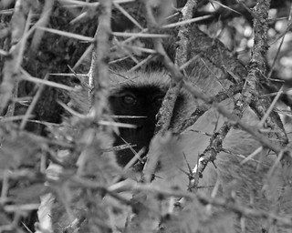 _DSC_2371_3 by Conservation Images, on Flickr  _PC122538_2 by Conservation Images, on Flickr GratefulHume fucked around with this message at 00:12 on Feb 14, 2013 |
|
#
?
Feb 6, 2013 22:06
|
|

|
Primo Itch posted:I like the second one better. The windmill with the chimneys and smoke all in the same place are confusing in the first one. Love the colours. I think I just like how everything is spaced out and more balanced in the 2nd rather than the cluttered corner and empty space on the first. This looks a little off level to me. The coloring is great though, especially the roof-trim-fence-caution paint combination. GratefulHume posted:I love this. The dark tones work well with the half-alive roots. Not much I'd do to make it better except maybe crop out the bit on the right that is mildly distracting. Nice work. I like the concept, but I don't think the face of the monkey stands out quite enough from the twigs. It just gets lost. Maybe play a bit more with the levels? do some dodging and burning to bring out the eyes? I've been going through some photos from Tanzania back in 2006. Here's one I'm working on at the moment. Check the full size for some elephant dick.  I did a black and white version, with a taller crop. I like what it does to the textures, as well as the tones on the crater ridge in the background, but without the farmer's red cloak it's just a less successful photograph. But it was worth a shot.  And here's a shot I took in Egypt earlier this year. I'd like it a lot better without the electrical pole, but I haven't been able to get rid of it in a way that looks quite right. That kind of constructive editing work has always been my weak point :-/ 
Shiruan fucked around with this message at 23:17 on Feb 6, 2013 |
|
#
?
Feb 6, 2013 23:13
|
|

|
Shiruan posted:
The colour one is a few minor tweaks short of phenomenal. The black and white one is functional, but forgettable. Try brightening and desaturating the blues in the top portion of the photo and kick up the contrast in the cloud a little. I think those changes will give a little better sense of scale and add a nice dichotomy between the cloud and elephant. Boosting the midtones of the elephant's skin just the tiniest bit might give it a little more punch too without looking aggressively processed. edit: I just want to add that there's a cyan cast to the image that isn't very typical of pictures I've seen of Africa. I like that a lot. burzum karaoke fucked around with this message at 23:30 on Feb 6, 2013 |
|
#
?
Feb 6, 2013 23:26
|
|

|
Shiruan posted:I've been going through some photos from Tanzania back in 2006. Here's one I'm working on at the moment. Check the full size for some elephant dick.  578689-R1-03-22 by zackaryattackary, on Flickr
|
|
#
?
Feb 7, 2013 08:21
|
|

|
The color elephant photo is great up to the hills, in my opinion. The sky isn't adding anything at all to the photo. The black and white isn't contrasting enough to really draw any attention at all. 
|
|
#
?
Feb 7, 2013 08:37
|
|

|
the usual "I'm a newbie so take it with a grain of salt" disclaimer.Watermelon City posted:
The theme is really insteresting and I like the angle, but how much post is in it? The colours look a bit unnatural (maybe that's what you were looking for?) I really like the colours and the progression of light from left to righ, but the left sand shore is quite light in a otherwise dark area and is drawing my attention heavily. Maybe darkening it a little? Two from Buenos Aires, on Tri-x  CC16817-R1-00-1MOD por primoitcho, no Flickr  CC16817-R1-01-2MOD por primoitcho, no Flickr
|
|
#
?
Feb 7, 2013 17:04
|
|
|
Primo Itch posted:the usual "I'm a newbie so take it with a grain of salt" disclaimer.
|
|
#
?
Feb 8, 2013 05:25
|
|
|
Primo Itch posted:
This one could be really cool. It needs to be straightened some, and do you have one where you took two steps towards the building to get the top out of the trees? I'm also interested in seeing this one in color, I feel like the contrast between the building and the trees could be interesting.  DSC_0214 by jpitha, on Flickr
|
|
#
?
Feb 9, 2013 01:23
|
|


|
Shampoo posted:This one could be really cool. It needs to be straightened some, and do you have one where you took two steps towards the building to get the top out of the trees? I'm also interested in seeing this one in color, I feel like the contrast between the building and the trees could be interesting. Yeah, I saw it need straightening just after uploading it. Unfortunately I don't have either since a)There was a fence in front of the church and this was the closest I could get to it and b)This was shot on B&w film, Tri-x (arista actually). Primo Itch fucked around with this message at 03:19 on Feb 9, 2013 |
|
#
?
Feb 9, 2013 03:14
|
|
|
The quality of posts has been really high as of late, folks! Keep it upPrimo Itch posted:
Holy contrast batman. I love the photo, but I'd tone down the blacks, personally. But hey, that's just a taste thing. To contribute: Good vs Evil  
|
|
#
?
Feb 9, 2013 19:50
|
|
|
sw1gger posted:The quality of posts has been really high as of late, folks! Keep it up drat, these are nice. Sometimes texture overlays can look overdone or cheesy but your treatment is great. Good job!! ")
|
|
#
?
Feb 10, 2013 04:00
|
|


|
sw1gger posted:Good vs Evil The first photo really doesn't do anything for me. I suppose macro shots of flowers can be really cool, but this sort of shot of flowers/plants never seems to work for me. It probably doesn't help that the subject matter itself is overdone. The second photo shows more promise, but I'd like to see more detail in the clouds near the horizon on the right side, smoother water (longer exposure maybe), also more dramatic colors could be nice (maybe a sunset or sunrise). My contribution: I re-edited on of the images I posted previously, I tried to make it a little brighter and more colorful.  #3 by razalas_solrac, on Flickr  abstract by razalas_solrac, on Flickr The second one is the original. Thoughts?
|
|
#
?
Feb 10, 2013 09:18
|
|

|
Druckman posted:
The branches seem even more effective to my eye than the red areas, which are either too small or too muted. Lightening the ground and barriers in front of the machine might help because that's where my eyes keep ending up. squidflakes posted:On this day, I will post a photo! Yeah, I think the negative space doesn't really contribute all that much plus I might have shifted my angle a little bit to get at least one elbow in the frame rather than chopping both. Also, I realize you were probably were focusing on the ring but since she's looking directly at the camera I would probably stop down to get her eyes in focus too. sw1gger posted:To contribute: The underexposed film / de-contrasted crushed blacks look seems a little more overdone here than on your previous shots, but that's just a personal taste thing. If they're intended to be paired, it might make more sense to shoot both with the same type of background? Why did you pick a city skyline for the second instead of another uniform backdrop? Messing with reverser ring macro:  Rollei by voodoorootbeer, on Flickr  stabby stabby by voodoorootbeer, on Flickr I submitted this last one to a different site for critique and was told that it could use "pop" and "punch" but didn't really get any specifics on what to change, other than flipping to b&w. Any suggestions?  ... by voodoorootbeer, on Flickr
|
|
#
?
Feb 10, 2013 09:33
|
|


|
voodoorootbeer posted:The underexposed film / de-contrasted crushed blacks look seems a little more overdone here than on your previous shots, but that's just a personal taste thing. If they're intended to be paired, it might make more sense to shoot both with the same type of background? Why did you pick a city skyline for the second instead of another uniform backdrop? Thanks for the feedback - much appreciated. Reason for doing the second one outside was because that's actually the roof of the studio. The first one was done in the basement (hell) while this one was high (heaven). Silly, but eh. Regarding your baby photo - it's awesome, but I agree it's a bit flat. Here's a simple re-edit I did just loving around:  The color correction was a bit green/blue so I made it a bit more yellow/magenta. Decreased blacks while upping contrast and a splash of clarity. I also added a pretty subtle vignette.
|
|
#
?
Feb 10, 2013 17:02
|
|
|
poopinmymouth posted:
I enjoy the contrast between the warm/cold lighting in this image. The yellow portions look almost metallic and it's a very arresting effect, and the snow in the foreground makes me want to mentally move through the space and get inside the building. The major flaw I can see is that there's a lot of tripled elements in the photo, and their identical forms plus the centered primary subject imply that this should be a perfectly symmetrical composition, but it's not, which makes the whole thing kind of fall apart for me.  Farm by TheJeffers, on Flickr
|
|
#
?
Feb 10, 2013 23:17
|
|

|
 DSC_0849 by zackaryattackary, on Flickr I like how the cat is centered, but I don't like how the posts at the top the stairs and the green railing take up so much space. On the other hand it was impossible not to have them in the picture.
|
|
#
?
Feb 11, 2013 02:28
|
|
|
The colour on both of these is great. I was going to ask if it was shot on film, but I linked through. sw1gger posted:Good vs Evil Both of these make me really uncomfortable - it might be a combination of the post-processing and not being able to see the model's face. Nicely done  This is actually a photo of a construction site, and while I definitely fiddled with it a bunch in post to get a more "abstract" look, I'm not sure if I'm just pushing too far / reaching.
|
|
#
?
Feb 11, 2013 06:49
|
|

|
It's really interesting, but I think that it's so dark that it stretches into the territory of just being confusing.
|
|
#
?
Feb 11, 2013 07:06
|
|

|
I like it, but it's in the area of being too dark to see what it's supposed to be, and not enough contrast to really get into anything super interesting on an abstract level.
|
|
#
?
Feb 11, 2013 07:57
|
|
|
Watermelon City posted:
I don't have a problem with the railing, but there's too much information in the picture. Maybe you could've used a bigger aperture to blur the back/foreground, or a long-ish exposure which would blur the people and get the attention back to the cat. TheJeffers posted:
I like this a lot, not much else to say about it. Some from Patagonia  ice por primoitcho, no Flickr 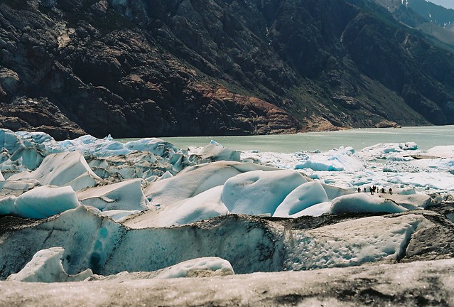 C016820-R1-02-18A por primoitcho, no Flickr  fotos 007 por primoitcho, no Flickr The last one is from my first roll of slide film, and every single picture came out underexposed 
Primo Itch fucked around with this message at 01:24 on Feb 12, 2013 |
|
#
?
Feb 12, 2013 01:21
|
|
|
Primo Itch posted:
I really like this one. The people give it an amazing sense of scale, the colors are just stunning. It might be a little crooked, it's tough to tell. The crop seems tight too, but that could also be a limitation of where you were. I would have liked to see more of the mountain behind the glacier.  DSC_0060 by jpitha, on Flickr Ephesus, Turkey
|
|
#
?
Feb 12, 2013 02:21
|
|
|
Primo Itch posted:Some from Patagonia I would crop the bottom out of this one, the oof foreground doesn't do much for me. A more panoramic crop just seems like it'll work better, and make it easier to notice the people.
|
|
#
?
Feb 12, 2013 03:07
|
|


|
I was in Montana a few months for work and spent my weekends hunting deer (with my camera). This was my first real concentrated attempt at wildlife photography other than shooting pictures of the birds that land on my feeder. IMG_7928 by Matt Roar, on Flickr  IMG_8133 by Matt Roar, on Flickr Shampoo posted:
I see sort of two separate shots here. One is a candid shot of a group of tourists enjoying a historic site, and the other the location itself. You've sort of chosen a crop that doesn't lead me to focus on either one. If the group of tourists to the right is your subject I would maybe consider moving your crop up to remove some of that empty space at the bottom of the picture. You would also want to consider cropping out some of the image on the far left. If the location itself is your subject and those people just happened to be standing there, I would crop them out. Or in a perfect world, wait until they walk away and reshoot the image. Hypnotized fucked around with this message at 06:11 on Feb 12, 2013 |
|
#
?
Feb 12, 2013 06:07
|
|
|
Watermelon City posted:
It's a snapshot, right? There is a ton of poo poo going on to the point of excess and some cat grafitti; I'm not sure what you wanted to portray. At the least, look for a moment to capture rather than "I see item, I will press the shutter when that item is in focus". Look for a contrasting element to the cat picture. Frame it differently to get the posts out of the picture if you don't like them or try to incorporate them somehow if you like the cat thing enough that you are building a whole image on that. One idea - frame it better and do a long exposure with a nd filter to show people moving constantly around in the frame but the cat is just sitting there smiling. Primo Itch posted:Some from Patagonia Oh, and wow I didn't even see the people at first glance in that second photo. Great sense of scale but as Mr. Despair said it would be good to draw some more attention to them. Hypnotized posted:
I think this turned out well, although I don't know much about wildlife photography. The snow hanging in the air really makes it - all of the other elements are good such as your framing, background etc. but the sense of time being stopped is really nice to see with the snowfall. ---- I am still trying to get a handle on my new camera - had a very brief window to try to get some fog photos today during a break at work but unfortunately I lost the sun in 10 minutes. The first two are just two crops - I think I prefer the wider one but would like some outside input.  DSCF1245-Edit-3 by Paul Hofreiter, on Flickr 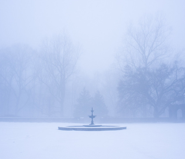 DSCF1245-Edit by Paul Hofreiter, on Flickr  DSCF1291 by Paul Hofreiter, on Flickr
|
|
#
?
Feb 12, 2013 06:34
|
|

|
rio posted:
I like the wider one also. The second look cleaner if you cropped out the building on the right completely. I like to glow of the 3rd shot. A very ominous feeling. It seems like the shot is lined up well, but also still looks a bit leaning on the left where the ground is. Could be just how the snow is laying. //// When I went for this shot, the little just looked at me with one of the best annoyed "What?" expression, and I just got the end of the expression here.  IMG_7300 by Wilson!!!!, on Flickr
|
|
#
?
Feb 12, 2013 07:16
|
|
|
Hypnotized posted:I was in Montana a few months for work and spent my weekends hunting deer (with my camera). This was my first real concentrated attempt at wildlife photography other than shooting pictures of the birds that land on my feeder. Your second shot is also nice, but your deer has a bit of a boring "grazing" pose. I would also clone out the dark shapes just above the deer. Here's my own snowfall animal picture from last weekend. 
|
|
#
?
Feb 12, 2013 16:02
|
|

|
Krakkles posted:It's really interesting, but I think that it's so dark that it stretches into the territory of just being confusing. Casu Marzu posted:I like it, but it's in the area of being too dark to see what it's supposed to be, and not enough contrast to really get into anything super interesting on an abstract level. Lightened up: 
|
|
#
?
Feb 13, 2013 00:41
|
|
|
rio posted:
Awesome. Nice crop, and the whole thing looks like a dream scene. Love it. I think it would look good framed and on a wall.  Minimal by Mijaeus, on Flickr  Los botes by Mijaeus, on Flickr  Simmetry by Mijaeus, on Flickr  Lamp by Mijaeus, on Flickr (USER WAS PUT ON PROBATION FOR THIS POST)
|
|
#
?
Feb 13, 2013 03:16
|
|

|
El Laucha posted:
This would look much better in B&W IMO  Bench by MEGAmurp, on Flickr
|
|
#
?
Feb 13, 2013 08:29
|
|
|
InternetJunky posted:Your first shot has a great effect with the gentle snow fall. The dark brush makes a great environment for the lighter deer. I really wish you had more room, especially on the bottom right. The deer feel a bit cramped in the shot. Man, the owl shots here are just great. I wish I had owls all over the place to shoot. I have no idea what was to the right, but if it was similar to the current background I would have preferred the bird to be further to the left in the frame and more of the space/snow on the right. It is still a very nice shot though. fake edit: also, if going to print I would dodge the owl a little.
|
|
#
?
Feb 13, 2013 09:56
|
|
|
sw1gger posted:Regarding your baby photo - it's awesome, but I agree it's a bit flat. Here's a simple re-edit I did just loving around: Lo and behold, the contrast and blacks sliders are untouched on the original. -_- I get nervous with clarity because I don't want to overdo it. Only had it to 10 but I'm guessing it would have been safe around 20 or 25. Is there some kind of primer out there for color correction? I'd like to be able to do something more than my current method of loving with the white balance until I say "huh, guess that looks about right." Primo Itch posted:Some from Patagonia I basically love the clouds coming off the peak and I like that the cyclist adds scale but the portrait format seems to take away from it by chopping the ridge like that. I don't think the foreground contributes all that much - did you by chance shoot a horizontal? El Laucha posted:Awesome. Nice crop, and the whole thing looks like a dream scene. Love it. I think it would look good framed and on a wall. Love the layers and gradients on the mountains. Did you try a 16:9? The upper half of the sky seems unneccessary. The roof and window shot doesn't really do much for me - it lacks context and as a geometric abstract I don't think it's really all that interesting. The lamp could be really effective I think in a square crop and in black and white like murp said. Vignette also seems like a bit much. more babby.  nice socks dude by voodoorootbeer, on Flickr not my babby. Does this work as a mom & baby portrait? Mom wasn't really dressed to have her picture taken. Also she insisted on the hat.  :-P by voodoorootbeer, on Flickr Experimenting with panorama portraits. Any suggestions for crop on this one?  |||\\\ by voodoorootbeer, on Flickr
|
|
#
?
Feb 13, 2013 10:44
|
|
|
voodoorootbeer posted:more babby. The exposure and colors look nice on both of your photographs. Those are very cute kids. I do think both shots would benefit from a closer crop, and reposing. I think a larger pumpkin would have looked better. Or if a larger one was not available maybe have him sit down and put it in his lap. Is that someone behind him holding him up? For the second image a slightly different pose in which we see part of the mother's face would have made it a stronger shot. Putting her hair behind her ear and/or turning slightly may have achieved that effect. ------------------------------------ Here are a couple shots from my hike in the Olympic National Forest.  IMG_8931 by Matt Roar, on Flickr  IMG_8894 by Matt Roar, on Flickr  IMG_8888 by Matt Roar, on Flickr On an interesting side note, I broke one of my ribs when I slipped and fell crossing that log in the second image. Hypnotized fucked around with this message at 05:24 on Feb 14, 2013 |
|
#
?
Feb 14, 2013 00:08
|
|
|
phootnote posted:When I went for this shot, the little just looked at me with one of the best annoyed "What?" expression, and I just got the end of the expression here. Primo Itch posted:Some from Patagonia ----- Hello Photo a Day. Some background: I used to post in a bunch of SA photography threads but avoided PAD because I didn't think I was good enough. I just want to get better now. Toward the end of last year, I stupidly ended up with a queue of something close to 1800 pictures. That included something like eight concerts (most of which were in a row), most of which were garbage anyway, as well as "actual photography" shots. I was too overwhelmed to process them. A couple of months ago, I picked through them, and selected the potentials in the Lightroom quick collection. I finally got to the concert shots done yesterday (average of 200 shots per show ... keeping 6). The actual photos for art's sake though ... I couldn't believe how lovely they looked to me at second glance. Didn't keep a single one. In fact, most of the pictures I've taken and put on Flickr or posted here are rather embarrassing to me. I need to purge my account. I've gone and marked some of the worst as private, but there's still a 1000 more to go through. Overall though, I feel like I've suddenly achieved a much more objective and critical eye for my own crap. My "style" is "budget". I have an Olympus E-PL2 with cheap lenses, and a Sony RX100 compact. The idea is that I can 'get by' without flash. In reality, I'm afraid of flash/lighting and it's something I need to learn. My photostream is currently full of concert shots. Another problem is that I rarely feel inspired enough to take interesting pictures out in the real world. It's something else I really need to work on. I'd like to post some of my older pictures that I still think are half-decent and would welcome any critique on what I should have done (better). My favourite concert shot:  Took it with a 70s manual Olympus lens. I like how despite it being predominantly reds and oranges, there's still a lot of contrast between the singer and the background lighting. Also proud of how sharp it is considering the lens. I'm not sure about the crop mostly. For some reason it generally looks better to me to give less headroom to musicians, disregarding the rule of thirds. My girlfriend against a backdrop at a weird corporate prize party (that took place on Halloween):  I wish the logo was level, but I couldn't rotate it without giving her an extremely awkward lean. I'm not too worried about the colour cast overall as it was accurate to the overall lighting for the venue; I didn't think I could "fix" it without making it extremely ugly. I don't like it on her face, but at least her features are distinct. I think this shot is 'interesting' but that it's overall ugly. I'm not sure what I could have done better.  I probably already used Viveza to give more contrast to the sky.
|
|
#
?
Feb 14, 2013 11:21
|
|
|
Hypnotized posted:The exposure and colors look nice on both of your photographs. Those are very cute kids. I do think both shots would benefit from a closer crop, and reposing. Yeah, his mom is behind him. He was about 5 months in that shot and definitely not standing on his own. Hair behind the ear for the second shot would be such a simple fix, wish I had though of it then. teethgrinder posted:
I would probably just do a square crop (chop off the right side) and adjust the whites to make the clouds stand out a little more.
|
|
#
?
Feb 14, 2013 19:44
|
|
|
 ? I wish there was a bit more space at the bottom but oh well. I think it's a huge improvement, but I guess it just wasn't that great a picture to begin with.
|
|
#
?
Feb 15, 2013 01:03
|
|
|
teethgrinder posted:
|
|
#
?
Feb 15, 2013 03:12
|
|
|
Mr. Despair posted:I would crop the bottom out of this one, the oof foreground doesn't do much for me. A more panoramic crop just seems like it'll work better, and make it easier to notice the people. Shampoo posted:I really like this one. The people give it an amazing sense of scale, the colors are just stunning. It might be a little crooked, it's tough to tell. The crop seems tight too, but that could also be a limitation of where you were. I would have liked to see more of the mountain behind the glacier. voodoorootbeer posted:I basically love the clouds coming off the peak and I like that the cyclist adds scale but the portrait format seems to take away from it by chopping the ridge like that. I don't think the foreground contributes all that much - did you by chance shoot a horizontal? teethgrinder posted:I don't like the tight vertical crop on a landscape. As well, it needs a bit of room at the to. With the narrow crop however, I think it would have a tonne of potential if it was a part of some sort of triptych though. Thank you all very much for the criticism. I did take the bottom of the second picture and it looks great. I don't have anything wider because i shot all those pictures with a 50mm, the only lenses I had avaliable at the time, and when you consider the size of those places and the fact they're protected and you shouldn't get out of the trails, "stepping back" wasn't much of a solution. I SHOULD have taken the clouds one horizontally too, oh well. I'll try a crop and see how it works. The last picture is in fact a composite of two different exposures, because there was no way of getting the pool and the sky in the same picture in the situation at the time. Maybe one more would've solved it. ^^^^ I like this picture very much, but maybe it could use a little more empty space under the point of the thing-the-crane-is-holding?
|
|
#
?
Feb 15, 2013 03:54
|
|
|
Unfortunately there is no more room to be had.InternetJunky posted:The crop is a big improvement, and I think the proper B&W treatment could make this something straight out of Hitchcock's "The Birds".
|
|
#
?
Feb 15, 2013 06:08
|
|
|

|
| # ? May 12, 2024 17:29 |
|
|
teethgrinder posted:Unfortunately there is no more room to be had. I like this quite a bit. I think bird silhouettes pretty much always look rad, and the array of birds in random spots around the crane give the crane good context within the frame. I like the second version you posted the most, its working better in color for me. For content: I've been playing with my new 18-55 lens - here are some shots I took today. I'm still a photography noob and learning by trial and [mostly] error.  IMG_2524 by s-bothun, on Flickr  IMG_2549 by s-bothun, on Flickr 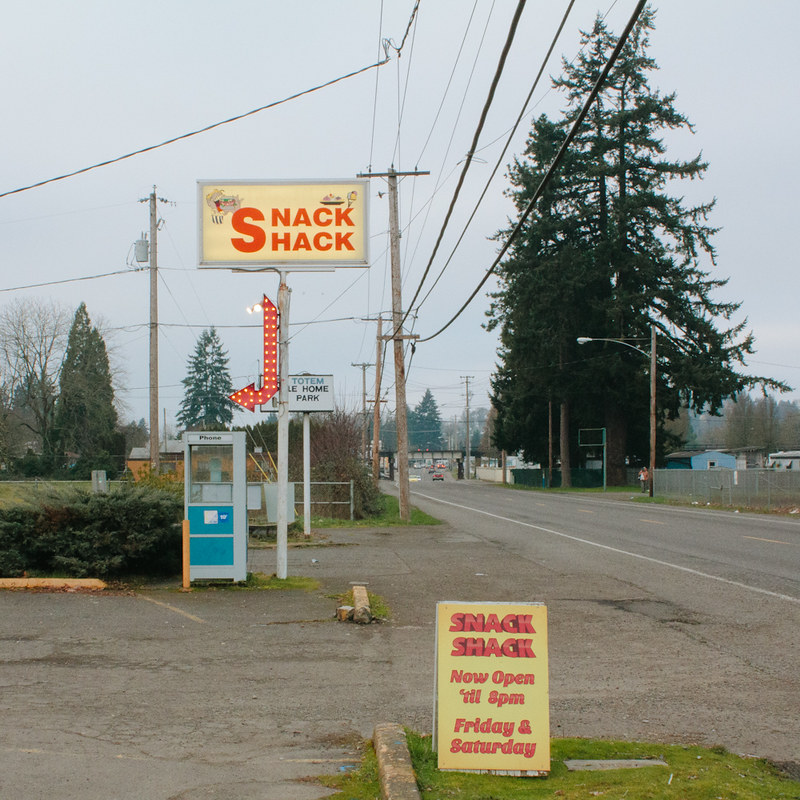 snack shack by s-bothun, on Flickr real nap shit fucked around with this message at 06:09 on Feb 16, 2013 |
|
#
?
Feb 16, 2013 05:33
|
|